

Introduction
Rockwell Extra Bold has a typographic presence that is difficult to overlook. Its broad geometric letterforms, low stroke contrast, and substantial slab serifs give even a short headline a sense of weight and permanence.
That visual strength is also why designers often search for fonts similar to Rockwell Extra Bold. Rockwell may not be available in a particular design application, or its familiar appearance may not fit the identity being developed. A project might need something narrower, softer, more contemporary, or better adapted to apparel and decorative graphics.
Rockwell belongs to the geometric slab-serif category. Its construction is relatively regular, with near-uniform strokes, prominent squared serifs, and circular forms that feel engineered rather than handwritten. The family first appeared in the 1930s and has remained closely associated with bold editorial typography, advertising, posters, and logo design.
The alternatives in this list are not intended as exact copies. Instead, each typeface captures a different part of Rockwell Extra Bold’s character, including its visual weight, geometric structure, sturdy serifs, compact rhythm, or retro display quality.
Table of Contents
1. Tecnica Slab Family
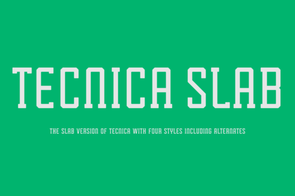
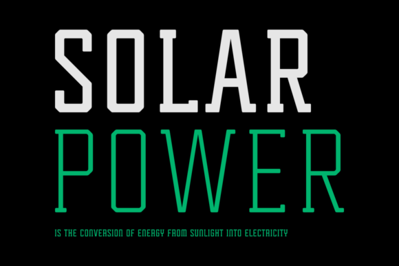
Tecnica Slab Family is one of the more convincing options when you want Rockwell’s geometric discipline without choosing something that feels like a direct imitation.
Its modular construction, slightly condensed proportions, and softened corners create a technical appearance, but the letterforms do not feel cold or overly mechanical. That balance makes the family useful for contemporary branding, editorial headlines, packaging, and industrial visual identities.
From a branding perspective, the narrower proportions are an important difference. Rockwell Extra Bold can become difficult to fit into compact logo arrangements or responsive website headings. Tecnica Slab occupies less horizontal space while maintaining enough visual weight to anchor a composition.
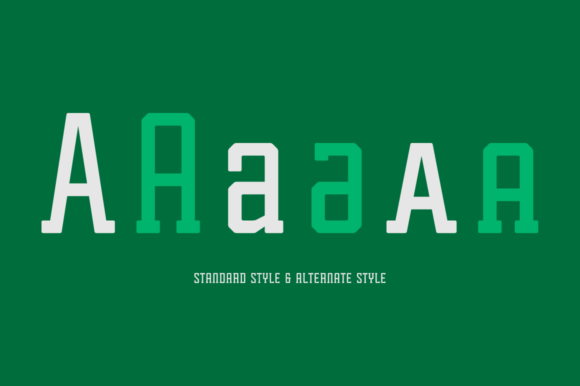
The range of standard and alternate forms also gives designers more control over personality. A restrained cut can support a serious identity, while the more distinctive alternates can add character to packaging or campaign graphics.
I would still test the heavier weights carefully at smaller sizes. Condensed letterforms and dense counters can reduce legibility when a headline is scaled down for mobile layouts.
Best for: branding, editorial headlines, technology graphics
Key features: geometric construction, condensed proportions, softened angles
2. Beaga
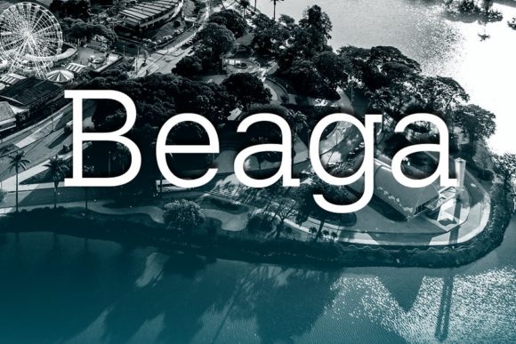
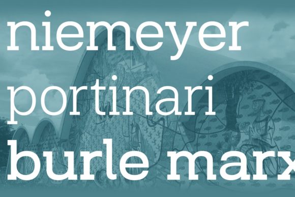
Beaga captures the cleaner geometric side of Rockwell while removing some of its overtly vintage character.
Its proportions feel controlled and contemporary, with enough weight to support logos and prominent headings without making every word look like a poster title. This gives it more flexibility within a complete visual identity.
One thing I often notice when reviewing brand systems is that a typeface may look strong in a standalone logo but become difficult to extend across packaging, websites, and supporting communications. Beaga appears more adaptable in that respect. Its construction is distinctive enough to establish personality, yet restrained enough to coexist with secondary typography.
I would consider it for an architecture studio, café identity, lifestyle brand, or product packaging system where Rockwell Extra Bold feels too familiar or visually heavy.
The spacing also gives the typeface a more measured appearance. It does not depend entirely on weight for impact, which can help a brand feel deliberate rather than loud.
Best for: logos, packaging, modern brand identities
Key features: clean geometry, balanced shapes, readable construction
3. Noir
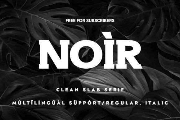
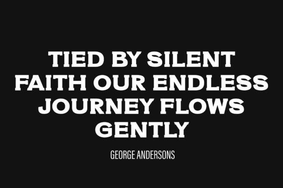
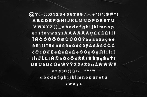
Noir is a useful alternative when the aim is to preserve Rockwell’s authority while moving toward a cleaner editorial tone.
Its heavy styles create a dense and grounded word shape, supported by substantial slab terminals and relatively controlled geometry. The result feels strong without leaning too heavily into nostalgia.
That makes Noir easier to place in modern packaging, magazine layouts, advertising systems, and visual identities where an obviously retro slab serif could feel artificial. A typeface can completely change the personality of a brand without altering any other design element, and Noir tends to make a composition feel more editorial and polished than Rockwell Extra Bold.
The availability of italic forms, small caps, and multilingual support also matters. These features are easy to overlook when evaluating a font from a single preview image, but they become important once the typeface is used across a broader brand system.
For body copy, I would still choose a more neutral companion. Noir is most convincing when given a clear display role rather than being expected to handle every level of the hierarchy.
Best for: editorial design, packaging, advertising headlines
Key features: heavy slabs, clean forms, italics and small caps
4. Going Clap
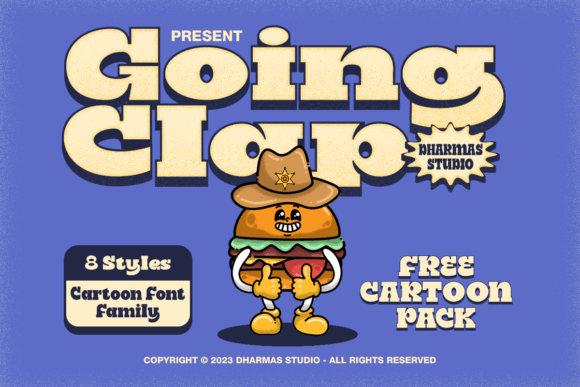
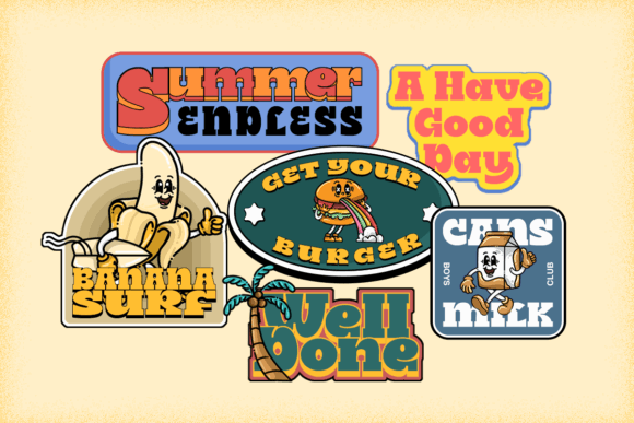
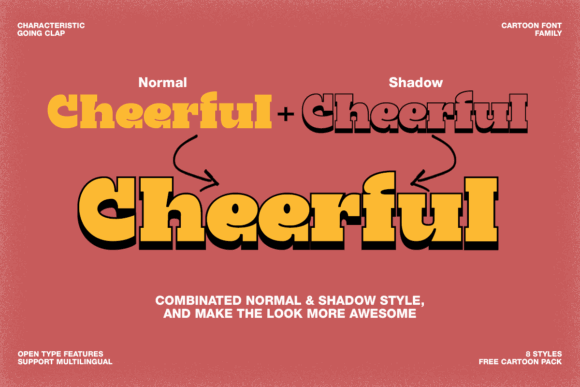
Going Clap is more expressive than Rockwell Extra Bold, but it shares the same kind of chunky visual presence.
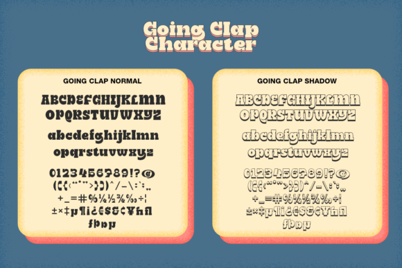
The family leans into nostalgic display typography and includes several widths, including condensed, standard, semi-expanded, and expanded versions. Shadow styles add another decorative layer.
This range can be particularly useful in poster systems and merchandise collections. The expanded styles fill wide spaces naturally, while the condensed cuts can fit into labels, badges, and narrow social media layouts.
From a design-system perspective, having several widths in the same visual language is valuable. It allows the typography to respond to different formats without replacing the core brand character every time the canvas changes.
The limitation is that Going Clap has a much stronger stylistic voice than Rockwell. It can quickly dominate a composition, particularly when outlines, shadows, and bright colors are combined. I would keep the supporting typography simple and avoid adding too many competing effects.
Best for: posters, merchandise, retro advertising
Key features: chunky slabs, multiple widths, shadow styles
5. Cozy

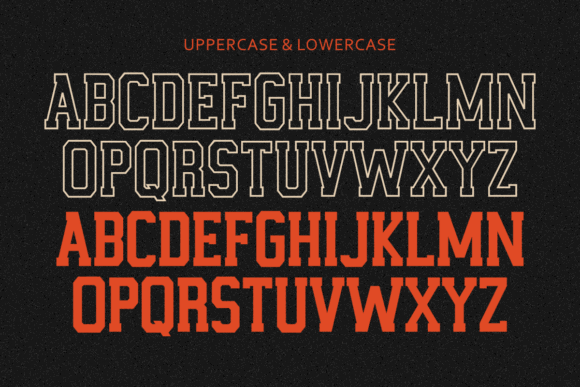
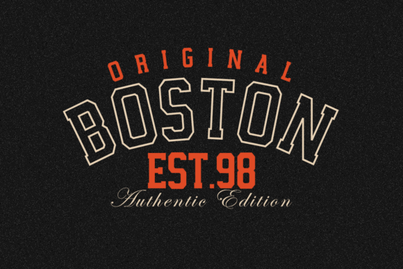
Despite its name, Cozy is not a quiet typeface. Its thick geometric letterforms, blocky proportions, and assertive display weight place it closer to vintage athletic typography.
The overall structure can replace Rockwell Extra Bold in apparel, sports graphics, labels, and retro promotional design, particularly when the goal is to create immediate impact.
Its outline styling also gives designers more control over visual weight. A solid version can carry the main headline, while the outlined style can be used for secondary words, jersey numbers, or layered vinyl compositions.
That flexibility is useful, but it needs restraint. Outline fonts often look clean at large sizes and then lose definition when reduced. Thin internal gaps may disappear in screen printing, cutting, or small digital previews.
Cozy also carries stronger athletic associations than Rockwell. I would not use it as a neutral corporate slab serif, but those associations can be an advantage for apparel brands, school graphics, and nostalgic sports identities.
Best for: sports graphics, apparel, retro posters
Key features: blocky slabs, outline style, athletic character
6. Vesper Murron
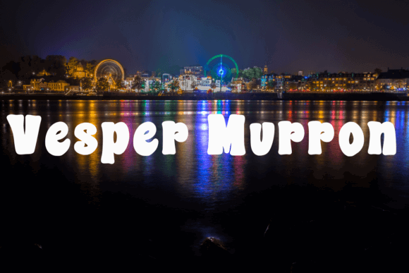
Vesper Murron takes the heavy slab-serif structure in a softer and more playful direction.
Its rounded forms preserve the visual mass associated with Rockwell Extra Bold, but the personality is friendlier and less formal. The thick, compact letterforms can make short phrases feel almost like stickers or illustrated lettering.
This typeface is better suited to children’s products, colorful packaging, casual merchandise, and social graphics than to conservative editorial design.
From a branding perspective, the rounded construction changes the emotional tone significantly. Where Rockwell can feel authoritative and established, Vesper Murron feels approachable and energetic.
That personality also limits its flexibility. Rounded display fonts can become repetitive when used throughout an entire website or packaging system. I would reserve it for the main name, campaign headline, or short statement and pair it with a quieter sans serif.
Best for: kids’ products, stickers, casual merchandise
Key features: chunky construction, rounded forms, playful personality
7. Wigenda Typewrite
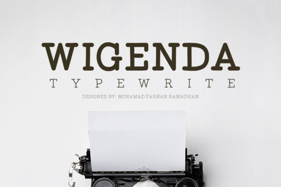
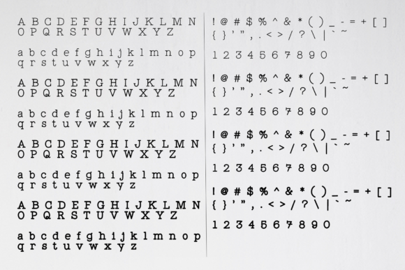
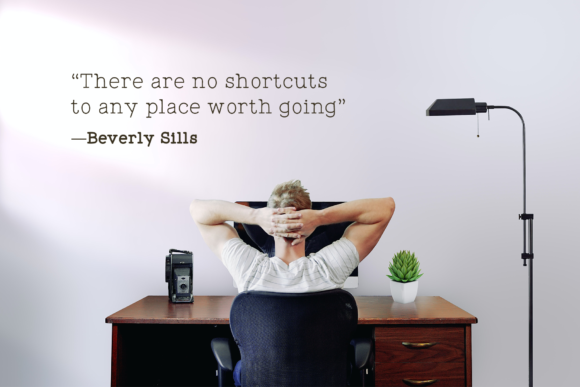
Wigenda Typewrite combines the mechanical rhythm of typewriter lettering with a broader range of weights, including regular, semibold, bold, and heavy styles.
The heavy cut is the most relevant comparison to Rockwell Extra Bold. It produces a similarly dense word shape but retains more printed texture and historical character.
That slight irregularity can be useful in editorial and identity work. Rockwell sometimes appears too clean or polished when a project is intended to feel archival, literary, journalistic, or handmade. Wigenda introduces atmosphere without relying on aggressive distressing.
The typewriter influence also creates a more noticeable rhythm between letters. That can add personality to book covers and title treatments, though it may require manual kerning in logos or very large headlines.
Small spacing decisions often have a greater effect than people expect. With this kind of typeface, I would inspect repeated characters and awkward pairs rather than relying entirely on the font’s default spacing.
Best for: editorial titles, book covers, vintage branding
Key features: typewriter influence, multiple weights, mechanical rhythm
8. Jeffjak
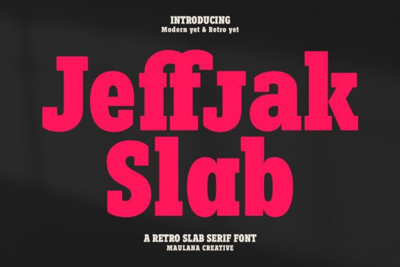
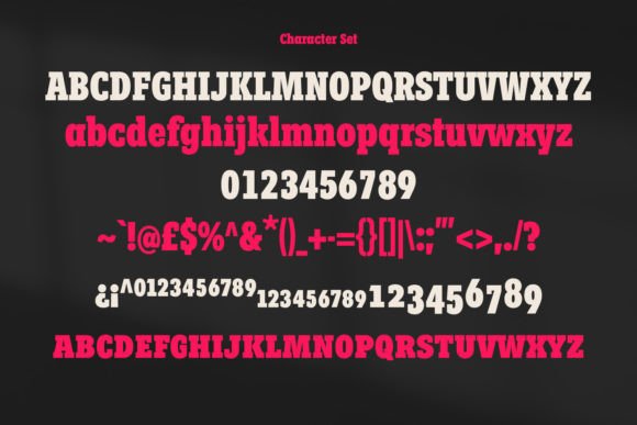
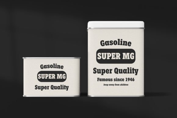
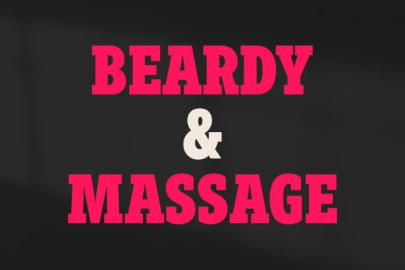
Jeffjak is a semi-geometric slab serif with medium-to-low stroke contrast, placing it in familiar Rockwell territory without feeling overly rigid.
Its letterforms have a more relaxed construction, while ligatures and alternate characters offer opportunities for customization. These details can be especially valuable in logo design, where one distinctive letter combination may help a wordmark feel considered rather than simply typeset.
From a branding perspective, this is one of Jeffjak’s main strengths. It gives designers room to shape a title or brand name without having to redraw the entire typeface.
The font can also extend beyond oversized display use. It has been positioned for logos, social media graphics, movie and book titles, short copy, and longer passages.
Even so, I would test paragraph text carefully. A font that technically supports longer text is not automatically the strongest choice for reading. Weight, spacing, and serif detail can become tiring when repeated across several lines.
Best for: logos, title design, social graphics
Key features: semi-geometric forms, low contrast, ligatures and alternates
9. Tapper
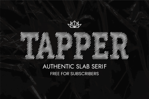
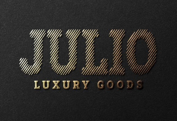
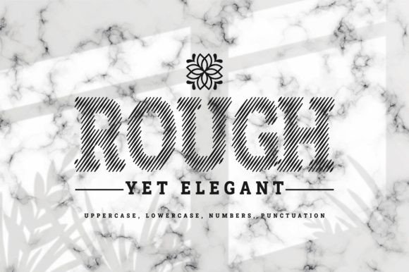
Tapper is a decorative slab serif for designers who appreciate Rockwell’s sturdy construction but want a more handcrafted finish.
Its geometric base keeps the letterforms controlled, while the decorative details introduce personality. This creates a useful middle ground between a clean commercial slab serif and a heavily stylized western font.
Tapper is most effective in short applications such as labels, package names, poster titles, and compact logos. The more text it carries, the more noticeable its decorative rhythm becomes.
This is common with expressive display typefaces. A few distinctive letters can make a brand memorable, but the same features can reduce readability when repeated across paragraphs or navigation elements.
I would also check how the typeface performs in one-color reproduction. Decorative details that look refined in a large digital preview may merge or disappear when printed on textured paper or reduced for a small label.
Best for: labels, packaging, handcrafted branding
Key features: geometric base, decorative details, prominent serifs
10. Varsity Bold
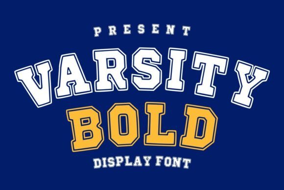
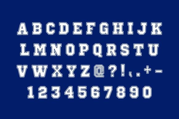
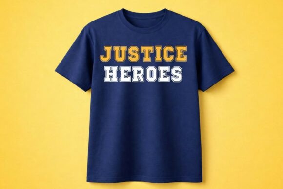
Varsity Bold translates Rockwell’s visual heaviness into a recognizably collegiate structure.
Its squared construction and substantial serifs suit team names, school initials, jersey numbers, and campus-themed merchandise. The typography communicates its category immediately, which can be more useful than subtlety in sports and school graphics.
This is not a neutral Rockwell replacement. Its cultural associations are specific, and it would feel misplaced in an understated editorial identity or professional services brand.
For team apparel, Cricut projects, and personalized merchandise, however, that specificity becomes an advantage.
The most practical difference is the treatment of corners and counters. Collegiate fonts often use sharper angles and tighter internal spaces than Rockwell. Letters such as E, R, S, and B should be tested at the actual production size, especially for vinyl cutting, embroidery, or small printed graphics.
Best for: team shirts, jerseys, school merchandise
Key features: bold weight, collegiate structure, squared letterforms
11. Boston College
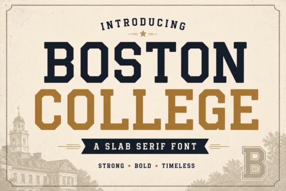
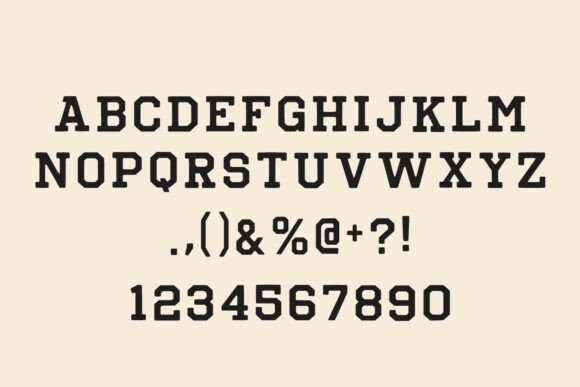
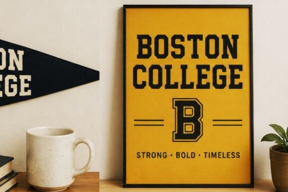
Boston College is another athletic slab serif, though its forms are more decorative and school-specific than Rockwell Extra Bold’s relatively neutral geometry.
It is most effective in short uppercase phrases. Team names, graduation designs, mascot graphics, and personalized sweatshirts are natural uses.
The heavy strokes also make the typeface suitable for large printed lettering and layered vinyl, provided the internal spaces remain open enough at the final size.
One thing I would avoid is over-styling the composition. Arches, outlines, shadows, stars, banners, and mascots are all common in collegiate graphics, but combining every device at once usually weakens the hierarchy.
The font already carries a strong visual identity. A simple layout often gives the letterforms more authority than a highly decorated one.
Best for: graduation graphics, team apparel, campus designs
Key features: athletic slabs, uppercase emphasis, heavy construction
12. Vintage College
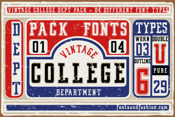
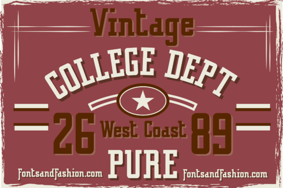
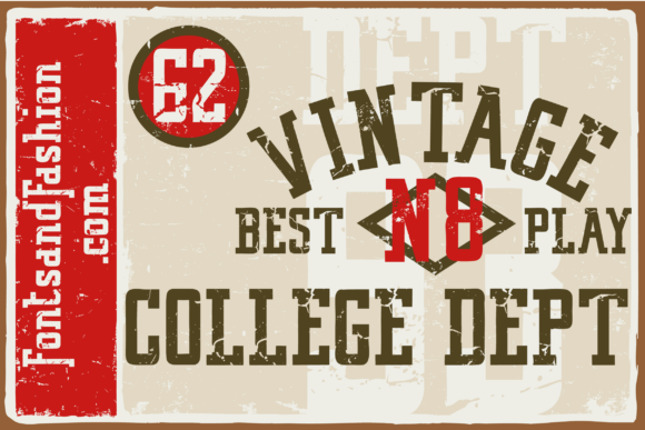
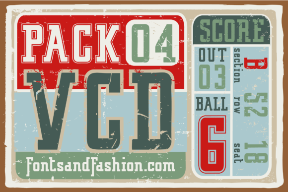
Vintage College sits between the structural weight of Rockwell Extra Bold and classic American athletic lettering.
Its sturdy slab construction gives it enough mass for T-shirts, hoodies, badges, and poster headlines. The vintage styling adds nostalgia without depending entirely on distressed texture.
This type of font is particularly useful when the typography needs to carry most of the design. A short two- or three-word phrase can fill the front of a shirt without requiring a complicated illustration.
From a branding standpoint, that efficiency can be valuable. Strong typography often feels effortless, which is why its role is sometimes underestimated. When the letterforms, spacing, and proportions are doing enough work, additional graphic elements may not be necessary.
The main limitation is longevity. Collegiate and retro apparel styles move in and out of fashion. For a permanent logo system, I would consider whether the nostalgic tone will still support the brand several years from now.
Best for: vintage apparel, badges, athletic branding
Key features: heavy slabs, retro styling, collegiate proportions
13. Rough Varsity
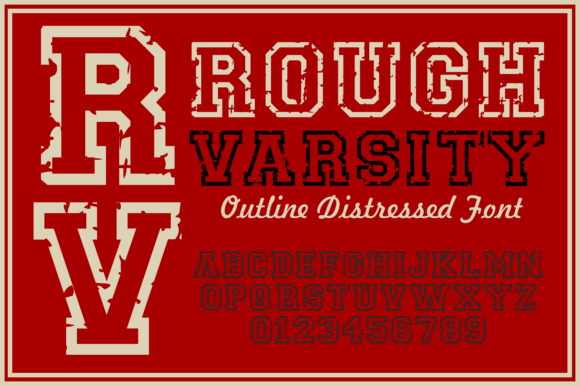
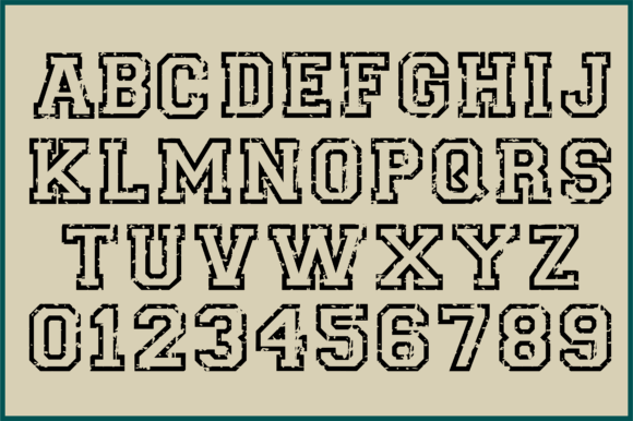
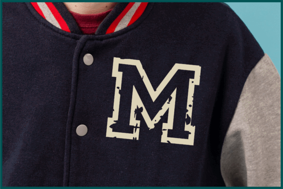
Rough Varsity combines athletic slab-serif letterforms with integrated distressing and a strong outline.
The broad shapes retain the forceful presence associated with Rockwell Extra Bold, while the worn texture makes the typography feel aged, printed, and intentionally imperfect.
Using a font with the texture already built into the letterforms can produce more consistent results than placing a generic distress overlay on top of clean typography. Random texture masks often damage small counters or make some characters look much more worn than others.
That said, distressed fonts still need careful testing. Fine texture may disappear in small prints, while larger gaps can become distracting when the typeface is used on a website or high-resolution display.
Rough Varsity is most convincing when the production method supports its character, such as screen-printed apparel, posters, jackets, hoodies, and vintage sports merchandise.
Best for: vintage sportswear, hoodies, distressed posters
Key features: rough texture, strong outline, athletic letterforms
14. Millow Dunno
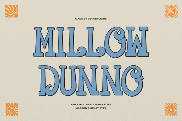
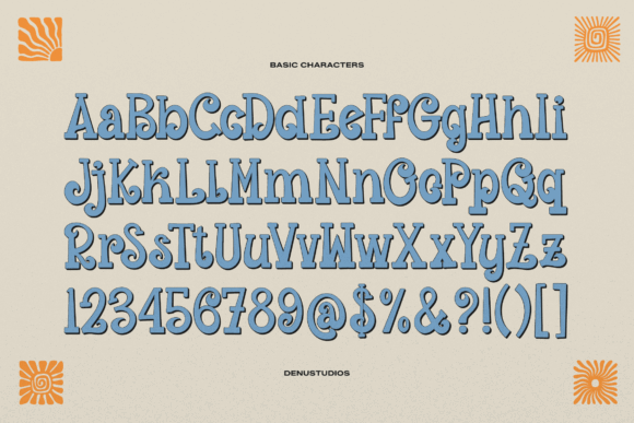
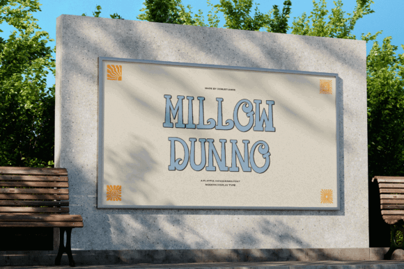
Millow Dunno is the loosest interpretation of Rockwell Extra Bold in this collection.
It shares the heavy slab-serif presence, but replaces rigid geometry with wavy curves, rounded terminals, and a distinctly 1970s visual language.
That makes it useful when Rockwell feels too serious or architectural. The flowing construction can suit music posters, café merchandise, summer products, retro packaging, and playful lifestyle brands.
The expressive details need room to breathe. When the typeface is reduced aggressively, the curves and narrow internal spaces can lose definition. Words with several rounded or tightly packed characters may become particularly difficult to read.
I would use Millow Dunno for the main phrase and pair it with a restrained sans serif for supporting information. That creates a clear hierarchy while allowing the display typography to retain its personality.
Best for: retro posters, playful packaging, music graphics
Key features: heavy slabs, wavy curves, 1970s influence
Read More: As you consider powerful typefaces like Rockwell Extra Bold, it's worth exploring the broader category of display fonts and how they can elevate your branding, Cricut, and craft designs.
Quick Comparison of the Best Rockwell Extra Bold Alternatives
| Font | Closest Quality | Best Use |
|---|---|---|
| Tecnica Slab Family | Geometric construction | Branding and editorial headlines |
| Beaga | Clean, balanced proportions | Logos and professional branding |
| Noir | Strong modern slabs | Packaging and advertising |
| Going Clap | Chunky retro weight | Posters and merchandise |
| Cozy | Bold geometric personality | Sports graphics and apparel |
| Vesper Murron | Heavy playful shapes | Kids’ designs and casual branding |
| Wigenda Typewrite | Multiple heavy weights | Editorial and vintage layouts |
| Jeffjak | Semi-geometric construction | Logos and title treatments |
| Tapper | Decorative slab details | Posters and packaging |
| Varsity Bold | Athletic structure | Team apparel and school designs |
| Boston College | Collegiate character | Jerseys and campus graphics |
| Vintage College | Retro athletic style | T-shirts and varsity branding |
| Rough Varsity | Distressed heavy lettering | Vintage sports merchandise |
| Millow Dunno | Rounded retro slabs | Groovy posters and playful branding |
What Fonts Pair Well With Rockwell-Style Slab Serifs?
Heavy slab serifs usually need a quieter companion.
Pairing two equally assertive display fonts often creates competition rather than hierarchy. The viewer is left unsure which element should be read first.
A neutral geometric or humanist sans serif is usually the safest direction. It creates contrast without making the design feel disconnected.
Rockwell itself is commonly paired with restrained sans-serif or text-serif families. Documented pairing directions include Rockwell with Circular and Rockwell Bold with Bembo.
Useful font-pairing approaches include:
- Geometric sans serif: clean, structured, and contemporary
- Humanist sans serif: warmer and generally easier to read
- Traditional text serif: editorial and established
- Simple monospaced font: technical or industrial
- Lightweight grotesk: strong contrast in visual weight
Use the slab serif for the logo, headline, or short statement. Let the supporting typeface handle navigation, descriptions, captions, interface labels, and body text.
The relationship between the two fonts matters more than simply choosing two attractive families. Look for contrast in weight and role, but enough similarity in proportion or construction to keep the identity visually coherent.
Final Thoughts
The closest font to Rockwell Extra Bold depends on which part of Rockwell you are trying to preserve.
For clean geometric structure, I would begin with Tecnica Slab Family, Beaga, or Noir. For a stronger retro personality, Going Clap and Cozy provide more decorative flexibility. Designers working on apparel and school graphics are more likely to benefit from Varsity Bold, Vintage College, or Rough Varsity.
The objective should not be to find an exact visual duplicate. Look for the same relationship between weight, spacing, serif shape, and proportion, then test the typeface in the actual layout.
Rockwell Extra Bold remains memorable because its individual decisions support one another. The geometry, visual weight, counters, spacing, and slab serifs all contribute to the same typographic voice.
A convincing alternative should achieve a similar sense of coherence, even if the letterforms themselves look noticeably different.
Some links in this article may be affiliate links. If you purchase through them, we may earn a small commission at no extra cost to you. Thanks for supporting our work.
FAQ
What font is closest to Rockwell Extra Bold?
Tecnica Slab Family and Beaga are among the closest options in this collection because they combine geometric construction, low stroke contrast, and substantial slab serifs. Rokkitt is another widely recognized Rockwell-inspired family, although it is not one of the Creative Fabrica products featured here.
Is Rockwell Extra Bold a good logo font?
Rockwell Extra Bold can be effective for short logos that need to feel solid, established, retro, or authoritative. Its heavy construction can become crowded in long names, so spacing and scale need careful adjustment.
What type of font is Rockwell Extra Bold?
Rockwell Extra Bold is a geometric slab serif. It uses prominent squared serifs, relatively even stroke widths, and geometric shapes rather than the high stroke contrast associated with modern serif typefaces.
Are slab serif fonts good for T-shirts?
Slab serif fonts are often well suited to T-shirts because their thick strokes remain visible from a distance. Collegiate, western, vintage, and geometric slabs are especially common in apparel, but detailed distressing and narrow counters should be tested at the final print or cutting size.
Follow Us