
Beautiful Websites: Reasons They Fail to Convert
Beautiful websites can create a strong first impression, but they do not always help visitors make decisions, trust a business, or take action.
For a long time, I believed that better design naturally led to better results.
It seemed logical.
A cleaner layout should make a business look more professional. Better typography should improve trust. More polished visuals should make a website feel more credible and increase conversions.
And to be fair, all of those things can help.
But after working around websites, brand identities, typography, and visual systems for long enough, I’ve become much more careful with that assumption.

A beautiful website is not automatically an effective website.
Some of the highest-converting websites are not the most visually impressive. And some beautifully designed websites struggle because they are solving the wrong problem.
That is the part many website owners and designers learn too late.
The goal is not simply to make a website look better.
The goal is to help people understand, trust, and act.
Table of Contents
The Trap Many Designers Fall Into

When designers evaluate a website, we tend to notice things most visitors never consciously see.
We look at:
- Typography
- Layout systems
- Grid structure
- White space
- Color palettes
- Micro animations
- Visual consistency
These details absolutely matter.
Good spacing can make a page feel calmer. Strong typography can make content easier to scan. A consistent visual system can make a brand feel more mature and reliable.
But the trap is assuming that visitors evaluate websites the same way designers do.
Most people do not arrive on a website thinking about grids, kerning, or animation timing.
They arrive with a problem.
They want to know whether this business can help them.
That difference changes everything.
What Visitors Actually Care About

Imagine someone searching for:
- A lawyer
- A plumber
- A dentist
- A marketing agency
- A web designer
When they land on a website, they usually are not asking:
“Is the spacing between these sections perfect?”
They are asking:
- Can I trust this company?
- Do they understand my problem?
- Have they helped people like me?
- What exactly do they offer?
- How much will it cost?
- How do I contact them?
- What happens next?
These questions often matter more than visual perfection.
This does not mean design is irrelevant. It means design has to support the visitor’s decision-making process.
A beautiful layout that hides the contact button, weakens the offer, or makes the page difficult to scan is not really good design. It may look impressive, but it fails at communication.
Why Some Ugly Websites Make More Money

This is one of the hardest lessons for designers to accept.
Some outdated websites still generate serious revenue.
They may have old typography, awkward spacing, heavy colors, and very little visual refinement. From a design perspective, they may look like they need a full redesign.
But they often do something extremely important.
They make the offer clear.
They show proof.
They make contact easy.
They give visitors enough confidence to take the next step.
These websites often have:
- Clear offers
- Strong testimonials
- Real case studies
- Visible contact information
- Trust signals
- Straightforward messaging
- Simple calls to action
Visitors may not admire the design.
But they understand the value.
And in many cases, understanding beats admiration.
I have seen this happen often when reviewing small business websites. The design may feel dated, but the page answers the visitor’s questions quickly. Meanwhile, a more polished competitor may look refined but leave people unsure about what the company actually does.
That is a serious branding problem.
Designers Optimize for Dribbble. Customers Optimize for Trust

This might be the biggest disconnect in modern web design.
Designers naturally appreciate creativity.
We notice:
- Beautiful typography
- Creative layouts
- Unique animations
- Editorial compositions
- Subtle visual details
- Strong brand systems
Customers notice different things.
They notice:
- Reviews
- Results
- Guarantees
- Pricing
- Experience
- Credibility
- Response time
- Risk
The average visitor is not judging your website as a portfolio piece.
They are evaluating whether they feel comfortable doing business with you.
That is why a website can look visually impressive and still feel weak from a conversion perspective. If the messaging is vague, the proof is missing, or the next step is unclear, the design cannot carry the entire experience.
A website should not only look designed.
It should feel useful.
The Importance of Typography
As someone who spends a lot of time looking at fonts, visual identity, and web design, I still believe typography matters a great deal.
Typography influences perception more than many people realize.
A typeface can make a brand feel refined, casual, technical, playful, expensive, traditional, or approachable before the visitor reads a full sentence.
Good typography improves:
- Readability
- Content hierarchy
- Visual rhythm
- Brand tone
- Professional appearance
- User experience
But typography is not a magic solution.
Most visitors will not choose a company because it uses a premium font. They probably will not leave because a website uses Inter instead of a custom typeface.
What they notice is whether the content is easy to read.
They notice whether the page feels trustworthy.
They notice whether headings guide them clearly from one idea to the next.
This is why highly readable fonts continue to dominate modern web design. They may not always look unique, but they perform well across screens, devices, and content types.
One thing I often notice in website redesigns is that the typeface itself is not always the problem. Sometimes the real issue is weak hierarchy, poor contrast, tight line spacing, or text blocks that feel too dense.
A good font can still fail if the typography system around it is poorly handled.
Why Simplicity Often Wins

Many successful websites share a surprising characteristic.
They are simple.
Not empty.
Not careless.
Simple.
They communicate their message quickly. They remove unnecessary distractions. They make it easy for visitors to understand what is being offered and what to do next.
This kind of simplicity often performs better than highly complex design because it reduces friction.
The easier it is to understand a website, the easier it becomes to trust it.
From a branding perspective, simplicity also helps create consistency. When a website has too many type styles, colors, layout patterns, and decorative elements, the brand starts to feel unstable.
Strong design usually does not need to shout.
It gives the visitor a clear path.
The Real Purpose of Design
At some point, I stopped thinking about design as decoration.
Now I think about design as communication.
A website does not exist to impress other designers. It exists to help visitors make decisions.
Good design makes those decisions easier.
It helps people understand:
- Who you are
- What you offer
- Why it matters
- Why they should trust you
- What they should do next
That is why the best websites often feel almost effortless.
You do not stop to admire every design decision. You simply find what you need.
That is usually a sign that the layout, typography, messaging, and structure are working together.
Where Design Still Matters
None of this means design is unimportant.
Far from it.
Design can influence:
- Trust
- Perceived quality
- User experience
- Brand recognition
- Professionalism
- Emotional tone
- First impressions
A poorly designed website can absolutely hurt a business.
Bad typography can make a serious company look careless. Weak spacing can make content feel overwhelming. Inconsistent colors and visual styles can make a brand feel unorganized.
The mistake is assuming that making a website more beautiful will automatically make it more successful.
Sometimes the bigger issue is not the visual design.
Sometimes the offer is unclear.
Sometimes the call to action is weak.
Sometimes the page lacks proof.
Sometimes the content does not answer the visitor’s real objections.
In those cases, improving trust, messaging, or usability may create a much bigger impact than changing the color palette or choosing a more elegant font.
Finding the Right Balance
The most effective websites usually find a balance between aesthetics and functionality.
They look professional.
They feel trustworthy.
They communicate clearly.
They help visitors accomplish their goals.
That balance is important because a website with no visual care can feel untrustworthy, but a website that focuses only on aesthetics can become difficult to use.
Good web design sits somewhere between brand expression and practical communication.
It should have enough visual identity to feel memorable, but not so much decoration that the message gets buried.
This is where hierarchy becomes especially important.
The visitor should immediately understand what matters most on the page. Headings, type size, spacing, contrast, buttons, images, and layout all need to guide attention.
When every element competes for attention, nothing feels important.
A Practical Shortcut for Building Cleaner Websites
Not every website needs to start from a blank screen.
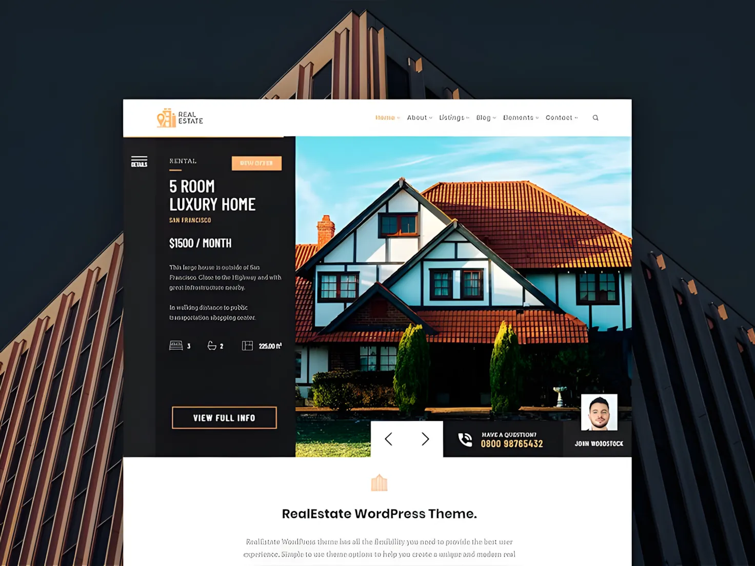
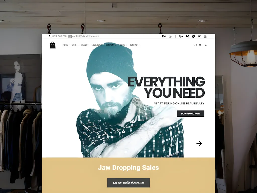
For small business sites, portfolios, blogs, shops, or agency pages, a good WordPress template can give you a cleaner starting structure: layout, spacing, sections, and basic visual direction.
I would still adjust the typography, colors, imagery, and copy so the site does not feel generic. But when used carefully, templates can save time and help you focus on what matters more: clarity, trust, and usability.
For that reason, a bundle like 50+ Best WordPress Templates can be useful if you want ready-made layouts for different website types without buying each theme separately.
When Unique Design Makes Sense

There are situations where visual distinction becomes extremely valuable.
For example:
- Luxury brands
- Creative agencies
- Design studios
- Fashion companies
- Premium products
- Hospitality brands
- Editorial platforms
In these industries, design itself becomes part of the product experience.
A luxury brand with generic typography and weak visual direction will struggle to communicate value. A creative agency with a forgettable website may have difficulty proving its own taste. A fashion company needs visual identity because perception is central to the offer.
In these cases, typography, imagery, layout, and brand atmosphere matter heavily.
But even then, clarity still matters.
Beautiful design cannot compensate for weak messaging.
A premium-looking website still needs to explain what the brand offers, why it matters, and how the customer can take the next step.
Visual distinction is powerful when it supports the message.
It becomes a problem when it replaces the message.
The Lesson Most Website Owners Learn Too Late
Many businesses spend months adjusting:
- Fonts
- Colors
- Layouts
- Animations
- Button styles
- Image treatments
while neglecting things like:
- Customer testimonials
- Case studies
- Product explanations
- Pricing clarity
- Calls to action
- Service details
- Frequently asked questions
- Contact information
Yet these elements often have a greater impact on conversions.
A visitor who trusts your business is far more valuable than a visitor who simply admires your design.
This is why I usually think a redesign should start with questions, not visuals.
What does the visitor need to understand?
Where do they hesitate?
What proof do they need?
What makes the offer different?
What information is missing?
Only after that does the visual system have a clear job to do.
While a website's beauty isn't the sole determinant of its success, choosing the right elements like modern and clean fonts can certainly contribute to a compelling user experience, much like these 15 Best Sans Serif Fonts for Modern Websites in 2026.
Final Thoughts
One of the biggest misconceptions in web design is the belief that beauty automatically leads to better results.
Good design matters.
Typography matters.
Branding matters.
But trust matters more.
The websites that consistently perform well are not always the most visually impressive. They are the ones that communicate clearly, build credibility, and help visitors solve problems.
That is the real purpose of design.
Not decoration.
Not visual perfection.
Not approval from other designers.
The goal is to make decisions easier.
And when a website does that well, the design becomes much more effective.
FAQ
Does good design increase conversions?
Good design can improve conversions, especially when it improves readability, trust, hierarchy, and usability. But design alone is rarely enough. Clear messaging, strong proof, and an easy path to action often have a bigger impact.
Why do some outdated websites still perform well?
Many older websites perform well because they communicate value clearly. They may not look modern, but they often include strong offers, testimonials, visible contact details, and simple calls to action.
Is typography important for websites?
Yes. Typography affects readability, hierarchy, brand perception, and user experience. However, a good typeface cannot fix unclear messaging or a weak offer.
What matters more than visual design?
Trust signals, customer testimonials, case studies, clear positioning, useful content, pricing clarity, and strong calls to action often influence buying decisions more than visual polish alone.
Should businesses invest in design?
Yes. Businesses should invest in design, but the design should support usability, credibility, and communication. A website should look professional, but it also needs to answer the visitor’s real questions.
What is the real purpose of web design?
The primary purpose of web design is to help visitors understand information and make decisions more easily. Strong web design combines visual identity, usability, content hierarchy, and trust-building.
Follow Us