Introduction
Ever wonder why sans serif fonts are always so popular? It’s `cause they’re good at being both timeless and modern. For designers who want type that’s clean, pro, and works for everything, sans serif fonts are still the way to go. If you’re working on a sweet new website, giving a startup a makeover, or setting up a magazine, a good sans serif font is key to the design.
Why are they still so big? It’s all about being clear and working for lots of things. Serif fonts feel more old-school, but sans serifs are smooth and simple. They’re easy to read, especially on screens, which is great `cause we’re always on our devices. These fonts get straight to the point, so your message is what people notice. That’s probably why everyone uses them, from tech companies to fancy fashion brands.
Plus, with simple designs and stuff looking good on phones being so important, sans serif fonts just fit in anywhere. You can find them in tons of styles—some are sharp, others are round, some feel more human—and they look good with other fonts too. You can mix them with script fonts to make things interesting, or use different sans serifs for a cool layered look.
Right now, there are so many cool sans serif fonts out there. The people who make fonts are dropping new ones that are changing things up with their shapes and how the letters fit together. Whether you want something super clean or with a bit of a weird vibe, you can find a sans serif font that works.
Affiliate Disclosure: Just a heads-up: some links here are affiliate links. It doesn’t cost you anything extra, but it helps support my work 💛
In this article, I’ve curated 40 of the best sans serif fonts for 2026, carefully selected for modern web design, UI/UX, branding, and editorial projects. I break down what makes a great sans serif font, explain the differences between geometric, humanist, and minimalist styles, and share practical tips on how to choose the right sans serif typeface for websites, logos, apps, and print—so you can pick fonts that look modern, readable, and timeless.
I’m going to show you 40 of the best sans serif fonts you can get now—put into groups like web/UI, branding, sharp styles, and simple designs for magazines. Let’s check out what makes these fonts awesome and how to pick the best one for your next design.
Table of contents
What Makes a Sans Serif Font Great?
So, what’s the difference between a font that’s just okay and one that’s amazing? Let’s look at what makes a sans serif font great, not just good.
Clean and Simple Design
A really great sans serif font is like a well-made suit: clean, balanced, and sure of itself, but not too loud. Simple design isn’t just about taking away extras; it’s about getting things right. When it comes to fonts, this means the lines are even, the space is right, and the letters look strong. Simple fonts aren’t boring; they’re just easy to read. They get rid of anything extra so you just see what’s important: the message.
The best simple fonts, like Helvetica Now or Avenir Next, let your design breathe. They have structure, but they’re not too uptight. They let you be creative without messing up the design. If you want a clean and modern look, a simple sans serif font is your best bet.
Easy to Read
Being easy to read is key, mostly for web and app design. Good sans serifs look good whether they’re big or small. That means the letters are clear (you can tell the difference between I, l, and 1), they’re the right height, and the space between letters is good.
Fonts like Inter, IBM Plex Sans, and Source Sans Pro are made to be easy to read on screens. They don’t tire your eyes out, and they stay clear on phones and computers. This means designers don’t have to pick between looking good and being easy to use.
Sharp vs Human vs Old-School
Each style of sans serif has its own feel:
- Sharp sans serifs (like Futura or Poppins) use shapes like circles, squares, and triangles. They feel modern and clean, but they might seem a bit cold if you’re not careful.
- Human sans serifs (like Gill Sans or Optima) have a bit of a hand-written feel. They seem warmer and more natural.
- Old-school sans serifs (like Neue Haas Grotesk, Helvetica) are the oldest styles. They often have little quirks that give them character.
The best sans serif fonts mix things from all three styles, so you get something special that works in lots of places.
How Sans Serif Fonts Are Being Used Right Now
Before we get to the list, let’s see where sans serif fonts are used right now and why some fonts are better for certain things.
Best Fonts for Web and UI
Apps and websites need to be clear, fast, and consistent. Sans serif fonts are great for user interfaces `cause they look good at any size and are easy to read on screens. The right font makes apps and websites easier to use, and it makes people trust them more.
For this, people love fonts like Roboto, Inter, and Plus Jakarta Sans `cause they work for lots of things and are free to use. These fonts work in many languages, have different weights, and make sure each letter is clear. Google Fonts has made many of these available to everyone, so web designers have awesome stuff to work with.
Best Sans Serifs for Branding
When it comes to branding, fonts aren’t just about getting the job done; they show how you feel. The right font tells people what you’re about. Fancy brands go for clean, simple sans serifs like Graphik or Söhne, while startups might pick something sharper or more fun like Gilroy or Maison Neue.
A good font for branding needs to be easy to remember and work in lots of places—on logos, packaging, and online. Think about something that will last, not just what’s cool right now.
Best Fonts for Print & Magazines
Even though we’re in the digital age, print is still around. Magazines, books, and brochures still need type, and sans serif fonts give them a fresh, modern look. Fonts like Basel Grotesk, Neutral Face, and Editorial New Sans are good choices for designs where being easy to read and looking good are both important.
Print also lets you try different things. You can use a strong sans serif for the title and a serif for the main text, or switch it up, to make things stand out.
40 Awesome Sans Serif Fonts for 2026
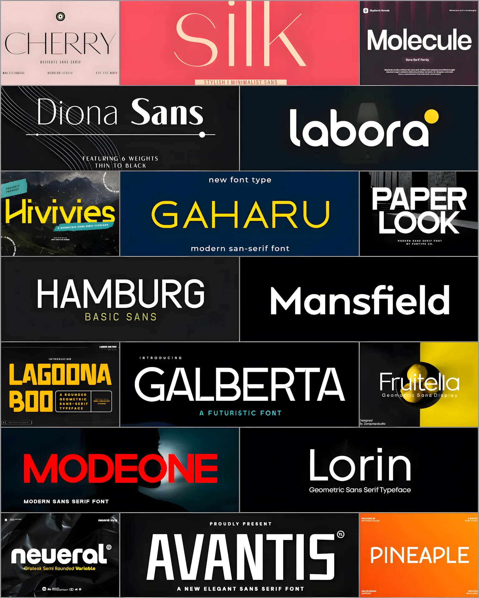
Ready to check out some fresh fonts? Here are 40 of the best sans serif fonts you should know about for 2026. I’ve sorted them into four groups to help you find the perfect one for your project.
1–10: Great Sans Serif Fonts for Web & UI
These fonts are all about being clear, easy to read, and working perfectly on screens.
1. Mesveda Font
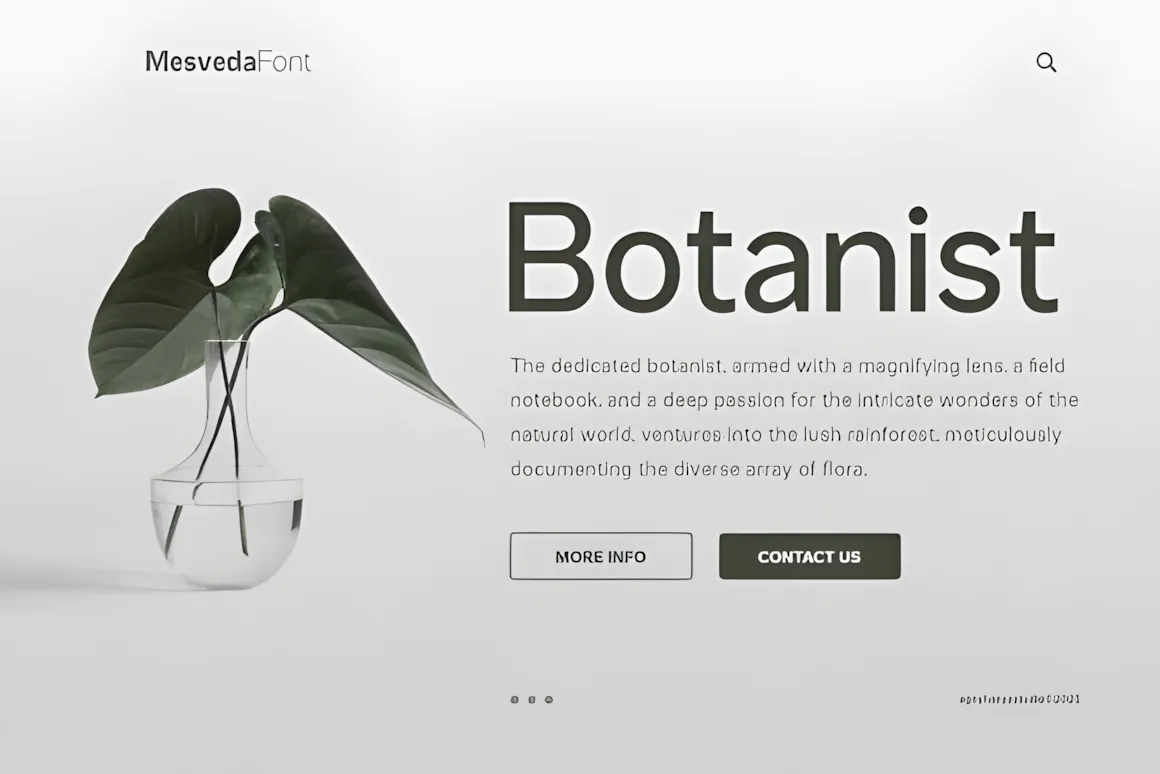
Check out Mesveda – a Sans Font Family!
Mesveda is a fresh, clean sans-serif font that’s both simple and stylish. It’s super flexible and comes in 14 styles, from thin to bold, plus italics.
It has uppercase and lowercase letters, numbers, punctuation, and supports multiple languages. It also has Opentype features.
Perfect for all sorts of design stuff like websites, user interfaces, logos, branding, ads, products, stationery, magazines, book covers, photography, art, weddings, fashion, special events, labels, and packaging.
2. Sentino Font
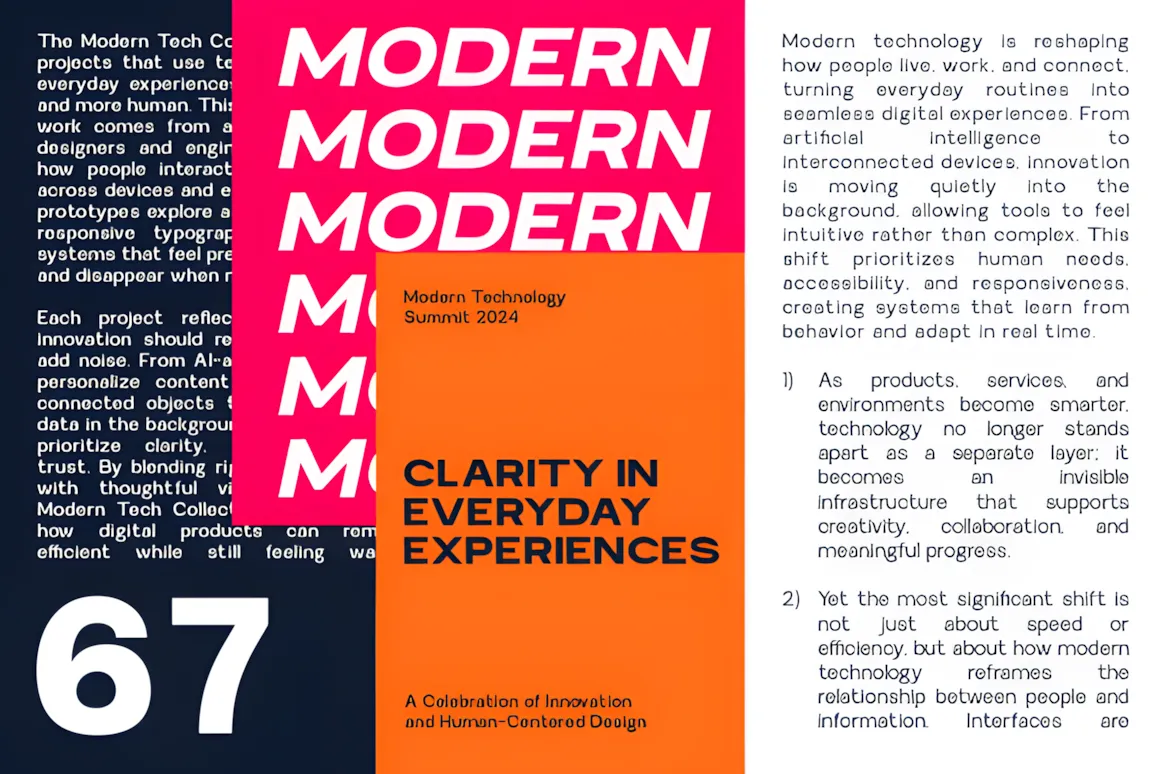
Sentino is a simple, easy-to-read sans-serif font made with today’s designs in mind.
It has a simple structure and nice shapes, giving it a balanced and up-to-date feel that’s calm, professional, and works well in many places. It’s simple on purpose, so your content and messages stand out while still looking neat and up-to-date.
This font has 7 weights and expanded styles, giving you choices for company branding, tech startups, and magazines. Sentino is based on geometric ideas, so it’s easy to read on screens and on paper. It has a neutral but strong tone, so you can use it with almost any script or serif font for a cool contrast. From big website titles to small text in a brand book, Sentino is a font you can always count on, and every designer should have it.
Made to be flexible, Sentino works smoothly for many uses, like branding, UI/UX design, magazine layouts, web design, and online stuff.
3. Mofiné Font
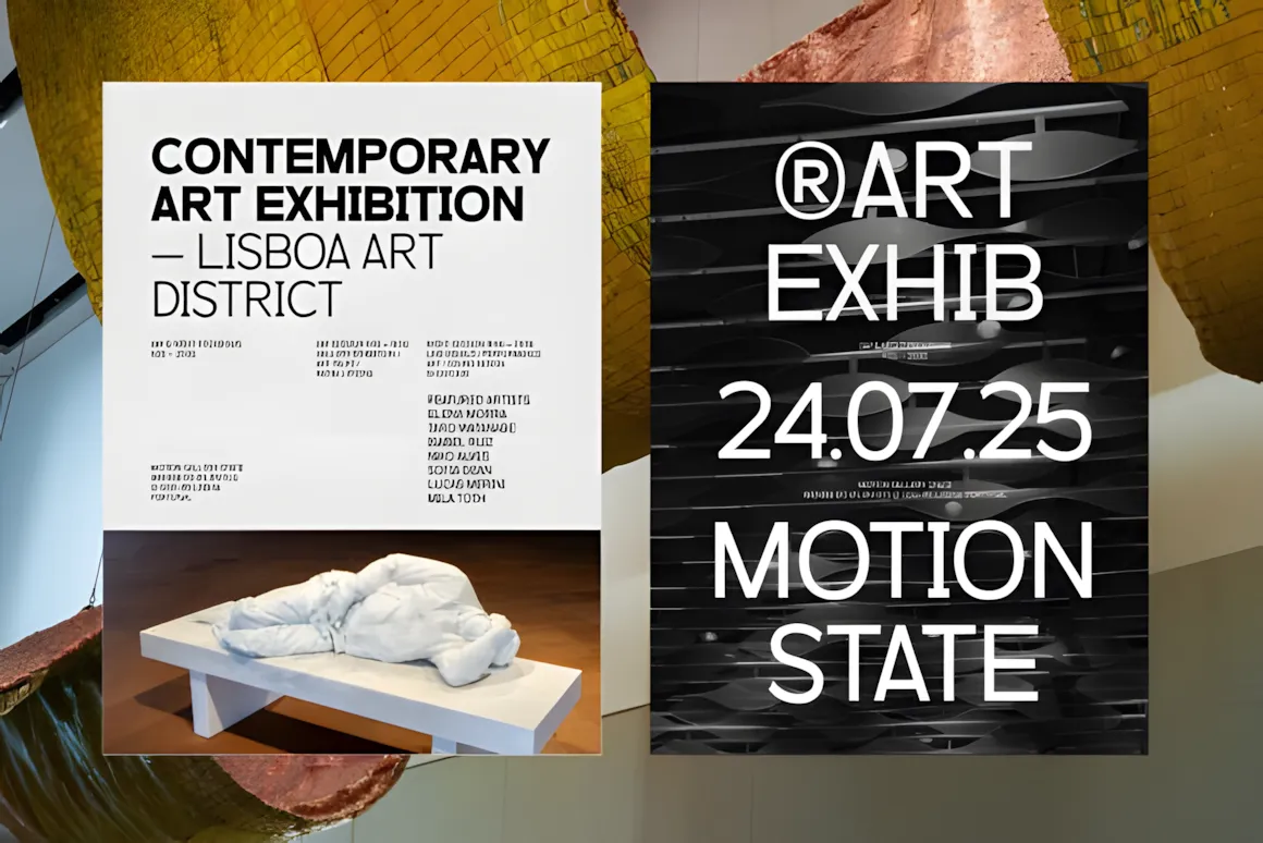
Mofiné mixes simple shapes with nice, human-friendly touches, so it looks both modern and inviting. It comes in 9 weights, making it super easy to get a consistent feel across your brand, website, and print stuff—from big headlines to clean app designs and easy-to-read documents. You get both OTF and TTF files, so it’s ready to go for your next project.
This font works great for company branding, app interfaces, building signs, or really any place you want a font that’s smart, up-to-date, and really clear to read.
4. Lemora Font
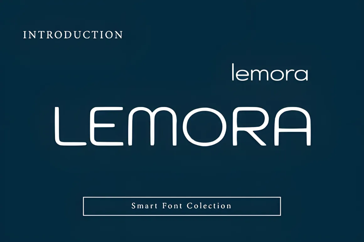
Lemora is a sans-serif font with round edges. It’s soft, simple, and easy to like. Its curved lines and clear letters make it great for all sorts of up-to-date branding stuff, like websites, logos, apps, and catchy titles. Lemora is both stylish and easy to read, giving off a unique, up-to-date vibe. It looks good on websites, printed stuff, and screens, so it’s a solid choice for startups, lifestyle brands, and fresh-looking designs.
5. Davigo Font

Davigo is a simple and easy-to-read sans-serif font that can add a pro and clear touch to your designs. It’s based on ideas from today’s work world and common branding rules. Davigo has neat lines, letters that look good together, and curves that are easy on the eyes, so it’s both easy to read and special. You can use it to make great titles, strong brands, slideshows, logos, websites, and more.
6. Monoskrn Font
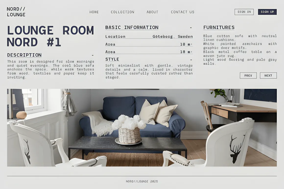
Monoskrn Sans Serif is a fresh take on monospaced fonts, made to be clear, solid, and easy to on a pro level.
MONOSKRN looks clean and simple, and it works great. It’s good if you’re coding, making a simple website, doing sci-fi branding, or just want something strong, modern, and well-built. The spacing gives it a cool beat. This nice sans-serif font comes in OTF, TTF, and webfont, so it’ll work anywhere, online or printed. Use MONOSKRN to show you’re clear and stylish.
It’s spaced so it’s easy to read, but still has that coding look people like. It comes in 14 styles for printing, websites, brand stuff, packaging, and how things look on screen.
Good for: logos, web pages, dashboards, packaging, tech brands, magazines, online stuff, and screens.
7. Giant Impact Font
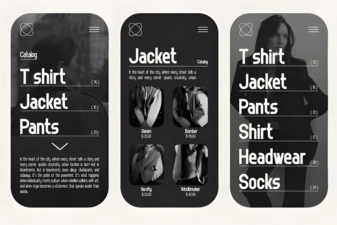
Hey, check out Mesveda – it’s a cool and fresh sans font family!
Mesveda gives you a clean, modern look that’s simple but stylish. It’s super flexible, with 14 styles from thin to bold, plus italics.
It has uppercase and lowercase letters, numbers, punctuation, support for many languages, and OpenType features.
Use it for all kinds of designs: websites, user interfaces, logos, branding, ads, products, stationery, magazines, book covers, photography, art, weddings, fashion, special events, labels, and packaging.
8. Magox Font
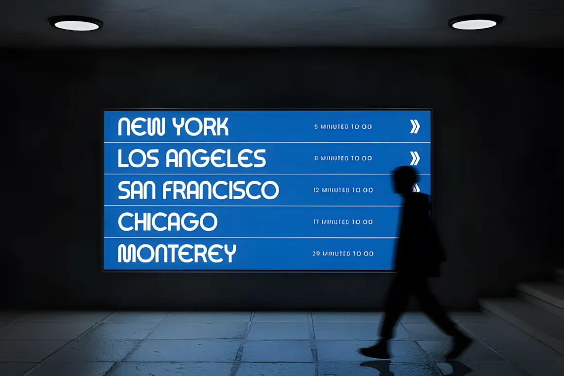
Magox is a sans-serif font that’s made to look strong, smooth, and modern.
With its simple shapes and smooth curves, Magox has a strong look but isn’t too harsh.
This font is great for brands that want to be clear, balanced, and modern. Its smooth shapes and even design make it easy to read, and its small details make it unique from other similar fonts. Magox gives a clean and cutting-edge style that suggests innovation and class. Try it with contrasting pictures and lots of blank space for a high-end brand look that’s professional and forward-thinking.
Magox works well for branding, logos, titles, packaging, posters, sites, and social media. It fits right in for both online and print. Whether you’re creating a simple brand or a bold, modern one, Magox gives your words a confident, professional feel.
9. Black Square Font
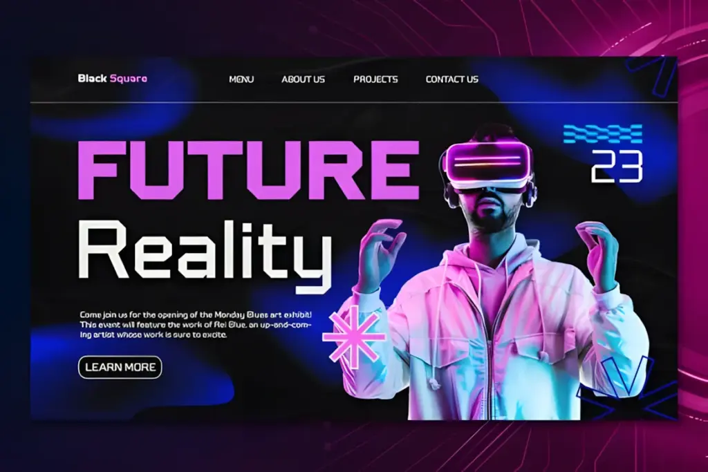
Black Square is a fresh sans-serif font family that looks modern, clean, and pro.
It’s super flexible, so it works great for all kinds of designs: logos, websites, user interfaces, ads, business branding, marketing stuff, banners, posters, digital signs, esports, regular sports, games, or anything with a tech feel.
10. Phyon Font
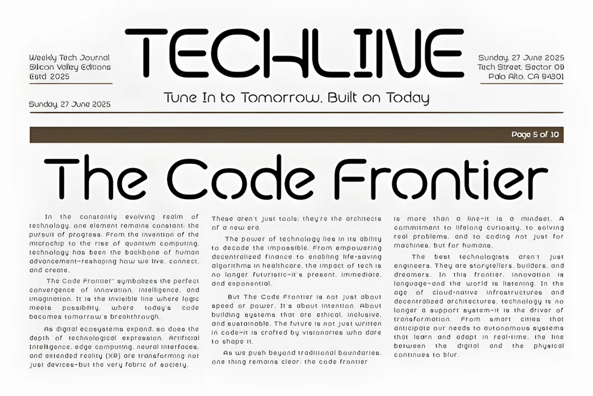
Phyon is a cool, rounded font made for today’s digital world.
It mixes clean lines with simple curves, so it feels both professional and forward-looking. It was made thinking about new tech, change, and simple, clean design. Each letter is made to give a sense of progress and clarity.
Whether you’re doing UI/UX design, branding a new business, designing digital stuff, or creating posters, Phyon is a great mix of easy-to-read and unique. Its smooth, modern look means it’s great for showing off products, tech stuff, sci-fi art, space themes, or any project with a future-facing vibe.
11–20: Best Modern Fonts for Branding & Identity
These sans serifs are stylish, easy to when using, and are made to show off your brand’s style.
11. Boldon Font
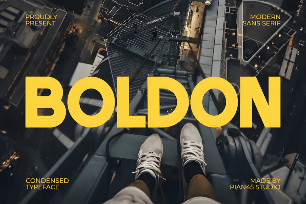
Boldon is a strong, modern sans-serif font that really grabs your attention.
Its super thick, squished design works great for branding that needs to pop, editorial layouts that pack a punch, sports logos, and headlines that shout.
This all-caps font gives a cool, up-to-date, and easy-to-spot look, so it’s a must-have for anything that needs to be bold, clean, and eye-catching, like sales and Black Friday ads.
12. Kloema Font
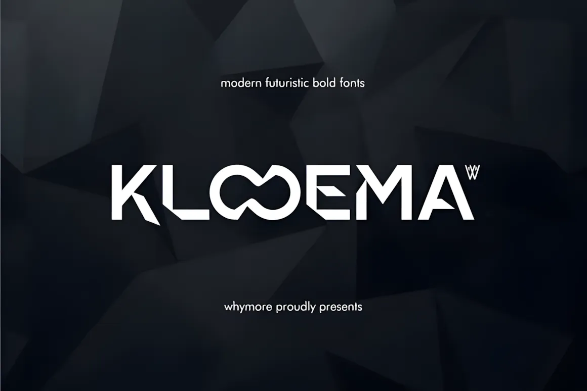
Check out Kloema, a cool sans serif font with a bold, modern vibe. It’s great for logos, tech branding, and making luxury businesses look their best.
Kloema has these awesome geometric shapes and a never-ending OO thing that makes it special. It really pops as a signature font for fancy brands, creative groups, fashion tech, and even those crypto startups.
You can use it for business cards, online stuff, packaging, and making awesome websites. It mixes strength with a touch of class, so it always looks good.
13. Creapy Font
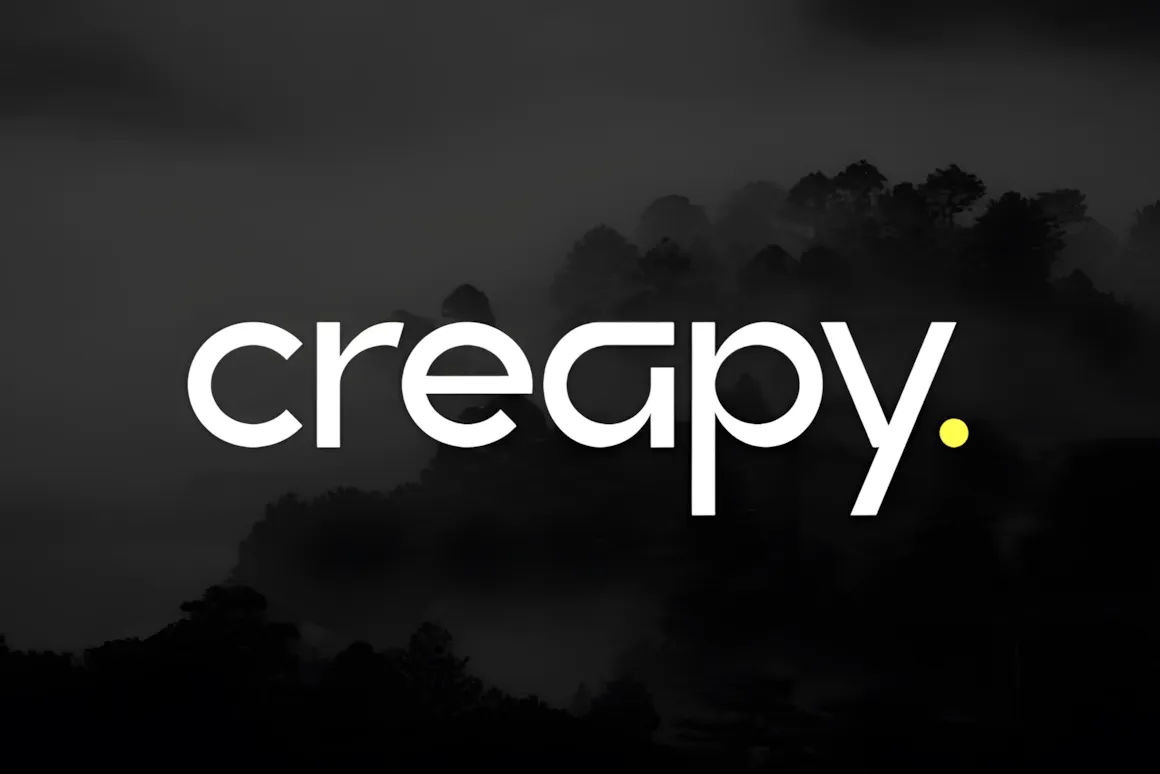
Creapy is a cool, modern font that’s not afraid to be different and grab people’s attention. Its fun, a little weird, and has a bold style that works great for logos, posters, titles, clothing, album art, or really anything that needs to stand out and be remembered.
14. Meiro Font
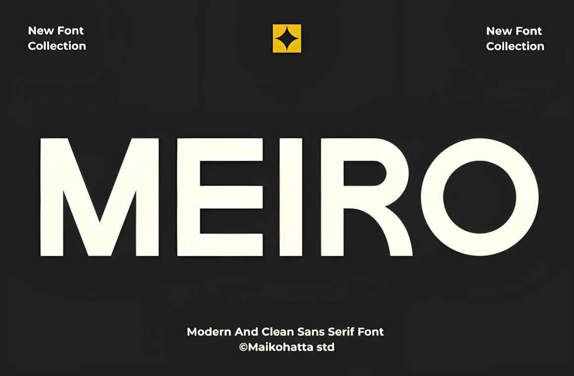
Meiro – a modern and clean sans serif!
Meiro is made to fit today’s look.
It has a strong feel but keeps things simple with its curves and even shapes, great for both online and printed designs.
This font is super useful for things like branding, logos, headlines, posters, web pages, social media, magazines, and work projects. It’s easy to read and has a simple style so it works for anyone wanting a pro and up-to-date look.
If you want to make a classy brand or cool ads, Meiro is a font that will not let you down.
15. Mandalic Font
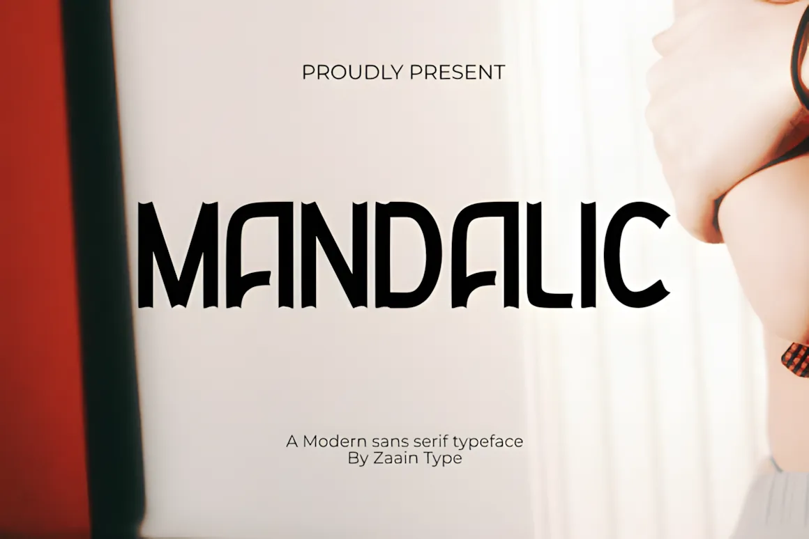
Mandalic is a sans serif font that mixes simple with today’s style. It has smooth lines and shapes that look good together. This font gives your designs a clean and pro feel. It’s strong but still nice, so Mandalic works great for logos, titles, and magazines. It comes in different sizes and styles for the upper case, so you can be as creative as you want. If you want something modern but easy to read, Mandalic is a great pick to make your brand look its best.
16. Ceraso Font
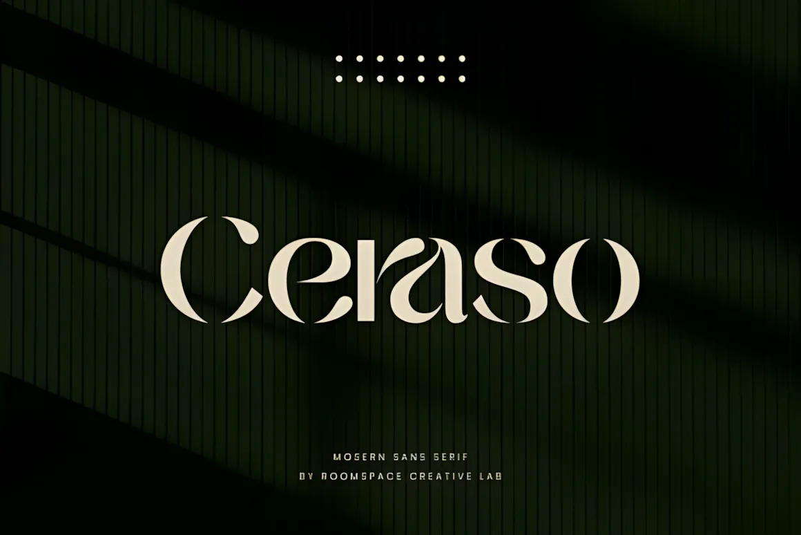
Ceraso is a cool, modern font with a stencil look. It’s great if you want your brand or logo to look classy. It mixes a current style with sharp stencil cuts, giving you a look that is clean, feels pro, and helps your brand stick in people’s minds. It works for tons of stuff – like business logos or fancy product boxes. Ceraso helps make sure your brand looks great and different from the rest.
17. Madbox Font
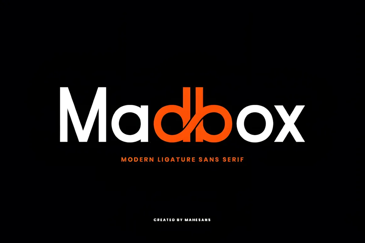
Madbox is a cool, modern sans serif font that mixes sharp geometry with artistic touches. It’s got a bold feel and some really neat letter combos (ligatures) that make it special. The db combo is super unique and becomes the main visual thing about it.
This font is simple but creative, so it’s great for things like branding, headlines, posters, and even futuristic-looking websites.
The letters are clean and easy to read, but the custom letter pairs add some movement and a fresh vibe, turning regular text into something eye-catching. Whether you’re using it in simple designs or something high-tech, Madbox gives your work a modern, unique touch.
18. Benova Font
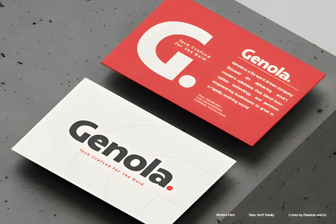
Benova is a sans serif font family that’s all about being adaptable, well-balanced, and super clear. It comes in 9 styles, from thin to black, all made with care. Benova has clean lines and shapes that make it easy to read, great for anything from printed stuff to online projects. Its look gives off a confident vibe, so it’s a solid pick for branding, business designs, magazines, and attention-grabbing titles.
19. Avantis Font
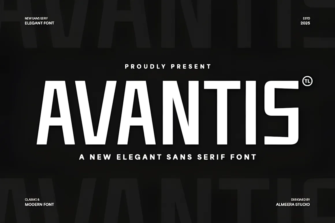
Meet Avantis, a cool, new sans serif font that mixes old-school charm with a fresh, modern feel. It’s super useful for things like branding, business looks, magazine designs, and online ads – basically, anywhere you want to look clear and up-to-date. Avantis has neat lines and everything’s sized just right, so it’s easy to read no matter where you use it. It’s simple but classy, giving off a polished, pro vibe. If you’re a designer wanting a font that’s both timeless and trendy, Avantis is your new best friend. Freshen up your text with Avantis and add a refined, stylish touch to anything you’re working on.
20. Labora Font
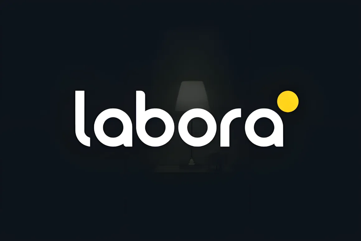
Labora is a simple and easy-to-read sans serif font that works great for today’s designs. Its letters are clear, well-balanced, and a little bit geometric, so it looks good whether you’re using it on a screen or in print. Labora is a great pick for logos, business designs, magazines, apps, and even presentations!
21–30: Best Geometric Sans Serif Fonts
Geometric sans serifs are based on shapes and give a feel of modernism, structure, and clarity.
21. Modeone Font
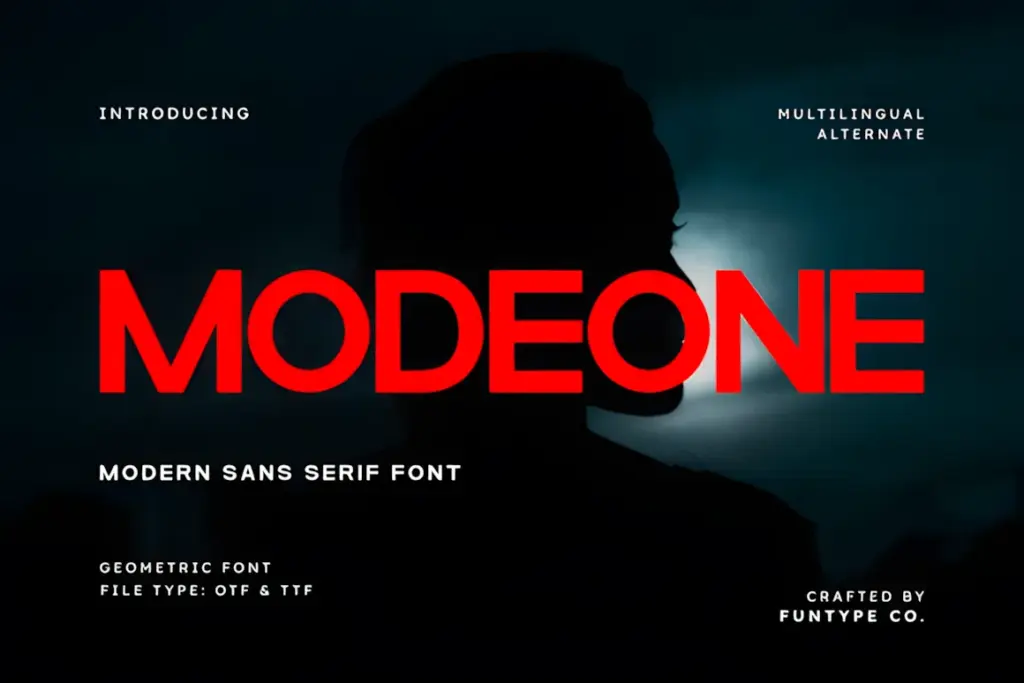
Modeone is a cool, simple font that’s both bold and geometric. It’s great for when you want to make a big impression or need things to look super professional. Because it’s nicely balanced and solid, Modeone works well for big headlines, modern brands, magazines, and awesome logos. It mixes simple style with its strong look, so your designs will always be clear, up-to-date, and memorable, whether they’re online or printed.
22. Miracle Font
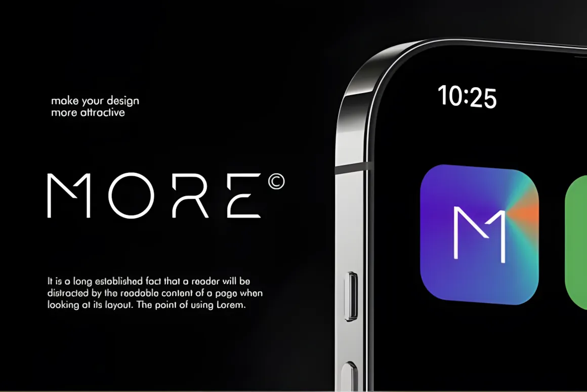
Hey, check out MIRACLE, a sans serif font with a cool, geometric vibe that’s all about the future.
It’s great for tech brands, startup logos, app designs, esports, and anything digital. If you’re working with AI, blockchain, or wearables, this font will make your design pop with a clean, modern edge.
Why it rocks:
- It’s ready for Web3 designs.
- It’s different and brands will stand out.
- You can use it for logos, apps, and more.
- It fits right in with tech and space themes.
- It makes headlines and posters grab attention.
- Mockups prove it makes any brand look high-end.
It’s perfect for:
- Tech brands: Think AI, blockchain, gadgets.
- App design: Great for icons, UIs, smart devices.
- Corporate stuff: Business cards, profiles that look modern.
- Esports: Logos, team branding that feels sharp.
- Social media: YouTube covers, Insta posts that look good.
- Product packaging: Gadgets, VR, anything high-tech.
23. Neueral Grotesk Variable Font
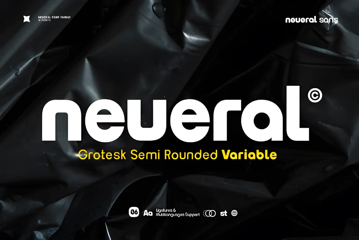
Neueral is a font that’s both modern and flexible, with a semi-round, geometric sans-serif style. Its simple and useful design makes it great for things like logos, articles, maps, business cards, and branding.
This font family comes in 18 different styles and has some cool Latin ligatures to give you lots of choices for your text.
FEATURES:
- 19 weights: regular and italic
- Standard and fancy ligatures
- Numbers and punctuation
- Fractions, superscript, and subscript
- Supports a bunch of Latin-based languages
24. Lorin Font
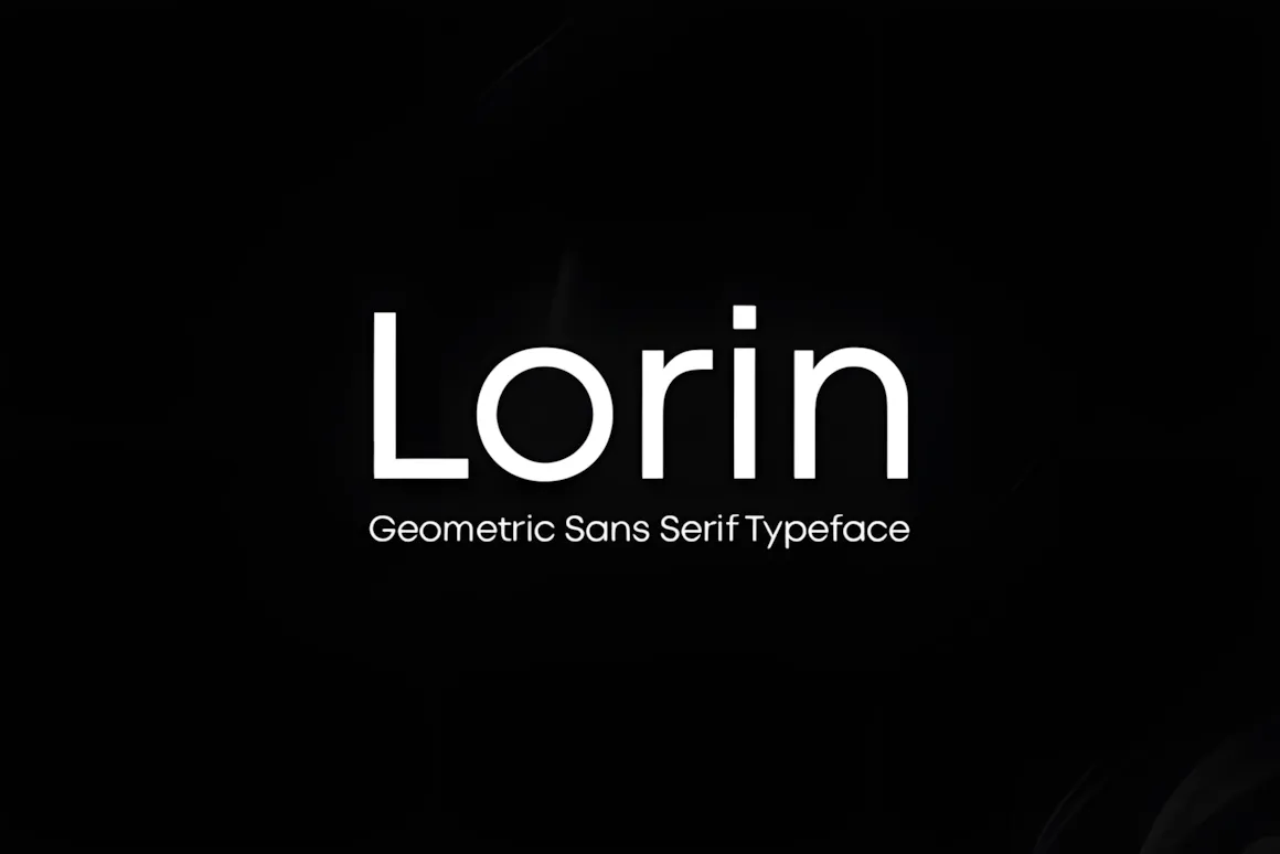
Lorin is a modern, geometric sans serif font that really puts the focus on making typography look good. It’s kind of inspired by classic geometric fonts, but with extra charm.
Lorin works great for all sorts of stuff, like logos, headlines, regular text, posters – basically, anything you can think of. Throw in some letter spacing, and you’ve got a style that’s popular on trendy fashion sites and minimal portfolios. It comes in 4 weights.
25. Hivives Font
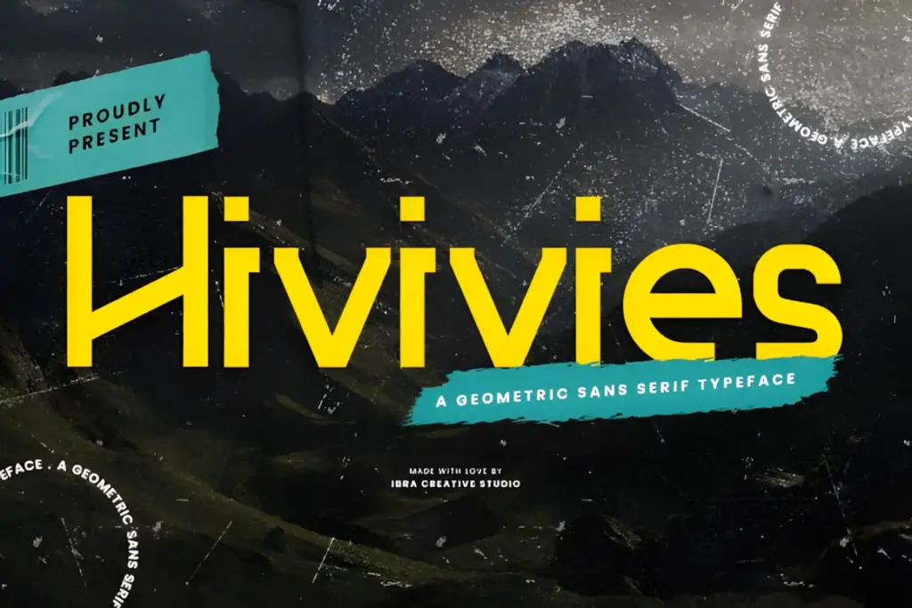
Hivives is a fresh, geometric sans serif font that mixes accuracy with a friendly feel. Its neat, straight lines and simple style give off a modern vibe that’s still easy to get to.
Hivives’ geometric design gives it a special, lasting quality, so it works well for many design jobs. The letters all have the same line thickness, sharp corners, and clear geometric forms, which make it look put-together and stylish.
26. Galberta Font
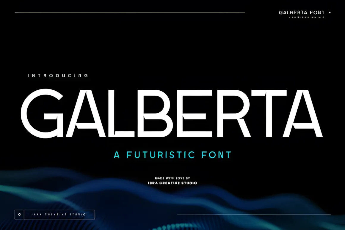
Galberta is a font from the future! Its design is slick and new. The letters are sans-serif and geometric, mixing strong, clean lines with gentle curves. It feels very modern and simple.
What makes this font cool is how it brings together pointy angles and smooth curves—it just looks good.
27. Lagoona Boo Font
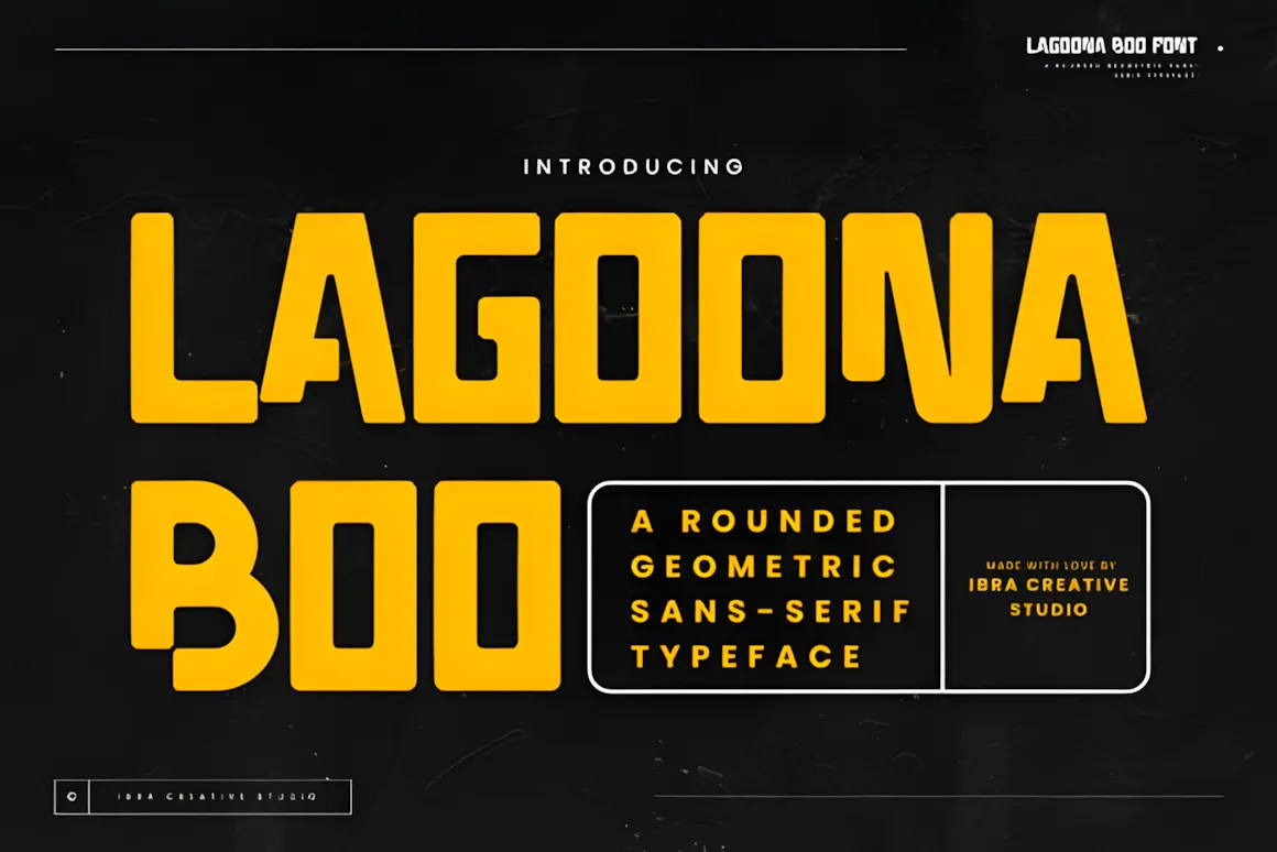
Lagoona Boo is a sans-serif font with round shapes. It mixes a fresh, up-to-date look with a fun, friendly vibe. The letters have soft curves and are nicely balanced, so it looks good and feels welcoming. Because it has rounded corners, Lagoona Boo feels warm and can be used in lots of ways for design. It’s easy to read and has a bit of a playful feel, so it’s great when you want something that’s both professional and fun.
28. Fruitella Font
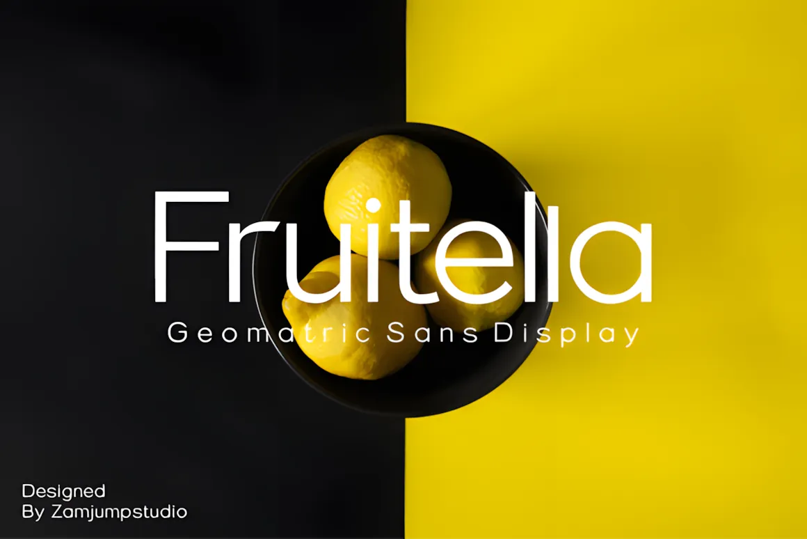
Fruitella has a geometric, sans-serif vibe. It’s built with some cool OpenType stuff in mind, like unique ligatures you don’t normally see. It’s just right for graphic design and any kind of display thing you might need. It works great on the web, for signs, for company stuff, and even for magazines and things like that.
29. Noar Font
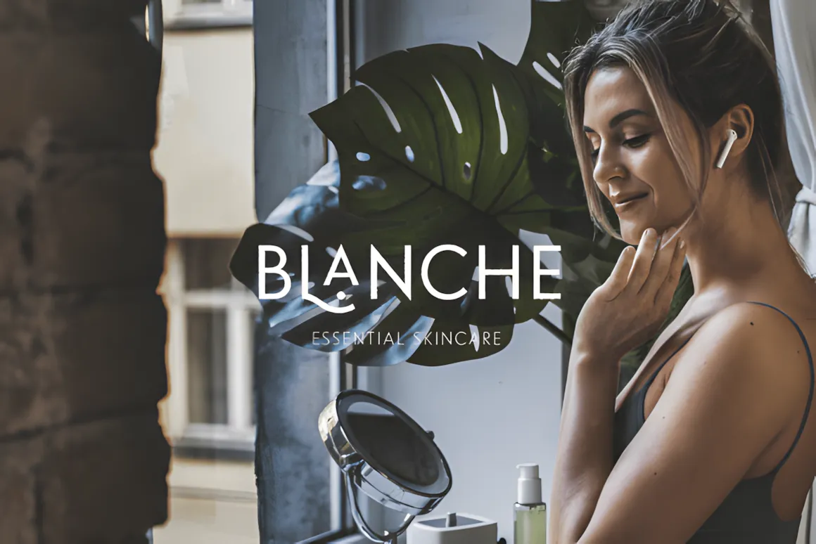
Noar is a fresh, simple sans serif font that’s easy to read. It has a clean look and feels very modern. It comes in five weights, from thin to bold, and each comes with italics.
Because it’s so simple and useful, Noar works great for all kinds of projects. It’s perfect for big headlines, clear descriptions, and titles that pop, and it looks great big. Noar has all caps and some cool style options so you can give your work a cool, real feel.
This font is good for logos, labels, ads, packaging, branding, magazines, book covers, cosmetics, banners, posters, and a lot more. Noar fits right in whether it’s on a screen or paper.
Also, all the cool extra characters and styles are easy to get to in any design App.
30. Mansfield Font
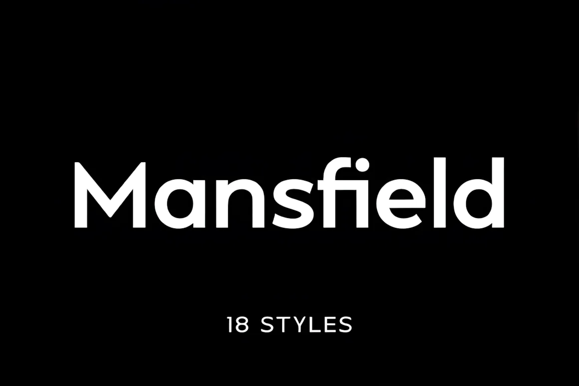
Mansfield is a cool, geometric sans-serif font that takes cues from classic fonts like Futura. It’s got that clean, modern vibe with sharp letters, making it great for all sorts of design stuff, like branding and magazines.
This font family comes with 9 weights and 18 styles, so you’ve got lots to play with. It’s perfect for posters, websites, apps, and pretty much any project where you want a sleek and professional look.
If you’re looking to impress, Mansfield is the way to go. Use it for logos, websites, or anything else – it’s got the visual punch to make your designs pop and give a new, sharp feel to everything you create. Check it out and see how it can boost your work!
31–40: Minimalist & Editorial Fonts
Want a simple, stylish look? These fonts are like the little black dresses of design—always chic and never too much.
31. Goldy Font
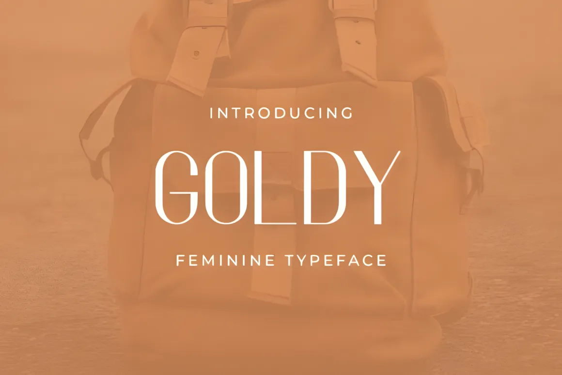
Goldy is a simple, modern font that feels really classy. Its clean look makes anything—logos, packaging, or even your social media—look sharp and up-to-date.
32. Hamburg Font
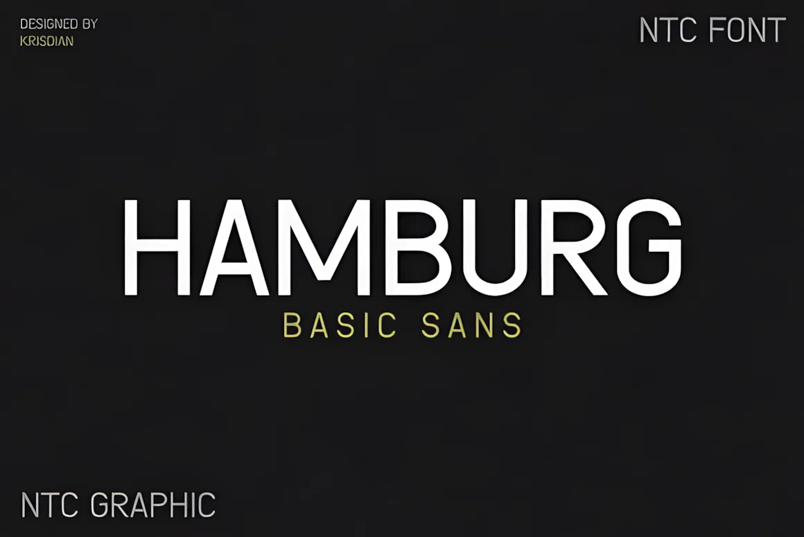
HAMBURG is a simple, clean sans serif font with cool letter shapes. It’s great for logos, magazines, websites, packaging, and anything else you can think of! HAMBURG looks good in print or online, plus it’s easy to read and always in style.
33. Paper Look Font
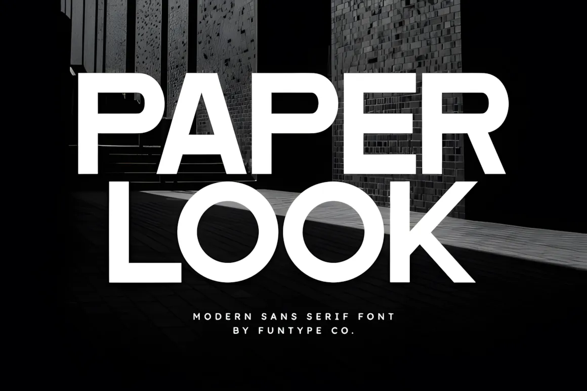
Paper Look is a sans serif font — clean, modern, and super clear. It’s great for bold headlines, branding, magazines, and simple posters. Basically, it makes your message pop on screens and in print, giving things a sharp, up-to-date feel.
34. Mandala Font
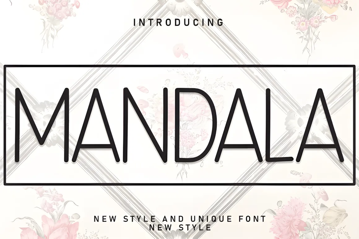
Mandala is a cool, clean font that’s perfect if you’re going for a modern look. It’s great for logos, packaging, magazines, and anything else where you want to feel stylish and up-to-date. It’s simple, yet very put-together.
35. Gaharu Font
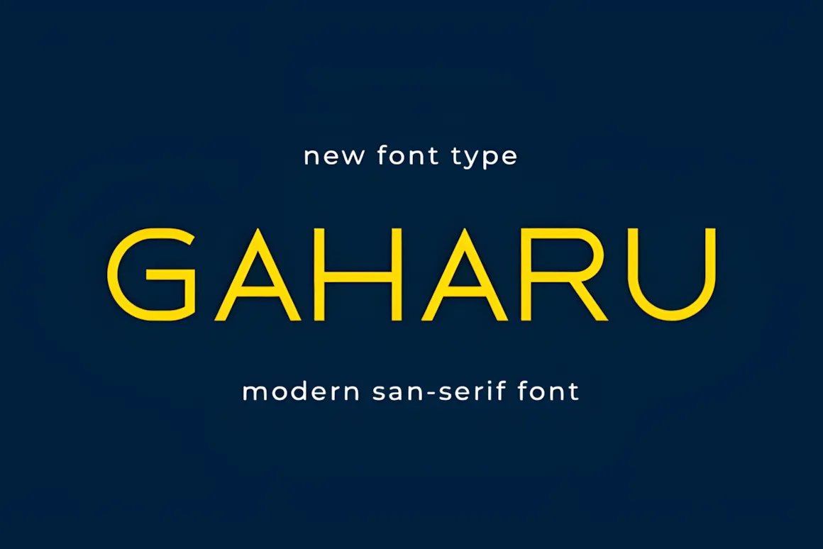
Gaharu is a simple, clean sans serif font with a calm, minimalist feel. Its soft curves and balanced design make it clear and stylish for any project like branding, websites, or packaging.
36. Gc Molecule Font
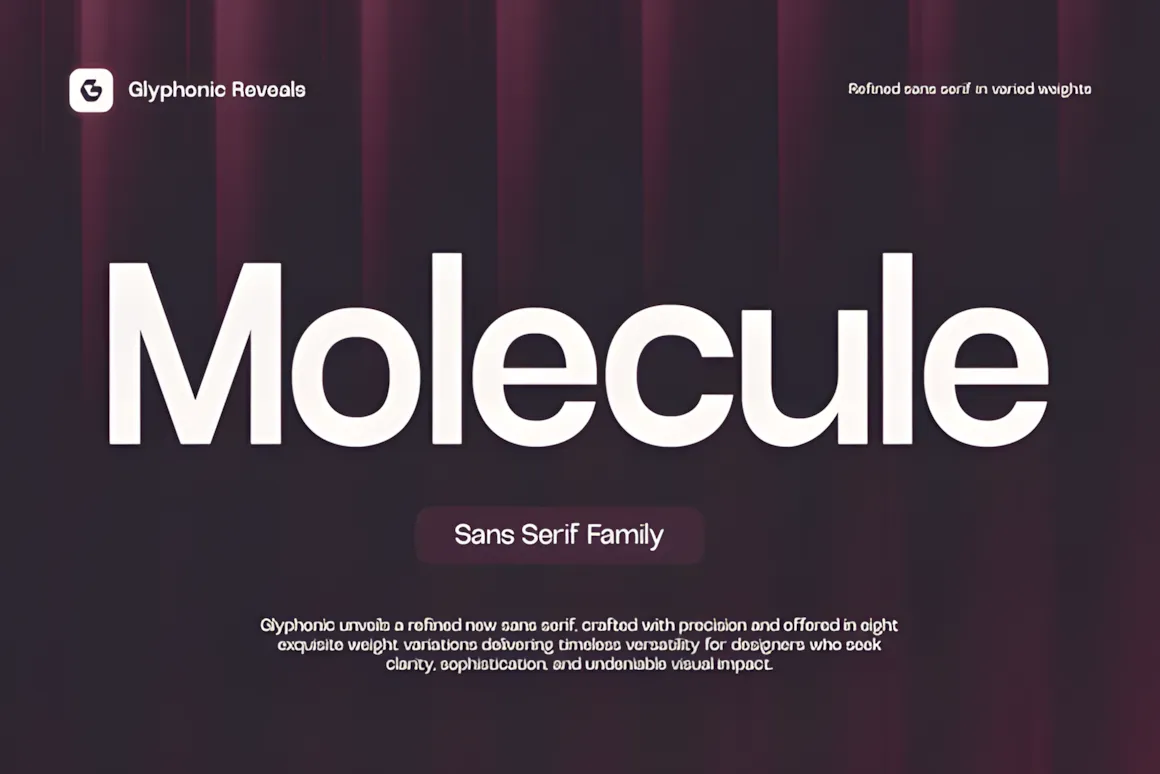
GC Molecule is a cool, clean font that’s made to be super clear and easy to use. It’s got smooth lines and balanced details, so it looks great whether it’s printed or on a screen.
This font is awesome for branding, magazines, tech projects, simple designs, and visual stuff. It’s made to be adaptable but still have its own unique style.
GC Molecule is perfect for sharp designs, big headlines, or simple posters. It makes everything look modern and stylish.
Make your design better with the clear and modern style of GC Molecule!
37. Pineaple Regular Font
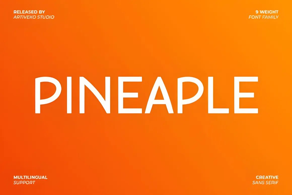
Pineaple is a simple sans serif font that adds a fresh, modern feel to your words. Think smooth lines and a clean look that works great for web design, branding, or spicing up social media.
It comes in 9 different styles, so it’s super flexible for whatever you’re working on—logos, websites, headlines, you name it. Plus, it supports many languages, making it ready for designs all over the globe. Pineaple is all about a friendly, clear style that’s easy to read and looks good.
38. Diona Sans Font
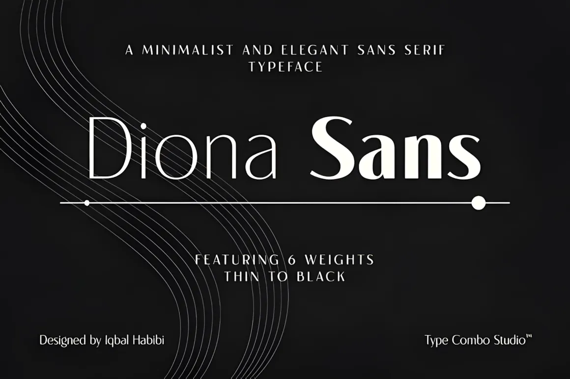
Diona Sans is a simple, clean display font with cool alternate characters and ligatures. It comes in six weights, from thin to black, and supports over 75 languages. With its high-contrast design, it’s awesome for headlines, logos, posters, and magazine covers.
Quick tip: To use the special characters, you’ll need software like Adobe Illustrator or Photoshop.
39. Silk Font
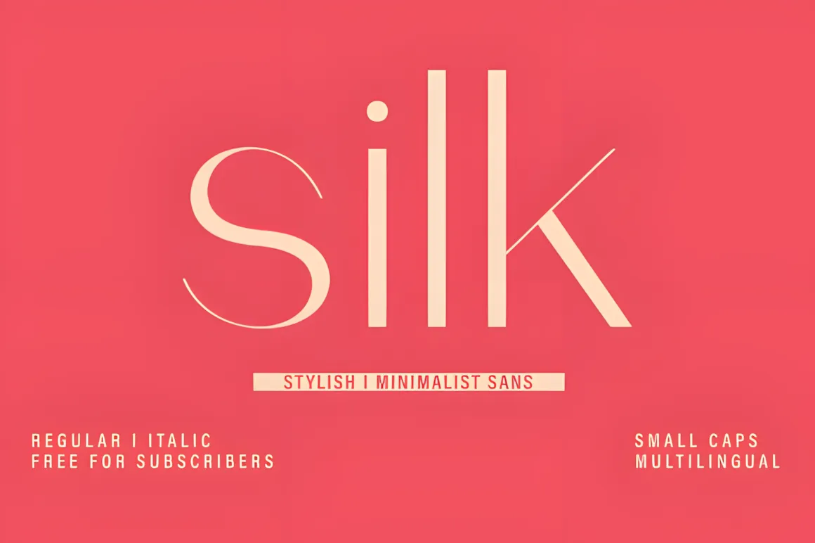
Hey there! Check out Silk, our minimalist sans serif font. It’s stylish, clear, and gives off a modern vibe.
Silk is great for logos, magazines, social media, and packaging. It mixes a soft, classy feel with simple shapes.
It comes in Regular and Italic, with small caps and lots of language support. If you’re a designer who wants something pretty and practical, Silk is for you.
Use it for fancy logos, fashion spreads, or simple websites. Silk brings a classic touch with a fresh, up-to-date look.
40. Cherry Font
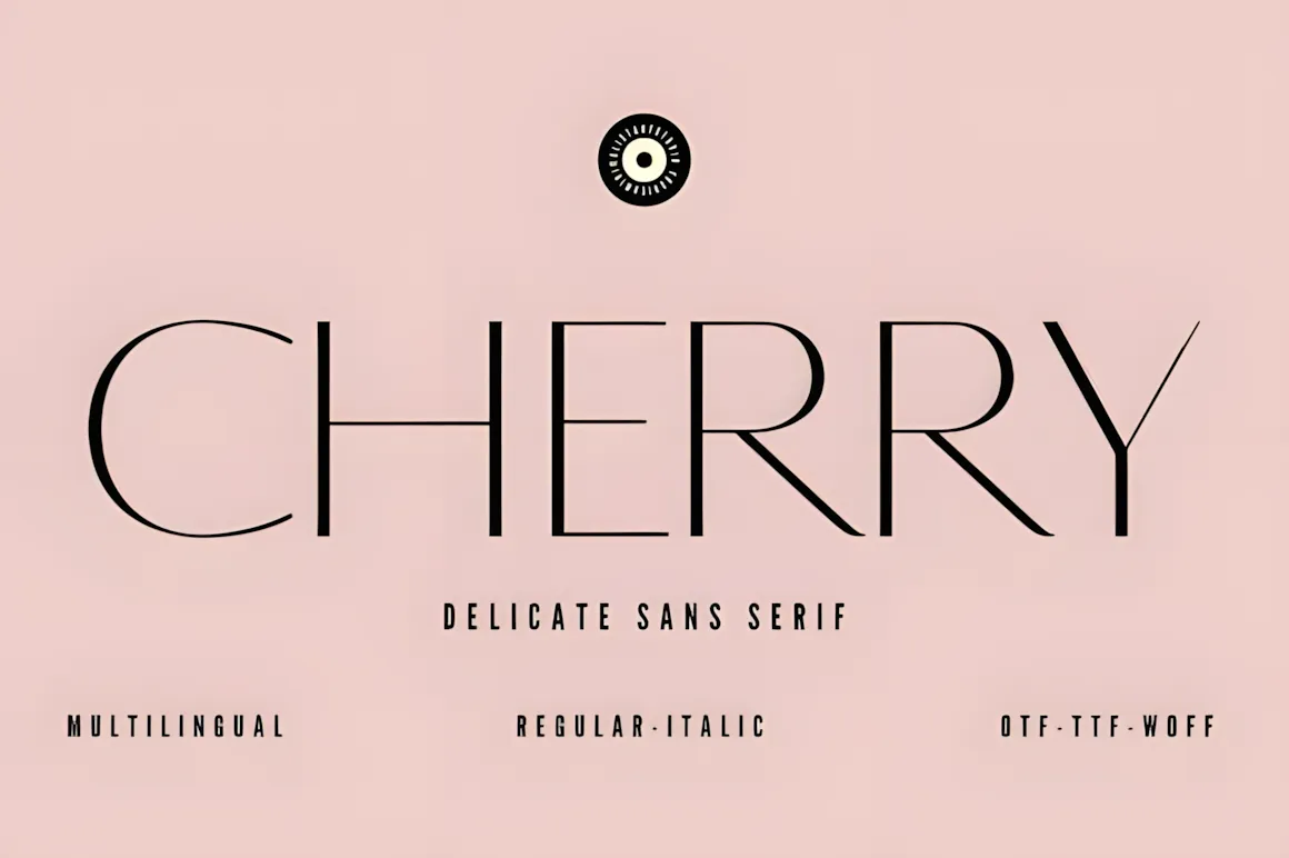
Check out Cherry, our fresh sans-serif font!
Cherry brings a modern, simple feel to your designs. Its thin lines and stylish look make it great for branding, logos, websites, and more.
If you like clean and simple designs, Cherry’s timeless vibe will grab people’s attention. It’s easy to on any project, big or small.
Use Cherry to add a bit of class to your work! It’s awesome for anyone who wants to create something that feels both modern and stylish.
How to Pick the Right Font
The font you choose says a lot about your design. How do you get it right? Ask yourself:
For Designers:
- What feeling do I want the project to give off? Serious? Fun? Fancy? Simple?
- Where will the font be used? Website? Print? App?
- Do I need different styles of the font? For making things stand out or fitting different screen sizes?
- Does it need to be really easy to read? Especially for long articles or small text?
For Brands:
- Does the font match what my brand is about?
- Can I use it everywhere (on paper, online, on phones)?
- Does it look good with my logo, colors, and other design stuff?
Test your fonts before you decide. Put them on a webpage or make a fake ad. See what feels right to you.
Tools for Playing With Fonts
Need help picking or trying out fonts? Here are some handy tools:
- Google Fonts: Has tons of free fonts for websites
- Fontpair.co: Suggests good font combos
- Fontjoy: Uses AI to pair fonts
- Typewolf: Shows cool design examples
- Adobe Fonts: Has great fonts with licenses for pro use
- Figma / Sketch / Adobe XD: Lets you preview and test fonts right in your designs
Use these to see the fonts in action before you make a choice.
In conclusion
Fonts are a building block of design now. Use this guide to find the right font for your next project. Good fonts help you build trust and tell your story. Choose wisely.
Looking for fonts like these?
Check out Creative Fabrica for lots of awesome, modern, sans serif fonts. They’re great for things like creating a brand, web design, or anything you want to print. It’s a super place to find fonts that can make your designs look clean, pro, and current.
You may also like:


