

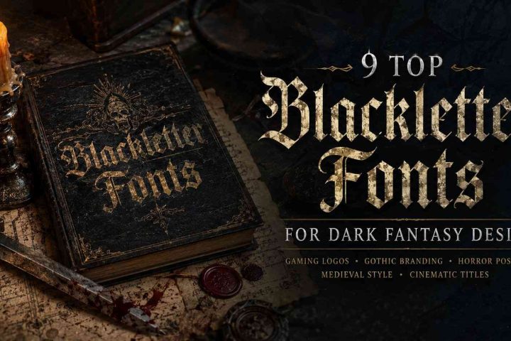
13 Best Old English Fonts for RPG Game Branding
If you’re building an RPG—whether it’s a tabletop system like D&D, an indie video game, or a full fantasy universe—your branding has one job: transport players straight into a world of ancient tomes, shadowed castles, and epic quests. Nothing does that faster than a well-chosen Old English font.
These blackletter typefaces carry centuries of gothic weight. They make titles feel like they were pulled from a medieval manuscript while still working on modern game assets. I’ve spent years designing assets for indie RPG projects, and the right Old English font consistently turns a generic logo into something players remember.
Here are the 13 best Old English fonts for RPG game branding right now—each with real strengths for titles, logos, posters, and merch.
If you're seeking a blackletter typeface that offers both classic style and a handwritten feel, the Black Smoke Font: Classic Handwritten Blackletter Typeface presents an authentic and versatile option.
Table of Contents
13 Best Old English Fonts for RPG Game Branding
Black Guando


Black Guando feels immediately suited for dark fantasy action RPGs and heavy medieval branding. The aggressive edges and compact structure give it a hostile, battle-worn appearance that works especially well for:
- dungeon crawlers
- PvP faction systems
- dark fantasy clans
- metal-inspired RPG branding
One thing that stands out is how solid the font remains against noisy backgrounds. Many ornate blackletter fonts disappear once effects are added, but Black Guando keeps its silhouette intact.
Best For: Dark fantasy logos and faction branding
Why It Works: Strong contrast and aggressive medieval styling
Raven Black


Raven Black leans into classic gothic fantasy aesthetics with dramatic strokes and a cleaner medieval structure. It works especially well for:
- necromancer-themed games
- gothic RPGs
- vampire worlds
- dark fantasy title screens
Compared to heavier blackletter styles, Raven Black has slightly better readability for longer words.
Best For: Gothic fantasy RPG logos
Why It Works: Balanced readability with strong blackletter identity
Juvelith


Juvelith takes a more modern approach to Old English typography. It still feels medieval, but the smoother flow makes it suitable for:
- fantasy MMORPGs
- elegant RPG branding
- magical kingdoms
- story-driven fantasy worlds
This is one of the safer choices if you want blackletter influence without fully committing to extreme gothic styling.
Best For: Fantasy RPG titles with elegant branding
Why It Works: Modernized blackletter structure feels cleaner in UI environments
Malitia Vetus


Malitia Vetus feels closest to historical medieval manuscript typography. It has a strong “ancient parchment” energy that works beautifully for:
- lore-heavy RPGs
- kingdom simulators
- historical fantasy
- medieval strategy hybrids
The decorative Lombardic influence gives it authenticity that many modern blackletter fonts lack.
Best For: Medieval lore systems and historical fantasy
Why It Works: Authentic manuscript-inspired detailing
Perrownt


Perrownt is one of the most game-ready fonts in this list. The tall geometric structure feels almost designed for modern gaming interfaces.
It works extremely well for:
- dark fantasy esports branding
- RPG launcher art
- hardcore PvP games
- futuristic medieval hybrids
The narrow construction also helps when fitting long titles into banners or Steam capsules.
Best For: Modern RPG branding and gaming interfaces
Why It Works: Sharp geometric design scales very well digitally
Black Valor


Black Valor has a classic medieval war-banner feel. It’s bold, readable, and highly effective for:
- knight-themed RPGs
- kingdom warfare games
- fantasy strategy hybrids
- dark guild systems
Some blackletter fonts feel overly decorative, but Black Valor stays controlled enough for large commercial branding use.
Best For: Medieval combat RPG branding
Why It Works: Strong readability with dramatic gothic presence
Merchant Ledger


Merchant Ledger stands out because it feels cinematic.
The typeface naturally fits:
- dark fantasy RPGs
- apothecary systems
- witchcraft worlds
- grim medieval adventures
This font also works surprisingly well for lore menus and collectible item titles because of its manuscript-inspired flow.
Best For: Dark fantasy worldbuilding
Why It Works: Rich medieval atmosphere without excessive clutter
Black Malor


Black Malor has a heavier, more grounded personality compared to ornate fantasy fonts. It feels practical and brutal.
That makes it especially useful for:
- hardcore survival RPGs
- dark kingdoms
- war-focused fantasy games
- grimdark branding
The cleaner geometry helps preserve readability in motion graphics and cinematic trailers.
Best For: Grimdark RPG branding
Why It Works: Heavy structure and clean gothic balance
Ragnar Gothic


Ragnar Gothic blends Viking-inspired aesthetics with modern blackletter styling. It immediately fits:
- Norse fantasy RPGs
- Viking survival games
- raid-based worlds
- northern mythology settings
The font feels aggressive without becoming chaotic.
Best For: Viking and Norse-inspired RPGs
Why It Works: Modern readability with traditional medieval influence
Black English


Black English pushes harder into classic gothic drama. It works best in projects where typography itself becomes part of the visual identity.
Ideal uses include:
- occult RPGs
- gothic horror games
- dark fantasy branding
- demonic faction systems
It pairs particularly well with smoky textures and silver metallic effects.
Best For: Gothic horror RPG branding
Why It Works: Strong visual drama and classic blackletter identity
Scarlet Crown


Scarlet Crown feels extremely aggressive and theatrical. This is the kind of font that instantly suggests:
- bloodborne aesthetics
- heavy metal fantasy
- cursed kingdoms
- brutal boss fights
The ornamental details are strong, so it performs best in large logos rather than small UI text.
Best For: Dark boss-centric fantasy branding
Why It Works: Intense visual presence and high-impact styling
Black Crown


Black Crown has a royal medieval identity that fits:
- noble factions
- fantasy empires
- kingdom-building RPGs
- gothic strategy worlds
It feels less chaotic than some heavier blackletter fonts, which makes it easier to integrate into broader branding systems.
Best For: Royal fantasy branding
Why It Works: Elegant medieval styling with strong readability
Bundles Blackletter


Bundles Blackletter is useful for developers or designers experimenting with multiple RPG aesthetics. Instead of a single style, it includes a wide mix of:
- Victorian blackletter
- metal fonts
- gothic display styles
- horror-inspired typography
This kind of bundle becomes practical during early branding exploration when testing different moods across logos, UI concepts, and marketing materials.
Best For: Testing multiple fantasy branding directions
Why It Works: Broad variety for concept development
How to Choose the Right Font for Your RPG World
A common mistake is choosing fonts based purely on appearance instead of worldbuilding alignment.
Here’s a simpler way to think about it:
| RPG Style | Recommended Font Direction |
|---|---|
| Dark Fantasy | Aggressive blackletter |
| Viking RPG | Nordic gothic |
| High Fantasy | Elegant Old English |
| Horror RPG | Ornamental gothic |
| Medieval Strategy | Historical manuscript |
| Hardcore PvP | Narrow geometric blackletter |
The font should match the emotional tone of the game world — not just the genre.
Final Thoughts

The best Old English fonts for RPG game branding do more than look medieval. They help establish tone instantly.
Some fonts lean toward historical realism. Others push into modern dark fantasy or metal-inspired aesthetics. The strongest choices are the ones that still feel readable once they leave the preview page and enter real production environments like logos, launchers, UI overlays, and promotional artwork.
For dark fantasy RPG branding, Perrownt, Merchant Ledger, Ragnar Gothic, and Black Crown are especially versatile starting points. Designers looking for more aggressive or theatrical styling will probably gravitate toward Scarlet Crown or Black Guando instead.
Source font references and specimens were reviewed from the uploaded Creative Fabrica collection.
FAQ
What is the best Old English font for fantasy RPG logos?
Perrownt, Merchant Ledger, and Ragnar Gothic are excellent for fantasy RPG logos because they combine strong medieval aesthetics with modern readability.
Are blackletter fonts good for game UI?
Blackletter fonts work best for titles, headers, and faction names. For body text and menus, cleaner serif or sans-serif fonts are usually easier to read.
What font style is commonly used in dark fantasy games?
Dark fantasy games often use gothic blackletter typography with sharp edges, heavy vertical strokes, and medieval-inspired ornamentation.
Can Old English fonts work in modern game branding?
Yes. Many modern RPGs mix classic blackletter structure with cleaner geometric styling to maintain readability across digital platforms.
Follow Us