Typography is a voice, not just design. It greatly influences how people see your brand. Good fonts build trust, guide users, and boost site memorability. Modern web design needs clean, adaptable fonts, and Google Fonts fits the bill.
Google Fonts are free for any use and simple to add, quick to load, plus, there are tons of choices for current designs. From simple sans-serifs to cool display fonts, it’s a top pick for designers everywhere.
With 1,400+ fonts, picking one can be hard. This guide lists the top 17 free Google Fonts that suit well for modern web design. Whether you’re making a simple portfolio, a fast startup site, or a bold online store, this fonts selection has you covered.
Let’s explore great-looking fonts that also lift your website’s performance.
Table of contents
Understanding Modern Web Design Typography
Web typography today blends form and function, balancing how a site looks with how easy it is to read. Where designers once had few font options, now there’s a huge selection designed for the web.
A good font should:
- Create a visual hierarchy, guiding readers through the content.
- Reinforce brand identity with its style.
- Improve readability with clear, spaced-out letters.
Looking ahead to 2026, expect minimalist, geometric, and highly readable fonts to trend. Brands are after typefaces that work on mobile, pair well with others, and adapt to different screen sizes. The goal is clear, quick, and attractive communication.
Benefits of Using Google Font
Still wondering why Google Fonts is the smart choice for web designers?
Here’s the deal:
- Totally free: You don’t need to worry about licenses, subscriptions, or renewal fees. Google Fonts are open-source, which means they’re completely free for both personal and commercial use.
- Easy to embed: Google Fonts provides a simple CSS link. Just copy and paste it into your
<head>section, and boom—you’re live. - Optimized for performance: Fonts are served through fast, global servers. You can even preload them and customize how they load for better performance.
- Customizable styles: Many fonts come with multiple weights (thin, light, bold, etc.) and styles (italic, condensed, expanded), allowing you to fine-tune the typography to match your exact brand feel.
- Constantly updated: New fonts are added regularly. Plus, many of the most popular ones now support variable fonts—one file with endless weight and width options.
From beginners to seasoned developers, Google Fonts is the no-brainer choice when it comes to balancing style, function, and performance.
How to Choose the Right Font for Your Website
Picking the right font for your website is like choosing the perfect outfit for your brand. It needs to fit your style, work well, and grab attention. With so many Google Fonts out there, finding the right one can feel like a lot.
Here’s how to make it easier:
- Know what your brand is all about: Is it fun or serious? Modern or classic? A strong font like Anton is good for a tech magazine, but something like Merriweather is better for a blog with lots of text.
- Pair fonts carefully: Don’t just throw two fonts together. A good idea is to use a strong serif or sans-serif for titles and a simpler, easy-to-read font for the main text. For example, try using Playfair Display with Open Sans.
- Keep in mind how it looks on different devices: Not all fonts look good on small screens. Choose fonts that still look good when you shrink them down and are made for the web.
- Think about font weights: A good font family gives you options. Go with fonts that have at least three weights—regular, bold, and italic—so you can use them in different ways.
- Make sure it’s easy to read: Fancy fonts might look cool, but if people can’t read your text without trouble, they’ll miss your point.
If you’re not sure, start with something simple. You can always get creative later once you have a solid base.
Roboto
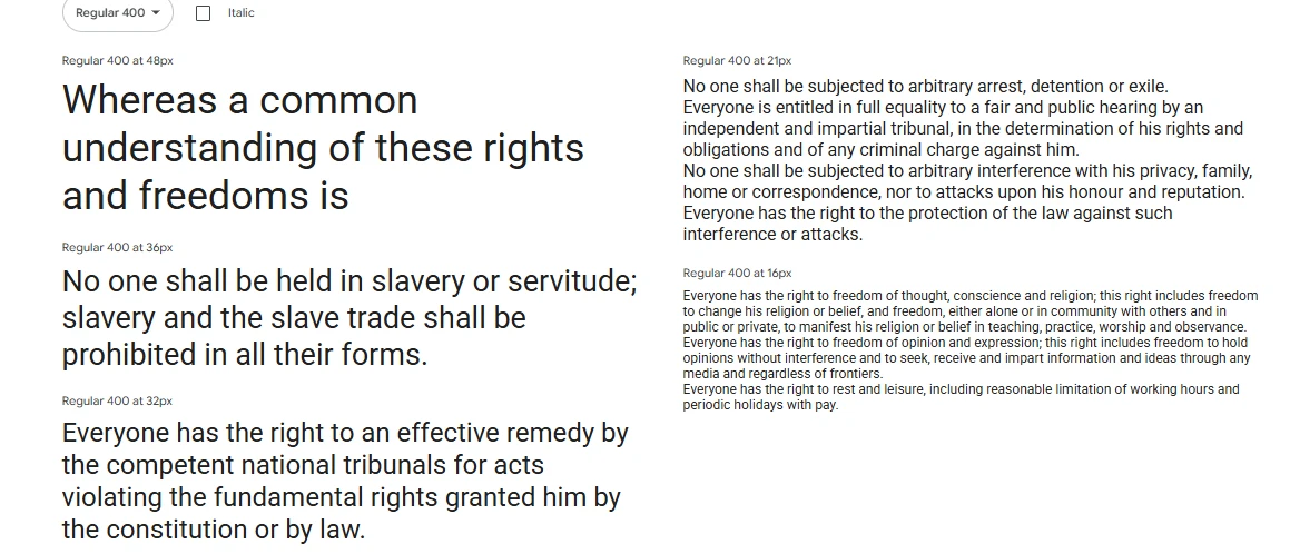
Roboto, a popular Google Font by Christian Robertson, balances structure and friendliness, making it versatile for apps, blogs, and dashboards.
Its modern, neutral tone stems from its clean, sans-serif design, softened by rounded edges and natural spacing. Available in various weights and styles, it simplifies typographic layouts.
Designed for digital screens, Roboto is optimized for readability, even on smaller, low-resolution displays. It serves as the default font for Android OS because of this.
Best use cases:
- Mobile apps
- Tech blogs
- Corporate websites
- UI/UX dashboards
Font pairing tip: Pair Roboto with Roboto Slab for a cohesive yet dynamic serif/sans combo, or use it with Lora to add a bit of elegance to your body text.
Open Sans
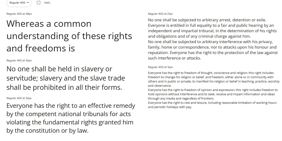
If you want a modern, readable font for any device, consider Open Sans. Steve Matteson designed this popular sans-serif option aiming for clarity.
Open Sans stands out with its easy-to-read letters, great for lengthy content like blog posts and product descriptions. It adapts well to different screen sizes, which makes it useful for mobile designs.
Plus, Open Sans keeps your website fast because it’s lightweight. With various weights available, you can easily create a visual hierarchy.
Best use cases:
- Blogs and news portals
- Corporate landing pages
- Online stores
- Mobile-first websites
Font pairing tip: Open Sans pairs beautifully with more expressive fonts like Playfair Display or Oswald for contrast in headers.
Lato
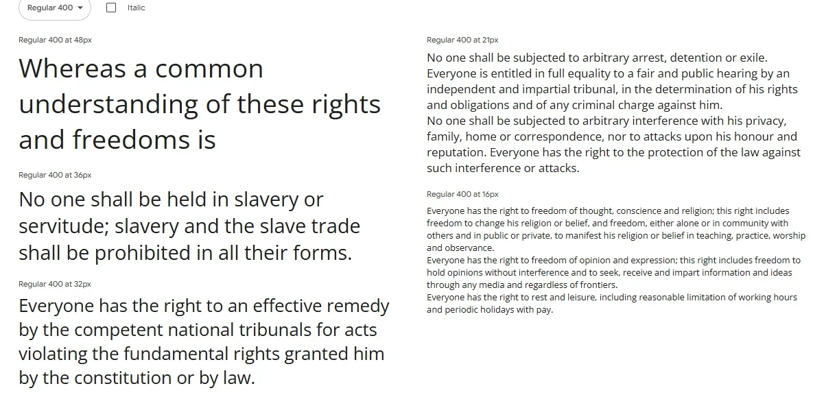
Lato, Polish for summer, is a sans-serif font by Łukasz Dziedzic that brings a warm, fresh touch to web design.
Its soft curves and semi-rounded letters create a friendly yet professional feel, suitable for brands aiming for competence and approachability.
With styles from Hairline to Black and italics, Lato works well for both headings and body text. Its clarity and support for many languages make it ideal for international websites and interfaces where personality is valued.
Best use cases:
- Startups
- Creative agencies
- Service businesses
- Educational platforms
Font pairing tip: Combine Lato with Merriweather for a modern serif/sans-serif pairing that reads well and looks professional.
Montserrat
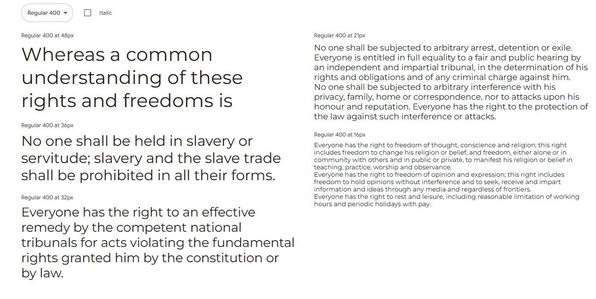
Montserrat, a modern font by Julieta Ulanovsky, draws inspiration from old Buenos Aires posters and signs, offering a bold, geometric vibe ideal for contemporary web design.
Great for headlines, calls-to-action, and logos, Montserrat’s uppercase letters make a statement. Available in various weights and styles, its geometric design guarantees a consistent, high-quality look on any screen.
Its clean structure and versatility let Montserrat give your brand a bold voice while keeping things readable, fitting everything from tech sites to fashion blogs and real estate pages.
Best use cases:
- Portfolio websites
- Creative agencies
- Lifestyle brands
- eCommerce headers
Font pairing tip: Use Montserrat for headers and pair it with Open Sans or Roboto for smooth, readable body content.
Poppins
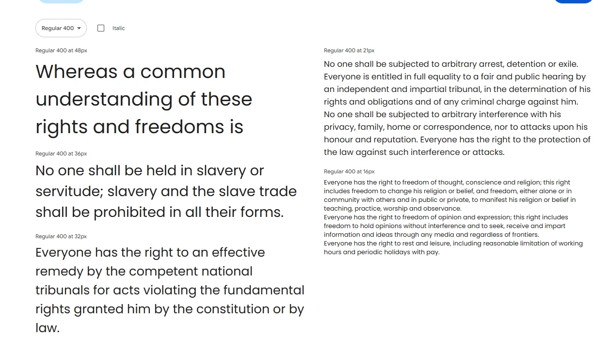
Poppins, a geometric sans-serif font from Indian Type Foundry, suits modern, minimalist designs with its balanced, symmetrical look.
Supporting both Latin and Devanagari scripts makes it globally versatile. Its clean lines and even weight distribution provide a sleek, friendly feel suitable for brands wanting a polished yet approachable look.
Available in various weights and italics, Poppins offers flexibility for visual hierarchy and style.
Best use cases:
- Tech startups
- Modern product sites
- Health and wellness brands
- Design portfolios
Font pairing tip: Pair Poppins with a serif font like Merriweather for an elegant contrast, or with Work Sans for a fully geometric duo.
Raleway
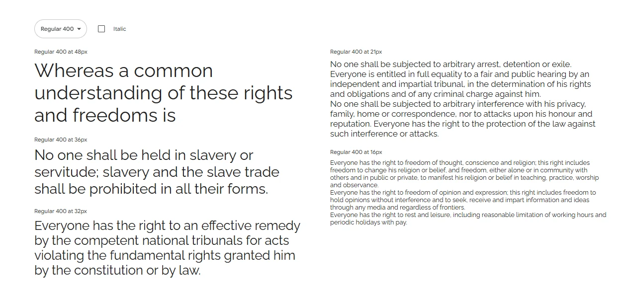
Raleway, a display sans-serif font by Matt McInerney, is both stylish and attention-grabbing. It was created for headlines and titles due to its modern, clean, high-end feel with thin, high-contrast styling.
Raleway’s uppercase letters are particularly noticeable, especially in bold, which makes a statement. Though sophisticated, it’s easy to adapt this font to minimalist or high-end designs.
While not suited for body text because of its tight letter spacing, Raleway excels in headers and feature sections.
Best use cases:
- Fashion websites
- Photography portfolios
- Landing pages
- Editorial sites
Font pairing tip: Raleway pairs nicely with Roboto or Open Sans in the body for readability, giving you a stylish header + clean text combo.
Inter
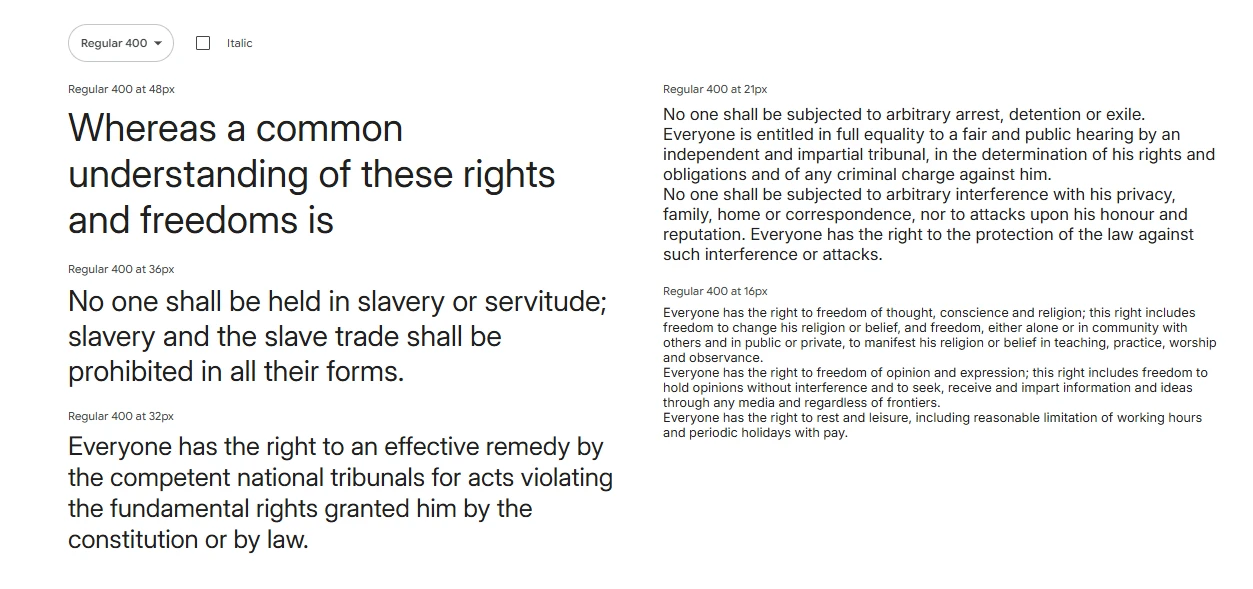
Inter is a sans-serif font made for user interfaces by Rasmus Andersson. It focuses on digital readability, which is great for developers and designers working on UIs.
Inter has tall x-heights, wide letter spacing, and clean lines that look good on high-res displays. It also includes OpenType features like alternate glyphs and contextual ligatures, suitable for dashboards and apps.
Because of its variable font support and clarity, Inter is becoming a popular UI font in design.
Best use cases:
- SaaS platforms
- Admin dashboards
- Developer tools
- Web apps and interfaces
Font pairing tip: Combine Inter with serif fonts like Lora for a classy yet functional design, or use different Inter weights to keep your type system consistent.
Nunito & Nunito Sans
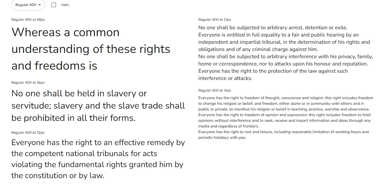
Nunito and Nunito Sans are great modern fonts with a friendly, rounded design. Vernon Adams created them, and Jacques Le Bailly expanded them. They mix soft curves and geometric balance for an approachable yet professional feel.
Nunito has rounded ends, giving it a warm tone. Nunito Sans is cleaner, making it suited for a modern look with character. They work well together; use Nunito for headers and Nunito Sans for body text, or the other way around.
This pair is readable, even in small sizes, and looks good on phones and computers. The fonts support many weights, making them flexible for bold calls-to-action or light text.
Best use cases:
- Educational websites
- Startup homepages
- App interfaces
- Nonprofit or community-driven brands
Font pairing tip: Use Nunito as your main typeface and pair it with a serif like Playfair Display to create a dynamic contrast between body and headers.
Work San
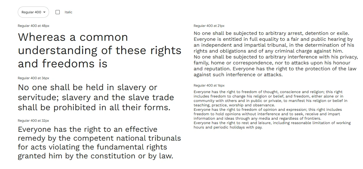
Wei Huang designed Work Sans for use on digital screens, where clarity is important. This Google Font is functional and modern.
Work Sans has a geometric base but is made for on-screen reading, unlike similar fonts meant for print. It has a tall x-height and wide spacing, and it stays clean even in light styles. Work Sans works well for dashboards or blogs.
The heavier styles are good for titles, and the regular and light styles are easy to read in body text. It also supports variable fonts, which is helpful for responsive design.
Best use cases:
- Tech startups
- Corporate blogs
- Dashboards and admin panels
- Mobile-first websites
Font pairing tip: Pair Work Sans with a serif like Lora for depth or with a display font like Raleway for visual variety.
DM Sans
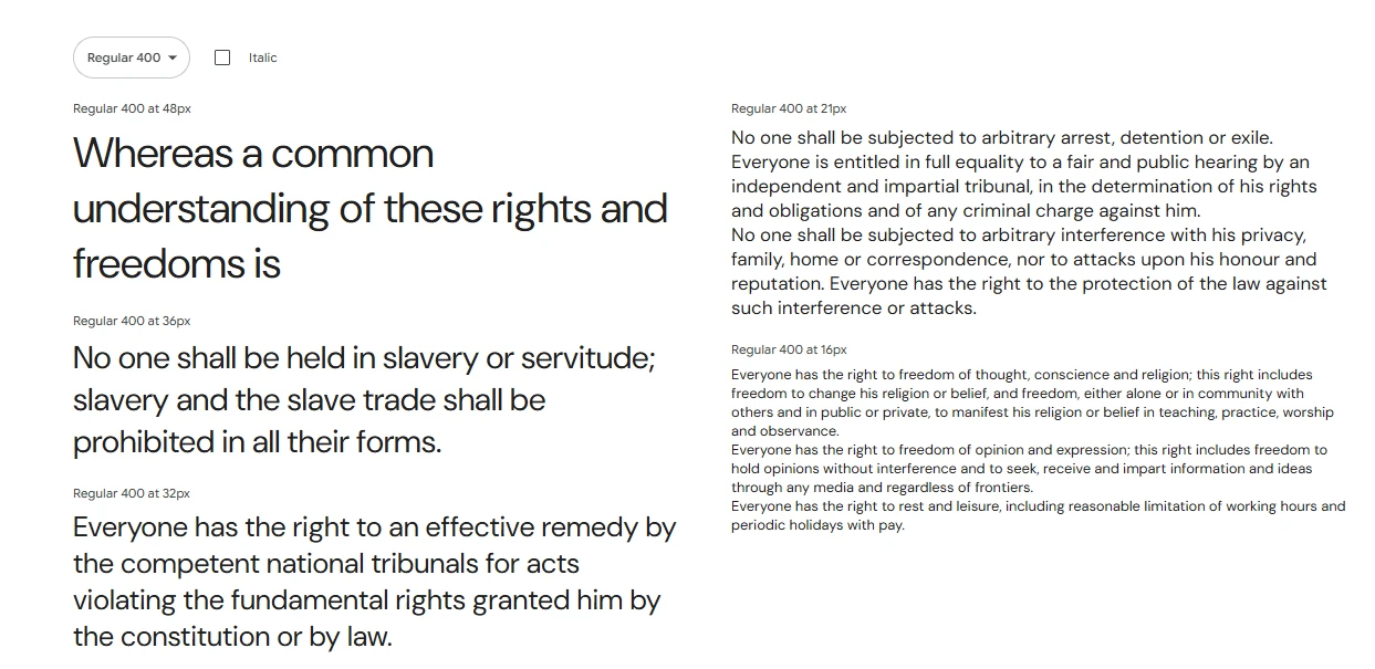
DM Sans is a low-contrast geometric sans-serif font designed by Colophon Foundry, commissioned by Google. It’s a relatively new addition to the Google Fonts library, but it’s quickly gaining popularity for its modern, minimalist aesthetic and exceptional legibility.
What makes DM Sans unique is how well it scales. Whether you’re using it at 10px or 100px, it retains its clean structure. It’s the kind of font that doesn’t draw too much attention to itself—but in a good way. It’s designed to be functional, fast-loading, and beautiful in digital interfaces.
It comes in Regular, Medium, and Bold weights, with italic styles to match. This makes it a solid choice for designers who need a reliable, web-optimized font family that fits into a clean, contemporary brand system.
Best use cases:
- Fintech websites
- SaaS platforms
- Portfolios
- Business landing pages
Font pairing tip: Use DM Sans throughout your UI for consistency or pair it with something decorative like Playfair Display to elevate your design.
Source Sans 3
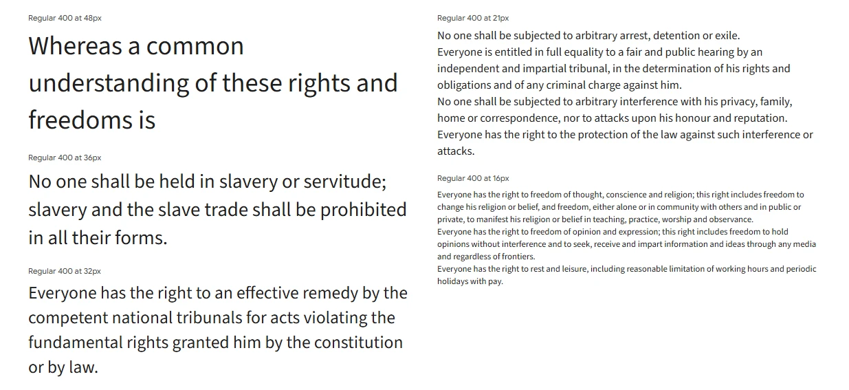
Adobe’s first open-source font, Source Sans 3, was created by Paul D. Hunt and remains a top professional choice in Google Fonts. It’s made for user interfaces and easy reading on screens.
The font has a simple, balanced design with great spacing, fitting well for both big and small text. This makes it great for content-heavy websites where you want consistency in buttons, menus, and paragraphs.
It comes in many weights, from ExtraLight to Black, each with italics, and is designed to look sharp on any device, at any resolution.
Best use cases:
- Documentation platforms
- Tech and SaaS blogs
- Corporate websites
- Developer tools and platforms
Font pairing tip: Use Source Sans 3 with Source Serif Pro for a family-style combo, or pair it with a standout display font like Montserrat for headlines.
Playfair Display

Playfair Display is a stylish serif font ideal for headings and quotes, giving web designs a luxurious, editorial feel. Though inspired by 18th-century typefaces, it works well online. Due to its decorative style, it’s best used sparingly, such as in headers or for sections you want to draw attention to. Try combining it with a simple sans-serif font for balance.
Best use cases:
- Lifestyle blogs
- Online magazines
- Wedding and luxury websites
- Portfolio hero sections
Font pairing tip: Pair Playfair Display with Open Sans, Lato, or Roboto for easy-to-read body text with a high-class header style.
Merriweather
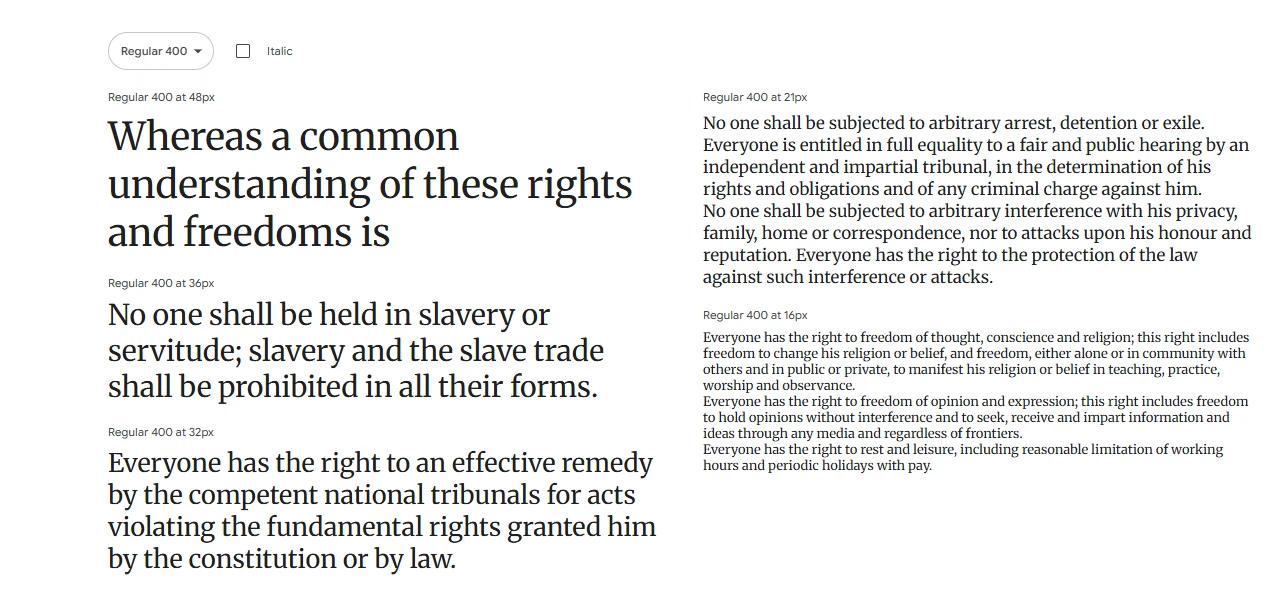
Merriweather, a serif font by Eben Sorkin, is great for on-screen reading, especially for long articles. Its slightly condensed letters give it a classic, inviting look and ensure readability in dense text.
What makes Merriweather special is how it combines traditional style with modern clarity. Its tall x-height, generous letter spacing, and gentle curves reduce eye strain, making it ideal for blogs, news sites, and other content platforms.
For added flexibility, Merriweather has a sans-serif version, Merriweather Sans, that pairs nicely and keeps a consistent look across your design.
Best use cases:
- Online publications
- Educational websites
- Academic blogs
- Any site with lots of reading
Font pairing tip: Use Merriweather for body text and pair it with Lato, Montserrat, or Raleway for strong, modern headings.
PT Sans
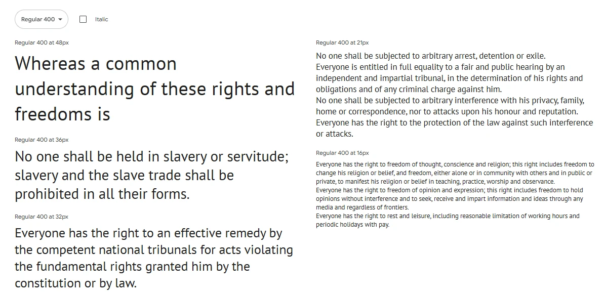
ParaType designed PT Sans as a clean, readable sans-serif with broad language support, initially to maintain Russian type traditions.
PT Sans shines with its versatility. Its balanced style suits various uses, especially UIs needing clarity. It’s a solid option for anything from business sites to multilingual platforms.
The font family includes regular, bold, italic, and bold italic styles, covering most needs without adding extra load.
Best use cases:
- Government and civic websites
- Multi-language sites
- Global nonprofits
- Educational platforms
Font pairing tip: Use PT Sans for body text and pair it with Oswald or Raleway for bold, contemporary headers.
Fira Sans
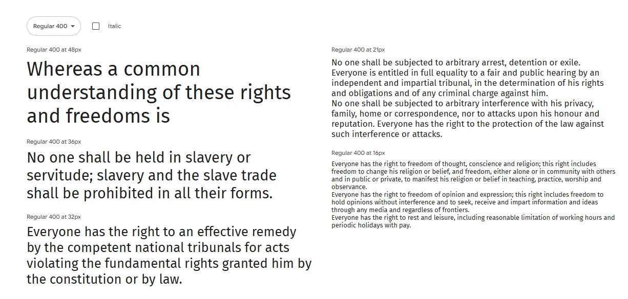
Fira Sans, initially designed for Mozilla Firefox OS and now on Google Fonts, is a modern, readable font ideal for websites and apps.
It balances personality with clarity, differing from geometric fonts like Poppins and neutral ones like Open Sans with its humanist curves and stroke contrast. This makes it both distinctive and easy to read and provides a balanced feel, avoiding stiffness or quirkiness.
Its wide array of weights and styles suits adaptable designs that need varied tones for headings and body text.
Best use cases:
- Tech blogs
- Developer portfolios
- Web apps
- User dashboards
Font pairing tip: Fira Sans pairs beautifully with Georgia or Merriweather for a refined serif contrast, or with itself in various weights for a unified look.
Oxygen
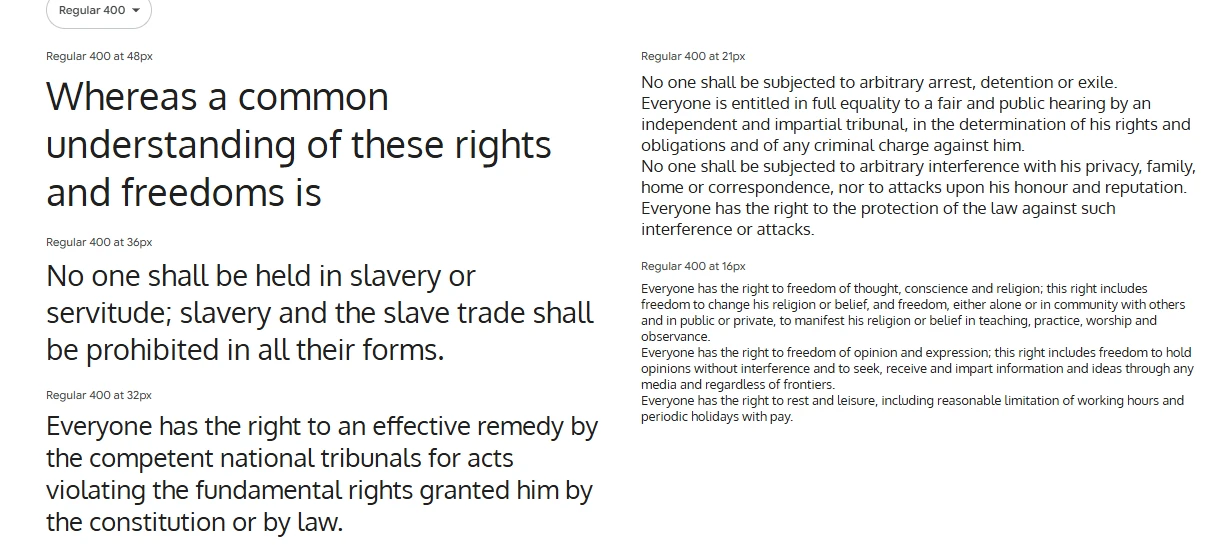
Oxygen is a clean, sans-serif font created by Vernon Adams for user interfaces. Initially part of the KDE project for Linux, it’s now popular online because it’s modern and easy to read.
Compared to fonts like Roboto or Lato, Oxygen is a bit wider, which makes it look stable and improves readability, especially in small sizes or low-contrast settings.
Oxygen’s strength lies in its clarity and neutrality; it supports the content without being distracting. It’s a solid option when the content needs to stand out.
Best use cases:
- Tech or software product websites
- Developer dashboards
- Minimalist blogs
- Web-based platforms and tools
Font pairing tip: Pair Oxygen with a serif like Lora for a bit of elegance, or keep it clean and use Oxygen in different weights for hierarchy.
Cabin
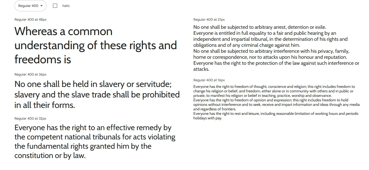
Cabin, a friendly sans-serif by Pablo Impallari, mixes handwriting’s warmth with modern design, inspired by Gill Sans.
Its rounded letters offer a soft, professional, and approachable feel, perfect for brands aiming to be inclusive and trustworthy.
Available in four weights with italics. It gives design options for a unified look.
Best use cases:
- Health and wellness brands
- Personal blogs
- Online communities
- Portfolio websites
Font pairing tip: Pair Cabin with Merriweather for a rich serif/sans pairing, or use it with Playfair Display for a modern-meets-traditional balance.
Font Pairing Tips for Web Designers
Pairing fonts is an art, not just a science. It’s about creating contrast, harmony, and visual rhythm across your layout. Get it wrong, and your site can feel cluttered or disjointed. Get it right, and your typography will guide your users seamlessly through the experience.
Here are some practical tips for great font pairing using Google Fonts:
- Contrast is key: Pair a serif with a sans-serif. Use a bold display font for headers and a clean, legible font for body text.
- Limit to two fonts: Using more than two fonts can make your design feel messy. Stick to a primary and secondary font.
- Use font families: Choose fonts with multiple weights and styles for flexibility. This lets you build hierarchy using size and weight rather than adding more fonts.
- Match the tone: Make sure both fonts reflect the same brand personality. Don’t pair a playful font with a strict, formal one.
- Balance style and function: Fancy fonts can attract attention, but always prioritize readability—especially in body text.
Example font pairs:
| Header Font | Body Font |
|---|---|
| Playfair Display | Open Sans |
| Montserrat | Lora |
| Raleway | Roboto |
| Merriweather | Source Sans Pro |
| Anton | Inter |
Test your pairings in real layouts before committing. A font combo that looks great in theory might fall flat once it hits your page.
Best Practices for Using Google Fonts in Modern Websites
Modern web design demands accessibility, scalability, and consistency. Here are some best practices to ensure you’re using Google Fonts the right way:
- Check accessibility: Ensure sufficient color contrast, font size, and legibility for users with visual impairments.
- Use a base font size of 16px or larger: Anything smaller can hurt readability, especially on mobile.
- Set consistent line-height and spacing: Good typography depends on rhythm. Use consistent spacing between lines and paragraphs for smooth reading.
- Avoid text images: Use actual text with fonts—not text embedded in images—for SEO and accessibility benefits.
- Test across devices: Fonts render differently on various screens and browsers. Always test your font styles on real devices before going live.
The beauty of Google Fonts is in their flexibility. Used correctly, they’ll elevate your brand, boost UX, and keep your design looking sharp and current.
Conclusion
Selecting the right fonts is key to branding, readability, and user experience. Our list of 17 free Google Fonts offers practical and high-performing options for today’s web design needs.
From clean sans-serifs to bold headers and stylish serifs, there’s a font for every design. Good typography should be seamless, enhance content, and tell your story subtly.
Feel free to try out different fonts, combine them, and test across devices. Make sure your website’s typography is both attractive and functional.
FAQs
- Are Google Fonts really free for commercial use?
Yes, every font in the Google Fonts library is open-source and free to use commercially, personally, and in print or digital projects. - Can I use multiple Google Fonts on the same website?
Yes, but keep it minimal. Stick to two or three max for performance and design consistency. - How do I install Google Fonts on my website?
Just visit Google Fonts, select the fonts you want, and copy the<link>or@importcode into your website’s<head>section. - What are variable fonts and why should I use them?
Variable fonts let you use a single font file that contains multiple weights and styles. They improve performance and give more design flexibility. - Do Google Fonts slow down websites?
Not if used wisely. Load only the weights/styles you need, usefont-display: swap, and consider preloading or self-hosting for best results.
Bonus Tip: Looking for More Professional Fonts Beyond Google Fonts?
While Google Fonts offers an amazing library of free options, sometimes you need something extra—something more unique or premium to set your brand apart. That’s where Creative Fabrica comes in.
Why Creative Fabrica?
- Thousands of high-quality fonts from professional type designers
- Commercial use license included with every download
- Beautifully curated font pairs to save you time
- Daily freebies and frequent discounts on premium font bundles
- Perfect for branding, web design, social media, and more
👉 Explore Creative Fabrica to level up your design game with fonts that go beyond the basics.
Whether you’re designing for clients or building your own brand, Creative Fabrica gives you access to an ever-growing library of creative tools.
You may also like:


