

Introduction
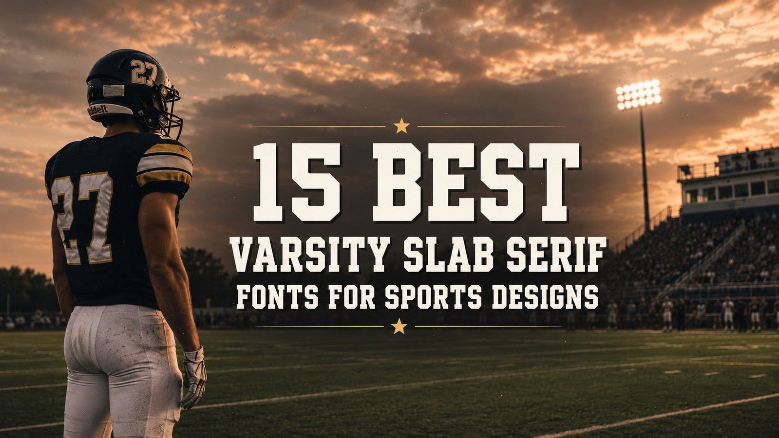
The best varsity slab serif fonts have a fairly specific job. They need to look bold, athletic, and recognizable, but they should not make every project feel like another generic college sweatshirt.
That balance is harder to find than it first appears.
When I browse varsity font collections, I often notice how quickly similar-looking typefaces begin to separate once you pay attention to their proportions. Some are wide and traditional. Others are tall and condensed. A few rely heavily on outlines, shadows, cracks, or distressed textures to create their personality.
Those differences become much more important when the lettering moves beyond a polished preview image and into an actual jersey, team logo, poster, hoodie, or heat-transfer design.
For this collection, I looked through varsity and athletic fonts available on Creative Fabrica and narrowed the selection to 15 options with clear slab-serif, collegiate, or sports-inspired characteristics. The list includes clean team fonts, vintage campus lettering, condensed display faces, outlined styles, and distressed options for retro sports merchandise.
Not every font here will suit every project. Some are flexible enough to support an entire team identity, while others are best treated as highly specific display typefaces.
Table of Contents
Best Varsity Slab Serif Fonts
1. Athletic Varsity
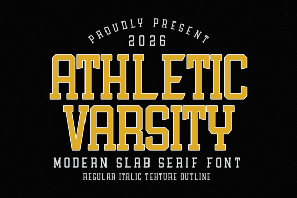
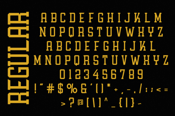
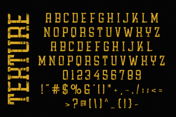
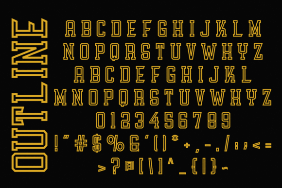
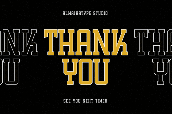
Athletic Varsity is one of the strongest options in this collection for direct, competitive sports branding.
Visually, the typeface has tall, condensed proportions that allow longer team names to occupy less horizontal space. The squared serifs preserve the familiar collegiate character, while the narrow structure gives the lettering a slightly sharper and more contemporary rhythm.
That combination is especially useful for:
- Jersey fronts
- Sleeve graphics
- Vertical posters
- Tournament banners
- Long school or team names
One thing I often notice with wide varsity fonts is that designers eventually reduce the text too much just to make the name fit. Athletic Varsity avoids some of that problem. Its condensed construction lets the letters remain large enough to hold their visual weight.
The face is assertive without depending on a distressed texture or elaborate inner outline. That makes it easier to move between vintage-inspired apparel and cleaner sports branding.
I would not use it for small supporting copy. The compressed letterforms need enough scale and spacing to remain clear, especially around dense combinations of vertical strokes.
Best for: Jersey fronts, team logos, narrow apparel layouts
Key features: Tall proportions, squared serifs, condensed athletic structure
2. Simple College
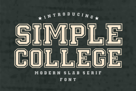
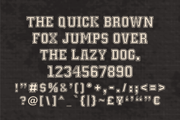
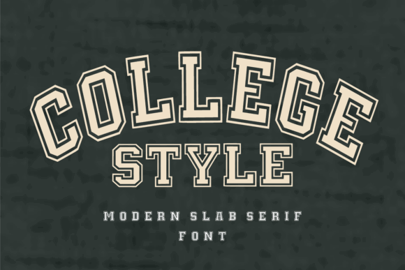
Simple College has a cleaner and more deliberately constructed appearance than many rough varsity fonts.
Its bold slab-serif foundation is combined with a double-outline treatment that immediately brings to mind school merchandise, campus emblems, spirit wear, and classic team graphics.
The outline adds depth, but it also increases the visual footprint of every character. This is one of those fonts that needs room.
Short words such as a mascot name, city, school, or graduation year will usually feel more balanced than a long phrase. At smaller sizes, the inner lines can begin to compete with the main letterforms, particularly when the design is printed on textured fabric.
From a branding perspective, the built-in outline is convenient because it creates an immediate two- or three-dimensional effect without requiring additional strokes in the design software.
That convenience has a limit. The outline is part of the font’s personality, so it is less adaptable than a clean solid face.
Best for: Spirit wear, school banners, collegiate emblems
Key features: Double outline, bold slabs, clean geometric construction
3. Boston College
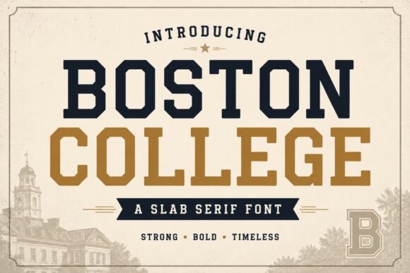
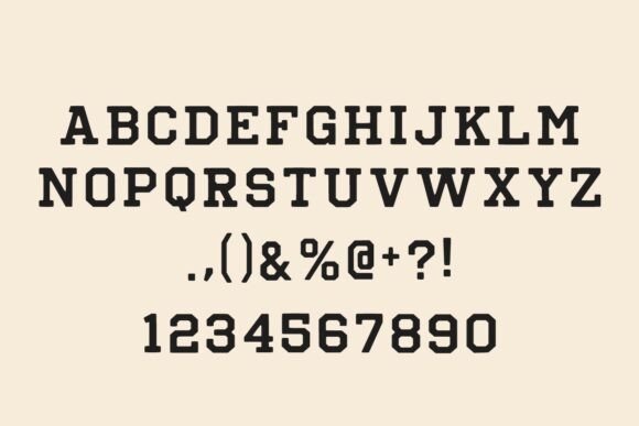
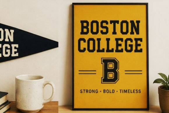
Boston College leans toward traditional university lettering rather than modern esports typography.
Its geometric letterforms and sturdy serifs give it an established, slightly nostalgic character. The overall shape feels familiar, but in this context, familiarity is not necessarily a weakness. Many college and alumni designs depend on that sense of history.
The font has enough weight for apparel and logo applications, yet its shapes remain comparatively readable. That balance makes it more practical for designs containing more than a single monogram.
I can imagine it handling:
- School names
- Tournament titles
- Booster-club graphics
- Alumni merchandise
- Traditional team logos
Some varsity fonts become visually exhausting after three or four letters. Boston College feels more controlled. The counters remain visible, and the structure does not rely on excessive decoration.
For a brand trying to look radically modern, it may feel too conventional. For baseball, football, basketball, or campus-themed identity work, that conventional character can be exactly what gives the design credibility.
Best for: University branding, alumni apparel, traditional team logos
Key features: Geometric letters, sturdy serifs, classic campus character
4. Varsity Athletic
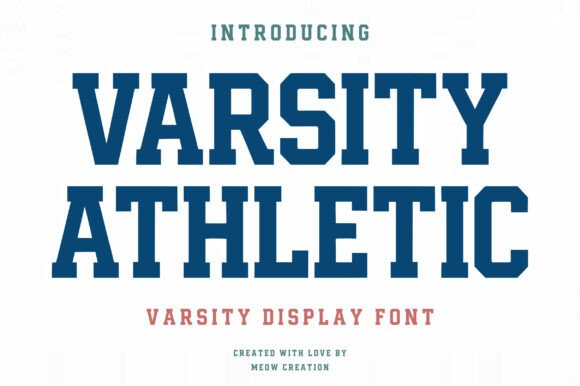
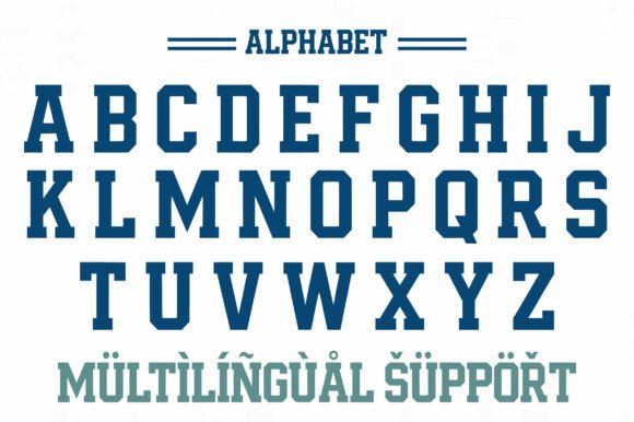
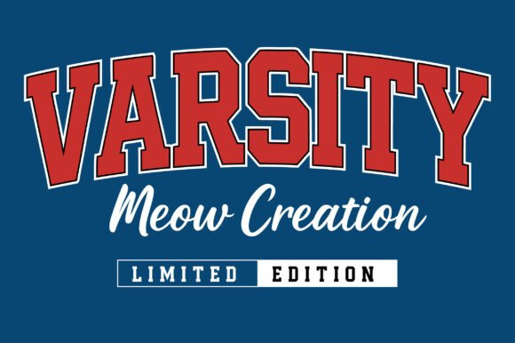
Varsity Athletic uses bold block shapes and a clean collegiate structure.
It includes uppercase letters, numbers, symbols, and multilingual support, which makes it more practical than decorative varsity alphabets that only provide basic capitals.
The uncluttered construction is the main reason I find it useful. There is no heavy grunge layer competing with a mascot, stripe system, badge, or secondary line of text.
That gives the font room to adapt across:
- Uniform graphics
- Scoreboards
- Tournament posters
- Team merchandise
- International sports projects
Because the letterforms are relatively clean, much of the final personality will come from the layout. Arched baselines, contrasting outlines, shadows, and restrained color combinations can move it toward vintage collegiate branding. A flatter composition with sharper spacing can make it feel more contemporary.
This is also one of the more sensible options for number-heavy designs. Numerals are often treated as an afterthought in font previews, even though they become one of the most visible elements on sports apparel.
Best for: Team merchandise, score graphics, multilingual sports projects
Key features: Block construction, included numerals, multilingual character support
5. Vintage Varsity
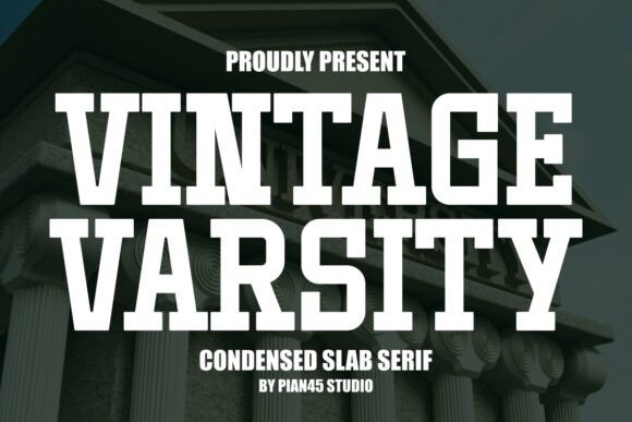
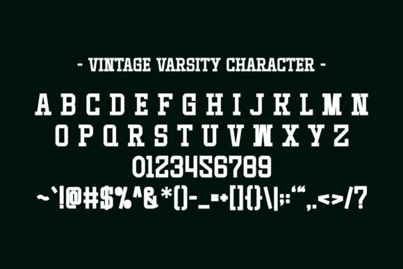

Vintage Varsity combines condensed proportions with a heavy slab-serif construction.
The result feels athletic without tying itself too closely to one sport, one decade, or one specific visual treatment.
Its narrower letterforms make it particularly useful for chest prints. There is often enough horizontal room left for a city, founding year, player number, or curved tagline without shrinking the main wordmark until it loses impact.
Despite the name, the font does not depend on an aggressive weathered texture. I actually see that as an advantage.
A clean vintage-inspired typeface gives the designer more control over how old the final piece should feel. Distress can be added through:
- Ink texture
- Grain overlays
- Faded color
- Rough printing
- Garment selection
A built-in distressed face makes that decision for every project. Vintage Varsity leaves more room to adjust the mood.
Best for: Sports apparel, long team names, retro posters
Key features: Condensed width, bold slabs, adaptable vintage appearance
6. Rough Varsity
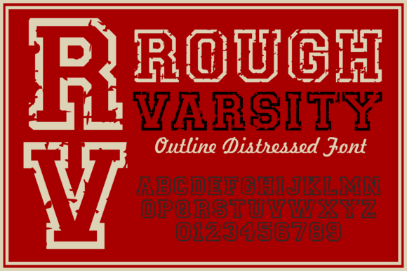
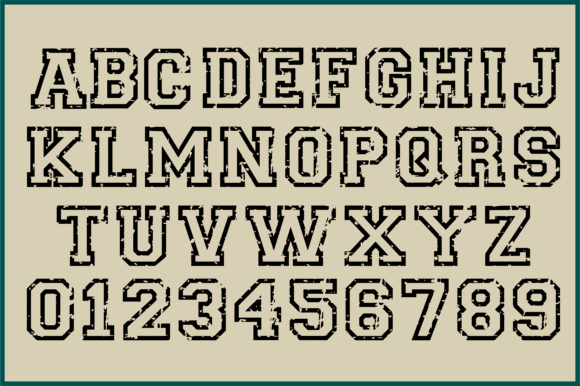
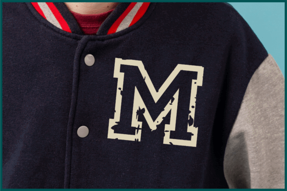
Rough Varsity is intended for designs that should look worn rather than freshly typeset.
It combines a strong outline with a distressed surface, giving the letters the appearance of an old sweatshirt, frequently washed jersey, vintage team poster, or weathered campus sign.
The texture adds character quickly. It also introduces practical limitations.
Fine distressed marks tend to disappear when the lettering is reduced. They can also become inconvenient in vinyl cutting, embroidery, and other production methods that do not handle tiny isolated details particularly well.
This is a good example of a resource that may look more flexible in a preview than it actually is. The worn texture is visually effective, but it should be tested at the intended physical size.
Used large enough, the font has more personality than a clean varsity face with an unrelated grunge texture placed over it. The distress feels integrated into the lettering rather than added as an afterthought.
Best for: Vintage hoodies, varsity jackets, distressed team graphics
Key features: Rough texture, strong outline, old-school athletic mood
7. Varsity Distressed
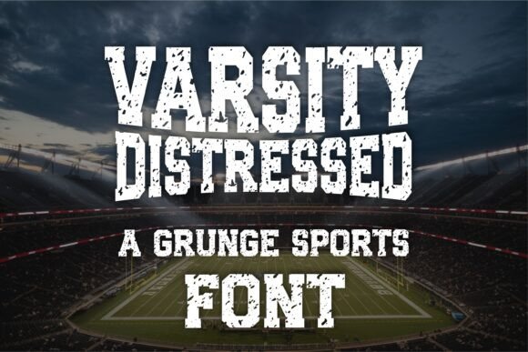
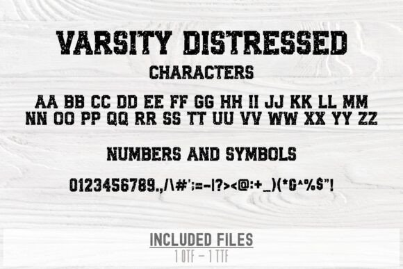
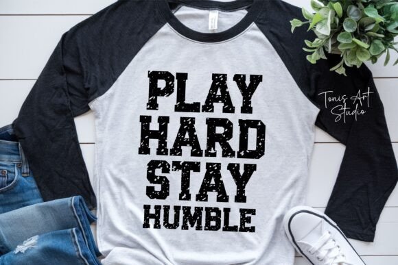
Varsity Distressed offers another worn athletic treatment, with a style clearly aimed at football, baseball, basketball, gym graphics, jersey designs, and team apparel.
This kind of font is useful when the typography itself needs to establish the retro mood. A short team name set in one or two colors can already feel like aged school merchandise without requiring many additional graphics.
The risk is visual overload.
A distressed typeface paired with a detailed mascot, several badges, a rough background, and multiple outlines can quickly lose hierarchy. Every element begins demanding attention at the same time.
I would give this font plenty of open space and keep the supporting typography simple. The irregular texture already provides enough visual movement.
Production testing matters here as well. Small cracks and narrow gaps can behave differently in a digital mockup than they do in screen printing, vinyl, or embroidery.
Best for: Football shirts, retro team apparel, gym merchandise
Key features: Distressed surface, heavy lettering, traditional sports styling
8. Varsity Grunge
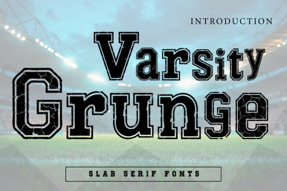
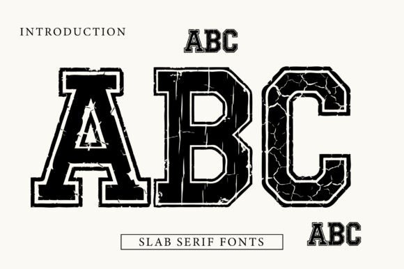
Varsity Grunge pushes the worn effect further with a cracked surface and a heavier display personality.
The texture feels deliberate and graphic rather than subtle. That can help a simple team name resemble finished merchandise even when the rest of the composition is relatively minimal.
At large sizes, the cracks create a strong single-color texture that suits:
- Game posters
- College apparel
- Athletic streetwear
- Vintage sports graphics
- Bold promotional artwork
This would not be my first choice for a youth league registration sheet, small event details, or any layout that depends on maximum clarity.
The typeface wants to be the loudest element in the composition.
Some display fonts become less effective when too many effects are layered on top of them. Varsity Grunge already has an active surface, so it often looks stronger with a restrained background and limited color palette.
Best for: Game posters, athletic streetwear, cracked vintage graphics
Key features: Cracked texture, bold display weight, grunge varsity style
9. Origin Athletic
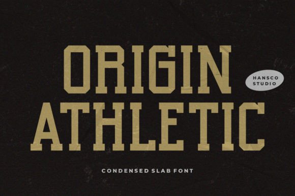
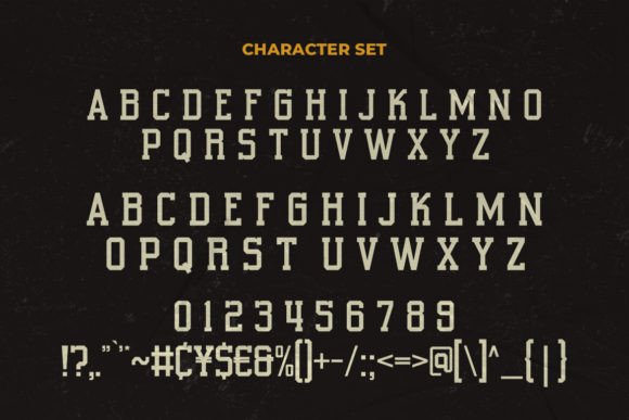
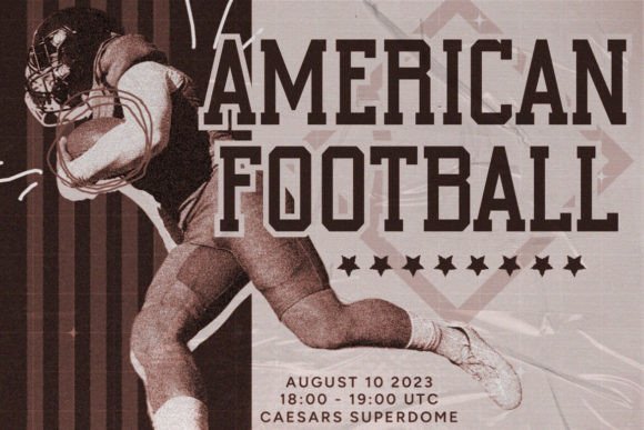
Origin Athletic sits more directly within the slab-serif category and offers a less novelty-driven approach to sports typography.
That distinction matters.
Not every athletic identity needs to look like a costume version of college lettering. Sometimes a clean athletic slab creates enough strength while leaving the mascot, shield, stripe system, or color palette to establish the rest of the personality.
Origin Athletic feels more like a foundation font than a finished effect.
It can be:
- Outlined for jersey lettering
- Set tightly for a team wordmark
- Used solid for posters
- Combined with labels or badges
- Adapted across several sports
The cleaner construction also makes it easier to build a consistent identity around the typeface. Excessive decoration can make a font memorable in isolation but difficult to reuse across different applications.
Strong branding often depends more on consistency than complexity, and Origin Athletic supports that approach.
Best for: Clean sports branding, labels, adaptable team wordmarks
Key features: Athletic slab construction, clean surface, flexible display use
10. Chicago Athlete
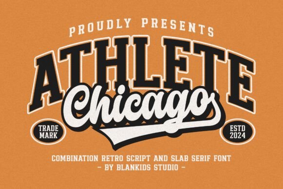
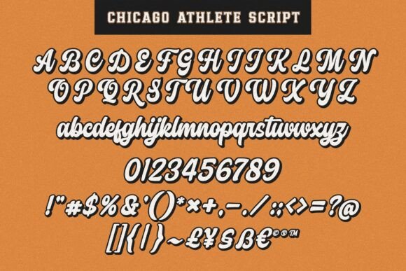
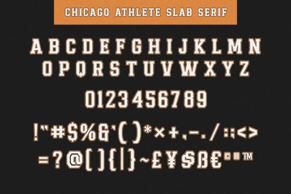
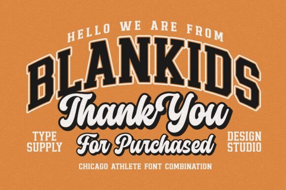
Chicago Athlete includes two related athletic slab-serif styles, giving designers more room to create hierarchy without introducing an unrelated second typeface.
That is more useful than it may sound.
In merchandise systems and team identities, a single style can become repetitive. One version may need to handle the team name, while another supports the city, division, founding year, or slogan.
Using two coordinated styles usually feels more intentional than combining separate varsity fonts simply because both appear bold.
Chicago Athlete suits:
- Layered team logos
- Badge compositions
- Apparel collections
- Poster series
- Coordinated merchandise systems
From a visual identity perspective, the related styles make it easier to repeat typography across several pieces while preserving variation.
This is the kind of practical detail that does not always stand out in a marketplace preview, but it becomes important when a project grows beyond one graphic.
Best for: Apparel collections, badge layouts, coordinated team branding
Key features: Two related styles, athletic slabs, built-in hierarchy options
11. Stacked College
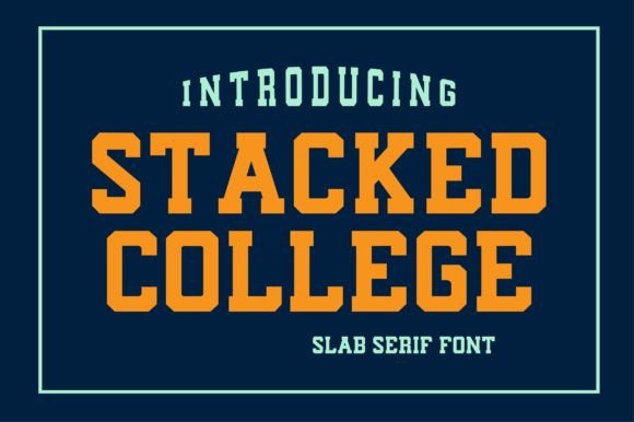
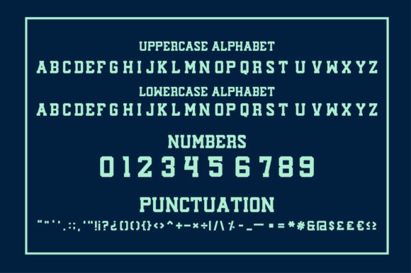
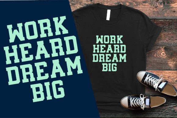
Stacked College has the heavy lines and sturdy serifs expected from classic collegiate lettering.
Its main strength is confidence without an overly aggressive or mechanical appearance. The letterforms feel substantial, but they still have some warmth.
That makes the font suitable for:
- Campus clubs
- Recreational leagues
- School events
- Vintage branding
- Community team graphics
Not every sports project needs to resemble a professional football franchise. For local teams, student organizations, and informal events, a slightly more approachable varsity style can feel more appropriate.
The typeface has enough weight to carry a central headline without becoming so stylized that every design looks identical.
For supporting text, I would pair it with a simple condensed sans serif rather than another decorative college font. The contrast allows the main lettering to feel heavier and more deliberate.
Best for: Campus clubs, recreational teams, retro college branding
Key features: Bold lines, sturdy serifs, approachable collegiate character
12. Blame Sport
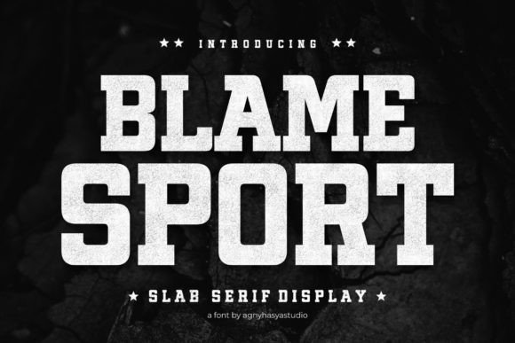
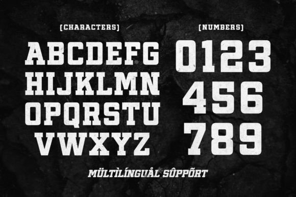
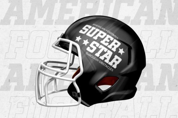
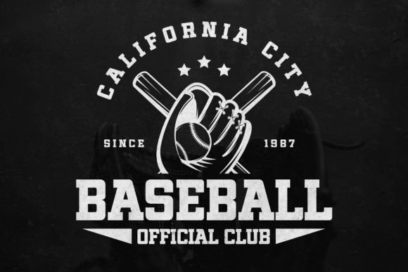
Blame Sport is a more contemporary athletic slab serif influenced by competitive sports, gym culture, and streetwear.
Compared with nostalgic varsity faces, it feels better suited to:
- Fitness branding
- Boxing posters
- Training apparel
- Combat-sports graphics
- Urban athletic campaigns
The lettering still communicates strength and competition, but it does not depend entirely on traditional campus imagery.
This makes it a useful alternative when arched college text, letterman-jacket styling, and heritage badges begin to feel too predictable.
Its more energetic structure would suit oversized lettering, strong cropping, angled compositions, and layouts with a sharper sense of movement.
Some trends in sports branding change quickly, especially when they borrow heavily from esports or streetwear. Blame Sport feels current, but I would still avoid surrounding it with too many trend-specific effects if the identity needs to last for several years.
Best for: Gym branding, boxing posters, modern sports apparel
Key features: Contemporary slabs, energetic structure, street-sport influence
13. Varsity Bold
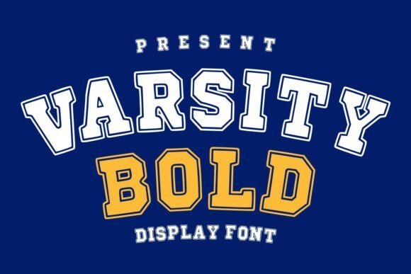
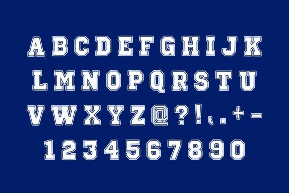
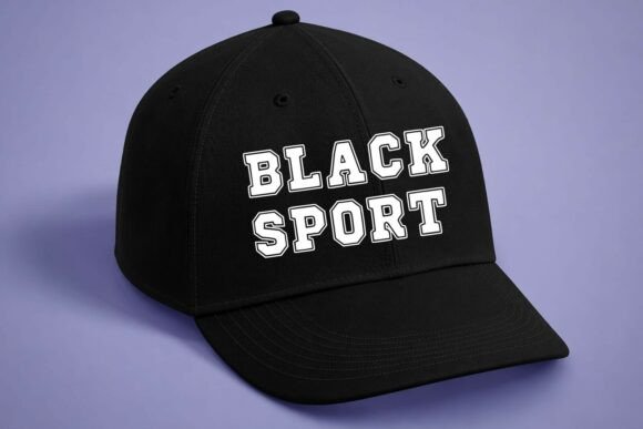
Varsity Bold combines slab-style characters with a sporty outline.
It is intended for team logos, merchandise, school projects, posters, and T-shirt designs. The built-in outline gives short words immediate contrast, particularly in two-color compositions.
That can be useful when the lettering needs to sit over:
- Photographs
- Textured backgrounds
- Mascot illustrations
- Bold garment colors
- Layered sports graphics
A plain solid font can disappear in those situations. The outline helps separate the letters from surrounding elements.
Spacing deserves extra attention, though.
When outlined characters sit too close together, their outer strokes can merge into a dense block. Increasing the tracking slightly often improves readability, especially around broad letters such as M, W, and A.
This is another typeface that will look stronger when the word is previewed at the actual intended size rather than judged from a large specimen image.
Best for: Two-color logos, school shirts, sports posters
Key features: Sporty outline, bold slabs, high-contrast display construction
14. Victory Varsity
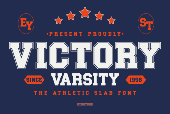
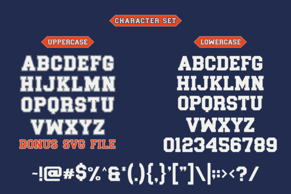
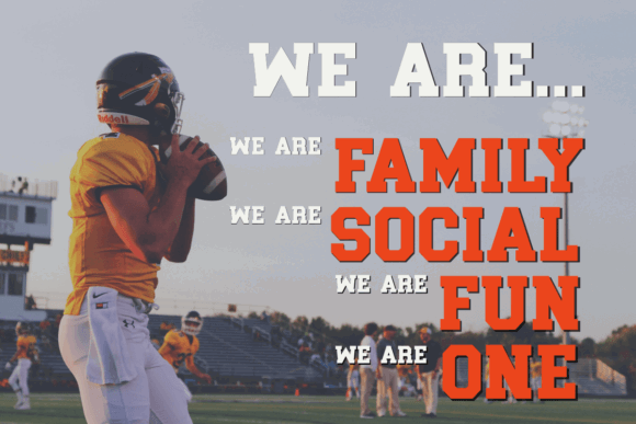
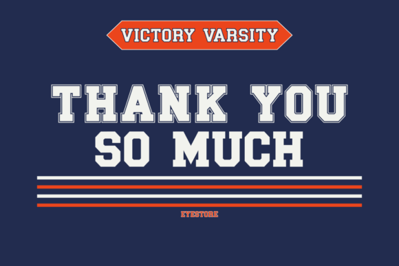
Victory Varsity is a modern bold slab serif inspired by traditional college lettering.
Its possible applications extend beyond sports into posters, labels, packaging, invitations, apparel, and logo design.
That broader range gives it an advantage for designers who want a varsity-influenced font without purchasing something that only makes sense on a football jersey.
It can move naturally into:
- School celebrations
- Seasonal graphics
- Graduation apparel
- Retro labels
- General college-inspired branding
The font still carries enough weight for team designs, but it is not tied to heavy distressing or a complex outline system. Those effects can be introduced only when the project actually needs them.
I tend to prefer this kind of flexibility in a display font. A typeface with too much built-in personality can become repetitive after several uses.
Best for: School events, versatile apparel, college-inspired branding
Key features: Modern slabs, clean finish, broad display applications
15. Varsity Legacy
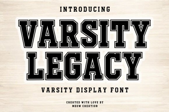
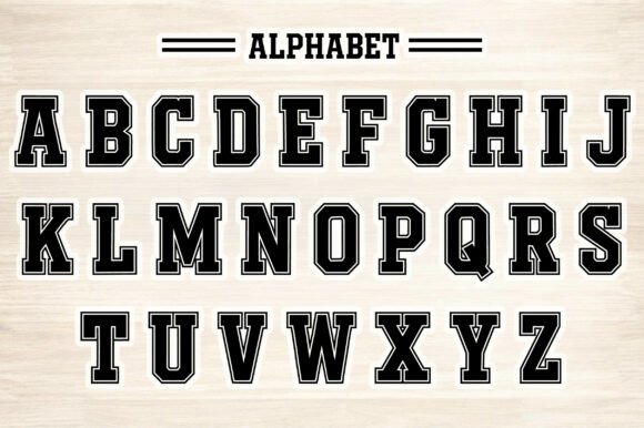
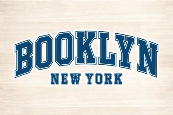
Varsity Legacy closes the collection with a traditional slab-serif direction intended for college prints, university lettering, team shirts, and logo applications.
The name matches its visual role.
This is the kind of typography that suits:
- Heritage collections
- Alumni graphics
- School anniversaries
- Established team identities
- University-style merchandise
The proportions and heavy serifs create a sense of continuity rather than novelty. That can be valuable for identities built around history, tradition, or long-standing community recognition.
I would keep the surrounding layout disciplined.
A school name, founding date, small divider, and restrained color palette will usually support this style better than multiple shadows, textures, banners, and badges competing for attention.
Let the weight and proportions of the lettering carry the design.
Best for: Alumni merchandise, heritage teams, university-style logos
Key features: Traditional proportions, heavy slabs, established collegiate tone
Read More: Just as varsity slab serifs are perfect for bringing a dynamic edge to sports designs, exploring 15 Best Western Slab Serif Fonts for Logos and Branding can introduce a whole new level of rugged authenticity to your projects.
Final Thoughts
The strongest varsity font is not necessarily the one with the most outlines, shadows, cracks, or distressed details.
It is the one whose proportions fit the actual application.
Athletic Varsity and Vintage Varsity are useful when horizontal space is limited. Simple College and Varsity Bold provide ready-made outline treatments. Boston College, Varsity Athletic, and Varsity Legacy stay closer to familiar campus lettering.
Rough Varsity, Varsity Distressed, and Varsity Grunge bring a worn merchandise feel, although their textures require more careful handling at smaller sizes.
Origin Athletic and Victory Varsity offer cleaner foundations that can adapt to a wider range of branding projects. Blame Sport moves in a more contemporary gym and street-sport direction.
For a reusable sports-design toolkit, I would begin with one clean condensed face and one distressed alternative. That combination covers more real projects than collecting several nearly identical outlined fonts.
A good varsity font should support the identity rather than become the entire identity.
Some links in this article may be affiliate links. If you purchase through them, we may earn a small commission at no extra cost to you. Thanks for supporting our work.
FAQ
What is a varsity slab serif font?
A varsity slab serif font is a bold display typeface with heavy strokes and block-like serifs. The style is closely associated with American college athletics, jerseys, letterman jackets, team logos, and school merchandise.
What font style is commonly used on sports jerseys?
College-style slab serifs, condensed block fonts, and bold athletic sans serifs are all common. The best choice depends on the sport, available space, production method, and whether the design should feel traditional or modern.
Are distressed varsity fonts suitable for Cricut projects?
They can be, but heavily distressed details may create many small cut pieces. Clean or lightly textured fonts are usually easier to weed. Always inspect the design at its final physical size before cutting.
What should I pair with a varsity font?
Pair varsity lettering with a simple sans serif, especially for dates, locations, player names, and supporting text. A restrained secondary font creates clearer hierarchy and keeps the main athletic lettering in focus.

Follow Us