

Introduction
Western slab serif fonts can bring much more to a design than the familiar cowboy aesthetic. Their broad proportions, heavy serifs, and wood-type influences often make a logo feel established, practical, and rooted in American visual culture.
I tend to associate this style with ranch brands, barbecue restaurants, breweries, outdoor companies, country apparel, coffee packaging, and whiskey labels. Still, a western font does not always need to resemble lettering from a weathered saloon poster.
Some typefaces in this collection offer a much cleaner interpretation of the style. They retain the strength and personality of traditional western typography while fitting more comfortably into contemporary branding systems.
Below are 15 western slab serif fonts with enough visual weight to anchor a logo, along with different levels of ornament, texture, and Old West influence.
Table of Contents
Best Western Slab Serif Fonts
1. Buffalo Western
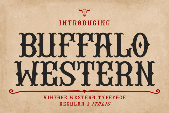
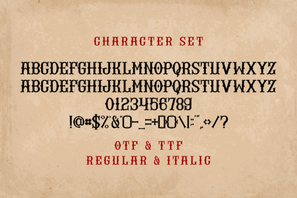
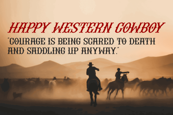
Buffalo Western by Eystore is one of the more adaptable western slab serif fonts in this collection. It includes regular and italic styles, giving designers a simple way to build hierarchy without introducing an unrelated secondary typeface.
Visually, the lettering has enough western character for ranch, country, and outdoor branding, but it does not rely on excessive ornament. The relatively clean construction makes it easier to imagine across storefront signs, clothing tags, packaging, and online graphics.
I would keep the main brand name upright and use the italic style for secondary wording such as “Supply Co.,” “Handcrafted,” or “Since 1987.” That creates movement without making the entire logo feel restless.
Best for: Ranch logos, apparel labels, outdoor brands
Key features: Regular and italic styles, sturdy slab construction
2. Wildhorn Slab
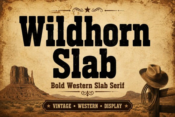
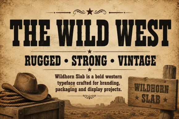
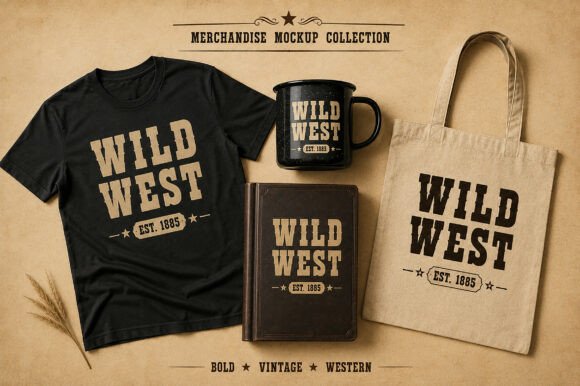
Wildhorn Slab by Wow Magic has broad, substantial letterforms influenced by frontier typography and vintage wood type.
Its visual weight gives short business names an immediate presence. From a branding perspective, it feels especially suited to whiskey packaging, coffee bags, leather patches, ranch signs, and heritage-inspired merchandise.
The structure is rugged without appearing chaotic. That leaves enough visual space for supporting elements such as stars, cattle brands, ornamental rules, mountain illustrations, or small establishment dates.
Long names may feel compressed, particularly inside circular badge compositions. Opening the tracking slightly or splitting the name across two lines can help the letters breathe.
Best for: Whiskey labels, coffee packaging, ranch signage
Key features: Heavy slabs, wood-type influence, rugged proportions
3. Durango Western
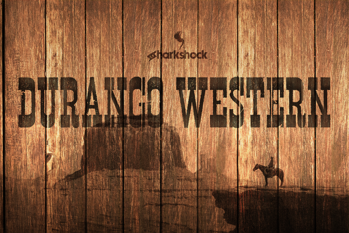
Durango Western by Sharkshock has the dramatic silhouette many people immediately associate with western display typography.
The unusual contours feel theatrical and expressive, making the typeface a natural fit for rodeo posters, country events, entertainment branding, and frontier-inspired merchandise.
This is not a font I would use for long supporting text. Its strength is in large, display-focused applications where the shape of each letter has room to register.
When reducing a Durango-based logo for a favicon or narrow mobile header, a simplified monogram will usually reproduce more reliably than the complete wordmark.
Best for: Rodeo brands, event posters, entertainment logos
Key features: Dramatic western silhouette, display-focused slab lettering
4. Sheriff Cowboy
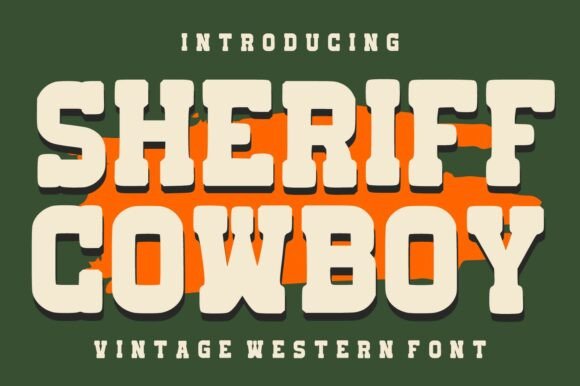
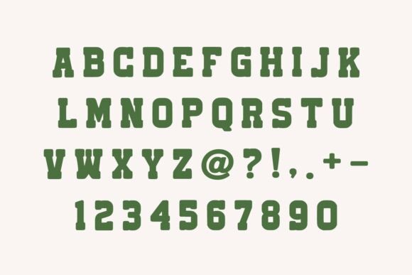
Sheriff Cowboy by Infinity Art Studio uses bold slab-style letterforms inspired by Old West signage and vintage Americana.
Compared with novelty fonts filled with ropes, bullets, and illustrations, its construction feels relatively direct. That gives it more flexibility across apparel, restaurant branding, badge logos, and product packaging.
I can see this working particularly well for a barbecue restaurant or smoked-food label. Pairing it with a restrained sans serif would help keep menus, prices, and supporting information readable.
The font already communicates a strong western theme, so I would avoid surrounding it with several different distressed effects. One controlled aged element usually looks more convincing than an entire layout covered in artificial wear.
Best for: Barbecue logos, badges, western apparel
Key features: Bold slab forms, classic Americana character
5. Western Goldrush
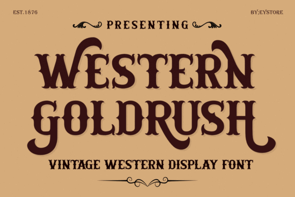
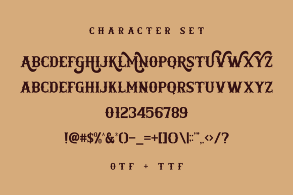
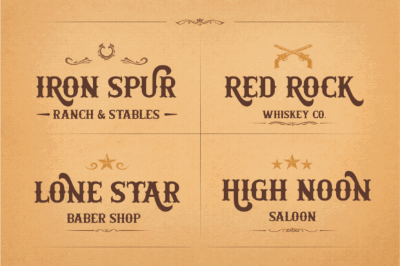
Western Goldrush by Eystore is designed for expressive display typography and includes multiple uppercase letter variations.
Those variations are useful when building custom-looking wordmarks. One drawback of using a recognizable display font is that a logo can sometimes feel as though the business name was simply typed into a template. Alternate letterforms help reduce that effect.
By comparing several versions of repeated letters, designers can create a more balanced rhythm and avoid awkward duplication.
Western Goldrush feels well suited to barbershop branding, bourbon labels, ranch logos, retro packaging, and apparel graphics. Its personality is already assertive, so the rest of the visual identity should remain fairly disciplined.
Best for: Barbershops, bourbon labels, badge logos
Key features: Uppercase variations, bold display construction, balanced readability
6. Wild Spur
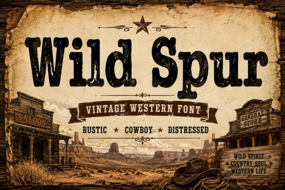
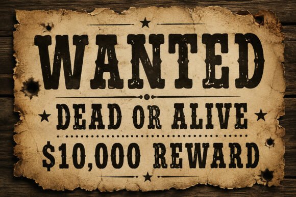
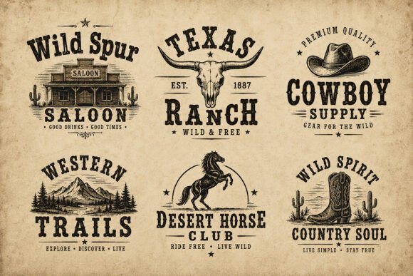
Wild Spur is a distressed western slab serif influenced by cowboy signage, ranch branding, saloon posters, and frontier-era typography.
The weathered surface gives lettering an aged appearance before any additional texture is applied. That can be useful for T-shirts, rustic packaging, posters, and merchandise where a rough printed finish is part of the intended look.
At the same time, the built-in distressing limits its versatility. Fine texture may lose definition when the logo is screen printed, engraved, embroidered, or displayed at a small size.
For a more flexible visual identity, I would use Wild Spur for the main display mark and introduce a clean companion typeface for addresses, product variants, ingredients, and website navigation.
Best for: Distressed logos, T-shirts, rustic merchandise
Key features: Weathered texture, strong slabs, frontier poster influence
7. Cowboy Retro
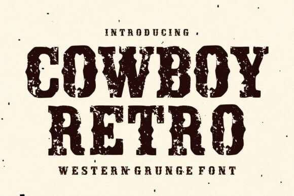
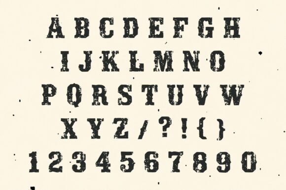
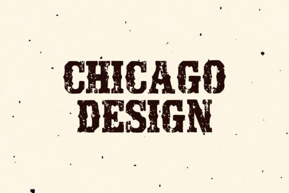
Cowboy Retro by WNIdesign combines thick slab serif shapes with noticeably worn edges.
The result feels less polished than a clean heritage typeface and closer to lettering printed from an old wooden block. That surface quality suits brands built around handmade products, smoked foods, country music, vintage clothing, and casual merchandise.
One practical advantage is that the font already provides texture, so designers do not need to add several overlay effects to make a graphic feel aged.
The worn details can become visually busy when placed over complex photography or detailed illustrations. Giving the wordmark a quiet background and a little breathing room will preserve its silhouette.
Best for: Handmade brands, vintage apparel, food packaging
Key features: Thick slabs, worn edges, retro print texture
8. Wild Western
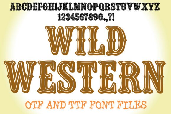
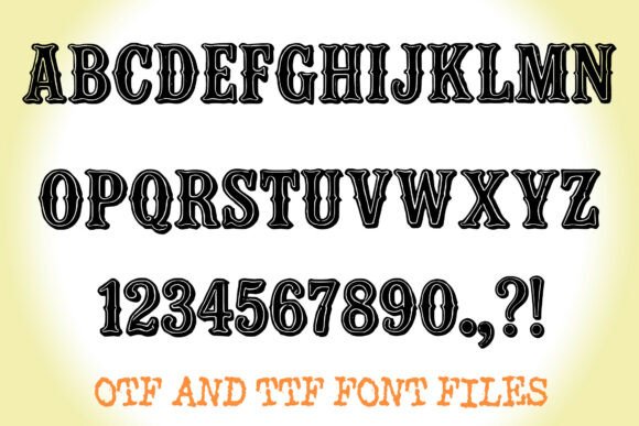
Wild Western by Squeeb Creative draws heavily from wood-type posters and saloon signage.
Thick stems, flared spurs, and engraved inline details give the characters a dimensional, crafted appearance. The package includes OTF and TTF files with letters, numerals, and essential punctuation.
The inline treatment allows the typography to carry much of the visual interest on its own. A relatively simple business name can look complete without needing an elaborate illustration or emblem.
However, inline details need physical space. At small sizes, the inner lines can begin to merge with the surrounding letterforms. I would reserve Wild Western for packaging fronts, signage, posters, and hero graphics rather than tiny labels or supporting copy.
Best for: Saloon logos, packaging fronts, western posters
Key features: Engraved inlines, flared spurs, OTF and TTF formats
9. Western Cowboy
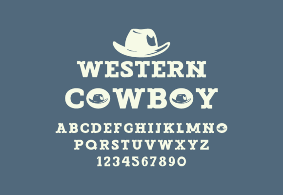
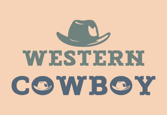
Western Cowboy by GraphicsNinja takes a cleaner and more balanced approach to western slab lettering.
The proportions are relatively simple, making the typeface easier to integrate into minimalist logos and contemporary web branding. It references frontier typography without turning every project into a themed attraction.
I could see it fitting a modern ranch stay, outdoor lifestyle brand, handmade boot company, boutique coffee label, or small-batch food business.
The cleaner skeleton also leaves room for customization. A designer could adjust the spacing, modify one or two terminals, or create a monogram without fighting against heavy ornament.
Best for: Modern ranches, web branding, lifestyle labels
Key features: Balanced proportions, clean retro styling, restrained detail
10. Cowboy Clasico
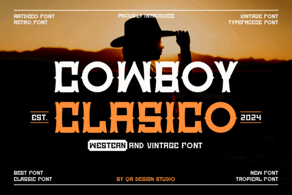
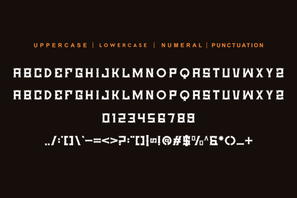
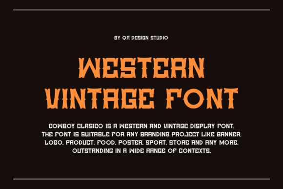
Cowboy Clasico by QR Design Studio is a bold western slab serif with a noticeably decorative personality.
Its stylized letterforms tend to work best with short business names. A compact wordmark gives each distinctive shape enough space to remain recognizable and prevents the composition from becoming overly dense.
Cowboy Clasico can establish an immediate theme for restaurants, bars, apparel brands, and country events.
For a premium or understated identity, I would compare it with cleaner slab serifs before committing. Its cowboy character is very specific, which is useful for the right brand but potentially limiting for one that may expand beyond that aesthetic.
Best for: Restaurants, country events, short wordmarks
Key features: Assertive letterforms, decorative slabs, strong western theme
11. Western of Dead
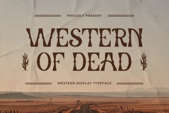
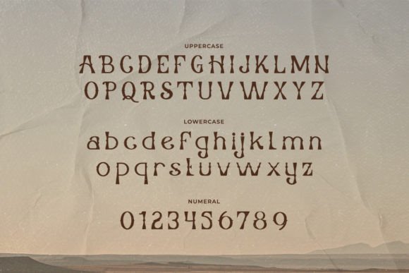
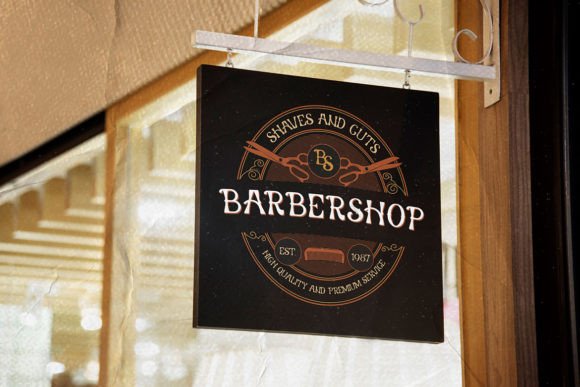
Western of Dead by TypeFactory combines western slab serif construction with a darker, rougher mood.
The design leans toward retro, grunge, outlaw, and alternative-western aesthetics rather than polished ranch branding. It is compatible with Windows, macOS, Linux, Cricut, Silhouette, and other cutting-machine workflows.
Visually, it feels closer to a wanted poster from a fictional frontier town than a refined heritage logo. That specificity is its main strength.
It could add far more character to tattoo merchandise, gaming graphics, outlaw apparel, or themed posters than a neutral slab serif. Traditional hospitality and luxury brands may find it too theatrical.
Best for: Tattoo brands, outlaw apparel, themed posters
Key features: Grunge influence, dark western mood, broad compatibility
12. Bitchcraft
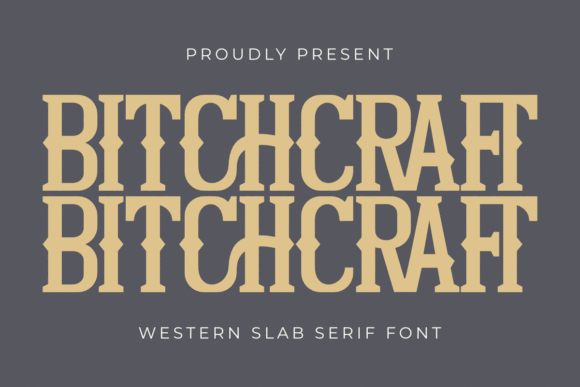
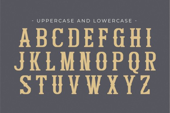
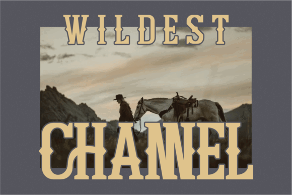
Bitchcraft by Pian45 is a bold western slab serif with distinctive ligatures and a deliberately rebellious attitude.
Its combination of cowboy imagery and unconventional naming separates it from more traditional ranch-inspired fonts.
The ligatures can help a wordmark feel intentionally composed rather than simply typed. Their value depends on the letters in the actual business name, so it is worth previewing the complete word before deciding.
From a branding perspective, Bitchcraft feels suited to women-led western apparel, tattoo merchandise, playful country boutiques, and event graphics with a sharper tone. Conservative corporate identities will probably need something less provocative.
Best for: Western boutiques, bold apparel, tattoo merchandise
Key features: Custom ligatures, bold slabs, rebellious cowboy styling
13. Rough Cowboy
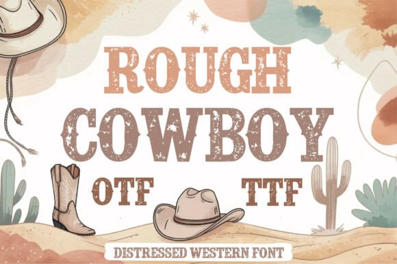
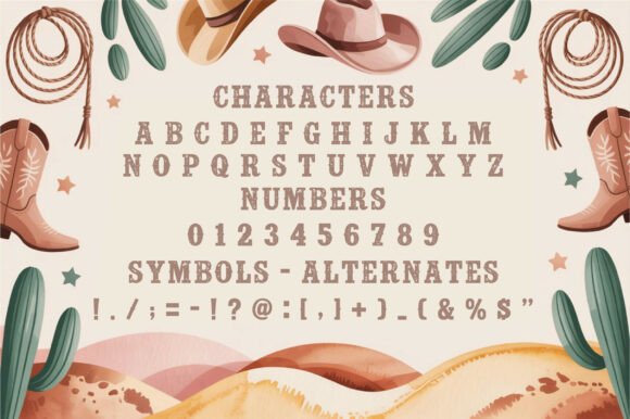
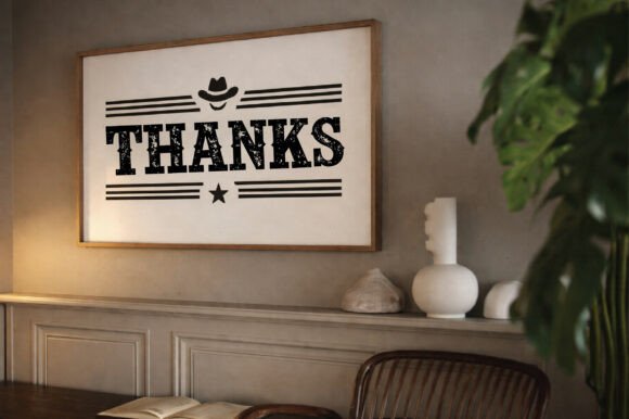
Rough Cowboy by Craft Artist leans fully into the textured, handmade side of western typography.
The rough finish gives the lettering a printed, carved, or weathered appearance from the beginning. It can suit souvenir graphics, casual food branding, rustic events, and western apparel.
As with many distressed fonts, production method matters. Fine irregularities that look attractive on a large digital preview may disappear in small vinyl cuts, embroidery, laser engraving, or low-resolution printing.
I always think it is better to test a logo using the weakest reproduction method in the brand system. A polished mockup can hide problems that become obvious on a real patch or product seal.
Best for: Souvenirs, rustic events, casual western apparel
Key features: Rough texture, heavy slabs, handmade appearance
14. Tango Western
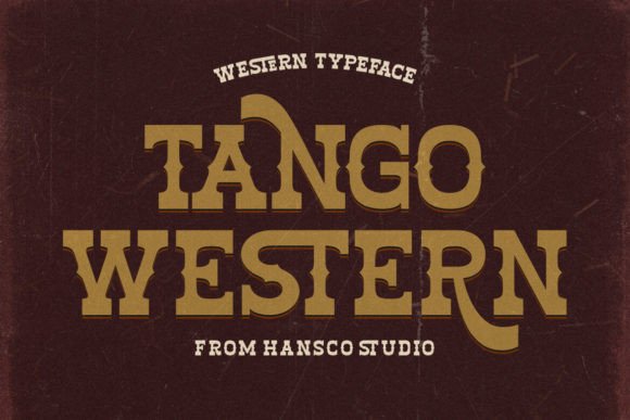
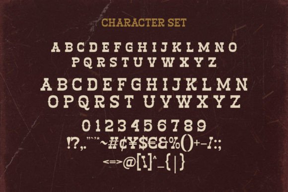
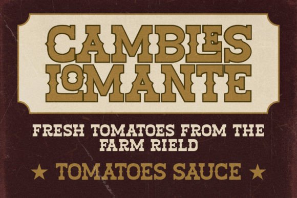
Tango Western by HansCo is a decorative western slab serif positioned for logos, packaging, and visual identity work.
Its character comes more from the shapes of the letters than from heavy distressing. That cleaner surface can be useful for packaging, where sharp edges often reproduce more reliably than extremely weathered details.
Tango Western could suit boutique food products, specialty coffee, western fashion, and event branding.
The typeface already contributes a fair amount of personality, so I would keep the supporting color palette controlled. Too many decorative colors, textures, and illustrations could weaken the hierarchy.
Best for: Boutique packaging, coffee brands, western fashion
Key features: Decorative slabs, cleaner edges, identity-friendly styling
15. Howdy Cowboy
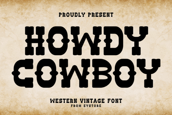
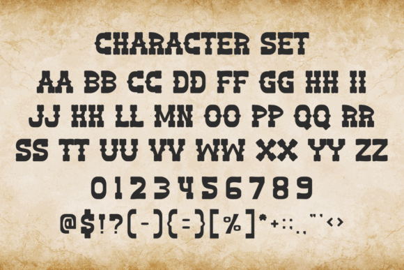
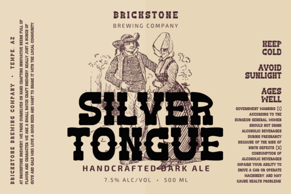
Howdy Cowboy by Eystore brings a friendlier and more informal tone to western slab serif typography.
Compared with darker, sharper, or heavily distressed fonts, its character feels approachable. That makes it suitable for family events, children’s western themes, farmhouse products, casual country shops, and playful apparel.
I would not choose it for a serious luxury whiskey label, but that is exactly why it fills a useful place in this collection.
Not every western brand needs to feel stern, weathered, or aggressively masculine. Sometimes a softer and more welcoming interpretation is a better reflection of the actual audience.
Best for: Family events, farmhouse products, casual shops
Key features: Friendly western tone, chunky slabs, playful character
Read More: Among the many excellent choices for logos and branding, you might find the classic Vintage College Font: Classic Slab Serif With Warm Character to be a particularly charming option with its traditional yet approachable feel.
Tips for Building a Western Brand Identity
A western font should be one part of the identity, not the entire identity.
Pair an expressive slab serif with a quieter sans serif for menus, web copy, ingredients, product details, addresses, and supporting information. The contrast creates a clearer visual hierarchy while protecting readability.
Successful font pairing usually depends on proportion, tone, and contrast. Two equally decorative typefaces often compete rather than complement each other.
Texture also needs restraint.
A distressed wordmark, aged paper, scratched illustration, worn border, and weathered background can make a design feel artificially old. One or two controlled imperfections usually create a more believable result.
Finally, test the logo in one color.
Western branding frequently appears on burned wood, leather stamps, embroidery, vinyl decals, packaging seals, and engraved products. A design that only works with gradients, shadows, and multiple outlines will be harder to reproduce consistently.
A strong one-color silhouette is often a better sign of a durable logo than an impressive mockup.
What Makes a Western Slab Serif Font Work in Branding?
Traditional slab serif fonts use thick, block-like serifs instead of the delicate finishing strokes found in many editorial or book typefaces. This construction naturally creates a feeling of stability, strength, and confidence.
That is one reason slab serifs have remained useful in branding for so long. Even before colors, illustrations, or packaging details are added, the typography can already suggest heritage and permanence.
Western slab serif fonts usually introduce additional details inspired by nineteenth-century wood type, including:
- Split serifs
- Pointed spurs
- Condensed proportions
- Engraved inline details
- Drop shadows
- Distressed surfaces
These details can give a logo a strong visual personality, but they also need to be handled carefully.
One thing I often notice when browsing western font collections is that the most decorative option is not always the most useful. A typeface may look impressive in a large specimen image but become difficult to read on a social media avatar, bottle label, embroidered patch, or mobile header.
Before choosing a font, I recommend typing the complete business name and testing it at several sizes. That reveals far more than judging a typeface from a carefully arranged preview.
Read More: If you're exploring distinctive options for your branding, consider the Fortune Seeker Font: Vintage Slab Serif With Patriotic Spirit, which perfectly blends vintage aesthetics with a bold, purposeful structure.
Final Thoughts
The strongest western slab serif fonts balance recognizable frontier character with practical letter construction.
Buffalo Western and Western Cowboy offer useful flexibility for brands that need to move between print and digital applications. Wildhorn Slab and Sheriff Cowboy bring heavier ranch and Americana energy. Wild Spur, Cowboy Retro, and Rough Cowboy are more appropriate when a visibly weathered finish is central to the identity.
Decorative choices such as Wild Western, Durango Western, and Cowboy Clasico can make a short wordmark memorable, but they need more space and greater restraint elsewhere in the design.
I would begin by typing the real brand name in three or four candidates. Compare the spacing, readability, visual rhythm, and silhouette before looking at polished mockups.
A western font should make the identity more distinctive. It should not make every business look like the same saloon.
Some links in this article may be affiliate links. If you purchase through them, we may earn a small commission at no extra cost to you. Thanks for supporting our work.
FAQ
What is a western slab serif font?
A western slab serif font combines thick, block-shaped serifs with details influenced by frontier posters, wood-type printing, ranch signs, saloons, and vintage Americana. Common features include spurs, inlines, shadows, condensed letters, and distressed textures.
Are western fonts suitable for professional logos?
Yes, particularly for ranches, restaurants, breweries, outdoor brands, apparel companies, and heritage products. Cleaner western slab serifs tend to be more versatile than heavily distressed or decorative styles.
What font pairs well with a western slab serif?
A clean sans serif usually provides the most useful contrast. Use the western font for the logo or headings and the sans serif for descriptions, menus, packaging details, and website text.
Can I use Creative Fabrica fonts in commercial branding?
Many Creative Fabrica fonts include commercial-use rights, but you should review the current license for the specific product and intended application. Logo use, merchandise, digital templates, and redistribution can involve different conditions.
Follow Us