

18 Sans Serif Fonts for Luxury Product Labels That Feel Premium
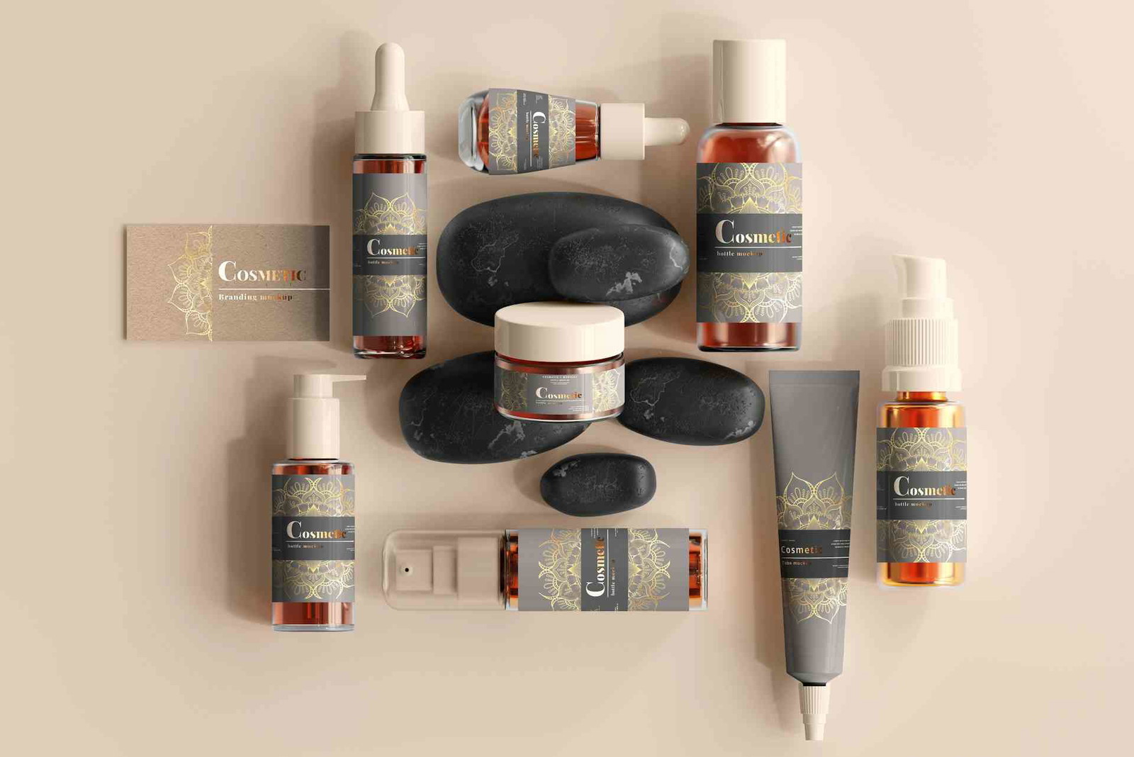
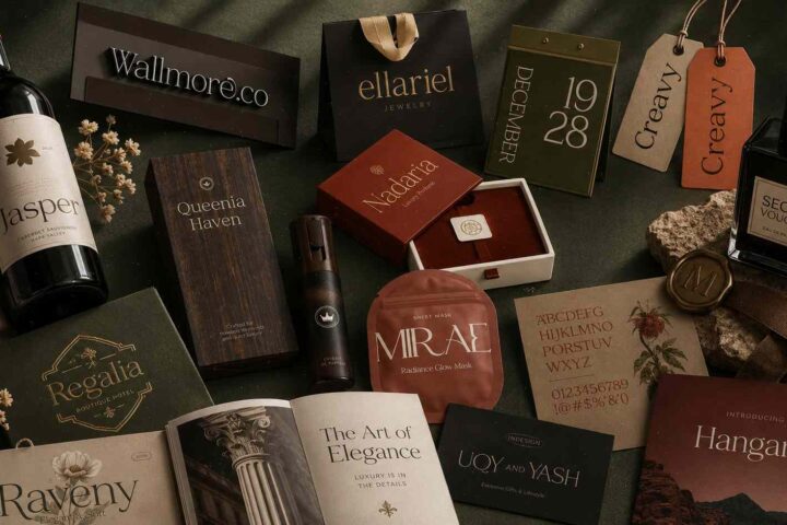
Luxury packaging has this weird effect where people decide how “expensive” something feels before they even touch it. I notice it constantly with skincare, candles, perfume bottles, even coffee packaging. The typography usually does the heavy lifting.
A good font can make a simple matte label look boutique-level. A bad one can make premium products feel oddly cheap, even when the packaging itself is beautiful.

And honestly, luxury branding has shifted a lot over the last few years. It’s not all ornate serif logos and gold foil anymore. A lot of modern premium brands are leaning into clean sans serifs, spacious typography, soft minimalism, and editorial-style layouts. You see it everywhere now in beauty brands, wellness packaging, fashion labels, and high-end lifestyle products.
Some links in this article may be affiliate links. If you purchase through them, we may earn a small commission at no extra cost to you. Thanks for supporting our work.
After digging through a lot of branding projects, packaging trends, and font libraries, these are the fonts that genuinely stand out for luxury product labels right now.
Some feel timeless. Some feel modern and fashion-forward. A few lean more artistic or futuristic. But all of them work beautifully when paired with thoughtful packaging design.
18 Best Fonts for Luxury Product Labels
1. Rosean
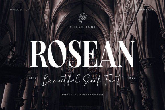
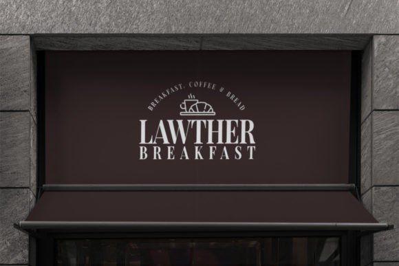
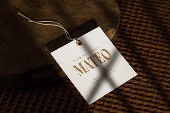
Rosean has that classic high-fashion editorial feel that immediately works for luxury labels.
The contrast between thick and thin strokes gives it a refined appearance without becoming difficult to read. Some serif fonts look gorgeous in previews but become messy on actual packaging. Rosean holds up surprisingly well, especially on foil-stamped labels or embossed boxes.
It feels especially suited for:
- perfume packaging
- boutique skincare
- luxury candles
- premium fashion branding
One thing I really like about Rosean is that it doesn’t feel trendy. It has that timeless magazine-style elegance that tends to survive design trend cycles pretty well.
2. Agiest
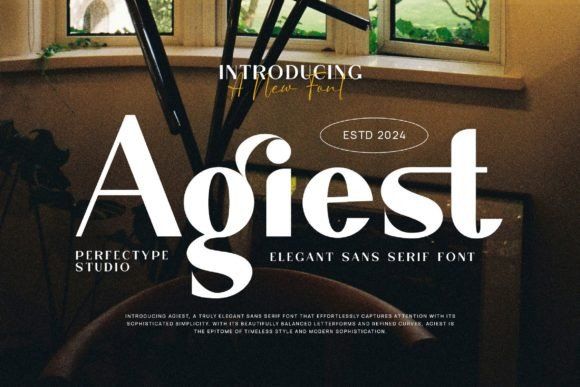
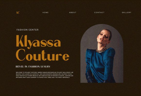
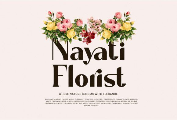
Agiest feels cinematic.
The tall proportions and sharp elegance instantly remind me of luxury fragrance campaigns or premium fashion editorials. It has a dramatic quality without looking overly decorative.
I could easily see this on:
- perfume bottles
- minimalist beauty packaging
- jewelry branding
- boutique hotels
Some serif fonts can feel cold or stiff. Agiest still feels soft enough to work across feminine branding while maintaining a polished upscale look.
3. Metzler
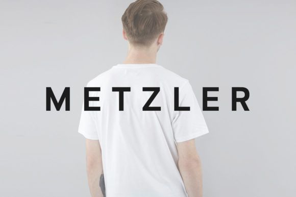
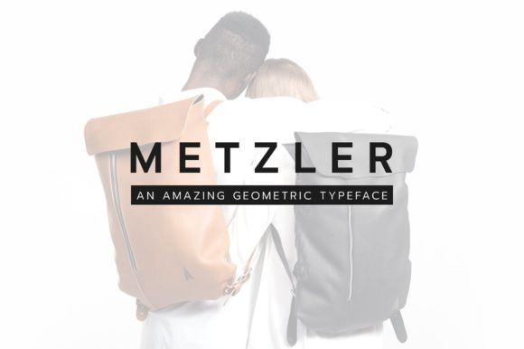
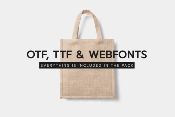
Metzler proves that luxury typography doesn’t need decorative details to feel expensive.
This is a geometric sans serif with extremely clean structure and beautiful spacing. It works especially well for modern luxury brands that want minimal packaging without looking sterile.
Honestly, this kind of typography is everywhere right now in:
- premium skincare
- wellness brands
- luxury supplements
- minimalist candle labels
The spacing is what really makes it work. Wide tracking instantly gives packaging that editorial “breathing room” luxury brands love using lately.
4. Andores
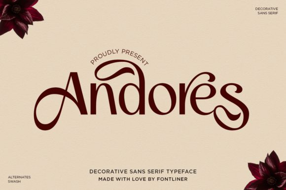
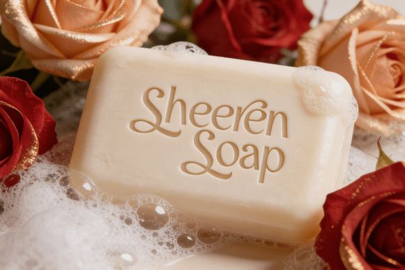
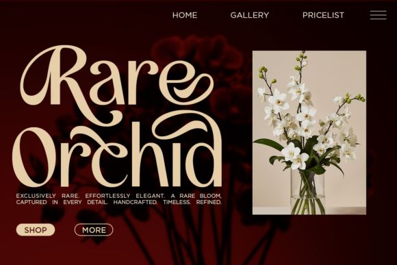
Andores leans softer and more emotional than most modern luxury fonts.
The subtle swashes add personality without overwhelming the packaging, which is surprisingly hard to pull off. A lot of decorative fonts quickly become cheesy in real-world branding. This one still feels tasteful.
It works beautifully for:
- feminine packaging
- floral branding
- romantic candle collections
- artisanal cosmetics
There’s something very boutique about it. It feels curated instead of mass-produced.
5. Wavea
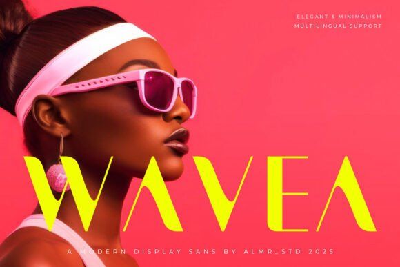

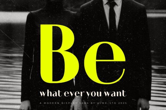
Wavea has that sleek fashion-brand energy that instantly makes packaging feel modern.
The thin geometric structure gives labels a very elevated appearance, especially when paired with muted palettes, matte finishes, or minimalist layouts.
I’ve noticed fonts like this photograph extremely well too, which matters now that so many brands rely heavily on Instagram, Pinterest, and online storefronts.
Wavea feels especially strong for:
- skincare packaging
- wellness branding
- premium cosmetics
- minimalist fragrance brands
It’s simple, but not boring.
6. Lepston
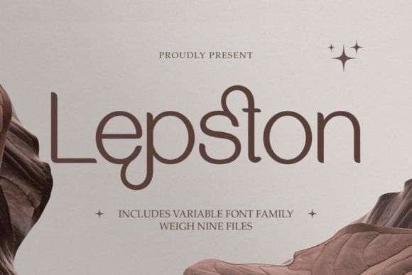
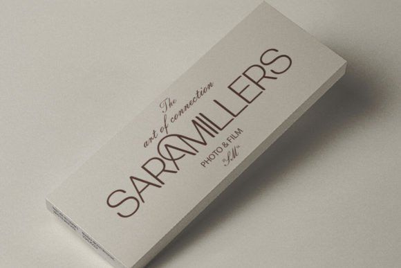
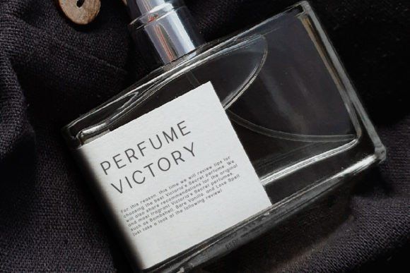
Lepston is one of the more versatile luxury fonts on this list.
The rounded details soften the typography enough that it feels approachable, while the thin lines still maintain a very premium editorial aesthetic.
This is the kind of font that works across an entire branding system:
- packaging
- websites
- shopping bags
- social graphics
- product inserts
That flexibility matters more than people realize. Some fonts look amazing on labels but awkward everywhere else.
Lepston transitions really smoothly across platforms.
7. Grebavi
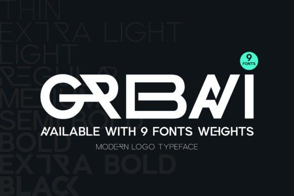
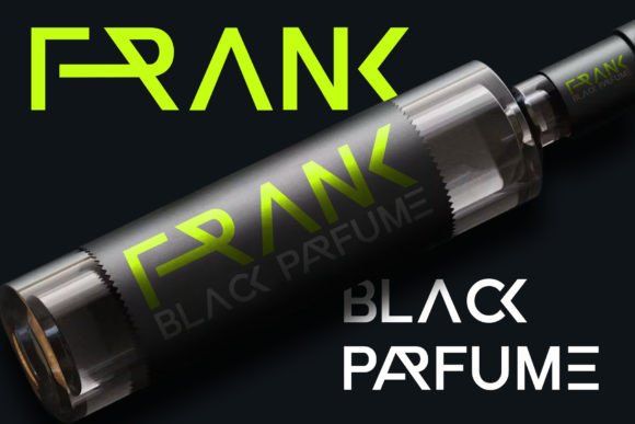
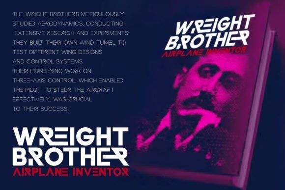
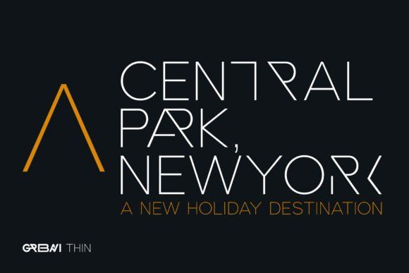
Grebavi feels futuristic in a very polished way.
The geometric structure and ligatures create a strong luxury-tech aesthetic that works incredibly well for modern branding. It feels expensive through precision rather than ornament.
I’d use this for:
- luxury streetwear
- premium gadgets
- futuristic skincare
- high-end wellness products
- modern fragrance brands
The ligatures are especially useful if you want logos or wordmarks to feel more custom-designed.
8. Retro Signature
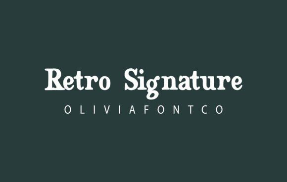
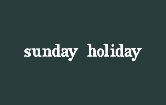

Retro Signature has warmth that a lot of luxury fonts lack.
Instead of feeling corporate or ultra-minimal, it feels personal and handcrafted. That’s becoming increasingly valuable because consumers are gravitating toward brands that feel more authentic and story-driven.
This font works beautifully for:
- boutique coffee packaging
- candle labels
- gourmet foods
- handmade skincare
- vintage-inspired branding
It has personality without becoming messy.
9. Mooner
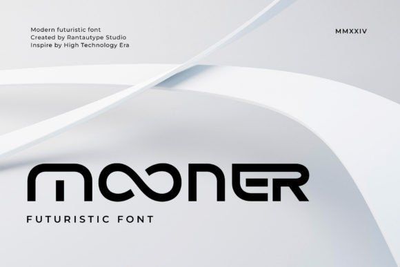
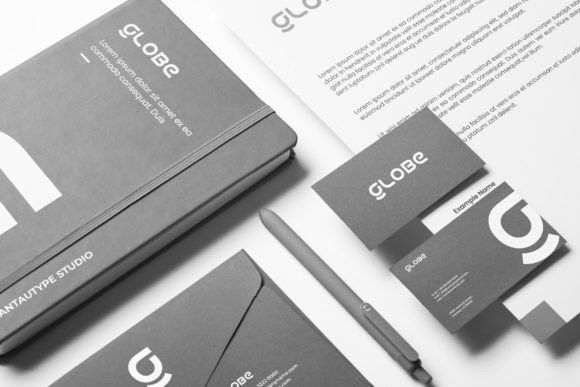
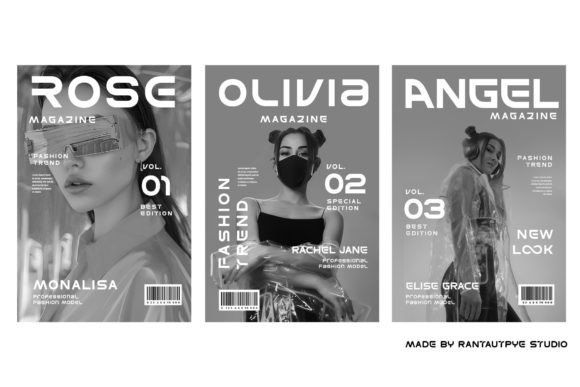
Mooner leans fully into futuristic luxury.
The rounded geometry gives it a sleek sci-fi atmosphere, but it still feels refined enough for premium branding. That balance is surprisingly difficult to get right.
A lot of futuristic fonts end up looking gimmicky. Mooner still feels usable.
Best suited for:
- luxury tech products
- gaming accessories
- futuristic cosmetics
- wellness technology
- modern sports branding
This font would look incredible with metallic foil or holographic packaging finishes.
10. Father Smiles
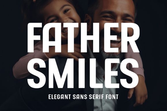
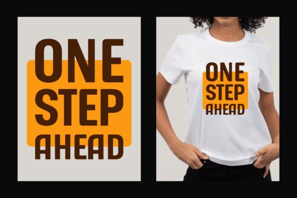
Father Smiles is bold in a way that still feels upscale.
Some luxury brands rely on delicate typography, but this font proves heavy sans serifs can work beautifully too. It feels confident without becoming aggressive.
I’d especially consider this for:
- premium liquor labels
- men’s grooming products
- fashion packaging
- luxury athletic branding
It has strong shelf presence, which matters when products compete visually in stores.
11. Spritzy
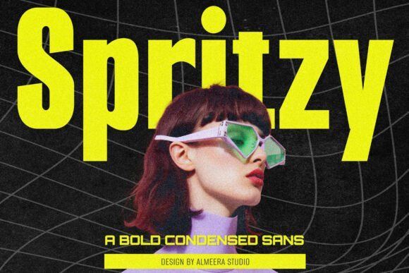
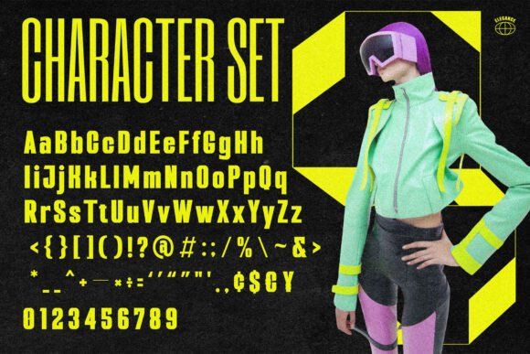
Spritzy brings a more youthful luxury aesthetic.
The condensed structure creates strong vertical impact without taking up excessive space on labels. That becomes really useful on smaller packaging formats.
It feels modern, energetic, and fashion-forward.
This font works especially well for:
- trendy beverage brands
- premium streetwear
- statement cosmetics
- bold lifestyle products
It pairs beautifully with high-contrast packaging and metallic accents.
12. Martix
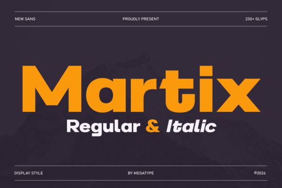
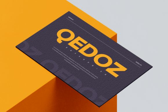
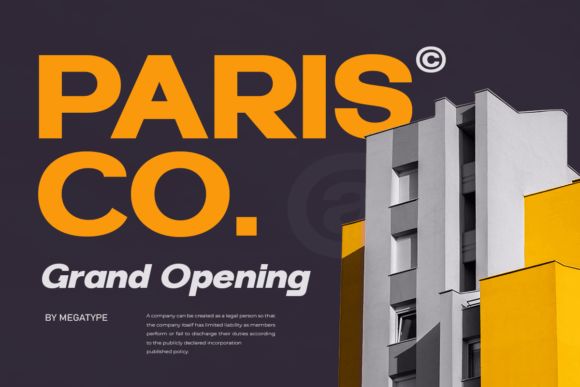
Martix blends industrial geometry with upscale minimalism.
The structure feels very editorial, almost like typography pulled from modern architecture magazines or fashion publications.
I could see this working well for:
- luxury supplements
- premium beverages
- contemporary fashion brands
- wellness packaging
The italic variations are surprisingly useful too. They add movement without disrupting the clean aesthetic.
13. Lagande
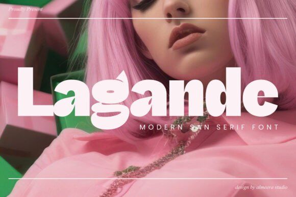
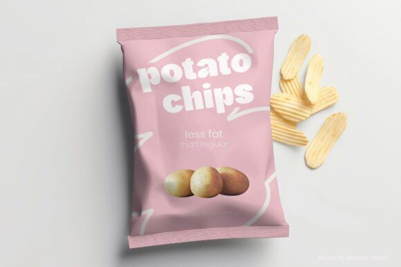
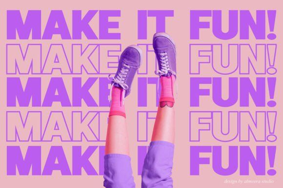
Lagande feels polished immediately.
It has enough visual personality to stand out on shelves while still maintaining the restraint luxury branding usually needs.
One thing I appreciate about Lagande is readability. It still performs well on curved packaging and smaller labels, where many luxury fonts start struggling.
This makes it practical for:
- beauty brands
- boutique drinks
- upscale snacks
- modern skincare
Especially if your packaging style leans minimal and clean.
14. Burnrock
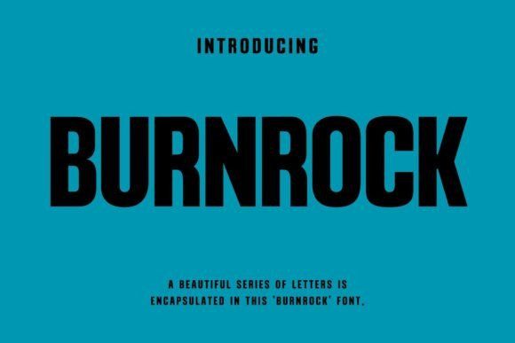
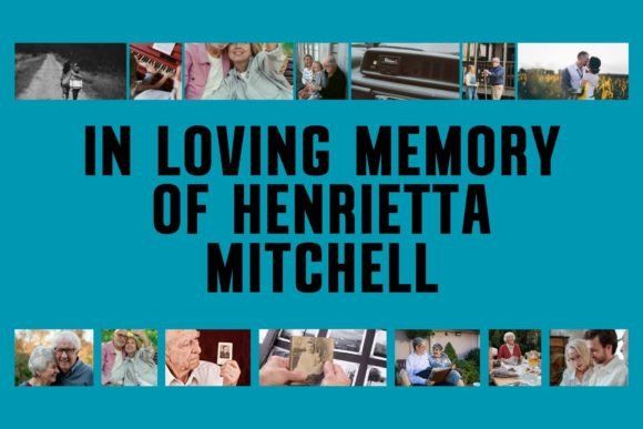
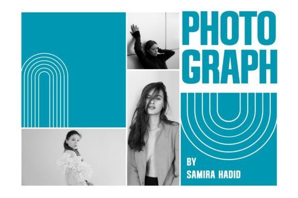
Burnrock takes a much bolder approach to luxury packaging.
The sharp futuristic styling creates instant impact, especially for younger premium audiences that associate exclusivity with innovation and individuality rather than tradition.
This font feels perfect for:
- gaming products
- luxury streetwear
- premium energy drinks
- edgy cosmetics
- modern fitness brands
Not every luxury label needs to feel quiet and understated. Burnrock proves bold branding can still feel premium when executed carefully.
15. Fanny
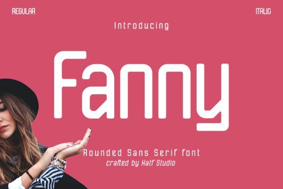
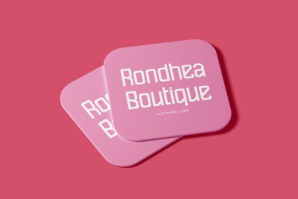
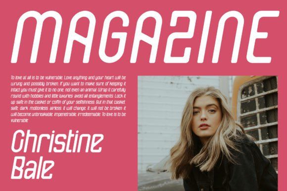
Fanny feels softer, warmer, and more approachable than most luxury fonts.
That rounded structure works incredibly well for modern brands trying to feel premium without becoming intimidating or overly formal.
It’s especially effective for:
- boutique skincare
- wellness products
- feminine branding
- premium children’s products
- artisanal packaging
Muted colors and textured labels pair especially nicely with this font.
16. Jumbone
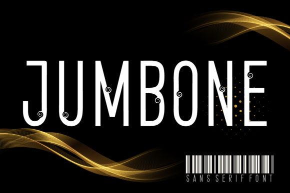
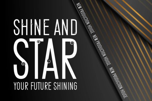
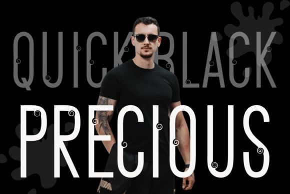
Jumbone has this handcrafted elegance that immediately creates emotional texture.
It almost feels custom-lettered, which gives products a much more boutique atmosphere. That handmade feeling has become a huge part of modern luxury branding lately.
Best suited for:
- artisanal candles
- handmade cosmetics
- luxury stationery
- boutique hospitality branding
- gourmet packaging
It feels artistic without sacrificing readability, which is harder to find than people think.
17. Bralwood
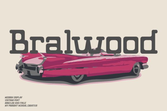
Bralwood mixes retro influence with strong premium character.
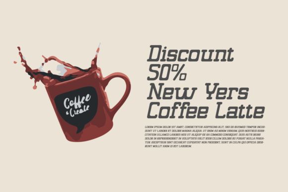
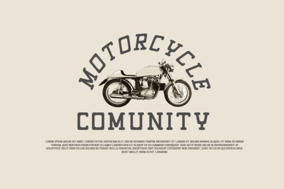
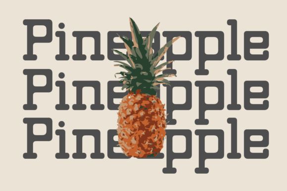
The thick vintage-inspired structure creates immediate visual authority while still feeling refined enough for luxury applications.
This font feels especially strong for:
- whiskey labels
- craft beverages
- gourmet coffee
- barbecue sauces
- heritage-inspired branding
When paired with textured paper or earthy packaging tones, it looks incredibly convincing.
18. Unesa
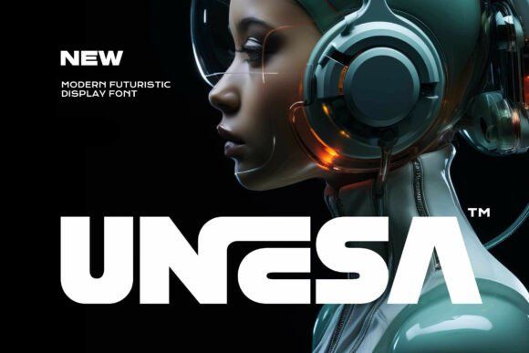
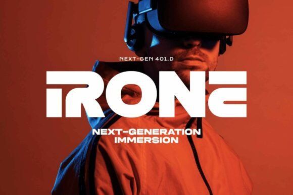
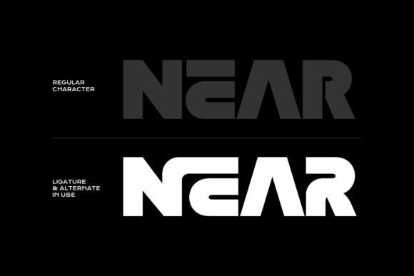
Unesa feels cinematic.
The futuristic structure creates strong visual impact while still maintaining clean sophistication. It’s bold, sleek, and very modern.
I’d especially consider this for:
- gaming accessories
- premium athletic brands
- luxury streetwear
- modern tech packaging
- futuristic beauty brands
It feels designed for younger luxury audiences that want exclusivity mixed with innovation.
While exploring the best sans serif fonts for luxury product labels, you might also be interested in how certain styles, like rounded sans serif fonts, are making a significant impact on modern branding. Discover 18 Rounded Sans Serif Fonts for Modern Branding.
Final Thoughts
Typography quietly shapes almost every luxury product experience.
People may not consciously analyze spacing, curves, or stroke contrast, but they absolutely feel the difference. That emotional reaction is what separates packaging that looks expensive from packaging that just looks decorated.
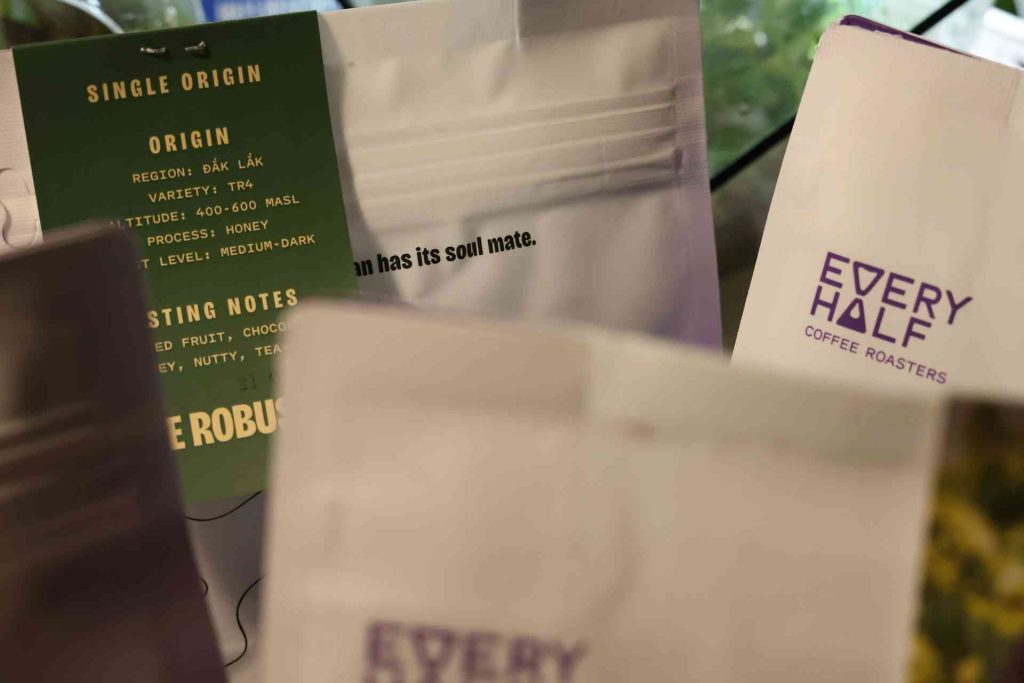
Some of these fonts lean timeless and editorial. Others feel futuristic or bold. The best choice really depends on the personality of the brand you’re building.
But if there’s one thing I’ve noticed from looking at a lot of premium packaging lately, it’s this:
The most convincing luxury branding rarely tries too hard.
FAQs
What type of font looks most luxurious?
Elegant serif fonts and clean modern sans-serif fonts are most commonly associated with luxury branding. Serif fonts suggest heritage and sophistication, while minimalist sans-serifs communicate modern premium aesthetics.
Are sans-serif fonts good for luxury labels?
Yes. Modern luxury brands frequently use sans-serif fonts because they create clean, sophisticated, and minimalist packaging. Fonts like Metzler, Wavea, and Lepston are excellent examples.
Which font works best for perfume packaging?
Fonts like Rosean, Agiest, Andores, and Lepston work exceptionally well for perfume packaging because they combine elegance, readability, and premium visual appeal.
Should luxury labels use decorative fonts?
Decorative fonts can work beautifully when used carefully. Fonts like Andores and Retro Signature add emotional storytelling and uniqueness without sacrificing sophistication.
How many fonts should a luxury brand use?
Most luxury brands use one or two font families consistently. Too many fonts create visual chaos and weaken brand identity. Consistency is key to maintaining a premium image.
Follow Us