

13 Packaging Sans Serif Fonts for Premium Luxury Branding
Packaging has this weird effect where people decide how “expensive” something feels before they even touch it. I notice it constantly with skincare, candles, coffee bags, even small Etsy brands. Sometimes the product itself is great, but the typography quietly pulls the whole thing down.
Some links in this article may be affiliate links. If you purchase through them, we may earn a small commission at no extra cost to you. Thanks for supporting our work.
And honestly, fonts are usually the reason.
A clean sans serif font can make a simple label feel refined, modern, and intentional. The wrong one makes premium packaging look generic in seconds. That’s why so many luxury brands lean heavily into minimalist typography now — especially in beauty, fashion, fragrance, and boutique packaging.

The interesting part is that premium sans serif fonts don’t necessarily look flashy. Most of the time, they’re restrained. Better spacing. Better proportions. Cleaner rhythm. Small details people don’t consciously notice… but definitely feel.
In this guide, I went through 13 elegant sans serif fonts that genuinely work well for premium packaging design. Some feel editorial and fashion-focused, others are softer and minimalist, and a few lean bold and cinematic. All of them have strong packaging potential when used thoughtfully.
13 Elegant Packaging Sans Serif Fonts That Look Premium
1. The Lonely
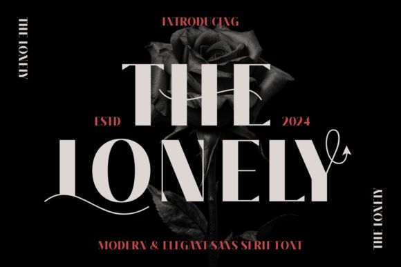
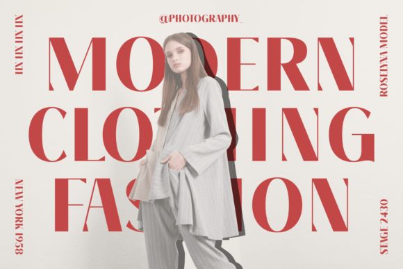
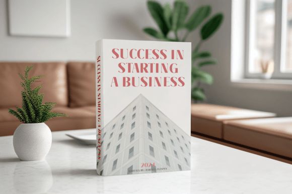
The Lonely has a dramatic editorial feel that instantly reminds me of luxury perfume campaigns and boutique fashion packaging.
It’s modern, elegant, and slightly cinematic without becoming difficult to read. The elongated shapes and refined contrast give it a polished high-fashion aesthetic that works beautifully on minimalist layouts.
I especially like this one for black packaging with metallic foil. It has that “premium fragrance counter” energy.
Best for:
- perfume packaging
- luxury candles
- boutique skincare
- editorial beauty branding
- fashion labels
The uppercase styling looks particularly strong when paired with lots of negative space.
2. Aureva
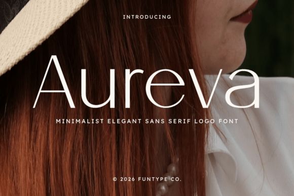
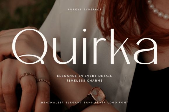
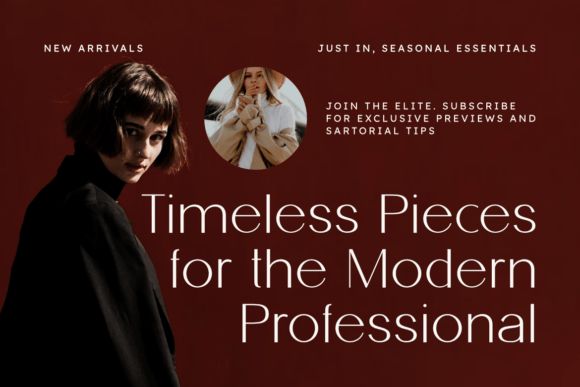
Aureva feels quieter and softer compared to some of the more dramatic fonts on this list.
The spacing is what makes it work so well. Everything feels airy and balanced, which gives the typography a calm luxury feel instead of a trendy one.
This font fits perfectly into the whole quiet luxury aesthetic that’s dominating skincare and fashion branding right now.
Best for:
- skincare packaging
- jewelry branding
- premium stationery
- wedding packaging
- minimalist beauty labels
Personally, I think Aureva looks best with warm neutral palettes and textured packaging materials.
3. Groote
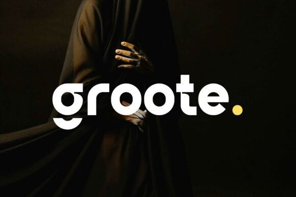
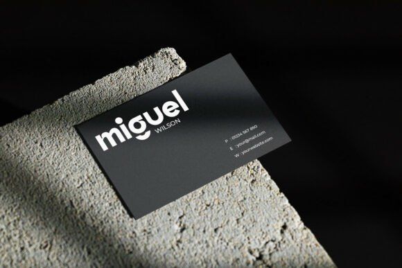
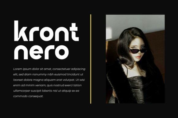
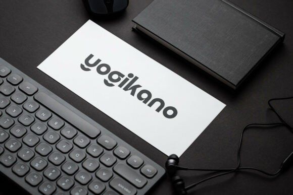
Groote adds a little more weight and presence while still staying refined.
Some ultra-thin luxury fonts disappear on packaging, especially smaller labels. Groote avoids that problem because it has stronger structure and cleaner readability.
The rounded geometry also makes it feel more approachable.
Best for:
- premium coffee packaging
- modern beverage labels
- lifestyle branding
- street-luxury fashion
- tech-focused packaging
It works especially well on larger applications like rigid boxes and shopping bags.
4. Bigdream
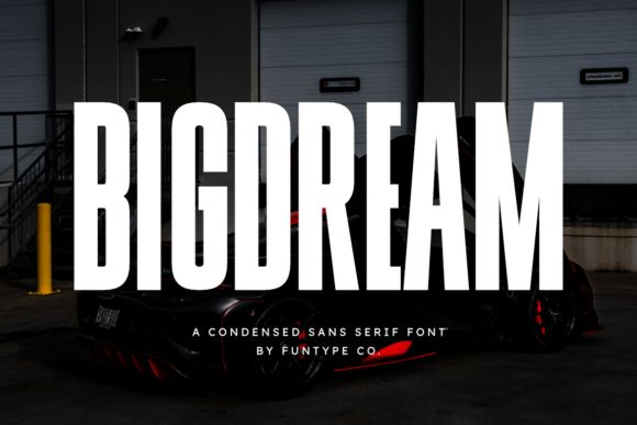
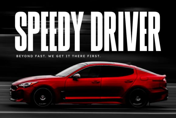
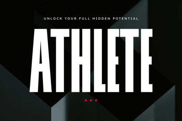
Bigdream is bold, condensed, and very confident.
This one feels more like premium automotive branding or luxury men’s grooming than soft minimalist skincare. It has a strong vertical structure that immediately grabs attention.
Definitely not subtle — but still elegant in the right context.
Best for:
- energy drink packaging
- men’s grooming products
- automotive branding
- luxury sports packaging
- fashion campaigns
I’d use this carefully though. Bigdream shines most in headlines and large-format typography rather than small body text.
5. Ennora
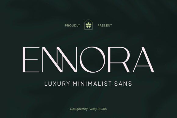
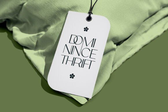
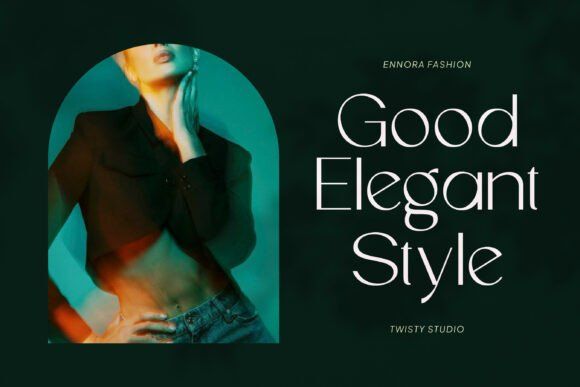
Ennora has that soft minimalist beauty branding feel that’s become really popular recently.
What I like about it is that it still feels human. Some minimalist fonts get too clinical, but Ennora keeps enough warmth in the curves to feel elegant instead of sterile.
It almost feels spa-like visually.
Best for:
- organic skincare
- wellness packaging
- feminine branding
- boutique perfume labels
- luxury invitations
This font pairs beautifully with matte textures and embossed finishes.
6. Noveau
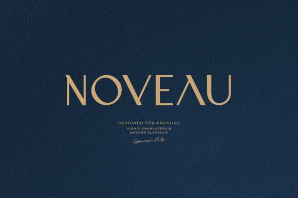

Noveau leans heavily into prestige luxury branding.
The uppercase styling gives it a very commanding presence that feels expensive immediately. It reminds me of high-end fragrance packaging or premium jewelry boxes where typography becomes the centerpiece.
The spacing here is excellent too. Nothing feels cramped.
Best for:
- jewelry packaging
- perfume bottles
- champagne labels
- luxury fashion branding
- editorial covers
Gold foil with Noveau looks especially good. Probably one of the strongest foil-stamping fonts on this list.
7. Velocia
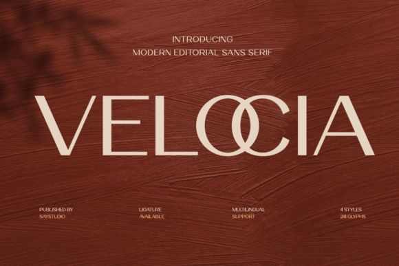
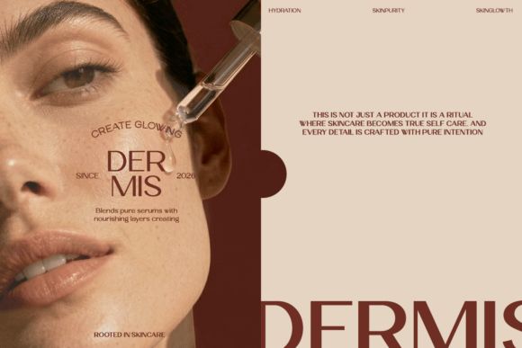
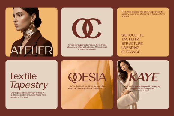
Velocia blends editorial sophistication with modern geometry really well.
There’s a smoothness to it that makes words feel almost custom-designed, especially in larger headlines. That subtle editorial personality gives packaging a more elevated feel without looking overly decorative.
Best for:
- fashion packaging
- boutique wine labels
- ecommerce branding
- editorial beauty products
- lifestyle packaging
One thing I appreciate about Velocia is how versatile it feels across both print and digital use.
8. Caveline
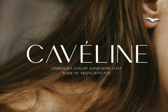
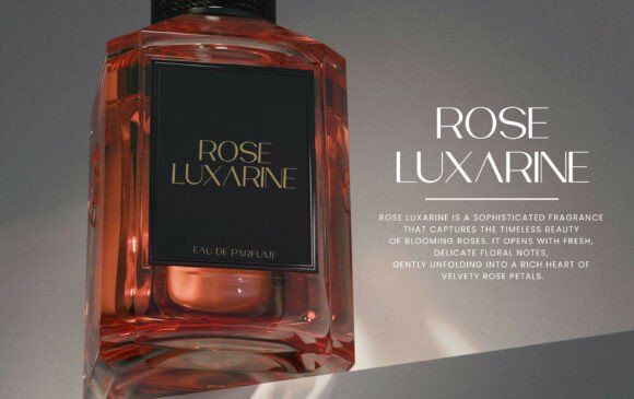
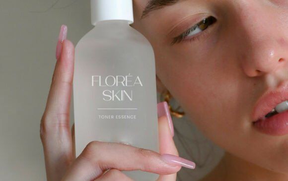
Caveline is minimalist but surprisingly readable.
A lot of thin luxury fonts completely fall apart at smaller sizes, especially on labels. Caveline holds up much better than most.
It feels delicate without becoming fragile.
Best for:
- candle labels
- beauty packaging
- wedding branding
- skincare products
- minimalist social branding
This is the kind of font that works best when the overall design stays restrained.
9. Nerova
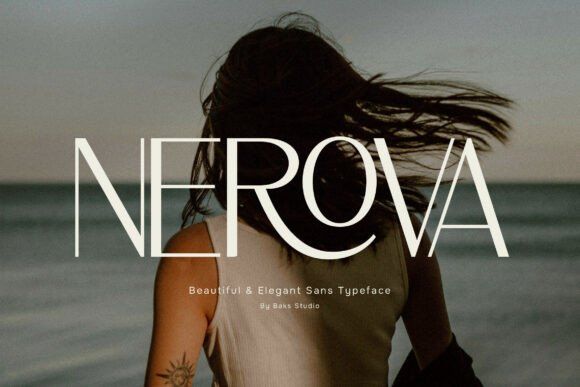
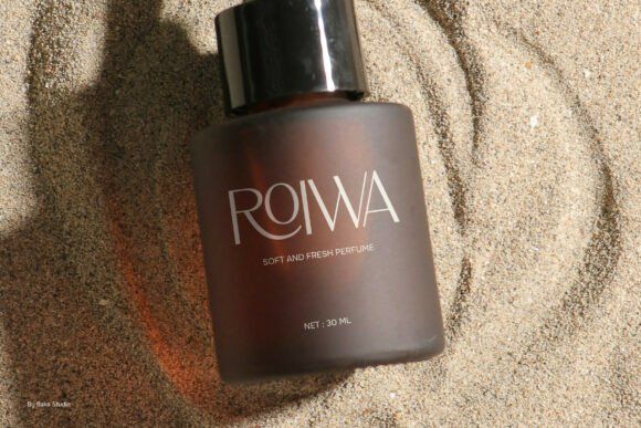
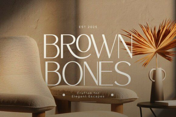
Nerova sits right in the middle between modern minimalism and timeless luxury.
It doesn’t push too hard stylistically, which honestly makes it more useful long-term. Some fonts feel exciting initially but become exhausting after repeated use. Nerova stays balanced.
Best for:
- cosmetics packaging
- wellness products
- boutique retail labels
- editorial packaging
- premium ecommerce branding
Very flexible font overall. Probably one of the safest choices if you’re building a broader packaging system.
10. Skinova
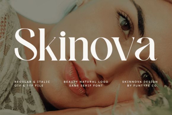
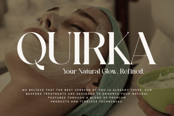
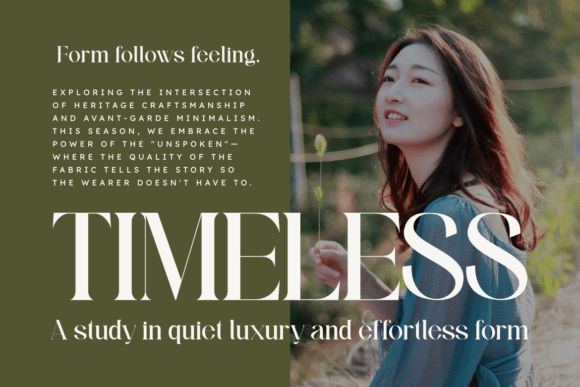
Skinova was clearly designed with beauty branding in mind.
The soft curves and higher contrast strokes create a smoother, more feminine feel compared to sharper geometric sans serifs.
It photographs beautifully too, which matters a lot for beauty brands now.
Best for:
- skincare labels
- spa branding
- cosmetic packaging
- feminine product branding
- luxury invitation design
I could easily see this used on minimalist glass serum bottles.
11. Elvera
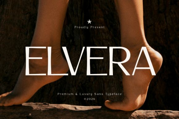
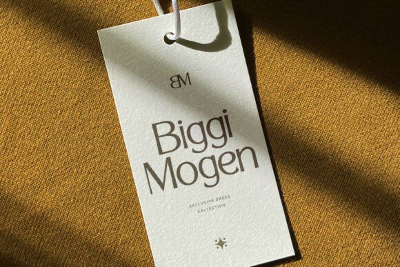
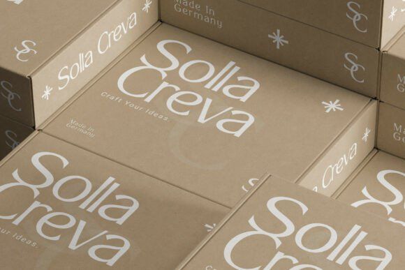
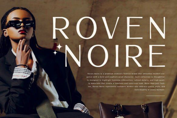
Elvera feels architectural in the best way.
Very clean. Very balanced. Nothing excessive.
This is the type of font that works well for brands trying to look timeless rather than trendy. It doesn’t rely on gimmicks or exaggerated details to feel premium.
Best for:
- fashion campaigns
- premium retail packaging
- luxury product launches
- editorial branding
- minimalist packaging systems
Also extremely adaptable across different materials and print finishes.
12. Affigue
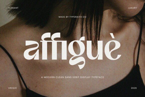
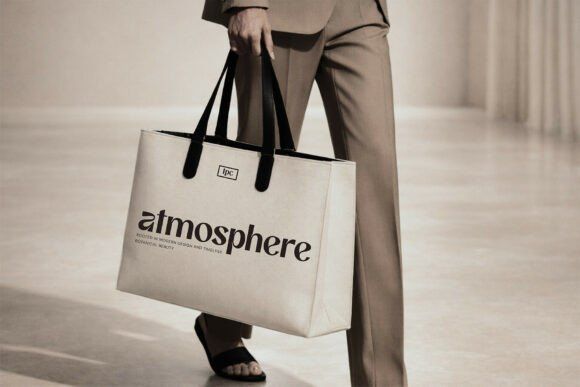
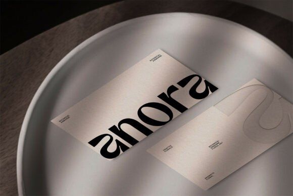
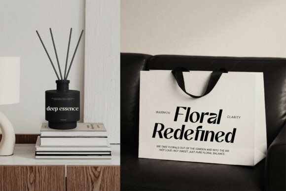
Affigue adds more personality than some of the cleaner minimalist fonts here.
There are subtle stylistic details throughout the letterforms that give it a more fashion-forward editorial energy. It feels artistic while still staying polished.
Best for:
- fashion packaging
- beauty branding
- luxury posters
- campaign visuals
- editorial-inspired labels
This one definitely works better at larger sizes where those details can breathe properly.
13. Vorue
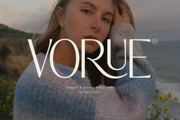
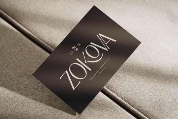
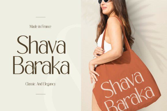
Vorue finishes the list with a really nice retro-modern balance.
There’s a softness to it that feels very European fashion editorial. Slightly vintage-inspired, but still contemporary enough for modern luxury branding.
It has personality without feeling gimmicky.
Best for:
- boutique fashion labels
- lifestyle branding
- summer collections
- editorial beauty packaging
- premium retail products
Honestly, this font would look incredible on textured packaging with muted earthy colors.
How to Choose the Right Packaging Font for Your Brand
The best packaging font depends heavily on the type of emotional response you want.
A luxury skincare brand usually benefits from softer minimalist typography. An automotive or tech product may need something bolder and more geometric.
A few things worth considering:
- packaging material
- printing method
- readability at small sizes
- digital presentation
- target audience
- product positioning
One mistake I see constantly is choosing fonts purely from mockups without testing them on realistic packaging sizes.
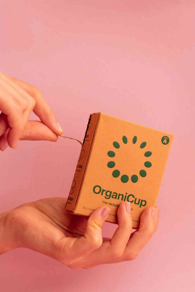
A font can look amazing in a giant Behance presentation and become unreadable on an actual product label.
Always test:
- small labels
- mobile previews
- foil stamping
- embossing
- ecommerce thumbnails
That usually reveals problems quickly.
Matching Fonts With Product Categories
Different font styles naturally align with different industries.
| Product Type | Recommended Style |
|---|---|
| Skincare & Beauty | Thin minimalist sans serif |
| Automotive & Tech | Bold geometric sans serif |
| Perfume & Jewelry | Elegant uppercase display fonts |
| Fashion Packaging | Editorial sans serif |
| Organic Wellness | Soft curved minimalist fonts |
| Luxury Beverages | Condensed premium display fonts |
Typography works best when it reinforces the product experience instead of fighting against it.
If you're looking for even more beautiful typefaces to make your products stand out, you'll love our selection of 17 Premium Fonts for Elegant Packaging Design.
Final Thoughts
Elegant sans serif fonts have basically become the visual language of modern premium packaging.
And honestly, for good reason.
They’re versatile, readable, modern, and adaptable across both physical packaging and digital branding. The best ones feel refined without trying too hard.
Fonts like The Lonely, Aureva, Velocia, and Noveau each create very different moods, but all of them can elevate packaging when paired with thoughtful design decisions.
At the end of the day, premium branding usually comes down to restraint. Better spacing. Better balance. Better typography choices.
Not more decoration.
FAQs
Why do luxury brands use sans serif fonts?
Sans serif fonts feel clean, modern, and adaptable across packaging, ecommerce, and social media. They also reproduce well on premium materials like foil, embossing, and textured paper.
Are minimalist fonts better for skincare packaging?
Usually, yes. Minimalist typography creates a calm and refined aesthetic that fits naturally with beauty, wellness, and skincare branding.
What makes a font look expensive?
Good spacing, refined proportions, balanced geometry, and subtle visual consistency tend to make typography feel more premium.
Can bold sans serif fonts still feel luxurious?
Definitely. Fonts like Bigdream and Groote prove that bold typography can still feel sophisticated when the proportions and spacing are handled well.
Follow Us