

ℹ️ Affiliate Disclosure: This article may contain affiliate links. We may earn a commission at no extra cost to you. Thanks for your support! ❤️
How to Choose Canva Fonts for Professional Designs
Clean typography can make a Canva design feel more credible before anyone reads a single sentence. When I’m choosing Canva fonts for professional designs, I look for balanced letterforms, strong readability, restrained details, and enough personality to keep the finished layout from looking like a default corporate template.
For this list, I focused mainly on geometric and minimalist sans serifs, with a few more distinctive options for logos and editorial-style headings. These are Creative Fabrica fonts rather than a list limited to Canva’s built-in library, so they’re especially useful when you want a brand identity that feels less familiar. Canva currently supports uploading custom brand fonts through its Brand Kit tools on eligible plans, subject to the font license and account permissions.
Quick Picks
My quick answer: the best clean professional Canva fonts combine simple shapes with clear spacing and a distinctive but controlled personality. Geomatrix and Carteny are strong all-purpose choices, Saficel offers more weight flexibility, Maison suits polished lifestyle layouts, and Perfect Corporate is a natural fit for presentations and business graphics.
21 Clean Canva Fonts I’d Use for Professional Designs
1. Saficel
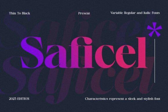
Saficel is a sleek modern sans serif for designers who want one professional typeface with enough range to build a fuller visual hierarchy. The family runs from thin through heavy styles and includes regular and italic variations, giving it more flexibility than a single-weight display face.
I’d put Saficel near the top of my list for pitch decks, brand guides, LinkedIn graphics, and polished service-business content. Its biggest advantage is flexibility: you can create contrast through weight rather than introducing several unrelated fonts.
Best for: presentations, brand systems, business graphics
Key features: multiple weights, regular and italic styles, sleek contemporary structure
2. Geomatrix
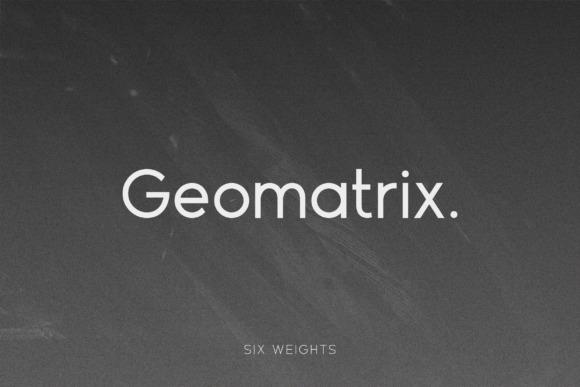
Geomatrix is a geometric sans serif family with open forms and a clean contemporary rhythm, making it one of the most versatile fonts in this roundup. Creative Fabrica shows multiple weights including thin, light, medium, bold, and black.
This is my pick when a Canva project needs to look modern without leaning too fashionable or too corporate. I’d use lighter weights for supporting copy and stronger weights for headings, which makes Geomatrix useful for everything from PDFs to website mockups.
Best for: websites, lead magnets, brand templates
Key features: geometric construction, open shapes, multiple weights
3. Artega
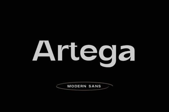
Artega is a minimalist geometric sans serif with straightforward shapes suited to clean logos, headings, and modern social graphics. Its restrained construction keeps the visual tone neat without making the typography disappear completely.
I’d use Artega when the layout already contains photography, icons, or strong color and the typography needs to stay controlled. It is less suited to a brand that depends on ornamental or highly expressive lettering, but that limitation is exactly why it fits minimal Canva designs.
Best for: minimal logos, social posts, modern headers
Key features: geometric forms, minimalist appearance, clean sans-serif construction
4. Mograph
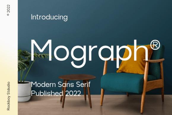
Mograph is a minimal modern sans serif designed as a straightforward typeface for a broad range of layouts. Its clean letterforms make it especially easy to imagine in uncluttered Canva compositions where readability matters more than decorative detail.
I like Mograph for promotional graphics that need to feel current without looking trendy for the sake of it. It is a sensible supporting font for quote graphics, simple flyers, title cards, and neutral small-business branding.
Best for: flyers, quote cards, simple promotions
Key features: modern sans serif, minimal detailing, versatile visual tone
5. Gianna
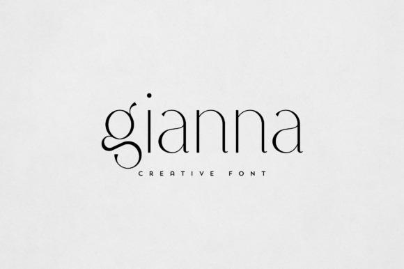
Gianna is an elegant sans serif aimed at branding, packaging, headlines, magazine-style graphics, and text overlays. It carries more visual polish than a purely utilitarian corporate face while remaining considerably cleaner than a script or decorative display font.
I’d choose Gianna for consultants, beauty brands, boutiques, or lifestyle businesses that want professionalism with a softer edge. For dense documents, I would still pair it with a very neutral body font and let Gianna handle the more visible typography.
Best for: elegant branding, packaging, magazine graphics
Key features: refined sans-serif styling, clean lines, versatile display use
6. Clean Modern
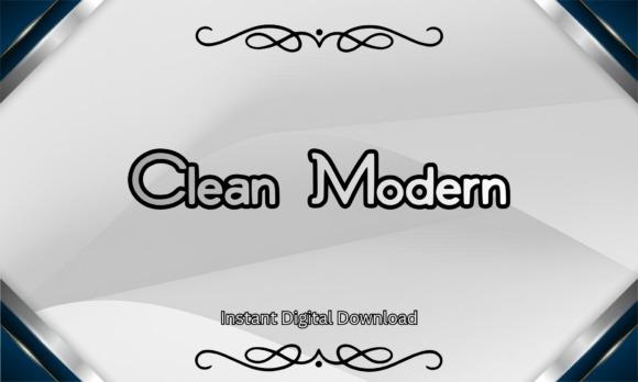
Clean Modern is a minimalist sans serif created specifically around a structured, professional look for branding, logos, signage, packaging, and digital design. The listing includes OTF and TTF files and explicitly identifies Canva among its compatible design workflows.
If you want a business font that communicates competence immediately, this is one of the most literal fits on the list. I’d keep the surrounding layout equally disciplined—simple grids, generous whitespace, and a limited color palette suit its character best.
Best for: business branding, storefront graphics, digital ads
Key features: bold structure, minimalist sans serif, OTF and TTF files
7. Goks
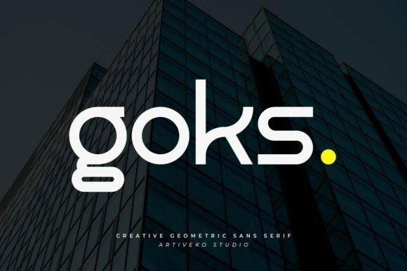
Goks is a clean sans-serif logo font that combines balanced proportions with distinctive character details. It is designed to retain a professional structure while giving logos more personality than an anonymous geometric typeface.
I’d reserve Goks for names, short headings, and identity work rather than long paragraphs. That focused role makes it useful when a Canva brand kit already has a neutral body font but still needs a recognizably different wordmark or campaign headline.
Best for: logos, wordmarks, campaign headlines
Key features: balanced proportions, distinctive details, clean sans-serif base
8. Modern Limited
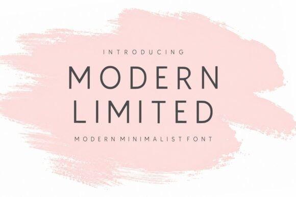
Modern Limited is a minimalist sans serif with balanced proportions and restrained contemporary letterforms. Its design emphasizes simplicity and readability, which places it comfortably in professional editorial and branding territory.
This would be one of my picks for a calm presentation deck, portfolio cover, architecture studio graphic, or upscale service brand. I would avoid crowding it with too many decorative elements; its appeal comes from the controlled spacing and low-noise aesthetic.
Best for: portfolios, presentations, minimal brands
Key features: balanced proportions, refined forms, contemporary sans-serif style
9. Motage
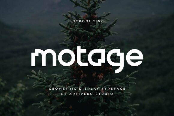
Motage is a geometric sans serif created for logo and identity work, using clean geometry and balanced proportions to produce a precise contemporary appearance. Its structured construction makes it particularly suitable for modern business and technology-oriented branding.
I’d use Motage when I want a Canva layout to feel intentional and slightly technical without drifting into science-fiction styling. It should suit startup pitch graphics, product launches, software mockups, and streamlined visual identities especially well.
Best for: tech branding, startups, product graphics
Key features: geometric construction, precise proportions, contemporary logo styling
10. Tanod
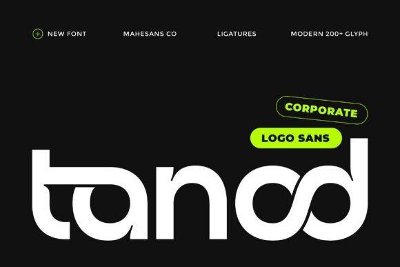
Tanod is a modern geometric sans serif that combines a clean structure with subtle character quirks, giving it a more distinctive identity than a standard corporate font. Its sharp, legible letterforms are positioned for logos, technology brands, and contemporary business identities.
I’d reach for Tanod when a logo needs to look polished but not generic. It has enough edge for premium product branding or a creative agency, though I would use its more distinctive forms selectively in text-heavy Canva documents.
Best for: premium logos, tech brands, agency graphics
Key features: geometric structure, sharp forms, distinctive character details
11. Minimalist
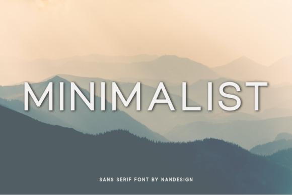
Minimalist is a slim, simple sans serif aimed at branding, magazine covers, packaging, social graphics, and other layouts that benefit from understated typography. Its light visual footprint makes it particularly suited to designs with generous negative space.
I’d use this font for elegant product imagery, simple quote graphics, or a restrained beauty and wellness aesthetic. Thin typography can lose impact at very small sizes, so I’d give it enough scale and contrast rather than forcing it into tiny labels.
Best for: packaging, beauty graphics, magazine covers
Key features: slim letterforms, simple structure, understated visual weight
12. Helagen
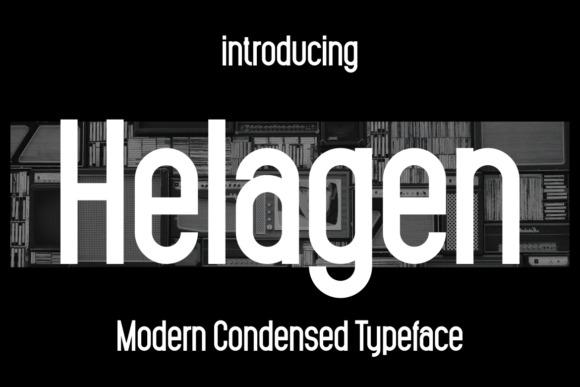
Helagen is a modern condensed font designed for branding and display applications including logos, blog headers, posters, stationery, and promotional graphics. Its narrower proportions help it fit substantial headline text into less horizontal space.
I’d choose Helagen for vertically oriented Canva posters, presentation covers, Pinterest graphics, or product labels where a wider sans serif feels too bulky. Condensed faces can become tiring in paragraphs, so I would keep this one focused on display text.
Best for: posters, narrow headlines, presentation covers
Key features: condensed proportions, modern styling, display-focused structure
13. Maison
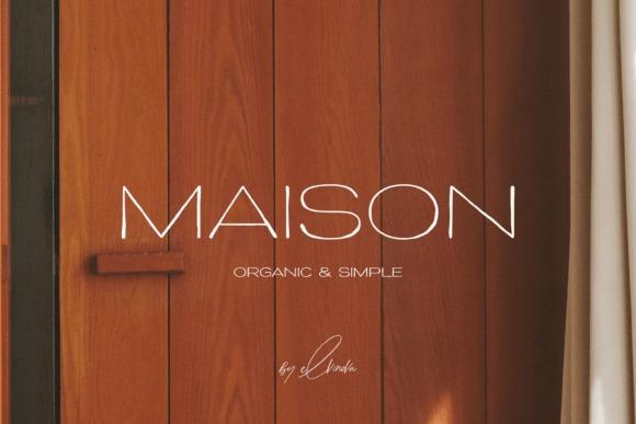
Maison is an elegant modern sans serif with a minimalist appearance suited to book covers, magazines, invitations, and social media layouts. The typeface leans polished and lifestyle-oriented while retaining the clean foundation needed for professional graphics.
This is one of my preferred styles for a brand that wants to look sophisticated without turning to high-contrast serif typography. I’d pair Maison with muted photography and plenty of breathing room for a contemporary editorial feel.
Best for: lifestyle brands, editorial posts, invitations
Key features: clean sans serif, elegant tone, minimalist styling
14. Perfect Corporate
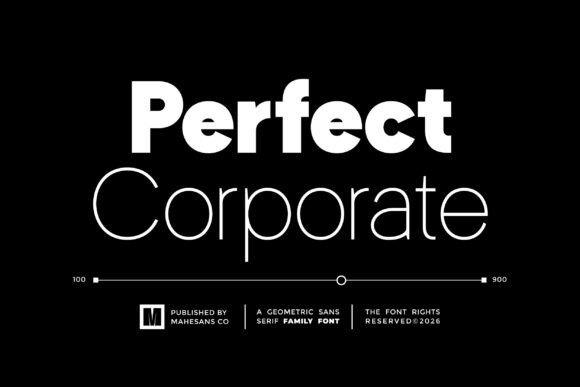
Perfect Corporate is a modern geometric sans serif designed around clarity, consistency, and professional visual impact. The styling makes its intended role unusually clear: this is typography for structured business communication rather than decorative headline work.
I’d use it for annual-report graphics, training slides, proposals, charts, business presentations, and LinkedIn carousels. If your brand needs friendliness or handcrafted character, another font may fit better, but for orderly information design this one makes immediate sense.
Best for: reports, presentations, corporate social posts
Key features: geometric construction, consistent proportions, business-focused styling
15. Agoma
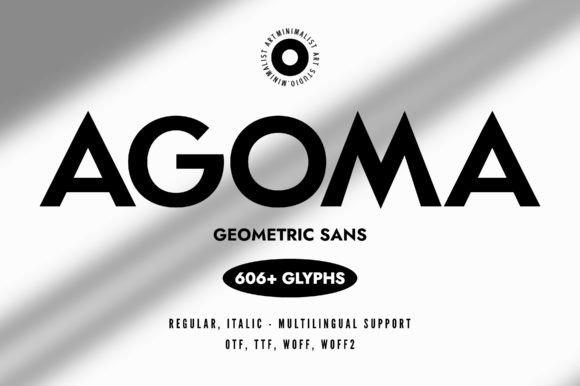
Agoma is a minimalist grotesk-style sans serif built with geometric precision and a clean modern appearance. Compared with the softer choices here, its stronger construction gives headings and logos a little more visual authority.
I’d choose Agoma for a creative studio, architecture brand, menswear concept, or modern product launch that needs bold typography without obvious ornament. Its character is better suited to confident headings than delicate wedding or romantic layouts.
Best for: bold branding, product launches, studio graphics
Key features: grotesk influence, geometric precision, strong clean shapes
16. Beauxri
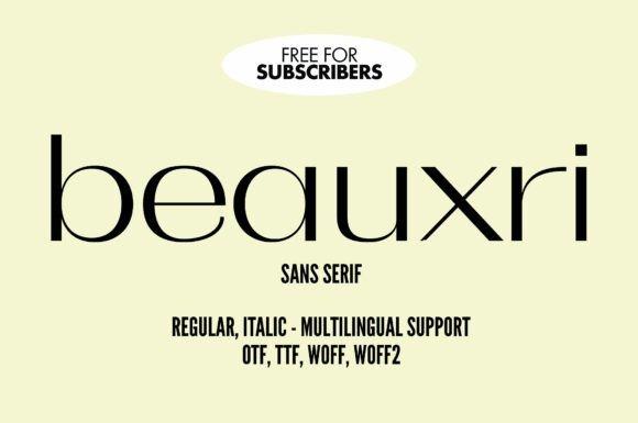
Beauxri is a chic modern sans serif that blends minimalist structure with a more fashion-conscious personality. It is presented for logo, magazine, website, and similar design applications and also includes broad language support.
I’d pick Beauxri for beauty, fashion, photography, personal-brand, or boutique content where a conventional office font feels too plain. It remains clean enough for professional use, but it brings noticeably more personality than the most neutral fonts in the list.
Best for: fashion branding, beauty graphics, magazines
Key features: minimalist construction, stylish details, broad language support
17. Modernis
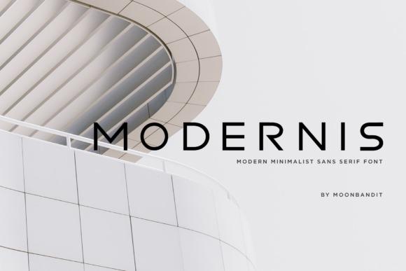
Modernis is a clean minimalist sans serif offered in regular and bold styles for logos, headlines, and display text. The two-weight setup is simple, but it gives Canva users enough contrast to create a basic heading hierarchy without complicating the brand system.
I’d use Modernis for creators who want an uncomplicated brand font they can deploy repeatedly across thumbnails, posts, covers, and promotional designs. If you need a large family with many weights, Geomatrix or Saficel provides more range.
Best for: social templates, logos, clean headlines
Key features: regular and bold styles, minimalist construction, straightforward display use
18. Carteny – Geometric Sans Family
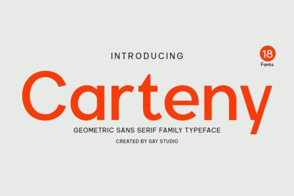
Carteny is a geometric sans-serif family based on clean shapes, precise proportions, and a balanced visual rhythm. Its stated focus on clarity and versatility makes it particularly well suited to coordinated design systems rather than one-off decorative graphics.
If I were building an entire Canva brand kit from scratch, Carteny would be one of my strongest candidates. The geometric approach is neutral enough to repeat across presentations, PDFs, website graphics, social posts, and identity pieces without creating stylistic friction.
Best for: brand systems, presentations, digital products
Key features: geometric family, balanced proportions, clean visual rhythm
19. Edtile
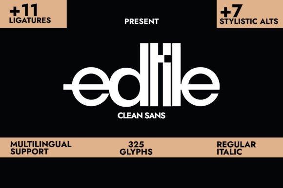
Edtile is a clean compressed sans serif intended for logo design, packaging, banners, and other layouts where narrow typography can create stronger visual impact. Its compressed proportions distinguish it from the rounder geometric fonts elsewhere on this list.
I’d use Edtile for product names, vertical layouts, labels, or large uppercase statements. It is less convincing as a default paragraph font, but as a controlled display face it can make a minimal Canva composition feel much more designed.
Best for: packaging, banners, product names
Key features: compressed width, minimalist construction, strong display presence
20. Bogea
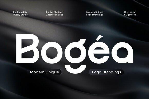
Bogea is a geometric sans serif designed around precision, balanced shapes, smooth curves, and professional logo use. It also includes alternate letterforms, giving designers room to customize individual characters when building a more distinctive identity.
I’d use Bogea when a clean wordmark needs just enough customization to avoid looking stock. The alternates are most valuable in short text such as company names, so I would keep longer supporting copy simpler and let the logo typography carry the personality.
Best for: logos, identity design, professional wordmarks
Key features: geometric shapes, smooth curves, alternate characters
21. Marquis – Elegant Modern Serif
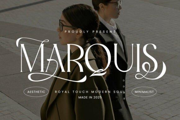
Marquis is a modern serif that combines classic curves, fine detailing, and ligatures with a cleaner minimalist direction. It is the deliberate outlier in this mostly sans-serif list and gives professional Canva layouts a more editorial or luxury-oriented option.
I’d use Marquis for a premium headline, magazine cover, upscale logo, or presentation title paired with a quiet sans serif underneath. I would not make it the default font for dense slides; its strength is the contrast and sophistication it brings in smaller doses.
Best for: luxury headings, editorial covers, premium branding
Key features: modern serif structure, refined curves, stylish ligatures
My Final Picks
If I wanted one versatile family for a full Canva brand system, I’d start with Geomatrix, Saficel, or Carteny. For straightforward business communication, Perfect Corporate is the clearest fit, while Maison and Beauxri bring a more polished lifestyle character.
The strongest professional typography rarely needs to shout. Pick a font whose structure matches the brand, give it enough whitespace, establish a simple hierarchy, and use the same typographic rules consistently across your Canva templates.
Frequently Asked Questions
What are the best Canva fonts for a professional look?
u003cstrongu003eFor a clean professional look, I’d start with Geomatrix, Saficel, Carteny, Perfect Corporate, or Maison.u003c/strongu003e They have restrained shapes that suit business graphics while still offering enough character to avoid looking completely generic. The right pick depends on the project. Perfect Corporate feels especially suited to reports and presentations, Maison has a softer editorial tone, and Geomatrix or Carteny makes sense when you need a flexible font system across many templates.
Can I upload my own fonts to Canva?
u003cstrongu003eYes, Canva currently allows custom font uploads through its Brand Kit features on eligible accounts.u003c/strongu003e Canva says font uploads are available to Canva Pro users, while permissions can also depend on your role in a team or organization. Canva’s workflow places uploaded fonts inside Brand tools so they can be reused consistently. Before uploading a third-party font, check its current license and make sure your intended use is allowed.
Which fonts make Canva presentations look more professional?
u003cstrongu003eFor professional Canva presentations, choose fonts with clear letterforms, moderate contrast, and a reliable hierarchy.u003c/strongu003e Saficel, Geomatrix, Perfect Corporate, Modern Limited, and Carteny are the styles I’d shortlist first because they support clean, structured layouts. Avoid using an expressive logo font for every text element. I prefer a strong heading style with a quieter regular weight or companion font for supporting text, labels, and smaller information.
Should a professional Canva design use serif or sans-serif fonts?
u003cstrongu003eSans-serif fonts are the easiest starting point for clean contemporary Canva designs, but a serif can make headings feel more editorial or premium.u003c/strongu003e The choice should follow the brand personality and the amount of text rather than a rule that one category is always more professional. I’d use geometric sans serifs for presentations, business graphics, and modern brand systems. For luxury or editorial designs, a font such as Marquis can provide a sophisticated heading while a simpler sans serif handles the supporting information.
Follow Us