

ℹ️ Affiliate Disclosure: This article may contain affiliate links. We may earn a commission at no extra cost to you. Thanks for your support! ❤️
Why these are the best lettering fonts for logos, posters, and branding
Lettering fonts can give a design the warmth of hand-drawn type without requiring every word to be drawn from scratch. The difficult part is choosing a style that supports the project instead of overpowering it. A thin script may look refined on stationery but disappear on a busy poster, while a textured brush face can command a headline yet become tiring in a long phrase.
This selection covers clean handwritten lettering, sign-painter styles, bold brush faces, technical drafting forms, and energetic display scripts. I focused on how each option handles hierarchy, readability, mood, and practical project fit, so the list works for logos, packaging, apparel, invitations, posters, social graphics, and personalized crafts.
Many more lettering fonts are available, while this shortlist concentrates on styles with distinct uses, readable forms, and clearly different personalities.

The most useful lettering fonts match their stroke style to the finished design. Choose smooth monoline handwriting for approachable labels and stationery, restrained script for invitations and branding, sign-painter lettering for vintage commercial graphics, or a heavy textured brush face when a poster, shirt, or package needs immediate visual impact.
What Matters When Choosing a Lettering Font
Start with the size and length of the message. Connected scripts and decorative swashes have room to breathe in a short name or invitation heading, but a simpler handwritten face is easier to scan in a longer quote. For small labels or mobile graphics, prioritize open counters, clear spacing, and recognizable capital letters.
Next, match stroke weight to the production method. Thick brush lettering holds attention on apparel, signs, and posters. Thin scripts feel lighter and more formal, but their delicate strokes may need extra care at small print sizes or when used for cutting projects. Texture also changes the mood: rough edges suggest paint and movement, while smooth curves feel polished and controlled.
Finally, decide whether the lettering is the hero or an accent. Expressive fonts usually perform best in headlines, logos, and short phrases. Pair them with a quiet sans serif or serif for supporting copy. Before committing, preview the exact words you plan to use; a font can feel completely different once its uppercase letters, repeated characters, and spacing appear in the real phrase.
Quick Picks
- Best all-around sign style: Captain Casual — combines hand-painted character with practical readability across several project types.
- Best for elegant branding: Hand Lettering Thin — gives logos and stationery a smooth, restrained script treatment.
- Best for clean technical lettering: Architect Pro — brings a human drafting feel without losing structure or clarity.
- Best for bold apparel: George Brush — uses all-caps brush texture to create forceful shirt and merchandise graphics.
- Best for street-inspired projects: Vandal Revolt — adds monoline graffiti energy to posters, album art, and youth-focused branding.
Lettering Fonts for Logos, Posters, Crafts, and Branding
1. Captain Casual
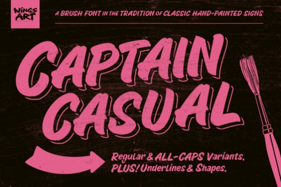
Captain Casual is a brush-lettering system for projects that need the easy confidence of classic hand-painted signs. Its mixture of lowercase and all-caps forms makes it useful for storefront graphics, food packaging, retro logos, vehicle-inspired artwork, and event posters where personality still needs to remain readable.
I would choose this before a highly ornamental script when a phrase has to communicate quickly. Decorative underlines and shapes give short compositions extra structure, but the commercial sign-painting character is quite specific. For formal invitations or delicate beauty branding, Hand Lettering Thin creates a softer impression.
2. The Lettering Font
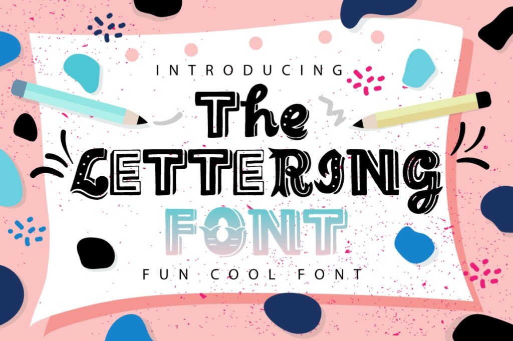
The Lettering Font is a hand-lettered display face suited to greeting cards, craft quotes, simple logos, and casual social graphics. Its broad project range makes it a sensible starting point when you want a handmade look without committing to a strongly formal, technical, or graffiti-influenced direction.
This is the flexible middle ground in the roundup: expressive enough for a title, yet less specialized than the sign-painter and street styles below. That versatility can also be its limitation. If the design depends on a very specific mood, choose Captain Casual for vintage commerce, Architect Pro for drafting, or Vandal Revolt for urban energy.
3. Hand Tulis Letter Gedrik
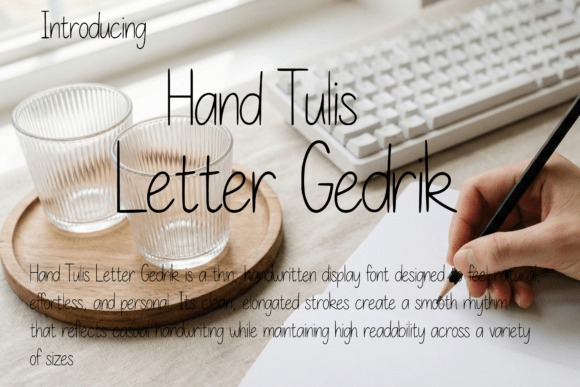
Hand Tulis Letter Gedrik is a thin monoline handwritten display font for lifestyle branding, journals, stationery, packaging, quotes, and editorial accents. Its elongated strokes create a casual human rhythm while the relatively clean construction keeps the lettering more orderly than a rough brush face.
Choose it when warmth and clarity matter more than theatrical movement. It can support a relaxed personal brand or add a handwritten note beside structured typography. The thin weight is less suited to loud posters or small cut-vinyl lettering, where Creafo Elacte or George Brush should hold their shape and presence more convincingly.
4. Marker Brush
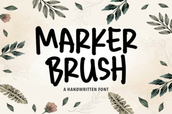
Marker Brush is an expressive handwritten brush font for packaging, bold quotes, social graphics, posters, and merchandise that should resemble energetic marker lettering. Natural-looking strokes and handcrafted texture give words movement, making the font most effective when the lettering is a main visual element rather than supporting copy.
I would use it for short phrases that benefit from visible texture and an informal voice. Detailed brush character can become busy when a line is long or the design is reduced heavily. For a cleaner handwritten effect at smaller sizes, Hand Tulis Letter Gedrik makes more sense; for blockier impact, consider George Brush.
5. Architect Pro
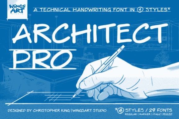
Architect Pro is a precision-minded hand-lettering font for presentations, concept boards, technical-themed branding, studio graphics, and editorial layouts. It draws on the visual language of drafting by hand, giving text a personal quality while retaining the consistency expected from a modern digital typeface.
This option stands apart from the brush scripts because its personality comes from controlled construction rather than sweeping strokes. Use it when a project needs to feel considered, practical, and human. It is less suitable for romantic invitations or aggressive apparel graphics; Hand Lettering Thin and The Scrakers cover those directions more naturally.
6. Hand Lettering Thin
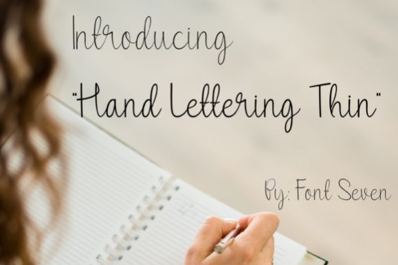
Hand Lettering Thin is a smooth handwriting-based script for logotypes, wedding stationery, beauty packaging, and brand accents that call for a light, polished signature. Its restrained weight lets it add elegance without the visual mass of a marker or painted brush style.
Choose it for short names and headings with generous space around them. The delicacy that gives this font its refinement also creates its main tradeoff: fine strokes can lose strength in small reproduction, busy backgrounds, or intricate cutting projects. Digital offers a warmer playful script, while Captain Casual is the better option when legibility and weight must lead.
7. Vandal Revolt
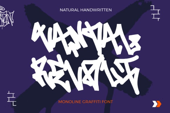
Vandal Revolt is a monoline graffiti font for streetwear, album covers, posters, youth branding, and urban event graphics. Clean single-line strokes give its hand-drawn letterforms a smoother flow than a heavily textured paint font, while the shapes still carry a rebellious street-art attitude.
This makes sense when the project needs an edgy voice but cannot afford chaotic texture. Keep the phrases short and give the letters open space so the distinctive forms remain easy to recognize. The style can feel out of place in formal or family-oriented designs; The Lettering Font is a safer neutral choice, and George Brush provides a heavier athletic alternative.
8. Digital
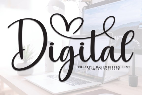
Digital is a flowing handwritten font for invitations, greeting cards, logos, quotes, and social graphics that need a friendly script with a polished edge. Its smooth strokes balance playfulness and sophistication, so it can bridge personal projects and softer small-business branding.
I would favor Digital when Hand Lettering Thin feels too delicate and Marker Brush feels too forceful. It has enough personality to carry a name or short sentiment, although a flowing script is not the first choice for dense text or tiny labels. Pair it with a straightforward sans serif and reserve it for the words that deserve emphasis.
9. George Brush
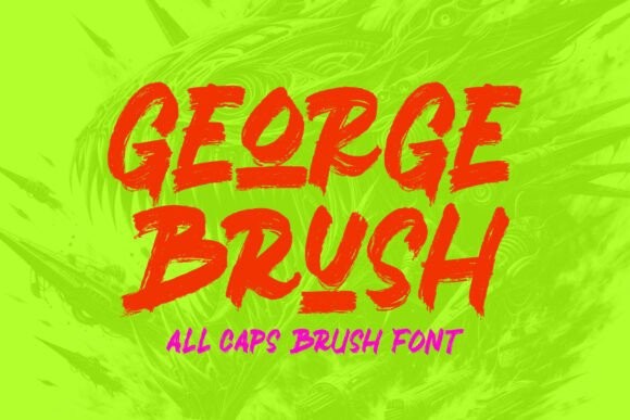
George Brush is a bold all-caps handwritten face for apparel branding, merchandise, posters, and logotypes that need immediate force. Detailed brush texture keeps the capitals from feeling like ordinary block lettering and gives large words the raw edge of hand-painted type.
Use it for compact headlines, team-style graphics, and single-word designs where scale can show the texture. All-caps intensity becomes tiring in sentences and can flatten hierarchy if every line uses the same treatment. Creafo Elacte is a more playful condensed alternative, while Marker Brush provides looser movement for quote-led compositions.
10. The Scrakers
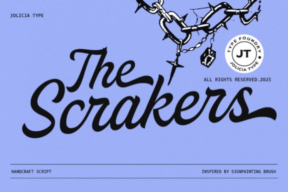
The Scrakers is a high-energy sign-painting script for motorcycle branding, streetwear, retro logos, packaging, posters, and assertive headlines. Thick strokes, a pronounced slant, and rhythmic connections make the lettering feel fast and handcrafted rather than calm or ceremonial.
Its OpenType feature set includes stylistic and contextual alternates plus ligatures, giving experienced designers more control over repeated letters and word shapes. That flexibility rewards careful typesetting, but the aggressive motion may overwhelm quiet layouts. Choose Captain Casual for a more readable commercial-sign tone or Elanova Brush when rough texture matters more than connected script flow.
11. Creafo Elacte
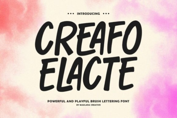
Creafo Elacte is a bold condensed brush-lettering font for sports apparel, packaging, social graphics, and headlines that need youthful energy. Thick, slightly irregular strokes create a spontaneous painted effect, while the narrow proportions help a strong title fit into limited horizontal space.
This font is useful when George Brush feels too broad or conventional for the composition. Its all-caps structure, numerals, punctuation, and full glyph set support punchy display work, but the rugged personality is not subtle. Avoid using it for delicate invitations or long passages; it is most convincing as a short visual shout paired with restrained supporting type.
12. Degan
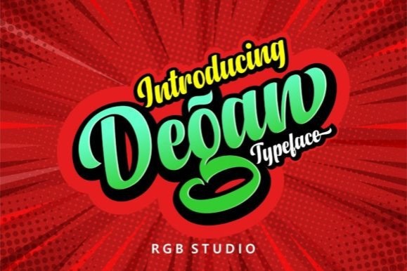
Degan is a manual brush-lettering font for logotypes, packaging, quote designs, promotional graphics, apparel, and social content. Personalized curves give it a crafted feel, while PUA-encoded extra characters and ligatures provide options for shaping more distinctive names and short phrases.
I would consider Degan for a logo or hero phrase that benefits from alternate characters rather than a fixed out-of-the-box word shape. Accessing and choosing extras adds a small typesetting step, so a simpler face may be faster for casual work. The Scrakers offers more aggressive sign-painter motion; Digital is easier to place in softer invitation and greeting-card layouts.
13. Elanova Brush
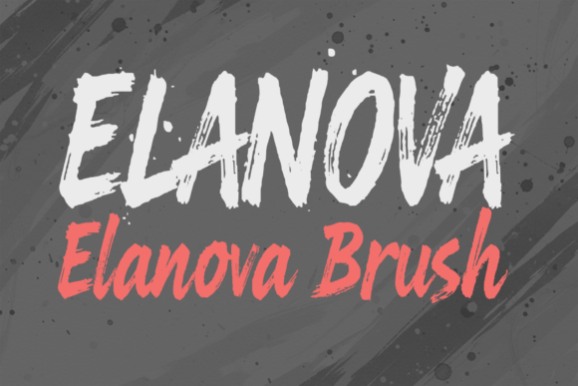
Elanova Brush is a hand-painted brush font for posters, branding, packaging, merchandise, and social graphics that should feel raw and artistic. Rough edges, fluid movement, and intentional imperfections make its lettering look tactile, especially when it is displayed large enough for the texture to remain visible.
Choose Elanova Brush when a clean digital finish would weaken the concept. It can add credibility to music, food, art, or outdoor themes, but its irregular surface may reduce clarity in tiny applications. Marker Brush feels more marker-led and conversational, while George Brush gives all-caps layouts a firmer, more compact silhouette.
14. Lettering
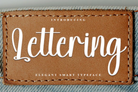
Lettering by FreshTypeINK is a bold handwritten font for nostalgic headlines, labels, cards, and craft designs that need confident personality without the roughness of a painted brush. Its substantial forms make short words feel friendly and visible, especially in casual retro-inspired compositions.
This is a useful choice when thin handwriting disappears but all-caps brush lettering feels too confrontational. Give it room around the word shape and use a neutral companion font for details. The nostalgic character narrows its range for sleek corporate work; Architect Pro is more controlled, while Hand Lettering Thin supports a more refined brand voice.
15. English
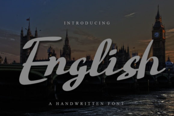
English is a refined monoline script for wedding stationery, photography marks, packaging, magazine accents, and elegant branding. Smooth connections create a graceful handwritten line, while alternates and ligatures can help important names and phrases feel more deliberately lettered.
Use it when the project needs sophistication but more fluidity than Hand Lettering Thin. Decorative options are most effective when selected sparingly; too many flourishes can make a short phrase harder to read or compete with other details. For casual warmth choose Digital, and for bolder commercial lettering move toward Captain Casual.
Lettering Font Comparison
| Product | Best for | Font Style / Personality | Best Project Fit |
|---|---|---|---|
| Captain Casual | Readable vintage lettering | Commercial sign-painter brush | Logos, packaging, posters |
| The Lettering Font | General handmade style | Versatile hand-lettered display | Cards, quotes, casual logos |
| Hand Tulis Letter Gedrik | Soft approachable designs | Thin monoline handwriting | Journals, lifestyle branding |
| Marker Brush | Energetic short phrases | Textured marker lettering | Posters, social graphics |
| Architect Pro | Structured human lettering | Technical drafting style | Presentations, studio branding |
| Hand Lettering Thin | Light elegant accents | Delicate smooth script | Logos, weddings, packaging |
| Vandal Revolt | Urban visual identity | Monoline graffiti | Streetwear, album art |
| Digital | Friendly polished script | Playful flowing handwriting | Invitations, cards, quotes |
| George Brush | Forceful large headlines | Bold textured all caps | Apparel, merchandise, posters |
| The Scrakers | High-motion display type | Slanted sign-painting script | Streetwear, retro logos |
| Creafo Elacte | Narrow bold titles | Condensed playful brush | Sports graphics, packaging |
| Degan | Custom-looking wordmarks | Brush script with alternates | Logos, apparel, promotions |
| Elanova Brush | Raw painted texture | Rough expressive brush | Art posters, packaging |
| Lettering | Bold nostalgic charm | Confident handwriting | Labels, cards, craft titles |
| English | Graceful formal accents | Refined monoline script | Weddings, branding, editorial |
How to Use Lettering Fonts Without Losing Readability
Preview the Real Words at the Final Size
A sample alphabet cannot reveal every spacing problem. Type the actual brand name, quote, or event title and look closely at repeated letters, capitals, joins, and punctuation. Then reduce the design to its likely phone-screen, label, or printed size. Thin connections and rough textures that look expressive when enlarged may close up or disappear when reduced.
Give Expressive Lettering One Clear Job
Most lettering faces are display tools, not body-copy fonts. Use one for the main name, headline, or short emotional phrase, then switch to a restrained serif or sans serif for dates, prices, directions, ingredients, and longer explanations. This creates hierarchy and allows the handmade element to stay distinctive rather than becoming visual noise.
Match Texture and Weight to Production
For print and digital graphics, textured edges can add convincing brush character. For small vinyl cuts, narrow strokes, tight counters, and detailed roughness may require more preparation and careful weeding. A smooth, heavier form is often easier to reproduce than a delicate script. Always test the word at the intended dimensions and material rather than assuming that cutting-machine compatibility guarantees an effortless result.
Use Alternates and Swashes Selectively
Alternates and ligatures can prevent repeated letters from looking mechanical and can improve the silhouette of a wordmark. They are most effective when they solve a visible problem. One expressive capital or finishing swash usually has more impact than decorating every available letter. Check that flourishes do not collide with surrounding text, frames, or illustrations.
Check the Current License for the Intended Use
Font licensing can differ by product and use. Review the current license details before using a font for client work, logos, websites, apps, print-on-demand products, templates, or any project that will be distributed. Keep a record of the applicable terms with the project files so the design decision remains easy to verify later.
Which Lettering Font Fits Your Project?
If you need a versatile hand-painted commercial look, Captain Casual offers the clearest balance of character and readability. Hand Lettering Thin makes more sense for restrained wedding or beauty branding, while Architect Pro suits technical, editorial, and studio-led concepts.
For large, energetic graphics, choose George Brush when you want solid all-caps impact or The Scrakers when motion and connected sign-painter rhythm matter. Vandal Revolt is the more focused choice for graffiti and streetwear. Whichever direction you take, preview the exact wording at its final size before building the rest of the layout around it.
Frequently Asked Questions
What is a lettering font?
A lettering font is a digital typeface designed to reproduce the character of drawn, painted, brushed, or handwritten letters. Unlike one-off hand lettering, a font lets you type and revise text consistently. Styles range from clean monoline handwriting to textured brush scripts, sign-painter forms, and decorative display lettering.
Which lettering fonts are easiest to read?
Lettering fonts with open counters, moderate stroke contrast, clear spacing, and recognizable capitals are usually easier to read. Simple monoline handwriting and restrained sign-painter styles tend to remain clearer than scripts with many swashes. Always judge the exact phrase at its final size because readability changes with wording and layout.
Can lettering fonts be used with Cricut or other cutting machines?
Many installable lettering fonts can be used in cutting-machine software, but the letterforms still determine how easy a design is to cut and weed. Thick, smooth strokes are often more practical than very thin lines or rough textures. Test the finished word at the intended size and simplify intricate details when necessary.
How should I pair a lettering font with another typeface?
Pair an expressive lettering font with a quieter serif or sans serif that handles supporting information clearly. Create contrast in role rather than adding another decorative style: use the lettering for a name or headline and the companion face for dates, descriptions, or details. Compare proportions and spacing so neither font makes the other look accidental.
Follow Us