

ℹ️ Affiliate Disclosure: This article may contain affiliate links. We may earn a commission at no extra cost to you. Thanks for your support! ❤️
How the Best Fonts for Websites Improve Readability
The best fonts for websites are not simply the typefaces that look attractive in a large specimen or branding mockup. They are the fonts that remain clear when someone is reading a product description, scanning a navigation menu, completing a form, or moving through a long article on a phone.
Typography usually has a bigger influence on website perception than many people realize. It affects how quickly visitors understand information, how trustworthy a business appears, and whether the visual identity feels consistent from one page to the next.
A typeface may look impressive at 60 pixels and become frustrating at 16 pixels. This is why I treat website typography as part of the interface rather than as surface decoration. Readability, hierarchy, spacing, and loading performance all need to be considered alongside brand personality.
The following 17 fonts are practical options for blogs, business websites, portfolios, online stores, publications, and software interfaces. Most are available through Google Fonts or standard system font stacks, which also makes them relatively straightforward to use on WordPress and other website platforms.
Quick Picks
- Best overall: Inter
- Best for dense interfaces: Source Sans 3
- Best friendly all-purpose option: Open Sans
- Best for editorial websites: Merriweather
How I Picked These
I compared these website fonts by readability at practical screen sizes, interface clarity, hierarchy, language support, family versatility, and how well each option works across mobile and desktop layouts. I also considered loading and implementation practicality, because a good website font needs to perform well inside a real interface rather than only look attractive in a specimen.
Best Fonts for Websites
1. Inter

Inter is one of the most dependable starting points for a modern website. It was designed with computer screens in mind, and its tall x-height helps lowercase characters remain visible at smaller sizes.
From a usability perspective, Inter handles interface typography particularly well. Navigation, form fields, buttons, product information, tables, and dashboard labels remain clear without requiring much adjustment.
Its neutral letterforms suit SaaS websites, online stores, business sites, dashboards, and content-heavy blogs. The family also includes enough weights to create a complete hierarchy without introducing a second font.
The limitation is personality. Inter can feel impersonal when it is used across every heading, paragraph, button, and logo element. In branding projects, I often pair it with a more expressive serif or display typeface for major headings while keeping Inter for the functional parts of the interface.
Best for: SaaS sites, dashboards, online stores
Key features: Tall x-height, variable weights, clear letterforms
2. Open Sans
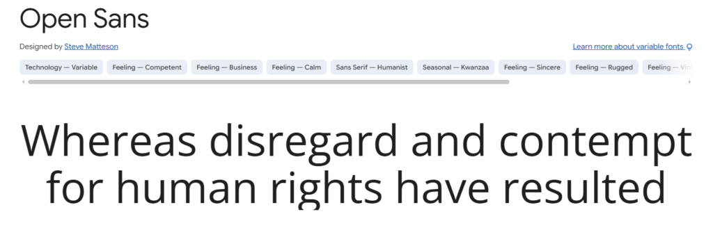
Open Sans has a humanist structure that feels warmer and less mechanical than many contemporary sans serifs. Its open forms and generous proportions remain comfortable in paragraphs, navigation menus, form labels, and buttons.
It is especially useful for websites that need broad language support. The Google Fonts version includes Latin, Greek, and Cyrillic characters, making it practical for multilingual brands and international content.
From a branding perspective, Open Sans is not particularly distinctive. That is not always a weakness. On websites where photography, editorial content, products, or illustrations should take visual priority, a restrained typeface can create useful balance.
The main risk is familiarity. Because Open Sans has been used extensively across the web, it needs a considered color system, spacing structure, and heading treatment to avoid feeling generic.
Best for: Blogs, nonprofit websites, service businesses
Key features: Open forms, broad language support, approachable tone
3. Roboto
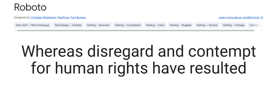
Roboto combines geometric construction with softer curves. The result feels technical without becoming excessively rigid.
It is particularly reliable in interfaces that contain many text sizes and functions. Product filters, account pages, mobile controls, navigation, tables, and notifications can all sit within the same typographic system.
Roboto also benefits from familiarity. Many users have encountered it through Android interfaces, so the letterforms often feel immediately readable.
That familiarity can also make a website look ordinary. One thing I often notice when reviewing brand identities is that a neutral font gets blamed for weak branding when the real problem is an underdeveloped visual system. Roboto needs strong spacing, color, imagery, and hierarchy around it if the website is expected to feel distinctive.
Best for: Mobile interfaces, applications, product pages
Key features: Compact proportions, open curves, versatile weights
4. Source Sans 3
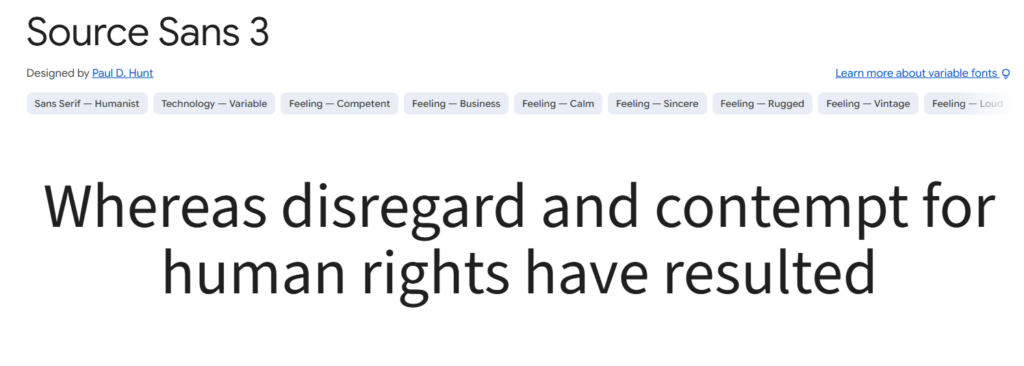
Source Sans 3 is one of the strongest options for information-heavy websites. Adobe originally developed the family for user interfaces, and that purpose is still visible in its proportions and spacing.
The characters remain clear in forms, tables, menus, documentation, and long paragraphs. Its slightly narrower width also allows more information to fit into responsive layouts without making the text feel compressed.
This is useful for dashboards, government websites, educational platforms, and knowledge bases where horizontal space is limited and hierarchy needs to remain obvious.
Source Sans 3 has a quiet visual personality. It rarely becomes the main visual feature of a website, but it supports content extremely well. Strong typography often feels effortless, which is one reason it can be overlooked.
Best for: Documentation, education, government websites
Key features: Interface-focused design, efficient width, clear spacing
5. Lato
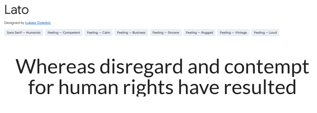
Lato balances professional structure with subtle warmth. Its letterforms feel stable enough for business communication, while the rounded details prevent it from appearing cold or overly institutional.
It can handle both headings and body text, making it a practical single-family solution for smaller websites. This is useful when a project needs a consistent visual identity without the complexity of managing multiple font families.
Lato was created by Polish designer Łukasz Dziedzic and includes a broad range of weights and styles. The heavier weights have considerable visual presence, which can help headings feel confident.
They also need space. Large Lato headings can become dense when line spacing is tight or when too many bold elements compete on the same page. I tend to use its strongest weights selectively rather than treating every section heading as a visual announcement.
Best for: Business websites, agencies, online courses
Key features: Warm details, strong weights, balanced proportions
6. Work Sans
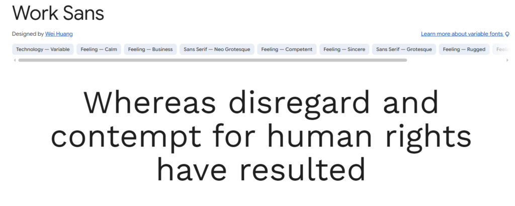
Work Sans takes inspiration from early grotesque typefaces and was developed with on-screen text at medium sizes in mind.
It feels more editorial than Inter or Roboto, but it remains restrained enough for navigation, interface labels, and body copy. This makes it useful for brands that want a contemporary digital presence without looking like a standard software product.
Work Sans is particularly effective in bold headings. Its structure creates strong visual weight without relying on decorative details.
The lighter weights require more care. Thin strokes may lose definition against photographs, gradients, or lower-quality displays. A font can appear refined in a design file and still perform poorly once it is placed inside a real responsive layout.
Best for: Creative agencies, portfolios, magazines
Key features: Grotesque structure, crisp headings, broad weight range
7. DM Sans
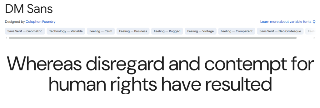
DM Sans is a low-contrast geometric sans serif designed to remain readable at smaller sizes. Its clean curves give websites a contemporary appearance without the severe geometry found in some similar families.
It suits digital products, creator websites, modern service businesses, and minimalist online stores. Buttons, short headings, prices, and interface labels look particularly clear in medium and semibold weights.
Visually, DM Sans creates a polished and controlled tone. It can help a brand feel current without becoming strongly associated with a passing visual trend.
For long paragraphs, I usually increase the line height slightly. Geometric fonts can feel dense when text is tightly set, especially on narrow mobile screens. Comfortable paragraph spacing makes a noticeable difference.
Best for: Creator sites, startups, modern stores
Key features: Geometric forms, low contrast, clean small text
8. IBM Plex Sans
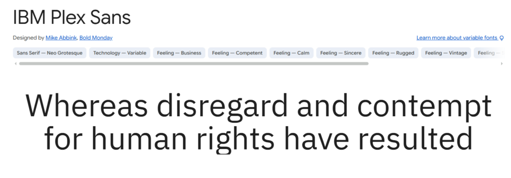
IBM Plex Sans feels technical, structured, and slightly editorial. It belongs to a larger type system that includes serif, monospaced, and condensed styles.
That coordinated family gives designers more room to create hierarchy without losing consistency. A technical label can use IBM Plex Mono, body text can remain in IBM Plex Sans, and more editorial sections can introduce IBM Plex Serif.
From a branding perspective, this flexibility is valuable. A font family becomes more useful when it can support multiple touchpoints rather than only looking strong in a homepage heading.
IBM Plex Sans suits technology companies, financial platforms, research organizations, and brands that need to communicate authority without appearing conservative.
Some of its character details are more noticeable than those in Inter or Open Sans. Test small interface labels carefully, particularly when the font is placed over complex backgrounds.
Best for: Technology, finance, research websites
Key features: Coordinated family, technical tone, strong hierarchy
9. Fira Sans
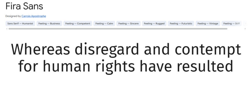
Fira Sans has open shapes and a humanist rhythm that helps digital interfaces feel approachable. The family includes several widths, italic styles, and a related monospaced typeface.
It is particularly useful for developer websites, product documentation, educational platforms, and layouts that combine prose with code samples.
Fira Sans has more personality than many neutral interface fonts. The shapes feel recognisable without becoming distracting, which can strengthen a visual identity when the rest of the design is relatively minimal.
While Fira Sans offers unique personality for specific brands, exploring a wider range of options can help you find the perfect match for your next project, and we've compiled more fantastic choices in our list of 15 Best Sans Serif Fonts for Modern Websites in 2026.
That personality is not appropriate for every brand. It may feel too informal for luxury businesses or too contemporary for traditional institutions. Font selection is rarely about identifying a universally good typeface. It is about finding the right relationship between readability and brand perception.
Best for: Developer sites, education, technical content
Key features: Multiple widths, open forms, matching mono style
10. Nunito Sans
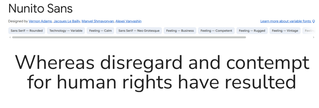
Nunito Sans uses softly rounded terminals that give it a welcoming and informal tone. The underlying construction remains controlled enough for navigation, short paragraphs, buttons, and interface elements.
It suits wellness websites, family brands, educational services, children’s products, and consumer businesses that want to appear approachable without looking childish.
The rounded details influence brand perception immediately. A typeface can completely change the personality of a website without altering the logo, imagery, or color palette.
Nunito Sans is less suitable for brands that need a strict institutional, luxury, or high-fashion appearance. In those contexts, its softness can undermine the intended tone.
Best for: Wellness, education, family-focused brands
Key features: Rounded terminals, balanced construction, approachable tone
11. Noto Sans
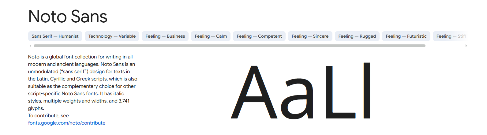
Noto Sans is a practical option for websites serving international audiences. The wider Noto project was designed to provide coordinated typography across many languages and writing systems.
That coverage helps multilingual pages maintain a more consistent visual identity. Without it, browsers may substitute unrelated fonts for unsupported characters, creating visible differences in weight, spacing, and baseline alignment within the same sentence.
The broad family does not mean every website should load every available language set. Large character collections increase font file sizes, so only the subsets required by the website should be delivered.
This is an area where branding and performance overlap. Consistency matters, but unnecessary font data can slow down the experience the typography is supposed to improve.
Best for: Multilingual websites, global organizations, localization
Key features: Extensive language support, neutral forms, coordinated scripts
12. Atkinson Hyperlegible
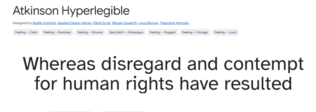
Atkinson Hyperlegible was designed to make commonly confused characters easier to distinguish. Letters and numbers have deliberately different shapes, helping readers identify information more quickly.
This can be especially useful in account details, form instructions, healthcare information, navigation labels, and public-service interfaces.
Its personality is more functional than fashionable. For accessibility-focused organizations, senior-oriented services, healthcare resources, and public information websites, that directness can be a significant advantage.
I would not necessarily use it as the main display typeface for every brand. It can, however, serve as a highly readable body font beneath a more expressive heading family.
Accessibility does not require removing all personality from a design. It requires knowing where expression is appropriate and where clarity should take priority.
Best for: Accessible websites, healthcare, public information
Key features: Distinct characters, open counters, functional construction
13. Lexend
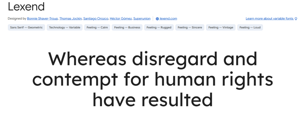
Lexend uses generous spacing and simplified letterforms to create a more relaxed reading rhythm. It feels contemporary without being strongly connected to one industry or brand category.
The open spacing can benefit educational platforms, resource libraries, reading tools, and websites aimed at users who find tightly packed text uncomfortable.
That same spacing makes Lexend wider than compact families such as Source Sans 3. Navigation labels, pricing tables, buttons, and narrow mobile components should be tested before it is applied throughout an entire interface.
This is a good example of why readability cannot be judged in isolation. A font may improve comfort in long-form text while creating practical problems in constrained UI components.
Best for: Education, resource websites, reading tools
Key features: Generous spacing, simplified forms, relaxed reading rhythm
14. Merriweather
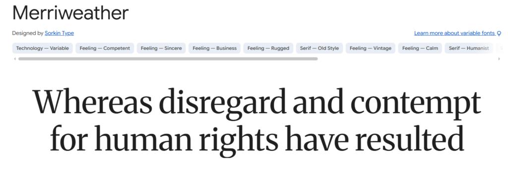
Merriweather is one of the safest serif fonts for long-form website content. It offers the traditional texture of book or newspaper typography while maintaining sturdy letterforms that remain clear on screens.
It suits editorial websites, essays, food blogs, travel publications, and brands that want to communicate experience or authority without becoming overly formal.
Merriweather can be used for article body text, large headings, or both. I often pair it with a neutral sans serif for navigation and interface elements. The contrast creates hierarchy without making the visual system feel disconnected.
Its heavier texture can make compact product pages feel crowded. It needs comfortable line height, sensible line length, and enough white space around headings.
Best for: Editorial websites, blogs, long articles
Key features: Screen-friendly serifs, sturdy strokes, traditional tone
15. Source Serif 4
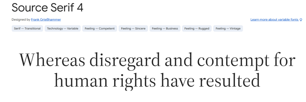
Source Serif 4 is a flexible editorial family with enough styles for body copy, quotations, subheadings, and long-form reading.
It feels refined without becoming as delicate as many fashion-oriented display serifs. This makes it suitable for publishing websites, professional blogs, cultural organizations, and premium service brands.
Pairing it with Source Sans 3 creates a particularly coherent font system. The serif and sans serif provide contrast, but their related proportions help the overall identity remain consistent.
The family offers many weights and optical options, although most websites will not need all of them. Loading every available style usually adds complexity without improving the hierarchy.
A focused system of regular, semibold, and bold weights is often more effective than a large library of barely distinguishable variations.
Best for: Publishing, cultural websites, premium service brands
Key features: Editorial texture, broad family, coordinated sans pairing
16. Literata
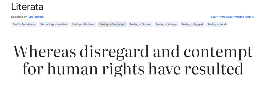
Literata was developed for digital reading and has a stronger literary personality than many common web serifs.
Its letterforms feel expressive without becoming ornamental. This can give essays, newsletters, book websites, and feature articles a recognisable voice.
From a branding perspective, Literata is useful when written content is central to the identity. The typeface adds atmosphere before the reader has processed the first sentence.
That strong identity can also compete with decorative logos, complex illustrations, or highly stylised photography. I would use it more carefully in an established brand system with several competing visual elements.
Many decorative fonts attract attention initially but become difficult to manage across larger branding systems. Literata avoids most of that problem, but it still needs a clear role.
Best for: Newsletters, essays, literary publications
Key features: Digital-reading focus, expressive serifs, editorial personality
17. Georgia
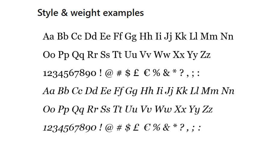
Georgia remains a useful system-font option for websites that need dependable serif typography without an additional font download.
Its large lowercase forms and sturdy serifs were designed to hold up on screens. It can reduce font-loading complexity and provide an immediate fallback for editorial layouts.
The main drawback is familiarity. Georgia can make a website feel dated when it is combined with default spacing, narrow margins, and conventional colors.
That is usually a design-system issue rather than a fault in the typeface itself. With shorter line lengths, generous spacing, careful sizing, and a modern sans serif for interface elements, Georgia can still feel deliberate.
It is also useful as a fallback font because it is widely available and maintains reasonable readability before a custom serif loads.
Best for: Fast blogs, simple publications, font fallbacks
Key features: System availability, sturdy serifs, no web-font request
Read More: Beyond general readability, exploring specific font types can open up new design possibilities for your site; for instance, learn more about the versatile applications of 15 Best Monospace Fonts for Coding, Branding and Web Design.
Quick Comparison of the Best Website Fonts
| Font | Style | Strongest Use |
|---|---|---|
| Inter | Sans serif | All-purpose interfaces |
| Open Sans | Humanist sans | Blogs and service websites |
| Roboto | Neo-grotesque sans | Mobile and product interfaces |
| Source Sans 3 | Humanist sans | Documentation and dense layouts |
| Lato | Humanist sans | Business and education |
| Work Sans | Grotesque sans | Creative and editorial brands |
| DM Sans | Geometric sans | Modern businesses and stores |
| IBM Plex Sans | Grotesque sans | Technology and finance |
| Fira Sans | Humanist sans | Technical content |
| Nunito Sans | Rounded sans | Friendly consumer brands |
| Noto Sans | Sans serif | Multilingual websites |
| Atkinson Hyperlegible | Accessible sans | Public and accessible content |
| Lexend | Readability-focused sans | Education and reading tools |
| Merriweather | Serif | Long-form articles |
| Source Serif 4 | Serif | Publishing and premium brands |
| Literata | Serif | Essays and newsletters |
| Georgia | System serif | Lightweight editorial websites |
How to Load Web Fonts Without Slowing Your Site
A well-chosen font can still damage the reading experience when it loads poorly.
Web fonts add network requests. They can delay text rendering, produce visible layout shifts, or briefly replace a carefully selected typeface with an unrelated fallback.
Typography should support the website rather than become a performance problem.
Use WOFF2 Files
WOFF2 generally offers better compression than older web-font formats. Smaller files reduce the amount of data visitors need to download.
For most modern website projects, WOFF2 should be the primary format unless older browser support creates a specific requirement.
Load Only the Weights You Use
Do not load thin, light, regular, medium, semibold, bold, extra bold, and black simply because the family contains them.
For many websites, three font files are enough:
- Regular for body text
- Medium or semibold for interface elements
- Bold for headings
A properly configured variable font can also provide several weights through one file, although it should still be tested carefully for browser rendering and file size.
Use font-display
The CSS font-display descriptor controls what visitors see while a custom typeface is downloading.
Using swap allows a fallback font to appear rather than leaving the text invisible.
@font-face {
  font-family: "Example Font";
  src: url("https://cdn.fontiverse.com/fonts/example-font.woff2") format("woff2");
  font-weight: 400;
  font-style: normal;
  font-display: swap;
}
This improves immediate access to the content, although the change from the fallback to the final font may still create movement if their proportions are very different.
Choose a Similar Fallback Font
A fallback typeface with proportions close to the web font can reduce visible layout changes during loading.
body {
  font-family: Inter, Arial, sans-serif;
}
Arial does not look identical to Inter, but it provides a reasonably neutral fallback. For more controlled projects, fallback metrics can be adjusted to create a closer match.
The important point is that fallback selection should be intentional. It is part of the typography system, even when visitors only see it briefly.
Subset Fonts Carefully
Load only the languages and character ranges required by the content.
The unicode-range descriptor can prevent unnecessary subsets from downloading when a page does not contain those characters.
This should be handled carefully on websites with translated pages, comments, customer names, account profiles, or user-generated content. Removing too many characters can create inconsistent fallback typography later.
Keep Body Text Comfortable
Font selection cannot compensate for poor typography settings.
Most article and business layouts need:
- A comfortable base font size
- Strong text-to-background contrast
- Moderate line lengths
- Enough line spacing
- Clear separation between paragraphs
- Consistent heading intervals
Avoid very thin weights for body text. They may look elegant on a high-resolution desktop display but lose clarity on lower-quality screens, bright backgrounds, or mobile devices used outdoors.
Tracking should also be handled with restraint. Increasing letter spacing can help uppercase labels, but excessive tracking makes normal paragraphs feel fragmented.
Which Website Font Should You Choose?
For the broadest range of website projects, Inter is the best all-purpose website font. It remains clear in navigation, body copy, buttons, forms, account screens, and responsive layouts.
Choose Source Sans 3 when the website contains dense information or narrow interface components. Open Sans creates a friendlier reading tone, while DM Sans introduces a cleaner geometric character.
For editorial websites, Merriweather is a dependable serif starting point. Source Serif 4 provides a more flexible publishing system, while Literata gives articles and newsletters a stronger visual identity.
I would not make the final decision from a font specimen alone. Test the typeface inside the actual website with real headings, paragraphs, menus, forms, prices, error messages, and mobile screens.
A font may look impressive on its own but struggle once it is used across multiple brand touchpoints. The best website typography is rarely the most decorative option. It is the system that communicates clearly, supports the brand, and allows visitors to read without noticing the effort behind it.
FAQ
What is the best font for a website?
Inter is the most versatile option for many modern websites because it was designed for screens, remains readable at small sizes, and includes a broad range of weights. Source Sans 3 and Open Sans are strong alternatives.
What is the most readable font for website body text?
Inter, Open Sans, Source Sans 3, and Merriweather are dependable body-text choices. The result also depends on font size, contrast, line height, and paragraph width.
Are serif or sans-serif fonts better for websites?
Both can be effective. Sans-serif fonts are common in navigation and interfaces, while screen-friendly serif fonts such as Merriweather and Source Serif 4 can make long articles feel more editorial.
Do website fonts affect page speed?
Yes. Every font file adds data and may affect text rendering. Use WOFF2, load only necessary weights, select required language subsets, and configure u003ccodeu003efont-displayu003c/codeu003e to improve loading behavior.
Follow Us