

Why the Best Monospace Fonts Work Beyond Coding
The best monospace fonts are no longer confined to programming environments and terminal windows. I now see them used across technology brands, editorial layouts, portfolio websites, packaging, navigation systems, product interfaces, and retro-inspired graphics.
In a true monospaced typeface, every character occupies the same horizontal space. A narrow letter such as “i” takes up exactly as much room as a wider character such as “m.” This creates predictable alignment, which is useful for source code, numerical data, tables, technical specifications, and interface elements.
That fixed spacing also gives monospace typography its distinctive personality. Even ordinary words begin to feel systematic, deliberate, and slightly mechanical.
There is a tradeoff, though.
Monospaced text can become dense when used for long paragraphs, especially on smaller screens. The rigid rhythm that makes code easy to align does not always create the most comfortable reading experience. I usually reserve monospace fonts for code blocks, labels, metadata, headlines, short introductions, navigation, and carefully selected brand elements rather than applying them to an entire article.
This collection includes practical coding families, clean geometric typefaces, typewriter-inspired designs, and more expressive display fonts. Some are suitable for real programming environments. Others borrow the visual language of terminals, grids, early computers, and digital interfaces without being designed for extended coding sessions.
Quick Picks
- Best for coding: NK57 Monospace
- Best for polished branding: Bova Monospace
- Best for modern web systems: Kiota Mono
- Best for understated logos and packaging: Morequiet
- Best for retro gaming graphics: Joystix Monospace
How I Picked These
I compared these monospace fonts by character clarity, fixed-width rhythm, technical-symbol usefulness, small-size readability, family flexibility, branding potential, and how well each option fits its intended role across code, interfaces, websites, packaging, editorial layouts, and display graphics.
15 Best Monospace Fonts
1. NK57 Monospace
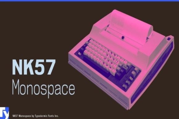
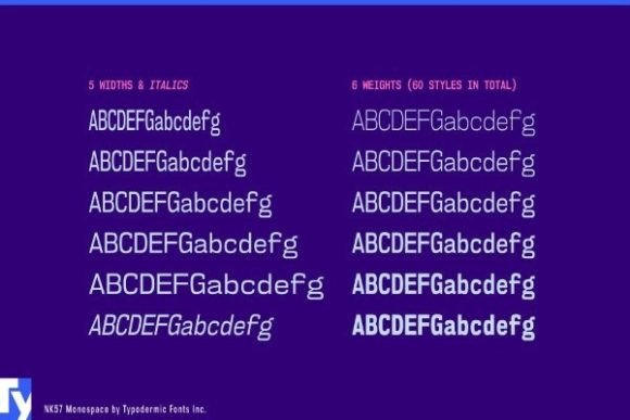
NK57 Monospace is the most convincing coding-oriented family in this collection. It includes 60 styles, which gives designers and developers significantly more control over hierarchy, emphasis, and visual weight than a single-font download.
The character set includes European accents, Greek, Cyrillic, programming symbols, and less common mathematical characters. That coverage matters in technical products. A typeface may look strong in a specimen but become difficult to use once an interface needs multilingual content, mathematical notation, or a wider set of programming characters.
Visually, NK57 Monospace feels functional without becoming completely anonymous. Its letterforms are orderly enough for code and technical documentation, but there is still enough personality for developer portfolios, application interfaces, data-focused editorial layouts, and software branding.
For actual coding, I would test the ambiguous characters before committing to it. Zero and capital O, lowercase l and uppercase I, braces, quotation marks, and punctuation all need to remain distinct at small sizes.
Those details matter far more during a long coding session than how impressive the font looks in a large promotional preview.
Best for: Coding, technical interfaces, multilingual digital projects
Key features: 60 styles, Greek and Cyrillic support, mathematical symbols
2. Joystix Monospace
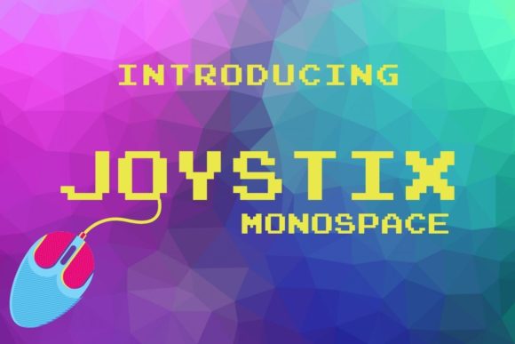
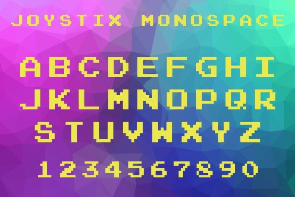
Joystix Monospace is a pixel-style display font that draws heavily from classic arcade games. Its visual language is immediate. Even without illustrations or gaming imagery, the squared letterforms communicate retro technology and early digital entertainment.
That clarity can be useful in branding. A typeface can establish the direction of an identity before color, illustration, or texture is introduced.
Joystix is not a font I would recommend for writing code or presenting long technical passages. Its pixel construction creates considerable visual texture, and that texture quickly becomes tiring in paragraphs or dense interface layouts.
It is much more effective in game logos, streaming graphics, stickers, achievement badges, event posters, merchandise, and short website headings.
Spacing needs careful attention. Pixel fonts already have strong internal geometry, so placing the letters too close together can make the composition feel crowded. Generous whitespace usually gives Joystix more impact than additional effects or decorative backgrounds.
Best for: Arcade branding, game graphics, retro headlines
Key features: Pixel construction, fixed spacing, strong nostalgic character
3. Bova Monospace
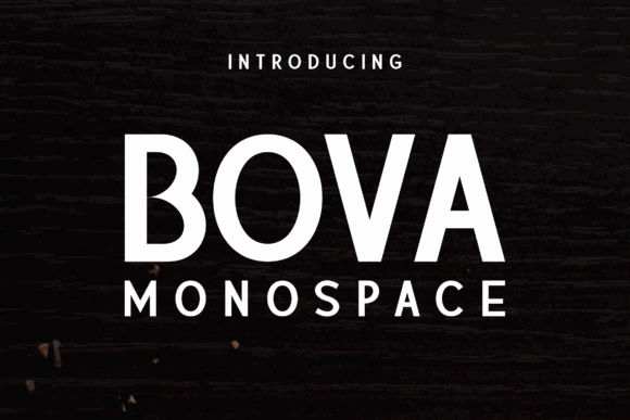
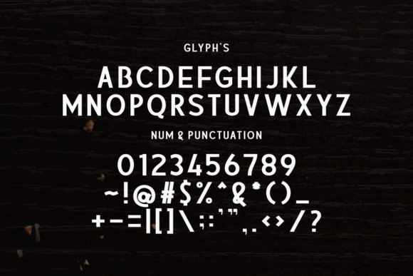
Bova Monospace takes a more polished and editorial approach to monospaced typography. Its sharp construction gives it enough visual authority for magazine covers, posters, contemporary branding, and technology-focused campaigns.
One thing I often notice when reviewing display typefaces is that some fonts lose their character when enlarged. They may perform adequately at interface sizes but look weak or awkward in a large headline. Bova holds its structure more confidently at display scale.
The spacing creates a controlled rhythm without making every word feel overly mechanical. That balance makes it easier to use in branding systems where the font needs to feel technical but not aggressively futuristic.
I would pair Bova with a quieter proportional sans serif for body copy. The contrast allows the monospace rhythm to function as a recognisable brand signal while preserving comfortable reading across longer content.
It can carry a headline, logo, or section title effectively, but using it for every text element would weaken the hierarchy.
Best for: Editorial covers, modern branding, technology posters
Key features: Sharp forms, fixed-width rhythm, display-oriented proportions
4. Bittypix Monospace
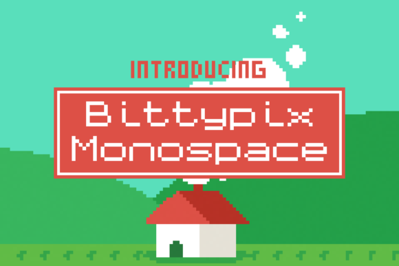
Bittypix Monospace is built around an 8-pixel grid. Its limitations are also what give it such a clear identity.
The letterforms retain the visible modularity associated with early interfaces, bitmap type, and low-resolution games. This makes Bittypix more convincing than a generic retro font that simply imitates pixel typography with smoother vector shapes.
It is particularly useful for scoreboards, inventory labels, game menus, countdowns, badges, packaging details, and small interface-inspired elements. I also like the contrast it can create when used as metadata beside a larger, smoother display face.
The underlying grid needs to remain intact. Artificial italics, excessive scaling, and aggressive tracking can distort the relationship between the pixels and weaken the original construction.
Legibility also depends on output size. A pixel font may look clean on a large design canvas but lose important details when reduced for a social thumbnail or small mobile screen. Always test it at the final publishing dimensions.
Best for: Pixel art, game interfaces, retro digital labels
Key features: Eight-pixel grid, compact forms, authentic bitmap texture
5. Monospace
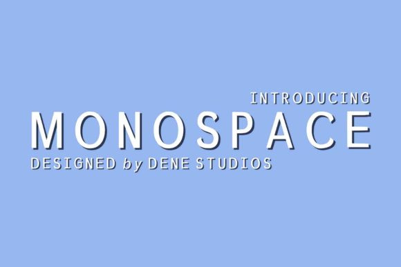
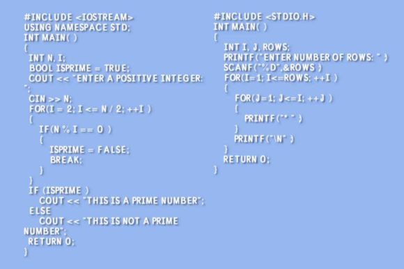
Monospace by denestudios is a restrained sans serif with a simple, neutral construction. It has fewer stylistic quirks than many of the pixel and terminal-inspired fonts in this collection, which makes it easier to integrate into minimalist visual identities.
From a branding perspective, this is more useful as an identity or display face than as a dedicated coding font. Its clean geometry suits short wordmarks, portfolio headings, product labels, presentation covers, and controlled social graphics.
The lack of obvious decoration is an advantage, but it also places more responsibility on the layout. Minimal typography rarely succeeds through the typeface alone. Spacing, scale, alignment, contrast, and surrounding whitespace become much more important.
Without a clear hierarchy, Monospace can look plain rather than intentional.
I would use it with a strong grid and noticeable differences between headline, label, and body-text sizes. Small spacing decisions often have a bigger influence on brand perception than people expect.
Best for: Minimal branding, portfolio headings, clean digital layouts
Key features: Simple sans-serif forms, neutral tone, adaptable construction
6. Kiota Mono
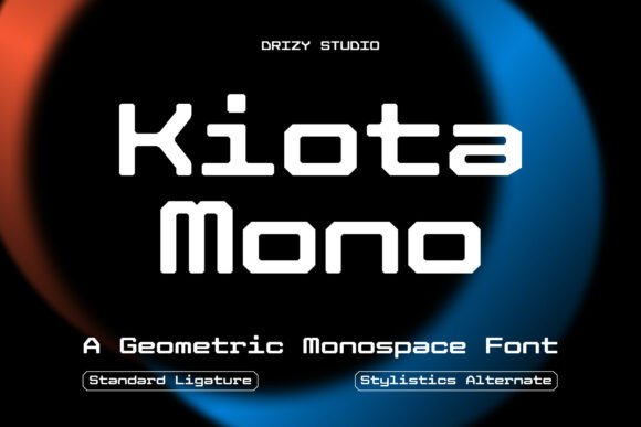
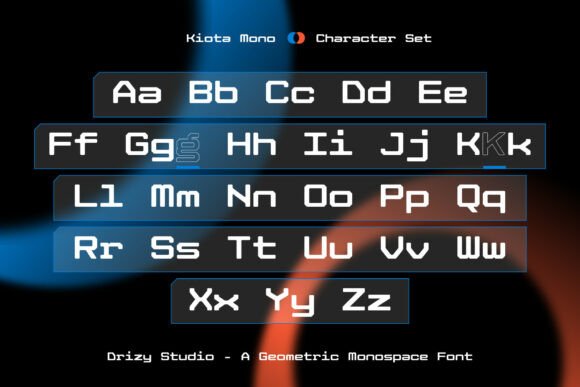
Kiota Mono is a contemporary geometric typeface built around strict monospacing. Each character follows a consistent width, while the individual shapes remain clean enough for structured layouts and modern digital systems.
Kiota feels more architectural than nostalgic. It does not immediately resemble an old typewriter, arcade game, or command-line terminal. That makes it useful for brands that want to communicate technical precision without relying on familiar retro references.
I can see it working in architecture portfolios, design studio identities, software landing pages, specification sheets, editorial grids, and section labels. On a website, it could support navigation, statistics, timestamps, feature categories, and compact headings.
Its geometric consistency creates a strong relationship with layout grids. However, that same regularity can feel cold if it is not balanced with photography, illustration, color, or a more approachable companion typeface.
For coding, I would still test a complete character specimen. A font can be technically monospaced without offering the punctuation clarity or character differentiation required for extended editor use.
Best for: Design grids, architecture portfolios, modern web interfaces
Key features: Strict monospacing, geometric shapes, contemporary construction
7. Code Mono
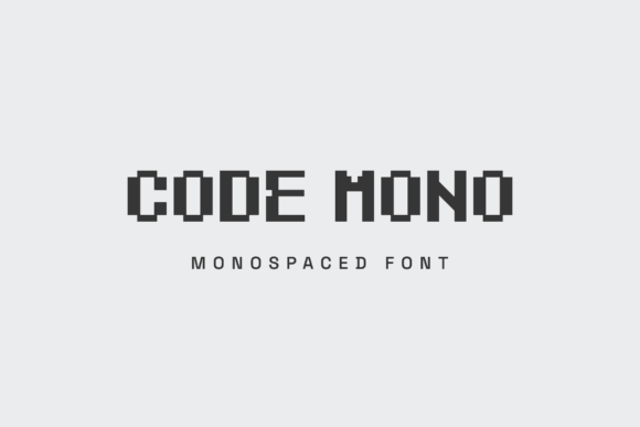
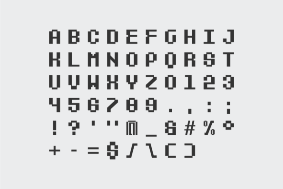
Code Mono is a blocky, pixel-influenced display face designed to create a sharp technological impression. Its strongest applications are titles, posters, futuristic graphics, software-event identities, and code-inspired wordmarks.
Despite the name, I would treat it as a visual interpretation of coding rather than a practical everyday programming font.
This distinction matters. A font can communicate software culture without being suitable for displaying hundreds of lines of source code. Code Mono uses assertive shapes and pronounced visual weight, which are useful in branding but potentially distracting in an IDE.
For a cybersecurity company, developer conference, game studio, or electronics brand, that recognisable digital language can be valuable. It establishes a technical tone without requiring literal terminal screenshots in every piece of communication.
Use it at medium or large sizes, and check the counters carefully. On textured or low-contrast backgrounds, the interior spaces may close up, particularly in heavier words.
Best for: Tech wordmarks, digital posters, software-event graphics
Key features: Blocky forms, pixel influence, assertive display construction
8. Terminal Mono
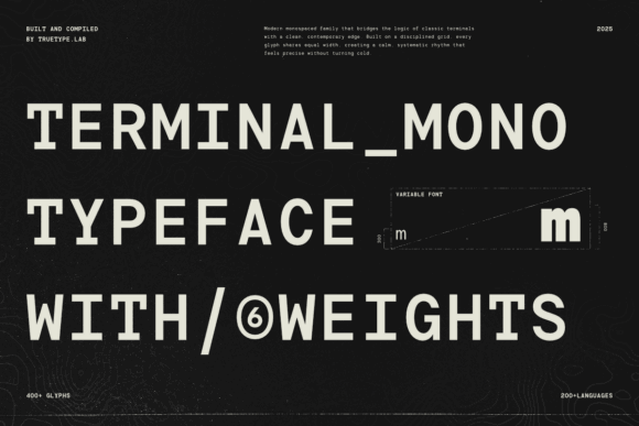
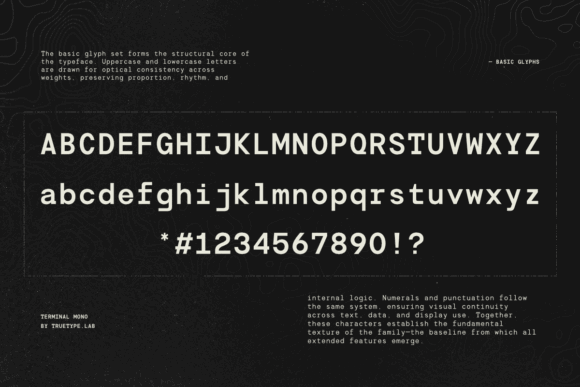
Terminal Mono is designed around the appearance of coding environments, command-line interfaces, and technical dashboards.
It makes sense for terminal mockups, developer merchandise, interface concepts, dashboard labels, technology presentations, and code-themed editorial graphics. It can create a more believable terminal atmosphere than simply placing bright green text in a generic system font.
The recognisable character of terminal typography means the surrounding design should remain restrained. Adding scan lines, glow, distortion, grids, static, and glitch effects at the same time usually introduces more noise than personality.
A strong design does not need to use every available reference.
On websites, I would apply Terminal Mono selectively to code snippets, categories, command-style buttons, numeric values, and small interface labels. It can establish a technical voice quickly, but repeating it across every heading and paragraph may make the design feel themed rather than considered.
Best for: Terminal graphics, dashboards, developer merchandise
Key features: Code-inspired appearance, fixed spacing, utilitarian digital tone
9. Morequiet
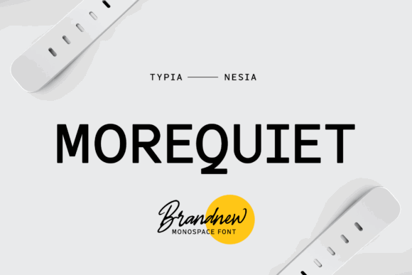
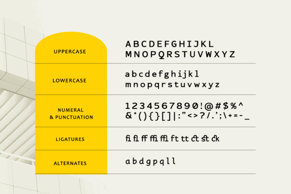
Morequiet is a clean monospace sans serif with a restrained, contemporary character. It retains some of the structure associated with typewriters, but the finish feels more controlled than nostalgic.
This is one of the more adaptable branding fonts in the collection. It could suit coffee packaging, studio identities, stationery, apparel labels, portfolio websites, and understated technology products.
Its visual personality is subtle, which is often useful in a broader brand system. Some display fonts attract attention immediately but become difficult to manage once they appear across packaging, social media, web interfaces, presentations, and printed materials. Morequiet is less likely to dominate those surrounding elements.
Still, minimalism should not be confused with low contrast. At small sizes, equal-width characters can make compact labels feel denser than a proportional sans serif would.
I would use Morequiet for a brand name, product line, or short heading and pair it with a neutral grotesk for descriptions and body copy. That preserves its distinctive rhythm without compromising everyday readability.
Best for: Minimal logos, packaging, understated brand systems
Key features: Clean mono sans serif, typewriter influence, restrained character
10. Miracle Mono
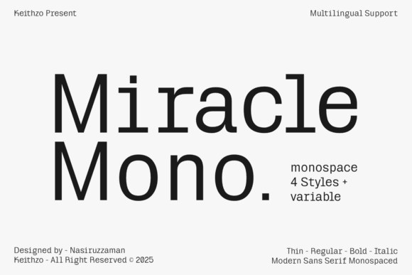
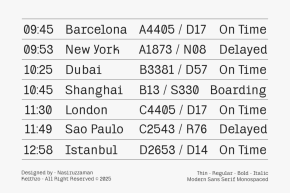
Miracle Mono includes Thin, Regular, Bold, and Italic styles, along with a variable font option. That range makes it more useful for a connected identity system than a one-style novelty font.
A variable font can be particularly valuable in responsive web design. The visual weight can be adjusted for different contexts rather than relying only on fixed font files. A light treatment may feel refined in an oversized desktop heading, while a firmer weight can improve clarity on smaller screens.
Miracle Mono could support technology branding, website headings, editorial details, campaign graphics, packaging labels, and interface accents. Its stylistic range also makes it easier to build hierarchy within one family.
This consistency matters in visual identity work. Introducing too many unrelated fonts often creates a fragmented brand tone, especially when the typography is already visually distinctive.
Before using the variable file on a production website, check technical compatibility, loading performance, and fallback requirements. Flexibility is useful only when it does not introduce unnecessary complexity.
Best for: Responsive branding, web headings, flexible visual systems
Key features: Four core styles, variable weight, modern monospace structure
11. Noplato Mono
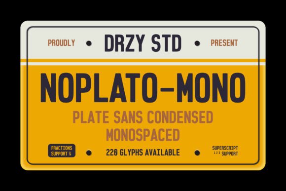
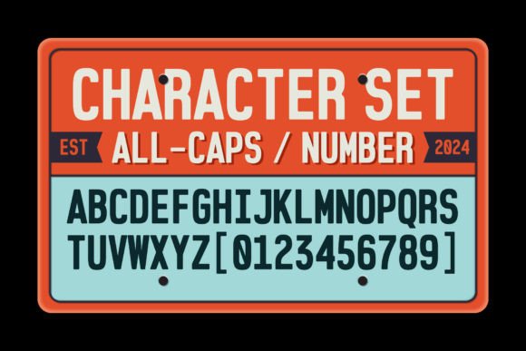
Noplato Mono is a geometric monospace sans serif from Drizy Studio. Its orderly construction makes it suitable for editorial design, website accents, contemporary packaging, and interface-focused graphics.
It occupies useful territory between functional and expressive typography. The typeface communicates precision without depending on exaggerated pixel forms, distressed textures, or overt science-fiction references.
That restraint makes Noplato easier to combine with photography, product imagery, and illustration. It can create a consistent grid-like rhythm without competing with the main visual content.
I would use it for captions, coordinates, issue numbers, dates, navigation, product specifications, compact headlines, and category labels. These are situations where the fixed-width structure can reinforce organisation and hierarchy.
For long passages, a proportional companion font will usually provide more natural word shapes and more comfortable line lengths.
Best for: Editorial systems, interface labels, modern packaging
Key features: Geometric construction, consistent rhythm, restrained sans-serif styling
12. Borgen Monospace
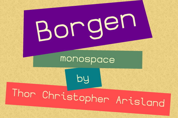
Borgen Monospace is a simple geometric family with clean, technical letterforms. Its available styles include heavier and oblique variants, giving designers more control over emphasis than a single-weight font would provide.
Borgen feels systematic without immediately suggesting gaming, cyberpunk, or science fiction. That makes it a sensible option for engineering companies, industrial branding, business technology, technical presentations, and structured portfolio layouts.
The regular style can support labels and secondary information, while the heavier weights create stronger section headings and compact wordmarks.
As with most geometric monospace fonts, line length deserves attention. Equal-width characters expand many ordinary words, so a text block can become wider and visually heavier than expected.
On responsive websites, that can create awkward wrapping or overly dense navigation. Test real content rather than relying only on short specimen words.
Best for: Engineering brands, technical presentations, structured portfolios
Key features: Geometric forms, multiple weights, clean technical appearance
13. Rofane Mono
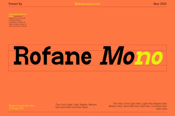
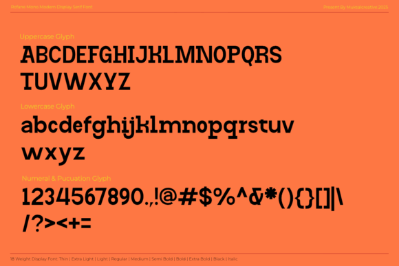
Rofane Mono is a display-oriented coding font with a contemporary digital character. Its presentation leans more toward branding and headlines than dense programming environments.
The typeface is a natural fit for technology posters, conference identities, interface mockups, social graphics, and product-launch materials. It has enough personality to carry a headline while retaining the measured cadence associated with monospaced typography.
I would not use it across an entire landing page. It is more effective when it establishes a technical voice at a few deliberate moments: a hero heading, feature label, statistic, product code, or short callout.
Selective use also creates better hierarchy. When every element uses the same expressive typeface, the interface loses contrast and the most important information becomes harder to identify.
For body copy, choose a companion font with open counters, moderate width, and calmer spacing. The pairing should reduce visual tension rather than introduce a second competing personality.
Best for: Conference branding, technology posters, digital campaigns
Key features: Display-focused shapes, coding influence, modern fixed rhythm
14. Monogamy
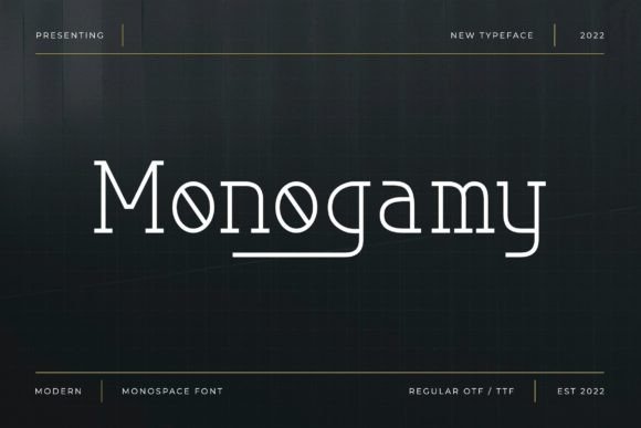
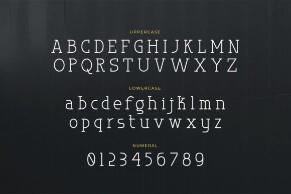
Monogamy differs from most fonts in this collection because it is a monospaced serif rather than a monospace sans serif.
The serif details introduce a literary and editorial tone, while the fixed spacing retains the mechanical rhythm associated with typewriters and archival documents. That combination can create a brand personality that feels analytical, independent, and slightly unconventional.
Monogamy is particularly suitable for book covers, independent publishing, magazine titles, stationery, café branding, cultural projects, and vintage technology themes.
It is not the obvious choice for a programming environment, but it offers more character for identity work. A typeface can completely change the personality of a logo without altering any other design element, and Monogamy is a good example of that effect.
Pair it with a plain sans serif and allow enough breathing room around the letters. The serif details and fixed-width structure already create substantial visual texture, so additional decoration is rarely necessary.
Best for: Editorial identities, book covers, vintage branding
Key features: Monospaced serif, typewriter character, structured editorial rhythm
15. Sumyar Monospace

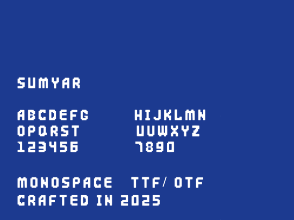
Sumyar Monospace is a bold display font with pixel-inspired construction. It is designed for digital themes, retro visuals, and prominent titles rather than continuous reading.
Its heavy visual weight gives it more impact than many thin terminal fonts. That makes it suitable for gaming thumbnails, streaming graphics, posters, event identities, merchandise, and short promotional phrases.
Sumyar needs space around it. At small sizes, the heavy strokes and pixel details can begin to merge, particularly on low-contrast backgrounds.
This is why testing at the final publishing size is essential. A heading that looks clear on a large desktop artboard may become unreadable once reduced to a website thumbnail or mobile preview.
Used selectively, Sumyar creates a strong focal point. Used across every element, it can flatten the hierarchy because every label, heading, and button begins competing at the same visual volume.
Best for: Gaming titles, streaming graphics, bold retro posters
Key features: Heavy weight, pixel styling, high-impact display forms
Read More: While monospace fonts offer a distinct modern touch for branding, another compelling option to consider for a unique brand identity is diving into the world of Vintage Display Fonts for Branding: 13 Stunning Retro Picks.
Quick Comparison of the Best Monospace Fonts
| Font | Visual Character | Strongest Use |
|---|---|---|
| NK57 Monospace | Clean, extensive, technical | Coding and multilingual interfaces |
| Joystix Monospace | Pixelated, arcade-inspired | Gaming and retro graphics |
| Bova Monospace | Sharp, polished, editorial | Posters and technology branding |
| Bittypix Monospace | Compact 8-pixel construction | Pixel art and small retro labels |
| Monospace | Minimal, neutral, modern | Logos and clean layouts |
| Kiota Mono | Geometric, precise, contemporary | Web design and grid systems |
| Code Mono | Blocky, digital, assertive | Tech headlines and wordmarks |
| Terminal Mono | Utilitarian, terminal-inspired | Coding themes and dashboards |
| Morequiet | Minimal, understated, refined | Brand identities and packaging |
| Miracle Mono | Flexible, modern, variable | Responsive branding systems |
| Noplato Mono | Structured, geometric | Editorial and interface design |
| Borgen Monospace | Clean, technical, restrained | Corporate technology projects |
| Rofane Mono | Modern, display-focused | Posters and digital branding |
| Monogamy | Monospaced serif | Editorial and vintage identities |
| Sumyar Monospace | Bold, pixel-inspired | Gaming titles and display text |
Which Monospace Font Should You Choose?
The best monospace fonts succeed because their fixed rhythm serves a clear purpose.
Sometimes that purpose is functional, as it is in source code, tabular data, and technical interfaces. In other situations, the same structure becomes a recognisable branding device.
NK57 Monospace is the most practical coding option in this collection. Kiota Mono, Bova Monospace, Morequiet, and Miracle Mono are stronger candidates for polished visual identities and website systems. Joystix, Bittypix, Code Mono, and Sumyar are better reserved for expressive retro or digital display work.
Monogamy offers a different direction by combining monospaced spacing with serif details, giving editorial and vintage identities a more distinctive voice.
The most convincing designs rarely use monospace typography everywhere. They use it selectively to create contrast, organise information, and give specific elements a precise technical character.
Strong typography often feels effortless, which is why it can be easy to overlook. In practice, that apparent simplicity usually comes from careful decisions about letterforms, spacing, hierarchy, scale, and context.
Some links in this article may be affiliate links. If you purchase through them, we may earn a small commission at no extra cost to you. Thanks for supporting our work.
FAQ
What is the best monospace font for coding?
NK57 Monospace is the strongest coding-oriented font in this selection because it includes 60 styles, technical symbols, Greek, Cyrillic, and broad character coverage. Fira Code, JetBrains Mono, Cascadia Code, and Monaspace are also widely considered outside Creative Fabrica.
Are monospace fonts good for websites?
Yes, particularly for code blocks, statistics, navigation labels, timestamps, buttons, and short headings. They are usually less comfortable for long body paragraphs because equal-width characters produce denser, less natural word shapes.
Can a monospace font be used for a logo?
A monospace font can create a precise, technical, editorial, or retro identity. Clean families such as Kiota Mono and Morequiet suit modern brands, while pixel fonts such as Joystix communicate gaming and digital nostalgia more directly.
What is the difference between a monospace font and a coding font?
A monospace font gives every character the same width. A coding font is normally monospaced but also considers programming-specific needs, including clear punctuation, distinguishable characters, technical symbols, small-size legibility, and sometimes coding ligatures.
Follow Us