

ℹ️ Affiliate Disclosure: This article may contain affiliate links. We may earn a commission at no extra cost to you. Thanks for your support! ❤️
How to Choose Font Bundles for Business Documents
The best sans serif fonts bundle for business documents should do more than give you dozens of trendy display faces. It needs to support the less glamorous parts of professional design: long paragraphs, numbered sections, tables, captions, presentation slides, and headings that still look organized on page 30.
I looked for collections that could help build a repeatable document system rather than a one-time title page. My strongest picks include clean everyday sans serifs, useful weight variations, condensed options for charts and tables, and enough visual range to separate headings from body copy.
Quick Picks
- Best overall: Modern Sans Serif Font Bundle
- Best for executive documents: Elegant Sans Serif Bundle
- Best for creative business documents: Sans Serif Bundle Collection
- Best for multi-client variety: 82-Font Sans Serif Collection
- Best for agencies: The Ultimate Font Family Bundle
How I Picked These
I compared these bundles by paragraph readability, heading range, numeral clarity, available weights and widths, document-system flexibility, collection size, and how well the included styles can support reports, proposals, presentations, tables, and branded office templates.
Best Sans Serif Font Bundles for Professional Documents
1. Modern Sans Serif Font Bundle
My pick for the best all-around business bundle

This 20-font collection is the first one I would inspect for a broad corporate design toolkit. Its included typefaces span clean geometric styles, softer forms, and more distinctive heading options, giving you room to establish hierarchy without mixing unrelated font sources.
The listed fonts include Mansory, Chopard, Solen, Conso, Cosen, Grovana, Monton, Laro, Laro Soft, Parnas Sans, Dress Code, and Modern Sans. That range is useful when one project needs a restrained body face while another needs a sharper title font. The bundle carried a 5.0 rating based on one review when researched.
I would start with the quieter, more open designs for body copy and reserve the narrow or highly stylized choices for report covers and section dividers.
Best for: Annual reports, proposals, branded Word templates
Key features: 20 fonts, varied sans serif styles, commercial license, verified 5.0 rating
2. Elegant Sans Serif Bundle
Best for polished executive documents
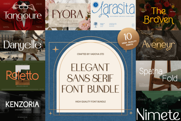
This is a tighter ten-font collection built around refined, contemporary sans serif forms. The product positions the fonts for editorial layouts, premium branding, packaging, and visual identities, but that same controlled appearance can translate well to investor summaries, consulting reports, and executive presentations.
I like this bundle most for documents where typography needs to feel upscale without becoming decorative. It could be especially useful for a firm that wants cleaner proportions than standard office fonts while keeping the page restrained.
The listing showed a 5.0 rating, one verified review, and 28 favorites at the time of research. It also lists Windows, macOS, and Linux compatibility.
My one caution is that elegant display-oriented fonts are not automatically good paragraph fonts. Preview lowercase text at 10–12 points before choosing one for a long report.
Best for: Executive summaries, premium proposals, consulting decks
Key features: 10-font collection, refined proportions, cross-platform compatibility, PUA encoding
3. Sans Serif Bundle Collection
Best for documents that need personality
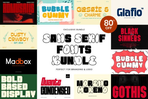
This collection includes Moreno, Glafio, Glossie & Charmie, Gothis, Romusans, Quante Condensed, Bubble Gummy, and Madbox. It is more expressive than my first two choices, combining bold, condensed, retro, and playful directions.
For conventional financial statements or legal documents, several of these faces may be too distinctive. For marketing plans, trend reports, workshop PDFs, or startup presentations, however, the range gives you more freedom.
Quante Condensed could be useful for narrow labels and compact headers, while stronger faces such as Gothis or Romusans may suit covers and section openers. I would pair those expressive headings with the collection’s calmest font for paragraphs rather than forcing one design to handle every role.
Best for: Marketing reports, creative proposals, startup presentations
Key features: Eight named fonts, condensed options, bold display styles, varied personalities
4. Sans Serif Fonts Bundle
Best budget-friendly general collection
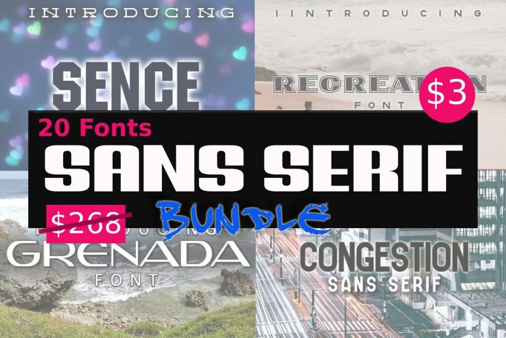
This listing gathers 20 sans serif fonts in a single bundle. It does not provide the same detailed editorial description or review history as some higher-ranked options, but its focused sans serif format makes it more relevant to business documents than bundles padded with scripts and decorative faces.
I would view this as an exploration kit. It gives a small business or freelance designer enough options to test different document personalities without committing the whole brand to one type family.
Before using any included font throughout a 40-page proposal, check the numerals, punctuation, bold weight, italics, and lowercase spacing. Those small details matter more in business documents than an impressive cover specimen.
Best for: Small-business templates, simple reports, font exploration
Key features: 20 sans serif fonts, focused collection, commercial license, broad project flexibility
5. Sans Serif Font Bundle: 82-Font Collection
Best for maximum variety on a limited budget
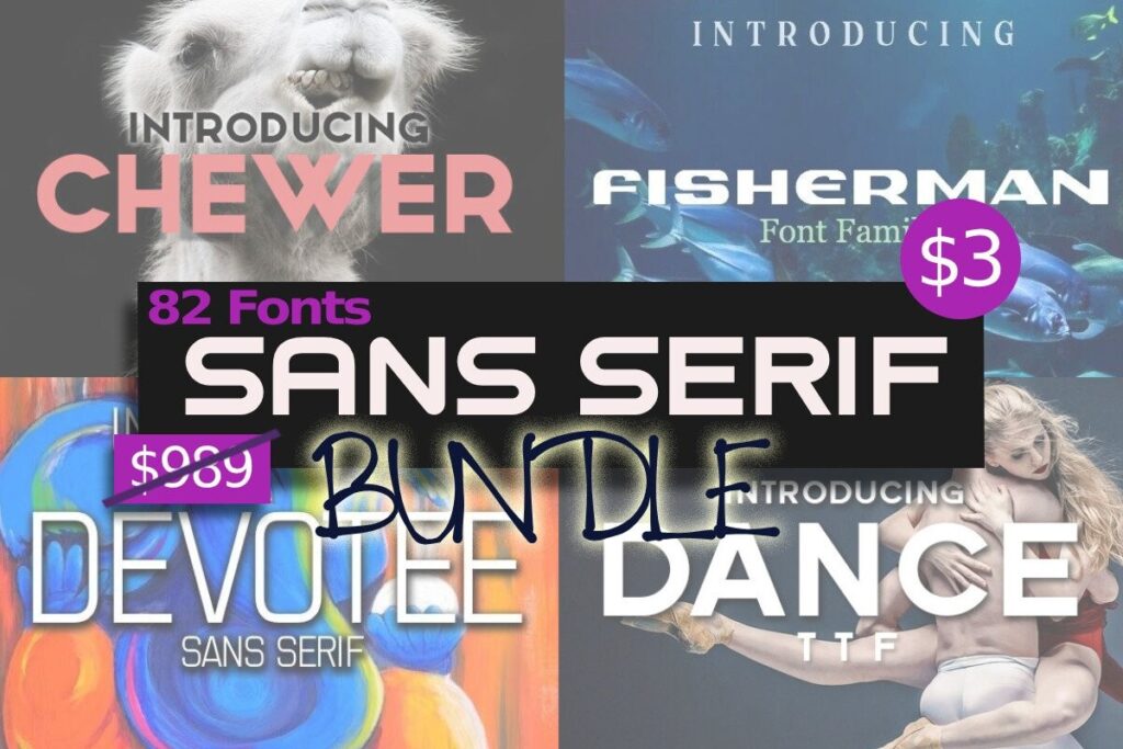
With 82 fonts, this is one of the largest dedicated sans serif collections in the roundup. The size is attractive when you produce documents for multiple brands or clients and need clearly different visual directions.
The tradeoff is decision fatigue. A large library does not automatically create a coherent document. I would shortlist three candidates, build the same two-page sample in each, and compare headings, paragraphs, tables, bullets, and page numbers.
This bundle makes the most sense for designers who are comfortable curating type. A business owner who wants one dependable corporate family may get more practical value from a smaller, better-documented collection.
Best for: Multi-client design, template libraries, brand experimentation
Key features: 82 fonts, wide stylistic range, commercial license, high quantity
6. Sans Serif Font Bundle
Best for straightforward office and brand projects
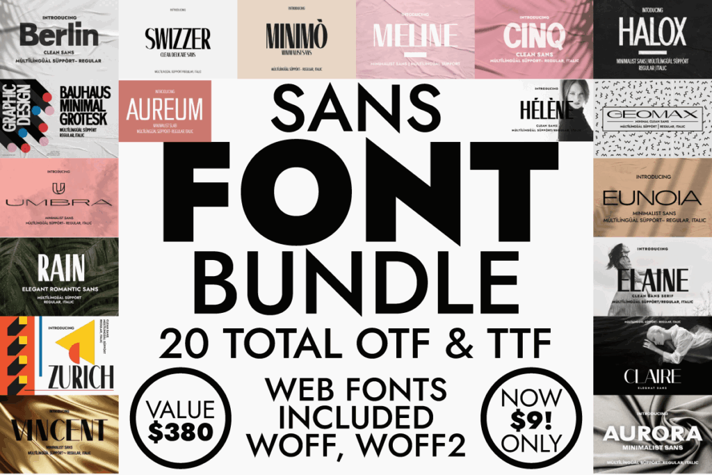
This separate 20-font listing comes from Minimalistartstudio. Its scale is manageable enough to compare without opening dozens of nearly identical files, yet broad enough to create different heading and supporting-text combinations.
I would consider this bundle for standard business collateral: proposal covers, service guides, internal handbooks, onboarding documents, and presentation templates. The collection had no visible reviews in the researched listing, so I would rely heavily on the specimens rather than assuming all 20 options are equally suitable for text-heavy layouts.
Look closely at the capital I, lowercase l, and numeral 1. Those characters should remain easy to distinguish in instructions, account information, technical documents, and tables.
Best for: Employee guides, service documents, internal templates
Key features: 20 fonts, manageable collection size, minimalist direction, commercial license
7. The Sans & Serif Bundle
Best for building a complete hierarchy
Despite its name, this mixed collection is relevant because it contains ten font families and 45 individual font files. Included families listed on the page include Gobold, Alighty Nesia, Blackplotan, Chosence, Goeslim, Hastro, C7nazara, Ovine, Ooh, and Upbolters.
Gobold is the standout reason I would consider the bundle for business materials. A multi-style family can cover strong titles, narrow labels, page furniture, and data-oriented layouts more consistently than a folder of unrelated one-weight fonts.
Because several included families appear display-led, I would not assume the entire bundle is suited to body copy. Its better role is supporting a structured hierarchy: one restrained text face, one bold heading family, and perhaps a condensed style for tables or sidebars.
Best for: Branded reports, infographics, structured presentation systems
Key features: 10 families, 45 font files, condensed styles, mixed hierarchy options
8. Slab, Serif and Sans Serif Font Bundle
Best for reports that combine authority and clarity
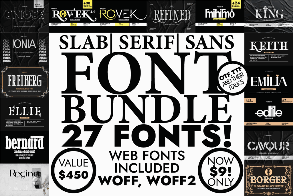
This bundle contains 19 individual fonts plus an eight-font family, for 27 fonts in total. It held a 5.0 rating from two reviews when researched.
I included a mixed serif-and-sans collection because many business documents benefit from controlled contrast. A sturdy slab or serif can give report titles more authority, while a quieter sans serif handles tables, captions, navigation, and supporting text.
The important word is controlled. Limit yourself to two families and define their roles before formatting the document. Switching typefaces every few paragraphs creates visual noise and makes future template maintenance harder.
Best for: Research reports, formal proposals, editorial-style documents
Key features: 27 total fonts, eight-font family, serif/sans contrast, 5.0 rating from two reviews
9. The Modern Collection Font Bundle
Best for teams producing many content types
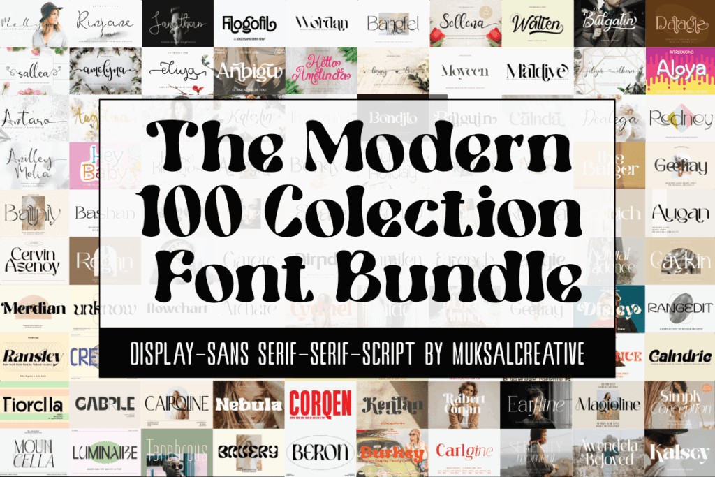
This 100-font collection combines sans serif, serif, script, and display categories. The listing specifically identifies clean modern sans serifs among the included styles and states that the fonts have multilingual support. It also carried a 5.0 score based on 14 reviews, the strongest visible review count among the principal bundles in this roundup.
For a team that produces reports, social graphics, invitations, presentations, and packaging, that breadth can be economical. For business documents alone, most users will only need a small portion of it.
I would create an approved internal shortlist after downloading: one font for body copy, one family for headings, and one optional accent. That prevents employees from treating the bundle as permission to use a new typeface on every page.
Best for: Content teams, multilingual brands, varied marketing collateral
Key features: 100 fonts, multiple categories, multilingual support, 5.0 rating from 14 reviews
10. The Ultimate Font Family Bundle
Best for agencies and advanced document systems
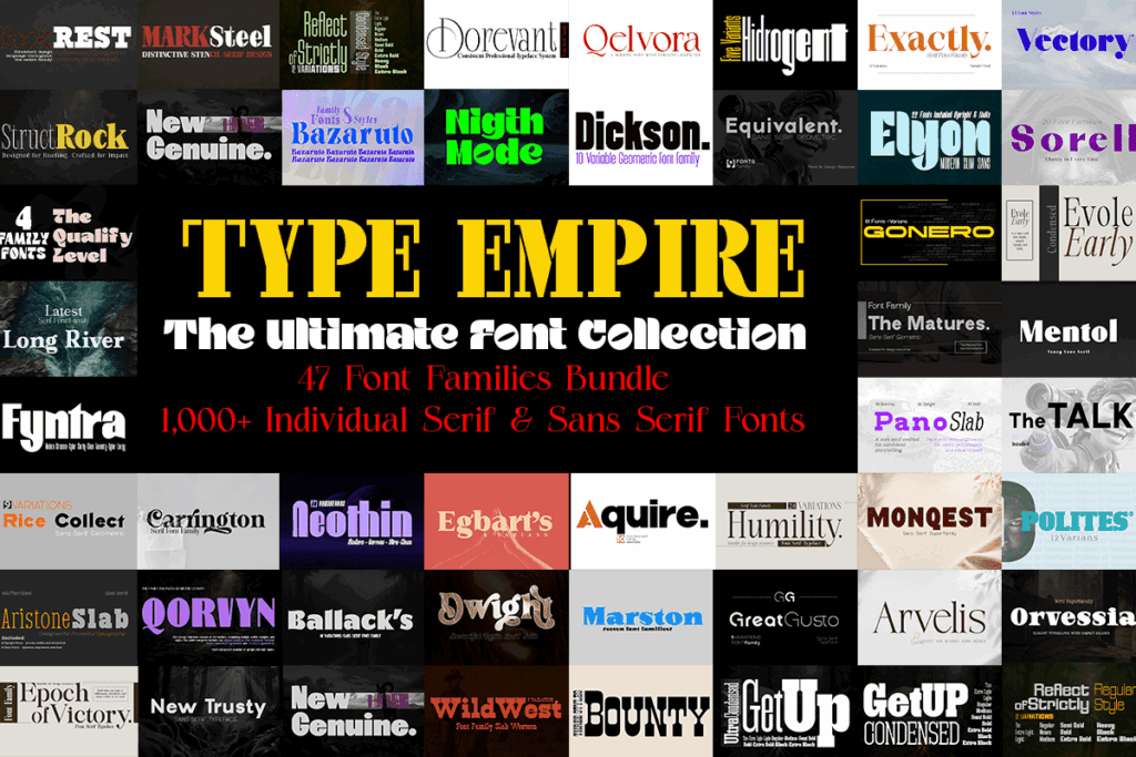
This is the heavyweight option. The listing describes 47 complete serif and sans serif families with more than 1,000 individual styles, including variations in weight, width, upright forms, and italics across selected families.
That depth can be genuinely useful in complex document systems. A broad family lets you use regular text, semibold subheads, bold titles, condensed chart labels, and italics without losing visual consistency.
It is also excessive for a company that simply needs one readable proposal template. I would choose this for an agency, publisher, or in-house design department—not for someone hoping that a thousand fonts will make the selection process easier.
Best for: Agencies, publishing teams, large corporate design systems
Key features: 47 families, 1,000-plus styles, weight variations, multiple widths
Which Sans Serif Font Bundle Should You Choose for Business Documents?
My top choice is the Modern Sans Serif Font Bundle because its 20-font lineup offers a practical middle ground: enough range for several document styles without becoming an unmanageable archive.
For refined executive material, I would look next at Elegant Sans Serif Bundle. For an agency or large design team that needs deep weight and width coverage, The Ultimate Font Family Bundle offers far more room to build a complete typography system.
The best purchase is not necessarily the bundle with the largest number on the cover. It is the one that gives you a readable paragraph font, a dependable heading family, clear numerals, and enough weight variation to keep the entire document organized.
FAQ
What is the best sans serif font style for business documents?
A neutral or humanist sans serif with open letterforms, clear numerals, and several weights is usually the safest choice. Avoid highly condensed or decorative styles for long paragraphs.
Can I use a Creative Fabrica font in Microsoft Word?
Downloaded OTF or TTF fonts can generally be installed at the operating-system level and then selected in Word. Exact compatibility and embedding permissions should be checked for the specific font and license.
How many fonts should I use in a business report?
One family with multiple weights is often enough. Two coordinated families can also work: one for headings and one for body text. Using more than two usually makes the report harder to keep consistent.
Are sans serif fonts more accessible than serif fonts?
Not automatically. Accessibility guidance does not prescribe one universal font category. Character clarity, size, spacing, contrast, layout, and the reader’s individual needs all affect readability.
Save to Your Inspiration Board
Follow Us