

ℹ️ Affiliate Disclosure: This article may contain affiliate links. We may earn a commission at no extra cost to you. Thanks for your support! ❤️
Best Free Varsity Fonts for Cricut Shirts, Jerseys, and Team Designs
Varsity lettering is one of the easiest ways to give a Cricut design a recognizable sports, school, or collegiate look. Thick block letters immediately suggest team jerseys, athletic departments, campus apparel, championship graphics, and retro school merchandise.
The harder part is finding free varsity fonts for Cricut that are readable, easy to cut, and licensed clearly enough for products you intend to sell.
For this list, I focused primarily on fonts available through Google Fonts. They are convenient for Cricut users because the files can be downloaded directly, installed on a computer, and used inside Cricut Design Space. Their licensing is also easier to verify than many “free” fonts that are actually limited to personal projects.
Some fonts below are traditional college styles. Others are athletic display fonts that can create a varsity look when combined with outlines, arched text, contrasting colors, or a strong sports-themed layout.
Quick Picks
- Best traditional varsity look: Graduate
- Best for long team names: Alumni Sans Collegiate One
- Best modern and esports option: Tourney
- Best bold solid option: Alfa Slab One
- Best supporting font: Oswald
How I Picked These
I compared these free varsity fonts by cutability, licensing clarity, distance readability, width, outline and stencil complexity, small-size performance, and how practical each option is for Cricut shirts, jerseys, school merchandise, team names, numbers, and supporting text.
1. Graduate
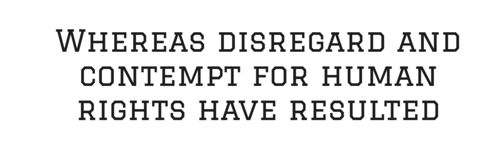
Graduate is the strongest starting point when you need a recognizable American college look without having to build the style from scratch. Google Fonts describes it as a classic college block design commonly associated with campuses in the United States.
Its squared forms, slab-like details, and open interior spaces make words feel structured and academic. It is especially effective for class-year shirts, graduation decorations, school clubs, alumni events, and campus-themed merchandise.
Graduate is relatively clean compared with more decorative varsity fonts. That simplicity helps when cutting adhesive vinyl or heat-transfer vinyl because there are fewer fragile interior details. It also leaves room for adding your own offset layer in Cricut Design Space.
The font is distinctive enough for short names and initials, but a full sentence will feel heavy. Use it for the main wording and pair it with a simpler condensed font for dates or supporting information.
Best for: Graduation shirts, school clubs, college-style apparel
Key features: Classic block letters, slab details, open counters
2. Alumni Sans Collegiate One

Alumni Sans Collegiate One has a taller, narrower profile than a conventional varsity block font. That makes it useful when a long team name needs to fit across the chest of a shirt without shrinking the letters too much.
The font is based on the broader Alumni family and is available as a standalone collegiate display typeface. Its narrow proportions give designs a slightly vintage athletic-program feel, especially when the text is arched over a mascot, number, or founding year.
This style is particularly useful for school names with many characters. A wide slab-serif font may force you to compress the layout, while Alumni Sans Collegiate One naturally occupies less horizontal space.
The letterforms are decorative enough to establish the theme but still fairly controlled. For clean results, keep the spacing slightly tighter in large headlines and avoid using it for small explanatory text.
Best for: Long team names, campus shirts, athletic posters
Key features: Narrow proportions, collegiate detailing, strong uppercase rhythm
3. Tourney

Tourney feels more modern than a traditional letterman-jacket font. Its design combines sports typography with technical and futuristic details, and Google Fonts notes that it can feel equally at home in a stadium or science-fiction setting.
The family is especially useful for jerseys, esports graphics, team numbers, gaming shirts, and youth sports designs. Several styles create an outlined or layered appearance, allowing the font to carry more visual interest without requiring a separate decorative graphic.
The open construction looks sharp at large sizes, but some versions contain narrow sections that may be difficult to weed on small vinyl cuts. Test a single word before committing to an entire batch of shirts.
Tourney is one of the better options when classic collegiate lettering feels too traditional. It still communicates competition, but the personality is more contemporary and energetic.
Best for: Esports shirts, modern jerseys, tournament graphics
Key features: Outlined construction, athletic geometry, multiple visual styles
4. Alfa Slab One
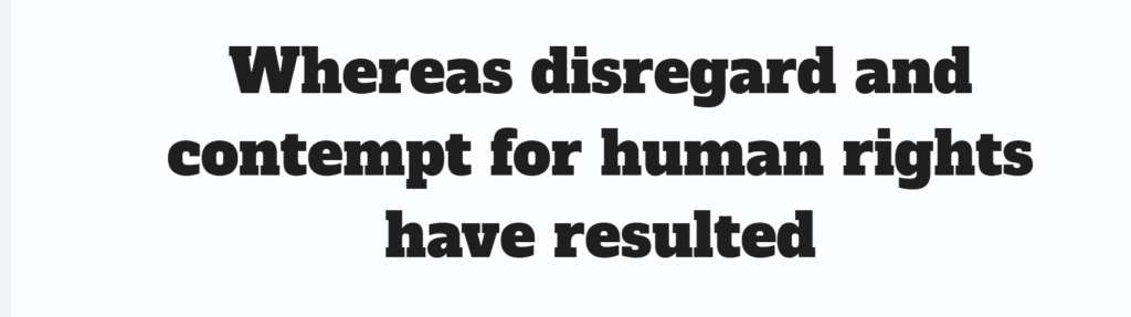
Alfa Slab One is not strictly a varsity typeface, but its extreme weight and prominent serifs make it easy to adapt for college-style Cricut designs. Google Fonts describes the family as having very heavy stems, large serifs, noticeable contrast, and gradual terminals.
The font creates substantial visual weight, which is useful for sweatshirt fronts, mascot names, sports-bar graphics, championship designs, and retro athletic logos. Even without an outline, the letters feel solid and established.
Because the forms are so heavy, the font generally cuts cleanly at medium and large sizes. The main concern is spacing. Some combinations can appear crowded, especially when an offset or shadow is added.
Alfa Slab One looks best when given room to breathe. Add moderate letter spacing, use a simple color palette, and avoid placing several additional effects around it.
Best for: Sweatshirts, mascot logos, bold athletic headlines
Key features: Heavy slab serifs, wide forms, strong visual weight
5. Black Ops One
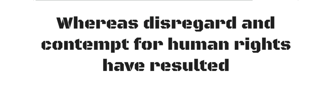
Black Ops One brings a tougher, more tactical mood to sports lettering. It is a heavy, semi-geometric typeface influenced by military stencil forms.
That makes it a good match for wrestling teams, football graphics, fitness apparel, paintball shirts, obstacle-course events, and aggressive mascot designs. The cutout details create texture without making the font look distressed or worn.
The stencil breaks can become small on compact projects, so Black Ops One performs better on large shirt graphics than on narrow labels or tiny decals. When cutting HTV, use a test size and check that every bridge remains thick enough to handle cleanly.
Its personality is quite specific. It may feel too severe for elementary school spirit wear, but it fits competitive or strength-oriented themes naturally.
Best for: Football, wrestling, fitness, tactical team designs
Key features: Military stencil influence, heavy weight, angular construction
6. Bungee
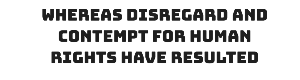
Bungee was originally designed around bold urban sign lettering that can make dramatic use of restricted space. Although it does not imitate a traditional college jersey directly, its stacked, blocky presence works surprisingly well in playful varsity compositions.
It is a useful choice for pep-rally posters, youth team shirts, dance squads, cheer graphics, school events, and oversized one-word designs. The letters have enough personality to carry a layout without additional clip art.
Bungee is visually dense. It is most effective when the wording is short—usually one to three words. Long school names may become difficult to scan unless the letters are spaced carefully.
For Cricut projects, use the font at a generous size and consider pairing it with a simple sans serif. Adding too many outlines or shadows can make the already-bold forms feel congested.
Best for: Pep rallies, youth teams, bold event shirts
Key features: Urban block forms, compact shapes, playful personality
7. Londrina Outline

Londrina Outline offers a lighter and more casual alternative to strict athletic typography. It belongs to a four-style family that also includes solid, shadow, and sketch versions.
The outlined construction works well for retro school graphics, kids’ sports shirts, field-day designs, summer camps, and informal club merchandise. It has a hand-drawn quality that keeps the result from feeling like official university branding.
This font needs size. The outline can become thin when used for small decals or narrow shirt text. For better cutting performance, enlarge the design or apply an offset that strengthens the outside shape.
Londrina Outline also layers nicely over a solid copy of the same text. That approach can create a two-color collegiate treatment while preserving the font’s loose personality.
Best for: Kids’ teams, retro school shirts, casual clubs
Key features: Hand-drawn outline, rounded forms, informal retro character
8. Stardos Stencil
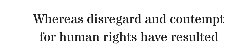
Stardos Stencil combines serif letterforms with practical stencil breaks. It was created as a display-focused stencil font rather than a body-text family.
Its serif structure gives it a more traditional feeling than many industrial stencil fonts. That balance makes it suitable for vintage gym graphics, heritage-style sports logos, school workshop shirts, baseball themes, and old athletic department designs.
The letters are not as wide as a classic varsity font, so Stardos Stencil can fit longer words more comfortably. It works particularly well when paired with an established date, location, or small team emblem.
The stencil gaps are functional visually, but they also introduce extra edges for a cutting machine. Keep the lettering large enough that those openings remain intentional rather than looking like accidental cuts.
Best for: Vintage sports logos, gym shirts, baseball graphics
Key features: Serif stencil design, traditional proportions, display-focused construction
9. Big Shoulders Stencil

Big Shoulders Stencil is a condensed American Gothic-style font from the broader Big Shoulders superfamily, which was developed in connection with the Chicago Design System.
Its narrow shape makes it especially useful for player numbers, vertical graphics, sleeve text, team rosters, and tall poster layouts. The industrial character also suits urban basketball themes, boxing events, and competitive fitness branding.
Because the letters are condensed, the font can produce strong vertical impact without occupying too much width. However, narrow letterforms can feel weak when cut very small. Use a heavier weight and check thin joins before cutting.
This is less of a traditional high-school varsity font and more of an athletic utility face. It works best alongside a wider headline font rather than replacing it in every part of the design.
Best for: Jersey numbers, sleeve text, narrow athletic layouts
Key features: Condensed width, stencil cuts, industrial American character
10. Oswald
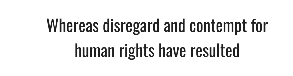
Oswald is a condensed sans serif based on the tradition of Alternate Gothic-style typefaces. It does not have decorative varsity serifs, but it is one of the most practical supporting fonts for Cricut sports designs.
Use Oswald for player names, dates, locations, divisions, team mottos, or small wording placed around a larger collegiate headline. Its narrow construction helps secondary information fit without competing with the main design.
Oswald is also easier to read at smaller sizes than most outlined varsity fonts. For that reason, it can be a better choice for sleeve text, back-of-shirt details, or product labels.
Pair it with Graduate, Alfa Slab One, or Tourney to create clearer hierarchy. The varsity font establishes the theme, while Oswald handles the information.
Best for: Player names, supporting text, dates, team details
Key features: Condensed sans serif, clear hierarchy, versatile weight range
11. Racing Sans One
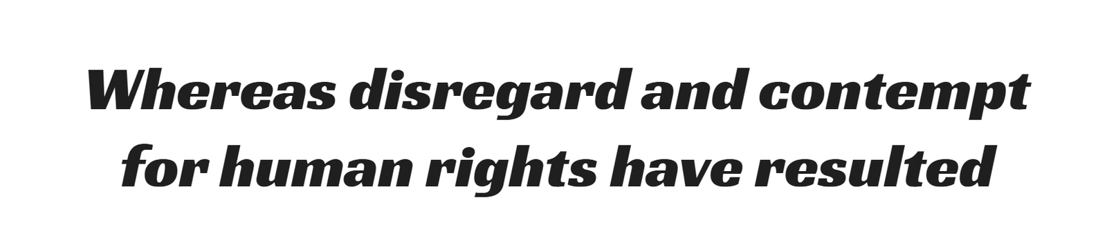
Racing Sans One is a high-energy display typeface with noticeable contrast between thick and thin strokes. Google Fonts connects its structure to early sans-serif styles that incorporated lowercase characters and strong stroke contrast.
It is particularly effective for motorsports, racing teams, competitive clubs, fast-pitch softball, cycling events, and designs that need a sense of forward movement.
The font feels more dynamic than a square college block. It can add variety to a collection that otherwise consists of similar slab-serif alphabets.
Thin sections may be less forgiving in small HTV cuts, so avoid reducing it too far. It is better suited to a large team name or event title than to a tiny player label.
Best for: Racing teams, cycling events, energetic sports graphics
Key features: High stroke contrast, forward energy, display-oriented forms
Read More: If you're ready to explore beyond varsity fonts for your Cricut projects and branding, discover more creative options in our guide to the Best Display Fonts: 10 Creative Fonts for Branding, Cricut & Crafts.
Quick Comparison of the Best Free Varsity Fonts
| Font | Style | Best Application |
|---|---|---|
| Graduate | Classic college block | School shirts and graduation designs |
| Alumni Sans Collegiate One | Narrow collegiate display | Team names and large headlines |
| Tourney | Modern outlined sports font | Jerseys and esports graphics |
| Alfa Slab One | Heavy slab serif | Bold logos and sweatshirt designs |
| Black Ops One | Military athletic display | Tough team and fitness branding |
| Bungee | Urban block display | Posters and oversized shirt text |
| Londrina Outline | Casual outline font | Retro school and youth designs |
| Stardos Stencil | Serif stencil | Vintage athletic graphics |
| Big Shoulders Stencil | Condensed industrial stencil | Numbers and narrow layouts |
| Saira Stencil One | Modern geometric stencil | Contemporary sports apparel |
| Oswald | Condensed sans serif | Supporting text and player names |
| Racing Sans One | Fast, energetic display | Motorsports and competitive themes |
How to Choose a Varsity Font for Cricut
The best-looking font on screen is not always the easiest font to cut. Before choosing one for a finished product, consider the material, design size, number of layers, and amount of detail inside each letter.
Match the Font to Your Material
Simple solid fonts are generally easier to use with adhesive vinyl and heat-transfer vinyl. Fonts with narrow outlines, stencil gaps, or interior shadows may require more careful weeding.
For cardstock, wider shapes are useful because thin sections can tear when removed from the mat. For sublimation, cutting complexity is less important because the design is printed rather than weeded.
Check Small Interior Cuts
Look closely at letters such as A, B, D, O, P, and R. Small counters and narrow openings can disappear when the design is reduced.
Before cutting an entire shirt design, test one difficult word at the final production size. A font that looks clean at twelve inches may become messy at four inches.
Use Outlines Carefully
A common Cricut varsity effect uses a solid letter with one or two offset layers. This can create the familiar two-color jersey look even when the original font is not outlined.
Keep the first offset relatively narrow. An oversized outline can close counters, fill small gaps, and make individual letters merge together.
Confirm the Current License
“Free download” and “free for commercial use” do not always mean the same thing. Many font websites provide files at no cost but restrict business use, physical products, logos, or digital files.
Check the license included with the font at the time you download it. Save a copy of the license or a screenshot of the relevant terms with your project records. License terms can be updated, and third-party font directories occasionally label files incorrectly.
Which Free Varsity Font Should You Choose for Cricut?
Graduate is the clearest option for a traditional college look, while Alumni Sans Collegiate One handles longer school names more efficiently. Tourney is better for modern jerseys and esports designs, and Alfa Slab One delivers the strongest solid lettering for sweatshirts and large shirt fronts.
For supporting text, Oswald is often more useful than another decorative typeface. It keeps names, dates, and team information readable while the main varsity font carries the visual theme.
Whichever font you choose, test it at production size before cutting a full design. The difference between a good digital preview and a clean physical result usually comes down to spacing, interior cuts, and the thickness of small details.
FAQ
What is the best free varsity font for Cricut?
Graduate is one of the best free choices for a traditional varsity look. Its block construction, college-style details, and relatively open letterforms make it suitable for school shirts, graduation projects, and sports merchandise.
Can free Google Fonts be used for commercial Cricut projects?
Google Fonts are distributed under open licenses, but you should still review the license shown for the individual font before selling products. Save the license information with your project records and avoid assuming that every font downloaded from a third-party website has the same terms.
How do I make a font look like varsity lettering in Cricut?
Type the main wording in a bold college or slab-serif font, then use Cricut Design Space’s Offset tool to create an outside border. Duplicate or layer the text in contrasting colors to produce a jersey-style effect.
Which varsity fonts are easiest to weed?
Solid fonts with wide strokes and limited interior detail are generally the easiest to weed. Graduate and Alfa Slab One are more manageable than thin outlined or stencil fonts, especially for smaller heat-transfer vinyl projects.
Follow Us