

Halloween Fonts for Every Spooky Craft Project
The best Halloween fonts should establish a spooky mood without making your message difficult to read. For this roundup, I selected 36 Halloween fonts for invitations, shirts, signs, stickers, party decorations, and Cricut crafts. The collection includes dripping horror lettering, playful ghost fonts, pumpkin-inspired characters, gothic styles, and cleaner display faces for projects that need more readable typography.
My advice is to choose the font around the final product rather than picking the most decorative alphabet first. Intricate details can look striking on a large poster but become messy on a small vinyl decal. A chunky design is usually easier to cut and weed, while a lighter or more refined style may suit invitations and printed stationery better.
I looked for verified Creative Fabrica fonts with clearly identifiable Halloween styling and useful applications across apparel, invitations, signage, sublimation, and paper crafts. I also considered readability, cutting complexity, personality, layout flexibility, and how easily each design could support short seasonal phrases.
Table of Contents
Best Halloween Fonts for Invitations, Shirts, Signs, and Crafts
1. Scary Drips
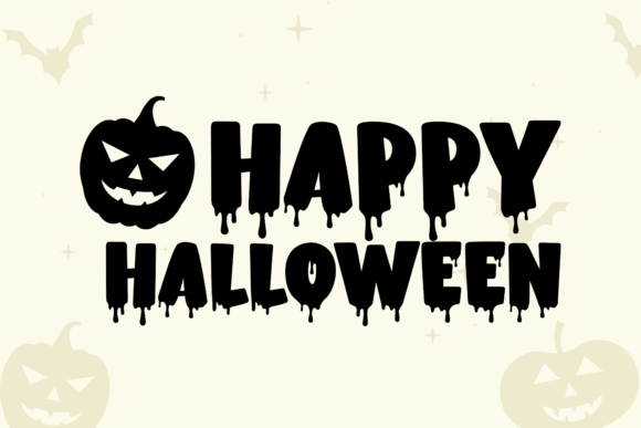
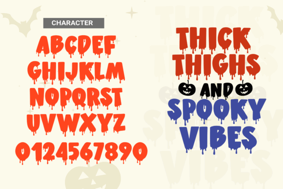
Scary Drips uses thick display lettering with irregular liquid details hanging from the characters. The weight gives short phrases strong visibility, making it a natural fit for Halloween shirts, haunted-house signs, posters, and bold party graphics.
I like this font most when the wording is short and the letters have room to breathe. The dripping shapes may require extra attention when cutting small vinyl, so I would avoid shrinking it for narrow labels or detailed favor tags.
Best for: horror shirts, haunted-house signs, party posters
Key features: thick lettering, dripping details, high-impact display style
2. Hellaween
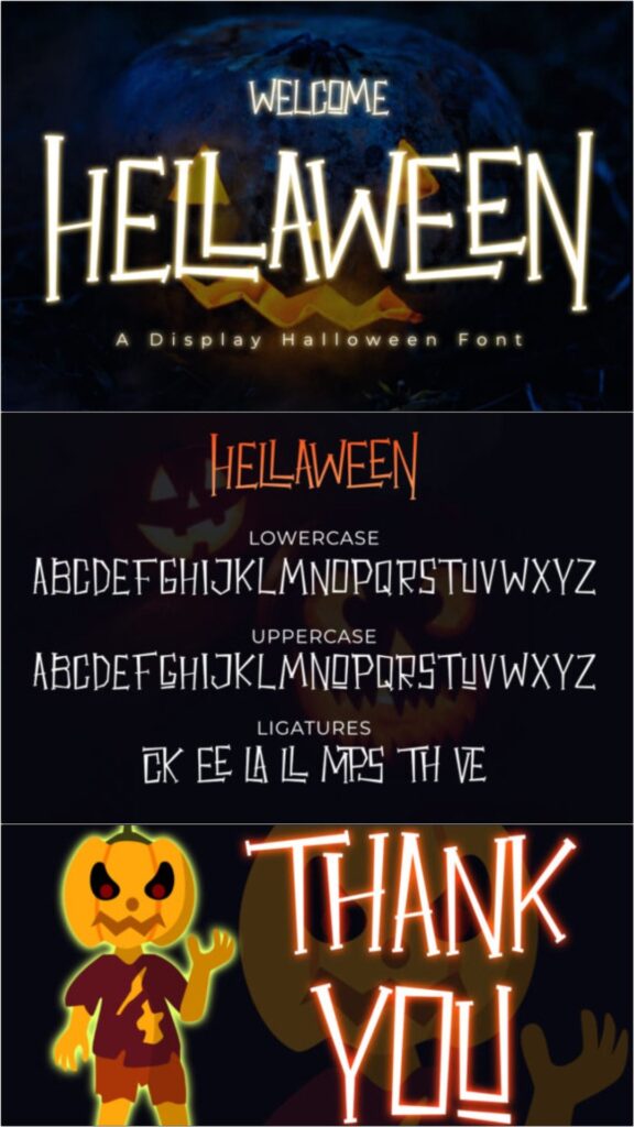
Hellaween has a playful slab-serif structure that feels spooky without becoming excessively dark or gruesome. Its sturdy characters can support invitations, family Halloween shirts, treat bags, classroom decorations, and friendly seasonal signs.
My pick for designers who need one adaptable Halloween typeface, Hellaween balances personality with useful readability. It is less suitable for serious horror branding, but that softer tone is precisely what makes it practical for mixed-age events.
Best for: family invitations, classroom crafts, treat bags
Key features: slab serifs, cartoon character, readable letterforms
3. Wicked Halloween
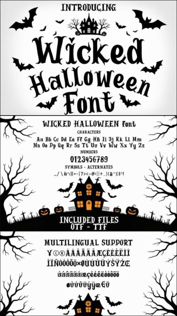
Wicked Halloween combines pointed serif details with exaggerated, ominous curves. It has enough drama for witch-themed invitations, gothic porch signs, trick-or-treat shirts, horror book covers, and seasonal social graphics.
I would use it for a central title rather than long paragraphs. Its distinctive silhouettes create atmosphere quickly, but combining it with another decorative font could make the design crowded. A plain sans serif is the safer companion.
Best for: witch invitations, gothic signs, dramatic apparel
Key features: sharp serifs, sinister curves, theatrical personality
Download Wicked Halloween Font
4. The Spooky Time
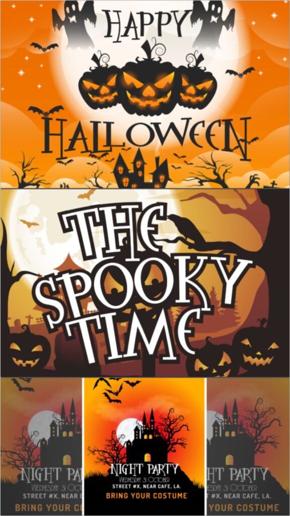
The Spooky Time is a decorative display font built for cheerful seasonal crafting. Its irregular forms add movement to porch signs, Halloween banners, apparel graphics, party labels, and scrapbook titles without relying on realistic blood effects.
I like it for projects that should feel festive rather than frightening. The unusual character shapes need generous sizing, so test narrow letters carefully before using the font on small tumblers, tags, or miniature decals.
Best for: porch signs, banners, seasonal shirts
Key features: irregular shapes, playful mood, decorative display lettering
5. Infectious Halloween
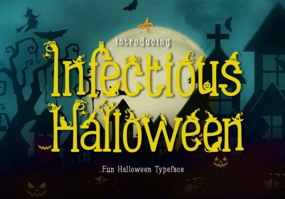
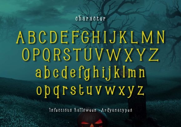
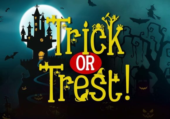
Infectious Halloween draws on sharp marks, curved strokes, and symbol-like details for an occult-inspired appearance. Its unusual construction suits mysterious invitations, potion labels, fantasy covers, witchy branding, and dark event graphics.
My take is that this font rewards careful typesetting more than quick template work. Alternative combinations and decorative details can create memorable titles, but the intricate style may lose clarity when used for long wording or small cutting projects.
Best for: occult invitations, potion labels, fantasy posters
Key features: symbolic forms, sharp strokes, mysterious styling
Download Infectious Halloween Font
6. Halloween by Trim Studio
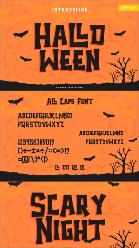
This Halloween display font uses bold decorative characters that remain recognizable in both colorful and single-color layouts. It can carry shadow-box titles, party decor, stickers, signs, apparel, and layered paper projects.
I would consider this one when a project needs unmistakable Halloween imagery without an aggressive horror tone. Check the smallest interior spaces before cutting because decorative shapes that print clearly may require simplification at miniature vinyl sizes.
Best for: shadow boxes, layered crafts, party decor
Key features: bold forms, seasonal details, color and monochrome potential
7. The Mummy Returns
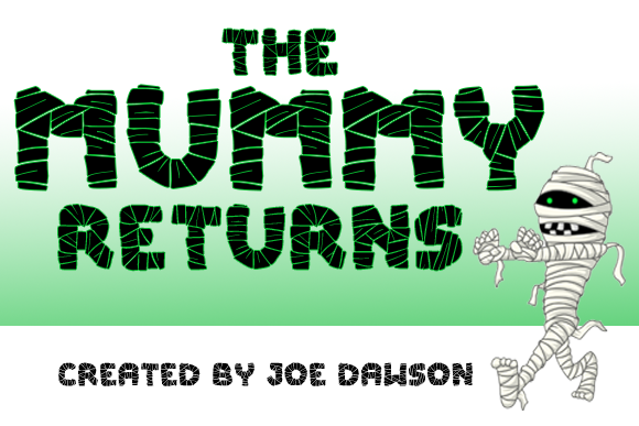
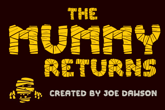
The Mummy Returns mimics wrapped bandages through uneven layered strokes. That recognizable theme makes it useful for mummy party invitations, costume shirts, classroom projects, candy-bar wrappers, and Egyptian-inspired Halloween displays.
I like it as a specialized font rather than a general-purpose Halloween purchase. It delivers a clear concept immediately, though the textured construction can become visually heavy when several lines are stacked together.
Best for: mummy parties, costume shirts, candy wrappers
Key features: bandage texture, uneven strokes, themed display lettering
8. Halloween Party
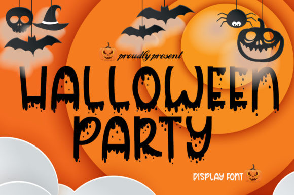
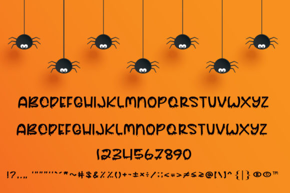
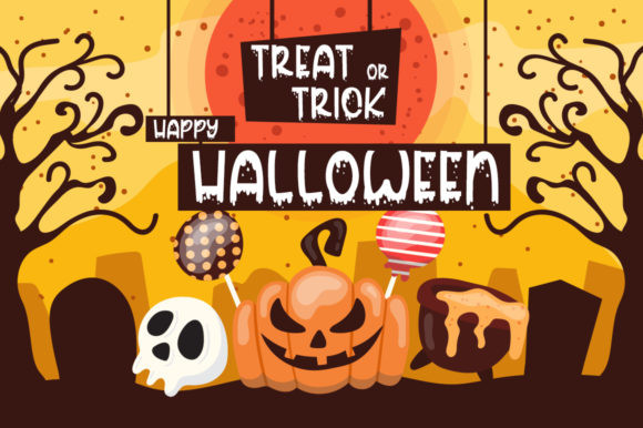
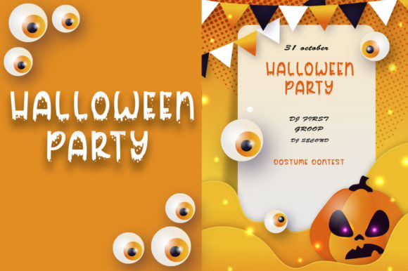
Halloween Party is a dramatic display face with distressed, liquid-like character details. It fits horror invitations, haunted attraction posters, party shirts, window signs, album art, and other projects that need an intentionally unsettling title.
I would keep the color palette simple and let the letter shapes provide the drama. The rough edges may complicate tiny cuts, so this is a stronger option for printed pieces, sublimation, or larger vinyl lettering.
Best for: horror parties, attraction posters, large shirts
Key features: distressed edges, liquid details, aggressive display style
9. Mitoos Halloween
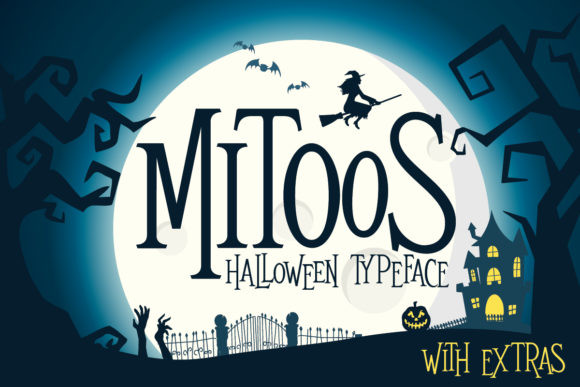
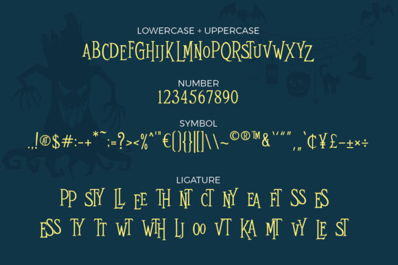
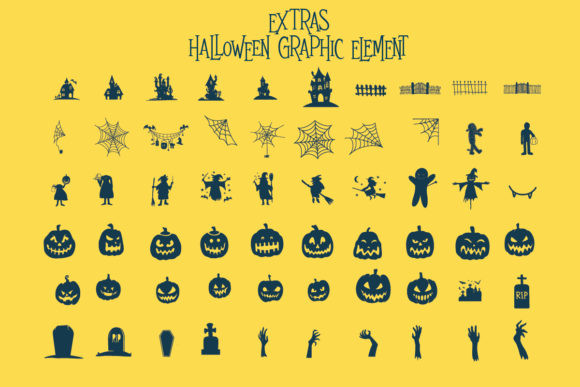
Mitoos Halloween offers a lighter, friendlier interpretation of seasonal lettering. Its whimsical personality can support children’s invitations, classroom signs, candy labels, scrapbook pages, stickers, and matching family apparel.
This is one of my picks for crafts aimed at younger audiences. It creates a Halloween connection without looking threatening, although designers seeking a gothic or cinematic horror effect will probably find it too cheerful.
Best for: kids’ invitations, classroom decor, candy labels
Key features: whimsical shapes, friendly mood, craft-focused personality
Download Mitoos Halloween Font
10. Creepyon

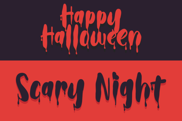
Creepyon features jagged, dripping characters designed to create a strong horror impression. The uneven forms suit scary shirts, movie-night invitations, haunted maze signs, thriller covers, and bold October promotional graphics.
I would reserve it for a headline or one central phrase because its texture is intentionally intense. It can dominate nearby illustrations, so the surrounding layout should stay relatively clean and spacious.
Best for: scary shirts, haunted signs, horror covers
Key features: jagged outlines, dripping forms, forceful visual impact
11. Ghost Walker
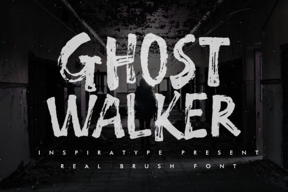
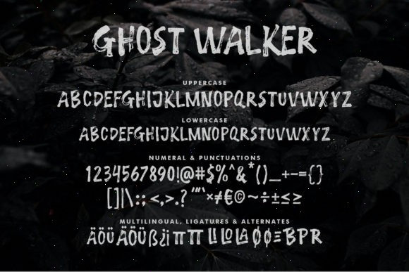
Ghost Walker uses quirky, uneven letters that suggest movement without becoming overly gruesome. It works for ghost-themed party invitations, mugs, wall art, stationery, tote bags, posters, and playful Halloween branding.
I like this font for projects that sit between cute and creepy. The irregular rhythm gives short words personality, but longer sentences may look restless unless tracking and line spacing are adjusted carefully.
Best for: ghost parties, mugs, wall art
Key features: uneven rhythm, quirky characters, moderate spooky tone
12. The Funny Ghost
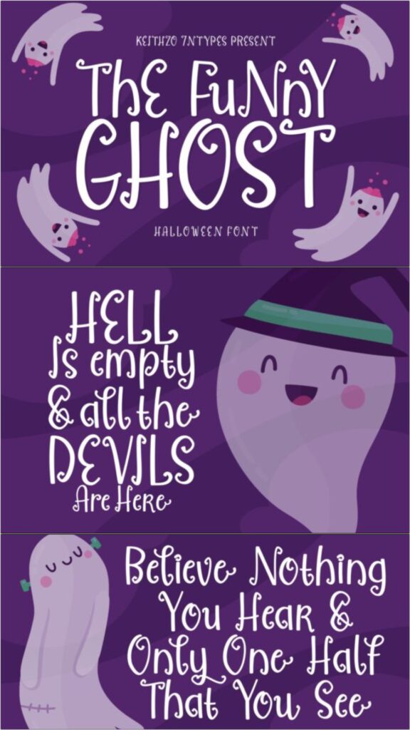
The Funny Ghost has curling terminals and cartoon-like forms that give the alphabet a mischievous expression. It is suited to kids’ shirts, school worksheets, treat-bag labels, party invitations, stickers, and cheerful ghost decorations.
My favorite use would be a short phrase paired with simple ghost illustrations. The decorative curls add charm, but they also create small sections that should be inspected before cutting the font from adhesive vinyl.
Best for: kids’ shirts, treat bags, ghost invitations
Key features: curled terminals, cartoon styling, friendly readability
13. Spooky Webbie
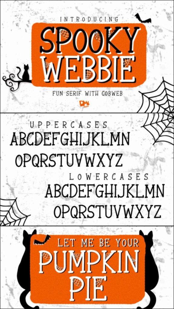
Spooky Webbie integrates spiderweb-inspired details into decorative Halloween lettering. The built-in theme can save time when creating spider shirts, candy signs, tote bags, classroom banners, wall art, and October party decor.
I would avoid adding a separate web pattern behind every word because the combination could reduce legibility. The font already provides substantial decoration and performs best when given a plain or lightly textured background.
Best for: spider crafts, tote bags, classroom banners
Key features: web details, themed characters, decorative silhouettes
14. Cute Ghost
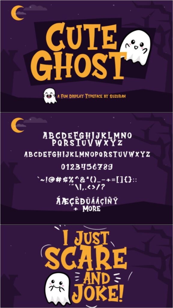
Cute Ghost brings rounded, energetic character shapes to lighthearted Halloween layouts. It is an approachable option for children’s invitations, pastel Halloween shirts, stickers, school crafts, party cups, and printable activity pages.
I like it for audiences who want seasonal styling without blood, sharp spikes, or gothic lettering. Its playful appearance can feel too informal for elegant invitations, so match it with casual illustrations and simple supporting text.
Best for: pastel Halloween, kids’ parties, stickers
Key features: rounded forms, cute character, energetic layout presence
15. Scary Zombie
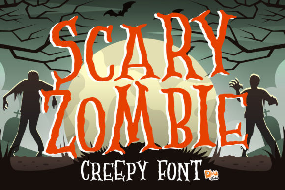
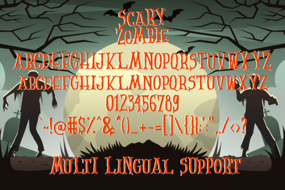
Scary Zombie uses distorted strokes and irregular proportions to give text an animated, undead quality. It can add character to zombie walk posters, costume shirts, game-night invitations, party banners, stickers, and horror-comedy graphics.
My recommendation is to use it with concise wording and strong contrast. The deliberately unstable shapes become harder to scan in long phrases, especially when placed over a detailed photographic background.
Best for: zombie events, costume shirts, game nights
Key features: distorted strokes, irregular proportions, undead personality
16. Afterlife Party
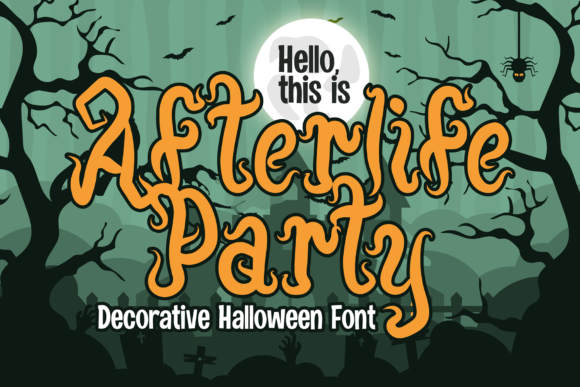
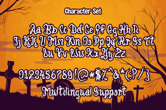
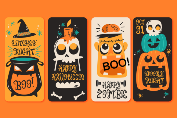
Afterlife Party combines spooky display lettering with a celebratory tone. It is suited to dance-party invitations, Halloween shirts, drink menus, photo-booth signs, social posts, and decorations for events that should feel lively rather than grim.
I would use it as the headline on a coordinated party set. The strong personality helps unify multiple pieces, although repeating it for addresses, schedules, and other small information could make the invitation difficult to navigate.
Best for: dance parties, drink menus, photo booths
Key features: festive mood, spooky display forms, strong headline presence
17. Crusterous
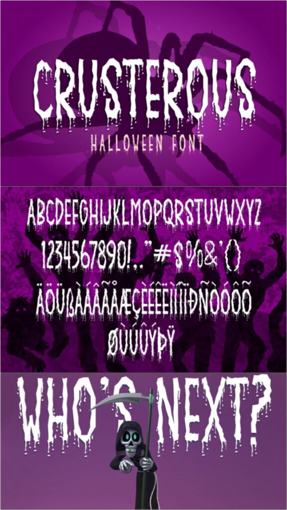
Crusterous uses heavy, chunky letterforms that can hold their own beside monsters, pumpkins, skulls, and other large illustrations. It fits banners, porch signs, apparel, posters, packaging labels, and bold craft-fair displays.
I like its sturdy construction for production methods that favor broader shapes. It is not the most refined option for formal stationery, but its substantial weight can improve visibility on signs viewed from several feet away.
Best for: porch signs, craft displays, bold apparel
Key features: chunky weight, strong visibility, broad character shapes
18. Cadabra
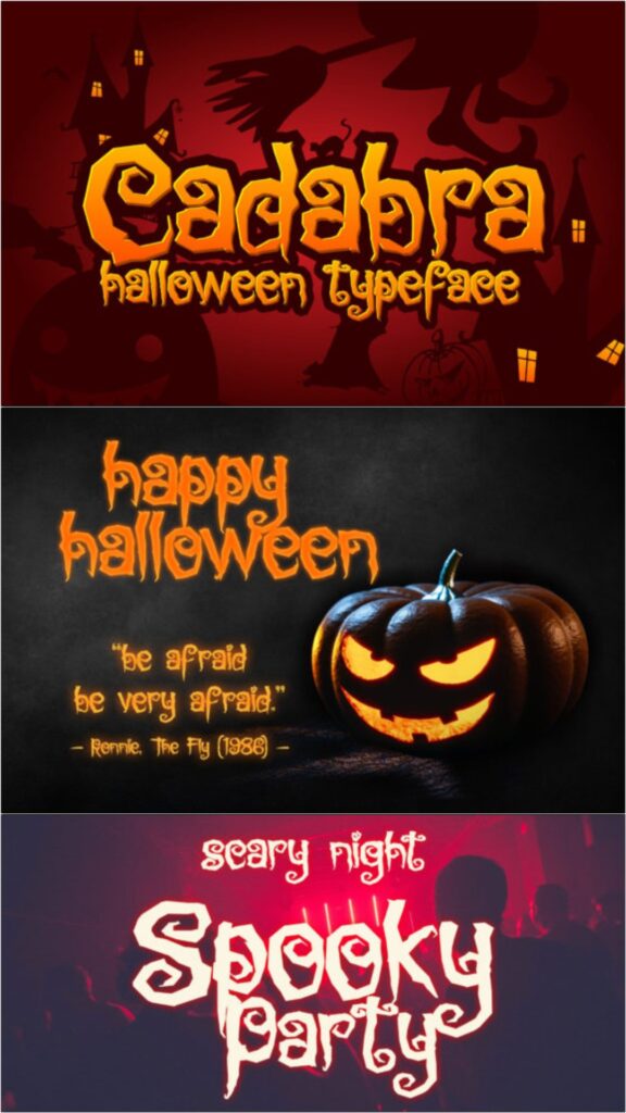
Cadabra has a magical, eccentric style that can bridge Halloween and fantasy themes. It is a useful candidate for witch invitations, spell-book covers, potion labels, party menus, thumbnails, posters, and whimsical seasonal branding.
This would be my pick when a project needs mystery without a dripping horror effect. The unusual details are best preserved at medium or large sizes, and a restrained secondary font will help keep practical information readable.
Best for: witch invitations, potion labels, spell-book covers
Key features: magical styling, eccentric shapes, fantasy crossover
19. Spicy Fire
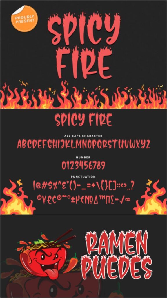
Spicy Fire incorporates flame-like forms into attention-grabbing display lettering. Beyond Halloween, it can support demon costumes, hot-sauce labels, biker shirts, bonfire signs, music graphics, and fiery event promotions.
I would choose it for a focused fire or infernal concept rather than a general ghost-and-pumpkin layout. The flame details already create movement, so additional outlines, shadows, and textures should be added sparingly.
Best for: demon shirts, bonfire signs, fiery posters
Key features: flame shapes, dynamic movement, bold display construction
20. Beastman
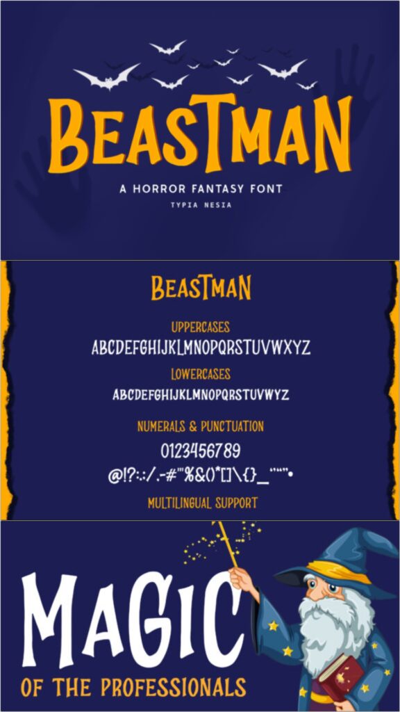
Beastman has a fantasy-monster personality that feels less graphic than many traditional horror fonts. It can work on creature-feature invitations, gaming shirts, fantasy posters, monster birthday decorations, and illustrated seasonal packaging.
I like it for designers who want a Halloween-adjacent font that remains useful after October. It may need supporting illustrations to communicate a specific holiday theme because the lettering is not limited to pumpkins, ghosts, or witches.
Best for: monster parties, gaming shirts, fantasy posters
Key features: creature-inspired style, flexible theme, distinctive display forms
21. Pumpkinos
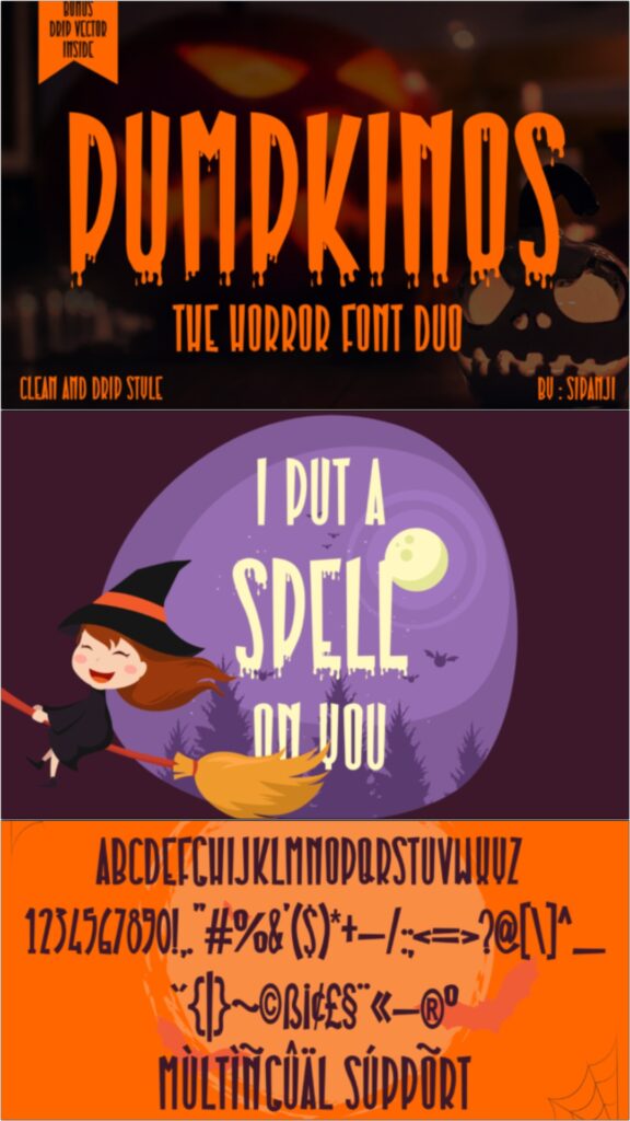
Pumpkinos uses bold seasonal forms and special characters suited to pumpkin-centered layouts. It can anchor fall festival posters, pumpkin patch signs, Halloween shirts, invitations, advertising graphics, and harvest-themed packaging.
This is one of my stronger choices for signage because its theme is easy to recognize from a distance. Avoid combining every special character in a single line; a few decorative substitutions will usually create a cleaner result.
Best for: pumpkin patches, fall signs, seasonal apparel
Key features: pumpkin theme, bold forms, decorative characters
22. Spooky Halloween
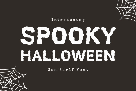
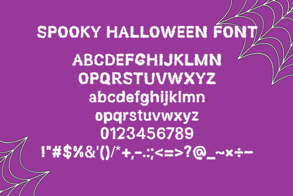
Spooky Halloween uses bold, sharp sans-serif forms to create an atmospheric title without excessive ornament. Its comparatively direct structure can suit haunted-house flyers, party invitations, event signs, social media graphics, and horror-themed shirts.
I like the balance between personality and readability here. It is a sensible option when the message contains more than two or three words, though very small body copy should still be set in a simpler companion font.
Best for: party invitations, event signs, haunted flyers
Key features: sharp sans serif, bold weight, practical readability
Download Spooky Halloween Font
23. Scary Horror
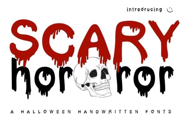
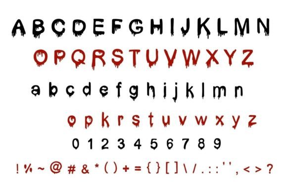
Scary Horror adds pronounced dripping details to an eye-catching display alphabet. It is aimed squarely at haunted attraction flyers, scary party invitations, horror shirts, thriller posters, window graphics, and seasonal merchandise.
I would use it when the project is meant to feel intense rather than cute. The dripping sections could become fragile during small vinyl production, making printing, sublimation, or larger heat-transfer applications more practical.
Best for: haunted attractions, horror shirts, thriller posters
Key features: blood-like drips, high contrast, intense display personality
24. Dripping Horror
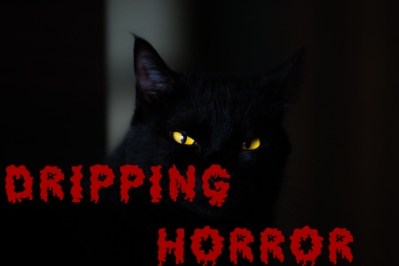
Dripping Horror takes a direct decorative approach with liquid extensions beneath its characters. The style fits horror movie graphics, haunted garage signs, party cups, costume shirts, stickers, and titles for spooky digital content.
My preference would be to use this font in one solid color so the silhouettes remain clear. It communicates the theme quickly, but the novelty effect may overpower elegant stationery or sophisticated gothic layouts.
Best for: horror graphics, costume shirts, spooky stickers
Key features: liquid extensions, decorative alphabet, immediate horror theme
25. Horror Dripped
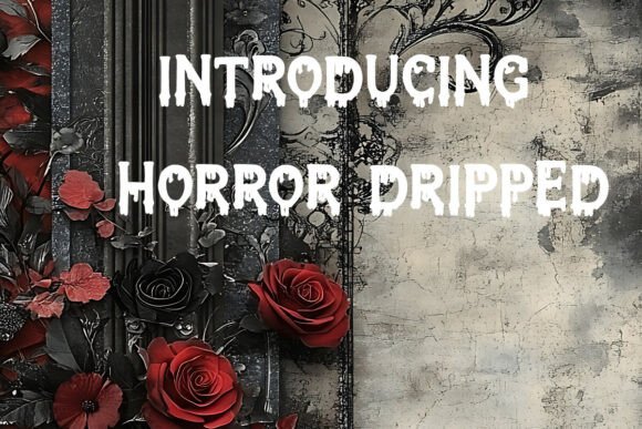
Horror Dripped pairs an edgy display structure with irregular liquid details. Its applications extend from shirts and stickers to greeting cards, vintage horror posters, SVG-based crafts, social graphics, and bold seasonal branding.
I like its potential for merchandise because the lettering remains forceful even without additional illustrations. Use a test cut before committing to a large vinyl batch, since narrow drips can be harder to weed consistently.
Best for: merchandise, greeting cards, vintage horror posters
Key features: edgy structure, irregular drips, strong standalone presence
26. Scary Drip
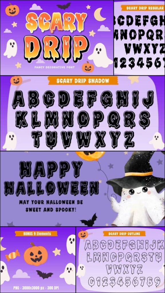
Scary Drip combines chunky rounded letters with playful dripping details. That mix makes it useful for Halloween T-shirts, mugs, stickers, invitations, banners, party decorations, and product packaging that needs a mischievous seasonal mood.
This is my pick for crafters who want drips without a realistic blood effect. The broader shapes should translate better than extremely thin horror lettering, although the smallest dangling details still deserve a sample cut.
Best for: mugs, playful shirts, party banners
Key features: chunky letters, rounded shapes, cartoon drips
27. Witch Spooky
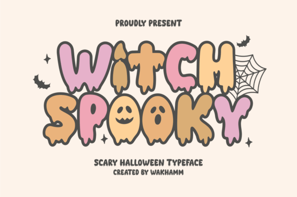
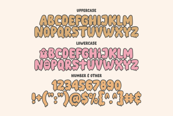
Witch Spooky uses drippy character details and themed letter construction to give short words a witchy Halloween identity. It can support spell-themed invitations, apparel, cauldron signs, party labels, stickers, and fantasy craft projects.
I would use it for names, titles, and compact phrases where the individual character details remain visible. It is less effective for dense informational text, especially when several decorative glyphs appear close together.
Best for: spell invitations, cauldron signs, witch apparel
Key features: witch theme, drippy details, decorative character forms
28. Halloween by Umitype
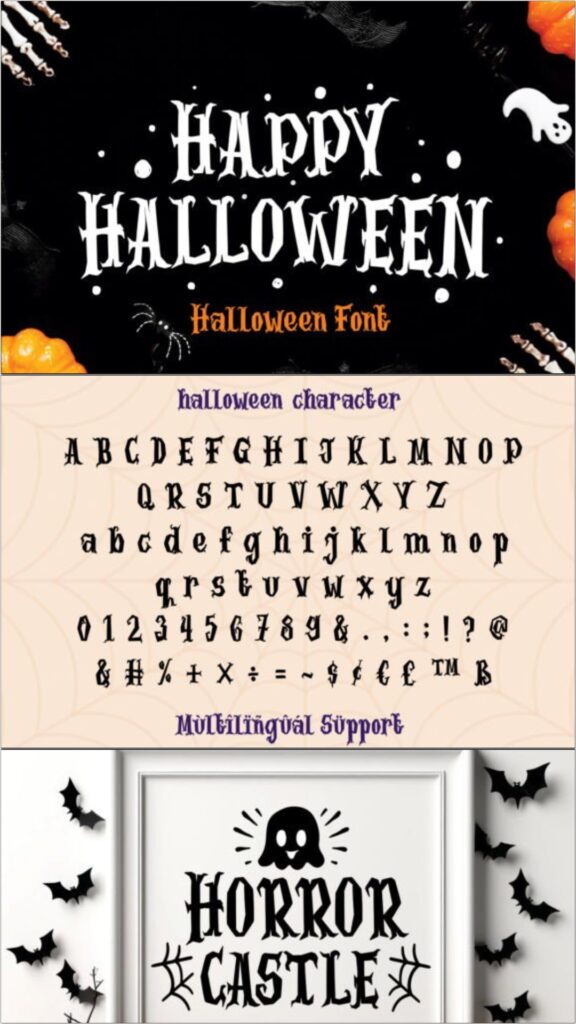
This Halloween font blends playful construction with a slightly haunting personality. It can be used for screen-printed shirts, posters, embroidery layouts, seasonal decorations, invitations, labels, and general October craft projects.
I like its broad project range, particularly for makers who sell several types of Halloween products. Before using it for embroidery or small vinyl, simplify the wording and verify that enclosed spaces remain open at the intended size.
Best for: printed shirts, embroidery layouts, seasonal decor
Key features: playful styling, versatile applications, clear Halloween character
Download Umitype Halloween Font
29. Spooky Witch
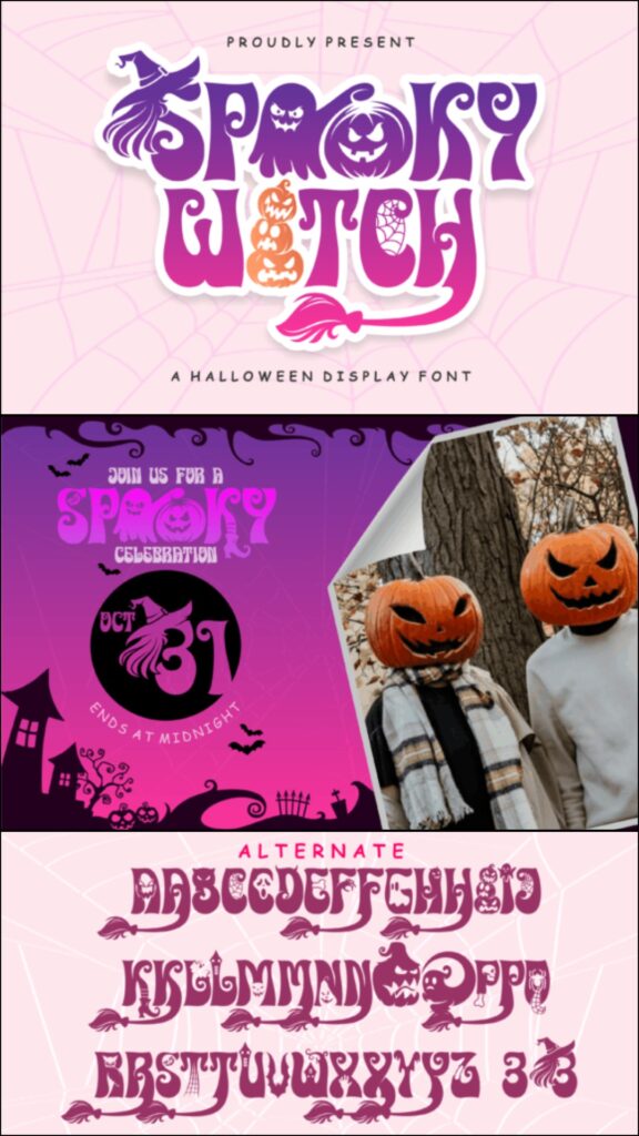
Spooky Witch incorporates Halloween imagery such as witch, web, bat, pumpkin, and ghost-inspired details into its character set. It can create richly themed invitations, custom names, shirts, posters, signs, and sublimation designs.
This font offers plenty of visual storytelling without requiring separate clipart, but that benefit comes with greater production complexity. I would keep it large and avoid using multiple illustrated alphabets in the same design.
Best for: illustrated invitations, custom names, sublimation
Key features: built-in imagery, witch motifs, highly decorative characters
30. Cute Halloween by Black Line
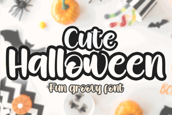
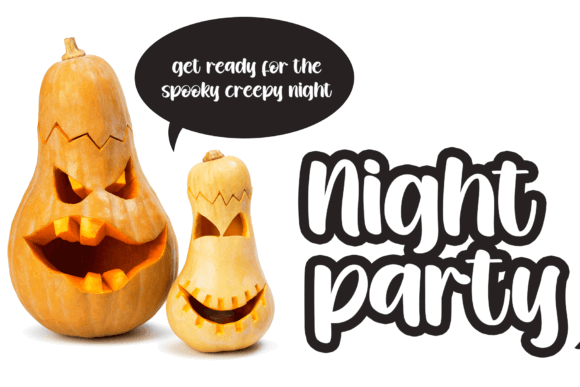
Cute Halloween uses cheerful display lettering for crafts that should feel sweet, playful, and seasonal. It fits kids’ invitations, matching family shirts, classroom signs, candy packaging, stickers, and pastel Halloween decorations.
I would choose this instead of a dripping horror font for elementary-school events or family-friendly merchandise. Its informal personality is less appropriate for upscale invitations, but it pairs naturally with cartoon ghosts and pumpkins.
Best for: family shirts, school events, pastel decor
Key features: cheerful shapes, kid-friendly mood, casual display style
31. Dripping Halloween
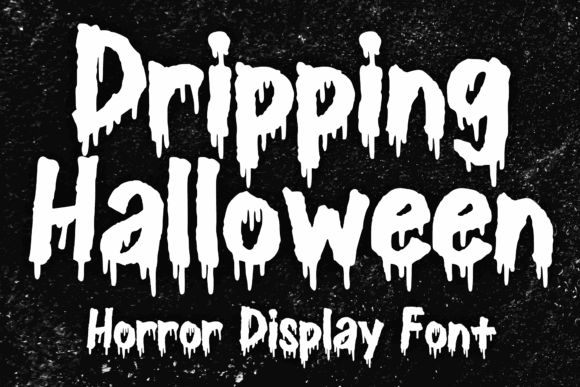
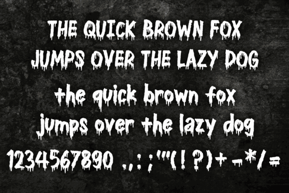
Dripping Halloween draws inspiration from vintage horror films, comics, and heavy music lettering. Its ink-like extensions can support merchandise, scary book covers, party invitations, greeting cards, posters, stickers, and event banners.
I like it for darker retro layouts where a polished modern font would feel out of place. The visual texture should be treated as a focal element, and very long wording may weaken the strong poster-like effect.
Best for: vintage horror, music shirts, scary book covers
Key features: ink drips, retro influence, dramatic merchandise appeal
Download Dripping Halloween Font
32. Halloween by Pian45
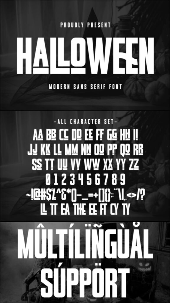
This Halloween typeface uses condensed sans-serif characters with angular cuts that create a spooky but relatively controlled appearance. It can suit modern invitations, vertical posters, narrow signs, shirt graphics, labels, and social media titles.
My pick for layouts with limited horizontal space, its condensed structure can fit longer wording more efficiently than wide cartoon fonts. Avoid compressing the tracking too aggressively because the angled details still need separation.
Best for: narrow signs, modern invitations, vertical posters
Key features: condensed width, angular cuts, contemporary appearance
Download Pian45 Halloween Font
33. Spooky Pumpkin by Yean Aguste
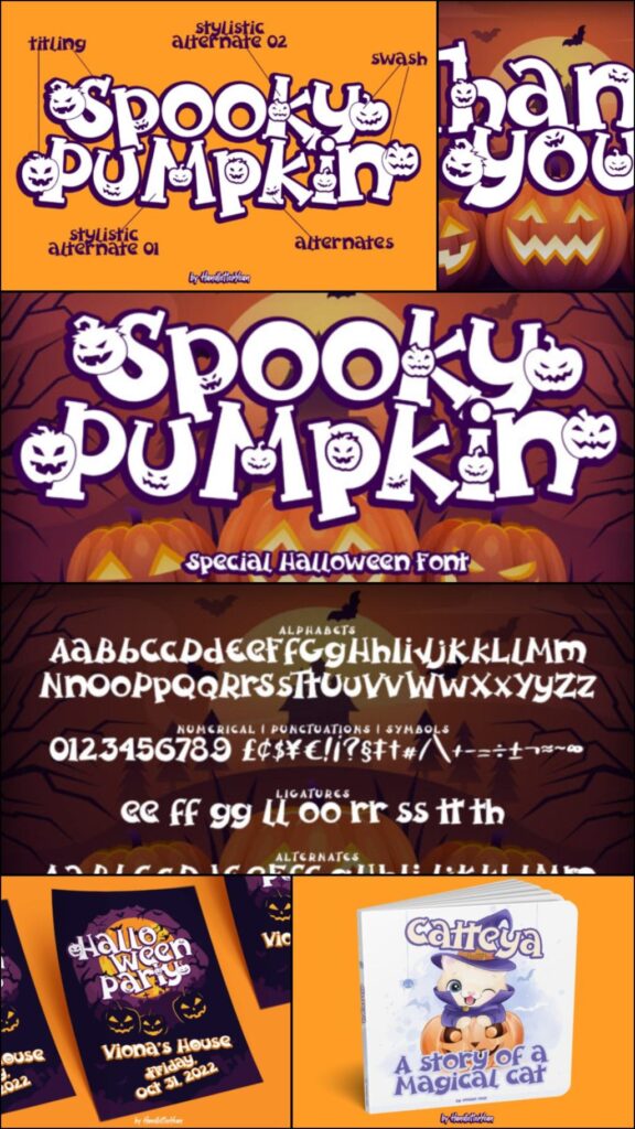
Spooky Pumpkin is an expressive display font created for pumpkin-centered Halloween graphics. It can add personality to fall shirts, market signs, pumpkin patch branding, stickers, invitations, tote bags, and seasonal wall decor.
I would use it for projects where the pumpkin theme needs to be obvious before a viewer reads the full message. Because the decorative treatment is visually strong, use simpler typography for prices, dates, and supporting details.
Best for: pumpkin patches, fall shirts, market signs
Key features: pumpkin personality, bold display forms, seasonal versatility
34. Ghost Pumpkin
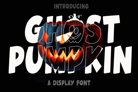
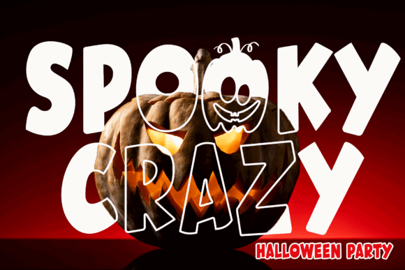
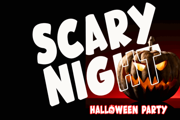
Ghost Pumpkin combines two of the most recognizable cute Halloween themes in one playful typeface. It fits children’s shirts, treat containers, party invitations, nursery-style seasonal signs, stickers, and family craft projects.
I like it for makers who prefer illustrated characters over sharp gothic lettering. The novelty styling gives short names plenty of charm, but it may be too detailed for small labels or lengthy multi-line text.
Best for: children’s shirts, treat containers, cute signs
Key features: ghost theme, pumpkin details, playful display lettering
35. Halloween Spooky
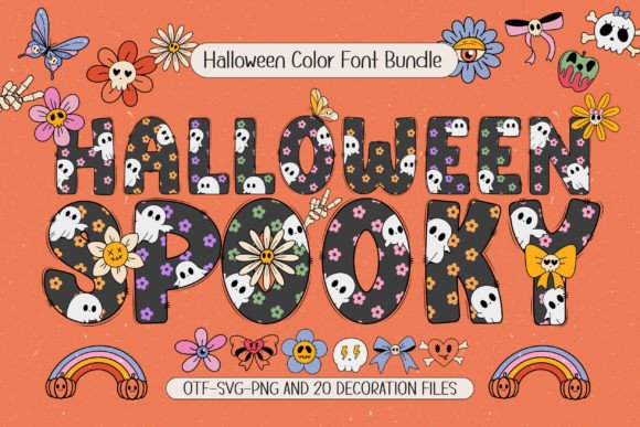
Halloween Spooky includes multiple font styles and matching seasonal artwork, giving crafters more flexibility than a single alphabet. It can support personalized names, sublimation, posters, DIY decor, invitations, shirts, and coordinated party sets.
This is my pick for a broader collection of related projects because the included styles can create hierarchy without leaving the same theme. More options also require restraint, so choose one primary style and one supporting style per design.
Best for: coordinated party sets, personalization, sublimation
Key features: multiple styles, matching artwork, flexible hierarchy
Download Halloween Spooky Font
36. Classic Halloween
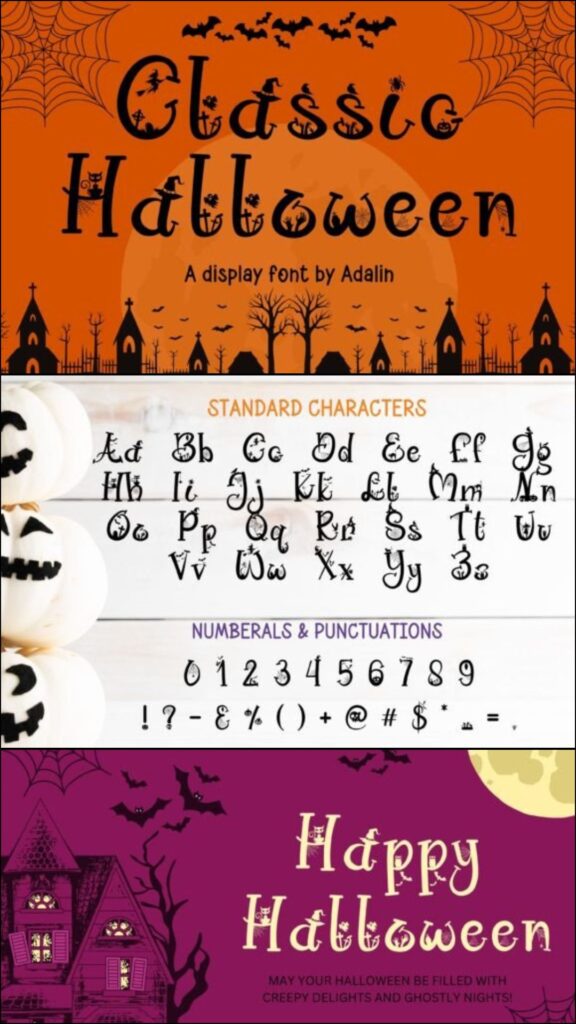
Classic Halloween provides a decorative seasonal look that can support traditional black-and-orange designs. It is suitable for invitations, porch signs, candy labels, apparel, greeting cards, stickers, and familiar pumpkin-and-bat layouts.
I would choose it when a project needs recognizable Halloween character rather than a trendy pastel or extreme horror style. Its traditional direction makes it versatile, though a highly unusual brand concept may need something more specialized.
Best for: traditional invitations, porch decor, candy labels
Key features: classic seasonal styling, decorative forms, broad craft applications
Download Classic Halloween Font
Final Thoughts
The right Halloween font depends on the balance between mood, readability, and production complexity. For family crafts, I would start with Hellaween, Cute Ghost, or Mitoos Halloween. Scary Drips and Scary Horror are stronger options for intense apparel and haunted events, while Cadabra and Infectious Halloween suit magical or occult-inspired invitations.
Before downloading several similar designs, write the exact phrase you plan to use and preview it in each font. That simple comparison makes it easier to notice crowded letters, weak characters, awkward spacing, or details that may disappear at the final size.
Frequently Asked Questions
What is the best Halloween font for invitations?
Hellaween is a flexible option for family invitations, while Cadabra and Infectious Halloween suit magical or witch-themed events. Use the decorative font for the headline and a simpler typeface for the date, address, and RSVP details.
Which Halloween fonts are easiest to use for Cricut shirts?
Chunkier fonts such as Crusterous, Hellaween, and Scary Drip are generally more practical starting points than alphabets filled with extremely thin webs or drips. Cutting difficulty still depends on the final size, material, blade condition, and design settings.
Can I use a Halloween font for commercial products?
Commercial permissions depend on the license attached to the specific download and how you plan to distribute the finished product. Review the current licensing terms before selling shirts, invitations, signs, digital files, or other merchandise.
How many fonts should I use in one Halloween design?
One decorative Halloween font and one simple supporting font are usually enough. A third style may be useful for a small accent, but combining several novelty fonts often weakens hierarchy and makes the design harder to read.
Follow Us