

ℹ️ Affiliate Disclosure: This article may contain affiliate links. We may earn a commission at no extra cost to you. Thanks for your support! ❤️
How Serif Font Bundles Improve Restaurant Menu Design
The best serif font bundles for restaurant menus give you more than a handsome title font. They provide enough variation to create a clear hierarchy between the restaurant name, menu sections, dish descriptions, prices, and small-print details.
I reviewed the available collections with those practical roles in mind. Some of my picks lean polished and restrained for fine dining. Others bring the heavier shapes, vintage texture, or casual personality that suit steakhouses, bakeries, cafés, and neighborhood restaurants.
My main rule is simple: the most expressive face should not automatically become the body font. A dramatic high-contrast serif can look beautiful across the top of a menu while becoming tiring in a dense list of entrées. I prefer bundles that let a designer combine personality with restraint.
Quick Picks
- Best for fine dining: Elegant Serif Font Bundle
- Best for contemporary restaurants: Modern Serif Bundle
- Best for steakhouses and barbecue: Slab Serif Font Bundle
- Best for bakeries and brunch: The Beloved Font Bundle
- Best complete menu hierarchy: Slab Serif, Serif, Sans Serif Font Bundle
How I Picked These
I compared these bundles by menu readability, section-heading impact, price and numeral clarity, style range, suitability for different restaurant concepts, hierarchy flexibility, and how well each collection balances expressive display typography with readable supporting text.
Best Serif Font Bundles for Restaurant Menu Design
1. Elegant Serif Font Bundle
My pick for: fine-dining menus

This is the first bundle I’d inspect for a restaurant that wants an elegant menu without committing to one narrowly defined visual style. It contains 26 fonts and had a 5.0 score based on 19 reviews when researched, giving it one of the stronger popularity signals in this roundup.
A larger collection is useful when the same typography must extend beyond a dinner menu. You might need related treatments for wine lists, private dining cards, seasonal inserts, table numbers, and social graphics.
I would reserve the most delicate high-contrast styles for the restaurant name, tasting-menu title, or section headings. For ingredients and longer dish descriptions, choose the quietest and most open design in the collection.
Best for: Fine dining, wine lists, boutique hotels
Key features: 26-font collection, elegant serif focus, multiple stylistic options, strong review history
2. Professional Modern Serif Font Bundle
My pick for: multi-location restaurant branding
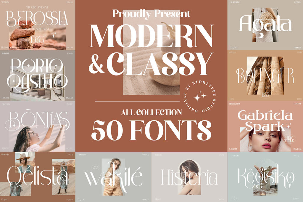
With 50 serif fonts, this is the broadest dedicated modern-serif collection on my list. The product page showed a 5.0 rating from 12 reviews, although the original standalone bundle offer was listed as expired during research.
The scale makes it particularly useful for a hospitality group rather than a single one-page menu. A designer could assign different personalities to a flagship restaurant, café counter, cocktail lounge, and seasonal campaign while keeping everything within a broadly sophisticated serif direction.
More options can also create more inconsistency. I would select one primary serif family, one accent face, and perhaps a neutral companion rather than mixing half a dozen unrelated designs on the same menu.
Best for: Restaurant groups, hotels, extensive brand systems
Key features: 50 fonts, modern serif emphasis, broad stylistic range, 12 recorded reviews
3. Modern Serif Bundle
My pick for: contemporary chef-led restaurants
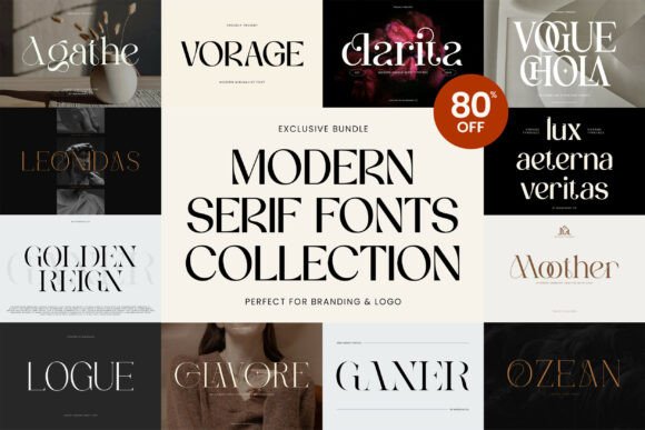
This collection includes eight named serif fonts: Agathe, Clarita, Vorage, Vogue Chola, Ganer, Ozean, Glavore, and Logue. The product page also identifies PUA-encoded characters and compatibility with Windows, macOS, and Linux.
My take is that this bundle fits restaurants that want editorial drama rather than old-fashioned formality. Think restrained color, generous spacing, oversized section titles, and a menu that feels closer to an independent food magazine.
Several of the included designs appear better suited to headlines than dense text. That is not a flaw, but it means the bundle should be used deliberately. I would pair a distinctive title face with one of its calmer styles or an existing readable text family.
Best for: Chef’s tables, modern bistros, editorial menus
Key features: Eight serif fonts, italic options, PUA encoding, desktop compatibility
4. Headline Serif Bundle
My pick for: prominent restaurant names and menu sections
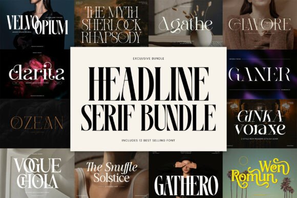
This bundle brings together 12 headline serif fonts and is presented as a collection of the designer’s best-selling headline styles.
The word “headline” matters. I would not buy this expecting every font to handle a tightly packed two-page menu. I would buy it when the menu needs strong typographic moments: the restaurant name, “From the Grill,” “Chef’s Specials,” or a bold prix-fixe heading.
A display serif can also help a simple black-and-cream menu feel intentional without adding illustrations or decorative borders. Just give the letters room. Tight line spacing and narrow columns can make expressive serifs look cluttered.
Best for: Menu covers, category headings, specials boards
Key features: 12 headline serifs, display-focused designs, varied personalities, branding potential
5. Elegant Serif Bundle
My pick for: wine bars and boutique cafés
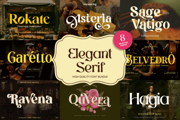
This eight-font collection emphasizes balanced proportions, graceful curves, and classic serif construction. The page showed compatibility with major desktop operating systems and listed the product as updated in 2026.
Compared with oversized mega-bundles, eight fonts can be easier to evaluate and manage. That narrower selection is appealing when you need a coherent identity quickly and do not want to sort through dozens of similar files.
I like this direction for a small menu with ample white space: perhaps coffee and pastry offerings, a compact wine list, or an evening small-plates card. I would avoid setting long ingredients lists in an extremely thin weight, especially on textured or low-contrast paper.
Best for: Wine bars, pastry menus, boutique cafés
Key features: Eight selected serif fonts, balanced letterforms, classic styling, updated collection
6. Slab Serif Font Bundle
My pick for: steakhouses and barbecue restaurants
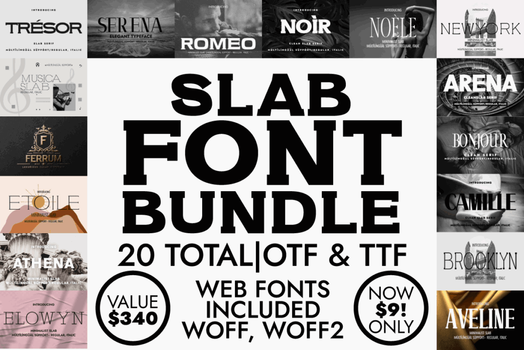
This collection gathers 20 slab serif fonts. Slab serifs have heavier, block-like terminals, giving headings a sturdy silhouette that can stand up to rustic textures, dark backgrounds, kraft paper, and bold food photography.
I would consider this bundle for a steakhouse, smokehouse, brewery kitchen, burger restaurant, or casual venue with an industrial interior. The structure can give menu sections a confident visual rhythm without relying on oversized decorative graphics.
The main caution is weight. A heavy slab used for every dish and description can make a menu feel dense. My preferred setup would use a slab for titles and prices, then a lighter serif or clean sans serif for descriptive copy.
Best for: Steakhouses, barbecue, breweries
Key features: 20 fonts, slab serif construction, bold hierarchy, strong print presence
7. Luxury, Chic, and Elegant Font Bundle
My pick for: tasting menus and luxury hospitality
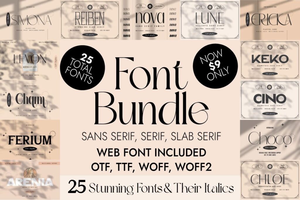
The product description lists 25 fonts with italic counterparts and notes that one font family is included.
This is the direction I’d choose when a menu should feel minimal, expensive, and fashion-aware. High-end dining typography often benefits from restraint: one elegant serif, controlled capitalization, wide margins, and modest differences in size rather than multiple decorative effects.
Italic styles are useful for short chef’s notes, regional labels, wine origins, or translated dish names. They should remain secondary. Too much italic text slows scanning and can weaken the clean hierarchy that makes a luxury menu effective.
Best for: Tasting menus, hotel restaurants, cocktail lounges
Key features: 25 fonts, matching italics, included font family, minimalist luxury direction
8. Victorian Style & Decorative Serif Font Bundle
My pick for: historic pubs and themed restaurants
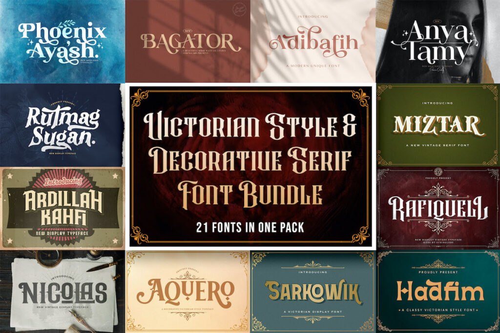
This bundle includes 21 Victorian, blackletter, and decorative fonts. It had a 5.0 rating based on one review when checked.
It is the most specialized collection in the roundup. I would not use it for a neutral neighborhood restaurant, but it could be exactly right for a heritage pub, theatrical cocktail bar, apothecary-themed café, or restaurant housed in a historic building.
The decorative faces need strict limits. One ornate restaurant name or section heading can establish the theme. Several ornate fonts competing across dish names, descriptions, and prices will make the menu harder to navigate.
Pair the decorative type with something substantially simpler. The contrast will make the historic lettering feel more deliberate.
Best for: Historic pubs, themed bars, heritage branding
Key features: 21 fonts, Victorian styling, blackletter options, decorative display faces
9. Slab Serif, Serif, Sans Serif Font Bundle
My pick for: building a complete menu hierarchy
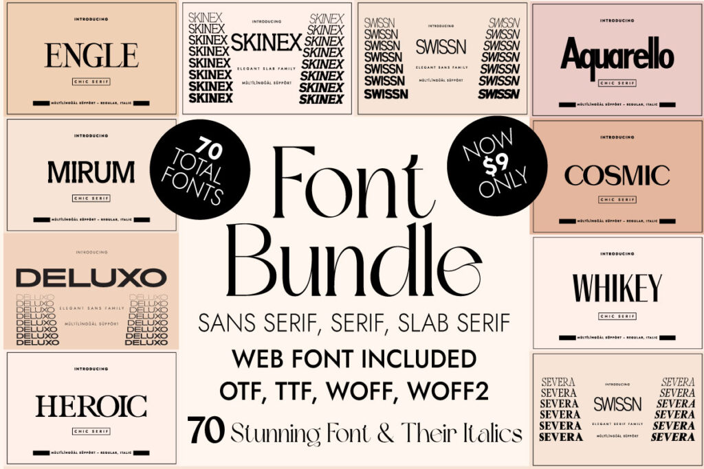
This mixed collection states that it includes 70 fonts and italic variations across slab serif, serif, and sans serif categories.
A mixed bundle may sound less focused than a serif-only set, but it solves a real menu-design problem. Restaurants rarely need one font repeated everywhere. They need contrast between expressive headings and highly legible supporting information.
I would use a slab for the restaurant name, a traditional serif for dish names, and a sans serif for descriptions, dietary markers, or prices. Because all three classifications are available in one package, it is easier to test combinations before committing.
The downside is decision fatigue. Establish the hierarchy before browsing: display, text, and utility. That prevents the menu from turning into a font sampler.
Best for: Full menu systems, food halls, casual dining
Key features: 70 fonts, serif and sans-serif mix, italic variations, broad hierarchy options
10. The Beloved Font Bundle
My pick for: bakeries and welcoming brunch cafés
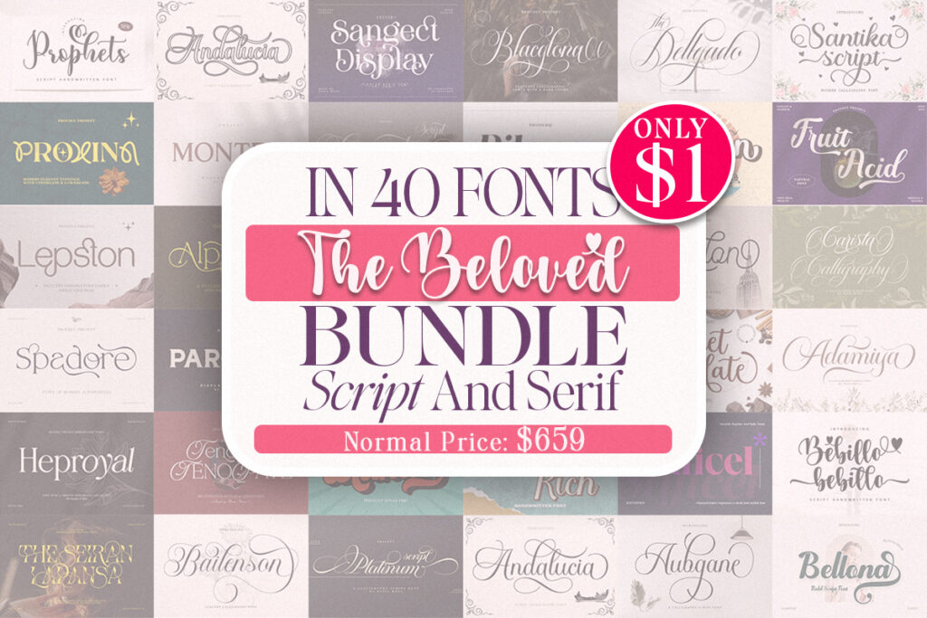
This collection contains 40 script and serif fonts. It showed a 5.0 rating from 18 reviews when researched.
The script-and-serif combination gives it a softer personality than the formal modern collections. I can see it fitting bakery menus, dessert shops, brunch cafés, tea rooms, and restaurants built around handmade or family-style positioning.
Use the script fonts as seasoning rather than the main ingredient. A short phrase such as “baked daily” or “chef’s favorite” can add warmth, but full paragraphs in script will be difficult to scan. The serif portion should carry the working content.
Best for: Bakeries, brunch cafés, dessert menus
Key features: 40 fonts, script and serif mix, warm personality, strong review count
11. Playful Vintage Font Bundle
My pick for: diners and retro café menus
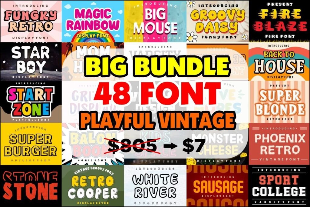
This bundle contains 48 vintage-style fonts and had a 5.0 rating based on 24 reviews, one of the highest review counts among these selections.
I like it for concepts that should feel nostalgic without becoming overly formal: burger counters, ice cream shops, roadside diners, pizza restaurants, coffee bars, and playful family venues.
The large collection provides plenty of personality, but a restaurant still needs consistency. Choose a single decade or visual mood rather than combining Western slabs, groovy curves, and ornamental scripts on one page.
For an effective retro menu, I would use one characterful face at a generous size and keep the supporting typography simple.
Best for: Diners, ice cream shops, retro cafés
Key features: 48 fonts, vintage direction, playful display options, 24 recorded reviews
12. Modern Bundle
My pick for: trend-led restaurants and social-first brands
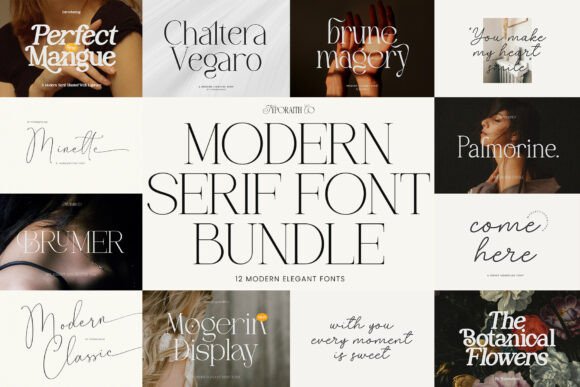
This 12-font modern serif bundle combines contemporary serif styling with features such as delicate strokes, ligatures, and script influences.
It suits restaurants whose menus must also translate into Instagram posts, event announcements, packaging, and promotional cards. The style feels more editorial than traditional, which can help a new venue establish a recognizable visual identity quickly.
For print menus, inspect the thinner strokes carefully. Delicate hairlines may lose clarity when printed small, reversed out of a dark background, or placed over photography. I would use those faces at display sizes and select a sturdier option for food descriptions.
Best for: Modern cafés, pop-ups, social-first restaurants
Key features: 12 fonts, contemporary serif styling, ligatures, mixed elegant accents
Quick Comparison
| Font bundle | My preferred use | Visual direction |
|---|---|---|
| Elegant Serif Font Bundle | Fine-dining menus | Refined and versatile |
| Professional Modern Serif Font Bundle | Large hospitality brand systems | Polished and varied |
| Modern Serif Bundle | Contemporary restaurants | Fashion-forward |
| Headline Serif Bundle | Restaurant names and section titles | Bold and expressive |
| Elegant Serif Bundle | Boutique cafés and wine bars | Graceful and restrained |
| Slab Serif Font Bundle | Steakhouses and barbecue menus | Strong and structured |
| Luxury, Chic, and Elegant Font Bundle | Tasting menus and hotel dining | Minimal and upscale |
| Victorian Style & Decorative Serif Font Bundle | Historic pubs and themed venues | Ornamental and vintage |
| Slab Serif, Serif, Sans Serif Font Bundle | Full menu systems | Flexible and practical |
| The Beloved Font Bundle | Bakeries and brunch menus | Warm and approachable |
| Playful Vintage Font Bundle | Diners and casual cafés | Retro and energetic |
| Modern Bundle | Trend-led restaurants | Editorial and contemporary |
Which Serif Font Bundle Should You Choose for a Restaurant Menu?
For a polished fine-dining menu, my first choice is Elegant Serif Font Bundle. Its 26-font scope gives a designer enough variety to establish a complete hospitality identity without moving outside the serif category.
For a strong rustic menu, I’d choose Slab Serif Font Bundle. Its heavier construction should give headings and prices a confident presence.
For a bakery or brunch concept, The Beloved Font Bundle offers the friendliest balance of serif structure and handwritten warmth.
The most versatile technical option is Slab Serif, Serif, Sans Serif Font Bundle. It covers all three classifications needed to create contrast and hierarchy within one package.
Whichever bundle you pick, build the menu around reading conditions rather than font-preview drama. The best restaurant typography gives the venue a distinct voice while letting customers find their next dish without effort.
FAQ
What is the best serif font style for a fine-dining menu?
A restrained modern or high-contrast serif often fits fine dining because it creates an elegant editorial tone. Use its most delicate style for large headings and select a more substantial weight for dish descriptions.
Are serif fonts readable on restaurant menus?
They can be highly readable when the letterforms have open counters, sensible spacing, and enough stroke weight for the chosen print size. Paper texture, lighting, contrast, and line spacing matter just as much as the serif classification.
How many fonts should a restaurant menu use?
Two families are usually enough: one expressive face for headings and one readable face for menu content. A third utility style can be added for prices or dietary labels, but every font should have a clearly defined role.
Can I use Creative Fabrica fonts for commercial restaurant menus?
Creative Fabrica product pages generally indicate that downloads include commercial licensing. Review the current license attached to the specific product before using it in logos, client work, packaging, editable templates, or redistributed digital files.
Save to Your Inspiration Board
Follow Us