

ℹ️ Affiliate Disclosure: This article may contain affiliate links. We may earn a commission at no extra cost to you. Thanks for your support! ❤️
How to choose graffiti lettering fonts for street art
Graffiti lettering has to do more than look rough or rebellious. A font that works for a large streetwear headline can become hard to read on a sticker, while rounded bubble letters create a completely different mood from sharp tagging or layered 3D forms. For street art designs, the useful differences are shape, stroke weight, spacing, outline structure, dimensional effects, and how much personality the lettering adds before color or texture is applied.
This roundup focuses on graffiti fonts that cover noticeably different visual roles, from chunky bubble lettering and tag-inspired forms to shadowed, layered, angular, and decorative styles.
Many more graffiti fonts are available, while this selection concentrates on styles with distinct project uses, recognizable letterforms, and clearly different street-art personalities.

The most useful graffiti lettering fonts depend on the finished design: chunky display styles suit shirts and posters, layered fonts create dimensional headlines, sharper urban lettering fits music and streetwear graphics, and decorative graffiti forms work well when the lettering itself needs to become the main visual element.
Quick Picks
For chunky bubble lettering: Back Wild — rounded, heavy forms and swash characters make it useful when the lettering should dominate the design.
For layered 3D lettering: Street Stronger — three font layers are intended for building dimensional graffiti typography.
For decorative graffiti: Wild Hustle Graffiti — expressive graffiti forms and included swashes suit logos, apparel, labels, and statement headings.
For sharper urban graphics: Under Boom — its bold, sharp-edged treatment fits streetwear and music-oriented layouts.
For bubble-style street art: Bubble Horns Graffiti — a dedicated graffiti display font for more playful urban lettering.
Graffiti Fonts for Street Art, Posters, Apparel, and Urban Designs
1. Back Wild
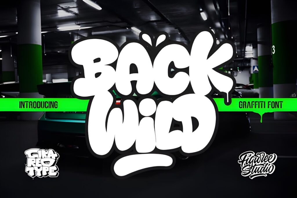
Back Wild is a bold, chubby graffiti display font suited to oversized words, streetwear graphics, stickers, and poster headings. The rounded weight gives it a more playful personality than aggressive marker-style graffiti, and the font includes separate swash characters for adding decorative movement.
Choose it when the lettering needs to feel substantial even before outlines or textures are added. For a harder, sharper street-art direction, Under Boom or Vandal Lineros makes more sense.
2. Road Monsta
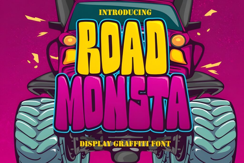
Road Monsta is an installable display font included in a graffiti-focused font collection and works as an urban headline option for short words, graphics, and apparel concepts. Its role is strongest where the type itself needs more personality than a conventional display face.
Use it for compact street-art compositions rather than long supporting copy. If dimensional layering is the main goal, Street Stronger or Urban Maxim offers a more specialized approach.
3. Subawy Ripple
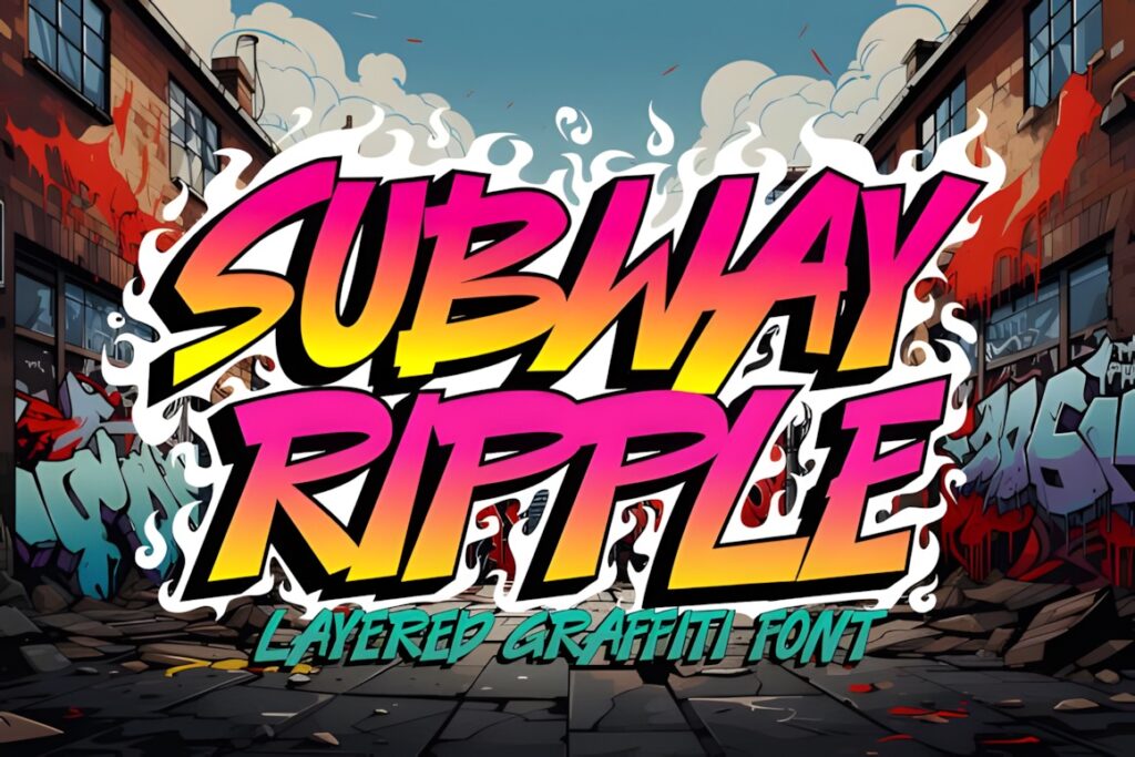
Subawy Ripple is another dedicated font from the same graffiti collection, making it suitable for urban display typography and short street-inspired titles. It gives designers an alternative to the heavier chunky styles when visual variation across a set of graphics matters.
Keep it at display size where its individual letter shapes can remain part of the composition. Pair it with a restrained sans serif when smaller supporting information is needed.
4. Fast Blaze
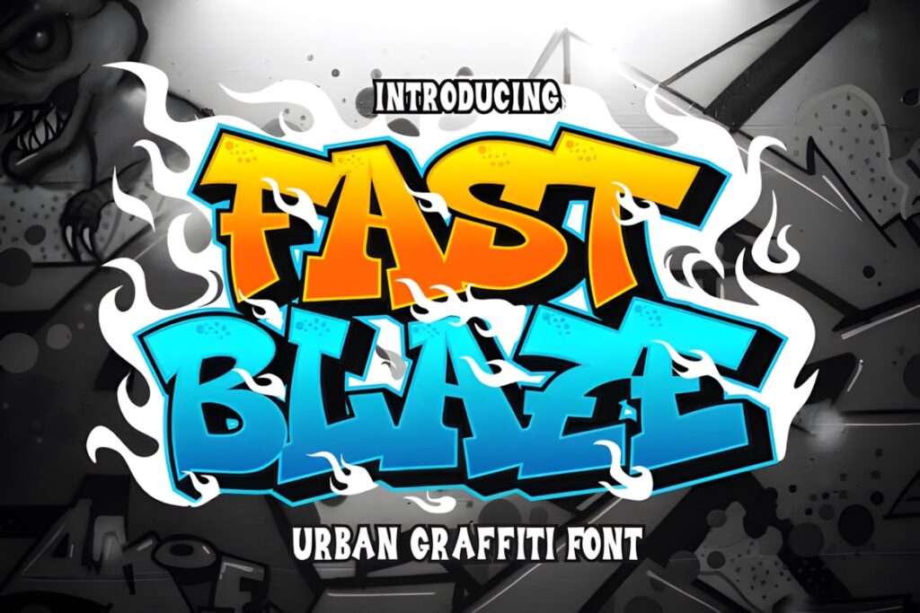
Fast Blaze is a graffiti-oriented display font suited to high-impact typography where a short name, phrase, or title should carry most of the visual energy. It also has one of the stronger visible favorite counts among the graffiti products reviewed here.
Consider it for cover graphics, merchandise, or poster lettering rather than paragraphs. Large scale gives decorative display fonts like this more room to show their character clearly.
5. Vandal Lineros
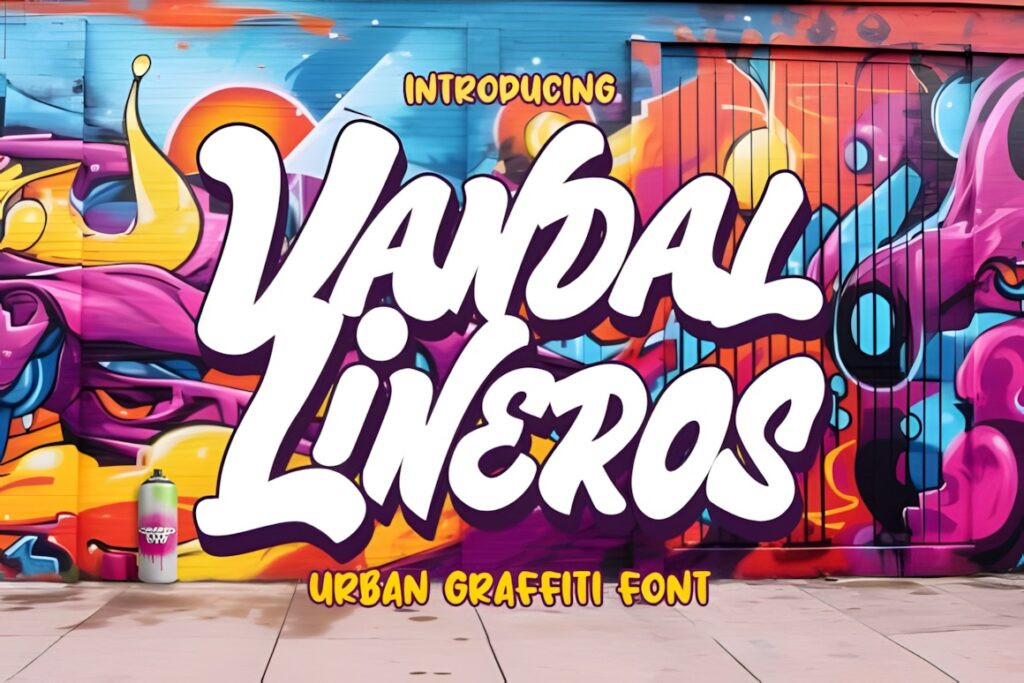
Vandal Lineros is explicitly presented as a graffiti typeface with an edgy, urban direction. It makes sense for logos, posters, album-style graphics, wall-art compositions, and other projects where conventional clean typography would feel too restrained.
Use it as a visual focal point rather than a neutral supporting typeface. For softer, rounded graffiti lettering, Back Wild shifts the mood in a more playful direction.
6. Bade Hoper
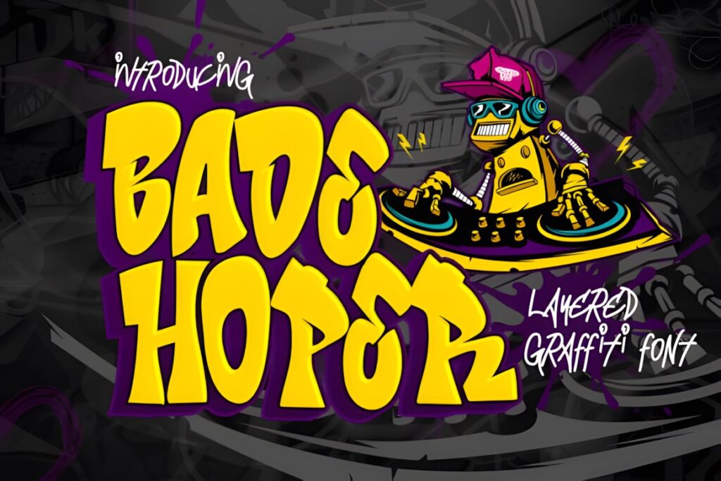
Bade Hoper is an installable display font included among a dedicated set of graffiti typefaces. Its clearest role is expressive urban lettering for short titles, apparel graphics, labels, or visual identities that need a street-art component.
Because the design intent is decorative, give the words space to breathe and avoid using the font for dense copy. A simple companion face will make the graffiti lettering stand out more clearly.
7. Griffin Rase
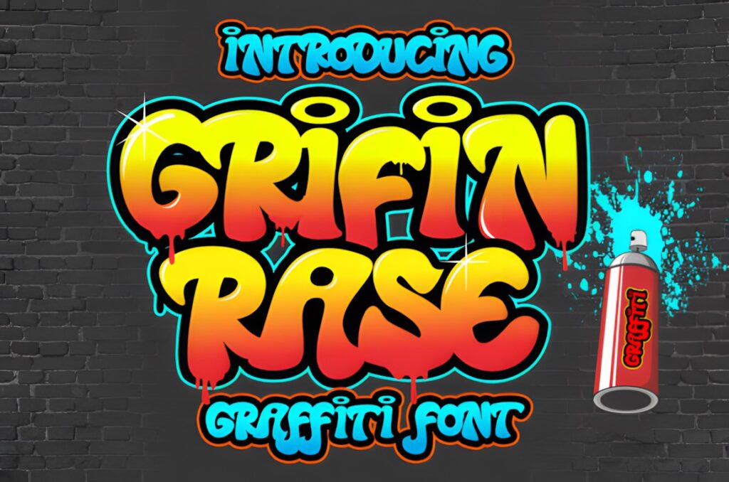
Griffin Rase is a graffiti-like display font intended for apparel, logotypes, advertising, crafts, and wall decoration. That broad display focus makes it useful when you want an urban look without committing to a specialized layered treatment.
It is a practical middle-ground choice for projects that need recognizable graffiti character but still leave room for your own outlines, colors, illustrations, or background textures.
8. Wild Hustle Graffiti
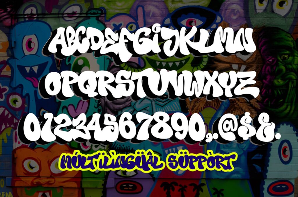
Wild Hustle Graffiti combines decorative graffiti lettering with additional swash characters. That makes it especially useful when a logotype, apparel design, label, wall graphic, or headline needs extra flourishes around the core lettering.
Choose it when expressive forms are part of the concept. For a cleaner project where the surrounding illustration should provide most of the detail, Griffin Rase offers a less ornament-dependent direction.
9. Street Stronger
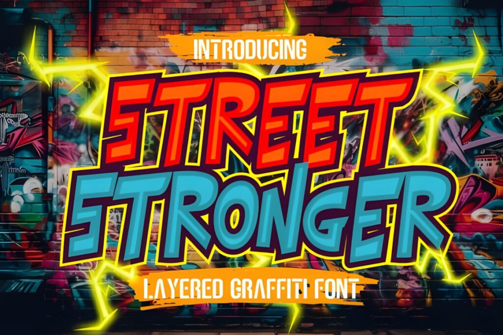
Street Stronger is a three-layer graffiti font designed to produce a dimensional effect. The layered construction makes it a useful choice for poster titles, stickers, merchandise, and digital graphics where the lettering needs built-in depth rather than a flat silhouette.
It makes the most sense when you can work at a generous display size. If you want simpler typography with fewer visual components, Beluga Road is easier to treat as a conventional single display face.
10. Hiper Hoper
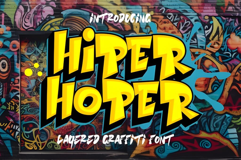
Hiper Hoper is another layered graffiti font, with regular, shadow, and inner components used to build three-dimensional lettering. The construction gives designers more control over depth and contrast than a flat graffiti font.
Use it for large urban headlines and graphic treatments where separate layers can be given different fills or values. For simpler sticker text or compact labels, a single-layer style will usually stay easier to manage.
11. Beluga Road
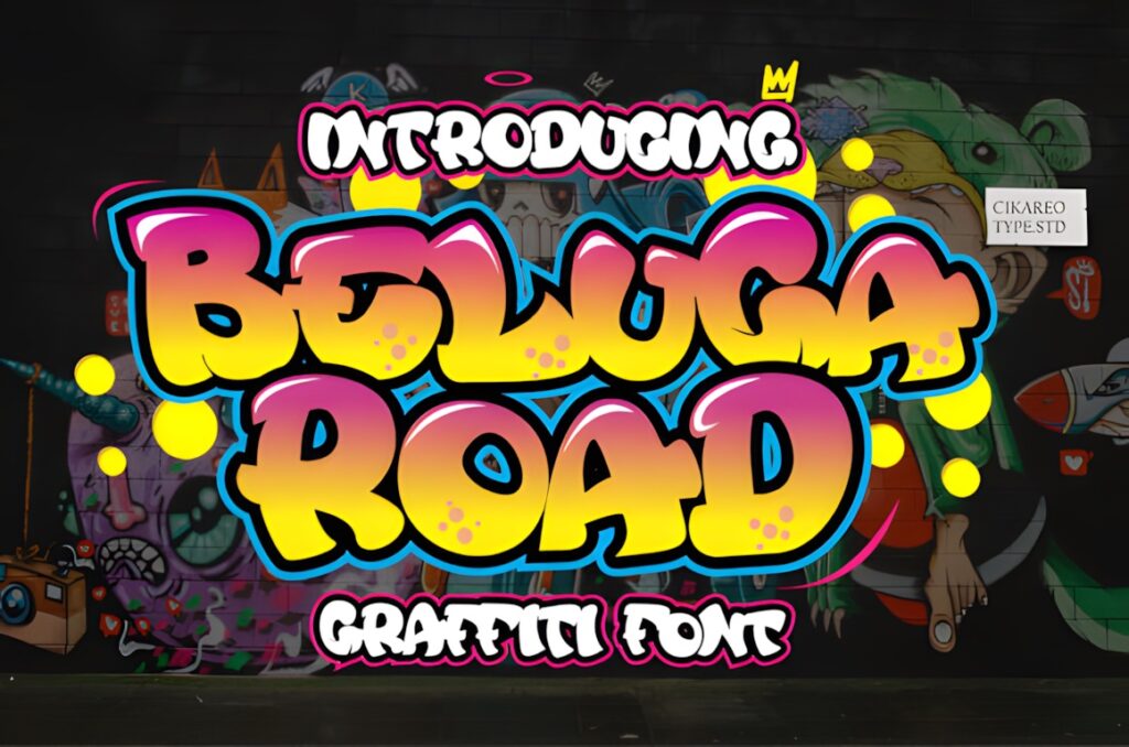
Beluga Road is a neat graffiti-style display font recommended by its product page for shirts, sportswear, logos, advertisements, and clothing. It is a useful alternative when you want urban personality without relying on separate shadow layers or elaborate effects.
Choose it when the typography needs to integrate with other graphic elements instead of overpowering them. Street Stronger is a better match when dramatic depth is the main visual idea.
12. The Bolder Shadow
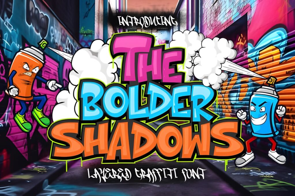
The Bolder Shadow is an installable display font from the graffiti collection and stands out as one of the more frequently favorited products in this group. That makes it worth comparing when you want forceful urban lettering with a strong display-first role.
Use it for short phrases and titles where the lettering can stay large. Avoid making an expressive shadowed display face compete with an equally decorative secondary font.
13. High Damage
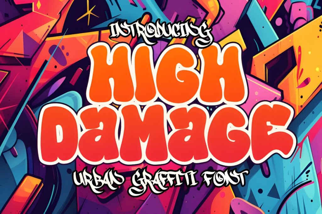
High Damage is a graffiti-category display font suited to urban titles, artwork, apparel concepts, and short graphic phrases. Its role in this collection is a more aggressive alternative to cleaner display choices such as Beluga Road.
Keep the copy concise so the typography can act as an image rather than ordinary text. For longer wording, consider simplifying the surrounding layout and increasing spacing.
14. Gear Four
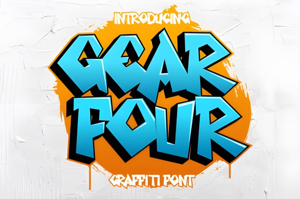
Gear Four is a graffiti-style display font positioned for branding, headings, invitations, apparel, and labels. Its broad project range makes it useful when you want recognizable street-art influence but still need flexibility across several types of finished graphics.
Use it for the main type treatment and pair it with a restrained supporting font. If the design calls for obvious 3D depth, Hiper Hoper or Urban Maxim provides that functionality more directly.
15. The Droga
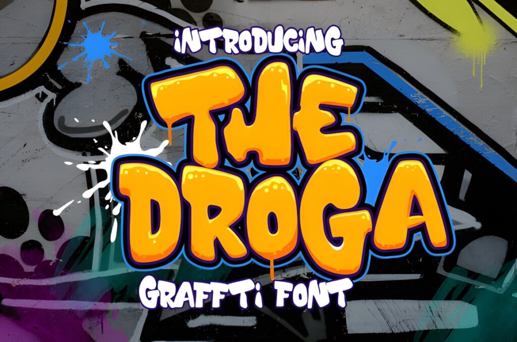
The Droga uses thick, heavy graffiti styling, giving short words a strong block of visual weight. The product is positioned for branding, headings, signatures, wall-art illustrations, apparel, labels, and related display projects.
This makes sense when you need dense lettering that will not disappear beside illustrations or busy backgrounds. Choose a lighter graffiti face when the composition already contains several heavy graphic elements.
16. Wolf Fangs
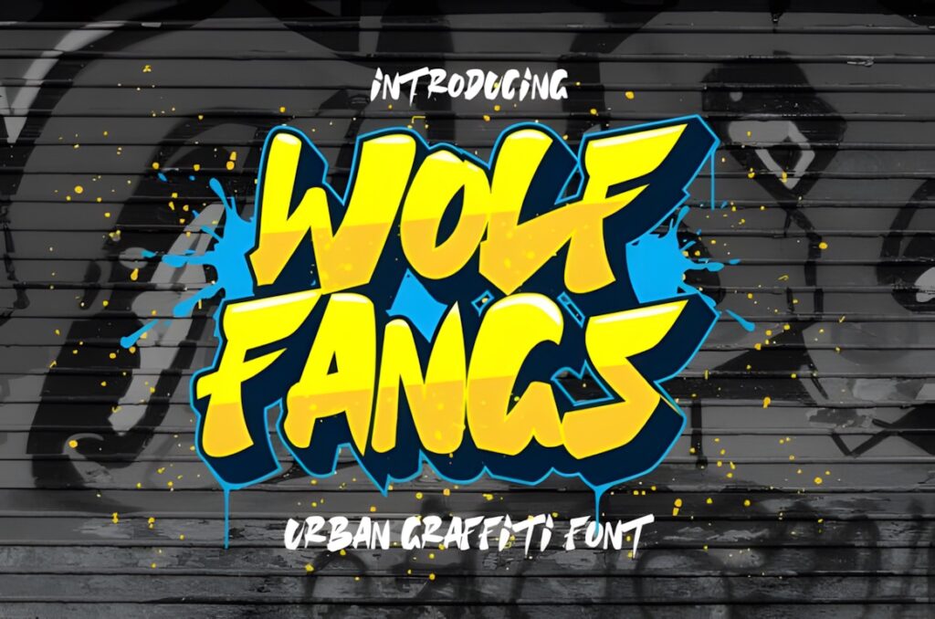
Wolf Fangs is a chunky graffiti display font intended for logotypes, graphics, apparel, and wall art. Its heavier forms give it enough presence to work as a standalone headline treatment rather than needing a large amount of additional decoration.
It fits bold streetwear and poster concepts particularly well. For a more decorative result with swashes, Wild Hustle Graffiti provides more built-in flourish.
17. Succer Head
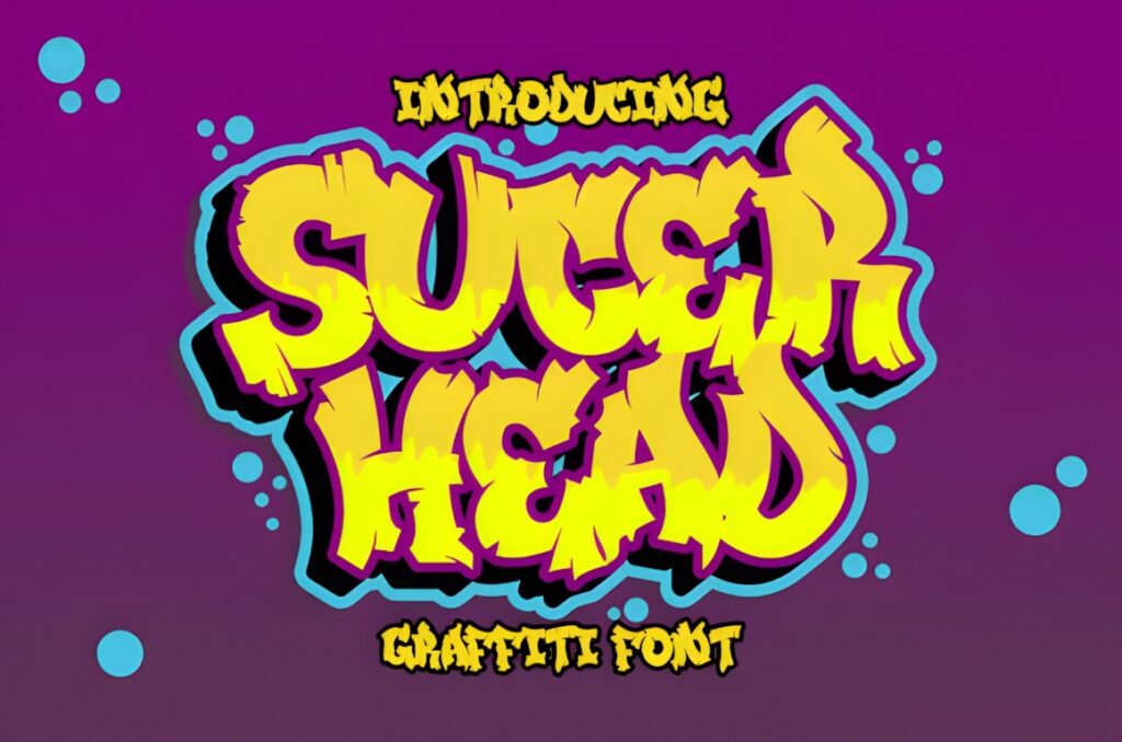
Succer Head is a graffiti-like display font intended for apparel design, logotypes, advertising, wall decoration, and craft projects. It is a general-purpose urban display option rather than a font built around one specific effect such as layering.
That flexibility is helpful when you want to add your own outlines, shadows, spray textures, or illustrations afterward. For built-in dimensional structure, choose one of the layered fonts instead.
18. Monosock
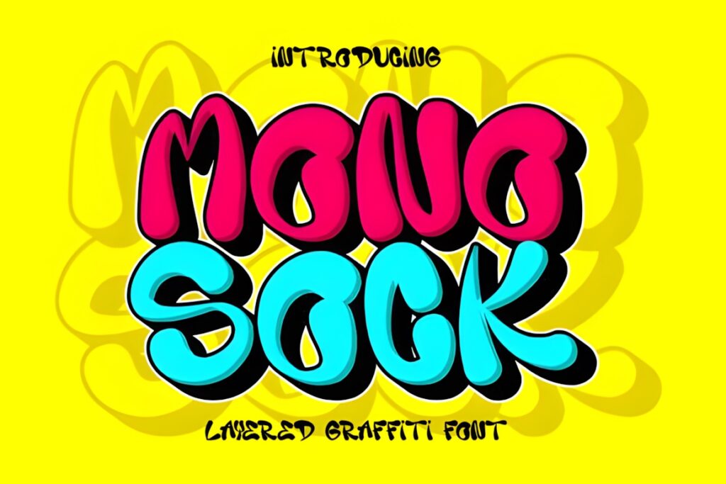
Monosock is an installable display font selected from a dedicated graffiti collection. It works as another urban lettering option for posters, apparel, logos, and short graphic statements where visual personality matters more than long-form readability.
Use it to create variation when several related designs need distinct lettering without leaving the graffiti theme. Keep supporting information in a simpler companion font.
19. Green Toxic
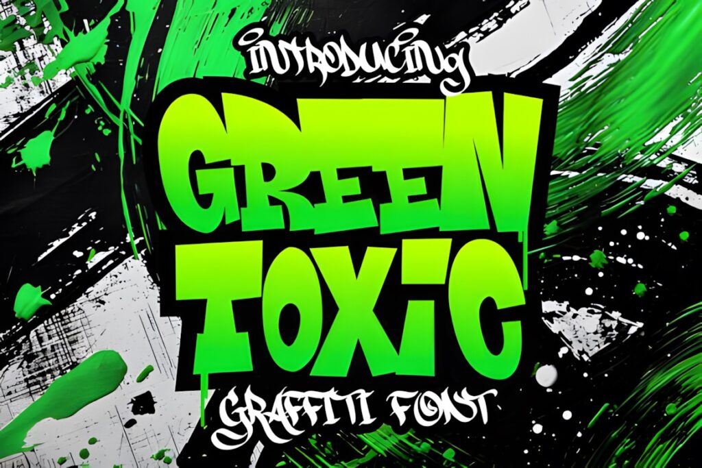
Green Toxic is a graffiti-focused display font suited to louder urban graphics and short statement typography. The name and placement within the graffiti collection make it a natural candidate for designs with energetic, unconventional visual themes.
Let the type remain the focal point instead of surrounding it with several equally decorative fonts. A clean sans serif can handle dates, captions, or secondary information around it.
20. Blue Monsta
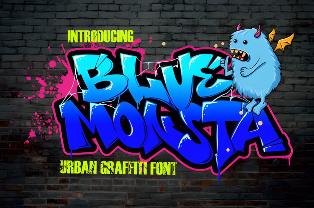
Blue Monsta is a graffiti-style display font suggested for branding, headings, logotypes, wall-art illustration, apparel, labels, and other decorative projects. It is useful when you want expressive urban lettering that can move between digital and merchandise layouts.
Use it at headline scale so the letterforms carry enough visual weight. For more explicitly sharp and aggressive typography, Under Boom provides a stronger directional contrast.
21. Under Boom
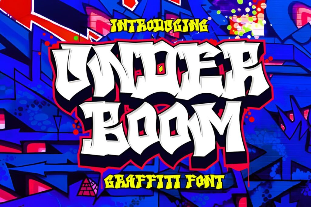
Under Boom is an urban graffiti font with a bold shape and sharper edges. The product page specifically connects it with music posters, apparel, shirts, streetwear, and more aggressive urban themes.
Choose it when rounded bubble lettering would feel too friendly. The sharper treatment works better for harder-edged music or streetwear graphics, while Back Wild gives the same general niche a softer, fuller personality.
22. Roket Monster
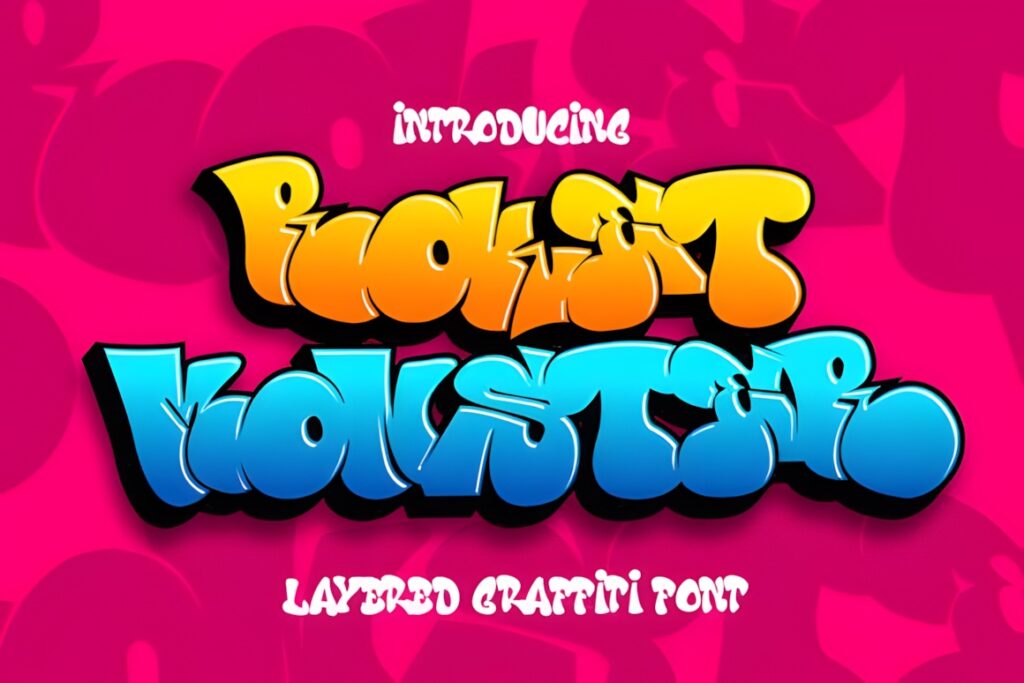
Roket Monster is an installable display font included in the same graffiti collection as the other urban-focused choices here. It offers another expressive lettering direction for short posters, stickers, apparel text, and logo experiments.
It works best where the font can be treated graphically. For small utility text, use a cleaner secondary typeface and reserve Roket Monster for the main visual statement.
23. Crazy Rooster
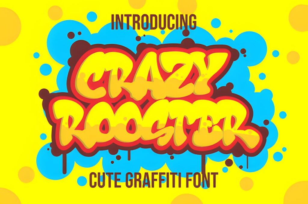
Crazy Rooster is a bold display font with a retro direction, giving this roundup an option that can bridge urban graphics and vintage-inspired layouts. It works when straightforward graffiti styling feels too predictable for the concept.
Consider it for posters, apparel, covers, or graphics that mix street culture with throwback visual cues. For a more conventional graffiti treatment, Beluga Road stays closer to the core urban-display look.
24. Jago Rawi
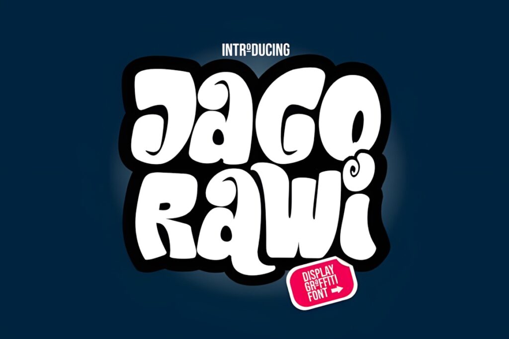
Jago Rawi is an installable display font from a dedicated graffiti font lineup. It suits short-form urban typography such as apparel graphics, title treatments, stickers, posters, and experimental branding where the font functions as a visual component.
Give it enough size for the character shapes to remain distinctive. Avoid setting several lines of small copy in the same decorative face.
25. Hightgraff
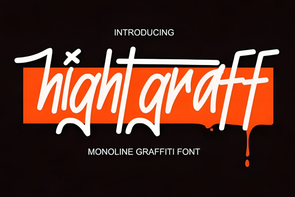
Hightgraff is another graffiti-oriented installable font intended for expressive display work. Its strongest use is short urban typography where the letterforms can become a central part of the artwork rather than simply carrying information.
Use it for names, slogans, poster titles, apparel text, or sticker graphics. Keep secondary text quieter so the composition has a clear typographic hierarchy.
26. Love and Rock
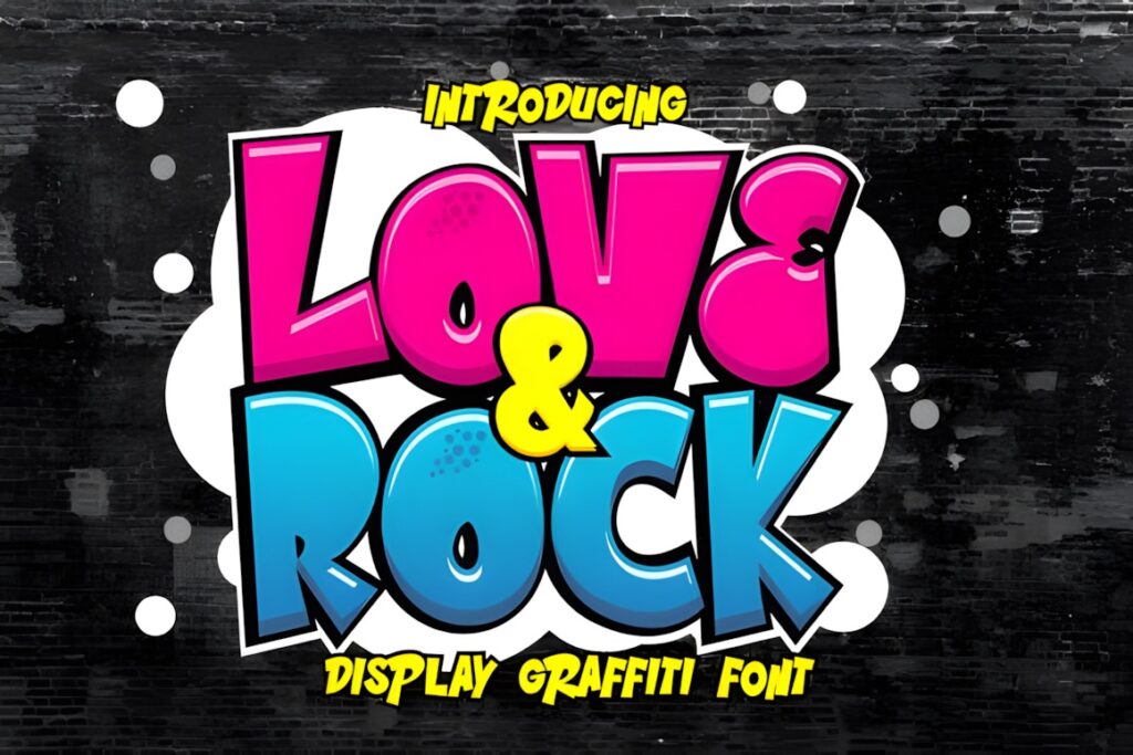
Love and Rock is part of the graffiti-oriented collection and gives the list an alternative for designs that mix street influence with music or expressive lifestyle graphics. It works most naturally for short display words and graphic-led compositions.
Consider it when the finished artwork needs more attitude than a conventional sans serif but does not need a complex three-layer construction.
27. Rhinos Pero
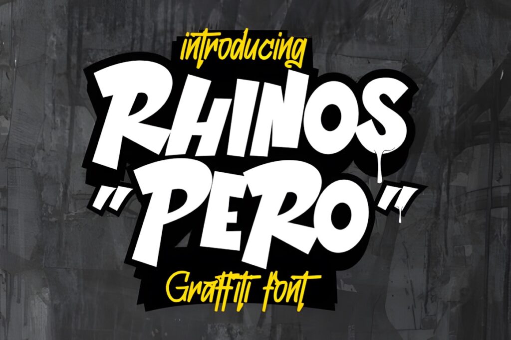
Rhinos Pero is an installable display font included among the graffiti typefaces in the Urban Vibes collection. That makes it appropriate for short-form street-art lettering across posters, merchandise, stickers, graphics, and related display work.
Use it where visual personality matters more than neutral readability. A simpler companion font can keep supporting information easy to scan.
28. Great Squater
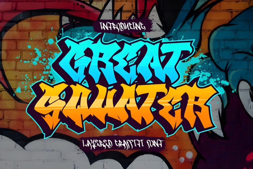
Great Squater uses two layers, solid and shadow, to create a dimensional graffiti effect. That makes it useful when you want visible depth but do not need the three-part construction found in Street Stronger, Hiper Hoper, or Urban Maxim.
Choose it for posters, street-art titles, stickers, and other compositions where a shadow can help the lettering separate from the background. Simpler flat text is better when the available space is very small.
29. Lord Jamet
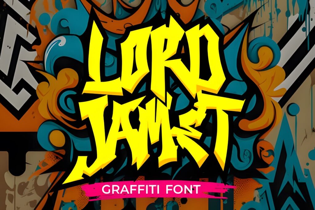
Lord Jamet is a dedicated display font included in the same graffiti collection as the other urban lettering options here. Its practical role is short expressive typography for poster titles, apparel designs, stickers, and graphic branding.
Keep the wording compact and allow enough surrounding space for the lettering to read as a graphic element. Use another font for body copy or small captions.
30. Hard Zone
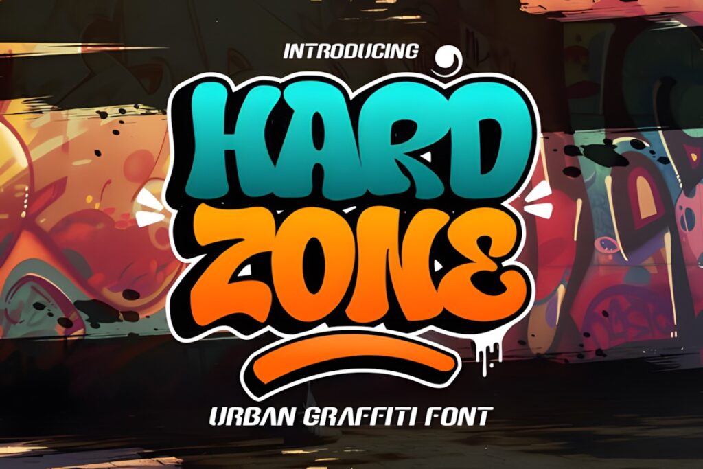
Hard Zone is a layered graffiti font combining regular letterforms, shadow treatment, and swashes. It is designed for forceful street-inspired headings and advertising-style display typography where both depth and decorative motion are useful.
Choose it when a flat type treatment feels unfinished. For a cleaner layered look without the added swash character, Urban Maxim provides a more structured alternative.
31. Street Wolfker
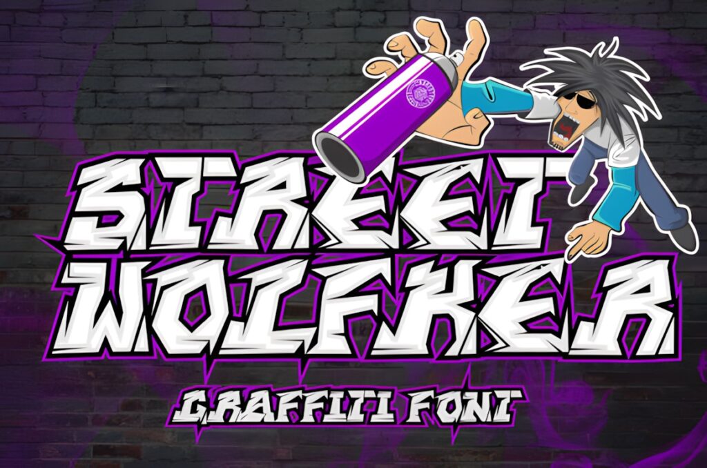
Street Wolfker is a graffiti-styled display font created specifically for urban-art designs. It offers a direct street-art look without depending on complex layered construction, making it useful for posters, short titles, logos, and apparel graphics.
Choose it when you want the graffiti identity to come primarily from the letterforms. For obvious depth and dimensional treatment, Great Squater or Street Stronger is more specialized.
32. Urban Maxim
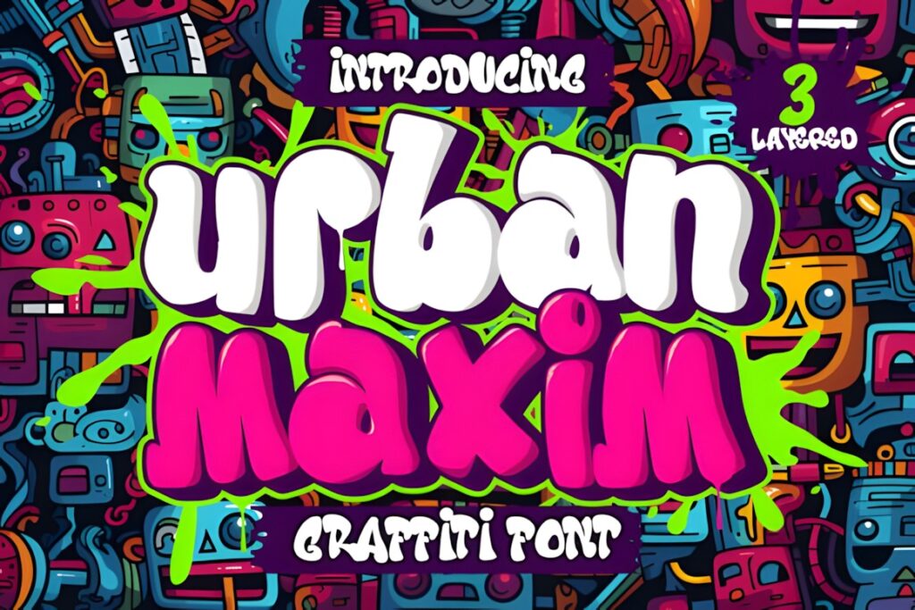
Urban Maxim uses three layers: solid, shadow, and inner shadow. Those components allow the lettering to build a more dimensional graffiti treatment suitable for street-art posters and other large display projects.
It works particularly well when color separation between layers is part of the finished design. For a faster, simpler shadow treatment, Great Squater reduces the construction to two layers.
33. King Jack Style
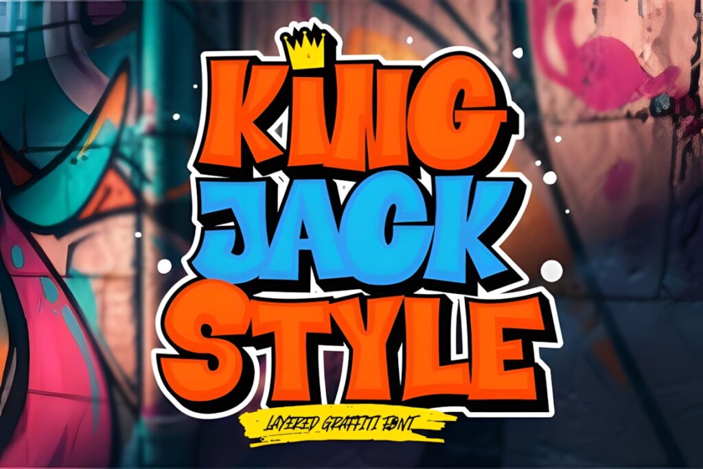
King Jack Style is an installable display font selected from the same graffiti-focused collection. It is most useful for projects where the typography needs a distinctive urban identity rather than the neutrality of ordinary headline type.
Use it for short names, graphic phrases, apparel text, or poster titles. Keep small functional information in a simpler typeface so the visual hierarchy stays clear.
34. Bubble Horns Graffiti
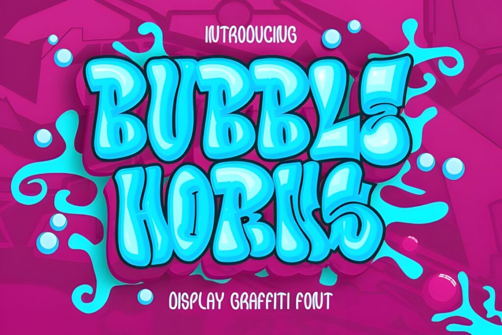
Bubble Horns Graffiti is a dedicated graffiti display font and a useful choice when you want the softer, inflated side of street lettering rather than narrow tags or sharp-edged forms. It is one of the more frequently favorited fonts in this group.
Bubble-style lettering works especially well for playful shirts, stickers, poster words, youth graphics, and large decorative titles. For a more aggressive tone, Under Boom creates a stronger contrast.
35. Metro Graffi
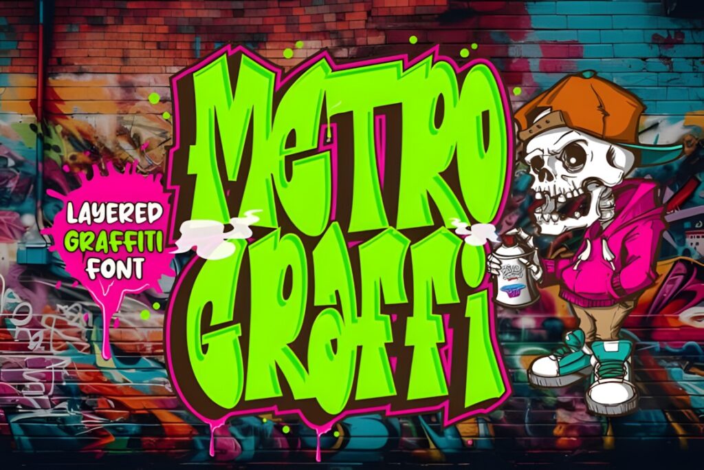
Metro Graffi is an installable graffiti display font suited to urban titles, street-art compositions, merchandise graphics, stickers, and short branding treatments. Its place in a dedicated graffiti font collection makes it a straightforward option when the project needs a recognizable urban type direction.
Use it as the primary display face rather than for dense text. If the lettering needs built-in dimensional layers, Urban Maxim or Street Stronger offers more specialized construction.
| Product | Best for | Font Style / Personality | Best Project Fit |
|---|---|---|---|
| Back Wild | Chunky statements | Bold, rounded graffiti | Shirts and posters |
| Road Monsta | Urban headlines | Expressive display | Apparel and graphics |
| Subawy Ripple | Alternative urban titles | Decorative graffiti | Posters |
| Fast Blaze | High-impact words | Graffiti display | Merchandise |
| Vandal Lineros | Edgy lettering | Urban graffiti | Logos and covers |
| Bade Hoper | Short street titles | Decorative display | Labels and apparel |
| Griffin Rase | Flexible urban graphics | Graffiti-like display | Logos and advertising |
| Wild Hustle Graffiti | Decorative lettering | Graffiti with swashes | Logos and apparel |
| Street Stronger | Dimensional titles | Three-layer graffiti | Posters |
| Hiper Hoper | Detailed 3D type | Layered graffiti | Large headlines |
| Beluga Road | Cleaner street type | Neat graffiti display | Sportswear and logos |
| The Bolder Shadow | Heavy display words | Shadowed display | Posters |
| High Damage | Aggressive graphics | Urban display | Streetwear |
| Gear Four | Versatile graffiti use | Decorative display | Branding and labels |
| The Droga | Heavy lettering | Thick graffiti | Wall art and apparel |
| Wolf Fangs | Chunky titles | Bold graffiti display | Logotypes |
| Succer Head | Custom graphic treatments | Graffiti-like display | Advertising |
| Monosock | Urban display variation | Graffiti display | Posters and apparel |
| Green Toxic | Loud urban themes | Expressive display | Graphic titles |
| Blue Monsta | General graffiti projects | Graffiti display | Branding and apparel |
| Under Boom | Hard-edged lettering | Sharp urban graffiti | Music and streetwear |
| Roket Monster | Expressive titles | Graffiti display | Stickers and apparel |
| Crazy Rooster | Retro street graphics | Bold retro display | Posters |
| Jago Rawi | Short urban typography | Graffiti display | Stickers |
| Hightgraff | Street-art titles | Graffiti display | Apparel |
| Love and Rock | Music-inspired graphics | Expressive urban display | Covers and apparel |
| Rhinos Pero | Graphic typography | Graffiti display | Posters |
| Great Squater | Simple dimensional type | Two-layer graffiti | Posters and stickers |
| Lord Jamet | Urban titles | Decorative display | Apparel |
| Hard Zone | Decorative 3D lettering | Layered graffiti with swashes | Headlines |
| Street Wolfker | Direct street-art look | Graffiti display | Urban graphics |
| Urban Maxim | Color-separated layers | Three-layer graffiti | Large posters |
| King Jack Style | Distinct urban lettering | Display graffiti | Merchandise |
| Bubble Horns Graffiti | Playful bubble lettering | Rounded graffiti | Stickers and shirts |
| Metro Graffi | Classic urban display | Graffiti lettering | Posters and branding |
How to Use Graffiti Fonts Without Losing Readability
Graffiti lettering usually works better as display typography than as body text. The more irregular the outline, shadow, swash, or internal detail becomes, the more space the reader needs to recognize each letter. That is why a design that looks clear across the front of a shirt may become muddy when reduced to a small social icon or narrow sticker.
Start by testing the actual word you intend to use. A font can look convincing in an alphabet preview while producing awkward shapes when several specific letters meet. Pay particular attention to repeated letters, narrow characters, and combinations where two expressive forms touch.
For bubble and chunky graffiti fonts, the broad shapes can handle fills, outlines, gradients, and simple textures well. Avoid stacking too many effects at once. Thick outline, heavy shadow, texture, glow, and several bright colors can quickly hide the underlying letterforms.
Layered fonts such as Street Stronger, Hiper Hoper, Great Squater, Hard Zone, and Urban Maxim give you separate structural elements for building depth. The advantage is control: the face, shadow, and interior can be treated independently. The tradeoff is complexity. At small sizes, those extra layers may merge visually, so reserve them for prominent type.
For apparel and poster designs, check the entire composition at thumbnail size before finishing. If the main word becomes difficult to recognize when reduced, simplify the background, remove an effect, increase spacing, or choose a less intricate graffiti face.
Pairing also matters. A graffiti headline already carries a strong personality, so supporting text usually benefits from contrast rather than imitation. A straightforward sans serif can handle dates, product details, event information, or captions while leaving the graffiti font responsible for mood and hierarchy.
If the project will be sold, used for client work, incorporated into a logo, distributed digitally, or placed on print-on-demand products, review the current license terms attached to the specific font before publishing the finished design.
Choosing the Right Graffiti Style for Your Project
If you need thick, playful lettering for shirts, stickers, or poster words, Back Wild or Bubble Horns Graffiti gives the design a fuller, more rounded street-art personality.
If dimensional lettering is the main goal, Street Stronger provides three layers, while Great Squater offers a simpler solid-and-shadow construction. Urban Maxim adds an inner-shadow layer when you want more control over depth.
For harder-edged streetwear or music graphics, Under Boom makes more sense than the rounded options. If you prefer decorative movement and swashes, Wild Hustle Graffiti or Hard Zone gives you more ornament directly in the lettering.
For a more flexible graffiti display face that leaves room for your own textures and effects, Griffin Rase, Beluga Road, or Street Wolfker keeps the street-art identity without making layering the entire concept.
Frequently Asked Questions
What type of graffiti font works best for street art designs?
Graffiti display fonts with bold, distinctive letterforms usually work well for street art designs because the typography can remain recognizable while carrying a strong visual personality. Chunky and bubble styles suit playful graphics, sharper styles fit harder-edged streetwear, and layered graffiti fonts are useful when the design needs dimensional depth. The final choice should match the scale and mood of the project.
Can graffiti fonts be used for shirts, stickers, and posters?
Graffiti fonts can work well for shirts, stickers, and posters when they are used primarily as display typography. Large words give decorative letterforms, shadows, outlines, and irregular shapes enough room to remain readable. For smaller supporting information, pair the graffiti lettering with a simpler font rather than reducing an intricate display face until its details become difficult to recognize.
How do you make graffiti lettering easier to read?
Graffiti lettering becomes easier to read when the design preserves clear letter separation and avoids excessive competing effects. Test the finished word at its intended size, simplify busy backgrounds, and remove extra shadows or textures if the letter shapes start to merge. For longer phrases, use a relatively restrained graffiti style or reserve the decorative font for only the most important words.
Can graffiti fonts be used for commercial design projects?
Commercial use depends on the current license attached to the specific graffiti font. Before using a font in client work, logos, merchandise, print-on-demand products, websites, apps, or distributed files, review the applicable license terms for that product. Licensing conditions can differ by use case, so the current product license should be checked rather than assuming every form of commercial distribution is permitted.
Follow Us