Introduction
Want to make your PowerPoint presentations really pop? The secret’s in the fonts! Cool PowerPoint fonts aren’t just about looks. They set the vibe, help get your point across, and keep everyone interested.
Affiliate Disclosure: Just a heads-up: some links here are affiliate links. It doesn’t cost you anything extra, but it helps support my work 💛
TL;DR
This article highlights 15 awesome fonts for PowerPoint that can instantly elevate your presentations. You’ll learn how to choose readable fonts that match the right mood, discover options for both business and creative slides, and get practical tips on installing and using fonts in PowerPoint on Windows and Mac.
Table of contents
How to Pick the Right Font
Choosing a font for your PowerPoint is more than just picking something pretty. It’s about making your slides come to life! The right font should back up what you’re saying, match the mood, and keep people reading. A great font can really boost your presentation if you do it right.
Make Sure It’s Easy to Read
First things first, your font needs to be readable. You might love a fancy font, but it needs to be easy to read, especially on a big screen. Fonts without those little extra strokes, like Arial or Verdana, usually work best. You want everyone to be able to follow along, even if they’re sitting in the back.
Also, check how the font looks in different sizes. The best fonts for PowerPoint are clear in big titles and smaller text. An easy-to-read font will keep people focused on what you’re saying, not struggling to read it.
Match the Presentation’s Feel
Once you know your font is readable, think about the mood you want to set. Fonts can give off different vibes. For example, if you’re doing a presentation, fonts like Playfair Display or Montserrat can add a touch of class. Want a more business-like feel? Try clean, simple fonts like Raleway or Roboto.
The right choice helps get your message across and adds some personality, so go with what feels right for your topic.
Top 15 Fonts
Now that you know how to pick a font, let’s look at some of the best ones for PowerPoint! These fonts can be clean and new or artsy and bold. They’re sure to make your slides stand out. They are spot on for business or creative presentations.
1. Rutina Grace
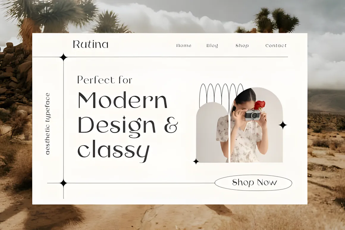
Rutina Grace is a lovely font with a bit of old-school charm and a fresh feel. Its curves and details make it great when you need a professional, classy look.
Rutina Grace is easy to read but still has a touch of style. It’s great for titles, quotes, or anything that needs to make a statement. Try it with a simple font for the main text to create a nice contrast.
2. Brisol
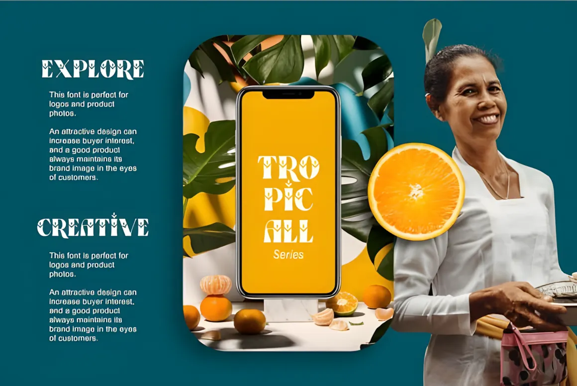
Bristol is a stylish font that mixes classic and modern styles. It’s simple and well-balanced, so it’s great for presentations that need to look professional and polished.
Bristol looks bold and classy, and it’s easy to read. It works well for titles, quotes, or anything that needs to grab attention. Use it with a simple font for the main text to keep things balanced.
3. Flamingo
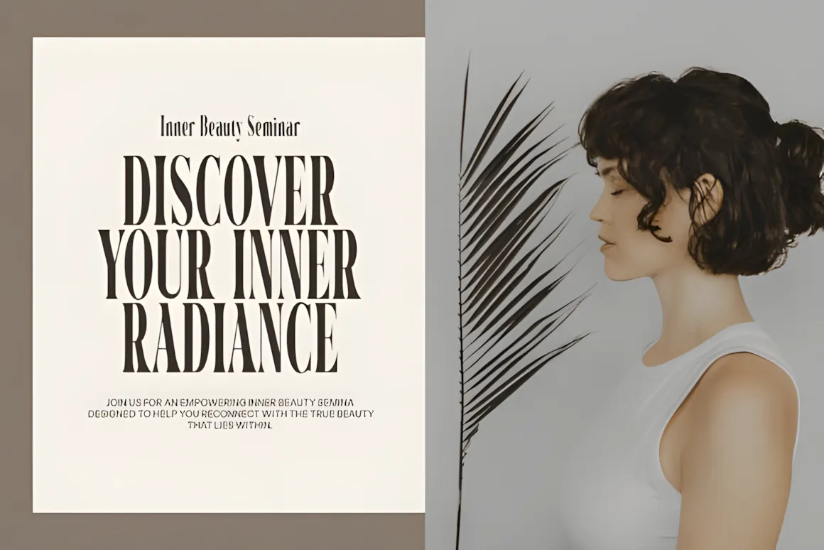
Flamingo is a new font that blends modern and vintage styles. Its stylish details and smooth curves make it a great choice for presentations that want to feel classy and modern.
This font is balanced and easy to read, but it still has personality so your slides don’t look boring. It’s great for titles, quotes, or anything that needs to make a statement. Using it with a simple font for the main text will create a nice contrast and improve your presentation.
4. Estetique
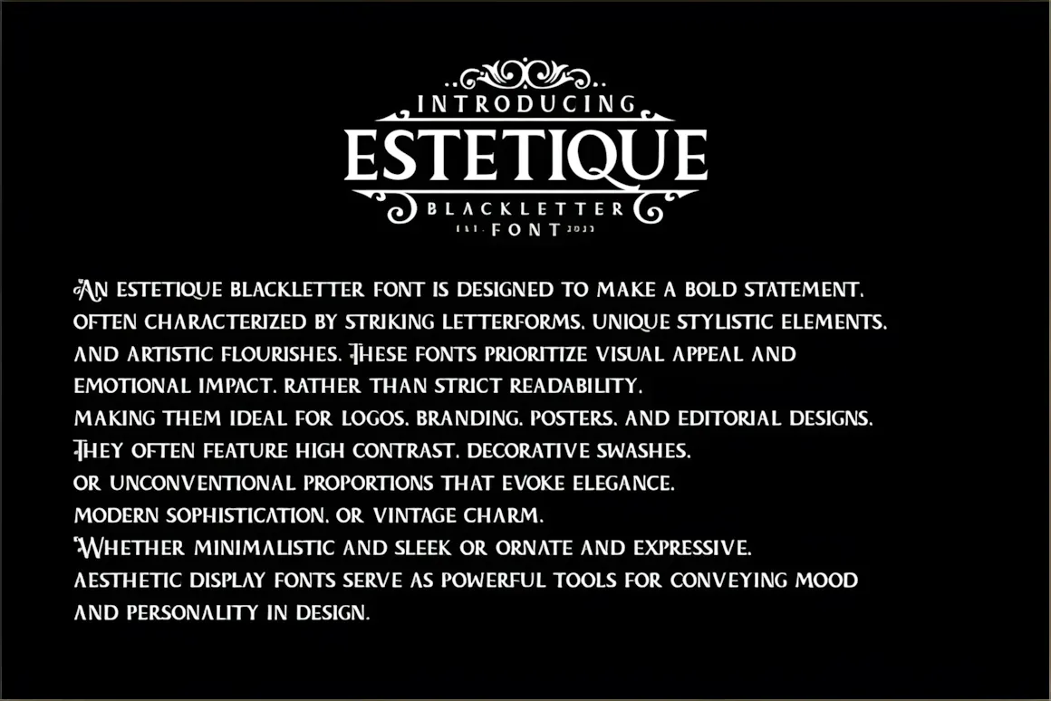
Estetique is a modern font that looks fancy and stylish. It’s clean and has a few curves, making it perfect for presentations that need to show off some class.
This font is sleek so it is easy to read. It makes your slides look great. It’s perfect for titles, quotes, or anything that needs to make a stylish statement. Try it with a fancy font for the main text to create a nice contrast.
5. Higlean
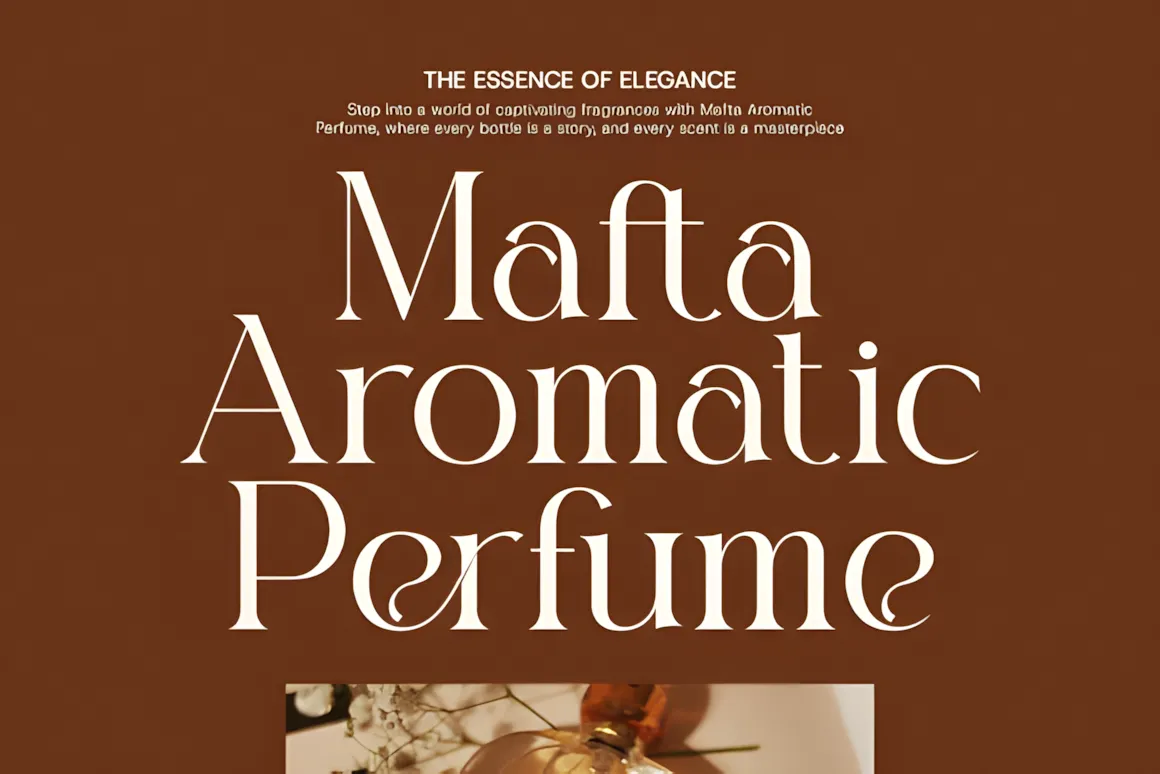
Higlean is a modern serif font that combines new and old styles. Its detailed lines look great in presentations that need to feel professional and stylish.
The simple design of this font makes it easy to read and adds some style to your slides. It’s great for titles, quotes, or anything that needs to make a statement. Try it with a simple font for the main text to create a balanced look.
6. Cellien
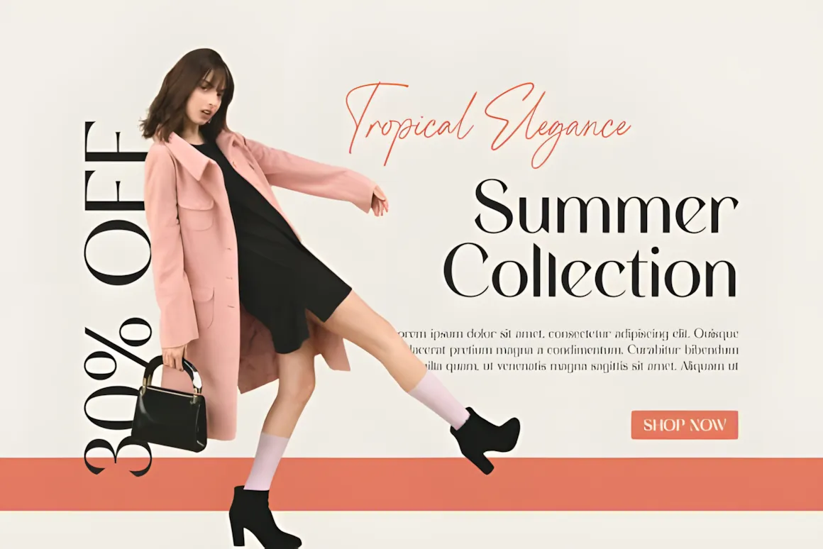
Cellien is an advanced font, both modern and classic. Its lines give it a great look for presentations that need to be stylish and business-like, not compromising on clarity. Put it in titles, quotes, or anything that needs to make a classy statement. A mix of Cellien with a simple font for the main text will make the perfect contrast and maintain the style of your presentation.
7. Melona Woman
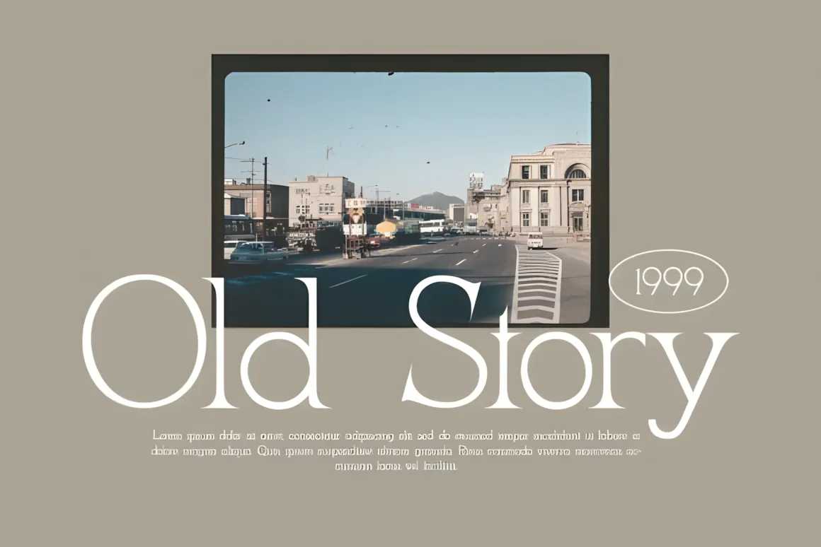
Melona Woman is a fancy font that adds personality to your presentation. Its flowing design makes it great for presentations that need a personal, artsy touch.
Melona Woman is great for a title slide, a quote, or anything that needs to make a statement. It looks balanced when used with a simple font as the main text.
8. Saficel
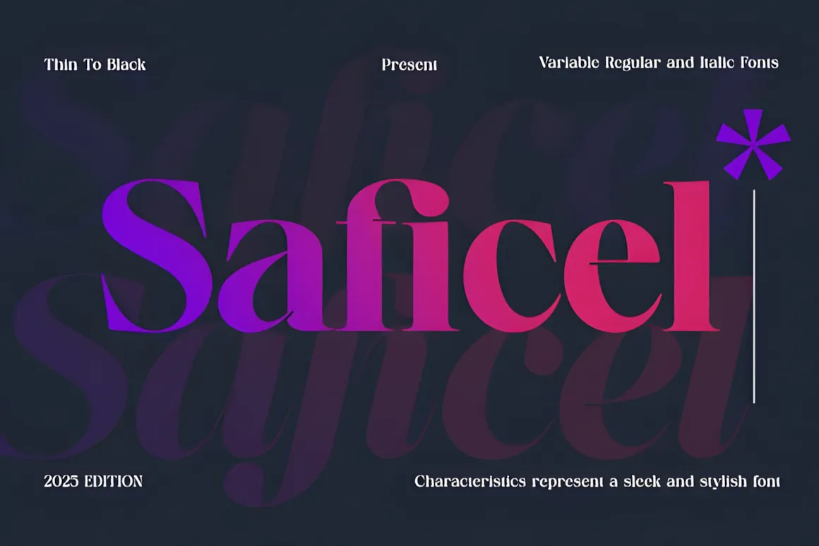
Saficel is a modern font. It is ideal when you need to do a business presentation and make sure the audience follow the point.
The lines make Saficel ideal for titles and body text. It looks fresh, pair it with another font to show a contrast on your slides.
9. Balancing
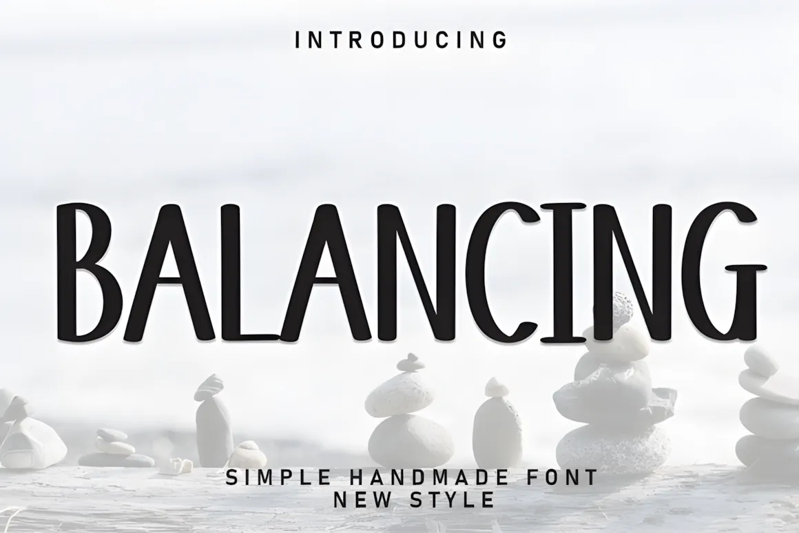
Balancing is a font with a modern vibe. It is awesome in presentations.
Balancing is easy . Your slides will be eye-catching, with an easy design to read and follow. You can use it as a title font and mix it with another body-text to create an elegant contrast.
10. Dringk
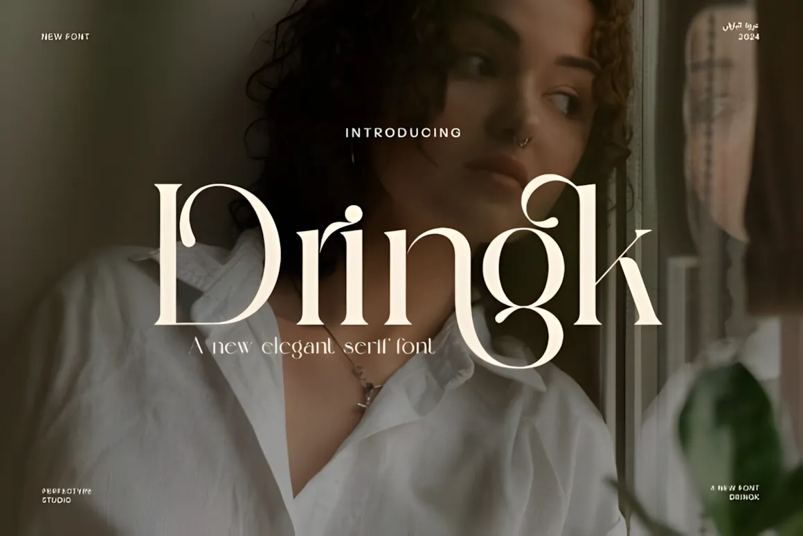
Dringk is a fun font that will add a touch of personality to your slides. Its style makes it great for presentations, where charm is the goal.
It is awesome to stress words or use it on a heading . Pair it with a normal font to make it easy to follow.
11. Molcer

Molcer is a font exuding class. It is awesome for your corporate presentation. Molcer with its lines makes your slides easy to follow and stylish.
The font is awesome for headings and body text ,so any presentation will look awesome with this one and easy to read. Put it in a marketing presentation that wants a high touch.
12. Monogram
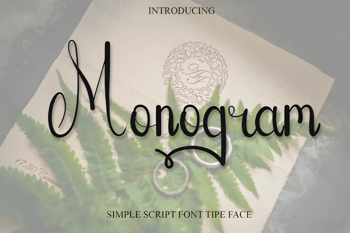
Monogram is a classic font with an design. With its shape , it can will get any look you want on your slides. Monogram gives style, whether for titles or any design.
It is nice for presentations with a nostalgic style; this font matches fonts for a balanced design.
13. Designer Music

Designer Music is a font. It is awesome for presentations about art or music.
Designer Music is awesome for headings. Use it with other fonts to make sure people can read what you say.
14. Bunny

Bunny is a font with a friendly vibe. Its style makes it awesome for casual presentations that need a light feel.
Apply Bunny to titles to make a great slide. It should be used with another font to make it easy to read.
15. Simple Alphabet

Simple Alphabet is an adorable font that will give a childish emotion to your power point presentation. It has readable forms and is great in presentations when the person wants to show a warm feeling.
The design of this font adds personality to your slides. It would be awesome on title slides, quotes, or anything that needs a saying. Simple Alphabet can be used with another font to make a contrast.
How to Use Fonts in PowerPoint
Once you’ve picked your fonts, it’s time to put them to work! Whether you’re using fonts from Creative Fabrica or ones that come with your computer, making sure they look right is key. Here’s how to do it:
How to use on Windows
Get the font: After downloading , unzip the file ) and find the font files (they have the extensions .ttf or .otf).
Add the font: Right-click on the typeface file and Install it in the menu. This will install it to the library of your system.
Use the font in PowerPoint: Open PowerPoint and see the fonts and select in the font list.
How to use on Mac
Tips for Using Fonts in PowerPoint
After picking your fonts, it’s important to use them well. Here are some tips to help you get the most out of your fonts:
There are some things to think about before you start fonts can change the feel of your slides, they should be easy to use. Too many fancy fonts can make it hard to read and make it hard for your audience to read. Keep it simple and creative.
Here are ways to use fonts in your presentations
- Check Compatibility: If you’re presenting on another computer, save the font in the power point presentation. This way, the computer can show the presentation even if it lacks the font. To save the font, Save>Embed fonts in the file.
- Easy to Read: Even aesthetic fonts should be readable. Make sure people can read them, mostly in large presentations. Also, test the presentation on other tech so that the text is readable.
- Limit the Number of Fonts: Too much fonts in a slide can be a mess. Use two or three fonts to give a look. Put a font in the heading and another in the test.
These tips will help you be sure that your fonts are awesome regarding your audience and purpose.
Conclusion
Picking the right fonts can make a difference in your presentation. The right fonts can add style and help get your message across clearly. The fonts make an effect on the presentation.
Here, at Creative Fabrica, we have many fonts to make your presentations awesome, and creative tools to help you realize your vision.
You may also like:


