
Typography Basics for Beginners: Understanding the Building Blocks of Design
Typography is one of those design skills people often overlook at first. Most beginners focus on colors, layouts, or images — which makes sense — but typography quietly shapes how everything feels. A clean font pairing can make a simple design look polished, while poor typography can make even good content feel messy or hard to trust.
Once you start paying attention to type, you notice it everywhere. Packaging, websites, café menus, YouTube thumbnails, phone apps… the fonts and spacing are constantly influencing how you read and react to things, even if you don’t consciously think about it.
If you’re new to design, understanding a few typography basics will instantly improve your work.
Table of contents
1. What Is Typography?
Typography is the practice of arranging text so it’s readable, visually balanced, and appropriate for the message you’re trying to communicate.
That includes things like:
- Font choice
- Font size
- Spacing
- Alignment
- Line height
- Hierarchy
At first glance, it might seem like “just picking fonts,” but typography is really about guiding the reader’s attention.
Good typography feels natural. You move through the content without friction. Bad typography does the opposite — even if people can’t explain why, they’ll often leave a page faster or lose interest when text feels cramped, inconsistent, or difficult to scan.
2. Why Typography Matters in Design
Typography affects both readability and emotion.
For example:
- A luxury serif font creates a completely different mood than a bold gaming font.
- Rounded fonts tend to feel friendlier.
- Thin elegant fonts often feel modern but can become hard to read at smaller sizes.
- Heavy condensed fonts create urgency and impact.
Even subtle changes matter more than people expect.
I remember redesigning a simple blog layout once where the only major change was typography — slightly larger body text, better spacing, and a more readable font. The site immediately felt calmer and more professional, even though the content itself stayed exactly the same.
That’s the quiet power of typography.
Good typography helps:
Guide attention naturally
Improve readability
Create visual hierarchy
Build brand personality
Increase user trust
Make designs feel polished
3. Typeface vs. Font — What’s the Difference?
Before choosing fonts, it helps to understand the main font styles you’ll see most often.
Serif Fonts
Serif fonts have small decorative strokes at the ends of letters.
Examples include:
- Times New Roman
- Garamond
- Baskerville
Serif fonts usually feel:
- Traditional
- Elegant
- Editorial
- Trustworthy
They’re commonly used in:
- Books
- Luxury branding
- Fashion magazines
- Print design
A lot of premium skincare or perfume brands still lean heavily on serif typography because it creates that refined, established look.
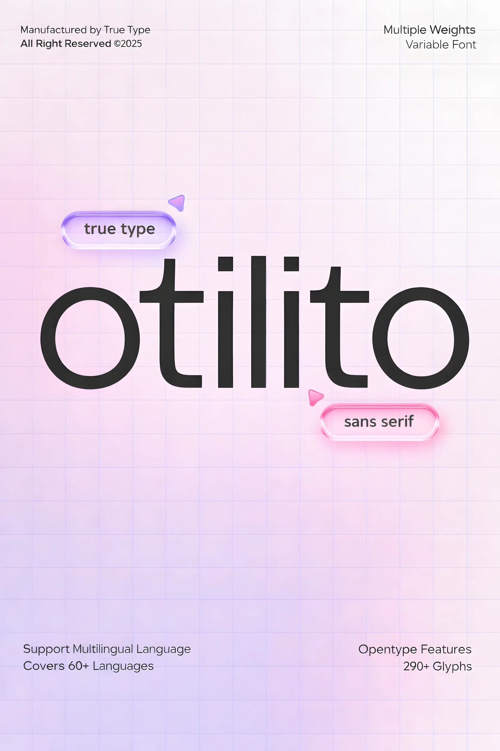
Sans Serif Fonts
Sans serif fonts don’t have decorative strokes.
Examples:
- Helvetica
- Inter
- Futura
- Montserrat
These fonts often feel:
- Clean
- Modern
- Minimal
- Digital-friendly
You’ll see sans serif fonts everywhere online because they stay readable across different screen sizes.
For beginners, sans serif fonts are usually easier to work with since they’re versatile and forgiving.
Script Fonts
Script fonts mimic handwriting or calligraphy.
They can feel:
- Elegant
- Personal
- Creative
- Romantic
But they’re also easy to misuse.
A common beginner mistake is using script fonts for large paragraphs. They almost always work better for:
- Logos
- Headlines
- Invitations
- Packaging accents
Even beautiful script fonts become tiring to read when overused.
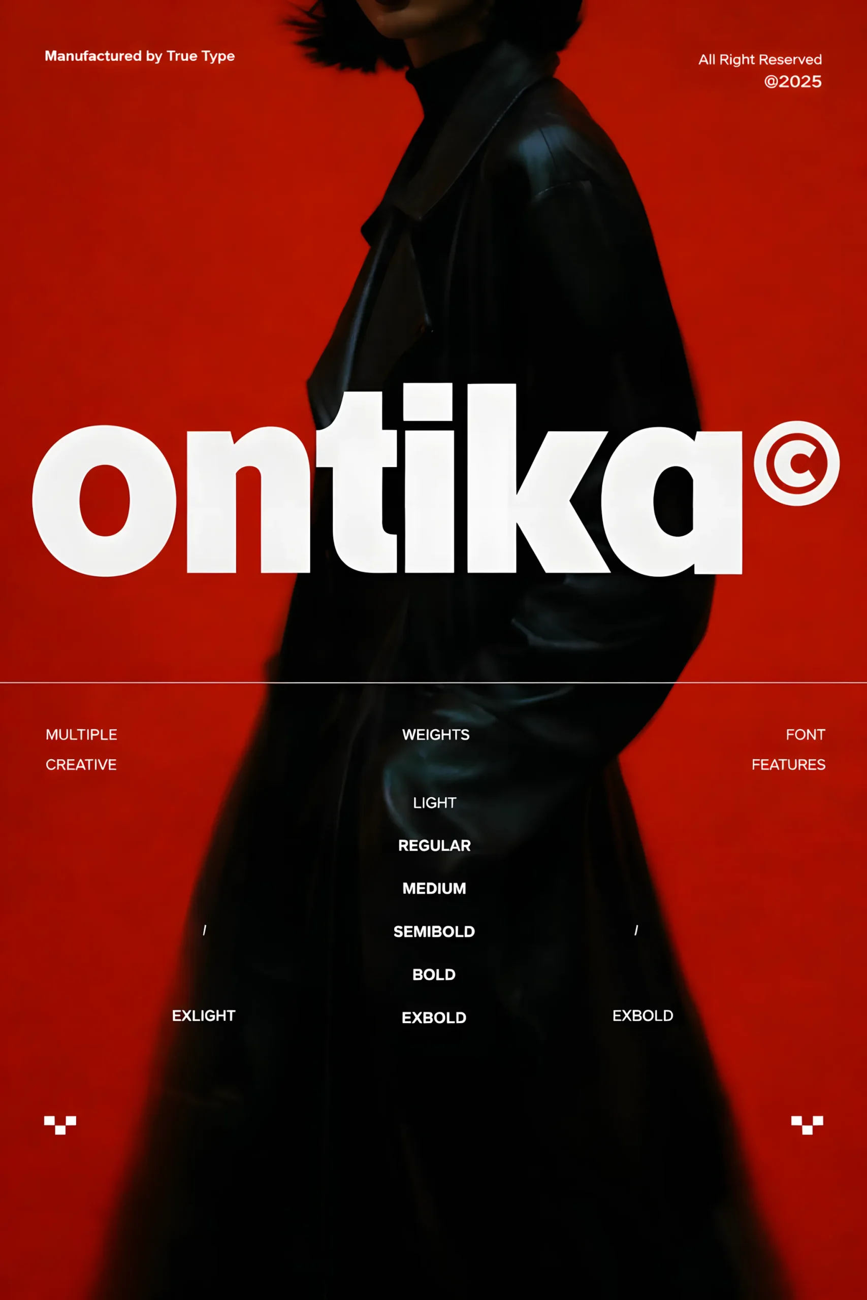
Display Fonts
Display fonts are decorative and attention-grabbing.
These are designed for impact rather than readability.
They work best in:
- Posters
- Headlines
- Branding
- Thumbnails
A lot of gaming and streetwear brands use display fonts because they create instant personality. The downside is that some display fonts look trendy for about six months and then suddenly feel dated.
That’s something you start noticing after working with fonts for a while.
Monospace Fonts
Monospace fonts use equal spacing for every character.
Examples:
- Courier
- Consolas
- JetBrains Mono
They’re mostly associated with:
- Coding
- Tech aesthetics
- Retro interfaces
Monospace fonts have become more popular in modern web design lately, especially for minimalist tech brands.
4. Font Anatomy: The Structure of Type
ou don’t need to memorize dozens of typography terms right away, but a few basics help a lot.
Kerning
Kerning is the spacing between individual letters.
Bad kerning creates awkward gaps that make words feel visually uneven.
Once you notice poor kerning, it’s hard to unsee it.
Tracking
Tracking adjusts spacing across an entire word or sentence.
Increasing tracking slightly can make luxury branding feel more refined. Too much tracking, though, makes text harder to read surprisingly fast.
Leading
Leading refers to line spacing.
Tight line spacing can make paragraphs feel dense and stressful, especially on mobile screens.
One small adjustment to leading often improves readability more than changing the font itself.
Hierarchy
Hierarchy helps readers understand what matters first.
Usually this comes from:
- Font size
- Font weight
- Spacing
- Contrast
Strong hierarchy makes content easy to scan quickly.
This becomes especially important in blog posts and web design because most people skim before they fully read.
Alignment
Alignment keeps text visually organized.
The most common types are:
- Left aligned
- Center aligned
- Right aligned
- Justified
For most digital content, left alignment is the easiest to read.
Centered text can look elegant for short headlines, but large centered paragraphs usually become difficult to follow.pacing, improve readability, and make your text feel balanced.
5. Serif vs Sans Serif: The Two Main Categories
Font pairing is where typography starts becoming really fun.
The goal is contrast without conflict.
A common combination is:
- Serif heading
- Sans serif body text
This works because the fonts feel different enough to create visual interest while still staying balanced.
Some practical beginner tips:
- Pair one bold font with one simple font
- Avoid combining too many decorative fonts
- Stick to two fonts at first
- Use font weight variation before adding extra font families
Honestly, beginners often use too many fonts. I did the same thing early on. Three or four different typefaces in one design usually creates visual chaos pretty quickly.
Simple combinations almost always age better.ody text often creates strong visual hierarchy and contrast.
6. Typography Principles Every Beginner Should Know
Once you understand the basics, the next step is mastering typography principles. These are universal design rules that guide how type should be arranged.
Contrast
Contrast helps important information stand out. You can create contrast through size, weight, color, or spacing. For example, pairing a bold title with light paragraph text draws the eye naturally.
Hierarchy
Typography hierarchy defines how readers scan content. Headlines should be large and clear, subheadings smaller, and body text consistent. Good hierarchy makes content scannable and easy to digest.
Alignment
Alignment provides structure. Choose one alignment style (left, centered, or justified) and stick to it for consistency. Avoid mixing alignments randomly.
Consistency
Use a limited number of typefaces (usually 2–3) and apply them consistently. Consistency builds recognition and improves readability.
7. Readability and Legibility
Readability refers to how easily the eye can move through a block of text, while legibility is about how clearly each letterform is perceived.
To improve both:
- Use adequate leading (line spacing) — tight lines can make reading tiring.
- Maintain proper contrast between text and background.
- Avoid using all caps for long paragraphs.
- Test your text on different screens or print formats.
For web design, always prioritize accessibility — make sure your typography is easy to read for everyone, including users with visual impairments.
8. Common Typography Mistakes to Avoid
Even experienced designers make errors when it comes to typography. Here are the most frequent ones:
- Using too many fonts — this causes visual chaos. Stick to a maximum of three.
- Poor spacing — incorrect kerning and tracking make text uneven.
- Ignoring hierarchy — when all text looks the same, readers get lost.
- Low contrast — light gray on white or dark red on black can hurt readability.
- Not testing designs — what looks good on your monitor may not work in print or mobile.
Avoiding these mistakes is key to professional-looking design.
9. How to Practice Typography as a Beginner
Learning typography for beginners is all about observation and experimentation. Try these exercises:
- Recreate layouts from professional magazines or websites — notice spacing, font pairing, and alignment.
- Experiment with different kerning, tracking, and leading to see how it affects readability.
- Use online resources like Creative Fabrica, and Fontiverse to explore typefaces.
- Practice pairing fonts with tools like Font Pair or Fontjoy.
Typography is a skill that improves over time — the more you design, the more intuitive it becomes.
Understanding these foundational design principles is key, and it's exciting to see how modern technology can help in creation; for instance, you can explore the 11 Best AI Tools for Creating Pinterest Pins in 2026 to easily bring visually stunning designs to life.
Final Thoughts
Typography can feel overwhelming at first because there are thousands of fonts and endless combinations. But most strong typography comes down to a few consistent principles:
- Clarity
- Balance
- Spacing
- Hierarchy
- Intentional font choices
You don’t need to master typography overnight. Even small improvements — cleaner spacing, better hierarchy, simpler font pairing — can dramatically improve your designs.
And honestly, the more time you spend noticing typography in the real world, the more natural it becomes.
After a while, you’ll start spotting tiny details automatically. Awkward spacing on a billboard. Perfect typography on skincare packaging. A font pairing that somehow makes a coffee shop menu feel expensive.
You may also like:
Follow Us