
Let’s Talk Type: A Guide to Fonts and How They Shape Design
Typography is one of those design things people notice without realizing they’re noticing it. A headline can feel elegant, loud, calm, modern, vintage, expensive, playful — all before you even read the words. That’s the power of type.
When I first started paying attention to fonts seriously, I thought typography was mostly about “making text look nice.” But once you work on websites, logos, packaging, Pinterest graphics, or even simple blog layouts, you start seeing how much fonts control the mood of a design. A bad font choice can make a polished design feel amateur in seconds. A good one quietly makes everything feel intentional.
This guide breaks down the basics of typography in a practical, easy-to-follow way without turning it into a design textbook.
Table of contents
A Quick Look at Type History
Typography has been around much longer than digital design. Long before Canva templates and Google Fonts, type was literally physical. Printers arranged metal letters by hand for books, newspapers, and posters.
A lot of today’s font styles still come from those early printing traditions.
Serif fonts, for example, trace back to Roman inscriptions and printed books. Sans serifs became more popular later when modern advertising and minimalist design started taking over. Then digital design changed everything again. Suddenly thousands of fonts became accessible to anyone with a laptop.
What’s interesting is how trends cycle. Fonts that felt outdated ten years ago suddenly show up everywhere again. Right now you’ll see a lot of retro serifs, soft sans serifs, and handwritten styles coming back into branding.
You can usually tell what era inspired a design just from the typography alone.

The Main Kinds of Fonts
Serif Fonts
Serif fonts have small decorative strokes at the ends of letters. Think of fonts commonly used in books, newspapers, or luxury branding.
They often feel:
- Traditional
- Elegant
- Trustworthy
- Editorial
Some serifs feel formal and refined, while others feel soft and modern. That’s why serif fonts work well for everything from fashion brands to long-form reading.
I still think a good serif headline instantly adds authority to a website. Especially for blogs or product packaging.
Popular examples include:
- Times New Roman
- Garamond
- Baskerville
Sans Serif Fonts
Sans serif fonts don’t have those decorative strokes. They usually look cleaner and more modern.
You’ll see them everywhere in:
- Apps
- Websites
- Tech branding
- UI design
- Social media graphics
A lot of newer creators default to sans serifs because they’re easier to use well. They’re flexible and usually readable even at smaller sizes.
Some can feel very neutral though. If you’ve ever looked at a startup website and thought “this looks like every SaaS company,” the font probably played a role.
Common examples:
- Helvetica
- Futura
- Inter
- Arial
Script Fonts
Script fonts imitate handwriting or calligraphy.
Some are elegant and flowing. Others feel casual and hand-drawn.
They work well for:
- Invitations
- Beauty brands
- Packaging
- Signature logos
- Pinterest graphics
But readability matters a lot here. A script font may look beautiful in a logo but become frustrating in paragraphs.
One thing I learned the hard way: many beginners overuse script fonts because they look “fancy.” Usually they work best in small doses.
Display Fonts
Display fonts are designed to stand out.
These are the fonts you use for:
- Posters
- Big headlines
- Logos
- Packaging titles
- YouTube thumbnails
Some are quirky. Some are loud. Some are extremely stylized.
They’re fun, but easy to misuse. I’ve seen display fonts completely overpower otherwise clean designs. Usually the best approach is pairing them with a simpler secondary font.
Monospace Fonts
Monospace fonts give every character the same width.
They’re associated with:
- Coding
- Terminal interfaces
- Retro tech aesthetics
You’ll often see them in developer tools or futuristic branding.
They’re not always the most readable for long paragraphs, but they add personality in the right context.
Understanding how fonts are grouped helps designers pick the right feeling and balance looking good with being easy to read. When you know the different types of fonts, you can mix and match to convey different feelings.
Font Things and How They Look
Typography isn’t only about picking a font family. Tiny details matter more than most people expect.
Weight
Font weight changes how bold or light text feels.
A thin font can feel elegant. A heavy bold font feels confident and loud.
Sometimes simply changing a heading from Regular to SemiBold improves a design more than switching fonts entirely.
Kerning
Kerning controls the spacing between letters.
Bad kerning is one of those things people don’t consciously identify, but they feel it when something looks awkward.
Luxury brands usually pay close attention to spacing. That polished look often comes from careful typography adjustments rather than complicated graphics.
Line Height
Line spacing affects readability more than many beginners realize.
Text that’s too tight feels cramped. Too loose and everything feels disconnected.
For blog content especially, comfortable spacing makes people stay longer on the page. I notice this immediately on sites with dense paragraphs — they feel exhausting before I even start reading.
Alignment
Alignment changes the structure and rhythm of a layout.
- Left-aligned text feels natural and readable
- Centered text feels formal or decorative
- Justified text can look editorial but sometimes creates awkward spacing
Most websites stick to left alignment for good reason.

Why Hierarchy and Readability Matter
Typography guides people through content.
Without hierarchy, everything blends together.
Good typography helps readers instantly understand:
- What’s important
- What’s clickable
- What’s a heading
- What’s supporting information
This matters even more on mobile. Large text blocks without spacing or clear headings are hard to scan.
One thing I’ve noticed while working on blog layouts: readers rarely consume content line by line anymore. Most people scan first. Typography helps control that scanning behavior.
A clean heading structure can make an average article feel easier to read.

Once you understand how fonts shape design, you might find yourself needing to identify a captivating typeface from an image. Luckily, there are several effective methods for How to Identify Fonts From Images in Seconds (8 Methods).
How to Pick Fonts and Put Them Together
Picking fonts gets easier once you stop searching for “perfect” fonts and start focusing on mood and function.
I usually ask:
- What feeling should this design create?
- Is readability more important than personality?
- Where will the font appear?
- Mobile or print?
- Long text or short headlines?
Those questions narrow things down quickly.
Understanding how different typefaces convey specific feelings is key, especially when you're looking to make a high-end impression with your branding, such as with these 15 Fonts for Luxury Beauty Brand Logos That Instantly Elevate Your Brand.
What Typography Does in Design
Typography is a key part of visual design and how a brand looks. The right font can make a product feel expensive, young, or cutting-edge. It tells you the feeling, makes you trust it, and makes the user experience better.
When the design is on websites etc, typography says how easy it is to access, how easy it is to read, and how the design flows.
Where to Find Fonts
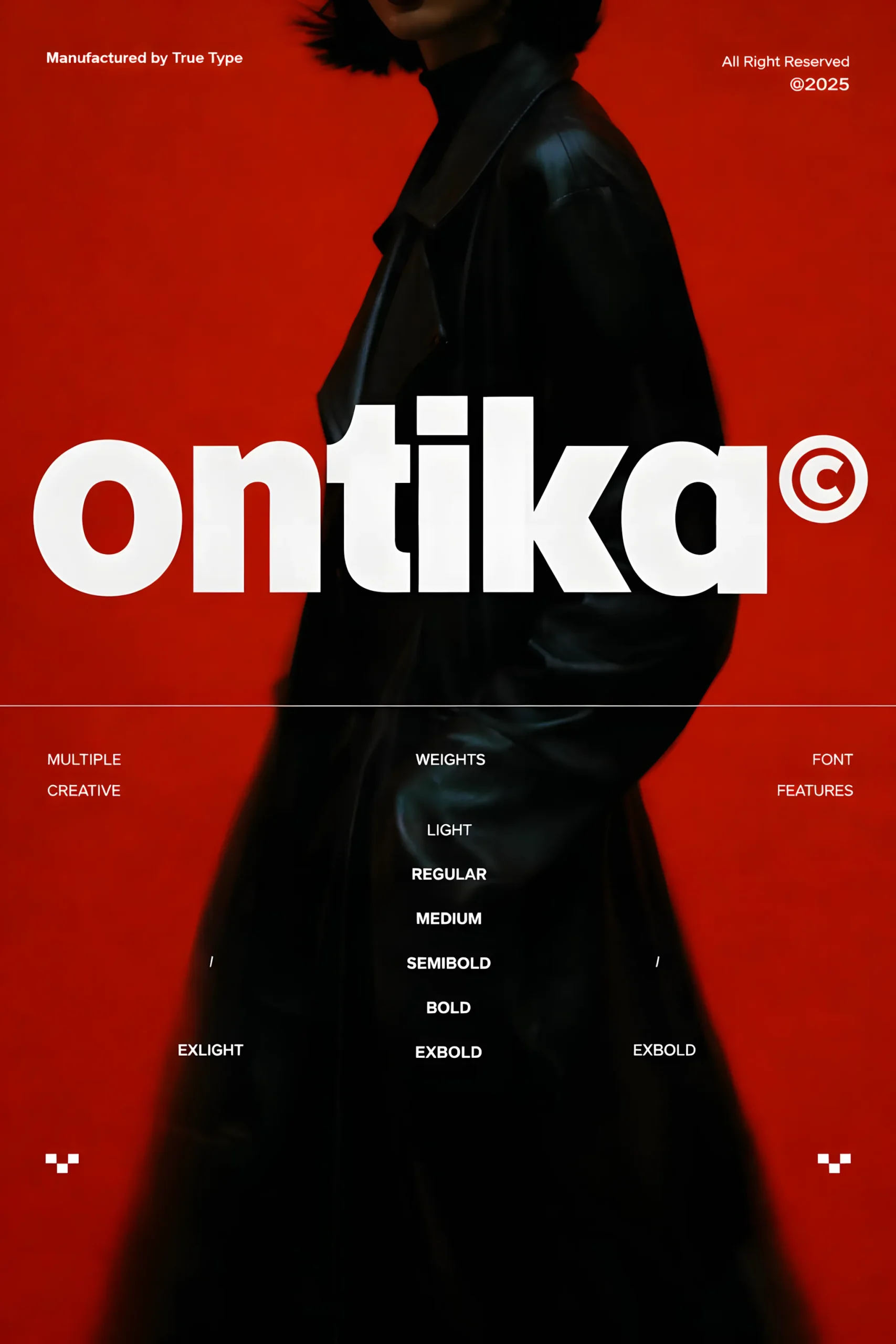
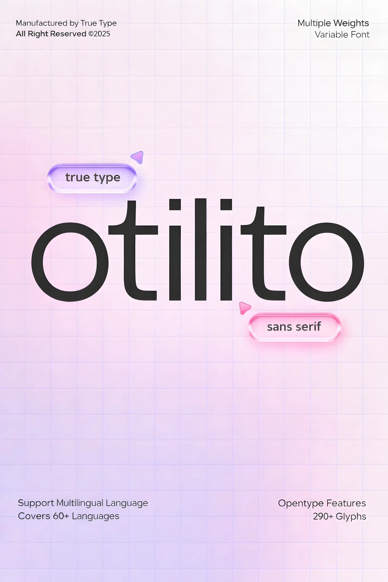
Now, designers have a lot of free and paid fonts they can get from places like Google Fonts, Adobe Fonts, and professional font places such as TypeType. Before getting a font, always read the rules about how you can use it, especially if you're using it for business.
Font Resources
Here are some trusted font libraries and marketplaces to explore high-quality typefaces for your next project:
- Fontiverse— a curated platform featuring unique and trending modern fonts from independent designers.
- TypeType Fonts — premium foundry known for versatile geometric and humanist typefaces.
- Google Fonts — the go-to source for free web-optimized fonts with global language support.
- Adobe Fonts — professional library seamlessly integrated with Creative Cloud.
- Fontshare — free and open-source fonts for web and print, perfect for startups and creatives.
- Creative Fabrica — a creative marketplace with thousands of fonts, graphics, and design assets, ideal for commercial projects and print-on-demand work.
Each of these platforms offers previews, pairing suggestions, and licensing details — helping designers choose fonts that balance readability, aesthetics, and brand identity.
FAQ — Common Questions About Typography
What is typography in design?
Typography is the art and technique of arranging text to make it readable, visually appealing, and effective in communication.
What are the main types of fonts?
The five main types of fonts are:
Serif – traditional and classic
Sans-serif – clean and modern
Slab serif – bold and geometric
Script – handwritten and elegant
Display – decorative and expressive
Each category creates a unique tone and emotional impression.
What’s the difference between typeface and font?
A typeface refers to the overall design (like Helvetica or Garamond), while a font is a specific style and weight within that family (e.g., Helvetica Bold 16pt).
Think of a typeface as a family, and fonts as its individual members.
In short
Typography is more than just letters on a page. It's a way of speaking through how things look and how they work. If you understand the basics of type, font, and design, you can make visuals that are easy to read and make people feel something.
So, next time you pick a font, think about the story it tells. Because every letter has a voice. Think about the overall message of the design, and then find a font that matches that message.

Follow Us