

ℹ️ Affiliate Disclosure: This article may contain affiliate links. We may earn a commission at no extra cost to you. Thanks for your support! ❤️
Vintage display fonts give a brand access to a visual language people already recognize. Art Deco geometry can suggest refinement and ceremony, rounded 1970s letterforms can feel warm and expressive, while Y2K typography often introduces a more experimental, digital personality.
That familiarity is useful, but nostalgia needs restraint.
A typeface can completely change the personality of a logo without changing any other design element. The wrong vintage reference can make a brand feel theatrical or dated. The right one can establish a clear point of view almost immediately.
This guide looks at 13 vintage display fonts for branding, grouped by era and visual character. I have considered how each typeface may function in a logo, headline system, packaging design, website, and wider visual identity rather than judging it only from an isolated specimen.
Quick Picks
- Best Art Deco option: Quantum Deco
- Best Y2K option: Qrazx
- Best 1970s-inspired option: Miracle Groovy
- Best refined fashion option: The Fauden
- Best Americana option: Dreams American Diner
How I Picked These
I compared these vintage display fonts by historical character, wordmark readability, scalability, spacing, visual distinctiveness, digital usability, and how well each option can support logos, packaging, campaign headlines, signage, and wider brand systems without making every touchpoint feel overly themed.
1. Quantum Deco
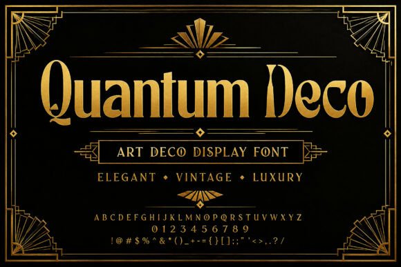
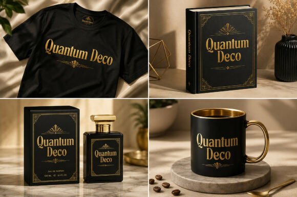
Quantum Deco draws from the geometric glamour of the 1920s and 1930s. Its tall letterforms, ornamental construction, and period-specific detailing create an immediate Art Deco association.
From a branding perspective, that clarity is both its strength and its limitation. The typeface gives a logo a defined historical character very quickly, but it may overpower a brand that needs to feel casual, understated, or contemporary.
I would consider it for hospitality, cocktail bars, event identities, boutique hotels, beauty packaging, or brands built around ceremony and luxury.
The letterforms need space. Tight tracking may cause the decorative features to compete with one another, while slightly more generous spacing allows the geometry to feel deliberate.
Use Quantum Deco for:
- wordmarks
- event titles
- packaging headlines
- signage
- premium campaign graphics
Pair it with a restrained geometric sans serif. Avoid using it for long headings or small interface text, where its ornamental details may reduce legibility.
2. Qrazx
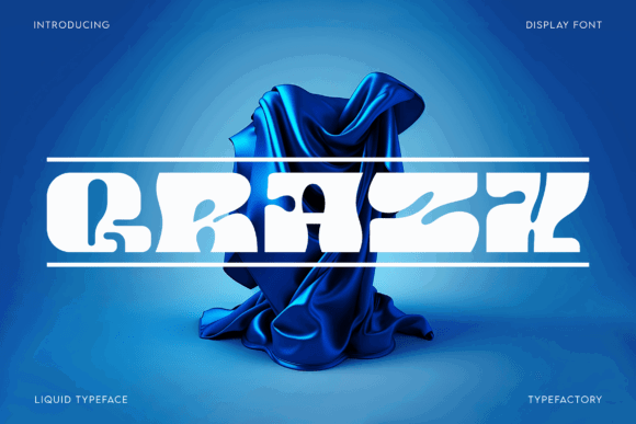
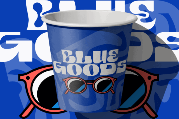
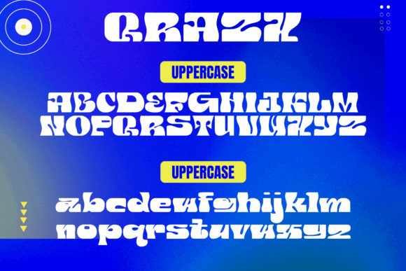
Qrazx approaches nostalgia through early-2000s futurism. Its liquid curves and experimental forms reference the chrome, bubble, and digital aesthetics commonly associated with Y2K design.
Visually, this typeface creates a youthful and fashion-led personality. It may suit music, streetwear, nightlife, cosmetics, gaming, or digital culture brands that want to appear expressive rather than conventional.
The unusual letterforms give the font strong recognition value, but they also require careful testing. Some characters may become harder to identify when the logo is reduced or viewed quickly on a mobile screen.
That makes Qrazx more suitable for short names than long ones.
I would use it as a central visual accent, then build the rest of the typography around a highly legible sans serif. The contrast helps the identity feel intentional rather than chaotic.
3. Miracle Groovy
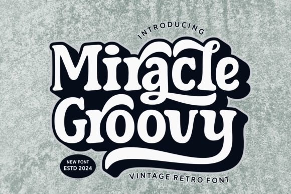
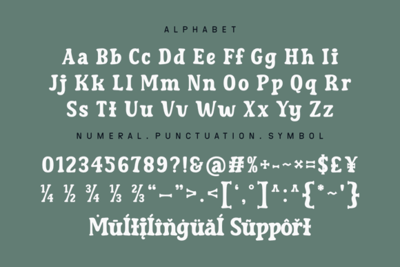
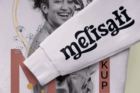
Miracle Groovy uses rounded, generous letterforms that strongly reference 1970s display typography. It feels warm, informal, and more approachable than many highly decorative vintage fonts.
The visual weight gives it a friendly presence, while the curved shapes soften the logo and make it feel less corporate. This could suit cafes, wellness brands, music projects, vintage stores, children’s products, or creative businesses.
Its personality is quite specific. That means it can build recognition quickly, but it may also limit the brand if every application depends on the same nostalgic mood.
I would avoid using it too frequently across a website. One strong appearance in the logo or main headline is often enough. Repetition can reduce its impact and make the interface feel visually heavy.
The typeface should be paired with something quieter and narrower to create contrast in both width and visual weight.
4. Devon

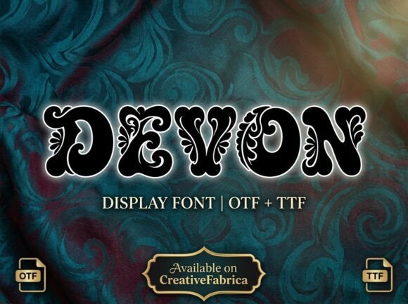
Devon has an ornamental, Baroque-influenced character with dense decorative detailing. It communicates heritage, theatricality, and old-world opulence almost immediately.
This is not a subtle typeface.
For branding, Devon is most appropriate when the visual identity can support that level of ornament. It may suit spirits, boutique hospitality, luxury events, decorative products, or brands with a historical narrative.
The font is likely to perform best in short names and large applications. Detailed letterforms can become visually crowded when the wordmark contains many characters.
Kerning also matters. Ornamental shapes create irregular negative spaces, so the logo may need manual adjustment rather than relying on the font’s default spacing.
Use Devon selectively and give it plenty of breathing room. A minimal color palette and simple supporting typography can prevent the overall identity from feeling excessive.
5. The Fauden
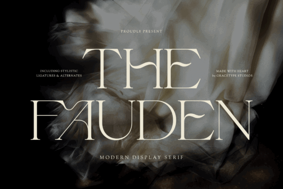
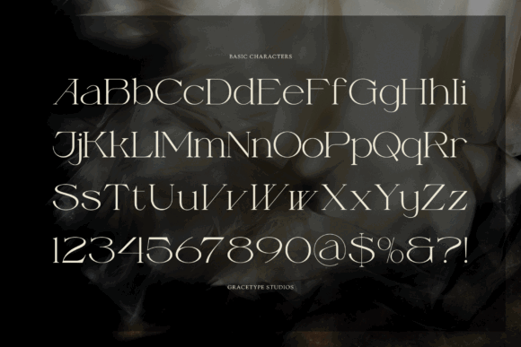
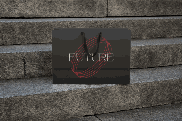
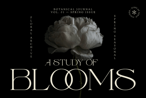
The Fauden is a high-contrast display serif with a refined, fashion-oriented character. It feels more contemporary than some traditional vintage faces, although its proportions still carry a clear editorial and heritage influence.
From a branding perspective, this balance makes it more flexible than a highly literal period font.
It could suit fashion, beauty, fragrance, boutique hospitality, premium publishing, or a personal brand built around visual sophistication.
Thin strokes are the main usability consideration. They can look elegant at large sizes but disappear against busy photography or when reproduced too small. Contrast should be tested carefully across mobile screens, printed labels, and low-quality displays.
The Fauden is better suited to a primary wordmark or large campaign headline than to functional website text.
Pair it with a clean sans serif that has enough visual weight to remain readable without competing with the logo.
6. Welp Clair
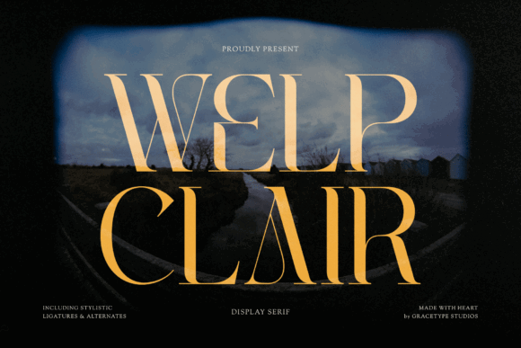
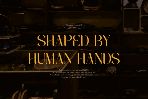
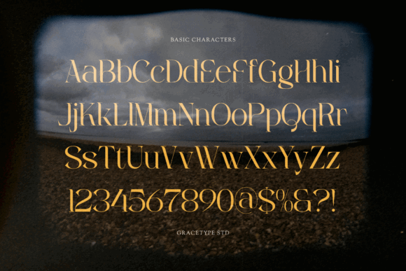
Welp Clair combines classic serif construction with a more stylized display quality. Its tall proportions and elegant contrast give it an editorial tone that feels polished without becoming heavily ornamental.
The spacing gives it a refined appearance, particularly in uppercase or title-style settings. It may suit boutique fashion, interiors, skincare, hospitality, or heritage-inspired lifestyle brands.
Its main advantage is flexibility. The typeface carries a vintage undertone without locking the identity into one obvious decade.
That said, the thinner details may still weaken at small sizes. I would test the logo in monochrome and at favicon or social-avatar scale before committing to it.
It may also benefit from custom tracking. Slightly expanded spacing can make the wordmark feel more premium, while overly tight spacing may reduce the elegance of the letterforms.
7. Blackdove
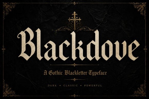
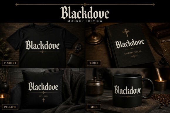
Blackdove has a dramatic, expressive structure that feels connected to fashion typography and high-impact editorial design. It gives a wordmark movement and confidence rather than quiet traditional luxury.
The typeface could suit beauty, fashion, creative studios, music projects, or brands that want a darker, more assertive visual identity.
Its strong personality requires restraint elsewhere. When paired with equally dramatic photography, ornate graphics, or multiple decorative fonts, the brand system may become difficult to control.
I would use Blackdove as the dominant display voice and keep the supporting typography neutral.
It is also important to review individual letter combinations. Dynamic letterforms can create awkward gaps, especially around capitals and sharply angled characters. Manual kerning will often make the difference between a polished logo and one that still looks like unedited font text.
8. Eagers
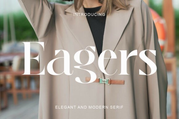

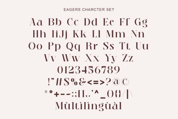
Eagers sits between contemporary display typography and a more traditional retro serif. Its strong forms give it confidence, while the historical influence is subtle enough to avoid turning the identity into a literal period reference.
That makes it useful for brands that want vintage character without looking overtly nostalgic.
I can see it supporting editorial businesses, fashion labels, creative studios, food packaging, hospitality, or modern heritage brands.
Compared with more delicate luxury serifs, Eagers appears structurally stronger and may remain clearer across a wider range of sizes. Even so, it should still be treated as display typography rather than a general-purpose text face.
The font can create an effective hierarchy when paired with a neutral sans serif. Use Eagers for the brand name and major headlines, then let the sans serif handle navigation, product details, and longer reading.
9. Crochet
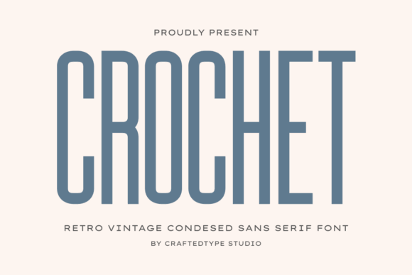
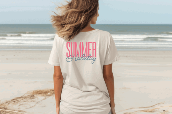
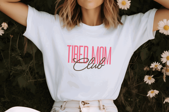
Crochet is a condensed sans serif with a retro tone that feels casual rather than heavily stylized. Its narrow construction can be useful for longer brand names or layouts with limited horizontal space.
From a visual identity perspective, this is a practical advantage. Not every brand name fits naturally into a wide display serif or script.
Crochet may suit cafes, vintage stores, packaging, creative businesses, editorial projects, or casual lifestyle brands.
The main challenge is tracking. Condensed fonts can become difficult to read when letters sit too close together, especially in uppercase settings. Slightly opening the spacing often improves legibility and gives the wordmark a more considered rhythm.
I would also test it at small sizes. A condensed logo can look strong on a desktop header but lose clarity in a social profile or mobile navigation bar.
10. Laura
Laura is an ultra-condensed sans serif with a strong poster and editorial character. Its tall, narrow letterforms create a distinctive vertical rhythm and can make even a simple wordmark feel more graphic.
This typeface is particularly useful when space is limited or when the identity needs a strong typographic silhouette.
It could suit fashion, publishing, cultural events, posters, packaging, hospitality, or brands with a modern-retro editorial direction.
The narrow proportions are visually effective but not universally readable. Long words may form a dense vertical texture, especially when set too tightly.
For digital use, I would keep it large and avoid using it for buttons, navigation, or small headlines. It can be an effective hero typeface, but it needs a more conventional supporting font throughout the interface.
11. Dreams American Diner
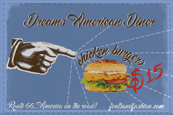
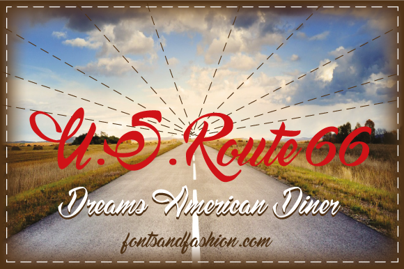
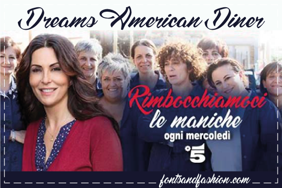
Dreams American Diner references mid-century signage and traditional diner scripts. Its connected forms create warmth and familiarity, making it especially relevant to food and hospitality branding.
It may suit diners, burger restaurants, cafes, bakeries, food trucks, retro events, or products that intentionally draw from Americana.
Script logos often look easy because the letters appear naturally connected, but spacing still requires attention. Awkward joins, oversized capitals, and long decorative strokes can affect the balance of the wordmark.
The font should also be tested for readability at distance. A script may look attractive on packaging but become unclear on exterior signage or a small delivery-app icon.
I would use it for the primary name and pair it with a sturdy sans serif for menus, pricing, ingredients, and digital navigation.
12. Artia Duo
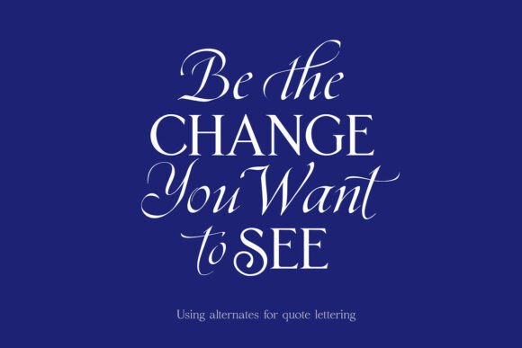
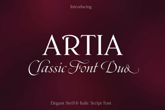
Artia Duo combines a display serif with a coordinated partner style. This gives the designer more control over hierarchy than a standalone display font.
The display face can carry the wordmark or main headline, while the supporting style can be used for taglines, secondary messages, or selected editorial content.
From a branding perspective, this is useful because the relationship between the two fonts has already been considered. The shared visual details can make the identity feel more coherent.
The risk is that the typography becomes too uniform. A logo and supporting font can match beautifully but still fail to create enough contrast between primary and secondary information.
I would test Artia Duo alongside a neutral interface font, especially for website use. The duo can shape the expressive parts of the identity, while the third typeface handles practical reading.
13. Sakem Elegance
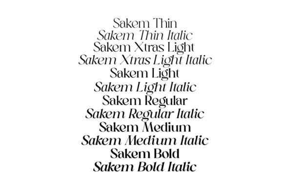
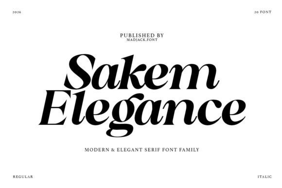
Sakem Elegance is a serif family with a refined, vintage-leaning voice. The presence of multiple coordinated styles makes it more adaptable across a wider brand system than a single display cut.
A display weight can be used for the logo and major headlines, while lighter or less decorative styles can support editorial layouts and packaging information.
This consistency is valuable, but it should not remove hierarchy. Using one family everywhere can make a design feel controlled yet visually flat.
I would vary scale, weight, spacing, and contrast carefully. Strong typography usually feels effortless, which is why it is often overlooked. In reality, that sense of ease comes from many small decisions working together.
Sakem Elegance may suit fashion, beauty, hospitality, publishing, interiors, or premium product branding where a cohesive serif-led identity is appropriate.
For websites, I would still consider a complementary sans serif for navigation, forms, and longer text.
Read More: And for those thinking about applying these eye-catching retro styles to merchandise, especially T-shirts, be sure to check out these 8 Creative Display Fonts for T-Shirts — Bold Retro Ideas.
Which Vintage Display Font Should You Choose for Your Brand?
Choosing vintage display fonts for branding is less about finding the most decorative typeface and more about controlling the relationship between personality and usability.
A strong display font can make a new brand feel established, expressive, or culturally familiar. It can also create readability problems, restrict future campaigns, or make the identity feel tied to a passing trend.
I would choose one clear historical reference, use it confidently at display size, and build the rest of the brand system around more practical typography.
Pay attention to the letterforms, but also study the spaces between them. Test the logo against photography, on small screens, in black and white, and beside the supporting typeface.
That wider context usually reveals more than the font specimen does.
Vintage display fonts FAQ
What are the best vintage display fonts for branding?
The best vintage display fonts for branding are the ones that match a clear visual era and support the brand’s personality. Quantum Deco suits Art Deco identities, Qrazx brings a Y2K feel, Miracle Groovy adds 1970s warmth, and Dreams American Diner creates a mid-century Americana look.
How do I choose a vintage display font for a logo?
Choose a vintage display font by looking at the brand’s tone, audience, name length, and intended applications. Test the typeface in a logo, website header, packaging design, social profile, and black-and-white version. A font may look impressive in a specimen but lose clarity at smaller sizes.
Can vintage display fonts be used on websites?
Vintage display fonts can be used on websites for logos, hero headings, campaign titles, and large editorial text. They are usually less suitable for navigation, buttons, forms, or body copy because decorative letterforms and unusual spacing can reduce readability on smaller screens.
What fonts pair well with vintage display fonts?
Clean sans serif fonts usually pair best with vintage display fonts because they create contrast and improve digital usability. Use the vintage typeface for the logo or major headings, then choose a neutral sans serif for body text, menus, product details, and interface elements.
How can I make vintage typography look modern?
Use vintage typography in small doses and combine it with clean layouts, contemporary spacing, restrained colors, and simple supporting fonts. Avoid mixing several nostalgic eras in one identity. A single strong vintage reference usually feels more considered than a design filled with competing retro details.
Follow Us