

ℹ️ Affiliate Disclosure: This article may contain affiliate links. We may earn a commission at no extra cost to you. Thanks for your support! ❤️
How to Choose Slab Serif Fonts for T-Shirt Design
A strong slab serif can make a T-shirt slogan feel athletic, rugged, nostalgic, or confidently minimal. The best slab serif fonts bundle for T-shirt design gives you more than one chunky alphabet—it gives you enough variation to build hierarchy, change the mood, and avoid making every shirt in a collection look identical.
I focused on bundles that suit the realities of apparel graphics: large lettering, short phrases, arched layouts, badges, team names, Western compositions, and distressed vintage prints. Slab serif fonts are especially useful in those roles because their substantial serifs give short headlines a firm visual footprint. They generally make more sense for prominent words than for dense paragraphs.
Some selections below are dedicated slab collections. Others combine slab serif, traditional serif, and sans serif styles. I like those mixed packages for shirt designers because a bold headline rarely has to do everything alone. A narrower sans serif or simpler companion font can handle dates, locations, taglines, and secondary text.
Quick Picks
- Best broad vintage collection: Vintage Slab Serif Font Bundle
- Best Western collection: Rodeon Western Bundle
- Best focused slab toolkit: Slab Serif Font Bundle
- Best complete typography system: Slab Serif, Serif, Sans Serif Font Bundle
- Best multi-niche library: Creative Font Collection Bundle
How I Picked These
I compared these bundles by headline readability, print-friendly weight, spacing, slab-serif variety, usefulness for badges and arched layouts, supporting-font options, production flexibility, and how well each collection can support short apparel slogans without losing clarity.
Best Slab Serif Font Bundles for T-Shirt Designs
1. Vintage Slab Serif Font Bundle
My pick for the broadest vintage slab collection

This is the first bundle I would examine when the goal is to create an entire run of retro T-shirts rather than one isolated graphic. The package lists 35 individual vintage slab serif fonts, covering robust athletic lettering and more nostalgic display styles.
That variety matters. One typeface can handle a curved team name, another can carry a compact badge, and a third can provide the weathered headline on a heritage-style shirt. I would still inspect every font at the final print size; highly decorative styles can lose clarity faster than cleaner slabs.
The listing is marked as an expired bundle, so availability should be checked before planning a collection around it.
Best for: Retro apparel collections, varsity graphics, heritage slogans
Key features: 35 fonts, vintage focus, athletic styles, varied slab forms
2. Rodeon Western Bundle
My pick for coordinated cowboy typography
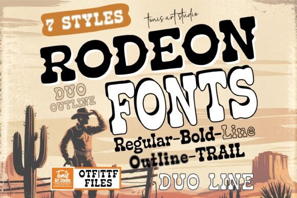
Rodeon is a seven-style Western serif collection built around a consistent rugged theme. A coordinated family is useful when you want several shirts to feel related without repeating the exact same letter treatment on every design.
I would reach for it when designing rodeo graphics, ranch logos, country-music merchandise, or outdoorsy badge compositions. Western fonts can become visually busy, so I would keep the supporting copy simple and let one prominent Rodeon style dominate.
The product information also identifies Cricut and Procreate among its potential creative workflows, which broadens its usefulness beyond conventional desktop layouts.
Best for: Rodeo shirts, ranch branding, country merchandise
Key features: Seven styles, Western theme, coordinated family, craft-oriented use
3. Western Bundle
My pick for bold frontier-style statements
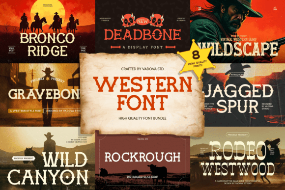
This package centers on slab serif lettering with a clear Western identity. Based on the product previews, it is the sort of collection I would reserve for short, high-impact wording: town names, ranch names, festival titles, or two- to four-word shirt slogans.
Its decorative personality is the selling point, but also the reason to edit carefully. An ornate Western headline needs room around it. Adding several illustrations, banners, and competing text styles can make the front of a shirt feel crowded.
My approach would be one dominant wordmark, one small supporting line, and a restrained graphic element such as a star, horseshoe, or simple border.
Best for: Cowboy slogans, Western events, rustic merchandise
Key features: Slab serif construction, decorative details, bold display character
4. Slab Serif Font Bundle
My pick for a focused slab-serif toolkit
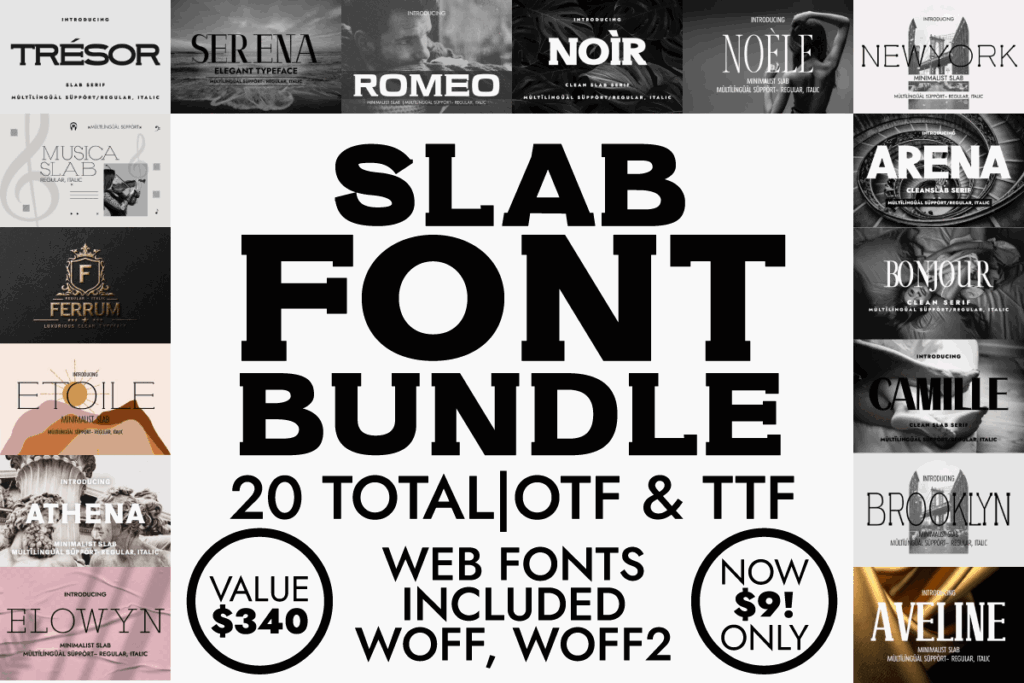
A dedicated slab serif bundle makes sense for designers who already own scripts and sans serifs but need stronger headline options. This listing keeps the category tightly focused instead of padding the package with unrelated decorative fonts.
I would use a collection like this for straightforward text-led shirts: family names, city merchandise, trade-themed slogans, club apparel, and compact vintage lockups. The most useful styles will usually be those with broad counters and moderate spacing, since those features preserve readability after printing.
Before committing to a font, preview troublesome characters such as R, S, G, 8, and &. Those shapes often reveal whether a typeface will stay clear in a short slogan.
Best for: Bold slogans, club shirts, text-first designs
Key features: Dedicated slab category, display focus, multiple headline options
5. Slab & Serif Font Bundle
My pick for old-school brand marks
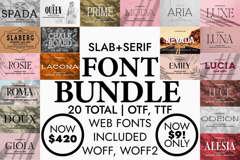
Combining conventional serifs with slabs gives you more control over tone. A heavy slab can anchor the main phrase, while a finer serif adds a date, location, establishment line, or product description.
I like this setup for brewery-inspired graphics, fictional workshop logos, barbershop shirts, coffee merchandise, and heritage brand concepts. The slab delivers impact; the traditional serif brings a slightly more refined voice.
Avoid setting every line in an equally bold style. A T-shirt composition usually feels more intentional when the primary phrase is visibly heavier than the supporting information.
Best for: Heritage branding, workshop shirts, vintage badges
Key features: Slab and serif mix, built-in contrast, display versatility
6. Serif and Slab Serif Typeface Bundle
My pick for polished vintage apparel
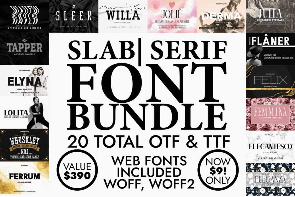
This bundle offers another serif-and-slab pairing, but I would place it toward the more polished side of the vintage spectrum. It is a better conceptual fit for tasteful heritage graphics than aggressively distressed sports lettering.
Try a solid slab for the brand name and a narrower serif for the supporting line. That combination can give a shirt the structure of an old package label without requiring a dozen decorative elements.
It should also translate well to coordinated merchandise such as tote bags, caps, stickers, and labels, provided each font’s thinner details remain suitable for the selected production method.
Best for: Boutique merchandise, heritage labels, refined retro tees
Key features: Serif/slab pairing, contrasting personalities, brand-system potential
7. Slab Serif, Serif, Sans Serif Font Bundle
My pick for complete shirt typography
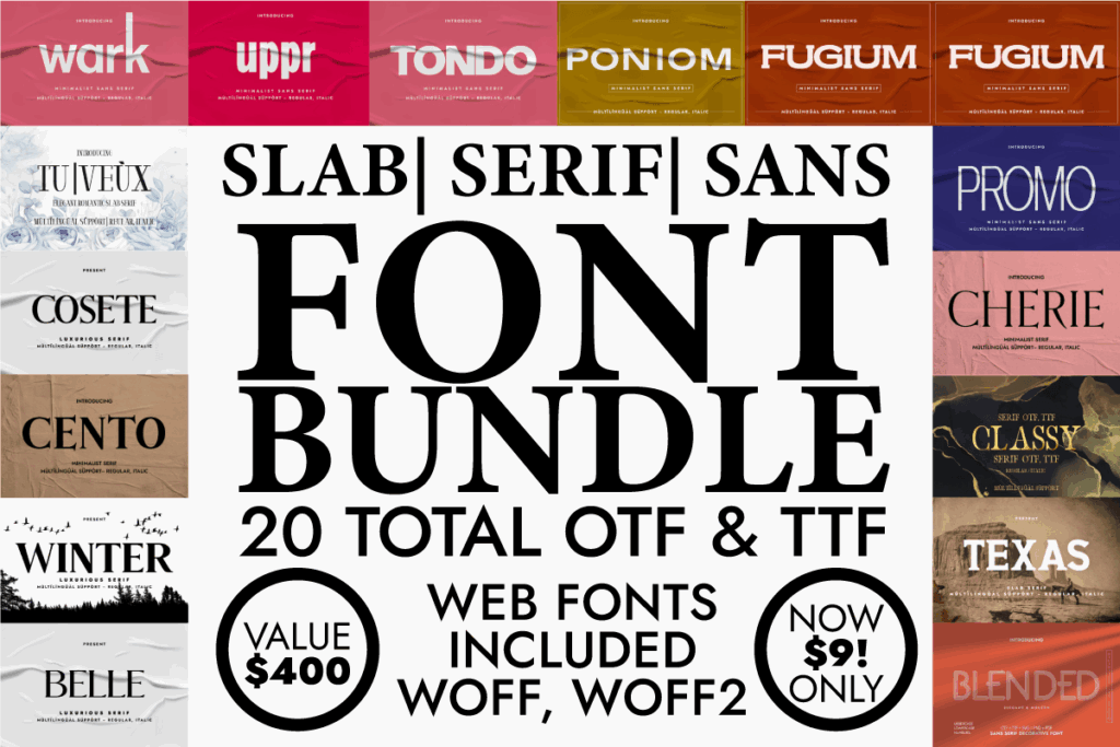
This mixed package includes the three categories I use most often when planning a type-led apparel composition: a slab for the headline, a serif for heritage character, and a sans serif for clean secondary information.
That means you can create contrast without reaching into several unrelated font folders. For example, set the main slogan in the slab, the location in a simple sans, and a small founding date in the serif.
The discipline is stopping at two styles when two are enough. Owning three categories does not mean all three need to appear on every shirt.
Best for: Layered slogans, brand merchandise, badge layouts
Key features: Three font categories, hierarchy options, broad design range
8. Slab, Serif and Sans Serif Font Bundle
My pick for varied slogan collections
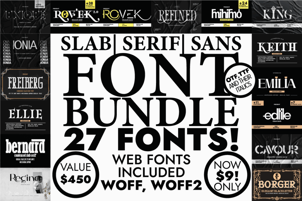
This bundle follows the same practical three-category structure but comes from a separate verified listing. I would compare its letterforms directly with the previous option rather than choosing by title alone.
Pay particular attention to width. Condensed lettering is useful for long phrases and narrow center-chest layouts, while wide slabs are stronger for short phrases and oversized back prints.
A mixed collection earns its place when each family solves a different spacing problem. It is less valuable when all the fonts have nearly identical proportions.
Best for: Slogan series, front-and-back prints, varied phrase lengths
Key features: Slab/serif/sans mix, multiple hierarchy roles, flexible proportions
9. Slab, Serif, Sans Serif Font Bundle
My pick for combining bold and clean lettering
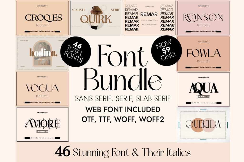
This is another verified mixed bundle with slab, serif, and sans serif components. Its main appeal is contrast: substantial display lettering can be paired with quieter supporting text rather than competing with another decorative face.
I would consider it for motivational shirts, event merchandise, small-business apparel, and location-based designs. A clean supporting font is especially useful when the design contains a phone number, web address, date, or small line that must remain readable.
Best for: Business shirts, event apparel, location graphics
Key features: Mixed styles, clean supporting options, headline-to-caption hierarchy
10. Slab Serif, Serif, Sans Serif Font Bundle No. 2
My pick for experimenting across apparel niches
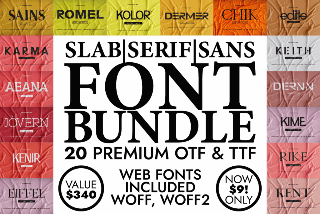
The repeated category name may not sound distinctive, but the product page represents a separate downloadable collection. I would judge it through specimen text rather than assuming it duplicates the earlier bundle.
Type your actual phrase into any available preview. Generic sample words can hide spacing problems that become obvious in a name containing several wide letters, repeated diagonals, or awkward pairs.
This option makes the most sense for designers who move among niches—sports, family shirts, small-business graphics, seasonal merchandise, and vintage sayings.
Best for: Multi-niche shops, custom orders, varied shirt collections
Key features: Separate mixed collection, three type categories, broad adaptability
11. Slab Serif, Serif, Sans Serif Font Bundle No. 3
My pick for building merchandise systems
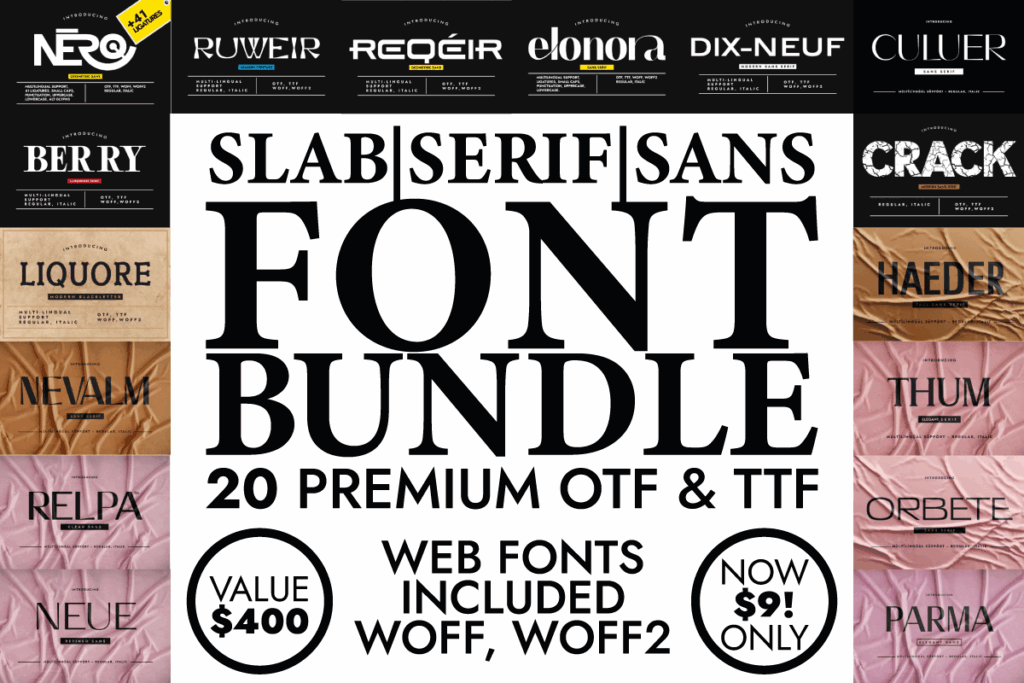
This third verified variation can support more than standalone T-shirts. A package with coordinated display and supporting fonts can help maintain consistency across apparel, packaging, social graphics, thank-you cards, and product listings.
For T-shirts, I would begin with the slab style and ask whether it can carry the design in one color. A strong one-color composition is easier to adapt to vinyl, screen printing, and simplified promotional use.
Then use the serif or sans only where it improves clarity.
Best for: Apparel brands, product lines, coordinated marketing assets
Key features: Three font classifications, system-building potential, adaptable hierarchy
12. Slab, Serif, Sans Serif Font Bundle No. 2
My pick for designers who need supporting fonts
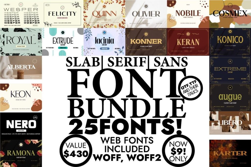
This separate bundle is another option for combining slab headlines with simpler secondary lettering. The preview image uses a different product asset from the similarly named collections, so it should be treated as its own package.
My deciding factor would be the supporting fonts. Many designers buy a bundle for the boldest specimen and overlook the smaller styles that will actually finish the composition.
Check whether the quieter fonts remain legible when used for a date, city, occupation, or short subtitle beneath the main slab-serif phrase.
Best for: Structured layouts, subtitle-heavy designs, branded shirt series
Key features: Separate font collection, supporting styles, hierarchy flexibility
13. Creative Font Collection Bundle
My pick for the largest cross-category toolbox
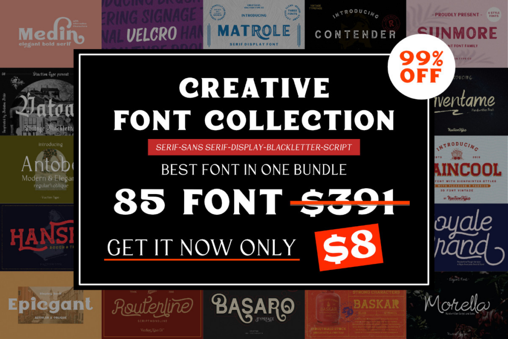
This collection is much broader than a dedicated slab bundle. The listing describes 85 fonts across 27 families, including slab serif, serif, sans serif, display, script, and blackletter styles.
That breadth is useful for a designer serving many apparel niches. You could build a rugged slab-serif shirt one day, a softer script composition the next, and a blackletter design after that.
The tradeoff is focus. Large bundles require more sorting, and not every included face will suit shirt production. I would create a shortlist folder for the fonts with the cleanest outlines, strongest spacing, and most legible small details.
Best for: High-volume designers, multiple niches, broad merchandise catalogs
Key features: 85 fonts, 27 families, several font categories, extensive variety
14. The Ultimate Font Family Bundle
My pick for a long-term design library
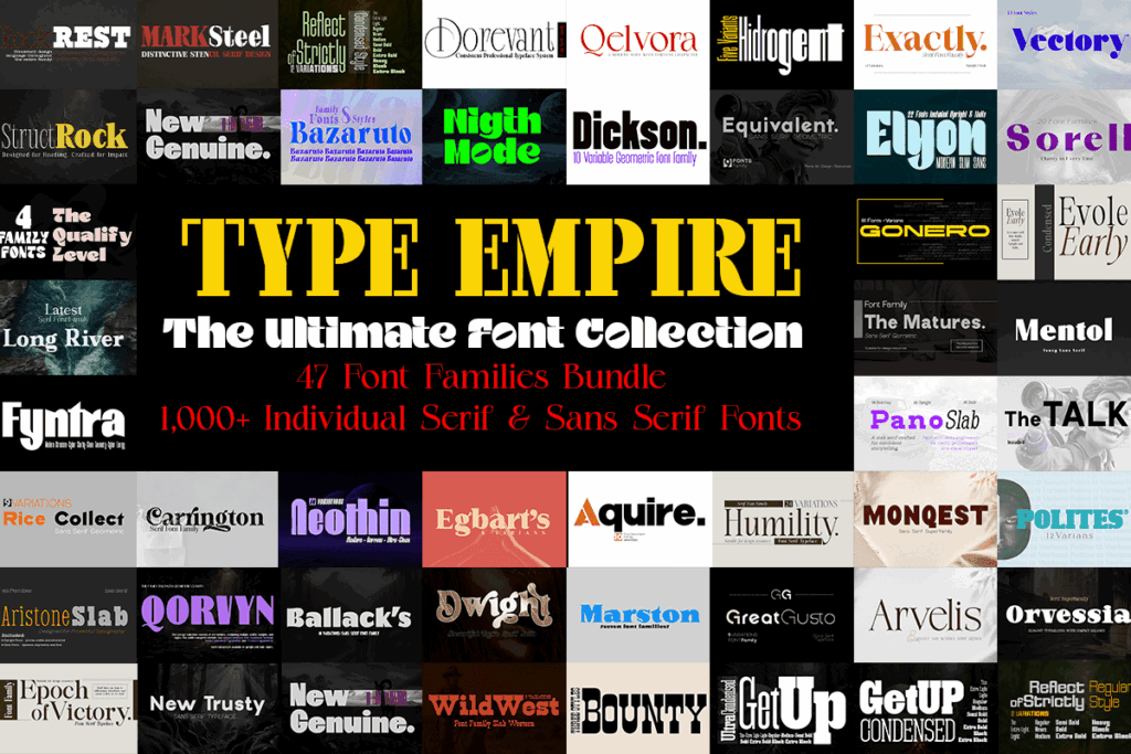
This bundle spans serif and sans serif categories and specifically includes Pano Slab Semi Expanded among its listed contents. It is not a slab-only purchase; it is a wider family library with a slab option inside it.
I would consider it when the purchasing goal extends beyond T-shirts. A varied family collection can support posters, packaging, online graphics, and brand materials alongside apparel.
For shirt work, semi-expanded slab forms can be effective on short phrases because they occupy horizontal space confidently. They need more caution on long quotations, where the line may become excessively wide.
Best for: Long-term libraries, multidisciplinary designers, short bold slogans
Key features: Multiple families, serif and sans categories, semi-expanded slab option
15. Bestseller Bundle
My pick for sporty and technology-inspired designs
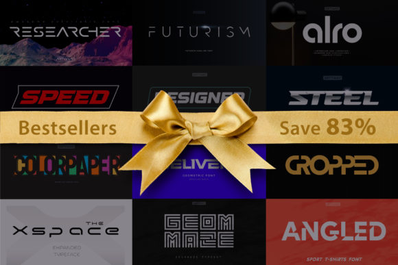
Bestseller Bundle is described as a display-font collection for technological products, sports, games, headlines, logos, and T-shirts. That gives it a more contemporary, energetic direction than the vintage-heavy options above.
I would use it for esports shirts, gym merchandise, motorsport-inspired graphics, gaming communities, and youth athletic designs. The style should be treated as display typography: keep wording compact and give the most distinctive letterforms enough room to be seen.
It is my wildcard pick for anyone who likes the weight and authority associated with slabs but does not want every shirt to look like an antique label.
Best for: Sports shirts, gaming merchandise, technology themes
Key features: Display collection, sporty direction, logo use, apparel relevance
Quick Comparison
| Bundle | My pick for |
|---|---|
| Vintage Slab Serif Font Bundle | Maximum vintage variety |
| Rodeon Western Bundle | Coordinated cowboy collections |
| Western Bundle | Statement Western graphics |
| Slab Serif Font Bundle | Focused slab-serif library |
| Slab & Serif Font Bundle | Vintage and editorial mixing |
| Serif and Slab Serif Typeface Bundle | Refined heritage designs |
| Slab Serif, Serif, Sans Serif Bundle | Full typographic hierarchy |
| Slab, Serif and Sans Serif Bundle | Flexible slogan collections |
| Slab, Serif, Sans Serif Bundle | Designers needing contrast |
| Mixed Font Bundle No. 2 | Multiple apparel aesthetics |
| Mixed Font Bundle No. 3 | Brand and merchandise systems |
| Mixed Font Bundle No. 4 | Supporting-font flexibility |
| Creative Font Collection Bundle | Large cross-category library |
| Ultimate Font Family Bundle | Broad long-term use |
| Bestseller Bundle | Sporty and technology-inspired tees |
Which Slab Serif Font Bundle Should You Choose for T-Shirts?
My strongest all-around pick is the Vintage Slab Serif Font Bundle because its listed 35-font collection gives a T-shirt designer enough range to build multiple vintage, athletic, and heritage concepts. The caveat is important: the listing was marked expired when researched, so confirm whether it is currently obtainable.
For a narrower visual identity, I would choose Rodeon Western Bundle. Seven coordinated Western styles are more useful to me than dozens of disconnected fonts when I am developing a cohesive country, ranch, or rodeo apparel line.
For designers who take varied custom orders, the Creative Font Collection Bundle has the broadest documented selection, with 85 fonts in 27 families. It demands more organization, but it can cover far more than slab-serif shirts alone.
The best purchase ultimately depends on the products you plan to make. Buy focused vintage or Western bundles when a clear aesthetic drives your shop. Pick a mixed slab, serif, and sans package when you need a practical typography system that can change with each customer.
FAQ
What is the best slab serif font style for T-shirt designs?
A bold slab with open counters, clear spacing, and moderate detail is the safest all-purpose option. It will usually stay readable in large slogans and can be adapted with outlines, shadows, arches, or textures.
Are slab serif fonts good for Cricut shirts?
They can be particularly useful for Cricut shirts because their thick strokes often produce substantial cut shapes. Always inspect small counters, distressed marks, and narrow gaps before cutting, especially when the design will be reduced.
Can I sell T-shirts made with Creative Fabrica fonts?
Creative Fabrica products are offered with licensing, but you should review the current license terms and the individual product page before selling merchandise. Do not assume that downloading a font allows redistribution of the font file itself.
Should I use a clean or distressed slab serif font?
Choose a clean slab when you want maximum flexibility or need small text to remain clear. Choose a distressed slab when the worn texture is central to the shirt’s vintage, Western, workwear, or athletic concept.
Save to Your Inspiration Board
Follow Us