

Slab Serif Display Fonts That Make Headlines More Powerful
Slab serif display fonts give a headline a sense of structure before the reader has processed the actual wording. Their substantial strokes, squared serifs, and often compact proportions create a visible mass that feels more assertive than a conventional serif typeface.
That visual weight is useful across posters, packaging, logos, editorial covers, merchandise, sports graphics, and website hero sections. A slab serif can make a brand feel athletic, industrial, academic, nostalgic, approachable, or distinctly Western. Much depends on the proportions, spacing, contrast, and surface treatment of the individual typeface.
For this list, I focused on popular Creative Fabrica slab serif fonts with enough presence to function as display typography. I also considered how each typeface might behave beyond its marketplace preview: in a logo, on a product label, inside a website layout, or across a larger brand system.
Some of these fonts are deliberately loud and thematic. Others are flexible enough to support a strong headline without controlling the entire design direction.
Table of Contents
Quick Picks
- Best for collegiate headlines: College Block 2.0
- Best for sports identity: Varsity Legacy
- Best for heritage branding: Lutherwood
- Best Western option: Texas
- Best adaptable editorial option: Caprint
How I Picked These
I compared these slab serif display fonts by headline readability, visual weight, spacing, thematic character, small-size performance, versatility across branding and editorial work, and how well each option can create impact without forcing every supporting element into the same bold style.
18 Best Slab Serif Display Fonts
1. College Block 2.0
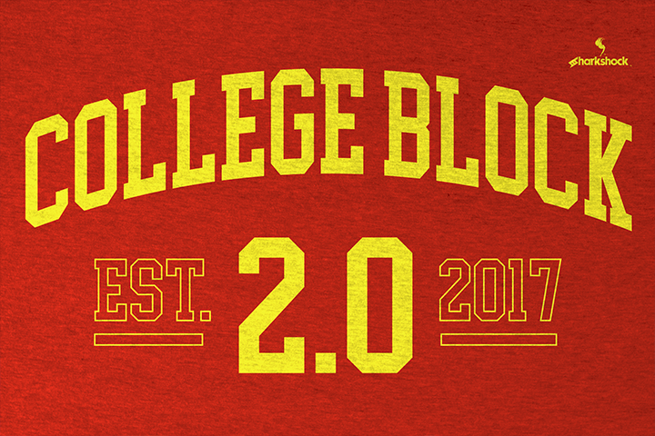
College Block 2.0 is one of the clearest options for traditional collegiate lettering. Its broad uppercase forms, squared construction, and athletic proportions immediately suggest campus sports, school identity, varsity apparel, and team graphics.
From a branding perspective, its main strength is immediate recognition. The visual language is familiar enough that viewers understand the reference without needing a mascot, stadium illustration, or additional decorative elements. A short team name can already feel like a complete graphic.
The blocky letterforms also hold up reasonably well when used with outlines, shadows, or contrasting borders. That is useful for shirts and banners, where the typography often needs to remain legible against fabric colors or busy backgrounds.
The limitation is equally clear. College Block 2.0 carries a strong academic and athletic association. It would feel out of place in elegant hospitality branding, luxury packaging, or editorial work that requires a quieter tone.
I would use it primarily for short uppercase phrases. Longer headlines can become visually dense, particularly when default tracking is tight.
Best for: Varsity apparel, school identities, team graphics
Key features: Collegiate structure, broad uppercase forms, blocky serifs
2. Varsity Legacy
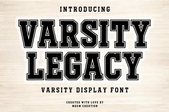
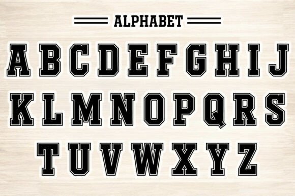
Varsity Legacy develops the familiar college-lettering style with more decorative character. It feels less like a basic athletic font and more like an identity element designed for logos, tournament graphics, alumni merchandise, and school-related branding.
The additional detail gives the font more personality, but it also makes scale more important. Decorative features that look clear on a large shirt graphic may become crowded inside a narrow badge, social media thumbnail, or mobile website header.
This is where practical testing matters. A display font may look impressive in a specimen image because the sample word has been carefully chosen. Once a longer team name or location is introduced, the spacing and internal counters may behave differently.
Varsity Legacy is most convincing when given room. I would avoid compressing it too tightly or surrounding it with several competing effects. Strong contrast and generous negative space will make the letterforms feel more authoritative.
Best for: Sports logos, alumni merchandise, tournament posters
Key features: Decorative varsity styling, commanding letterforms, identity-driven construction
3. Loved
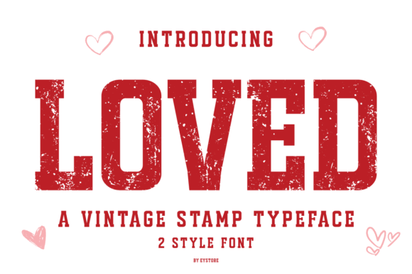
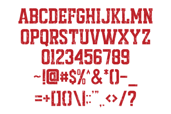
Loved offers a softer interpretation of slab serif typography. It retains enough visual weight to support a headline but avoids the aggressive, industrial quality found in many heavy display fonts.
Visually, this creates a useful middle ground. Loved can feel sturdy without becoming severe and expressive without looking overly decorative. That makes it easier to use for lifestyle branding, family-oriented graphics, casual packaging, boutique products, and friendly promotional material.
A typeface can completely change the personality of a logo without changing any other design element. In this case, the softer letterforms could make an otherwise plain wordmark feel more approachable.
The font is likely to perform best in relatively simple compositions. Adding several outlines, shadows, textures, and ornamental elements may weaken its natural character rather than improve it.
Loved is not necessarily the right option for formal corporate branding or serious editorial work. Its friendly tone is a benefit only when that personality matches the project.
Best for: Lifestyle graphics, approachable branding, casual packaging
Key features: Softer slab personality, sturdy shapes, friendly visual weight
4. Star Mode
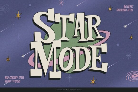
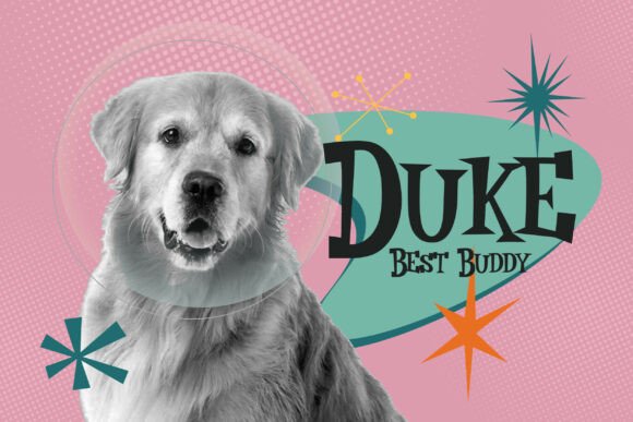
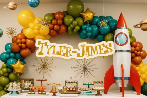
Star Mode moves further into decorative display typography. It is designed to become the focal point of a composition rather than quietly support another visual element.
This type of font can establish the direction of a poster, shirt, or event graphic with very little additional artwork. The letterforms already carry enough visual character to create a recognizable mood.
That does not automatically make it flexible.
Highly distinctive fonts often look memorable in a single campaign but become tiring when used across every page, heading, label, and social post. Within a larger brand system, Star Mode would be more effective as an accent typeface than as the only typographic voice.
I would reserve it for a main title, product name, campaign phrase, or short logo treatment. Supporting information should be set in a quieter sans serif with cleaner spacing and stronger readability.
This contrast is important. When every text element demands attention, the hierarchy disappears.
Best for: Event posters, entertainment graphics, statement apparel
Key features: Decorative construction, strong focal character, expressive display styling
5. Farmhouse Vintage
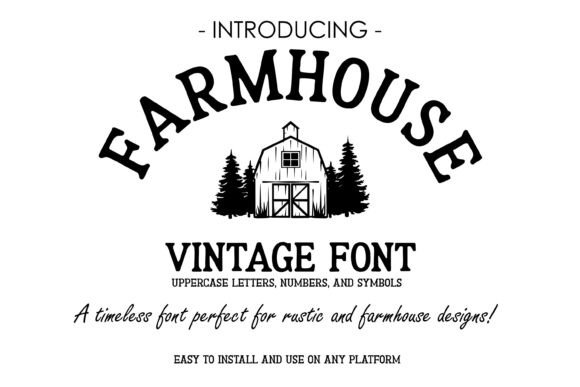
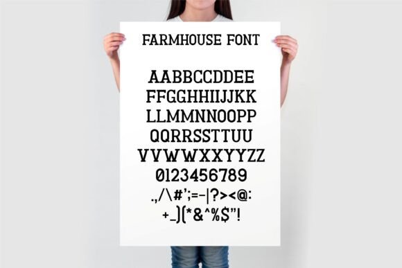
Farmhouse Vintage combines rustic serif construction with a relatively clear headline silhouette. It feels established and handcrafted without becoming so distressed that the typography loses its structure.
Its natural applications include farmhouse signs, market branding, handmade-product labels, rustic packaging, wall art, apparel, and small-business identities. This is the kind of typeface that can make a digitally produced design feel less sterile.
From a branding perspective, the rustic tone needs to be intentional. Farmhouse styling has been widely used across craft marketplaces, so the surrounding identity should contribute something distinctive through color, illustration, photography, or layout.
The font package is also practical for designers and crafters who move between typography software, print applications, and cutting-machine workflows.
I would still check the kerning of the actual brand name before finalizing a logo. Rustic typefaces sometimes include unusual spacing around wide capitals, diagonals, or repeated letter combinations.
Best for: Rustic signs, market branding, farmhouse merchandise
Key features: Vintage tone, readable silhouette, broad craft-file package
6. Bronco Western
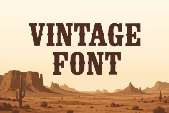
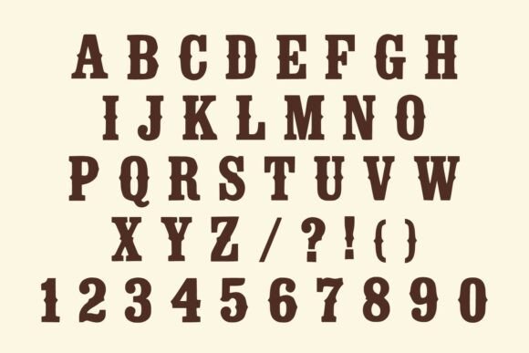
Bronco Western is built around an unmistakable Western reference. The lettering suggests frontier signage, ranch brands, rodeo posters, saloons, country entertainment, and regional merchandise.
The strength of this typeface is narrative. Even without supporting imagery, the letterforms immediately place the design within a particular cultural and visual context.
That specificity can be valuable for rodeo promotions, country music graphics, cowboy-themed apparel, bar signage, ranch logos, and regional events. It can also reduce the need for excessive decoration because the typography already carries the theme.
The same specificity limits its use elsewhere. Bronco Western would be difficult to integrate into a minimalist technology brand, contemporary luxury identity, or business that needs to communicate across several unrelated markets.
I would also avoid treating the font as body copy. Its thematic letterforms are intended to attract attention, not support extended reading.
Best for: Rodeo posters, ranch identities, country merchandise
Key features: Strong Western character, bold slabs, narrative display styling
7. Lutherwood
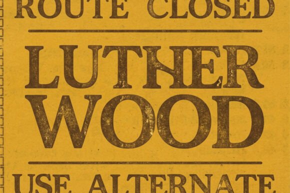
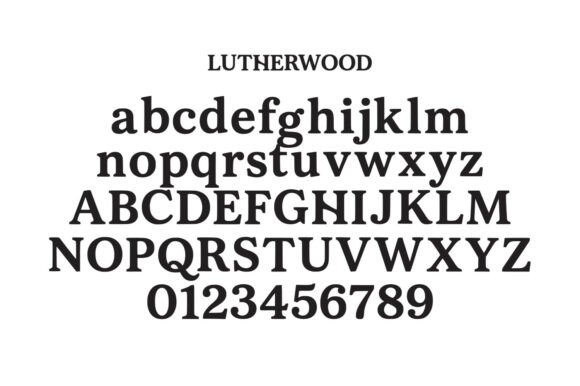
Lutherwood has a more crafted and heritage-oriented personality. It offers enough visual distinction for logos and packaging without being tied as strongly to sports or Western themes as several other fonts in this collection.
That broader tone makes it relevant for coffee packaging, restaurant identities, barbershop graphics, workshop branding, outdoor products, labels, and small businesses that want to communicate tradition or craftsmanship.
The letterforms can support a slightly aged visual identity, but I would not automatically add heavy distressing. One thing I often notice in heritage branding is that every element is given the same worn texture. The result usually reduces contrast and makes the identity look more like a template.
A clean rendering of Lutherwood may feel more considered. Subtle paper texture, restrained colors, and carefully spaced supporting type can communicate heritage without sacrificing legibility.
It is also worth testing the font beside photography. Strong display serifs often need more surrounding space than expected, especially when placed over detailed images.
Best for: Heritage logos, packaging, workshop branding
Key features: Crafted character, substantial serifs, traditional brand tone
8. Impossible
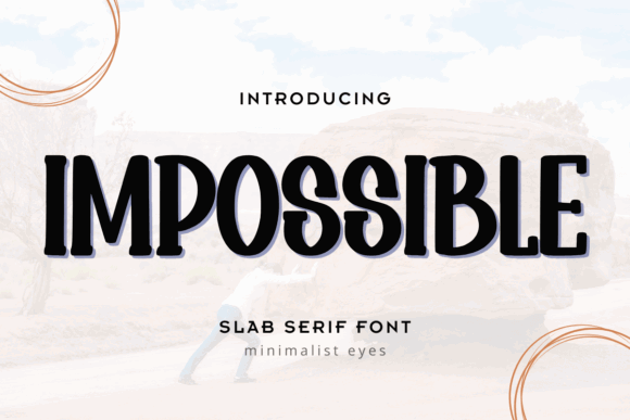
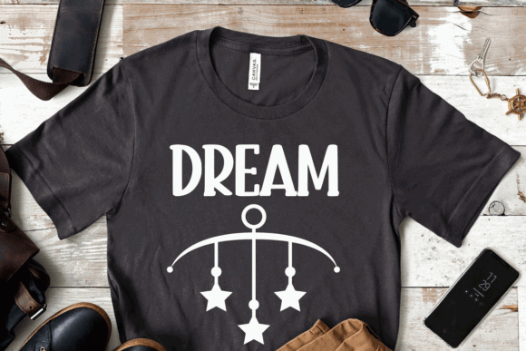
Impossible is one of the more personality-driven typefaces in the selection. It is intended for prominent display use rather than discreet supporting typography.
Its distinctive construction can suit posters, apparel, album-inspired graphics, bold social media titles, and packaging that needs a confident central wordmark. Because the font already has a strong personality, it may reduce the need for extra shadows, outlines, and decorative frames.
That visual confidence should be balanced with restraint elsewhere.
I would pair Impossible with a neutral geometric sans serif, increase the empty space around the title, and use a limited palette. Combining it with another decorative display face would make the hierarchy difficult to control.
A font like this can look strong in a logo, but that does not mean it should be used throughout an entire website interface. Navigation, buttons, labels, and longer text require a more functional typeface.
Best for: Poster titles, apparel, bold social graphics
Key features: Distinctive construction, high display impact, strong personality
9. Magnetico
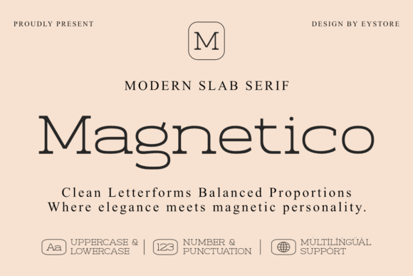
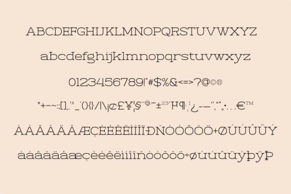
Magnetico has the visual density needed for high-energy display work. Thick strokes create a strong block of color within a layout, helping a short headline remain visible over photography, illustration, or patterned backgrounds.
This can be valuable in entertainment branding, event graphics, promotional material, bold packaging, and merchandise built around a short phrase.
Heavy typography still needs space. When dense letterforms are pushed too close together, counters begin to close and individual characters lose definition. This becomes particularly noticeable in thumbnails and mobile layouts.
Slightly increasing tracking can help, but spacing should be adjusted visually rather than applied mechanically. Some pairs may need more space while others already feel open.
Magnetico is likely to perform best as the loudest layer in the hierarchy. Supporting information should remain quieter, lighter, and less condensed.
Best for: Entertainment branding, event graphics, bold packaging
Key features: Dense visual weight, energetic tone, strong headline silhouette
10. Texas
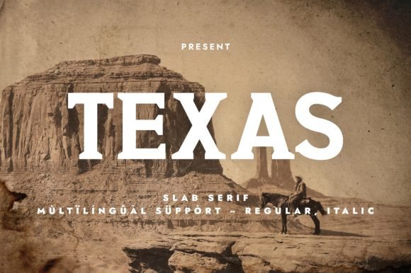
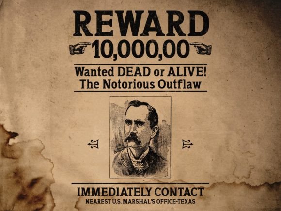
Texas provides a clear Western and regional influence without relying on the most exaggerated rodeo ornamentation. That gives it slightly more flexibility than some of the more theatrical fonts in this group.
It is a natural fit for barbecue branding, country events, restaurant signs, Americana packaging, travel souvenirs, and regional merchandise. The slab construction gives short words stability, while the stylistic details prevent them from feeling generic.
For a more contemporary identity, I would avoid the predictable combination of distressed lettering, faded red, aged paper, and multiple vintage illustrations. Setting Texas cleanly beside a modern condensed sans serif can create a more interesting contrast.
That balance between historical reference and modern execution often gives a brand more longevity. Trend-heavy vintage treatments can age quickly, while a strong typeface used with restraint tends to remain useful.
Best for: Barbecue branding, country events, regional merchandise
Key features: Western influence, sturdy proportions, recognizable headline shape
11. Bold Sport
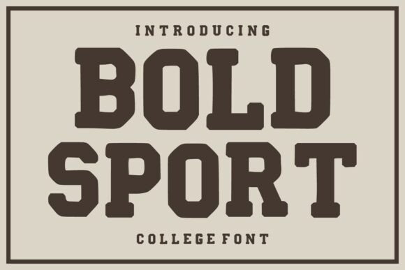
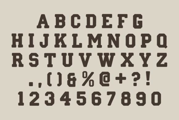
Bold Sport belongs firmly to the athletic side of slab serif typography. Its broad shapes, substantial strokes, and compact visual rhythm allow words to behave more like emblems than ordinary text.
That makes it suitable for gym promotions, fitness challenges, team apparel, tournaments, esports-inspired graphics, and strong promotional headlines.
The font should remain effective at thumbnail size when the wording is short and the contrast is clear. Long phrases will be more difficult because the dense construction creates a large visual mass.
In a website layout, I would limit Bold Sport to hero headlines, promotional banners, or campaign graphics. Using it for navigation, descriptions, or interface labels would make the page feel heavy and reduce scanning speed.
Typography hierarchy depends on contrast. Bold Sport should clearly occupy the top level, while dates, locations, prices, and calls to action are handled by a simpler family.
Best for: Fitness graphics, team apparel, tournament headlines
Key features: Athletic stance, heavy strokes, compact display impact
12. Texas Retro
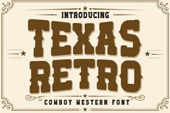
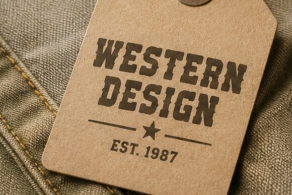
Texas Retro pushes further into nostalgic styling than the cleaner Texas typeface. It can give packaging, posters, shirts, and signs an immediate period character.
The font is particularly relevant for roadside-inspired graphics, country music artwork, vintage restaurant branding, state-themed souvenirs, and retro promotional design.
Its decorative personality allows it to become the main visual feature rather than simply support an illustration. A short phrase may be enough to build the entire composition around.
The trade-off is legibility at smaller sizes. Decorative details tend to lose clarity when the headline is reduced, especially on mobile screens or product thumbnails.
I would keep the wording concise and test the design at its actual output size. A two- or three-word headline will usually show the letterforms more effectively than a full sentence.
Best for: Retro packaging, country shirts, roadside-style signage
Key features: Nostalgic styling, Western influence, decorative headline character
13. Sweet August
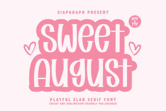
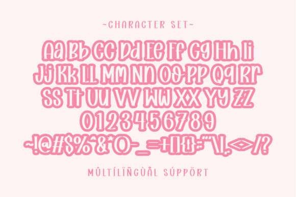
Sweet August introduces a warmer and more decorative tone than the sports, industrial, and Western fonts that dominate much of the slab serif category.
It can suit boutique branding, seasonal promotions, lifestyle graphics, invitations, product labels, and casual editorial headlines. The typeface may also work beside understated photography because its softer personality can reduce the rigidity of a structured layout.
From a visual identity perspective, Sweet August feels more appropriate for brands that want warmth and character rather than authority or toughness.
The main consideration is background contrast. Softer letterforms can lose definition over detailed imagery or patterned surfaces. It is usually better to create a clean text area or use a subtle overlay than to add a thick outline after readability has already been compromised.
Small spacing decisions often have a bigger impact than people expect. Testing line spacing and tracking will be especially important when the font is used across two or more lines.
Best for: Boutique branding, seasonal graphics, lifestyle headlines
Key features: Warm tone, softer slab personality, decorative forms
14. Old Typewriter
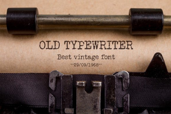
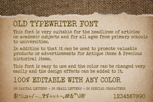
Old Typewriter introduces a mechanical and imperfect print quality. Instead of the polished geometry of a modern slab serif, it suggests physical typewriter keys, uneven ink, archival documents, and reproduced paper.
That character can be effective for book covers, editorial graphics, historical projects, café menus, quotations, documentary-style posters, and labels with a literary tone.
It can also work for short website headings when the surrounding interface is deliberately clean. The contrast between imperfect display lettering and a precise digital layout can feel considered when used sparingly.
The texture will become less legible as the type gets smaller. Fine counters and distressed edges may merge on mobile screens or low-resolution output.
I would keep Old Typewriter for headings, pull quotes, labels, and short phrases rather than body text. Extended reading requires more consistent letterforms and spacing.
Best for: Book covers, archival graphics, literary posters
Key features: Typewriter texture, mechanical rhythm, aged print character
15. Rustforge Slab
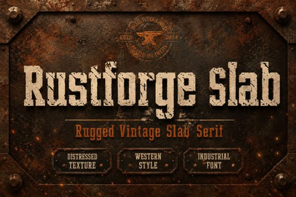
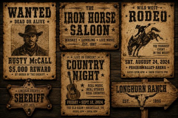
Rustforge Slab has an intentionally rugged and industrial direction. It suits automotive graphics, workshop signage, tool branding, outdoor equipment, masculine packaging, and merchandise with a manufactured or hand-forged aesthetic.
A rugged slab serif can create visual texture without requiring a separate illustration. The letterforms themselves may suggest metal, machinery, wear, fabrication, or physical production.
The main risk is excessive texture. If the typeface already includes roughness, placing it over scratched photography, heavy grain, distressed backgrounds, and several additional effects can destroy the counters that keep the letters readable.
Contrast should come from structure, not only decoration. A relatively simple background will usually make Rustforge Slab feel more deliberate and allow its surface details to remain visible.
It is also worth considering longevity. Industrial distress can suit a focused product line, but it may become restrictive if the brand later expands into cleaner or more refined categories.
Best for: Automotive graphics, workshop signs, rugged packaging
Key features: Industrial mood, heavy slabs, textured display presence
16. Caprint
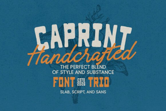
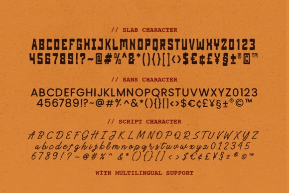
Caprint feels more print-oriented and editorial than a conventional varsity slab. It provides visible serif structure without immediately suggesting a sports team, ranch, or industrial workshop.
That makes it useful for poster headlines, café branding, labels, magazine-inspired layouts, packaging, and typographic merchandise.
Its main strength is adaptability. Depending on the palette, imagery, and spacing, Caprint could move between retro and contemporary applications more easily than the highly thematic fonts elsewhere in this list.
For a cleaner design, I would pair it with a straightforward sans serif and use consistent spacing throughout the layout. This gives the headline character while allowing supporting content to remain easy to scan.
A font may look impressive on its own but struggle once it is used across multiple brand touchpoints. Caprint appears more capable of supporting a broader visual system, although the actual brand name and use cases should still be tested.
Best for: Editorial posters, labels, adaptable retro branding
Key features: Print-inspired character, visible slabs, versatile display tone
17. Retro Block
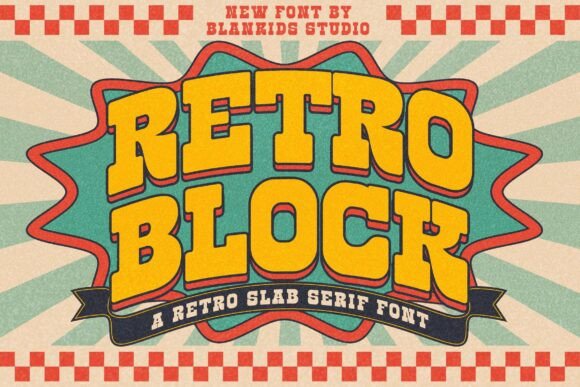
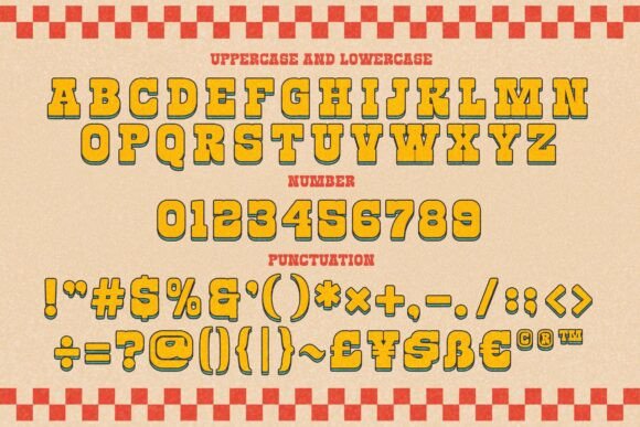
Retro Block combines substantial construction with a more playful period influence. Its dense letterforms recall vintage advertising, nostalgic apparel, food packaging, and colorful music graphics.
The font can be used for 1970s-inspired shirts, event posters, stickers, promotional campaigns, and product labels that need a large, recognizable title.
Because the characters create a strong visual mass, line length becomes important. A long headline compressed into a single line may lose the proportions that make the typeface appealing.
Breaking the wording into two balanced lines will often produce a stronger hierarchy. It also allows the text to remain larger, which preserves the distinctive letterforms in thumbnails and mobile previews.
Retro Block can support layered color treatments, but those effects should reinforce the structure rather than compete with it. The typography already contains enough personality to carry the composition.
Best for: Retro shirts, food packaging, music posters
Key features: Blocky construction, nostalgic tone, high visual density
18. Rodeo Night
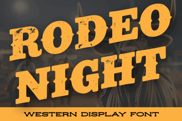
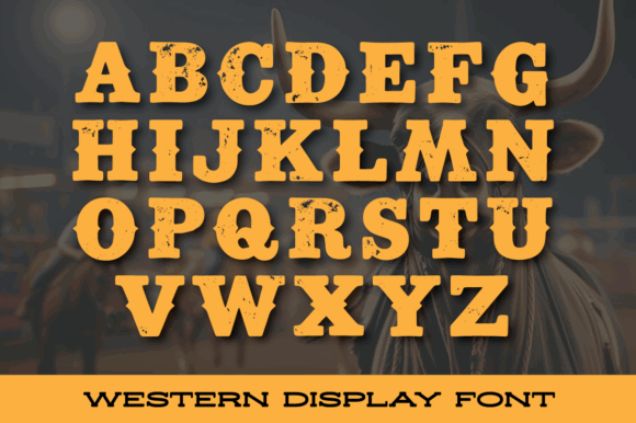
Rodeo Night closes the list with one of its most thematic options. It is designed to create atmosphere as much as communicate the wording.
Rodeo events, country bars, Western apparel, festival posters, album artwork, and themed packaging are natural applications. A short title set in Rodeo Night can establish most of the visual direction before illustration or photography is introduced.
That is useful when the Western association is central to the project. It becomes a limitation when the identity needs to shift between different moods or markets.
I would not choose Rodeo Night for a brand that expects to expand far beyond its original theme. The visual reference is difficult to neutralize, and supporting design elements may spend too much effort working against it.
Used in the right context, however, the font can create a strong and memorable headline with relatively few additional elements.
Best for: Rodeo events, country bars, Western posters
Key features: Strong thematic identity, decorative slabs, atmospheric display styling
Read More: If you're looking for even more options to make a strong visual statement, explore our list of 20 Bold Slab Serif Fonts: Powerful Logo & Headline Picks.
How to Choose a Slab Serif Display Font
Start with the message rather than the font category.
“Bold” does not describe a single personality. It can mean dependable, athletic, industrial, playful, rebellious, nostalgic, or authoritative. Two slab serif fonts may share similar stroke weight while creating completely different brand perceptions.
For sports and collegiate designs, look for wide uppercase letters, compact spacing, clear counters, and shapes that remain recognizable when outlined. College Block 2.0, Varsity Legacy, and Bold Sport follow this direction.
For Western and rustic projects, look for thematic character without losing basic legibility. Bronco Western, Texas, Texas Retro, Farmhouse Vintage, and Rodeo Night contain obvious regional and historical references.
For editorial and lifestyle headlines, choose a typeface with more balanced spacing and less decorative detail. Loved, Sweet August, Caprint, and Lutherwood are easier to position beside photography, body text, and supporting interface elements.
The actual wording matters more than the specimen image.
A carefully designed marketplace preview may use short words with ideal letter combinations. Your title may include repeated diagonals, narrow characters, punctuation, or several long words. These details can change the balance of the entire headline.
Which Slab Serif Display Font Should You Choose?
The most useful slab serif display font is not always the loudest option. It is the typeface that gives a headline the right amount of authority while preserving spacing, readability, hierarchy, and visual consistency.
College Block 2.0 and Varsity Legacy offer recognizable athletic lettering. Farmhouse Vintage and Lutherwood support rustic and heritage branding. Texas Retro and Rodeo Night provide an unmistakable Western identity, while Loved, Sweet August, and Caprint are easier to adapt to lifestyle and editorial applications.
Before downloading any display font, type the complete headline into the available preview. Check uppercase and lowercase letters, punctuation, repeated characters, and the specific words the project requires.
Then test the font within a realistic layout rather than judging it in isolation.
A display typeface may look impressive on a marketplace page but feel entirely different beside a logo symbol, product photograph, website navigation, or supporting paragraph. The strongest choice is the one that continues to communicate clearly across the full visual system—not only in a carefully prepared specimen image.
FAQ
What is a slab serif display font?
A slab serif display font uses thick, block-like serifs and is designed primarily for large text. Its strong shapes make it suitable for headlines, posters, logos, packaging, signs, and apparel.
Are slab serif fonts good for headlines?
Yes. Their substantial strokes create strong contrast and visual weight, which helps headlines stand apart from supporting copy. Decorative styles should usually be reserved for shorter titles.
What font pairs well with a bold slab serif?
A neutral sans serif is usually the safest pairing. It provides clear contrast and handles body text, captions, navigation, and smaller information without competing with the headline.
Can slab serif fonts be used for logos?
Slab serif fonts can work well for logos, particularly in sports, food, outdoor, heritage, automotive, Western, and editorial branding. The chosen style should match the brand rather than simply looking bold.
Follow Us