

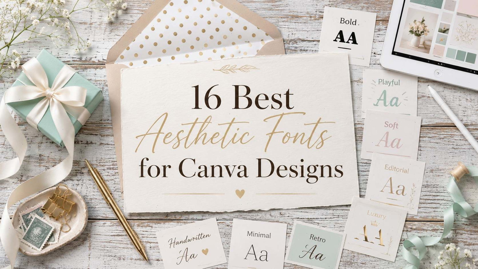
Aesthetic Canva designs usually fail for one quiet reason: the font looks generic. The layout can be clean, the colors can be soft, and the template can be trendy, but if the typeface feels flat, the whole design starts looking like something everyone else already posted.
Some links in this article may be affiliate links, which help support Fontiverse at no additional cost to you.
That is why choosing the best aesthetic fonts for Canva designs matters so much. Canva makes design fast, but the right uploaded font can make a pin, Instagram carousel, logo mockup, product label, or digital template feel much more intentional.
Below are 16 aesthetic fonts and font bundles from Creative Fabrica that fit different Canva design moods: minimal, elegant, retro, handwritten, editorial, luxury, soft, playful, and bold. Creative Fabrica’s general font library lists OTF and TTF formats and Canva compatibility, with commercial-use licensing available through its font marketplace.
Quick Picks
- Best luxury serif: Brelist
- Best clean modern option: Liner
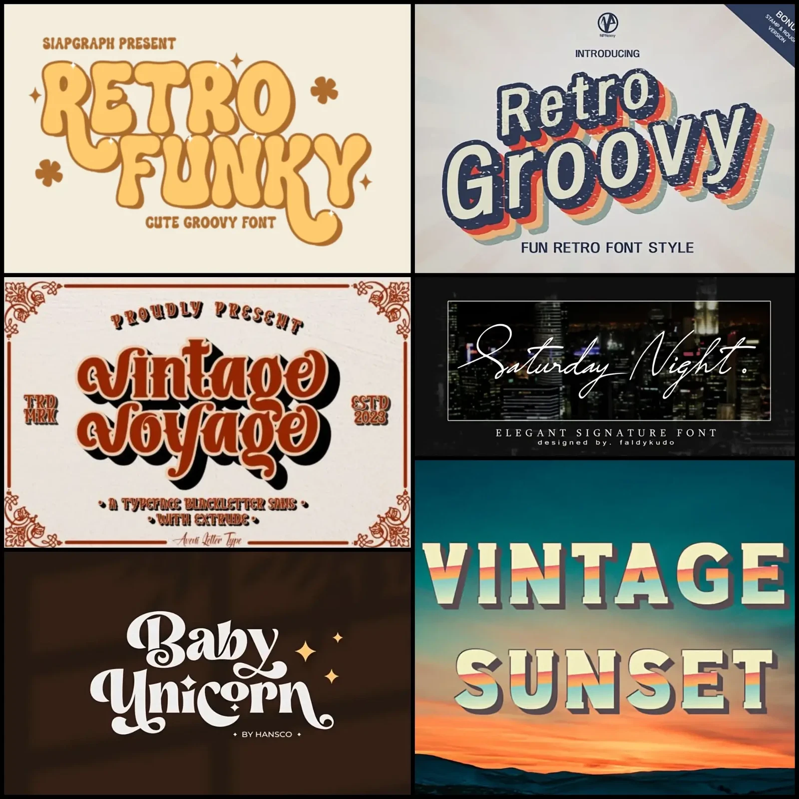
- Best retro option: Groovy Berry
- Best script accent: Bintang
- Best versatile bundle: Mega Font Bundle
How I Picked These
I compared these Canva-friendly fonts by mobile readability, visual personality, spacing, pairing versatility, font-format practicality, suitability for headlines versus accents, and how well each style can make a Canva design feel distinctive without sacrificing clarity on Pinterest, Instagram, presentations, templates, and brand graphics.
1. Brelist Font
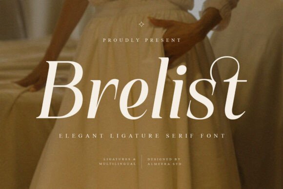
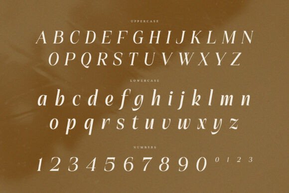
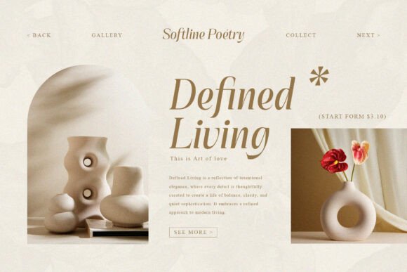
Brelist is the kind of elegant serif that works well when you want Canva designs to feel more boutique than basic. It has graceful curves, refined proportions, ligature details, multilingual support, and a polished editorial personality.
I would use this for beauty brand boards, luxury Pinterest pins, digital product covers, and high-end Instagram quote templates. It has enough character to carry a headline without needing much decoration around it.
The main thing to watch is spacing. A font like Brelist can look cramped if the title is too long or the canvas is too busy. Keep the copy short, give the letters room, and let the serif shapes do the work.
Best for: beauty branding, editorial pins, premium templates
Key features: elegant serif, ligatures, multilingual support
License: commercial use via Creative Fabrica subscription/single-item license
2. Quavera Font
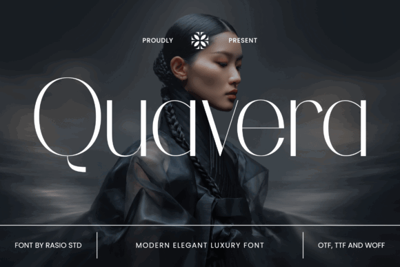
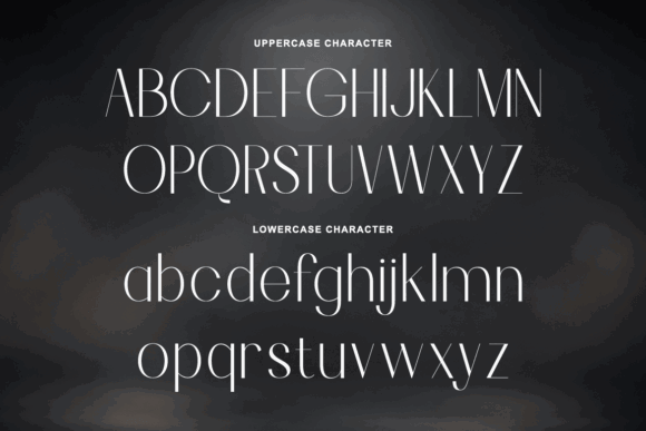
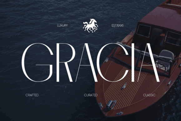
Quavera is a modern luxury-style font with a refined, fashion-forward look. It fits high-end magazine headers, boutique lifestyle branding, cosmetic packaging, upscale restaurant stationery, and chic event titles.
For Canva, this is a strong option when you want a design to feel expensive without overloading it with gold textures and decorative elements. It would look especially good on clean beige, black, ivory, or muted blush layouts.
I would avoid using it for long paragraphs. This is a title font. Use it for a hero word, brand name, pin headline, or cover title, then pair it with a simple sans serif underneath.
Best for: luxury pins, cosmetics, boutique branding
Key features: modern luxury style, refined display look
License: commercial use via Creative Fabrica subscription/single-item license
3. Almanac Zitole Font
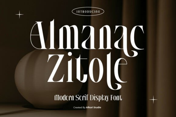
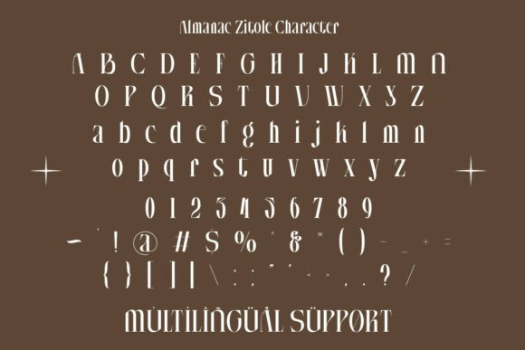
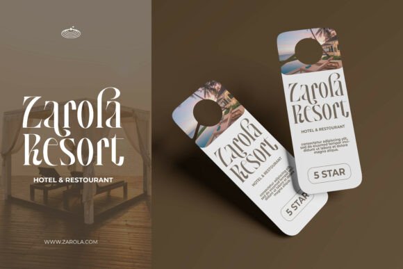
Almanac Zitole is a modern serif display font with sharp serif details, balanced proportions, contrast, alternates, multilingual support, and OTF, TTF, WOFF, and WOFF2 formats.
This one has more structure than many soft aesthetic fonts. That makes it useful for Canva designs where the headline needs to feel stylish but still readable. Think fashion blog covers, brand presentations, Pinterest graphics, media kits, or product launch templates.
The high-contrast letterforms give it a premium feel, but I would not overuse it. One strong headline is enough. If every text block uses this kind of serif, the design starts to feel heavy.
Best for: fashion graphics, media kits, luxury headlines
Key features: high-contrast serif, alternates, multilingual support
Formats: OTF, TTF, WOFF, WOFF2
License: commercial use via Creative Fabrica subscription/single-item license
4. Lycoris Font
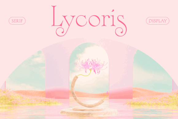
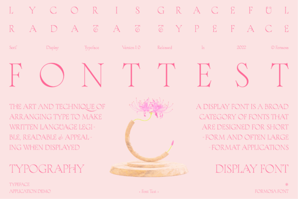
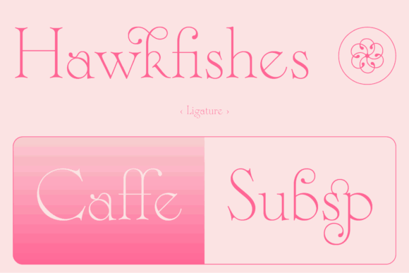
Lycoris is a slender display serif with elegant swashes and a botanical influence. Its thin strokes and curved details give it a delicate, almost floral mood.
This is a beautiful fit for soft Canva aesthetics: wedding mood boards, feminine branding, perfume-style visuals, minimal quote cards, or Pinterest pins around beauty and lifestyle content. It has a refined feel, but it is not as loud as a dramatic fashion serif.
The thin stroke is the only real caution. On small mobile graphics, it may lose impact if the contrast is too low. Use it large, with a calm background and enough color contrast.
Best for: wedding pins, feminine branding, soft editorials
Key features: slender serif, elegant swashes, botanical feel
License: commercial use via Creative Fabrica subscription/single-item license
5. Liner Font
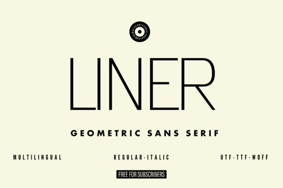
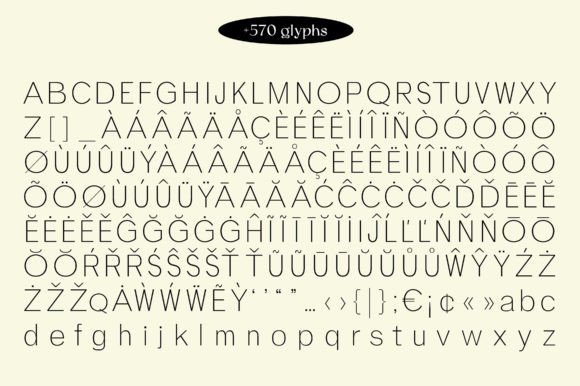
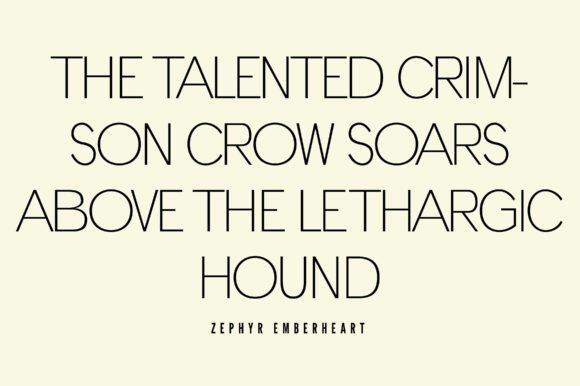
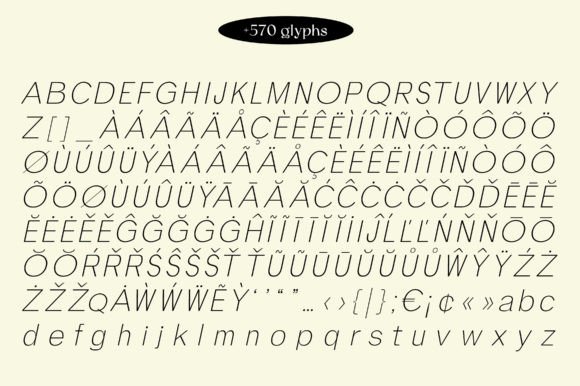
Liner is a geometric sans serif grotesque with clean lines, minimalist sophistication, and a modern aesthetic. It is designed for logos and headlines with readable, polished shapes.
This is one of the more practical aesthetic fonts for Canva because it can support a whole design system. You can use it for headings, subheadings, labels, and simple brand graphics without the layout feeling overdesigned.
I like this style for digital product templates, creator media kits, coaching brands, minimalist Pinterest graphics, and clean Instagram carousels. Pair it with an elegant serif or a small handwritten accent if the design needs warmth.
Best for: minimalist templates, modern brands, clean carousels
Key features: geometric sans serif, clean lines, readable
License: commercial use via Creative Fabrica subscription/single-item license
6. Monoforge Font
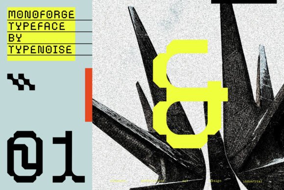
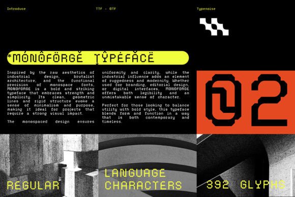
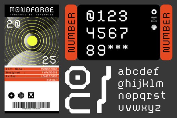
Monoforge is a bold monospaced typeface with clean geometric lines, rigid structure, industrial influence, and OTF/TTF formats.
This is not the soft beige “aesthetic” people often mean on Pinterest. It is more brutalist, techy, structured, and editorial. That can be a good thing. Canva designs in the productivity, AI, tech, streetwear, architecture, or modern portfolio space often need a font with more edge.
Use Monoforge when you want the design to feel strong and intentional. It works better for short words, section labels, bold covers, and poster-style layouts than for friendly lifestyle content.
Best for: brutalist pins, tech layouts, bold portfolios
Key features: monospaced, geometric, industrial style
Formats: OTF, TTF
License: commercial use via Creative Fabrica subscription/single-item license
7. Groovy Berry Font
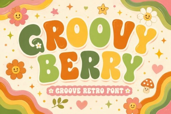
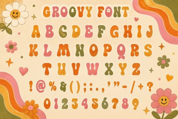
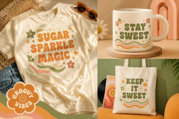
Groovy Berry is a bold retro display font inspired by 70s aesthetics, with chunky rounded letterforms, multilingual support, PUA encoding, and OTF/TTF formats.
This one is made for Canva designs that need personality fast. It would fit retro Pinterest pins, sticker mockups, music graphics, colorful product labels, t-shirt previews, and playful brand boards.
Because it is chunky and expressive, I would keep the rest of the design simple. Let the font be the main visual element. Too many icons, patterns, and stickers around it can make the layout feel noisy.
Best for: retro pins, stickers, playful branding
Key features: chunky display, rounded letters, PUA encoded
Formats: OTF, TTF
License: commercial use via Creative Fabrica subscription/single-item license
8. Bintang Font
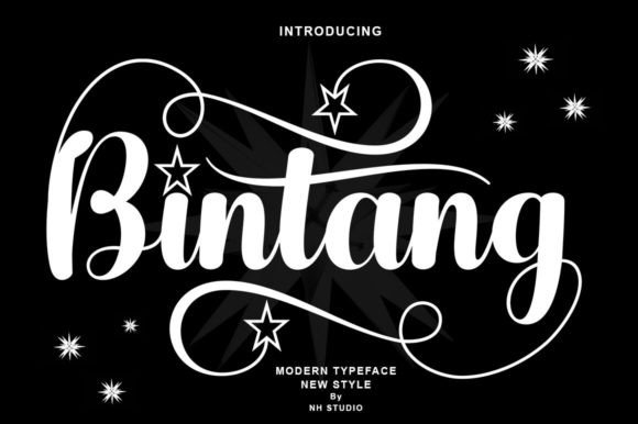
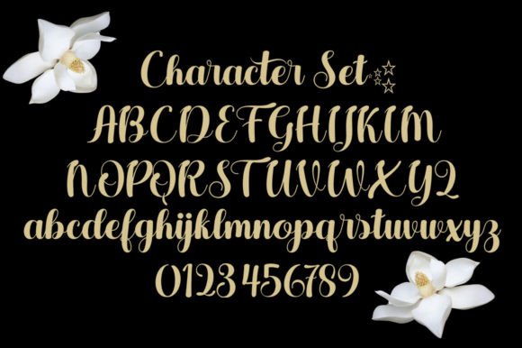
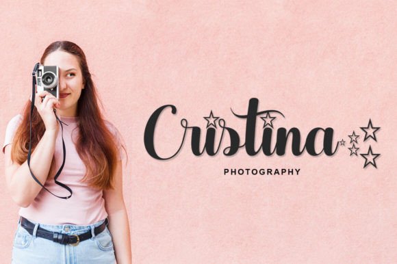
Bintang is an elegant flowing script with a varying baseline, smooth lines, glyphs, alternates, multilingual support, and OTF/TTF files.
For Canva designs, this is best used as an accent font rather than the whole layout. A single word in Bintang can make a wedding invitation, thank-you card, quote graphic, or feminine logo concept feel more personal.
I would pair it with a simple serif or sans serif. For example, use Bintang for one emotional word and a clean font for the supporting phrase. That keeps the design readable while still giving it that handwritten touch.
Best for: wedding cards, quotes, feminine logos
Key features: flowing script, alternates, multilingual support
Formats: OTF, TTF
License: commercial use via Creative Fabrica subscription/single-item license
9. Amsterdam Font
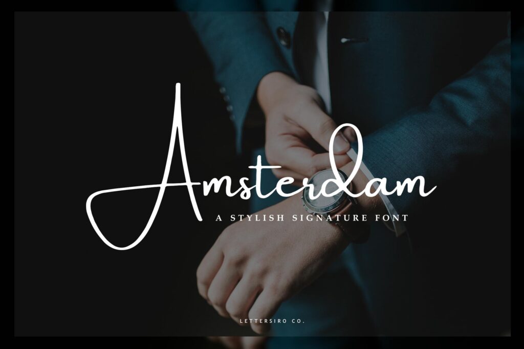
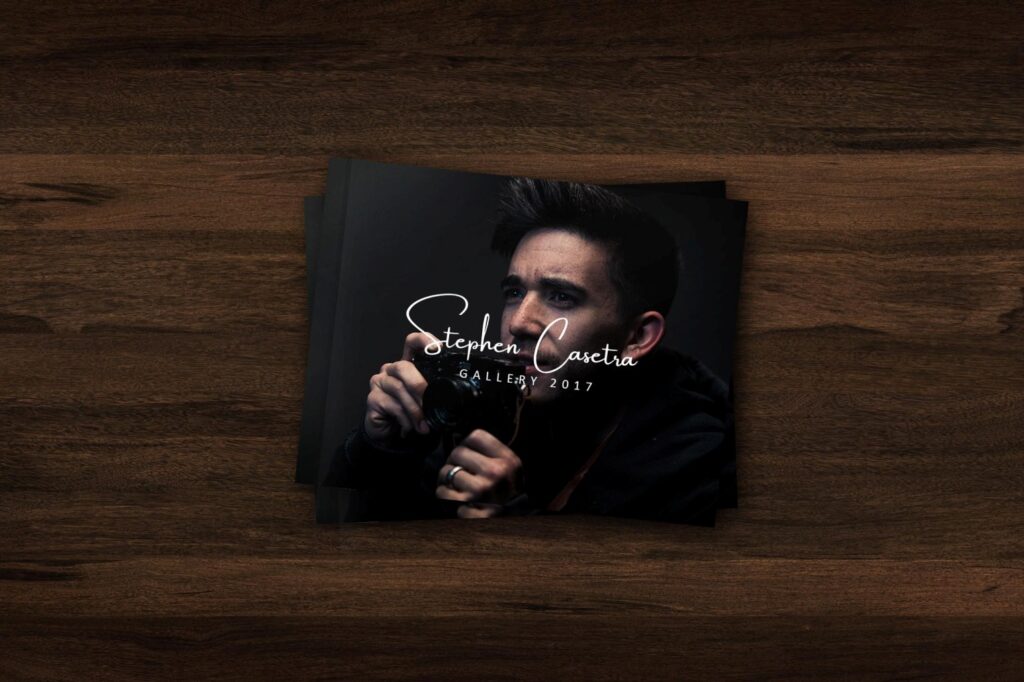
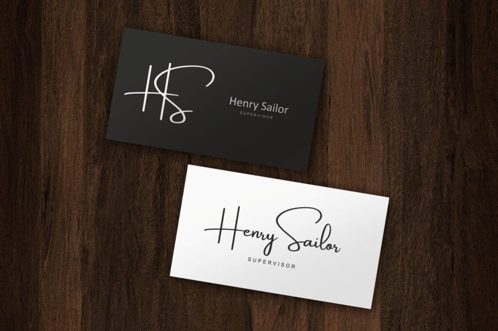
Amsterdam is a script and handwritten font listed under Creative Fabrica’s script fonts, with commercial licence included and a 2026 update shown in the listing preview.
This style is useful when Canva designs need a casual but polished handwritten look. It can work for personal brand graphics, signature-style logos, inspirational quote posts, lifestyle pins, and simple packaging mockups.
The risk with script fonts is readability. Keep the words short and avoid placing them over busy photos. A script title over a textured background might look pretty for a second, but it can fail when someone sees it on a phone.
Best for: signature logos, lifestyle pins, quote graphics
Key features: script style, handwritten mood, commercial licence
License: commercial licence included
10. Amy Font
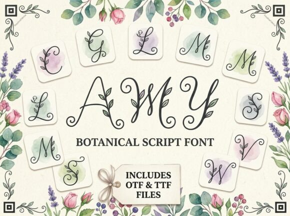
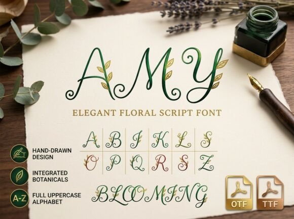
Amy is a botanical script font with leaf accents, graceful swirls, and a soft calligraphic feel. It is designed for invitations, save-the-dates, and place cards.
This is a very specific aesthetic, and that is its strength. It fits natural, romantic, garden-inspired, and wedding-related Canva designs. I would use it for bridal mood boards, floral invitation mockups, elegant quote pins, and soft lifestyle branding.
Because of the decorative leaf details, it is not the best choice for tiny text. Use it for titles, names, or short phrases where the details can actually be seen.
Best for: floral invitations, bridal pins, romantic branding
Key features: botanical script, leaf accents, calligraphic swirls
License: commercial use via Creative Fabrica subscription/single-item license
11. Hassengard Font
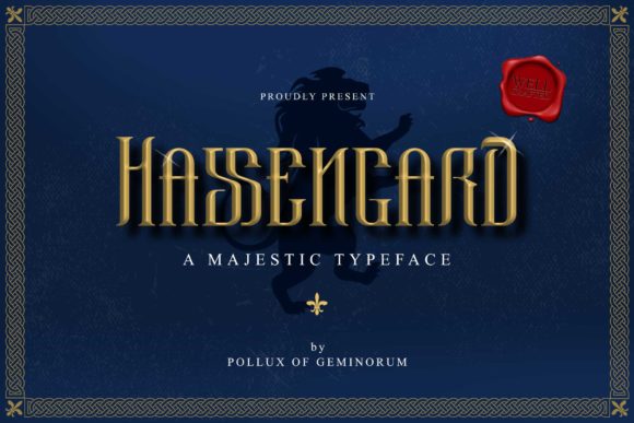
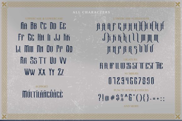
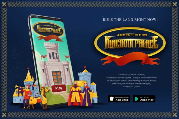
Hassengard is a stylish elegant display font suited for thank-you cards, quotes, greeting cards, logos, and business cards.
This is a good Canva font choice when you need something graceful but not too decorative. It can sit nicely in designs for boutique service brands, stationery templates, printable cards, and soft social posts.
I would test it in both uppercase and lowercase before committing to a layout. Some elegant display fonts look strongest in short title case phrases, while longer all-caps text can feel stiff.
Best for: cards, logos, soft brand graphics
Key features: elegant display style, versatile greeting-card use
License: commercial use via Creative Fabrica subscription/single-item license
12. The Stunning Artland Font
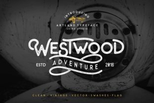
The Stunning Artland Font is a font family with Artland Regular and Artland Vintage, plus a special swash font and a wordflag font.
This is useful for Canva creators who want a more layered vintage aesthetic. The regular and vintage options give you room to build a coordinated look without jumping between unrelated fonts.
I would use Artland for poster-style pins, printable wall art previews, retro brand graphics, and product mockup titles. The swashes and wordflag elements can add charm, but use them lightly. A little vintage texture goes further than a full page of ornaments.
Best for: vintage pins, posters, printable wall art
Key features: regular and vintage styles, swashes, wordflag font
License: commercial use via Creative Fabrica subscription/single-item license
13. Jonie Font
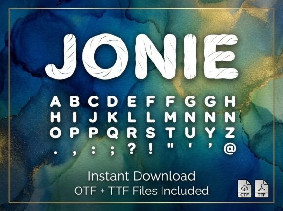
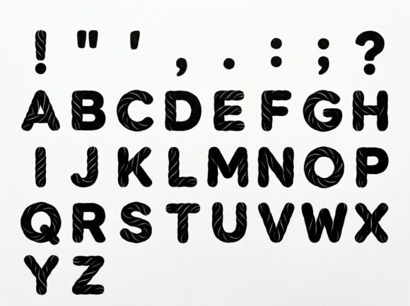
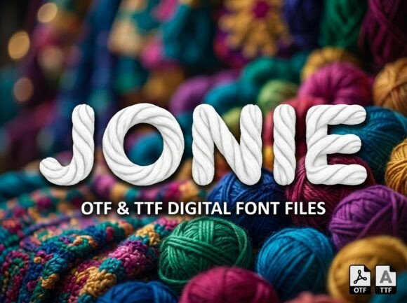
Jonie is described with a clean high-contrast texture that stands out against moody mixed-media backgrounds, alcohol ink waves, and golden-vein visuals. It fits boutique logotypes, nautical event flyers, country lifestyle headers, and rustic product labels.
This is more of a textured display choice than a neutral brand font. In Canva, it could work for moody quote graphics, rustic labels, beach-inspired boutique visuals, or dramatic Pinterest covers.
I would not use Jonie in a minimal layout where the font needs to disappear into the system. This font wants attention. Give it a strong background, a short headline, and enough contrast.
Best for: rustic labels, moody pins, boutique headers
Key features: high-contrast texture, display personality
License: commercial use via Creative Fabrica subscription/single-item license
14. Boy and Girl Font
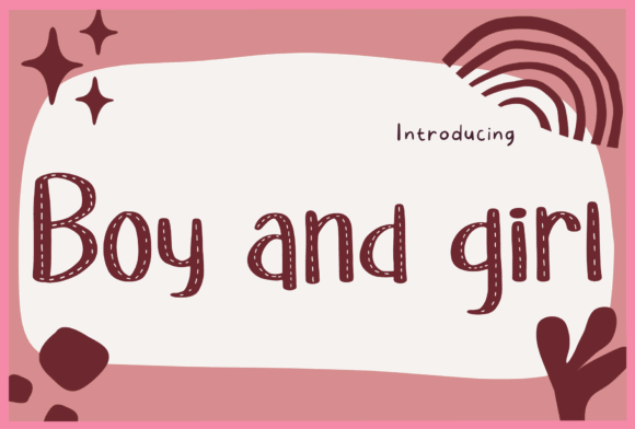
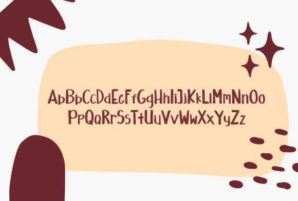
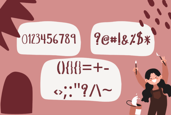
Boy and Girl is a handwritten display font made for designs that need a personalized style, including wedding invitations, thank-you cards, greeting cards, and logos.
This is a softer, more approachable aesthetic. It works best when the design should feel handmade, friendly, and personal rather than polished and luxury-focused.
Use it for planner pages, cute printable templates, small shop thank-you graphics, quote pins, or cozy lifestyle posts. Just be careful with long sentences. Handwritten fonts usually look best when the message is short.
Best for: cute templates, thank-you cards, cozy pins
Key features: handwritten display style, personalized feel
License: commercial use via Creative Fabrica subscription/single-item license
15. The Cute Handwriting Bundle Font
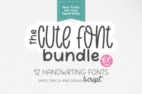
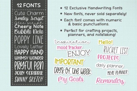
The Cute Handwriting Bundle includes 12 handwritten fonts designed to add charm and personality to creative projects.
A bundle like this is helpful for Canva creators because you get variation without changing the whole mood. You can use one handwriting style for a planner cover, another for worksheet headers, and another for social graphics.
This is especially useful for digital products, teacher resources, journaling graphics, printable planners, and Pinterest pins aimed at a softer craft audience. The main advantage is flexibility. The main risk is inconsistency, so choose two or three favorites and stick with them inside one brand set.
Best for: planners, worksheets, journaling graphics
Key features: 12 handwritten fonts, cute casual style
License: commercial use via Creative Fabrica subscription/single-item license
16. Mega Font Bundle
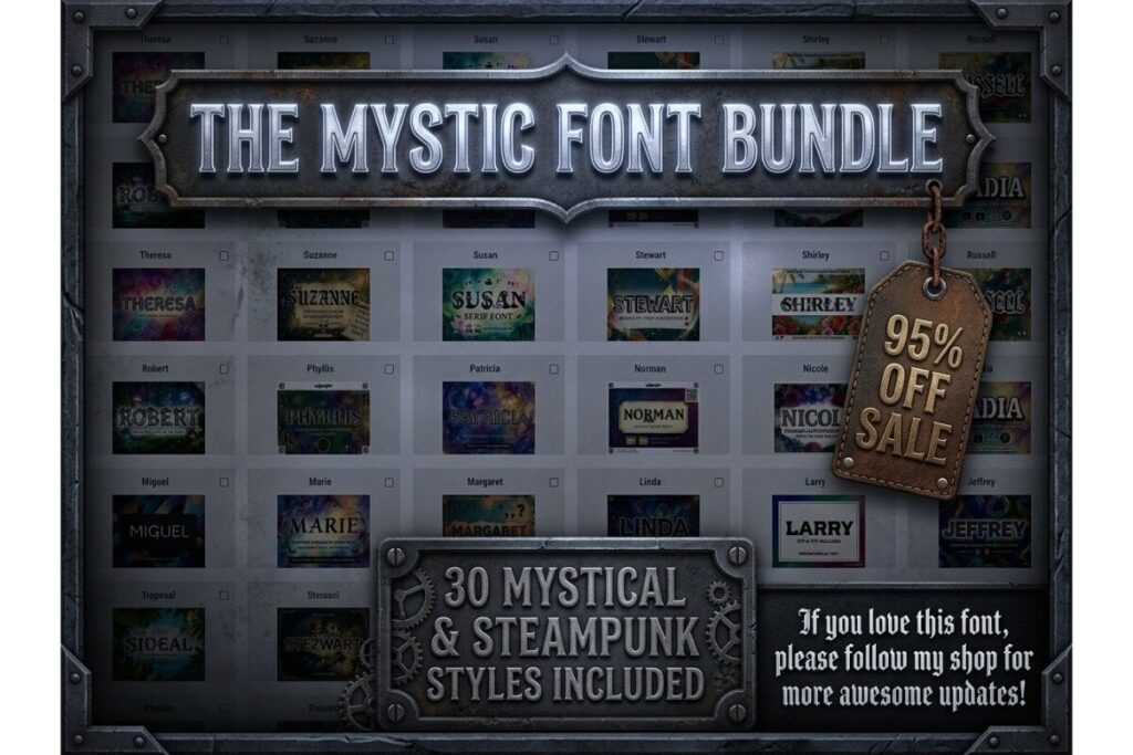
Mega Font Bundle includes 30 fonts across retro, script, gothic, floral, steampunk, and handcrafted styles, with OTF and TTF files for every font, plus PUA encoded characters.
This is the broadest pick in the list. It is not one single aesthetic. It is better for Canva creators who make many types of graphics: pins, covers, printable products, merch previews, posters, and brand mockups.
The upside is variety. The downside is that bundles can tempt you to use too many styles at once. For a cleaner result, choose one display font, one readable support font, and maybe one accent font. That is usually enough.
Best for: varied Canva projects, merch, social graphics
Key features: 30 fonts, mixed styles, PUA encoded
Formats: OTF, TTF
License: commercial use via Creative Fabrica subscription/single-item license
Read More: If you're particularly drawn to a vintage feel, you might be interested in exploring our selection of 6 Retro Aesthetic Fonts for Posters and Covers to give your designs that perfect nostalgic touch.
How to Choose the Right Canva Font Style
For Canva designs, I would separate aesthetic fonts into a few practical groups:
Elegant serifs are best for branding, beauty graphics, wedding templates, editorial pins, and premium lead magnets. They usually need generous spacing and should be used mostly for titles.
Minimal sans serifs are better for clean templates, modern brands, digital products, and readable social graphics. They pair well with decorative fonts because they do not compete too much.
Handwritten and script fonts add warmth, but they can get messy at small sizes. Use them for accent words, short titles, signatures, or quote graphics.
Retro display fonts are strong for pins, posters, stickers, merch mockups, and playful brand visuals. They need breathing room because they already carry a lot of personality.
How to Upload Creative Fabrica Fonts to Canva
Canva supports uploaded fonts through its brand font feature, and Creative Fabrica has a guide on installing and using fonts in Canva.
The basic workflow is simple:
- Download the font files from Creative Fabrica.
- Unzip the download folder.
- Open Canva and go to your brand settings.
- Upload the OTF or TTF font file.
- Use the font in your design like any other Canva typeface.
For most Canva projects, OTF and TTF are the formats you will care about most. WOFF and WOFF2 are more relevant for web use.
Best Font Pairing Tips for Canva Designs
The easiest Canva font pairing rule is this: pair personality with restraint.
If your headline font is decorative, use a quiet sans serif for the supporting text. If your title font is minimal, you can add a soft script accent. If your font is retro and chunky, avoid adding another loud display font next to it.
A few practical pairings:
- Elegant serif + clean sans serif
- Script accent + modern serif
- Retro display + simple geometric sans
- Handwritten font + plain readable body font
- Luxury display font + small uppercase sans serif
For Pinterest pins, readability matters more than beauty. A font can look gorgeous in a mockup and still fail if people cannot read it while scrolling. Test your design at phone size before publishing.
Which Aesthetic Font Should You Choose for Canva?
Choose Brelist when you want an elegant luxury serif, Liner for a clean modern system, and Groovy Berry when the design needs a bold retro personality. Bintang works best as a short script accent, while the Mega Font Bundle is the more flexible choice when you create many different Canva styles and need a broader library.
FAQ
What are the best aesthetic fonts for Canva designs?
The best aesthetic fonts for Canva designs are fonts that match the mood of the project while staying readable. Elegant serifs work well for branding and beauty graphics, handwritten fonts suit planners and personal content, and retro display fonts are strong for bold Pinterest pins.
Can I upload Creative Fabrica fonts to Canva?
Yes. Creative Fabrica fonts can be downloaded and uploaded into Canva through Canva’s brand font upload feature. Creative Fabrica also publishes guidance on installing and using fonts in Canva.
What font format should I use for Canva?
For Canva, OTF and TTF are usually the most useful font formats. Creative Fabrica’s font library notes that many fonts are available in OTF and TTF and are compatible with Canva.
Are aesthetic fonts good for Pinterest pins?
Yes, but only if they stay readable at mobile size. For Pinterest pins, use aesthetic fonts for strong headlines, keep the layout clean, and avoid thin or overly decorative fonts on busy backgrounds.
Follow Us