

Soft Fonts That Create a Feminine Aesthetic
The strongest soft aesthetic fonts feel gentle without losing clarity or visual structure. They often rely on rounded letterforms, relaxed handwritten strokes, graceful curves, or restrained decorative details to create a warmer and more approachable tone.
From a branding perspective, softness is not the same as weakness. A typeface can feel delicate while still giving a logo, package, or website heading a confident presence. Much depends on the spacing, visual weight, color palette, and supporting typography around it.
Soft fonts are often used in feminine branding, beauty packaging, wedding stationery, social media graphics, lifestyle blogs, boutiques, and personal product lines. However, feminine typography does not need to be heavily ornamental. A clean handwritten typeface can communicate warmth just as effectively as formal calligraphy, especially when it is paired with a structured serif or sans serif.
For this collection, I focused on fonts featured within Creative Fabrica’s popular font selection and evaluated them through typography, branding flexibility, readability, and visual tone.
Some are polished enough to support boutique identities and logo design. Others feel more casual, playful, or personal. The right choice depends on how much personality the font needs to carry and how clearly the typography must perform at smaller sizes.
Quick Picks
- Best refined feminine option: Aureline
- Best signature-style option: Brittany Signature Script
- Best romantic option: Amelia Rose
- Best friendly casual option: Cute Simple
- Best for planners and workbooks: Clean Notes
How I Picked These
I compared these soft aesthetic fonts by readability, visual tone, small-size performance, branding flexibility, spacing, decorative complexity, and how well each option can support logos, packaging, stationery, social graphics, planners, and other feminine design applications without overwhelming the layout.
16 Best Soft Aesthetic Fonts
1. Cute Simple
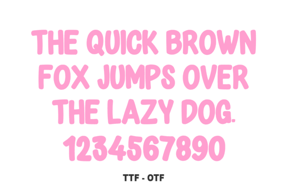
Cute Simple has the relaxed friendliness of casual handwriting, but the construction feels controlled enough for finished design work. Its rounded letterforms give words a warm, informal character without making the typography look excessively decorative.
Visually, the font feels approachable and uncomplicated. That makes it useful for planner headings, packaging labels, printable cards, product inserts, and social media graphics.
I would keep it away from long paragraphs. The handwritten rhythm is more effective when it creates contrast or personality in a short phrase. For practical information such as pricing, instructions, or product details, pair it with a neutral sans serif.
Small spacing adjustments may also be necessary in logo applications. Casual fonts often appear balanced in sample words but can develop uneven gaps when used with a specific business name.
Best for: Planners, labels, social posts
Key features: Rounded strokes, casual spacing, handwritten construction
2. Gastonia Script
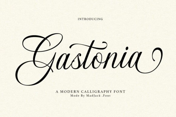
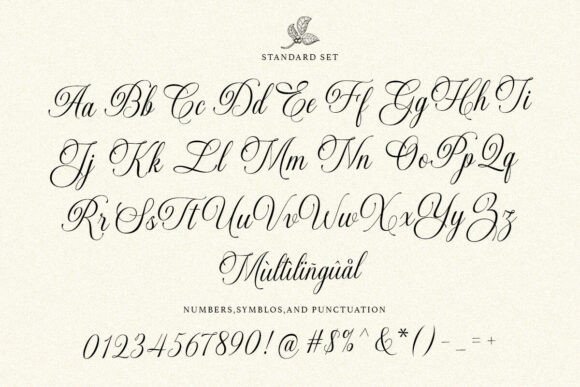
Gastonia Script introduces more movement and drama. Its connected strokes create a signature-like rhythm that suits romantic, fashion-oriented, and beauty-focused compositions.
This type of script can immediately become the focal point of a logo, invitation heading, or packaging design. The letterforms carry enough energy that they do not need much additional decoration.
That is also where restraint becomes important.
When Gastonia Script is placed too close to floral illustrations, decorative borders, or ornate icons, the composition can become crowded. The font needs breathing room around its ascenders, descenders, and sweeping connections.
I would use it for a business name, short title, or a few emotionally important words rather than complete paragraphs. A lightweight sans serif or spacious editorial serif can provide the contrast and hierarchy it needs.
Best for: Logos, invitations, beauty branding
Key features: Connected script, sweeping strokes, signature-like rhythm
3. Hello Honey
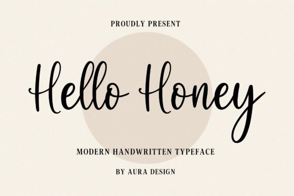
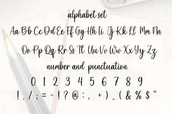
Hello Honey has a loose handwritten quality that feels personal and slightly imperfect. That imperfection gives the typeface much of its charm.
In digital design, handwritten fonts like this can soften rigid layouts and make them feel less automated. Hello Honey is especially effective when paired with muted pink, warm cream, sage, peach, or other understated colors.
Its light visual weight suits lifestyle quotes, greeting cards, product inserts, social graphics, and small business branding. However, thin strokes can disappear when placed over detailed photography or low-contrast backgrounds.
For that reason, I would generally place it over a clean image area or a solid color field. Adding a subtle overlay behind the text may also improve readability.
Hello Honey feels soft without becoming formal, which makes it useful when polished calligraphy would look too ceremonial or distant.
Best for: Quote graphics, cards, product inserts
Key features: Loose baseline, light strokes, natural handwriting texture
4. Mila
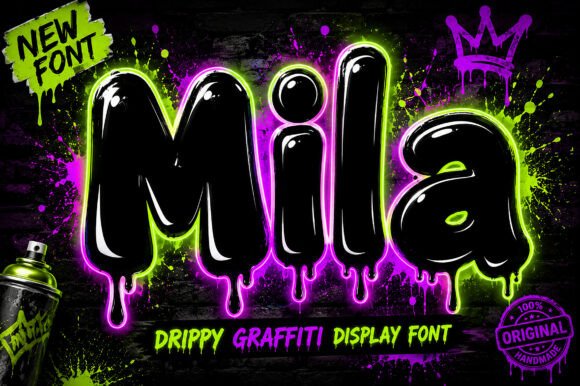
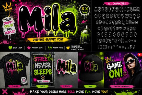
Mila leans toward a cute, contemporary aesthetic. Its simple shapes and soft curves make it easier to place within playful layouts than a highly flourished script.
The font has enough character to establish a visual mood without overwhelming illustrations, product photography, or supporting copy. It suits children’s products, stationery, feminine apparel graphics, stickers, and casual social content.
For branding, I would normally use Mila as a display or secondary typeface unless the brand is intentionally youthful. It can support a short logo name, but longer names may require careful tracking and manual kerning.
One thing I often notice when reviewing logo fonts is that rounded, playful typefaces can lose clarity when reduced. Mila should be tested on small labels, mobile headers, profile images, and favicon-sized applications before it becomes part of a larger brand system.
Best for: Stickers, stationery, youthful branding
Key features: Simple shapes, soft curves, playful personality
5. Mystic Whimsy
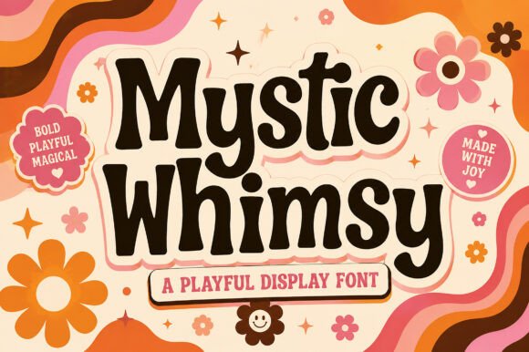
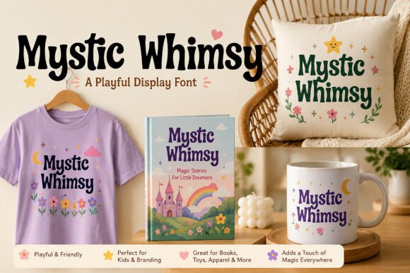
Mystic Whimsy is designed for dreamy, celestial, and slightly magical visual directions. It carries more decorative personality than a typical handwritten font, which makes it suitable for journal covers, spiritual branding, moon-themed products, and imaginative packaging.
From a branding perspective, this is a distinctive typeface rather than a neutral one. It establishes a clear mood very quickly.
That can be useful, but it also limits flexibility. A whimsical display font may look delicate while still becoming the loudest element in a design. I would keep the surrounding layout quiet, with generous negative space and minimal supporting decoration.
Mystic Whimsy is better suited to names and headings than functional information. Dates, ingredients, product details, navigation labels, and longer descriptions should be set in a much simpler typeface.
The contrast between expressive and practical typography will make the entire visual identity feel more intentional.
Best for: Celestial branding, journals, decorative titles
Key features: Whimsical details, expressive shapes, dreamy character
6. Little Love
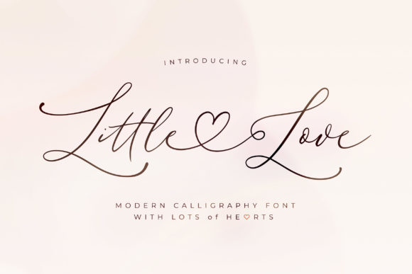
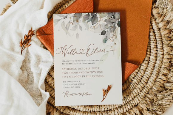
Little Love gives typography an affectionate, handmade quality. It feels personal rather than luxurious, making it appropriate for baby products, family prints, thank-you cards, Valentine’s designs, gift tags, and small packaging.
The friendly letterforms pair naturally with simple line illustrations and lightly textured backgrounds. However, combining the font with too many hearts, flowers, pastel patterns, or other cute elements can make the final design feel overly juvenile.
I would balance it with restrained color choices and a structured layout.
Little Love is most effective in short phrases. As the text becomes longer, the informal rhythm begins to compete with readability. This is common with handwritten fonts: the personality that makes them appealing in a heading can become tiring in continuous text.
Use it to create warmth, then let a practical sans serif handle the rest of the communication.
Best for: Baby products, gift tags, family prints
Key features: Friendly forms, handmade mood, gentle visual weight
7. Aureline
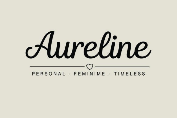
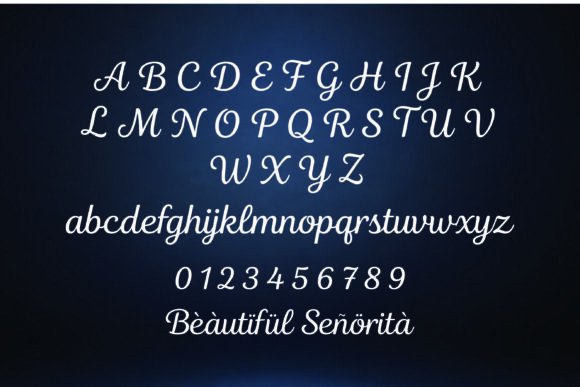
Aureline has a more refined presence than many of the playful fonts in this collection. Its graceful movement makes it suitable for wedding professionals, beauty businesses, photographers, and personal brands that want a soft visual identity without appearing childish.
The typeface has the potential to function as a wordmark when the business name is relatively short. Even then, I would test it carefully across real brand touchpoints.
Fine script details often look elegant in a large presentation mockup but become less distinct in mobile headers, favicons, social profile images, and small packaging labels. Scalability matters just as much as appearance.
Aureline pairs naturally with uppercase sans serif typography, particularly when the supporting text uses generous tracking. The contrast between the flowing script and structured capitals creates a clear hierarchy without making the identity feel rigid.
Best for: Beauty logos, weddings, personal brands
Key features: Graceful script, refined curves, elegant proportions
8. Brittany Signature Script
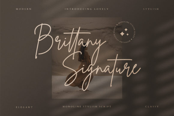
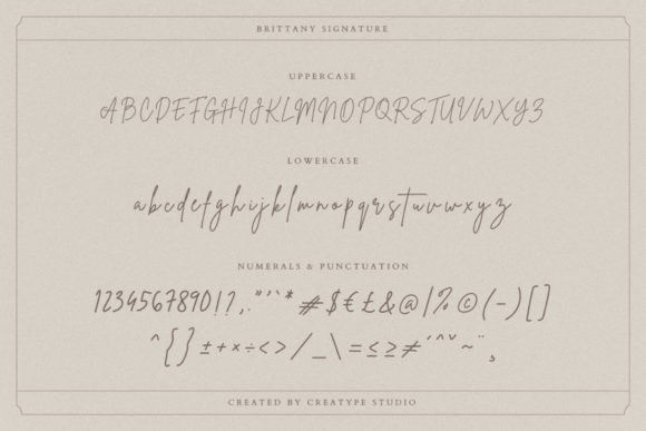
Brittany Signature Script creates the impression of a quick, confident signature. It feels modern and personal rather than traditional, which suits fashion, photography, beauty, coaching, and lifestyle branding.
Its greatest strength is movement. The letterforms flow horizontally across a composition and can soften design systems built around clean grids, geometric shapes, and neutral sans serif type.
Signature fonts should always be tested using the exact business name or phrase. The quality of the letter connections can change significantly depending on the character combination.
Some names create a smooth, balanced wordmark. Others produce awkward joins, uneven gaps, or oversized flourishes. Manual kerning may improve the result, but not every combination can be corrected easily.
For a flexible visual identity, I would use Brittany Signature Script selectively and allow a simpler typeface to handle navigation, body copy, product details, and supporting information.
Best for: Photography, fashion, signature logos
Key features: Fast movement, connected letters, modern handwritten style
9. Amelia Rose
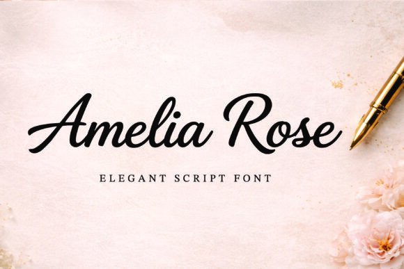
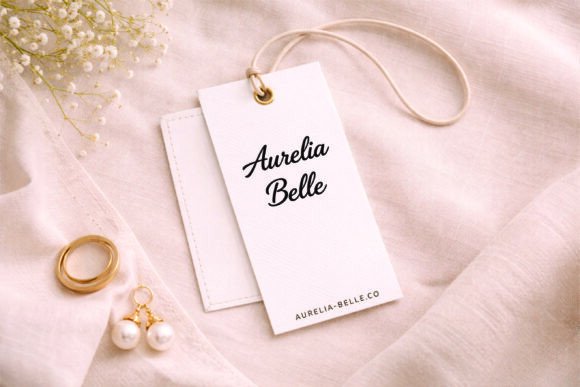
Amelia Rose feels romantic without depending on excessive ornament. Its visual tone naturally suits floral identities, wedding stationery, beauty products, candle labels, and feminine packaging.
The typeface occupies a useful middle ground. It feels more polished than casual handwriting but less formal than traditional calligraphy.
That balance makes it suitable for designs that need elegance without looking ceremonial. Amelia Rose can carry a prominent heading while leaving enough visual space for the supporting typography to remain clear.
Color can influence its personality considerably. Dusty rose, ivory, muted green, burgundy, charcoal, and warm botanical palettes will each push the font in a slightly different direction.
I would avoid pairing it with another decorative typeface. When two fonts compete for the emotional role, the hierarchy usually becomes uncertain. A restrained serif or geometric sans serif will create a more stable brand system.
Best for: Florists, candles, wedding stationery
Key features: Romantic flow, delicate strokes, restrained ornament
10. Milkbutter
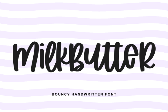
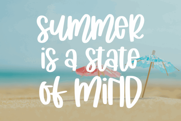
Milkbutter has a rounded, soft personality with a playful edge. The fuller letterforms make the font feel comfortable and approachable, which suits food packaging, cafés, handmade goods, children’s products, stickers, and cheerful merchandise.
Compared with thin scripts, Milkbutter has more visual weight. That allows it to hold up better over photography and remain recognizable when printed at modest sizes.
This makes it more flexible for practical applications such as labels, apparel graphics, product packaging, and promotional designs.
The font still needs typographic contrast. Pairing it with another rounded display typeface can make the entire composition feel inflated or overly sweet. A narrow sans serif or restrained grotesk will create a clearer distinction between personality and information.
Milkbutter can become visually dominant quickly, so the spacing and scale of surrounding elements should remain controlled.
Best for: Food packaging, stickers, cheerful merchandise
Key features: Rounded forms, fuller weight, approachable appearance
11. Clean Notes

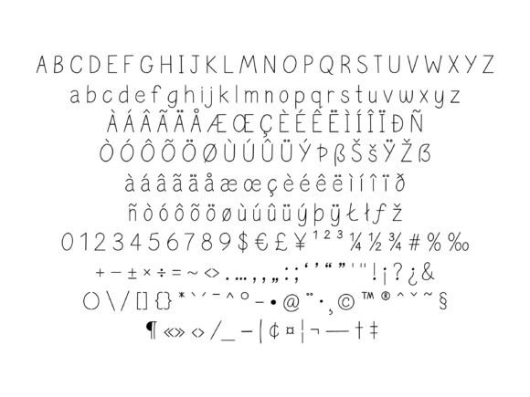
Clean Notes captures the appearance of neat, carefully written notebook text. It feels organized, calm, and personal, making it useful for planners, educational printables, digital notes, workbooks, and wellness materials.
The cleaner construction gives it an advantage over rougher handwriting styles when a design contains more than a few words. Its rhythm feels relatively even, and the letterforms remain recognizable at moderate sizes.
Even so, I would not use it as a replacement for a conventional body font in long reading sections. Handwritten typography introduces small variations that can become tiring over several paragraphs.
A more practical approach is to use Clean Notes for prompts, labels, annotations, pull quotes, or short callouts. The main content can remain in a highly legible serif or sans serif.
This creates a personal tone without weakening usability.
Best for: Planners, workbooks, digital notes
Key features: Neat handwriting, even rhythm, clear construction
12. Stylish Handwriting
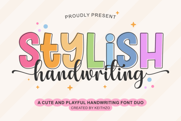
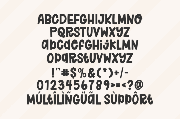
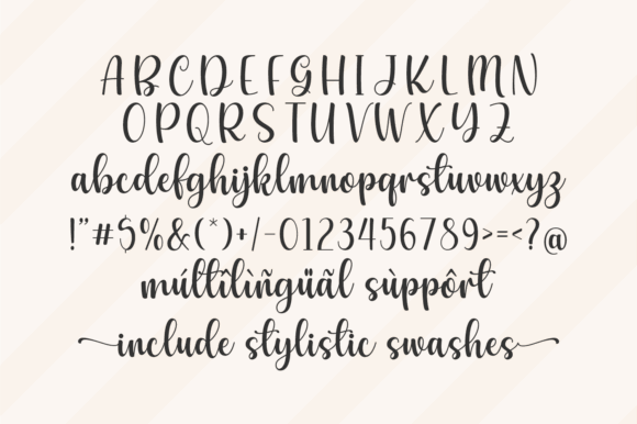
Stylish Handwriting has a fashionable, editorial quality that feels more composed than everyday handwriting. It can soften beauty campaigns, fashion graphics, blog covers, product announcements, and lookbooks without making them appear overly cute.
The letterforms provide texture and personality, but the font is still better suited to short content. On mobile graphics, long handwritten sentences can become slow to scan even when each character remains technically legible.
This distinction between legibility and readability is important. A viewer may be able to recognize every letter while still finding the complete phrase uncomfortable to process.
I would use Stylish Handwriting as an accent within an otherwise clean design system. One expressive heading or handwritten note often feels more sophisticated than applying script typography to every section.
Best for: Fashion graphics, lookbooks, beauty campaigns
Key features: Editorial handwriting, fluid rhythm, polished appearance
13. Handmade
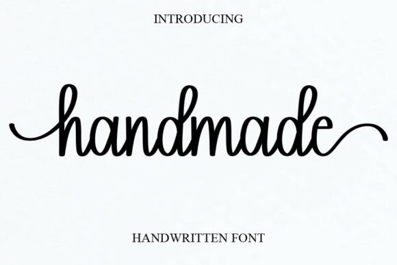
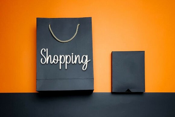
Handmade creates a direct visual connection to craft businesses, independent shops, and small-batch products. Its informal texture can make packaging feel less industrial, particularly when paired with recycled paper, natural colors, product photography, or simple illustrations.
It is a sensible option for candle makers, soap brands, ceramic studios, bakeries, craft sellers, and creative workshops.
However, the same handmade quality may feel too casual for premium beauty branding, financial services, or formal event stationery. Typography influences trust and positioning, so the font should match the price point and expectations of the audience.
I would keep the layout structured around it. The handmade feeling should come from the letterforms, not from inconsistent alignment or careless spacing.
A controlled grid can make informal typography feel authentic rather than unfinished.
Best for: Craft brands, soaps, handmade packaging
Key features: Informal texture, organic rhythm, artisan character
14. Grandma
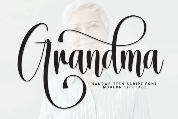
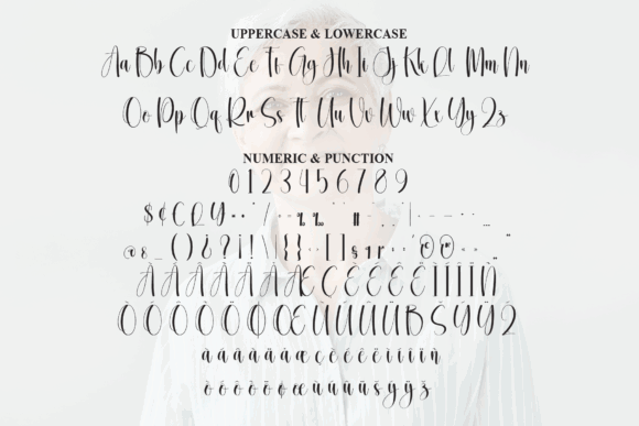
Grandma has a nostalgic warmth that suits family-centered and sentimental design work. It can support recipe cards, memory books, kitchen signs, family gifts, heritage products, and cozy seasonal graphics.
The typeface communicates emotion more strongly than minimalism. Its personality is connected to comfort, tradition, familiarity, and personal memory.
That makes it effective for the right message, but less appropriate for sleek fashion brands or modern technology companies.
When working with nostalgic fonts, I usually recommend limiting the number of vintage references around them. Elaborate borders, distressed textures, retro illustrations, and old-fashioned color palettes can quickly turn a warm design into a themed one.
Pairing Grandma with understated illustrations and clean spacing will usually produce a more convincing result.
Best for: Recipe cards, family gifts, memory books
Key features: Nostalgic mood, warm forms, sentimental personality
15. School Crush
School Crush introduces a youthful tone to soft aesthetic typography. It feels appropriate for diaries, classroom graphics, teen-focused products, notebooks, stickers, and playful social media content.
The letterforms are expressive enough to suggest personality without requiring a large amount of additional decoration. A small heart, underline, or star may be enough to support the typography.
Its youthful character is also its main limitation.
For mature beauty brands, luxury packaging, or professional service businesses, School Crush may feel too informal. The font performs best when the audience expects friendliness, energy, and a slight sense of nostalgia.
As with other playful fonts, I would test the capital letters and punctuation carefully. These details often determine whether the typeface feels polished or more like casual classroom lettering.
Best for: Diaries, school graphics, teen products
Key features: Youthful lettering, playful rhythm, casual personality
16. Winky Swing
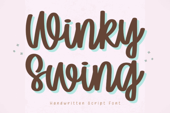
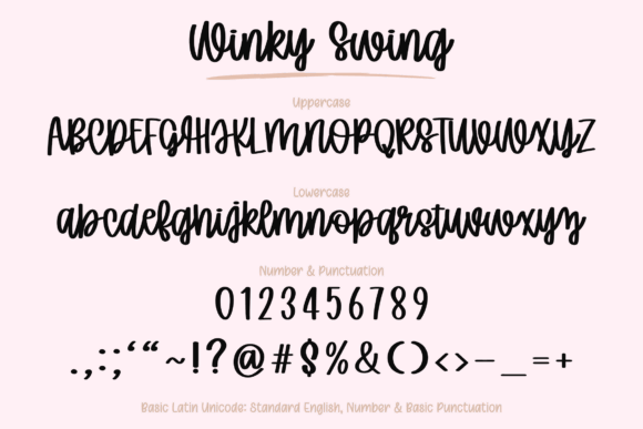
Winky Swing finishes the collection with a bouncy, cheerful display style. Its uneven movement gives words an energetic quality that suits children’s designs, party invitations, apparel graphics, stickers, and playful feminine branding.
The font is most effective when the text is short and expressive. Product names, cheerful phrases, and event titles give the letterforms enough room to show their personality without creating visual clutter.
Because Winky Swing already contains considerable movement, I would keep the surrounding composition stable. Straight alignment, simple shapes, and restrained illustration will give the typography something structured to contrast with.
Using too many tilted elements or irregular shapes around it can make the layout feel visually unsettled.
This is a good example of a display font that prioritizes personality over versatility. It can be memorable in the right context, but it is not intended to handle every part of a larger brand system.
Best for: Party designs, apparel, playful branding
Key features: Bouncy baseline, cheerful forms, energetic display style
Read More: Beyond just feminine designs, you can also discover how to elevate your projects using the 16 Best Aesthetic Fonts for Canva Designs.
Which Soft Aesthetic Font Should You Choose?
Soft aesthetic fonts cover a much wider range than traditional calligraphy. Some feel romantic and polished. Others are playful, nostalgic, casual, or quietly handwritten.
For refined beauty and wedding projects, Aureline, Amelia Rose, and Brittany Signature Script offer graceful movement and a more polished visual tone. Cute Simple, Mila, and Little Love are better suited to friendly stationery, personal products, and social content.
Milkbutter and Winky Swing bring more visual weight and energy, while Clean Notes offers a calmer handwritten alternative for planners, workbooks, and educational layouts.
The strongest choice is not necessarily the most decorative font. It is the typeface that remains readable, reflects the intended audience, and gives the rest of the layout enough space to function.
A font may look impressive on its own but struggle once it is used across multiple brand touchpoints. Testing it in a logo, website header, product label, social image, and small mobile layout will reveal far more than a polished font preview.
Soft typography should add warmth and personality without making the design feel fragile, crowded, or overly ornamental.
Some links in this article may be affiliate links. If you purchase through them, we may earn a small commission at no extra cost to you. Thanks for supporting our work.
FAQ
What fonts create a soft feminine aesthetic?
Scripts, clean handwriting fonts, rounded display styles, and delicate serifs often produce a soft feminine aesthetic. The best option depends on whether the design should feel elegant, cute, romantic, youthful, or handmade.
What is the best feminine font for a logo?
Aureline, Brittany Signature Script, and Amelia Rose are strong starting points for feminine logos. Always test the complete business name at small sizes before choosing a detailed script.
Can soft aesthetic fonts be used for body text?
Most decorative scripts and handwritten fonts should be limited to headings, names, and short phrases. Use a readable serif or sans serif for paragraphs, product details, and navigation.
What colors pair well with feminine typography?
Soft fonts pair well with cream, dusty rose, muted lavender, sage, peach, soft blue, burgundy, cocoa, and charcoal. Strong contrast remains more important than using a traditionally feminine color.
Follow Us