

ℹ️ Affiliate Disclosure: This article may contain affiliate links. We may earn a commission at no extra cost to you. Thanks for your support! ❤️
14 Best Handwritten Fonts for Product Packaging That Instantly Elevate Branding
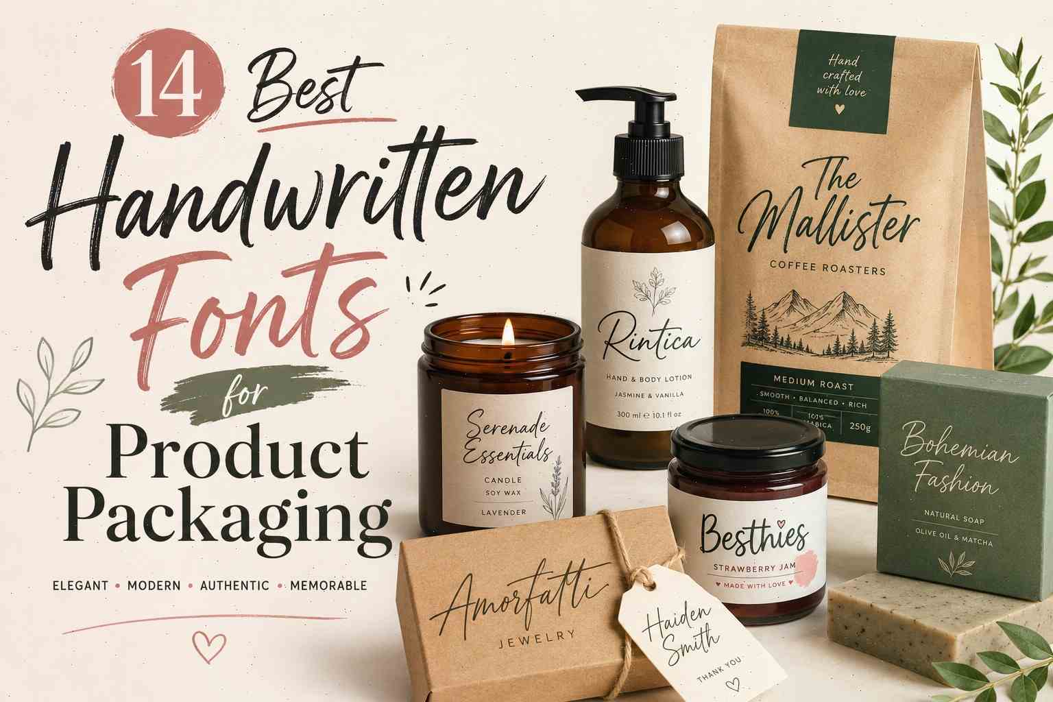
Product packaging stopped being “just packaging” a long time ago. These days, people notice the label before they notice the product itself. You see it constantly with skincare brands, boutique coffee, candles, handmade soap, even small Etsy shops trying to look a little more polished.
And honestly, handwritten fonts are a huge part of that.
A clean handwritten script can make a product feel handmade, premium, softer, more personal — sometimes all at once. I’ve seen fairly simple packaging designs look dramatically more expensive just from changing the typography.

The tricky part is choosing a handwritten font that actually fits the brand. Some scripts feel elegant and minimal. Others feel playful or artistic. A few look amazing on Instagram mockups but become unreadable once printed on small labels.
So instead of throwing random trendy fonts into a list, I pulled together handwritten fonts that genuinely work well for modern packaging design — especially for beauty brands, candles, coffee packaging, boutique labels, fashion products, and lifestyle branding.
A lot of these also work beautifully for:
- logos
- social media branding
- product inserts
- thank-you cards
- stickers
- website headers
14 Best Handwritten Fonts for Product Packaging
1. Miserable Emillia
A Sophisticated Script for Luxury Packaging
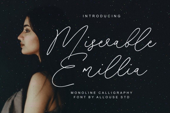
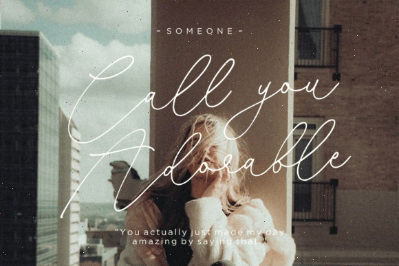
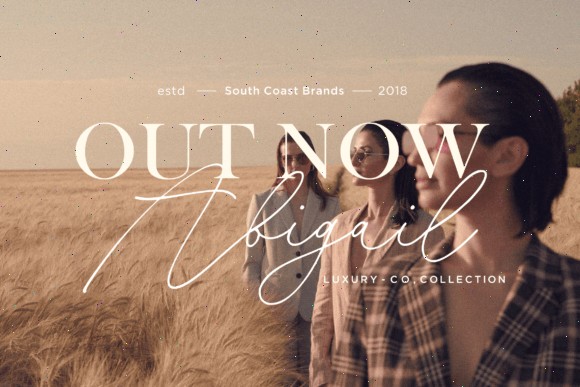
If your packaging style leans minimal, elegant, or boutique-inspired, Miserable Emillia is one of those fonts that instantly feels expensive.
It has a clean monoline signature look that works beautifully on modern luxury packaging without feeling overly decorative. Some script fonts try too hard with giant swashes and dramatic curves. This one stays controlled.
That restraint actually makes it feel more premium.
I could easily picture this on:
- perfume bottles
- minimalist skincare jars
- boutique candle labels
- jewelry packaging
- fashion tags
- wedding gift boxes
What I like most is the spacing. The thin strokes leave a lot of breathing room, which works really well for modern packaging trends where the typography becomes the main visual element.
This font also pairs beautifully with serif fonts like:
- Playfair Display
- Cormorant Garamond
That combination gives packaging a very polished editorial look.
If you’re building a luxury-style brand identity without making it feel overly flashy, Miserable Emillia does that naturally.
2. Beautymind
A Feminine Handwritten Font That Feels Modern
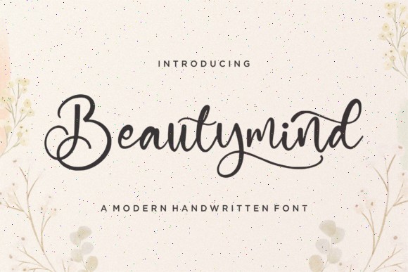
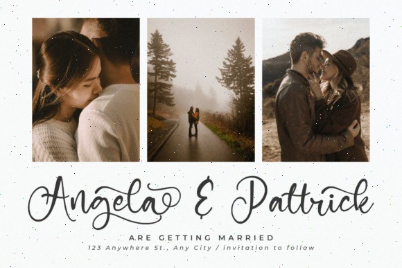
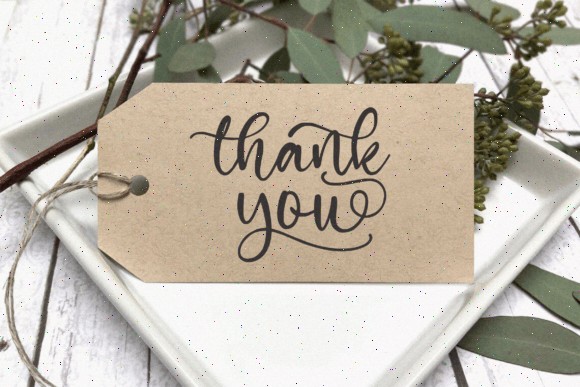
Some handwritten fonts immediately feel made for beauty packaging. Beautymind definitely falls into that category.
The lettering is soft, balanced, and readable — which honestly matters more than people think. A lot of trendy script fonts look gorgeous in previews but become frustrating on real labels.
Beautymind keeps enough clarity to still work on:
- skincare packaging
- makeup branding
- soap labels
- haircare products
- feminine wellness brands
- boutique fashion packaging
There’s also a polished Instagram-branding feel to it. I’ve seen very similar typography styles used on nude-toned cosmetic packaging lately, especially brands leaning into soft minimal aesthetics.
One detail designers will probably appreciate is that the font is PUA encoded, so accessing alternates and ligatures is pretty easy.
And those small typographic details matter. A subtle ligature tweak can make a logo feel custom instead of template-based.
This font would look especially good with:
- matte packaging
- embossed logos
- rose gold foil
- neutral color palettes
Simple packaging. Soft typography. Clean branding. It works.
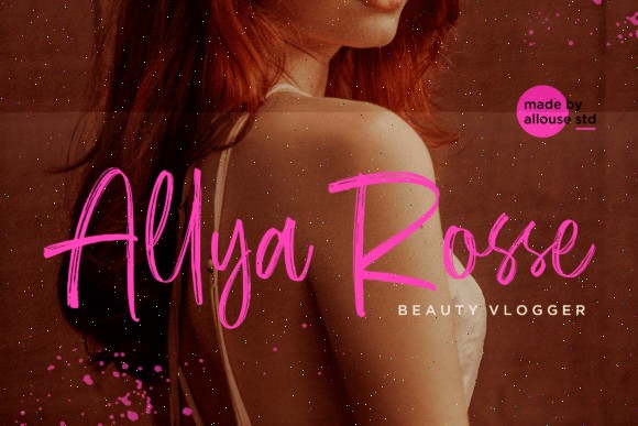
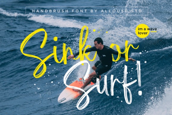
3. Brush Khalifa
A Bold Brush Script With More Energy
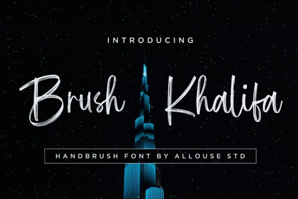
Not every packaging design should feel elegant or delicate.
Some brands need movement.
Brush Khalifa has that rougher handwritten brush style that feels energetic and creative without becoming messy. It works especially well for younger lifestyle brands or packaging that needs stronger shelf presence.
Best fits for this font:
- coffee bags
- streetwear labels
- creative merchandise
- energy drinks
- craft beverage packaging
- music-related branding
Brush-style fonts naturally create motion because the strokes imitate real paintbrush movement. That gives packaging a more expressive look compared to cleaner scripts.
I actually think this font looks strongest on darker backgrounds. White lettering on matte black packaging would look really good here.
Especially for coffee or apparel branding.
It also works well oversized. Some handwritten fonts fall apart when scaled large across packaging, but Brush Khalifa keeps its character.
This one feels confident without looking over-designed.
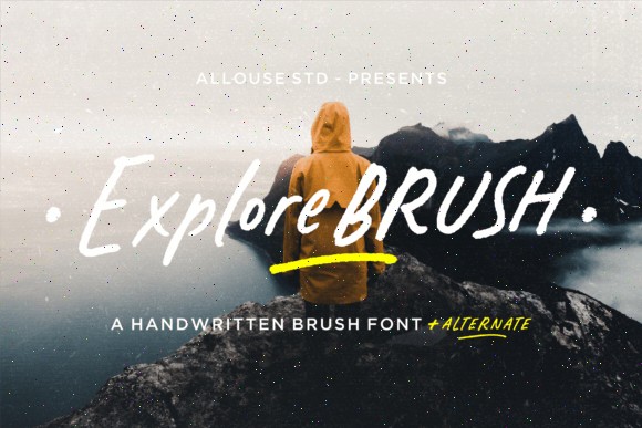
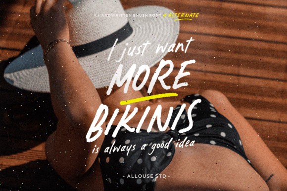
4. Explorebrush
An Adventurous Font for Outdoor and Lifestyle Brands
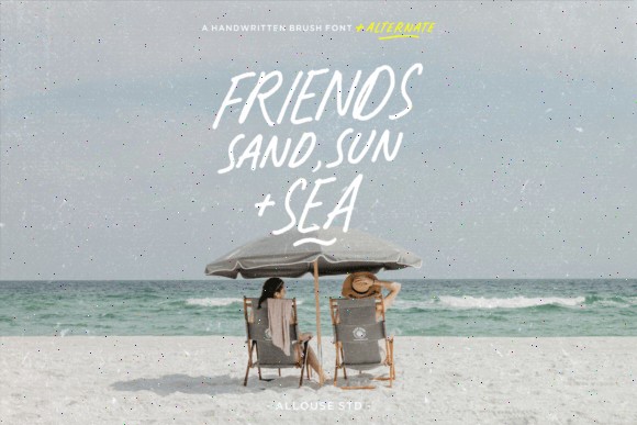
The name fits this font perfectly.
Explorebrush has that rugged handwritten texture that immediately feels connected to travel, outdoors, and handmade branding. The slightly imperfect brush texture makes it feel natural instead of overly polished.
And honestly, those imperfections are usually what make handwritten fonts feel believable.
This font works especially well for:
- camping gear packaging
- organic coffee brands
- eco-friendly products
- handmade soap labels
- adventure apparel
- lifestyle subscription boxes
I’ve noticed a lot of outdoor-inspired brands using typography like this lately paired with:
- kraft paper packaging
- muted greens
- earthy neutrals
- recycled textures
The combination instantly creates a more artisanal feeling.
What Explorebrush does really well is emotional storytelling. It doesn’t just label the package — it suggests a lifestyle around the product.
That’s a big reason handwritten branding performs so well visually on Pinterest too.
5. The Mallister
A Retro Handwritten Font With Vintage Packaging Charm
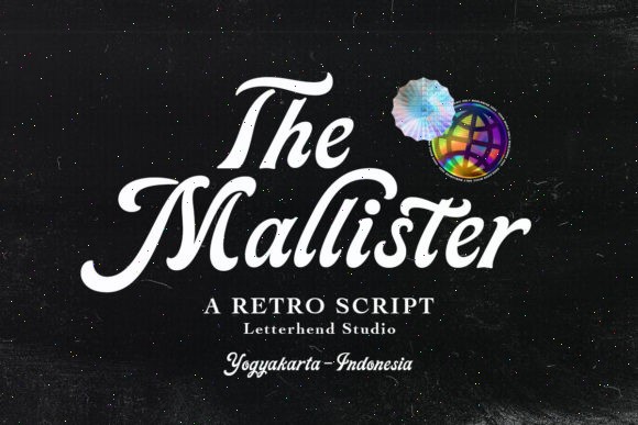
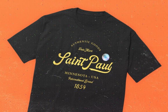
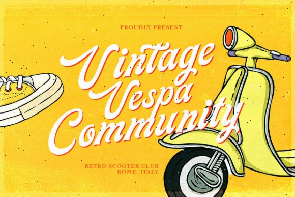
Retro-inspired packaging is everywhere right now.
Coffee brands, soda cans, chocolate packaging, barber products — vintage typography keeps showing up because it feels familiar and trustworthy.
The Mallister captures that old-school script look really nicely without becoming overly decorative.
This font feels especially strong for:
- coffee packaging
- whiskey labels
- bakery branding
- retro snack packaging
- barbershop products
- vintage-inspired apparel
One thing I like here is readability.
A lot of retro fonts become too exaggerated with giant curls and swashes. The Mallister still feels usable, even on smaller labels.
And that matters more in real packaging than people think.
The thicker lettering also helps with shelf visibility. Thin elegant scripts sometimes disappear from a distance, while this one still grabs attention.
Pair it with:
- mustard yellow
- cream
- forest green
- burnt orange
- navy blue
…and the branding instantly starts feeling nostalgic in a good way.
6. Rintica
Elegant Calligraphy for Luxury and Feminine Brands
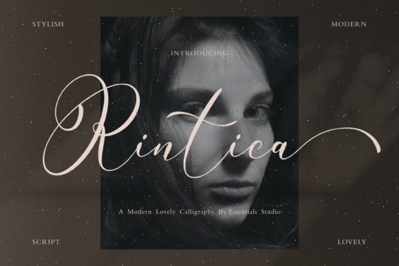
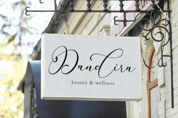
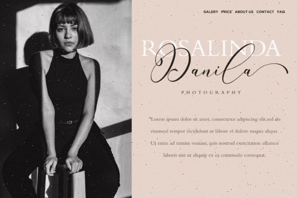
Rintica leans heavily into luxury branding, but in a quieter way.
Some elegant script fonts feel overloaded with decorative details. Rintica still has beautiful swashes and ligatures, but it stays refined enough to feel modern rather than overly formal.
This font works especially well for:
- perfume packaging
- bridal products
- jewelry branding
- premium candles
- boutique cosmetics
- luxury stationery
One thing I noticed while looking through the specimen is how smooth the letter connections feel. The ligatures create a really natural handwritten rhythm, which helps the typography feel more authentic.
That becomes important on minimalist packaging where the font is doing most of the visual work.
I could easily imagine this on:
- cream-colored rigid boxes
- gold foil labels
- embossed skincare packaging
- matte black perfume boxes
Very clean. Very upscale.
Another reason fonts like Rintica tend to age well is that elegant calligraphy usually survives design trends better than overly trendy handwritten styles.
If the goal is timeless luxury branding, this one makes a lot of sense.
7. Rateline
Bold Retro Lettering With Serious Shelf Presence
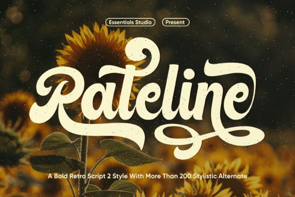
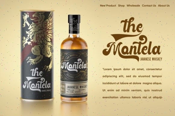
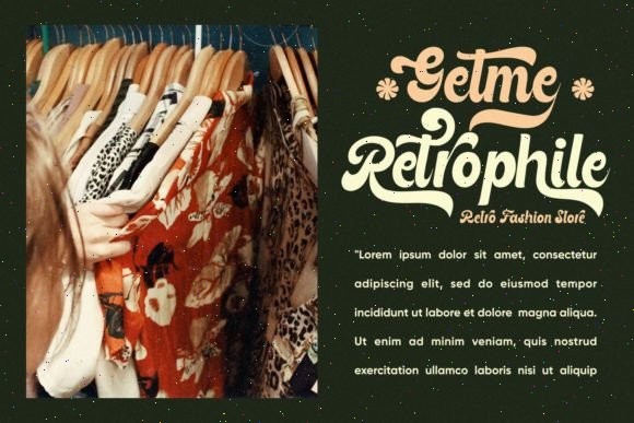
Rateline is much louder visually compared to something like Rintica.
And honestly, that’s the point.
This font has thick retro curves and oversized personality that immediately pulls attention toward the packaging. It feels playful, confident, and slightly vintage without looking outdated.
Best uses for Rateline:
- food packaging
- ice cream branding
- craft beverages
- hot sauce labels
- streetwear products
- festival merchandise
- retro snack brands
The font also includes a huge number of alternates, which gives designers a lot more flexibility when building custom-looking packaging layouts.
That matters because packaging starts feeling generic really fast when typography looks too “stock”.
Rateline works especially well with vibrant palettes:
- sunset orange
- teal
- mustard yellow
- cherry red
- cream tones
It’s definitely not a quiet font. This is the kind of typography that becomes the centerpiece of the packaging.
And for some brands, that’s exactly what you want.
8. Bohemian Fashion
A Minimal Handwritten Font for Boutique Branding
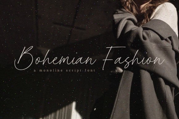
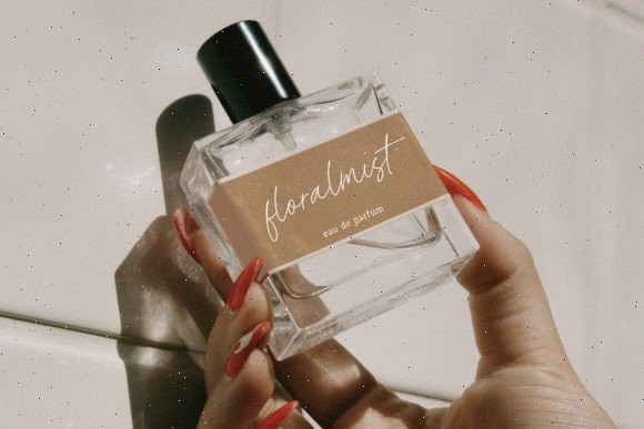
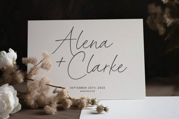
Bohemian Fashion proves that handwritten fonts don’t always need dramatic brush textures or giant swashes to feel stylish.
This one is thin, clean, and fashion-forward.
The monoline structure gives it a softer, more minimal look that works beautifully for modern boutique-style packaging.
Especially:
- skincare brands
- jewelry packaging
- boutique clothing labels
- minimalist candle brands
- organic beauty products
- lifestyle branding
I’ve seen very similar typography styles used on high-end Instagram skincare brands recently. Usually paired with muted colors, soft shadows, and minimal layouts.
The nice thing about thinner handwritten fonts like this is that they create intimacy without overwhelming the packaging.
It feels personal. Almost like a handwritten note from the founder.
This font would pair especially well with:
- sage green
- ivory
- beige
- blush pink
- charcoal gray
Simple combinations, but they photograph really well for social media and Pinterest content.
9. Amorfatti
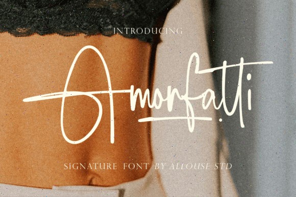
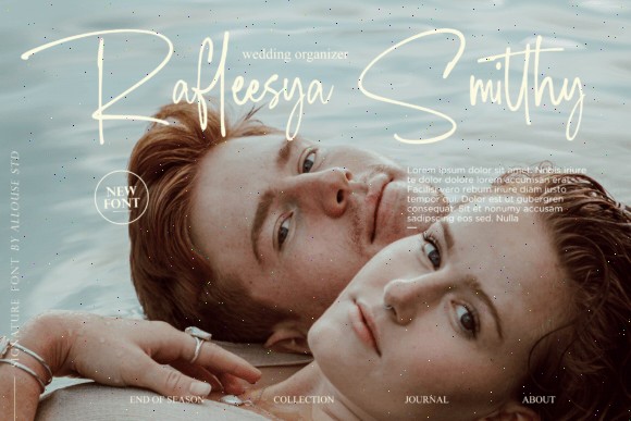
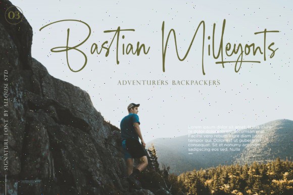
Signature fonts still dominate luxury branding for a reason.
Amorfatti has that confident handwritten signature aesthetic that instantly makes packaging feel more exclusive.
It works really well for:
- premium skincare
- luxury candles
- perfume labels
- fashion packaging
- jewelry boxes
- personalized gifts
- high-end stationery
One thing signature fonts do particularly well is create a founder-driven feeling around the brand. Even when customers know it’s digital typography, it still subconsciously feels more personal than generic corporate lettering.
That emotional effect matters a lot in boutique branding.
Amorfatti also works beautifully in logo-focused layouts with lots of white space. Honestly, some brands overcomplicate packaging with too many graphics when elegant typography would already do enough.
This font feels strongest when it’s allowed room to breathe.
I’d pair it with a clean serif for secondary text so the handwritten logo stays dominant without hurting readability.
10. Serenade Essentials
Soft Handwritten Typography for Lifestyle Packaging
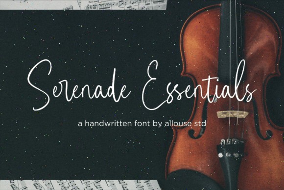
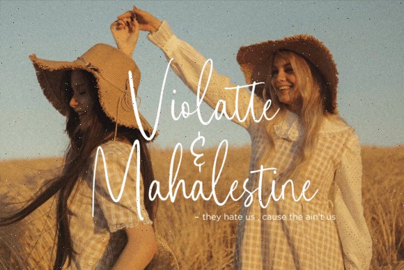
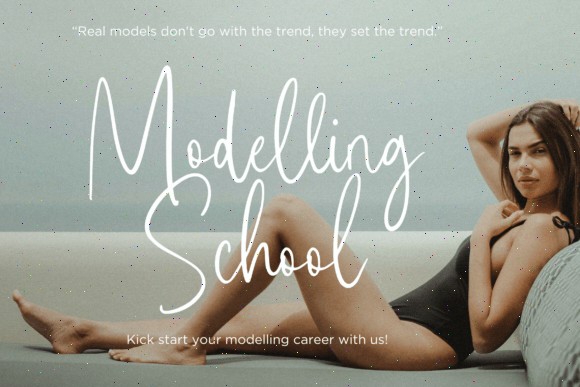
Serenade Essentials has a calmer feel compared to many handwritten fonts.
It doesn’t feel overly polished or aggressively trendy. Instead, it has a softer handwritten rhythm that works beautifully for brands trying to feel approachable and comforting.
Best fits include:
- handmade soap packaging
- tea labels
- wellness brands
- organic products
- home décor branding
- candle packaging
- self-care products
Some handwritten fonts feel too “designed.” This one feels more natural, which honestly makes it easier to trust visually.
I think that’s why softer typography performs so well in wellness packaging lately. Brands want products to feel calming before the customer even opens them.
Minimal packaging combined with relaxed handwritten typography can be surprisingly effective.
Especially on:
- textured paper labels
- kraft packaging
- muted earthy palettes
- matte finishes
This font quietly creates warmth without trying too hard.
11. Haiden Smith
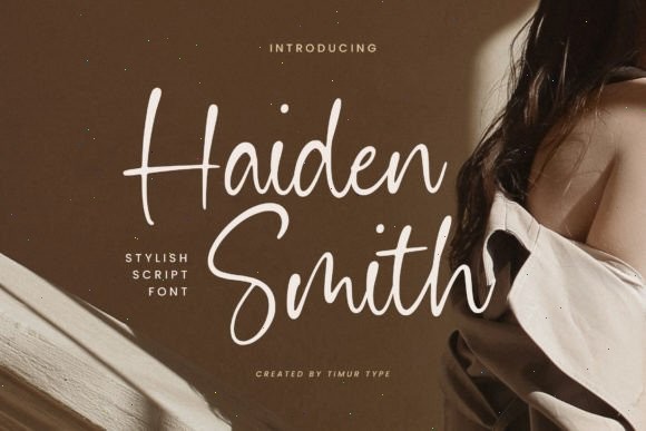
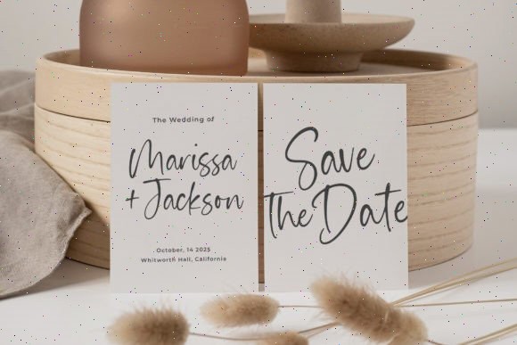
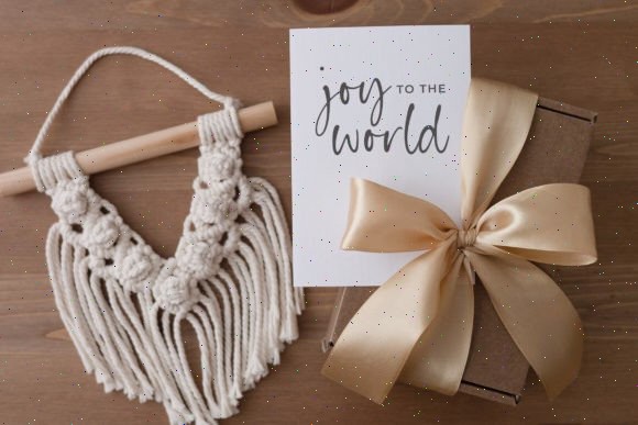
Haiden Smith sits somewhere between modern luxury and approachable handmade branding.
It has smooth clean strokes, but still keeps enough softness to feel personal rather than corporate.
That balance makes it extremely flexible for packaging design.
I could easily see this working on:
- artisan candles
- handmade skincare
- boutique coffee
- wellness packaging
- subscription boxes
- home décor brands
One thing I genuinely like here is readability. A lot of script fonts become difficult once scaled down on jars or small labels. Haiden Smith keeps its structure open enough to still feel usable.
That alone makes it more practical than a lot of trendy handwritten fonts floating around right now.
This font also fits really well into the “quiet luxury” aesthetic that’s been growing lately. Minimal packaging. Subtle typography. Nothing screaming for attention.
Just clean, confident branding.
And honestly, that style tends to age better long-term.
12. Cherylitta
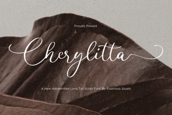
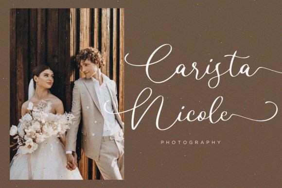
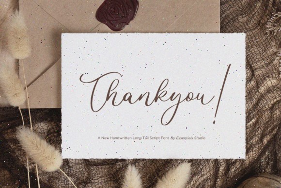
Long-Tail Script Typography for Elegant Packaging
If you like dramatic flowing scripts, Cherylitta is probably one of the strongest options on this list.
The long-tail lettering creates movement across packaging layouts in a way that feels very elegant without becoming chaotic.
Best suited for:
- wedding-themed products
- luxury cosmetics
- jewelry branding
- boutique packaging
- personalized gifts
- high-end stationery
Long-tail handwritten fonts naturally guide the eye across the design, which makes packaging feel more dynamic and refined.
This font also works especially well with:
- metallic foil
- embossed logos
- neutral palettes
- matte black packaging
- ivory or blush tones
One thing I’d avoid though is overcrowding the layout.
Fonts like Cherylitta look best when they have space. Too many graphics competing around them can make the packaging feel busy very quickly.
Used carefully, this font becomes the visual centerpiece almost by itself.
13. Besthies
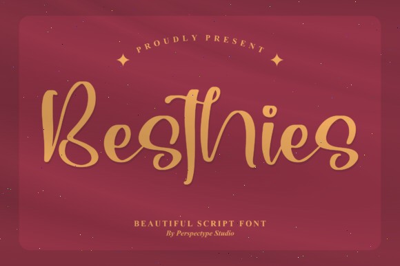
A Friendly Handwritten Font for Playful Packaging
Not every brand needs elegant luxury typography.
Sometimes packaging just needs to feel warm, cheerful, and approachable. That’s exactly where Besthies works really well.
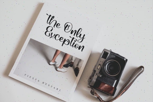
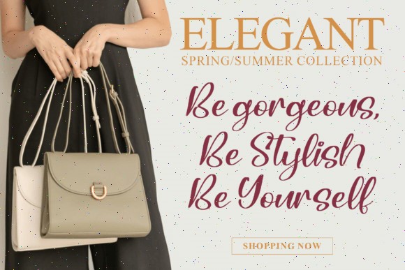
The lettering has a rounded, casual handwritten look that feels playful without becoming childish. It’s the kind of font that immediately makes packaging feel friendlier.
Best uses for Besthies:
- bakery packaging
- candy branding
- handmade crafts
- kids’ products
- DIY kits
- creative merchandise
- small Etsy-style brands
I’ve noticed fonts like this perform especially well for Instagram-focused handmade businesses. They photograph nicely and instantly give products that cozy “small creative shop” vibe people tend to love.
The font also includes an italic version, which helps when building packaging hierarchies or secondary branding elements.
This style pairs especially well with:
- pastel palettes
- playful illustrations
- sticker-style branding
- colorful packaging inserts
And honestly, not every product needs to feel ultra-premium. Friendly packaging can be way more memorable when it matches the audience correctly.
That’s where Besthies shines.
14. Biladhelpia
A Flexible Handwritten Font Bundle for Creative Packaging
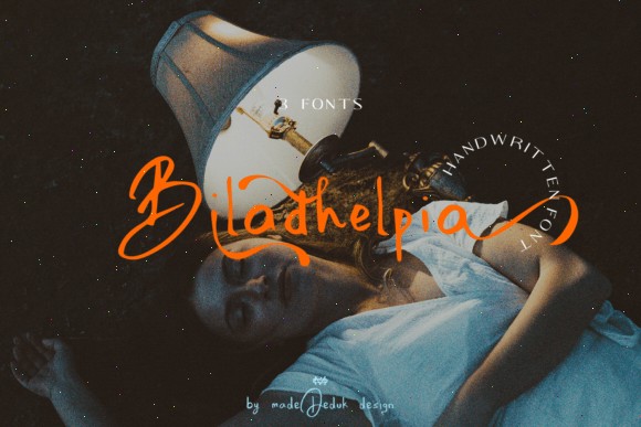
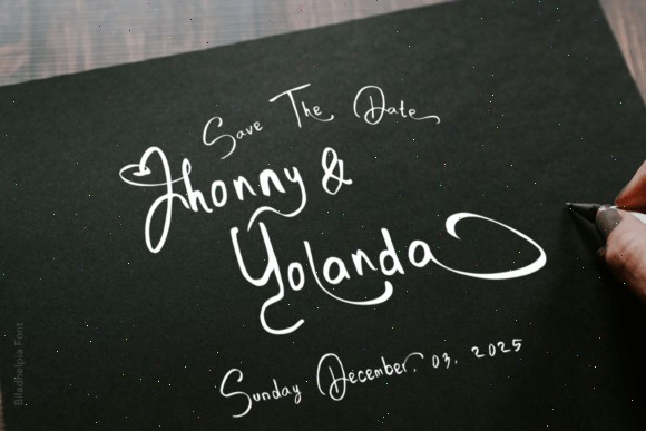
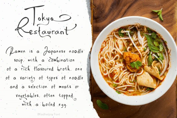
Biladhelpia is a little different from the other fonts here because it’s more of a flexible handwritten system rather than a single fixed style.
The bundle includes multiple handwritten variations along with alternates and ligatures, which makes it really useful for brands needing flexibility across different product lines.
Especially for:
- seasonal packaging
- handmade product collections
- creative brands
- organic products
- boutique labels
- artistic packaging
- lifestyle products
One thing I genuinely like about multi-style handwritten bundles is consistency. Brands can shift between rougher or cleaner typography styles without losing their overall visual identity.
That becomes helpful once product catalogs start growing.
Visually, Biladhelpia feels artistic and slightly imperfect in a good way. The handwritten texture keeps it from looking too digitally polished.
And right now, that more human look is exactly what a lot of smaller brands are trying to achieve.
This font also works nicely with layered packaging styles:
- collage aesthetics
- stamped graphics
- illustrations
- textured paper
- vintage-inspired layouts
If versatility matters more than having one extremely specific aesthetic, Biladhelpia offers a lot to work with.
While handwritten fonts offer a wonderful personal touch for packaging, if you're aiming for a more sophisticated and high-end feel, explore 18 Elegant Script Fonts for Luxury Packaging.
Conclusion
The right handwritten font can completely change how packaging feels before someone even touches the product.
Some fonts create elegance. Others feel artistic, nostalgic, playful, or handcrafted. And in crowded markets, those small emotional differences genuinely affect how people remember brands.
Personally, I think the best packaging typography usually feels intentional rather than trendy. A font doesn’t need to scream for attention to make packaging memorable.
Sometimes it’s just a clean handwritten logo on a simple matte label that ends up looking the most expensive.
Fonts like:
- Miserable Emillia
- Rintica
- Amorfatti
work beautifully for luxury branding.
Meanwhile:
- Brush Khalifa
- Explorebrush
- Rateline
bring much more energy and personality.
And softer fonts like:
- Besthies
- Serenade Essentials
- Bohemian Fashion
help packaging feel approachable and human.
That human feeling is probably why handwritten typography keeps working so well. Even with modern minimalist branding trends, people still connect emotionally to things that feel handmade or personal.
Especially small brands.
Sometimes the font really is the first thing people remember.
FAQ
Which handwritten font styles work best for luxury packaging?
Elegant signature fonts and refined calligraphy styles tend to work best for luxury packaging because they create a softer, more exclusive look without needing heavy graphics. Fonts like Rintica, Amorfatti, and Miserable Emillia work especially well on skincare, perfume, jewelry, and premium candle packaging.
Can handwritten fonts hurt readability on packaging?
Yes, especially if the font has overly decorative swashes or very thin strokes. A good approach is using handwritten fonts mainly for logos, headlines, or product names while keeping ingredients, instructions, and smaller details in a simpler readable font.
Are brush handwritten fonts good for minimalist packaging?
Usually brush fonts work better for bold, energetic, or artistic branding rather than minimalist packaging. Minimal layouts often look cleaner with monoline or signature-style handwritten fonts, while rough brush lettering tends to fit coffee brands, streetwear, creative products, and lifestyle packaging more naturally.
Which industries benefit most from handwritten packaging fonts?
Handwritten fonts work especially well in industries where emotional branding matters most, including skincare, beauty, candles, handmade crafts, boutique fashion, wellness products, coffee packaging, bakery branding, and personalized gifts because the typography helps products feel more human and memorable.
Follow Us