

ℹ️ Affiliate Disclosure: This article may contain affiliate links. We may earn a commission at no extra cost to you. Thanks for your support! ❤️
How Gothic Fonts for Halloween Invitations Set the Mood
The right typography can make a Halloween invitation feel like an old vampire proclamation, an elegant masquerade card, or a warning pulled from the door of a haunted house. These gothic fonts for Halloween invitations cover all three directions, with a few playful choices mixed in for family parties and less-serious celebrations.
My main rule is simple: use the dramatic font for the invitation headline, not every line of information. Gothic letterforms can create a strong first impression, but dates, addresses, RSVP details, and costume instructions still need to be easy to read.
Quick Picks
- Best overall gothic pick: Taylor Gothic
- Best elegant option: The Gallant
- Best dark-fantasy option: Vampire Mansion
- Best witchy option: Ancient Witches
- Best for full horror: Killer Bloods
How I Picked These
I compared these fonts by headline readability, gothic character, invitation suitability, decorative complexity, versatility across formal and playful Halloween themes, and how easily each style can be paired with simpler supporting type for dates, addresses, and RSVP details.
Best Elegant and Traditional Gothic Fonts
These are my picks for formal Halloween dinners, masquerade parties, gothic weddings, candlelit gatherings, and invitations designed to resemble antique notices.
1. Taylor Gothic
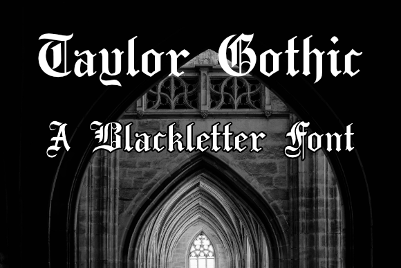
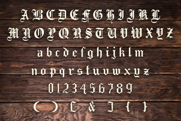
Taylor Gothic is the traditionalist in this group. Its bold blackletter construction gives a headline instant medieval weight without covering every letter in extra horror effects.
I’d use it for a short title such as “Midnight Masquerade” or “All Hallows’ Feast.” The relatively restrained decoration makes it easier to handle than many elaborate blackletter fonts, although I would still pair it with a simple serif or sans serif for the event information. It supports standard desktop platforms and common cutting-machine workflows.
Best for: Masquerades, formal dinners, medieval themes
Key features: Bold blackletter style, traditional proportions, strong headline presence
2. Koch Fraktur
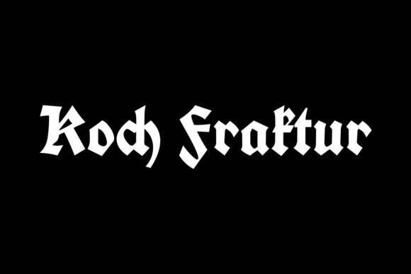
Koch Fraktur has a historical, printed-page quality that suits invitations styled like decrees, old bookplates, or mysterious European notices. The upright structure feels serious rather than cartoonishly spooky.
My take: this is strongest when the rest of the design is controlled. Try it with a cream paper texture, black ink, thin ornamental borders, and one dark accent. It is compatible with Windows, Mac, Linux, Cricut, Silhouette, and other cutting machines.
Best for: Antique notices, literary parties, vintage invitations
Key features: Fraktur construction, upright letterforms, old-world tone
3. The Gallant
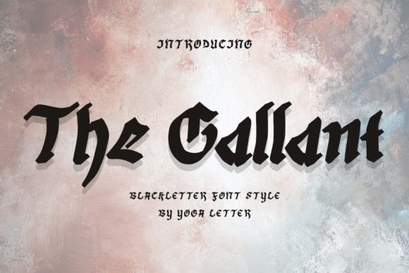
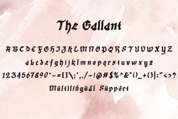
The Gallant softens the heaviness of blackletter with a more polished, decorative finish. It still reads as gothic, but it can move comfortably into an elegant invitation without making the event look like a metal concert.
I like it for gothic romance, Victorian Halloween parties, or a black-and-burgundy dinner invitation. The character set includes uppercase and lowercase letters, numerals, punctuation, and multilingual support, which gives you more flexibility when setting names and short phrases.
Best for: Gothic romance, Victorian parties, formal invitations
Key features: Elegant blackletter style, multilingual support, numerals and punctuation
4. Gothic Bold
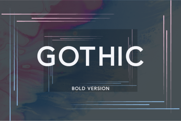
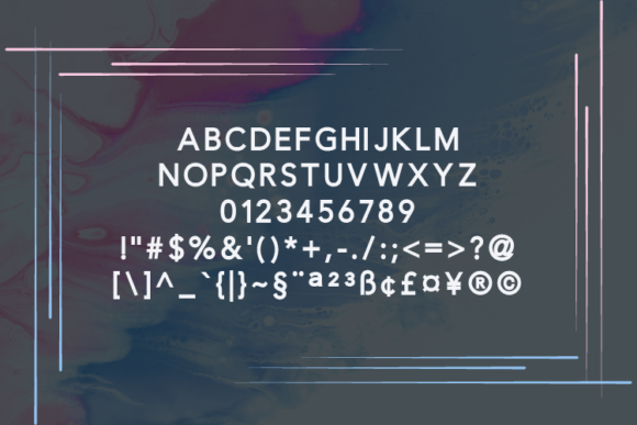
Despite its name, Gothic Bold takes a cleaner, more modern route than the historical blackletter options. Its sans serif construction makes it a useful bridge between spooky styling and practical readability.
I’d grab this for a contemporary invitation with black backgrounds, oversized typography, and minimal illustrations. It can also carry secondary headings more comfortably than the highly decorative fonts in this roundup. Pair it with a handwritten accent only when you need a little extra personality.
Best for: Modern parties, minimalist invitations, secondary headings
Key features: Bold sans serif structure, clean edges, usable at smaller sizes
Best Vampire and Dark-Fantasy Fonts
These fonts lean into fangs, castles, sharp terminals, fantasy games, and vintage horror imagery.
5. Vampire Gothic
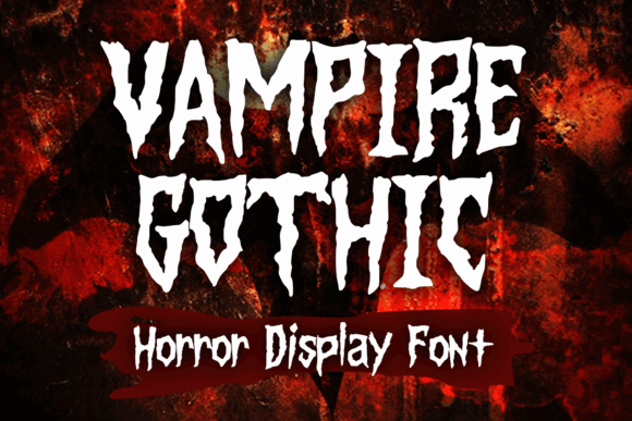
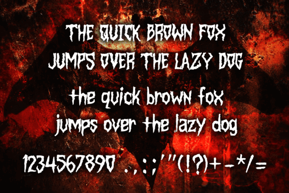
Vampire Gothic mixes vintage horror, comic-book energy, and metal-inspired shapes. It is less historically formal than Taylor Gothic and far more theatrical.
This would be my pick for a vampire ball, horror-movie marathon, or costume party where the invitation needs to feel fun as well as menacing. Keep the title large enough for the sharp details to stay visible, and avoid placing it over a busy photograph.
Best for: Vampire parties, horror screenings, costume events
Key features: Vintage-horror influence, sharp detailing, playful dark tone
6. Vampire Mansion
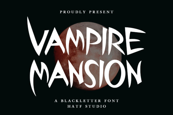
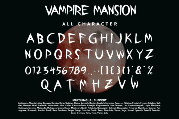
Vampire Mansion has the strongest haunted-castle personality of the bunch. Its blackletter base and horror-inspired styling suggest iron gates, candlelit corridors, and dramatic family crests.
I’d use it for a short main heading surrounded by architectural details such as arches, keys, bats, or ornamental frames. It may feel too intense for a casual pumpkin-carving party, but it fits a themed dinner or immersive mystery night beautifully.
Best for: Haunted mansions, mystery dinners, castle themes
Key features: Blackletter foundation, gothic-horror shapes, dramatic silhouette
7. Wicked Gothic
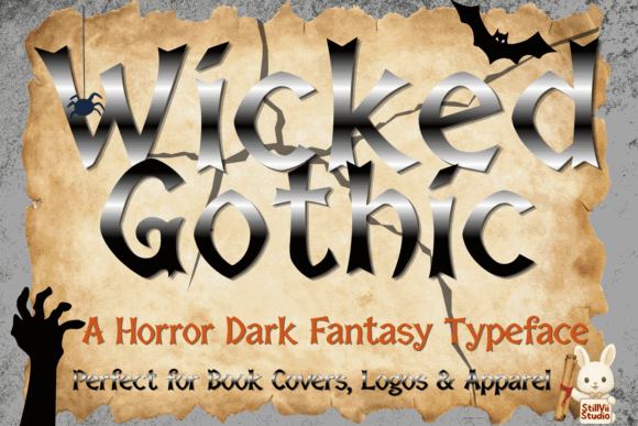

Wicked Gothic pushes sharp, fang-like details into the letterforms. The result is aggressive, angular, and clearly intended for dark fantasy or horror rather than historical realism.
I like it for one- or two-word headlines: “Wicked,” “Uninvited,” or “After Dark.” Longer phrases may become visually crowded, so give the letters room and keep the supporting copy neutral. A smoky background or red wax-seal motif would reinforce the mood without competing with the type.
Best for: Dark fantasy, vampire events, dramatic headlines
Key features: Fang-like terminals, sharp angles, high-impact display style
8. Valmeria
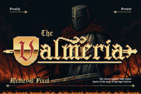
Valmeria feels like gothic lettering filtered through a dark fantasy role-playing game. It has sharp edges and carefully shaped curves, giving it a more polished look than a distressed horror font.
This is a strong option for invitations built around fantasy quests, cursed kingdoms, medieval banquets, or elaborate costume themes. I would pair it with a sturdy serif and use bronze, silver, or aged-gold accents rather than the standard Halloween orange.
Best for: Dark fantasy, medieval banquets, role-playing events
Key features: Sharp edges, sculpted curves, fantasy-inspired styling
Best Witchy and Occult-Inspired Fonts
These choices suit potion parties, coven gatherings, tarot nights, celestial themes, and invitations built around mystical symbols.
9. Ancient Witches
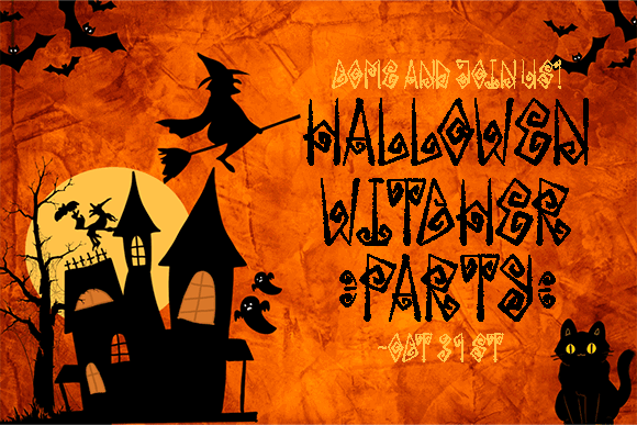
Ancient Witches combines rune-like shapes, spirals, carved geometry, and occult-inspired details. It creates a handcrafted magical atmosphere rather than a polished Victorian one.
I’d reserve it for the main title and perhaps one decorative phrase. It is PUA encoded, so its extra glyphs and alternate characters can help you customize a heading or create a symbol-rich layout. The font also supports common desktop platforms and cutting-machine software.
Best for: Witch gatherings, potion parties, occult themes
Key features: Rune-inspired forms, PUA-encoded extras, geometric details
10. Gothic Skull
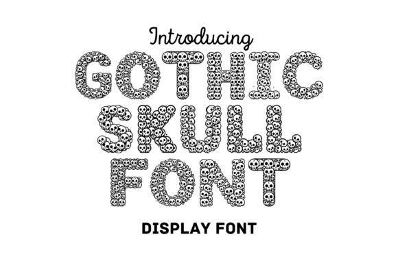
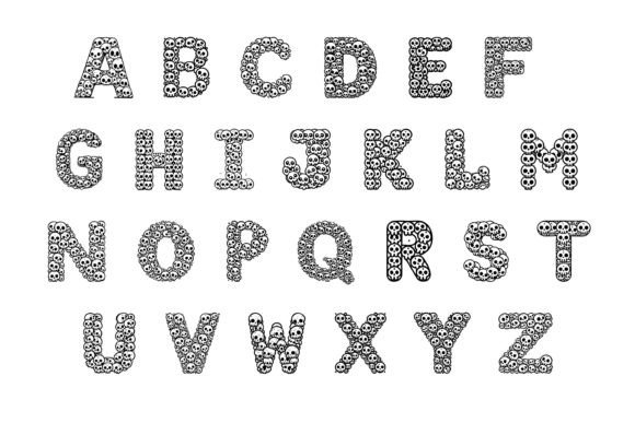
Gothic Skull builds skull imagery directly into the alphabet, so it does a large part of the decorating for you. That can be useful when you want a bold invitation without adding several separate clip-art elements.
Because the letters contain detailed motifs, I would use this only at display size. It is better for “Enter If You Dare” than for an address or RSVP deadline. Give it a plain background and plenty of contrast so the skull shapes remain recognizable.
Best for: Skeleton parties, graveyard themes, bold novelty invites
Key features: Integrated skull motifs, decorative alphabet, strong visual texture
11. Fang
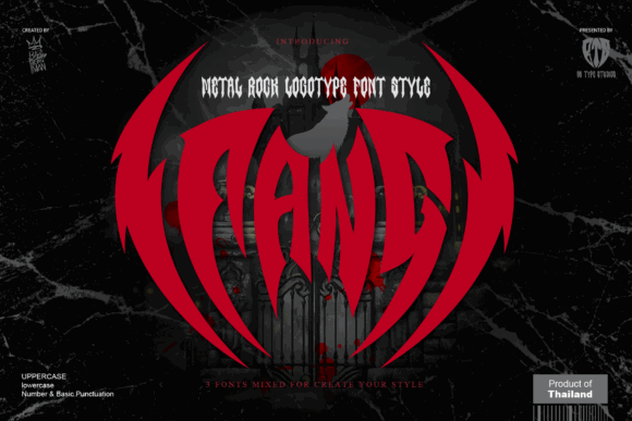
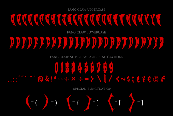
Fang is a direct, theme-forward choice for vampire and creature-inspired invitations. Even its name sets a clear direction, which makes it useful for designers who want the type to communicate the concept before guests read the details.
My preference would be to use it with restraint: one large title, a small bat or bite-mark illustration, and a clean block of supporting information. Too many competing horror devices could make the layout feel more like packaging than an invitation.
Best for: Vampire birthdays, monster parties, creature features
Key features: Horror display styling, sharp personality, headline-focused design
12. Toxic Night
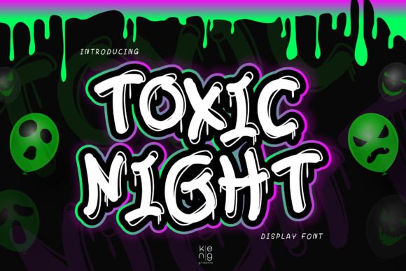
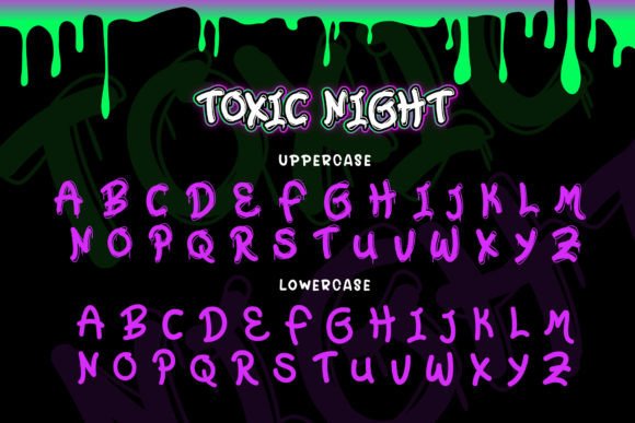
Toxic Night combines a stylish display structure with blood-trail inspiration. That gives it a cleaner starting point than many dripping fonts while retaining an obvious Halloween edge.
I’d choose it for a fashionable adults-only party, nightclub event, or contemporary invitation using black, acid green, violet, or deep crimson. Its decorative marks should remain concentrated in the headline; a plain geometric sans serif can handle the practical details underneath.
Best for: Nightclub parties, adult events, modern horror themes
Key features: Blood-inspired detailing, chic display structure, dramatic contrast
Best Creepy Halloween Display Fonts
These fonts are less formal and more theatrical. They suit haunted attractions, scary movie nights, zombie parties, and playful seasonal gatherings.
13. Gritluef
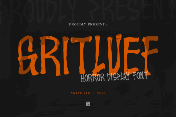
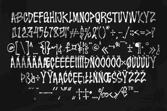
Gritluef is a horror display font designed specifically for spooky posters, creepy projects, and Halloween invitations. It has the irregular energy I’d expect from a haunted-house sign or slasher-film title.
This is not the font I would choose for an elegant dinner. It is the one I’d choose for a party promising jump scares, fake blood, or a basement horror marathon. Use it large, keep the line short, and let the uneven forms create the atmosphere.
Best for: Haunted houses, horror marathons, scary parties
Key features: Irregular display forms, distressed mood, high visual energy
14. Killer Bloods

Killer Bloods is the most graphic horror choice here. Dripping shapes, rough edges, sharp curves, and a hand-drawn finish make it look intentionally unstable.
My pick for this font would be a short warning-style headline rather than the event’s formal name. Try “You’ve Been Summoned” or “No One Leaves Early.” It is PUA encoded, giving you access to extra characters and alternates for a more customized display.
Best for: Slasher themes, haunted attractions, horror-film parties
Key features: Dripping details, uneven edges, PUA-encoded alternates
15. The Spooky Time
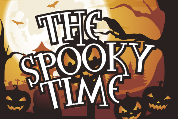
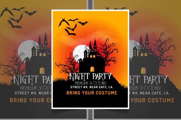
The Spooky Time lands on the friendlier side of Halloween display typography. It still looks seasonal, but it does not carry the same violent or sinister associations as Killer Bloods.
I’d use it for family parties, classroom invitations, trick-or-treat gatherings, or neighborhood events. It works with Windows, Mac, Linux, Cricut, Silhouette, and other cutting machines, making it practical for both printable cards and coordinating craft decorations.
Best for: Family parties, classroom events, trick-or-treat nights
Key features: Playful spooky style, approachable shapes, cutting-machine compatibility
16. Retro Spooky
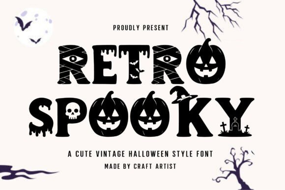
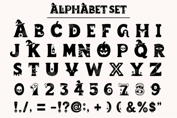
Retro Spooky is useful when you want Halloween atmosphere without medieval blackletter or graphic gore. Its decorative, vintage-leaning character can support invitations inspired by old advertisements, mid-century party cards, or campy monster movies.
I’d pair it with simple illustrations and a limited palette rather than layers of distressed texture. It supports major desktop systems and popular cutting-machine workflows, so it can carry across invitations, signs, labels, and matching party favors.
Best for: Retro parties, campy horror, vintage monster themes
Key features: Decorative construction, nostalgic mood, broad software compatibility
Which Gothic Font Should You Choose for a Halloween Invitation?
My most versatile pick is Taylor Gothic because it brings recognizable gothic character without relying on skulls, drips, or other fixed Halloween symbols. The Gallant is my choice for a refined invitation, while Vampire Mansion fits a full dark-fantasy concept.
For witchy designs, Ancient Witches offers the most distinctive magical personality. For unapologetic horror, Killer Bloods is the boldest option. Families and classroom hosts may find The Spooky Time easier to adapt to a cheerful Halloween event.
Whichever font you choose, let it create the first impression rather than carry every piece of information. One strong gothic title paired with calm, readable details will usually look more polished—and make it much easier for guests to know where they are supposed to be.
FAQ
What is the best gothic font for a Halloween invitation?
Taylor Gothic is a versatile starting point for a traditional Halloween invitation. It has clear blackletter character without the added skulls, drips, or highly specific imagery found in novelty horror fonts.
Can I use a gothic font for all the invitation text?
I would not use an ornate gothic font for every line. Keep it for the event name or one short phrase, then set the date, address, RSVP information, and instructions in a simpler serif or sans serif.
Which gothic fonts look elegant rather than scary?
The Gallant, Koch Fraktur, Taylor Gothic, and Gothic Bold can support a more refined layout. The result also depends on the surrounding design, especially the color palette, spacing, borders, and illustrations.
What font size should I use for a Halloween invitation title?
The best size depends on the card dimensions and length of the title. As a starting point, treat gothic fonts as large display type and test the invitation at its final printed size. If internal details disappear or neighboring letters merge, increase the size or choose a less ornate font.
Save to Your Inspiration Board
Follow Us