

ℹ️ Affiliate Disclosure: This article may contain affiliate links. We may earn a commission at no extra cost to you. Thanks for your support! ❤️
How to Choose the Best Creepy ABC Fonts for Your Project
Creepy ABC fonts can make ordinary alphabet projects feel spooky without making every design look like a horror-movie poster. I chose fonts with clear letter shapes, distinctive Halloween details, and enough visual weight for posters, stickers, bulletin boards, flash cards, and classroom displays. The mix includes dripping letters, monster styles, outlined faces, and kid-friendly decorative alphabets.
My strongest all-around picks are Halloween by Color Alphabet for colorful classroom materials, Monster Halloween by Reyrey Blue for bold stickers, and The Horror for outlined poster headlines. Choose simpler silhouettes for cutting machines and detailed color fonts for printed worksheets, labels, or wall displays.
Quick Picks
| Font | Best for | Format or style |
|---|---|---|
| Halloween by Color Alphabet | Classroom displays | Color and black font |
| Monster Halloween by Reyrey Blue | Stickers and signs | Dripping display font |
| The Horror | Large posters | Chunky outlined font |
| Scary Drip | Kid-friendly Halloween crafts | Rounded dripping font |
| Halloween Ghost | Vinyl projects | Bold dripping font |
| Halloween Alphabet | Printable ABC activities | Detailed color font |
| Spooky Scary Creepy | Dramatic headlines | Halloween display font |
| Monster Kids | Elementary classroom projects | Childlike handwritten font |
| Creepy Spooky | Party labels | Dripping display font |
| Night Witch Halloween | Book and movie themes | Sinister display font |
| Halloween | Decorative titles | Embellished display font |
| Horror Monster | Posters and banners | Heavy display font |
| Creepy | Friendly spooky designs | Playful display font |
| The Creepy | October party projects | Decorative Halloween font |
| Halloween Creepy | Readable signs | Friendly display font |
| Creepy Halloween | Bold alphabet cards | Thick display font |
| Scary Spooky | Seasonal worksheets | Decorative font |
| Spooky Halloween | Haunted-house flyers | Sharp sans serif |
| Monster Halloween by Nun Sukhwan | Playful decorations | Curly handwritten font |
| Spooky by Color Studio | Full-color printables | OpenType-SVG color font |
| Horrors | Shirts and poster titles | Bold display font |
| Scary Horror | Dark themed graphics | Horror display font |
How I Picked These
I compared these options by how well they fit the article’s intended use, including readability, visual character, practical versatility, distinctive features, and how clearly each choice differs from the rest of the roundup. I prioritized options that solve a specific design need rather than simply adding more similar-looking products.
1. Halloween

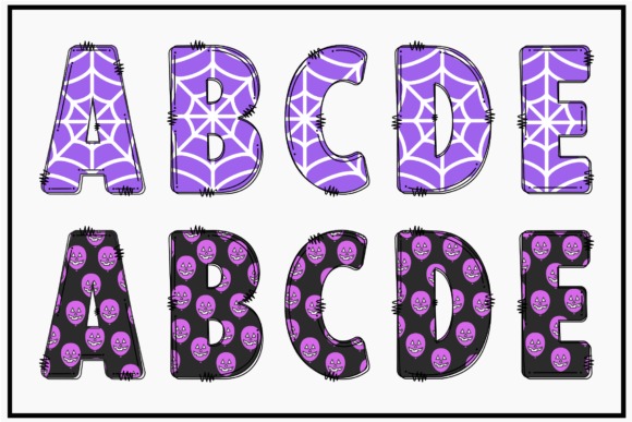
Halloween by Color Alphabet is a detailed color font for teachers and crafters who want every letter to carry a playful seasonal personality. Its illustrated appearance makes it especially useful for ABC posters, door signs, name labels, reading-center headers, and printable classroom decorations.
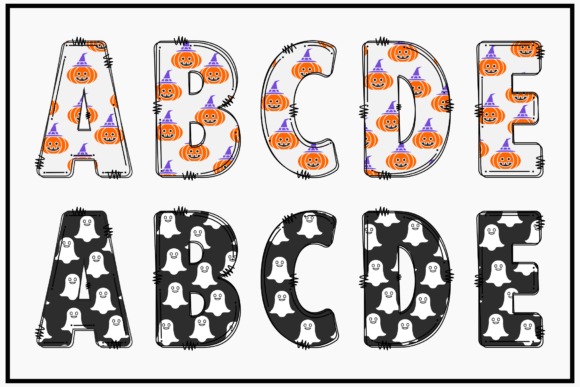
My favorite practical detail is the included black version, which gives you a cleaner option for cutting machines and one-color printing. The decorative version may become busy in small body text, so I would reserve it for individual letters, names, and short headings.
Best for: classroom alphabet posters, printable labels, Cricut projects
Key features: color letterforms, black version, detailed Halloween styling
2. Monster Halloween
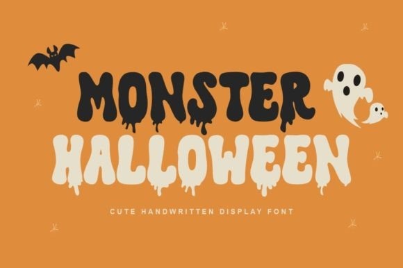
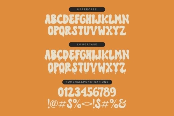
Monster Halloween by Reyrey Blue is a bold dripping font for stickers, signs, and headlines that need an obvious spooky-season identity. Its substantial letter shapes should remain noticeable on water-bottle decals, treat-bag labels, bulletin-board titles, and party posters.
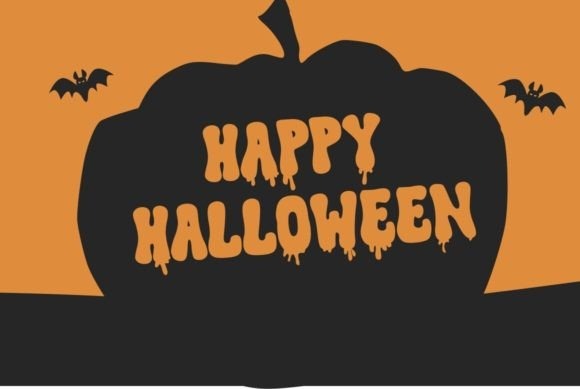
I like this one when the design needs fright and fun in roughly equal measure. The drips create strong character, but they also add small contours that may require slower weeding when the text is cut at a compact size.
Best for: stickers, party signs, bold classroom headings
Key features: dripping details, heavy forms, playful monster mood
3. The Horror
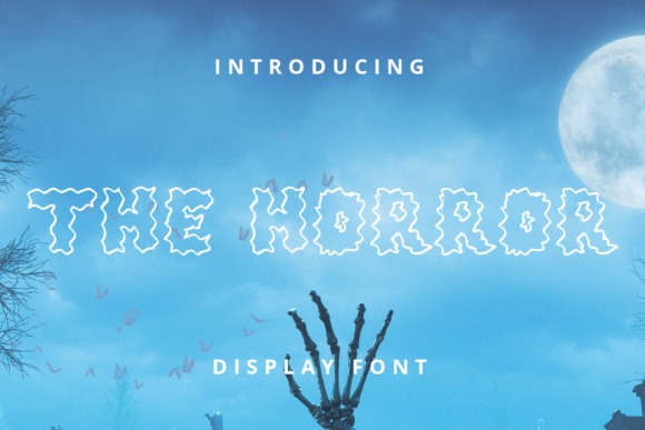
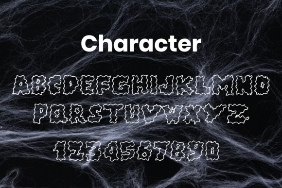
The Horror is a chunky outlined display font for oversized poster titles and alphabet letters that need strong separation from the background. Its broad shapes can carry contrasting fills, shadows, patterns, or classroom colors without losing the essential letter structure.
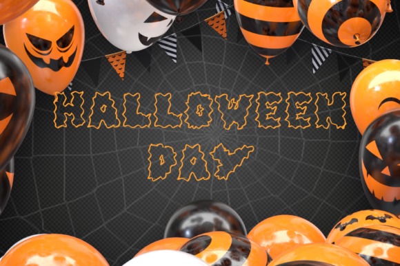
This is my pick for designs viewed from across a room because the outline can help each character stay defined. It is less appropriate for long instructions or reading passages, where its heavy construction would slow down scanning.
Best for: hallway posters, bulletin boards, large stickers
Key features: chunky lettering, outlined construction, high-impact display style
4. Scary Drip
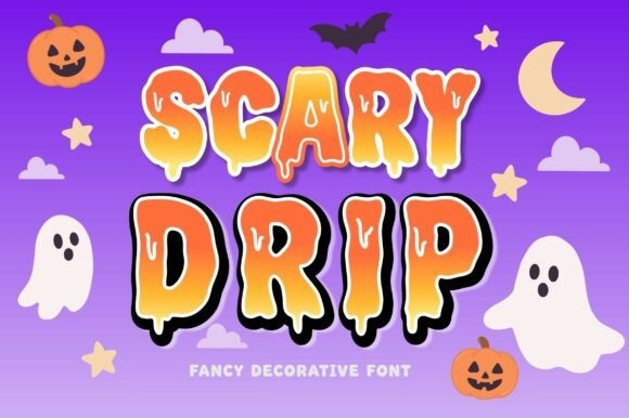
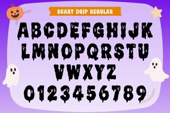
Scary Drip is a rounded Halloween font for younger audiences, cute-spooky stickers, and friendly classroom decorations. Its chunky letters soften the horror theme, while the hanging drips provide enough seasonal detail to make short words immediately recognizable as Halloween designs.
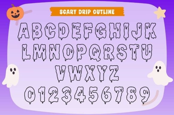
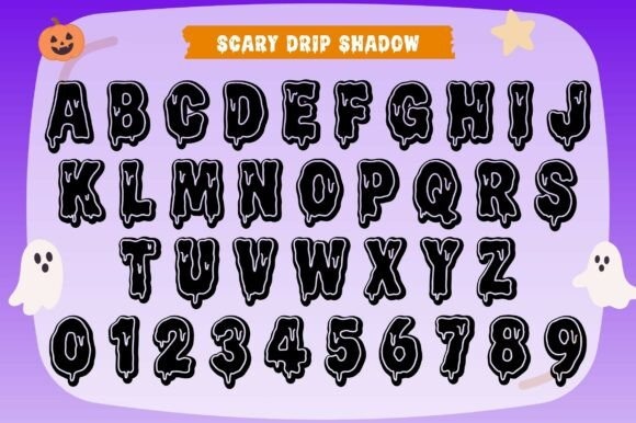
I would use this for preschool or elementary materials before choosing a sharper horror typeface. The rounded construction is inviting, though the dripping baseline can make tightly stacked lines look crowded unless you add generous spacing.
Best for: elementary classrooms, cute stickers, treat-bag tags
Key features: rounded letters, dripping accents, friendly creepy style
5. Halloween Ghost
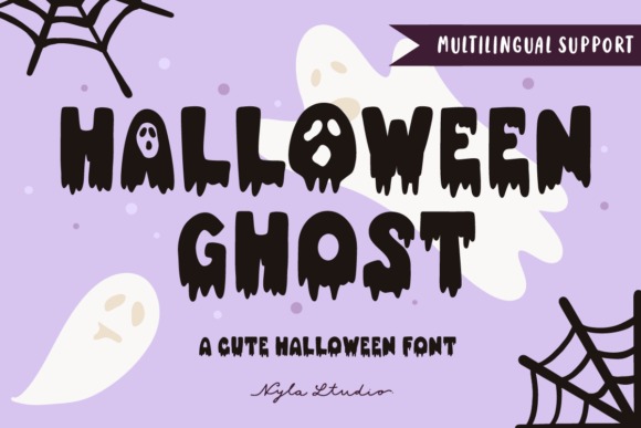
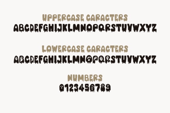
Halloween Ghost is a dripping display font for vinyl quotes, invitations, mugs, stickers, and retro-inspired seasonal graphics. The prominent Halloween silhouette gives simple words plenty of personality, making it useful when the typography needs to function as the main illustration.
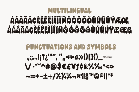
I like it most for short names and phrases rather than a complete paragraph. Its decorative edges should read clearly at poster scale, but small adhesive-vinyl projects may benefit from simplifying the design or increasing the finished width.
Best for: vinyl decals, mugs, Halloween invitations
Key features: dripping style, bold letter shapes, retro seasonal character
6. Halloween Alphabet
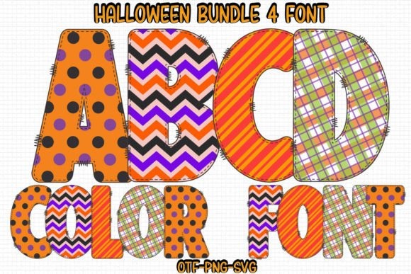
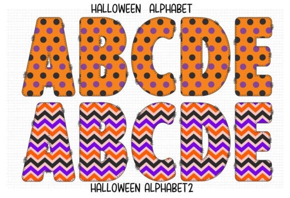
Halloween Alphabet by Color Studio is a detailed color font created for posters, school designs, flyers, and themed cover art. It is a natural match for ABC activities because individual characters can stand alone as decorative illustrations rather than relying on a full word for context.
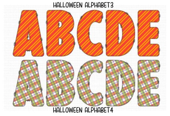
My take is that this font earns its place in print-first projects, especially alphabet cards and wall displays. Detailed colored letters can behave differently across design software, so confirm that your preferred program supports the format before building an entire classroom set.
Best for: printable ABC cards, school posters, seasonal worksheets
Key features: detailed color letters, alphabet-focused styling, print-friendly personality
7. Spooky Scary Creepy
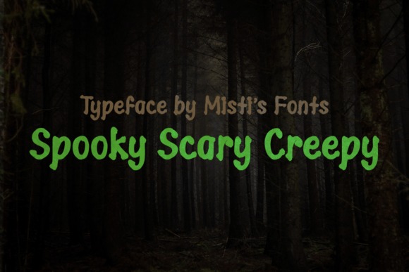
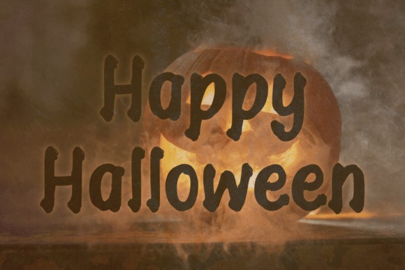
Spooky Scary Creepy is a dramatic Halloween typeface for posters, event titles, and seasonal graphics that should feel more theatrical than cute. It can give a basic alphabet layout a unified haunted theme without requiring separate illustrations around every character.

I would pair it with a plain sans serif for dates, directions, or classroom instructions. Its personality is the main attraction, but that same intensity can compete with smaller supporting information when every text element uses the font.
Best for: poster headlines, Halloween events, dramatic ABC art
Key features: theatrical mood, decorative letterforms, strong headline presence
8. Monster Kids


Monster Kids is a childlike handwritten Halloween font for classroom signs, story titles, and projects that should look as though the letters came from a mischievous monster. Its combination of irregular handwriting and dripping or slimy effects suits younger-audience designs particularly well.

I like the intentionally imperfect rhythm for spelling games and silly monster names. Because the baseline and strokes are informal, I would not use it to teach formal letter formation or as the primary model on handwriting practice sheets.
Best for: monster units, story titles, classroom door signs
Key features: childlike handwriting, slime effects, playful irregularity
9. Creepy Spooky


Creepy Spooky by Arendxstudio is a dripping font for Halloween labels, favor stickers, party headings, and compact seasonal signs. It balances recognizable alphabet forms with exaggerated liquid details, giving a plain word or initial an immediate Halloween treatment.
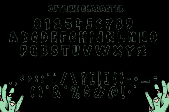
This is a useful middle-ground option when a cute bubble font feels too gentle but a jagged horror font feels too severe. The drips extend the visual height of each line, so allow extra space around text when arranging multiple labels on one sheet.
Best for: party labels, favor stickers, spooky names
Key features: dripping letters, readable core shapes, fright-and-fun balance
10. Night Witch Halloween
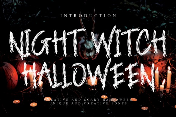
Night Witch Halloween is a sinister display font for scary book covers, movie-themed posters, game graphics, and older-student classroom displays. Its darker tone makes it suitable for designs built around witches, haunted stories, mysterious vocabulary, or classic horror imagery.
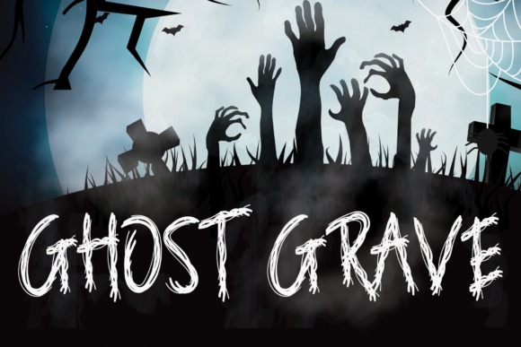
I would choose this over a cartoon monster font when the project needs tension rather than humor. The sinister forms may be too intense for early-elementary decorations, but they can suit middle-school reading events or theatrical promotions.
Best for: book covers, reading events, witch-themed posters
Key features: sinister appearance, display-focused forms, cinematic atmosphere
11. Halloween
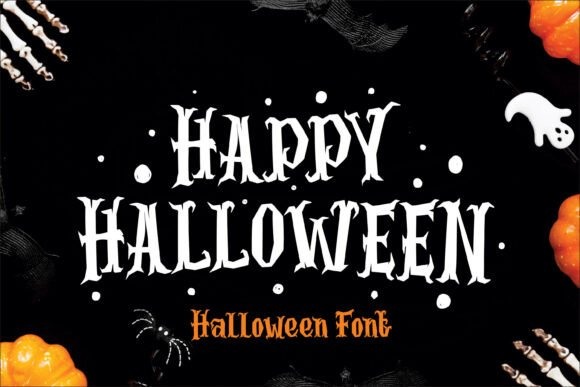
Halloween by Umitype is an embellished display font for decorative alphabets, poster headings, and themed words that need cobweb-like or bat-inspired details. The elongated shapes create a recognizable haunted silhouette even before color, texture, or illustration is added.
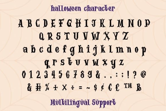
I like this font for one large letter per page, such as an A-to-Z hallway display or individual student initials. Its extended decorative parts can collide when letters are packed tightly, making generous tracking and line spacing especially important.
Best for: alphabet wall displays, initials, haunted poster titles
Key features: creepy embellishments, elongated details, decorative silhouette
12. Horror Monster
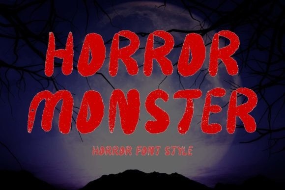
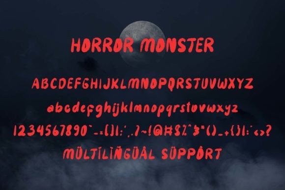
Horror Monster is a forceful display font for banners, stickers, horror titles, and posters that need thick, attention-grabbing typography. It is especially suited to short words such as “Boo,” “Beware,” or “Monsters,” where each letter can occupy substantial visual space.
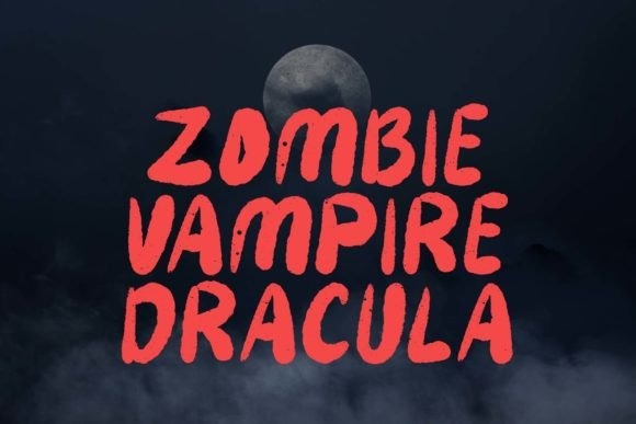
This is one of my stronger choices for older audiences and high-contrast graphics. The heavy personality may overpower cute illustrations, so I would pair it with equally bold monsters, dramatic textures, or simple solid-color backgrounds.
Best for: banners, horror stickers, large warning signs
Key features: heavy display forms, assertive mood, headline readability
13. Creepy
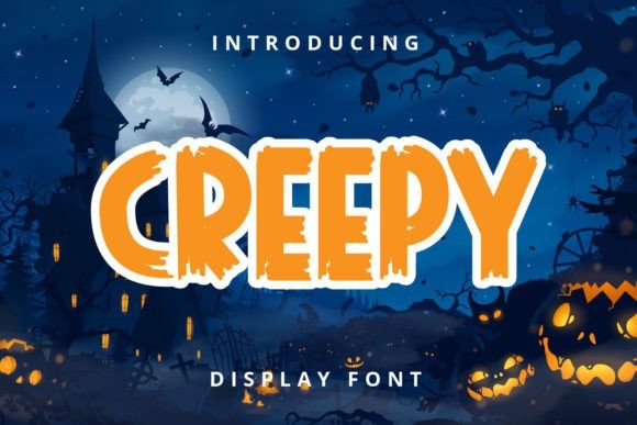
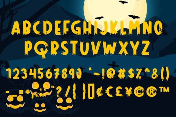
Creepy by nicetrip7 is a playful Halloween display font for craft projects that need spooky character without a grim or realistic horror look. It can support classroom signs, party invitations, sticker sheets, and short seasonal phrases for children or families.
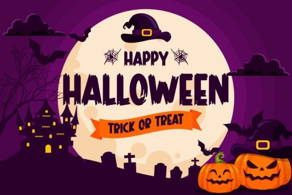
I see this as a flexible supporting font rather than the loudest option in the collection. Its approachable mood is useful when illustrations already carry the main visual theme, though designers seeking sharp, unsettling letterforms may find it too friendly.
Best for: family events, classroom signs, playful stickers
Key features: friendly Halloween tone, display proportions, versatile styling
14. The Creepy
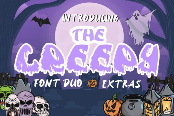
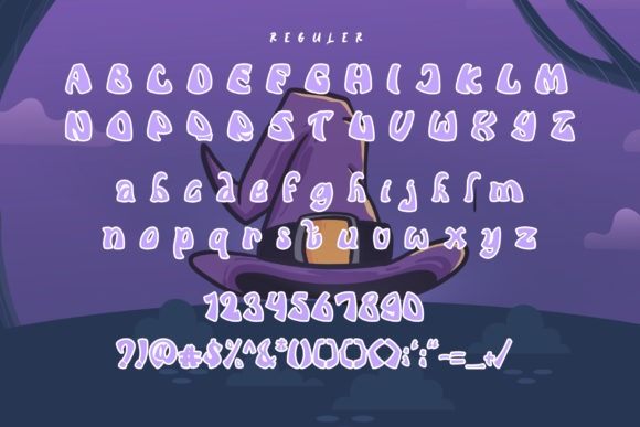
The Creepy is an October-ready decorative font for party signs, seasonal headings, and alphabet artwork that should communicate Halloween at a glance. Its display styling can turn a simple name or classroom word into a focal element without requiring a complicated layout.
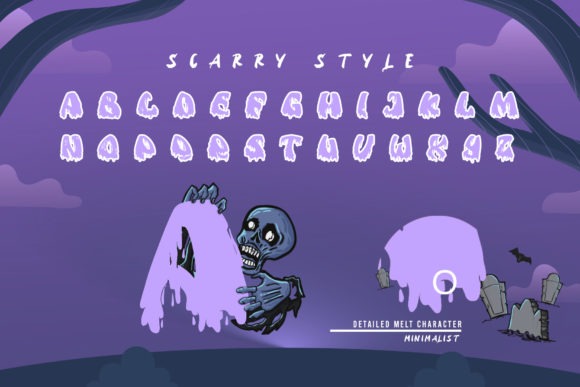
I would use it for medium and large text where the distinctive details have room to show. At very small sticker sizes, a simpler font may produce cleaner edges and more predictable readability.
Best for: October parties, name signs, seasonal alphabet art
Key features: decorative forms, clear Halloween identity, display-scale impact
15. Halloween Creepy
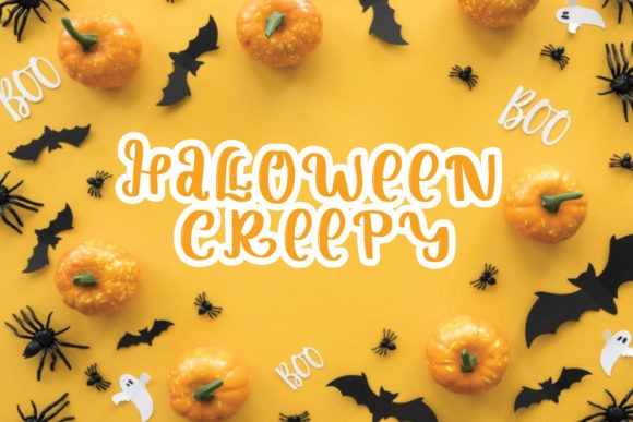
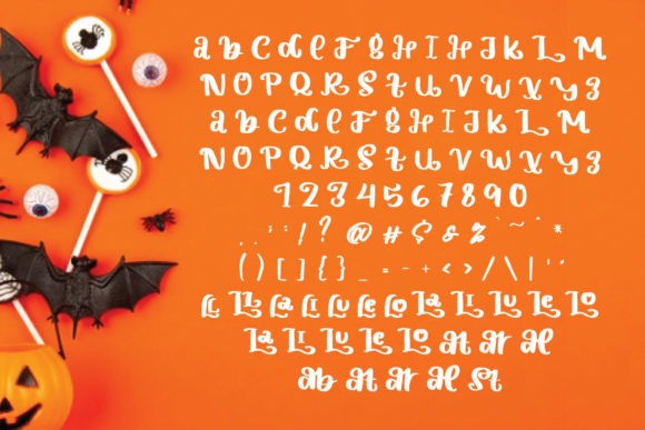
Halloween Creepy is a friendly spooky display font for readable signs, labels, and classroom projects. Its tone is light enough for child-centered crafts while still adding enough irregularity and seasonal character to distinguish it from an everyday school font.
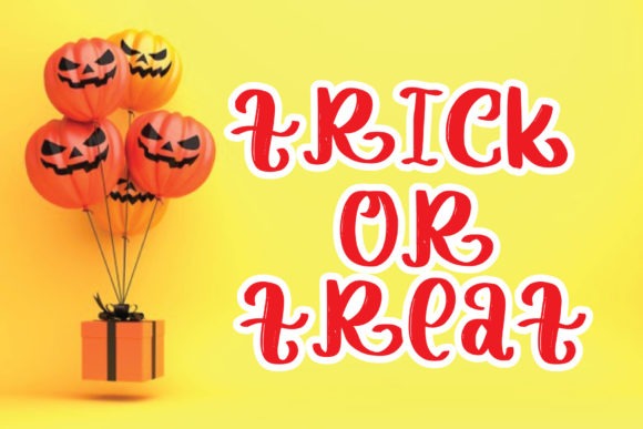
I like this for mixed-purpose project sets because the lettering can fit posters, tags, and short worksheet headings. It may not deliver enough intensity for a serious horror design, which is also why it feels more suitable around younger children.
Best for: readable signs, classroom labels, child-friendly crafts
Key features: friendly spooky mood, display construction, adaptable letterforms
16. Creepy Halloween
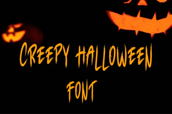
Creepy Halloween by Farz Studio is a thick-lettered display font for alphabet cards, poster headers, and short words that need solid visual weight. The broad characters can support bold color combinations and should remain more noticeable than thin, distressed alternatives.
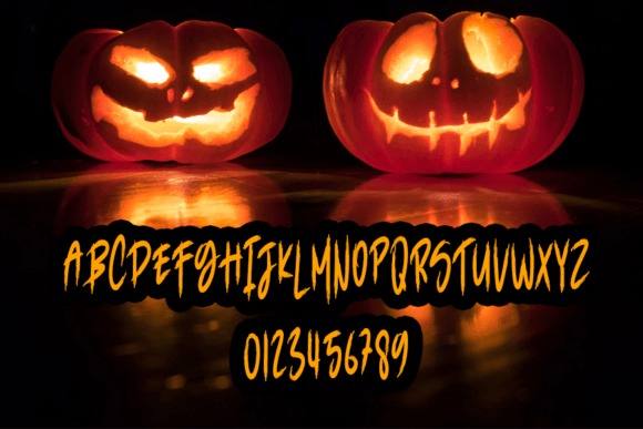
This is my pick for designs where readability matters almost as much as atmosphere. Thick forms can be easier to manage in larger vinyl projects, although any interior details and counters still need to be checked before cutting at a small scale.
Best for: alphabet cards, vinyl headlines, large classroom signs
Key features: thick letters, spooky display style, substantial visual weight
17. Scary Spooky
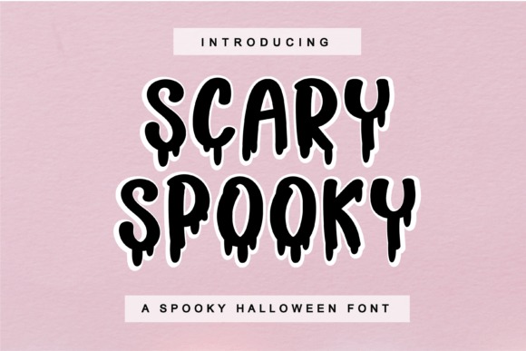
Scary Spooky is a decorative font for worksheets, labels, and Halloween activity pages that need a clear seasonal accent. It offers a themed alternative to plain classroom lettering while remaining appropriate for short educational words, game titles, and station signs.
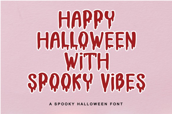
I would use it selectively for headings and answer-card titles, then switch to a simpler font for questions or directions. This keeps the page fun without asking students to decode decorative letters throughout an entire activity.
Best for: activity sheets, station signs, seasonal labels
Key features: decorative alphabet, spooky tone, heading-focused design
18. Spooky Halloween
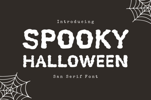
Spooky Halloween by The Magic Bee Studio is a sharp, atmospheric sans serif for haunted-house flyers, party invitations, and eerie poster headings. Its straighter construction gives it a more structured appearance than bubbly or handwritten Halloween fonts.
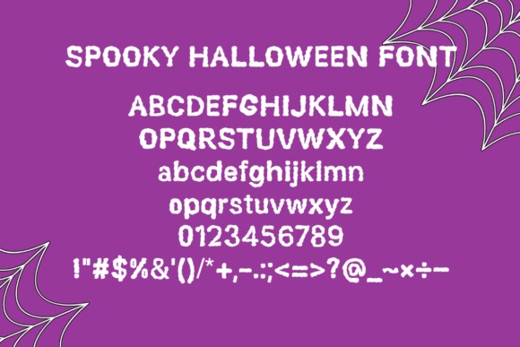
I like it for school events aimed at older students because it feels spooky without becoming visually chaotic. Sharp details can lose definition in tiny labels, so medium or large text is the safer use case.
Best for: haunted-house flyers, older-student events, eerie signs
Key features: sharp forms, atmospheric sans serif, structured appearance
19. Monster Halloween
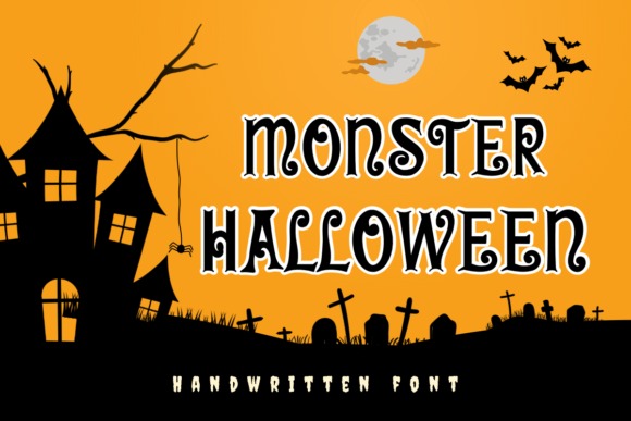
Monster Halloween by Nun Sukhwan is a curly handwritten font for invitations, decorations, and classroom words that should feel silly and eerie rather than threatening. Its hand-drawn movement can add energy to monster names, spelling games, and party signage.
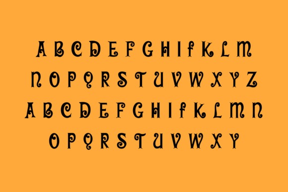
I would use it for expressive titles rather than formal alphabet instruction because the curly lines intentionally depart from standard letter models. It is a lively option for designs featuring friendly creatures, googly eyes, or hand-drawn illustrations.
Best for: playful decorations, spelling games, monster invitations
Key features: curly strokes, handwritten rhythm, whimsical spooky mood
20. Spooky
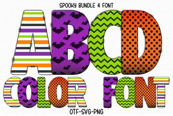
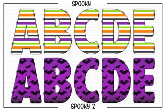
Spooky by Color Studio is an OpenType-SVG color font for full-color printables, digital posters, and alphabet pages where each character should function as decorative artwork. It can save layout time when you want illustrated-looking letters without placing separate clipart over every initial.
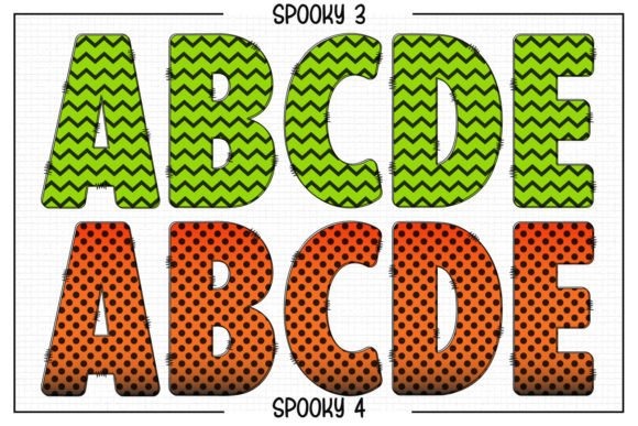
I would reserve this for compatible design software and print-based projects. Color fonts can be less predictable in basic text editors and cutting workflows, so a traditional outline font is more practical when you need one-color vinyl or broad software support.
Best for: full-color printables, digital posters, decorative ABC pages
Key features: OpenType-SVG format, colored characters, illustration-like detail
21. Horrors
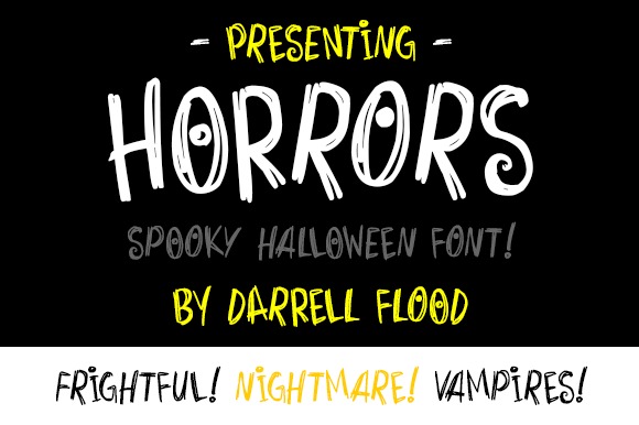
Horrors is a spectacular display font for T-shirts, craft signs, movie-style posters, and dramatic Halloween alphabet designs. Its forceful construction makes it useful when text must compete with dark imagery, distressed backgrounds, or large monster illustrations.
I would choose it for a bold display rather than a cute classroom theme. The visual intensity can be effective on one or two headline lines, but repeating it across every label may make a coordinated set feel heavy.
Best for: shirts, movie posters, dramatic craft signs
Key features: bold display lettering, horror atmosphere, strong visual presence
22. Scary Horror
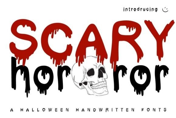
Scary Horror is a dark display font for unsettling poster titles, themed stickers, and alphabet graphics intended for older audiences. It gives letters a more serious horror identity than rounded slime or cartoon monster fonts, making it useful for cinematic or haunted themes.
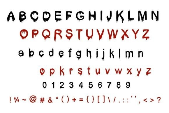
This is my final pick for designs where “creepy” needs to feel genuinely ominous. I would skip it for preschool classrooms, but it can fit teen reading displays, haunted attractions, theater graphics, and dark seasonal merchandise.
Best for: haunted posters, teen displays, dark sticker designs
Key features: horror-focused styling, dramatic forms, mature seasonal mood
Choosing Your Creepy Alphabet Style
The best creepy ABC font is the one that keeps the alphabet readable while matching the project’s audience and production method. I would start with Halloween by Color Alphabet for classroom printables, Monster Halloween by Reyrey Blue for bold seasonal stickers, or The Horror for large outlined posters.
Use decorative letters as focal points, then pair them with a plain supporting font for directions and longer text. That contrast gives the spooky alphabet room to stand out without making the complete poster, sticker sheet, or classroom activity difficult to read.
Frequently Asked Questions
What is the best creepy ABC font for classroom posters?
Halloween by Color Alphabet is my strongest classroom-poster pick because it combines decorative color letters with a separate black version. The colorful style suits printed wall displays, while the simpler black option can support one-color projects and cutting-machine crafts. For younger students, Scary Drip and Monster Kids also provide a playful mood. Teachers creating materials for older students may prefer Night Witch Halloween or Spooky Halloween for a darker, more theatrical appearance.
Which creepy font is easiest to use for stickers?
A thick font with open letter shapes is usually the easiest option for stickers because fine scratches and narrow drips can disappear at small sizes. Monster Halloween by Reyrey Blue, Creepy Halloween, and The Horror are sensible starting points for bold sticker words. Always create a small test print or cut before producing a full sheet. Sticker dimensions, material, printer resolution, blade condition, and the complexity of the chosen letters can all affect the final result.
Can I use creepy fonts to teach the alphabet?
Yes, creepy fonts can support themed alphabet recognition activities when their basic letter shapes remain easy to identify. Use decorative fonts for headings, matching games, wall cards, or review activities rather than as the only model for formal handwriting instruction. Pair each decorative character with a plain printed version when working with beginning readers. This helps students enjoy the seasonal theme while still connecting each embellished letter to the conventional form they see in books and worksheets.
Are color fonts suitable for Cricut projects?
Color fonts are usually better suited to compatible print and digital-design workflows than basic single-layer vinyl cuts. Cricut users should check whether a product includes a standard black font or another conventional font file in addition to its multicolored OpenType-SVG version. When a black version is available, it is often the more practical choice for cutting. Complex colored details may need to be flattened as printable artwork and used with a print-then-cut process rather than treated as simple editable text.
Follow Us