

ℹ️ Affiliate Disclosure: This article may contain affiliate links. We may earn a commission at no extra cost to you. Thanks for your support! ❤️
Selecting Vintage Calligraphy Fonts for Elegant Invitations
Vintage calligraphy fonts can give an invitation the polish of traditional penmanship without forcing every design into the same formal-wedding look. For this collection, I focused on scripts with copperplate influence, sweeping capitals, fine hairlines, old-fashioned flourishes, and signature-style movement—the details that make typography feel romantic and rooted in another era.
Looking for more creative resources? Creative Fabrica has a huge collection of fonts, graphics, templates, craft files, and design projects across many different themes and styles. It’s a useful place to browse when you want fresh ideas or ready-to-use assets for your next creative project.
My preference is to use decorative script selectively. Names, short headings, dates, and monograms can carry the ornate typography while a restrained serif handles addresses, schedules, and RSVP information. That contrast keeps an invitation sophisticated instead of crowded. Design guidance from Figma, Paperlust, and invitation specialists follows the same basic principle: flowing calligraphy gains clarity when paired with a more readable supporting face.
The best vintage calligraphy fonts for elegant invitations combine recognizable letterforms with period-inspired flourishes. For formal stationery, I favor copperplate scripts and refined swashes; for rustic or nostalgic invitations, softer handwritten styles feel more natural. Keep ornate lettering on short text and pair it with a clear serif or sans serif for essential details.
Quick Picks
- Best Overall: Classical Calligraphy — the strongest traditional option for formal wedding suites.
- Best for Rustic Invitations: Vintage Story — a softer old-world script for vineyard, inn, and handmade-paper stationery.
- Best for Luxury Names: Vintage Signature — refined signature-style movement for names and monograms.
- Best Retro Pick: Egalia Kokane — a cleaner vintage-modern direction for cocktail and mid-century celebrations.
| Font | Best for | Style |
|---|---|---|
| Classical Calligraphy | Traditional wedding suites | Vintage copperplate |
| Vintage Signature | Luxury names and monograms | Signature calligraphy |
| Vintage Story | Old-world romantic stationery | Rustic script |
| Invitation Script | Historically inspired invitations | Formal penmanship |
| Elemental Calligraphy | Formal invitation headings | Decorative copperplate |
| Delsya Script | Heritage luxury designs | Vintage copperplate |
| Alegarde | Gothic-romantic invitations | Classic copperplate |
| Victorian | Delicate vintage stationery | Thin formal script |
| Elegant Vintage Script | Romantic retro stationery | Flowing vintage script |
| Vintage Calligraphy | Classic romantic cards | Traditional script |
| Kallithea Script | Names and elegant headings | Handwritten copperplate |
| Brighter Calligraphy | Luxury invitation suites | Bold copperplate |
| Gabriella | Classic wedding stationery | Elegant script |
| Hadiyana | Flowing formal layouts | Classic calligraphy |
| Aneuk | Refined romantic invitations | Elegant calligraphy |
| Egalia Kokane | Retro-inspired celebrations | Classy retro script |
| Baby Vintage | Soft romantic invitations | Vintage handwritten script |
| Creative Vintage | Relaxed vintage stationery | Flowing handwriting |
| Calligraphy Script | Luxury editorial invitations | High-contrast calligraphy |
| Violyn Wedding Thivoria | High-end wedding suites | Romantic formal script |
How I Picked These Fonts
I selected these fonts by how well they solve different invitation-design jobs rather than by ornament alone. I compared legibility in names and short headings, copperplate or vintage character, alternate glyphs and swashes where available, visual weight for print, and how naturally each style pairs with supporting serif or sans-serif text. I also separated formal, rustic, Gothic-romantic, retro, and softer handwritten options so the list gives readers distinct choices instead of twenty variations of the same script.
20 Vintage Calligraphy Fonts for Invitations
1. Classical Calligraphy
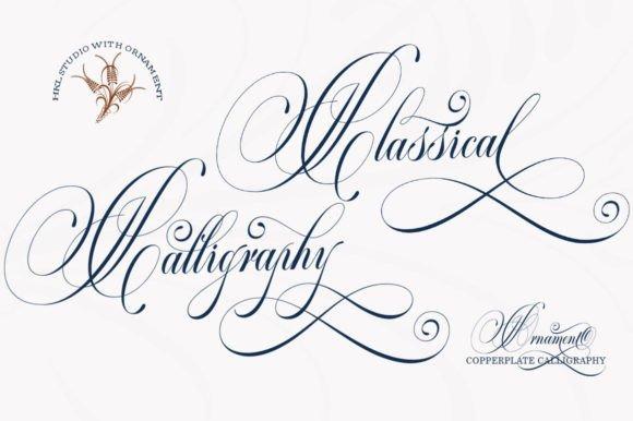
Classical Calligraphy is a vintage copperplate-inspired script for formal wedding invitations, romantic cards, and other designs that need traditional penmanship. Its product page highlights alternate characters, PUA-encoded glyphs, and swashes, giving you more room to shape names and short headings instead of accepting one repeated letterform.
This is one of my strongest picks for a black-tie invitation because the letterforms feel polished without drifting into casual brush lettering. I would reserve the most elaborate alternates for the couple's names and keep addresses or scheduling information in a quieter serif. Too many swashes in consecutive lines can quickly make a formal layout feel tangled.
Best for: formal weddings, black-tie invitations, romantic stationery
Key features: copperplate influence, alternate characters, PUA-encoded glyphs, decorative swashes
2. Vintage Signature
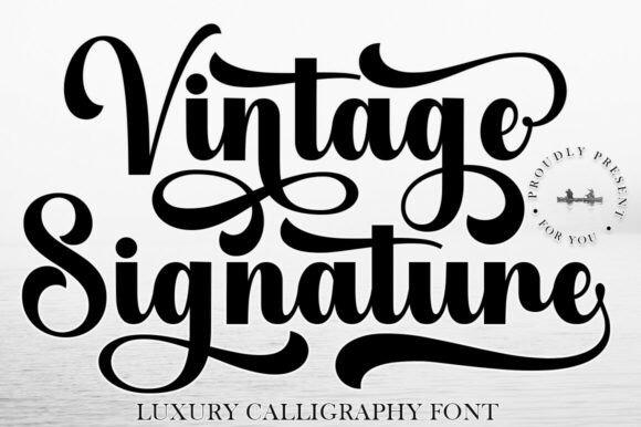
Vintage Signature is a luxury-oriented calligraphy typeface suited to names, monograms, save-the-date headings, and invitation focal points. Creative Fabrica describes it as combining timeless sophistication with an artistic calligraphy character, which makes it especially relevant when you want the lettering to resemble a refined personal signature.
I would choose this style for an invitation where the typography needs to feel personal rather than rigidly historical. Signature scripts can become difficult to scan when used for full sentences, so I would keep this one large and spacious. A restrained serif underneath gives dates and venue information enough visual authority without competing with the calligraphy.
Best for: couple names, monograms, luxury save-the-dates
Key features: signature look, luxury character, flowing rhythm, prominent display style
3. Vintage Story
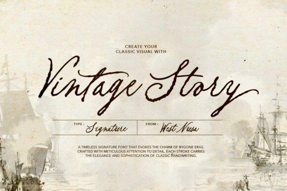
Vintage Story is a handwritten script with a deliberately old and rustic character, making it a natural fit for romantic invitations that need less ballroom formality and more nostalgic warmth. The font includes ligatures and alternates, and its listing specifically positions it for wedding invitations, love letters, signatures, and related designs.
My pick for this font would be a vineyard, historic inn, autumn, or handmade-paper invitation suite. The rustic movement gives it personality that polished copperplate sometimes lacks. I would avoid squeezing it into a dense minimalist grid; a generous layout with muted paper tones, deckled edges, or vintage-inspired ornamentation gives this kind of lettering room to make sense visually.
Best for: rustic weddings, vintage venues, love-letter themes
Key features: handwritten script, ligatures, alternates, old-world character
4. Invitation Script
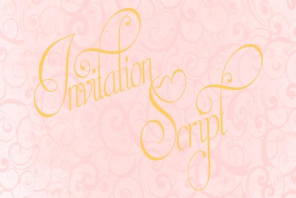
Invitation Script is a formal calligraphy typeface rooted in historical penmanship rather than a generic modern brush-script look. Creative Fabrica describes it as a contemporary interpretation of the calligraphy of Portuguese penman Manuel de Andrade de Figueiredo, giving the font an unusually specific historical reference for this list.
I would use this when authenticity and old-world atmosphere matter more than trendy simplicity. It suits invitations inspired by engraved stationery, period correspondence, heritage estates, or museum-like elegance. Because highly traditional scripts can dominate a small card, my preference is a generous name treatment with restrained supporting copy and plenty of negative space around the calligraphy.
Best for: heritage invitations, historic venues, formal stationery
Key features: historical inspiration, formal penmanship, ornate character, traditional rhythm
5. Elemental Calligraphy
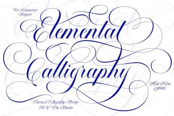
Elemental Calligraphy is an elegant script that combines decorative copperplate styling with a more contemporary finish. Its Creative Fabrica listing emphasizes the classic copperplate influence and refined treatment, making it useful for invitations that need historical cues without looking like a reproduction of antique handwriting.
I like this direction for formal hotel weddings, anniversary celebrations, gala invitations, and refined bridal stationery. The main caution with decorative copperplate is scale: delicate joins and flourishes deserve enough room to remain legible in print. Before committing to a full stationery suite, I would proof the actual names at final size rather than judging the font only from a large on-screen preview.
Best for: formal weddings, upscale events, invitation headings
Key features: copperplate styling, decorative script, refined contrast, formal appearance
6. Delsya Script
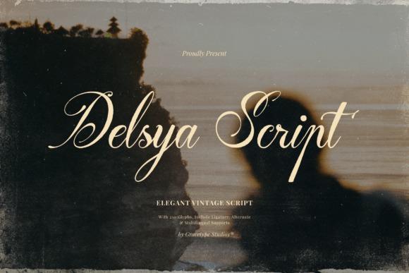
Delsya Script is an elegant vintage script built around copperplate-like movement, sweeping capitals, elongated terminals, and strong thick-to-thin contrast. Its listing highlights those traditional calligraphy references and positions the font for high-end wedding invitations, luxury branding, and other heritage-flavored design.
This would be my pick for a cinematic invitation with oversized names, a fine border, cream stock, and minimal supporting typography. The dramatic capitals can supply much of the decoration by themselves, so extra floral frames and flourishes may be unnecessary. Use those statement letters deliberately; every line does not need the same visual intensity as the couple's names.
Best for: luxury weddings, heritage themes, statement names
Key features: sweeping capitals, elongated terminals, copperplate rhythm, high contrast
7. Alegarde
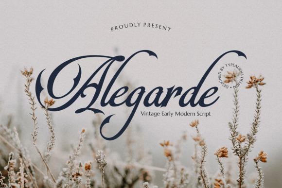
Alegarde is a classic script inspired by old copperplate lettering, with pointed stroke details that introduce a subtle Gothic edge. Creative Fabrica specifically notes its copperplate influence and suitability for wedding text, including invitations and the names of the couple.
I would choose Alegarde when a standard romantic script feels too sweet. Its sharper personality can complement castle venues, moody florals, candlelit receptions, literary themes, and dark-academia styling while still remaining recognizably elegant. That Gothic flavor is the limitation too: it may feel unnecessarily dramatic for a breezy beach or pastel garden invitation, where softer letterforms would be easier to harmonize.
Best for: Gothic romance, historic venues, dramatic invitations
Key features: copperplate inspiration, pointed details, classic script structure, distinctive personality
8. Victorian
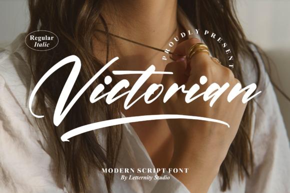
Victorian is a thin, graceful script designed for layouts that need a delicate luxury treatment. Its Creative Fabrica page notes PUA encoding and access to glyphs and ligatures, useful details if you plan to customize prominent words with alternate forms instead of relying only on the default alphabet.
I see this fitting romantic estate weddings, tea-room celebrations, feminine bridal showers, and invitations with botanical line art. Thin strokes are visually attractive but can be unforgiving at small sizes or with certain specialty printing methods. If the invitation will be foil stamped or letterpressed, I would ask the printer to review a proof before building the entire suite around very fine details.
Best for: Victorian themes, delicate stationery, botanical invitations
Key features: thin script, graceful letterforms, PUA encoding, glyphs and ligatures
9. Elegant Vintage Script
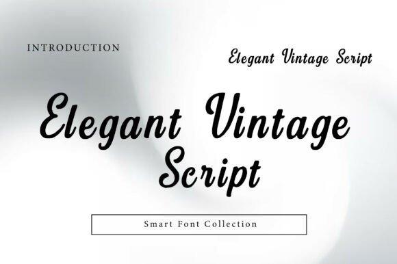
Elegant Vintage Script is a flowing retro-inspired calligraphy font with smooth curves and a classic handwritten appearance. Creative Fabrica identifies wedding invitations, stationery, signage, labels, and luxury editorial design among its intended applications, which makes it flexible beyond one narrowly formal aesthetic.
I would use it for an invitation that needs nostalgia without looking rigid or museum-like. It can bridge vintage and contemporary elements nicely—think cream paper, a modern serif, simple line borders, and one or two calligraphic focal points. Its flowing personality is already decorative, so I would skip busy background patterns that compete with the connected strokes.
Best for: romantic weddings, retro stationery, elegant signage
Key features: flowing script, smooth curves, vintage influence, handwritten character
10. Vintage Calligraphy
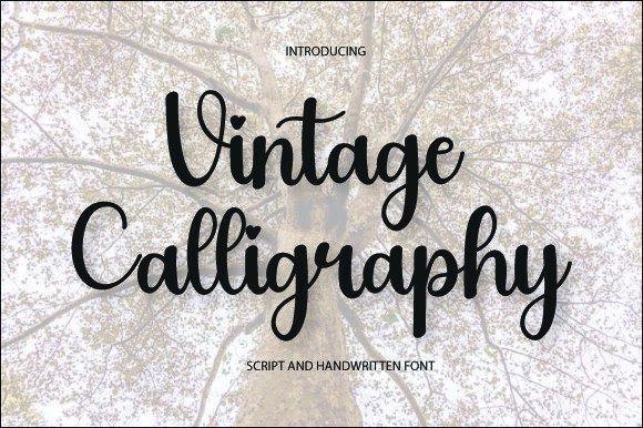
Vintage Calligraphy by AA studio is a traditional-looking script built around graceful handwritten letterforms and nostalgic styling. Its listing directly recommends it for wedding invitations, greeting cards, vintage branding, signage, and similar projects that benefit from a classic handwritten tone.
I like this as a middle-ground option for designers who want vintage atmosphere but do not need the more dramatic flourishes of formal copperplate. It can suit courthouse celebrations, intimate dinners, vow renewals, and understated wedding stationery. For a cleaner finished piece, I would let the calligraphy handle emotional words and names while giving practical information a straightforward companion typeface.
Best for: intimate weddings, vintage cards, understated invitations
Key features: traditional script, graceful forms, nostalgic styling, versatile appearance
11. Kallithea Script

Kallithea Script is an elegant handwritten copperplate calligraphy font with a gently moving baseline and a classic formal tone. Its Creative Fabrica listing includes wedding invitations among the suggested applications, alongside signatures, logos, stationery, and signage.
The dancing baseline makes this slightly less rigid than highly structured copperplate, so I would consider it for romantic events that want refinement without stiffness. It is particularly suited to large names or a short “Together with their families” treatment. For long location names or tightly spaced wording, check the joins carefully; lively baselines often look best when the copy is given breathing room.
Best for: wedding names, invitation headings, romantic stationery
Key features: copperplate influence, handwritten finish, dancing baseline, classic appearance
12. Brighter Calligraphy
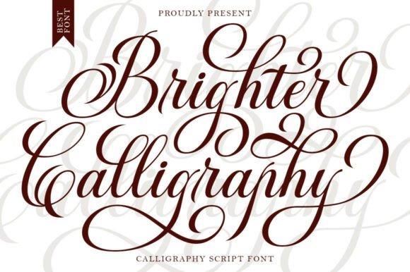
Brighter Calligraphy combines decorative copperplate influences with a bolder contemporary treatment. Creative Fabrica describes the font as an elegant script that mixes classic decorative calligraphy with modern styling, giving it enough visual weight for prominent invitation headings and upscale display text.
I would shortlist this for designers worried that an ultra-fine calligraphy font may disappear once printed. The stronger presence can hold its own against textured paper, decorative borders, or large floral artwork. Because the style has more visual weight, I would use a lighter companion serif rather than pairing it with another bold decorative face. That keeps the typography hierarchy obvious at a glance.
Best for: luxury invitations, printed headings, statement typography
Key features: copperplate influence, stronger strokes, decorative styling, modern refinement
13. Gabriella
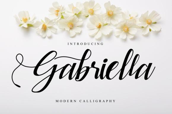
Gabriella is a classic script font intended for polished handwritten treatments such as wedding invitations, thank-you cards, greeting cards, logos, and related stationery. Its Creative Fabrica page also notes PUA encoding for accessing glyphs and swashes, giving designers more control over decorative letter combinations.
I would use Gabriella when the invitation needs an immediately romantic look rather than a strongly rustic or Gothic period reference. Alternate glyphs are particularly useful for repeated letters in names, where using the exact same form twice can make digital calligraphy feel mechanical. The temptation is to use every flourish available; selecting only a few usually produces a more convincing result.
Best for: wedding invitations, thank-you cards, romantic names
Key features: classic script, PUA encoding, glyphs, decorative swashes
14. Hadiyana
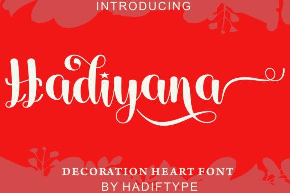
Hadiyana is an elegant calligraphy font inspired by classic flowing penmanship, with smooth lines, alternate forms, and decorative glyph options. The Creative Fabrica listing specifically suggests it for wedding invitations, thank-you cards, greeting cards, logos, and business cards.
This is a useful option for a romantic invitation that needs traditional cues but still feels fluid and approachable. I would pair it with a high-contrast serif for a more formal result or a restrained sans serif for a cleaner vintage-modern mix. Because the calligraphy has plenty of motion, give line endings enough clearance from borders and illustrations so the composition does not feel cramped.
Best for: romantic invitations, bridal stationery, elegant headings
Key features: smooth lines, alternate forms, decorative glyphs, classic influence
15. Aneuk
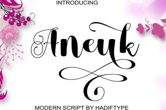
Aneuk is an elegant calligraphy font with smooth strokes, alternate characters, glyphs, and PUA encoding. Creative Fabrica presents it as suitable for wedding invitations and other handwritten applications where a polished script can serve as the primary decorative element.
I would consider Aneuk for invitations that need a graceful, familiar calligraphy mood without committing to the sharper details of historic copperplate. It is especially useful when the couple's names contain letters that benefit from alternate forms. Test several combinations before finalizing the design: in script typography, one capital or terminal flourish can change the balance of an entire centered layout.
Best for: names, romantic stationery, formal card designs
Key features: elegant calligraphy, alternate characters, PUA encoding, smooth strokes
16. Egalia Kokane
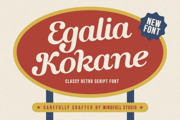
Egalia Kokane is a classy retro script that blends nostalgia with a cleaner handcrafted finish. Its Creative Fabrica listing explicitly includes elegant wedding invitations among its potential uses while emphasizing its retro design character, making it one of the stronger options here for invitations inspired by a later vintage era.
I would use Egalia Kokane for cocktail-party invitations, mid-century-inspired celebrations, retro hotels, or stationery that needs more personality than traditional ballroom calligraphy. It is less suitable if your goal is strict eighteenth- or nineteenth-century penmanship. Lean into its retro quality instead: pair it with a simple serif or geometric supporting face and keep the decorative elements restrained.
Best for: retro weddings, cocktail receptions, vintage-modern stationery
Key features: retro script, handcrafted look, nostalgic mood, clean presentation
17. Baby Vintage
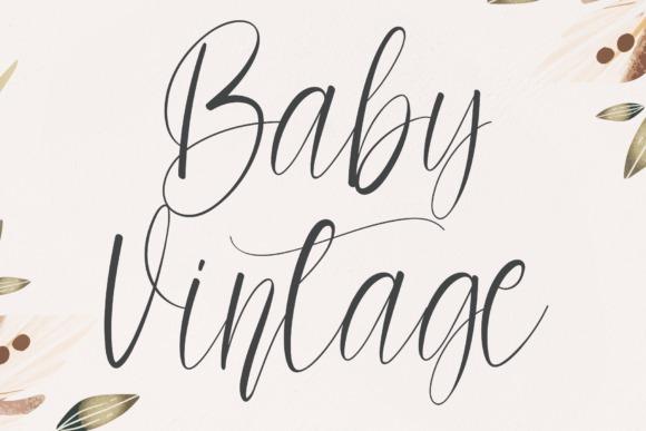
Baby Vintage is a fashionable handwritten script with a soft, romantic personality suited to wedding invitations, cards, and personalized designs. Creative Fabrica describes it as dainty and joyful, placing it on the lighter side of vintage calligraphy rather than among the highly ceremonial copperplate options.
I would use this for garden weddings, pastel stationery, small bridal events, and vintage-inspired invitations that should feel warm instead of stately. The softer character makes it easier to pair with watercolor flowers and informal illustrations. If the event is extremely formal or historically themed, I would move toward Classical Calligraphy or Invitation Script instead, since Baby Vintage has a noticeably more relaxed personality.
Best for: garden weddings, romantic cards, softer vintage themes
Key features: handwritten script, dainty appearance, romantic tone, relaxed vintage style
18. Creative Vintage
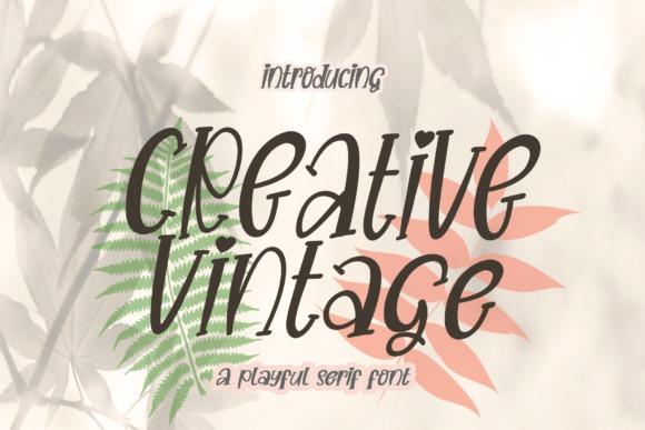
Creative Vintage is a flowing handwritten font intended for wedding invitations, stationery, labels, packaging, and other decorative typography projects. Its Creative Fabrica page emphasizes the smooth handwritten direction rather than strict historical calligraphy, giving it a more casual route into vintage invitation styling.
I would pick this for a relaxed celebration where handmade warmth matters more than formal etiquette: barn venues, small destination dinners, rustic save-the-dates, or vintage floral stationery all fit the mood. Because it is more handwritten than ceremonial, it can also handle short secondary phrases without feeling overly grand. I would still keep logistical paragraphs in a more conventional font for faster reading.
Best for: rustic invitations, casual weddings, vintage stationery
Key features: flowing handwriting, relaxed mood, decorative style, versatile application
19. Calligraphy Script
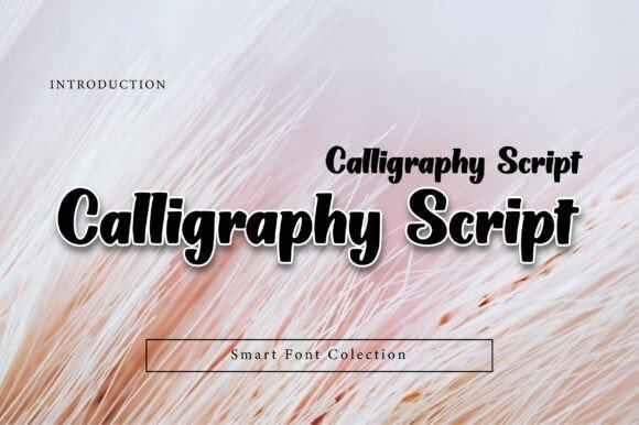
Calligraphy Script by Wow Magic is a high-contrast script with fluid strokes and a hand-inked pen character. Its Creative Fabrica description points specifically to luxury wedding invitations, premium labels, and fashion-oriented editorial projects, and it highlights the contrast between thicker and thinner strokes.
This is my pick for an invitation that needs fashion-editorial polish rather than obvious rustic nostalgia. The strong thick-to-thin rhythm can look striking beside a structured serif with generous tracking. Fine hairlines are the feature I would check most carefully on a physical proof, especially if the invitation uses textured stock, foil, embossing, or another process where extremely delicate details can reproduce differently from a screen preview.
Best for: luxury weddings, editorial invitations, premium stationery
Key features: fluid strokes, thick-thin contrast, hand-inked feel, formal styling
20. Violyn Wedding Thivoria
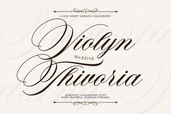
Violyn Wedding Thivoria is a romantic formal script with flowing calligraphic letterforms, stylistic alternates, and custom ligatures. Creative Fabrica positions it for high-end wedding invitations, exclusive logos, luxury packaging, and other projects that need an expressive but polished handwritten appearance.
I would choose this for the designer who wants customization options without abandoning a sophisticated invitation mood. Alternates and ligatures can help shape unusually long names or avoid awkward repeated characters, but they should support readability rather than become decoration for its own sake. My preferred treatment would be an oversized name lockup with restrained serif details below and generous margins around the script.
Best for: luxury weddings, personalized names, formal invitation suites
Key features: flowing letterforms, stylistic alternates, custom ligatures, romantic formal style
Which Vintage Calligraphy Font Should You Choose?
For the most traditional formal look, I would start with Classical Calligraphy, Invitation Script, or Delsya Script. Vintage Story is more convincing for rustic old-world stationery, while Egalia Kokane brings in a distinctly retro personality. For soft romantic layouts, Baby Vintage and Hadiyana are easier to style without making the invitation feel ceremonial.
The typography should still serve the invitation rather than overpower it. A beautiful calligraphy font becomes more convincing when it has enough white space, a clearly defined role in the hierarchy, and supporting text that guests can read immediately. That balance is what turns decorative lettering into an elegant invitation system instead of a collection of flourishes.
Frequently Asked Questions
What is the best vintage calligraphy font for wedding invitations?
u003cstrongu003eClassical Calligraphy is my first pick for a traditional vintage wedding invitation because its copperplate influence, alternates, and swashes support an unmistakably formal look.u003c/strongu003e Delsya Script is another strong option for heritage luxury, while Vintage Story fits rustic or old-world celebrations better.
Should I use a calligraphy font for the entire invitation?
u003cstrongu003eUsually, no. Calligraphy is easier to appreciate when it is reserved for names, short headings, dates, or a few accent phrases, while essential details use a simpler companion font.u003c/strongu003e Invitation typography guidance commonly recommends pairing decorative scripts with readable serif or sans-serif text rather than setting every line in ornate lettering.
What font pairs well with vintage calligraphy?
u003cstrongu003eA readable serif is the easiest partner for vintage calligraphy when you want a traditional invitation, while a restrained sans serif creates a cleaner vintage-modern contrast.u003c/strongu003e The main goal is differentiation: the supporting font should clarify information instead of competing with the decorative script.
Are thin calligraphy fonts suitable for letterpress or foil invitations?
u003cstrongu003eThey can be, but very fine hairlines should be checked with the printer before production.u003c/strongu003e Stroke thickness, final point size, paper texture, and the printing method all affect how delicate details reproduce, so an actual-size proof is more reliable than judging a large screen preview. Specialty-print designers specifically note that sufficient stroke weight can matter for letterpress and foil applications.
Follow Us