

ℹ️ Affiliate Disclosure: This article may contain affiliate links. We may earn a commission at no extra cost to you. Thanks for your support! ❤️
How to Choose the Best Wedding Font Combinations
Choosing wedding font combinations is easier when each typeface has a clear job. I like an expressive script or decorative serif for the couple’s names, then a restrained serif or sans serif for dates, locations, RSVP details, and other information guests need to read quickly. That contrast gives an invitation personality without sacrificing clarity.
For this list, I focused on ready-made font duos rather than asking you to assemble unrelated typefaces from scratch. The selections range from traditional serif-and-script combinations to cleaner sans-and-handwritten pairs, so there are options for formal ballroom invitations, minimalist ceremonies, boho stationery, romantic garden weddings, and contemporary celebrations.
Quick Picks
The best wedding font combinations pair one decorative typeface with one simpler companion font. Use the expressive style for names and short headings, then use the cleaner font for addresses, dates, menus, RSVP information, and longer wording. Serif-and-script duos generally feel more traditional, while sans-serif-and-script combinations create a cleaner contemporary look.
| Font combination | Best for | Format/type |
|---|---|---|
| The Bohemian Duo | Romantic modern invitations | Display + script |
| Folkies Duo | Refined rustic stationery | Sans serif + script |
| Luxury Duo | Black-tie weddings | Serif + script |
| Blank Page | Editorial invitations | Serif + script |
| Palestine Duo | Delicate modern layouts | Sans serif + script |
| Valen Valentine Duo | Romantic stationery | Clean companion + script |
| July Special | Soft contemporary designs | Sans serif + script |
| Boho Wedding Duo | Bohemian celebrations | Decorative + geometric sans |
| Lovely Heart | Sweet romantic invitations | Sans serif + script |
| Wedding | Art Deco stationery | Decorative + sans serif |
| Promag Duo | Minimal luxury suites | Sans serif + script |
| Contingent Duo | Modern luxury weddings | Serif + script |
| Premium Look Duo | Fashion-inspired invitations | Serif + script |
| Cyprus Sunrise Duo | Outdoor wedding stationery | Sans serif + handwritten |
| Second Mark Duo | Organic editorial designs | Serif + script |
| Fujinstall Font Duo | Versatile modern invitations | Sans serif + script |
| Candara Beauty Duo | Classic romantic stationery | Serif + script |
How I Picked These Wedding Font Pairings
I prioritized combinations with enough contrast to establish a visible hierarchy. A wedding invitation usually benefits when names can look decorative and personal while practical information remains quiet and readable. I also looked for duos flexible enough to carry through matching save-the-dates, menus, place cards, welcome signs, and thank-you cards.
17 My Favorite Wedding Font Combinations
1. The Bohemian Duo
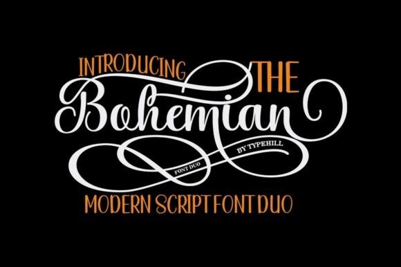
The Bohemian Duo is a romantic pairing for couples who want handwritten character without making the whole invitation look informal. Its expressive script has an irregular baseline and decorative personality, while the companion style gives the design a more structured foundation.
I would reserve the script for names, a short quotation, or a prominent heading and give the cleaner style the logistical information. The included alternates, ligatures, and swash possibilities make it attractive for personalized stationery, although using too many decorative forms at once could make a small invitation feel busy.
Best for: romantic weddings, watercolor stationery, modern boho invitations
Key features: complementary font styles, alternates, ligatures, multilingual support
2. Folkies Duo
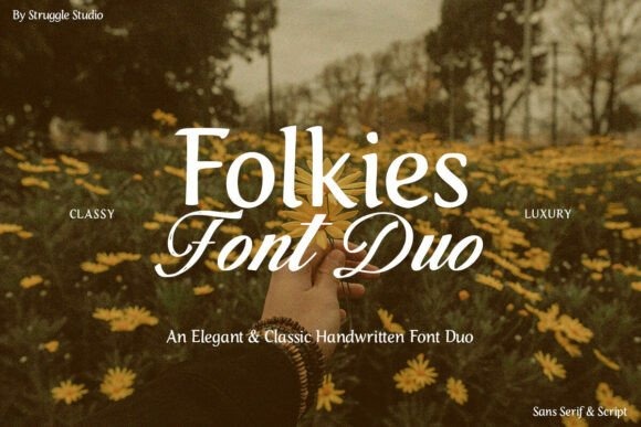
Folkies Duo combines an expressive script with a sturdier companion style, making it useful for refined wedding stationery that should still feel warm and handmade. The contrast is especially suited to layouts where the couple’s names need personality but the supporting details need restraint.
My pick for this duo would be a rustic-luxe invitation with plenty of negative space, textured paper, and restrained floral artwork. Its handcrafted character may feel too relaxed for extremely traditional engraved stationery, but it offers an appealing middle ground between formal and casual.
Best for: rustic-luxe weddings, intimate ceremonies, lifestyle-inspired stationery
Key features: contrasting styles, handwritten character, clear companion typeface
3. Luxury Duo
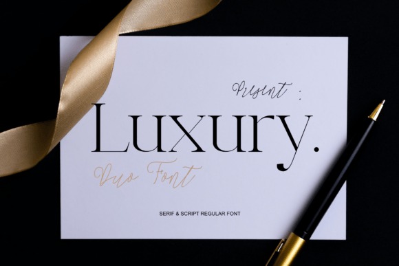
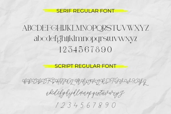
Luxury Duo is a serif-and-script pairing aimed squarely at elegant, upscale layouts. The serif supplies the polished structure I want for formal invitation wording, while the flowing script can turn names or short accents into the visual focal point.
I would use this combination for a black, ivory, champagne, or deep jewel-tone suite where typography is doing most of the decorative work. Because both halves lean sophisticated, the pairing can look particularly strong with generous margins; crowding the design with ornaments would compete with its built-in drama.
Best for: black-tie weddings, luxury invitations, editorial stationery
Key features: serif and script pairing, high-end character, strong typographic contrast
4. Blank Page
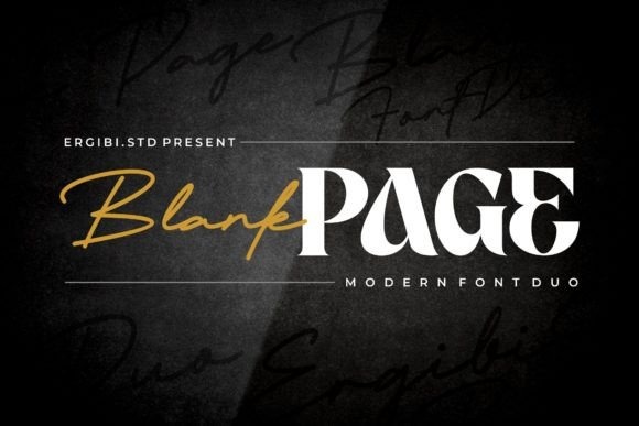
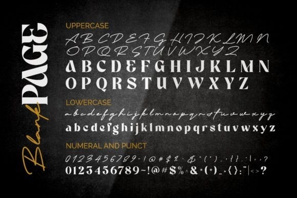
Blank Page is a display serif and script combination for wedding invitations with a more fashion-forward, editorial personality. Its serif includes distinctive letter details and ligatures, giving large headlines enough character to stand on their own beside the handwritten script.
I like this option for invitations inspired by magazines, boutique hotels, or minimalist luxury branding. I would keep the most unusual serif forms to larger text and use a restrained layout around them, since an already distinctive typeface needs less decoration than a neutral body font.
Best for: editorial weddings, contemporary invitations, statement typography
Key features: display serif, script companion, serif ligatures, luxury styling
5. Palestine Duo
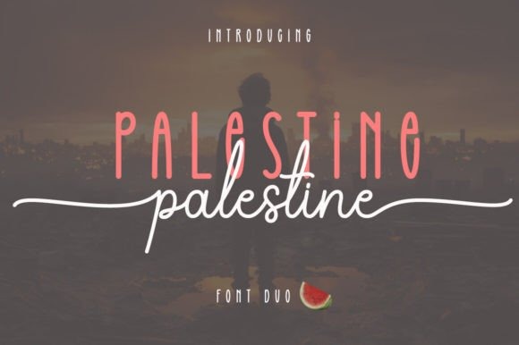
Palestine Duo combines a delicate script with a sans-serif companion, giving wedding stationery a softer contemporary look than the traditional script-and-serif formula. That makes it particularly useful when you want romance but still prefer clean, uncluttered typography.
I would place the script on the names and use the sans serif for the ceremony information, accommodations, or RSVP card. The font is PUA encoded for access to decorative glyphs and swashes, but I would treat those extras as accents rather than putting flourishes on every line.
Best for: modern romantic weddings, clean invitations, bridal shower stationery
Key features: script and sans serif, swashes, decorative glyphs, PUA encoding
6. Valen Valentine Duo
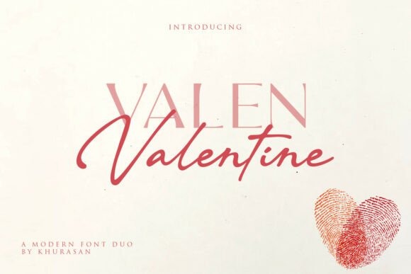
Valen Valentine Duo pairs a graceful handwritten style with a cleaner companion font, creating an intentionally romantic combination for love-centered stationery. The script is expressive enough for a couple’s names, while the second style gives supporting copy a calmer visual rhythm.
I would use this one for an invitation suite that needs to feel warm rather than ultra-formal: garden ceremonies, candlelit dinners, and Valentine-season weddings come to mind. Its romantic personality is fairly pronounced, so couples pursuing stark architectural minimalism may prefer a quieter pairing.
Best for: romantic weddings, save-the-dates, love-themed stationery
Key features: graceful script, clean companion font, coordinated two-style design
7. July Special
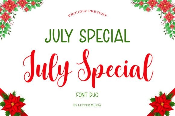
July Special is a soft sans-serif-and-script duo that fits contemporary wedding invitations without losing the handwritten detail many couples want. Its simpler companion font gives you a sensible place for practical text while the script creates visual emphasis.
I would use the pairing for a spring or summer suite with airy spacing, muted colors, and understated botanical elements. It is more relaxed than a high-contrast formal serif, which is useful for approachable modern weddings but less convincing if the brief calls for a rigid traditional aesthetic.
Best for: spring weddings, summer stationery, soft modern invitations
Key features: sans serif and script, coordinated styles, gentle contemporary character
8. Boho Wedding Duo
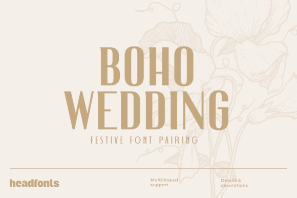
Boho Wedding Duo combines the decorative Nailhead Nova with Decohead, an Art Deco-influenced geometric sans serif. The result is more structured than a typical flowing calligraphy pairing, making it an interesting option for bohemian stationery with a glamorous architectural edge.
I would choose this for place cards, menus, or invitations using arches, line art, dried florals, and geometric framing. The decorative half has a distinctive personality, so it is best used selectively; letting Decohead carry the informational text will keep the invitation easier to scan.
Best for: boho weddings, Art Deco accents, destination celebrations
Key features: decorative display font, geometric sans serif, contrasting coordinated styles
9. Lovely Heart
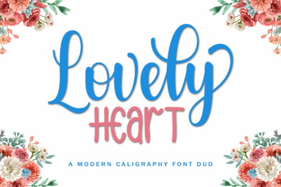
Lovely Heart is a delicate script-and-sans combination for invitations that should feel affectionate and personal rather than ceremonially formal. The clean sans serif offsets the flowing handwritten shapes, giving the pairing a useful built-in distinction between display and supporting text.
I would consider this for small garden weddings, bridal showers, engagement announcements, or stationery with illustrated flowers and softer colors. PUA encoding provides access to glyphs and swashes, but the romantic effect is already strong, so a restrained approach to those embellishments will usually look cleaner.
Best for: garden weddings, bridal showers, sweet romantic invitations
Key features: sans serif and script, swashes, glyph access, PUA encoding
10. Wedding
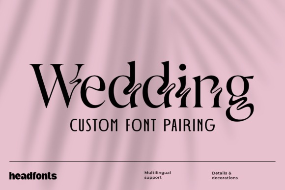
Wedding is a coordinated pairing of the ornate Zighead and the simpler Decohead sans serif. It offers an alternative to cursive-heavy wedding typography, using decorative geometry for the statement layer and clean letterforms for the practical information.
I would use this combination for a city venue, cocktail-style reception, or stationery with subtle Art Deco cues. It can feel sharper and more graphic than conventional calligraphy, which is an advantage for modern couples but may not suit invitations aiming for a soft handwritten aesthetic.
Best for: Art Deco weddings, city venues, geometric invitation suites
Key features: ornate display font, clean sans serif, strong stylistic contrast
11. Promag Duo
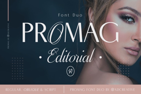
Promag Duo is an elegant sans-serif-and-script pairing for wedding stationery that needs a cleaner luxury look. Its contrasting styles let the script provide ceremony and personality while the sans serif keeps locations, timings, and other secondary copy visually controlled.
I would pair it with a restrained layout and make typography the main decorative device rather than surrounding it with dense artwork. This type of combination is especially useful for modern invitation suites because the sans serif can continue naturally onto information cards, menus, and signage.
Best for: minimalist weddings, modern invitation suites, elegant signage
Key features: sans serif and script pairing, clean contrast, versatile styling
12. Contingent Duo
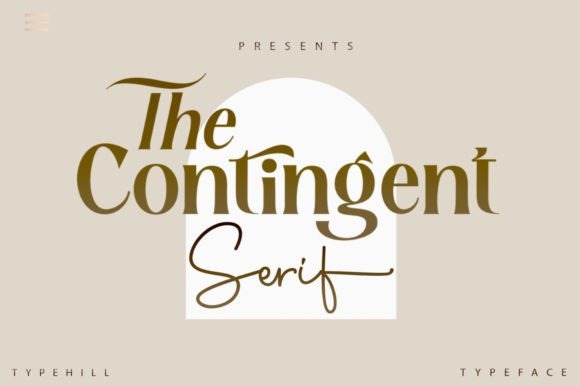
Contingent Duo combines an elegant script with a distinctive serif, creating the kind of contrast I look for in modern luxury wedding invitations. The serif can establish the editorial structure, while the script softens names and short emphasis lines with a personal handwritten element.
This would be one of my stronger options for typography-led stationery with lots of white space and minimal illustration. Because both fonts have noticeable character, I would avoid adding a third competing typeface; hierarchy can come from size, spacing, and capitalization instead.
Best for: modern luxury weddings, minimalist stationery, editorial invitations
Key features: serif and script, coordinated contrast, clean luxury aesthetic
13. Premium Look Duo
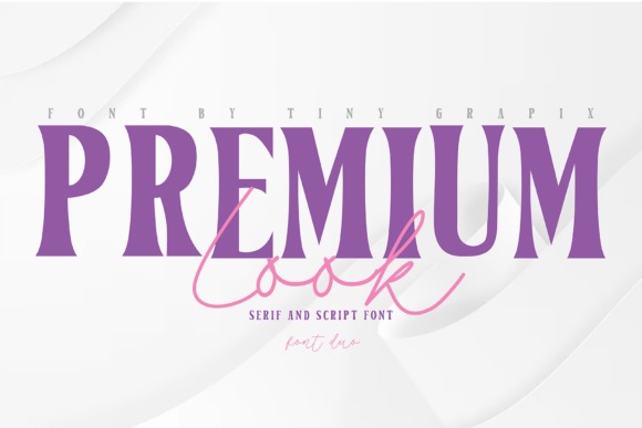
Premium Look Duo combines a high-contrast serif with an elegant handwritten script, giving invitations the polished tone associated with fashion editorials and luxury branding. The serif is suited to prominent structured text, while the script introduces a looser human element.
I would use it for an evening wedding, rooftop reception, or monochrome suite where dramatic typography needs to carry the design. The contrast can become visually strong at large sizes, so keeping body information straightforward and leaving enough breathing room around names should produce the most refined result.
Best for: fashion-inspired weddings, luxury stationery, monochrome invitations
Key features: high-contrast serif, handwritten script, coordinated two-font system
14. Cyprus Sunrise Duo
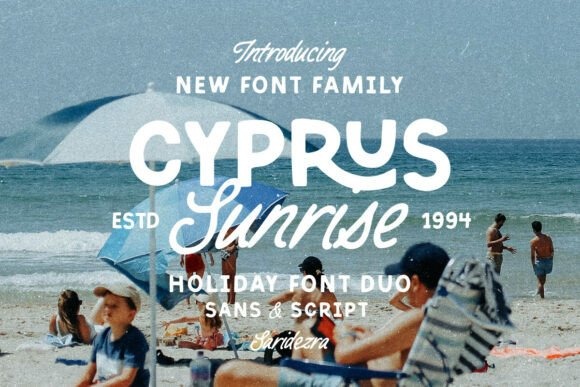
Cyprus Sunrise Duo pairs a bold sans serif with a monoline handwritten script, giving it a noticeably more relaxed character than most formal wedding combinations. The handcrafted quality makes it better suited to outdoor, destination, and nature-inspired stationery than highly traditional ballroom invitations.
I would use the handwritten side sparingly for names or informal headings and rely on the sans serif wherever quick reading matters. Its bolder construction can hold up well in signs and headings, making this one appealing if the invitation typography needs to extend across a larger day-of stationery system.
Best for: outdoor weddings, destination stationery, relaxed celebrations
Key features: bold sans serif, monoline script, ligatures, handcrafted styling
15. Second Mark Duo
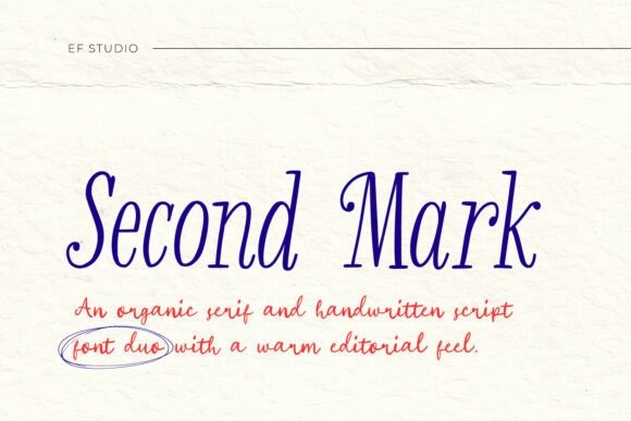
Second Mark Duo pairs an organic serif with a coordinating handwritten script for a warm editorial approach to wedding stationery. It feels less rigid than a classic formal serif but still provides the structure needed to keep an invitation polished and intentional.
I would choose this combination for understated celebrations with natural textures, handmade paper, neutral palettes, or botanical details. The script is best treated like a signature accent rather than a body font, while the serif can handle headings and more substantial wording without the layout becoming overly decorative.
Best for: organic weddings, handmade-paper suites, understated editorial designs
Key features: organic serif, handwritten script, warm coordinated pairing
16. Fujinstall Font Duo
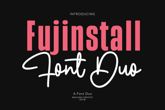
Fujinstall Font Duo combines script and sans-serif styles in one coordinated set, making it a practical option for couples who want a contemporary invitation without sourcing a second font separately. The script provides the decorative layer, while the sans serif keeps supporting information cleaner.
I like its flexibility for a complete stationery suite because the cleaner side can move easily from invitations to table numbers, menus, and informational cards. It has a more versatile everyday tone than some highly formal combinations, so I would favor it for modern celebrations rather than very traditional engraved layouts.
Best for: modern weddings, complete stationery suites, contemporary invitations
Key features: sans serif and script, coordinated styles, versatile wedding use
17. Candara Beauty Duo
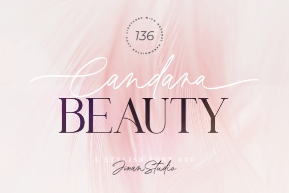
Candara Beauty Duo brings together a classic serif and elegant script, making it one of the more traditional romantic wedding font combinations on this list. The serif gives formal wording a stable framework, while the script can highlight names, initials, or a short sentimental phrase.
The script includes alternates, swashes, and ligatures, which gives designers room to personalize prominent words without bringing in another font. I would use those options selectively and keep essential details in the serif; that division preserves the romantic character while making the information easier for guests to follow.
Best for: classic romantic weddings, formal invitations, coordinated wedding suites
Key features: serif and script, alternates, swashes, ligatures
Frequently Asked Questions
What are the best font combinations for wedding invitations?
u003cstrongu003eA decorative script paired with a clean serif or sans serif is one of the most reliable wedding invitation combinations.u003c/strongu003e The script gives names and headings a romantic focal point, while the simpler companion keeps dates, addresses, RSVP information, and other essential details readable. For a traditional wedding, I would start with serif plus script. For a minimalist or contemporary wedding, sans serif plus script often looks cleaner. The strongest pairing depends on the ceremony style, but clear contrast between the display font and information font matters more than following one fixed formula.
How many fonts should I use on a wedding invitation?
u003cstrongu003eTwo fonts are usually enough for an elegant wedding invitation.u003c/strongu003e One can handle names and major headings, while the second carries the functional information. This creates contrast without making the design feel fragmented or difficult to follow. If more variation is needed, I would first use different sizes, weights, letter spacing, or capitalization within those two typefaces. A third font is rarely necessary unless the invitation is part of a deliberately eclectic design system.
Should the couple's names be written in a script font?
u003cstrongu003eScript is a popular choice for the couple’s names because it creates a personal, romantic focal point, but it is not required.u003c/strongu003e A distinctive high-contrast serif or decorative display font can look equally elegant, especially for modern, editorial, or Art Deco weddings. If you do choose script, I would keep it large enough to read comfortably and avoid covering every word in extra swashes. Letting the names carry the decorative treatment gives them more impact.
How do I make wedding invitation fonts easier to read?
u003cstrongu003eUse the most legible font for small and essential information, and save ornate lettering for larger, shorter text.u003c/strongu003e Strong contrast, adequate spacing, sensible font sizes, and a printed proof can prevent beautiful typography from becoming difficult for guests to decipher. I also avoid setting long passages in all caps when the chosen decorative style was designed primarily for mixed-case text. If a flourish interferes with another line or makes a letter ambiguous, simplifying it usually improves the invitation rather than making it less elegant.
Choosing Your Final Wedding Font Pairing
The strongest wedding font combination is the one that supports both mood and information. For traditional elegance, I would shortlist Luxury Duo, Candara Beauty Duo, or Contingent Duo. Promag Duo and Palestine Duo offer a cleaner modern direction, while Boho Wedding Duo and Cyprus Sunrise Duo suit celebrations with a more distinctive stylistic theme.
Whichever pairing you choose, give each font a consistent role throughout the wedding suite. That simple rule creates more polish than adding extra typefaces, and it makes every piece—from the first save-the-date to the reception menu—feel connected.
Follow Us