

ℹ️ Affiliate Disclosure: This article may contain affiliate links. We may earn a commission at no extra cost to you. Thanks for your support! ❤️
A display font can change the direction of a design before the color palette, photography, or layout system has even been decided.
That is one reason I spend so much time browsing font collections. Some typefaces immediately catch my attention but become far less convincing once I imagine them inside an actual brand identity. Others look understated in a preview, yet reveal much more potential when you consider packaging, editorial layouts, posters, merchandise, or logo design.
The 25 stylish display fonts below cover a wide range of aesthetics, from editorial serifs and retro bubble lettering to western outlines, brush fonts, and bold urban typefaces.
Not every font here is versatile. Some are highly specific, and a few need careful handling to avoid overwhelming a layout. That is not necessarily a weakness. Display typography is often at its most interesting when it has a clear point of view.
Quick Picks
- Best luxury/editorial option: Sovelis
- Best adaptable modern option: Maka
- Best refined serif option: The Paloma
- Best playful option: Melipe
- Best bold thematic option: Cowboy Varsity
How I Picked These
I compared these display fonts by headline readability, visual distinctiveness, scalability, spacing, small-size performance, thematic flexibility, and how well each option can support real branding, packaging, editorial, merchandise, poster, and social-media applications rather than only looking strong in a font preview.
1. Different Cultures Font
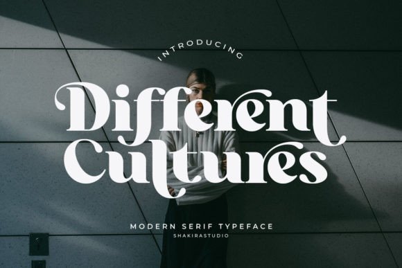
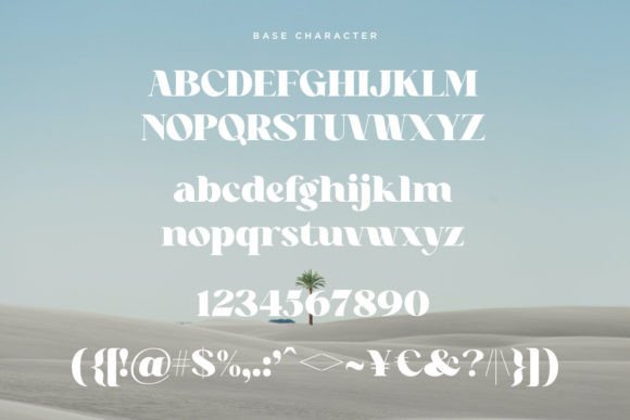
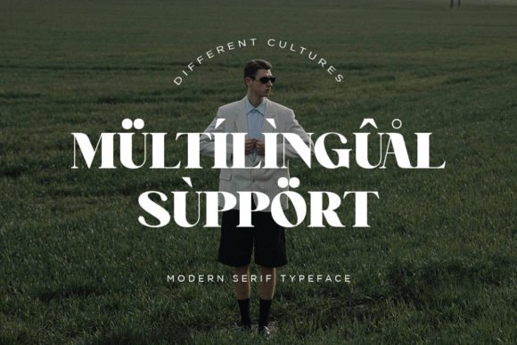
Different Cultures combines dramatic serif contrast with expressive curves and unusual ligatures. Visually, it sits somewhere between a luxury editorial typeface and a more experimental branding font.
The heavy stems give the lettering confidence, while the thin hairlines keep it from feeling too dense. I also like the way the alternate characters introduce movement without turning the entire wordmark into decoration.
From a branding perspective, this could suit boutique hotels, fashion editorials, travel publications, or lifestyle identities that need a sense of cultural richness and sophistication.
That said, the more decorative ligatures should be used selectively. Too many custom characters in one word can reduce clarity.
My take: I would consider Different Cultures for a short brand name or magazine masthead where the typography needs to carry much of the visual identity.
2. Stylish Alphabet Font
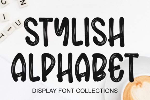
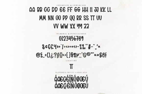
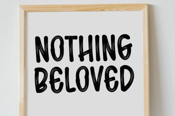
Stylish Alphabet has a hand-drawn, slightly irregular character that feels informal and energetic. The narrow strokes and exaggerated forms give it more personality than a standard handwritten display font.
This is not the kind of typeface I would use for long text. Its strength is immediate visual impact.
It could suit poster titles, merchandise, streetwear graphics, creative portfolios, social media designs, or packaging aimed at a younger audience. The uneven rhythm makes the lettering feel spontaneous, although spacing will need attention in shorter words.
My take: This font makes the most sense when the lettering is treated as the main graphic element rather than a supporting detail.
3. Sovelis Font
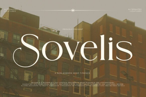
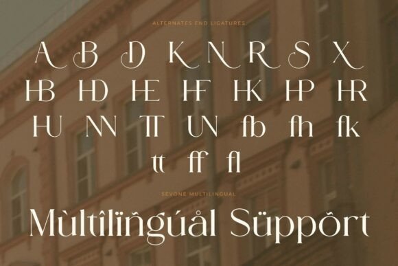
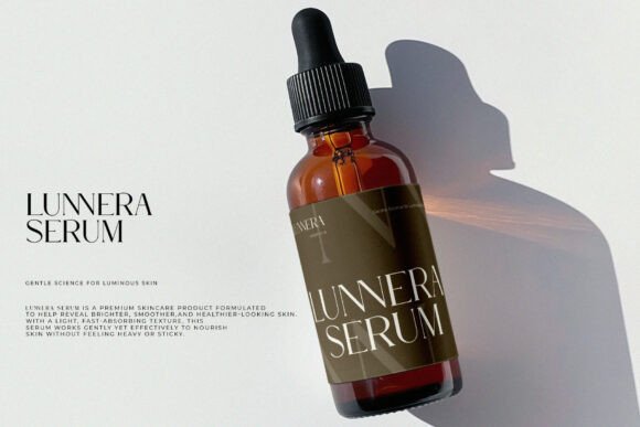
Sovelis is a high-contrast serif with long curves, sharp terminals, and a distinctly editorial mood. The letterforms feel polished, but not overly traditional.
One thing I often notice with luxury fonts is that the preview does most of the work. A dark photograph, generous spacing, and a single elegant word can make almost any serif appear premium. Sovelis has more substance than that, though. Its elongated curves and refined contrast give it enough identity to remain interesting outside the mockup.
It could fit high-end property branding, fashion campaigns, wine labels, beauty packaging, or boutique hospitality.
My take: I would use Sovelis in large sizes and give it room to breathe. Tight layouts would weaken the elegance that makes it appealing.
4. Cowboy Varsity Font
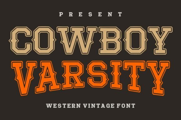
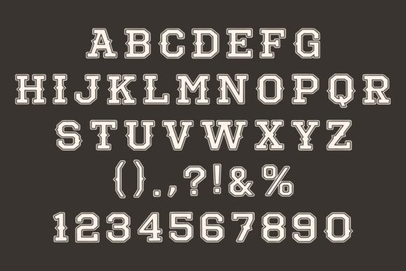
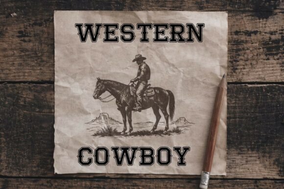
Cowboy Varsity blends western slab-serif construction with collegiate lettering. The layered outlines add depth, while the wide, sturdy forms remain readable from a distance.
This combination gives it a clear visual personality. It feels nostalgic, sporty, and slightly rugged without becoming a direct copy of old rodeo typography.
It could be useful for outdoor brands, breweries, local sports teams, apparel graphics, event posters, or heritage-inspired packaging.
The main limitation is obvious: it carries a strong theme. This is not a neutral typeface that can quietly adapt to every industry.
My take: Cowboy Varsity is most convincing when the project already has an Americana, athletic, or western direction.
5. Darkwood Font
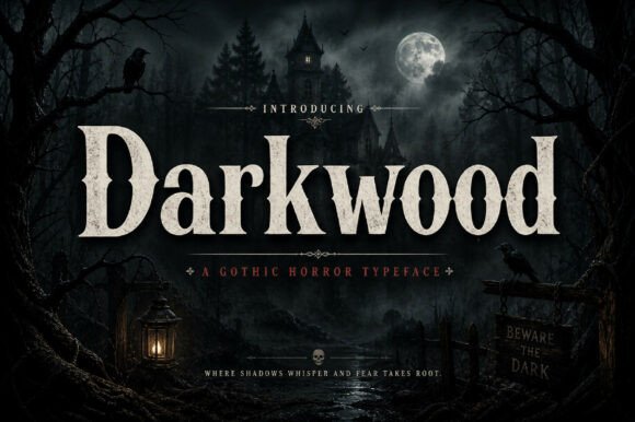
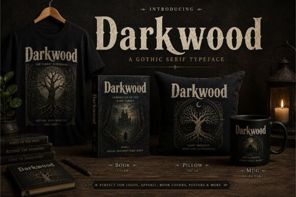
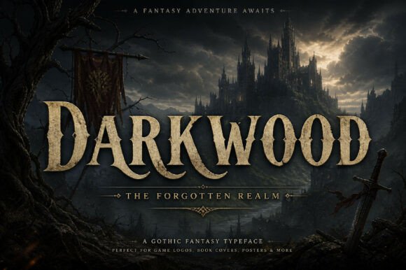
Darkwood is a compressed serif with a gothic atmosphere and substantial visual weight. Its sharp details and narrow proportions create a dark, cinematic tone.
The font feels suitable for horror titles, fantasy projects, dark editorial covers, spirits packaging, or music artwork. It could also work for a coffee or craft product brand that wants a more mysterious identity.
Because the characters are heavy and tightly structured, I would avoid using it in small sizes. The details need enough space to remain visible.
My take: Darkwood has strong mood-building potential, but it should be used as a focal typeface rather than repeated throughout an entire layout.
6. Stay Disney Font
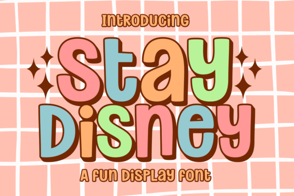
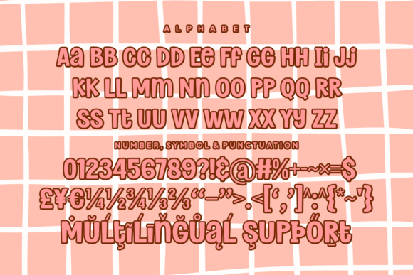
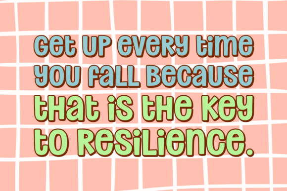
Stay Disney uses rounded bubble lettering inspired by the 1970s revival that continues to appear in packaging, social media graphics, and playful branding.
The thick curves feel cheerful and approachable. The lettering has enough volume to hold color, outlines, or layered effects, which makes it useful for stickers, thumbnails, children’s products, craft graphics, and casual merchandise.
This style has remained popular for several years, although it can become visually dated when combined with too many retro motifs at once.
My take: I would keep the surrounding layout relatively simple and let the soft, rounded letterforms create the personality.
7. Maka Font
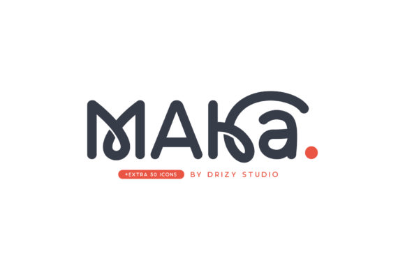
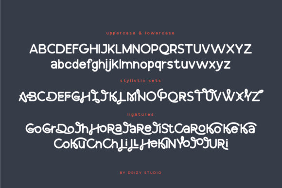
Maka has a clean, modern construction with unusual connections and curved details. It feels geometric at first, but the character shapes introduce enough irregularity to keep it from looking generic.
The spacing creates a calm rhythm, while the distinctive forms suggest technology, contemporary culture, or experimental branding.
It could suit app identities, modern editorial titles, creative studios, lifestyle products, or minimalist fashion labels.
My take: Maka is one of the more adaptable fonts in this collection, although the unusual characters may need testing in longer brand names.
8. Vera Font
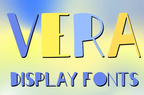
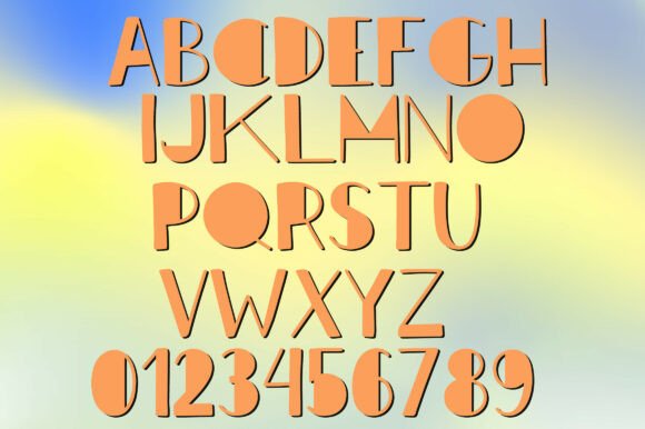

Vera uses tall, narrow letterforms with a playful shadow treatment. Its proportions make it particularly useful in layouts where horizontal space is limited.
The built-in dimensional effect gives the typography immediate character, although it also makes the font less flexible than a clean single-layer design.
It could suit summer campaigns, event posters, boutique packaging, social media covers, or colorful editorial layouts.
My take: Vera has strong poster potential, but I would avoid pairing it with overly complex backgrounds. The shadow detail already creates plenty of visual activity.
9. Annabeth Font
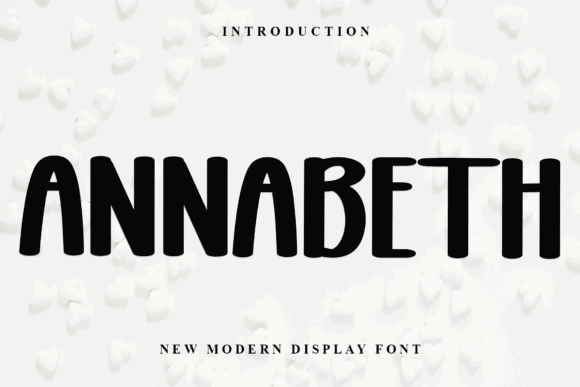
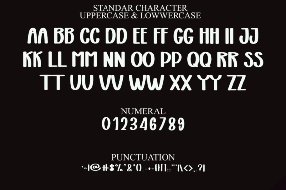
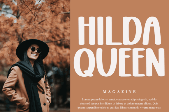
Annabeth is a rounded display sans with soft corners and simple, substantial forms. Despite the name and description in the original collection, it reads visually more like a friendly modern display font than a calligraphic typeface.
That distinction matters. The lettering feels approachable and contemporary rather than formal or ornamental.
It could suit lifestyle blogs, children’s products, informal branding, beauty graphics, or social media titles. Its readability is one of its strongest qualities.
My take: Annabeth is useful when a project needs softness without becoming overly cute or decorative.
10. Vintage Font
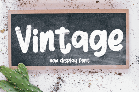
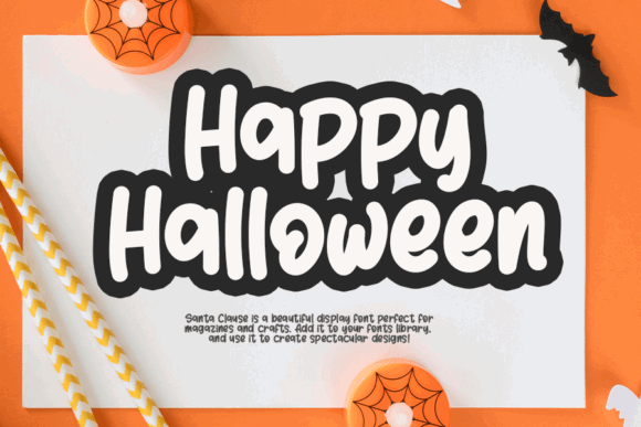
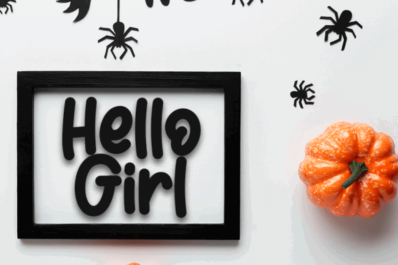
Vintage has a casual handwritten structure with rounded strokes and a lightly distressed surface.
The chalkboard-style preview gives it a rustic character, but the underlying letterforms could also suit craft packaging, café branding, informal signs, digital stickers, or handmade product labels.
I would be cautious with the texture at small sizes. Distressed fonts often look appealing in previews but lose clarity when reproduced on small packaging or low-resolution graphics.
My take: The font is most convincing in medium or large headings where the handmade texture remains visible.
11. Simple Anime Font
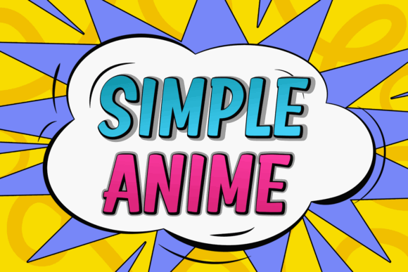


Simple Anime is a bold, condensed display font with a comic-inspired appearance. Its narrow proportions and heavy weight help it remain visible in crowded compositions.
This kind of typography is useful for gaming graphics, video thumbnails, youth-oriented merchandise, pop-culture designs, and energetic posters.
The font is straightforward rather than subtle. Its personality comes more from weight and proportion than unusual decorative details.
My take: I would use it when clarity and visual punch matter more than refinement.
12. Maghikle Font
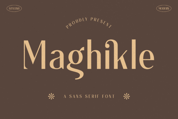
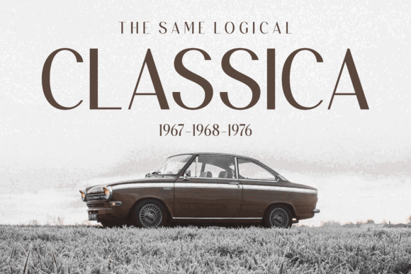
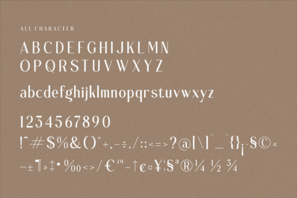
Maghikle appears as a refined serif rather than the sans serif described in the original text. Its slender proportions, soft curves, and elegant contrast give it a quiet editorial presence.
This is a good example of why I prefer looking closely at the actual letterforms rather than relying entirely on the product description.
Visually, Maghikle could suit fashion branding, boutique packaging, magazine titles, wedding stationery, or premium lifestyle identities.
My take: It has enough elegance for luxury work, but I would test the thinner strokes carefully in small print applications.
13. Funny Hippo Font
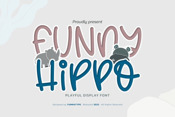
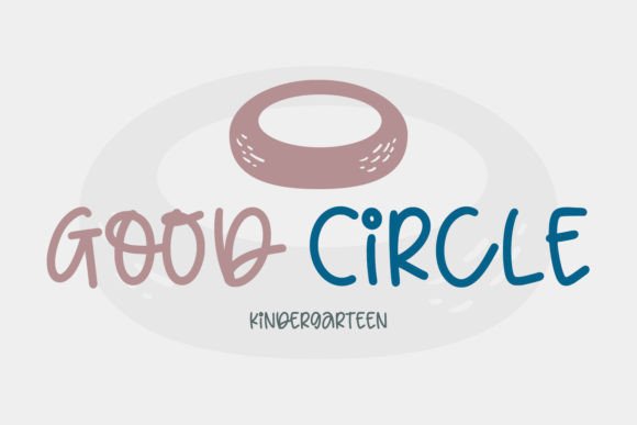
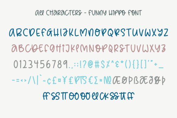
Funny Hippo is a playful handwritten display font with rounded strokes and uneven proportions. The irregular forms create movement and make the lettering feel approachable.
It could suit craft packaging, educational materials, casual children’s products, stickers, or friendly social graphics.
The style is expressive, but not especially neutral. It works best when the brand already has an informal tone.
My take: I like the human quality of Funny Hippo, although it should be paired with a cleaner secondary font to maintain hierarchy.
14. Valentine Font
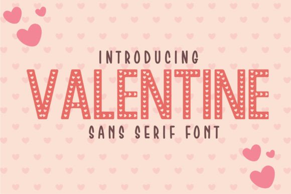
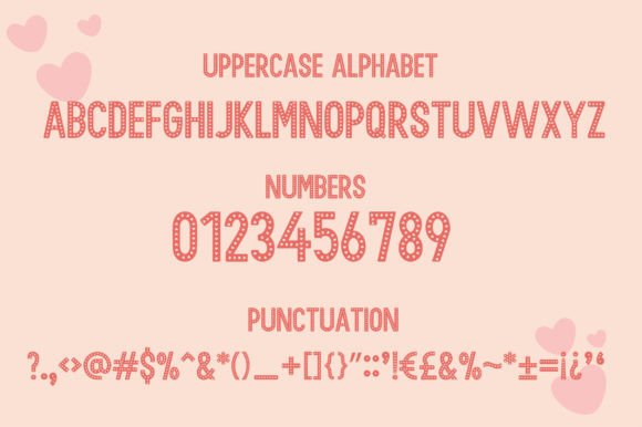

Valentine uses tall condensed letters filled with small heart motifs. It is highly thematic and clearly designed for seasonal or romantic projects.
The narrow structure gives it useful vertical presence, while the interior pattern adds decoration without requiring extra graphics.
It could suit Valentine’s Day packaging, event graphics, greeting cards, romantic stationery, or themed craft projects.
My take: This is a specialist font. It can be effective within the right theme, but its decorative heart pattern limits its usefulness beyond romantic campaigns.
15. The Paloma Font
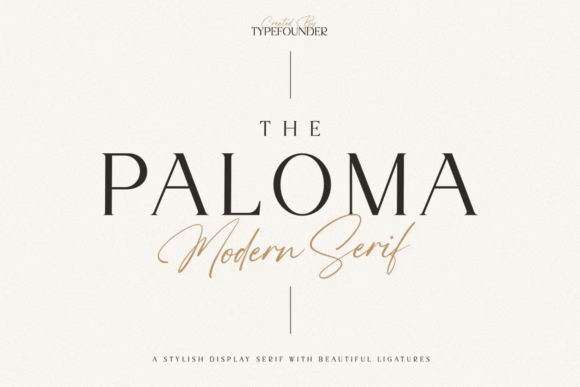
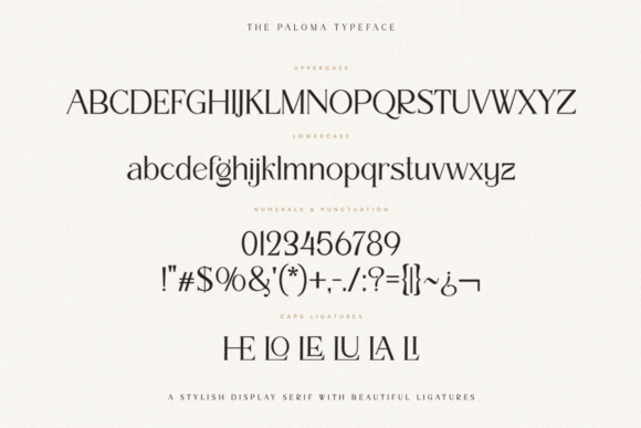
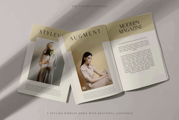
The Paloma is a modern high-contrast serif with sharp terminals and elegant proportions. The letterforms feel balanced, fashionable, and carefully spaced.
Its visual personality is refined without being excessively ornate. That makes it suitable for editorial design, wine labels, fragrance packaging, luxury stationery, fashion branding, or gallery materials.
The thin strokes may become fragile at small sizes, so I would reserve it mainly for display use.
My take: The Paloma is strongest when used with generous whitespace and restrained supporting typography.
16. Thick Font
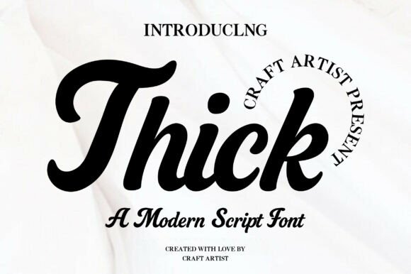
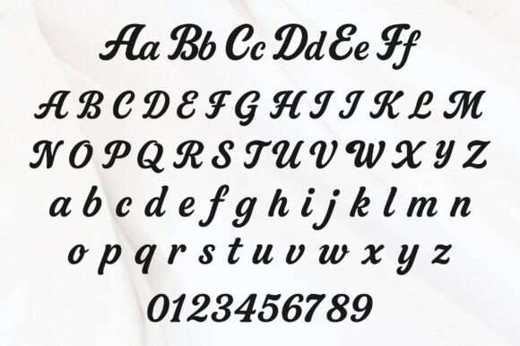
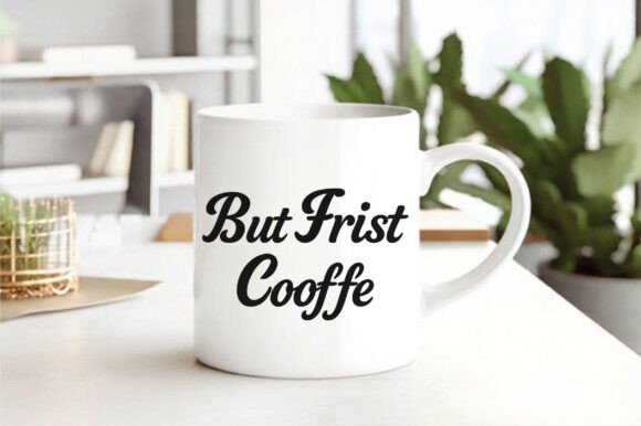
Thick is a bold script with rounded strokes and a retro sign-painting influence. The heavy construction gives it more presence than many casual scripts.
It could suit food packaging, café identities, T-shirt graphics, invitations, labels, or merchandise that needs a warm and approachable tone.
Some script fonts become difficult to read when the connections are too tight. Thick appears clearer than many alternatives, although spacing should still be checked word by word.
My take: I would use it for short phrases, product names, or logo-style lettering rather than long headlines.
17. Biges Font
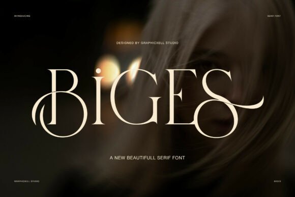
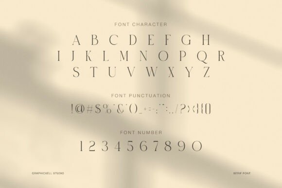
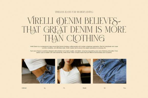
Biges is an elegant serif with dramatic swashes and narrow, high-contrast forms. The alternate characters create a luxurious editorial mood.
This style still appears frequently in beauty, fashion, jewelry, and skincare branding. It can look refined, although overusing swashes quickly makes the design feel ornamental rather than sophisticated.
The best results usually come from choosing one or two distinctive characters and leaving the rest of the word relatively simple.
My take: Biges has strong wordmark potential, especially for short names with enough space around the lettering.
18. Cowboy Outlines Font
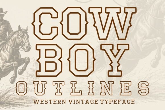
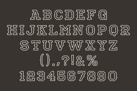
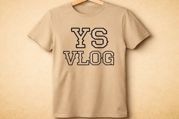
Cowboy Outlines uses a classic western slab-serif structure with open interior strokes. The outline construction makes it useful for layering, patches, apparel graphics, and textured poster designs.
It feels more flexible than a fully filled western font because the background can remain visible through the letters.
This could suit breweries, music festivals, country events, outdoor brands, western merchandise, or vintage sports graphics.
My take: The font has useful production potential, particularly for layered designs, but it still carries a strong western identity.
19. Distressed Font
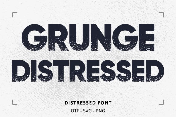
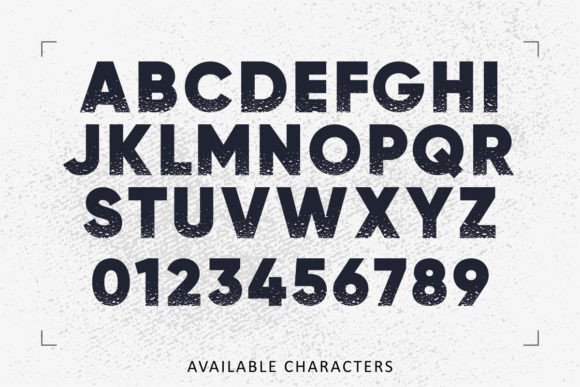
Distressed is a bold geometric sans with a weathered texture. The underlying letterforms are clean and highly readable, while the rough surface introduces an industrial or street-inspired character.
It could suit documentary posters, brewery labels, outdoor merchandise, alternative music promotion, workwear graphics, or vintage-style packaging.
Texture is often overused in distressed branding. A little wear can add credibility, but too much can make the typography look artificially aged.
My take: I would use the font against a relatively simple background and avoid adding extra distress effects.
20. Puzo Font
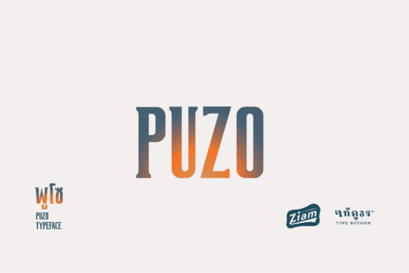
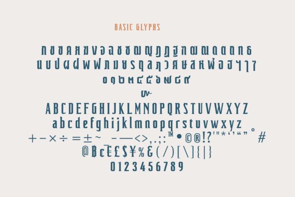
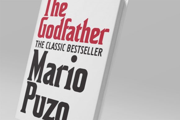
Puzo is a tall condensed display typeface with subtle serif-like details and a slightly vintage character.
Its narrow proportions make it useful for editorial columns, posters, tall packaging labels, hospitality branding, or minimalist wordmarks. The visual personality feels restrained, which gives it more flexibility than many fonts in this collection.
My take: Puzo could be a strong option for brands that want something distinctive without relying on elaborate swashes or decorative forms.
21. Neon Night Font
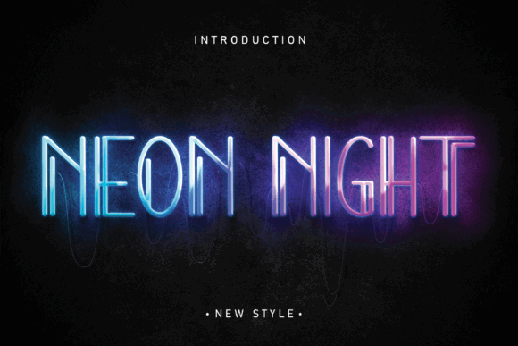
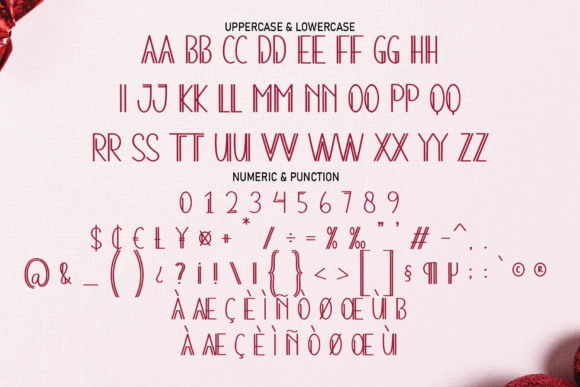
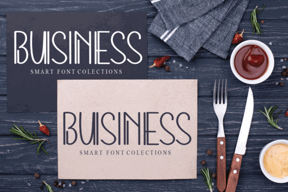
Neon Night is a connected script designed to imitate illuminated signage. Its soft curves and continuous strokes naturally suit glow effects and dark backgrounds.
It could fit nightlife branding, podcast covers, café menus, music graphics, event flyers, retro digital art, or entertainment projects.
The typeface depends heavily on styling. Without contrast, glow, or a suitable background, it may feel like a fairly conventional script.
My take: Neon Night is more of a mood-building asset than a versatile branding font.
22. Shallota Font
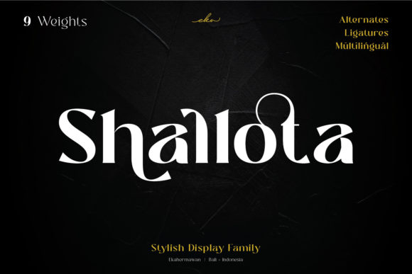
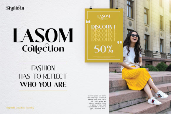
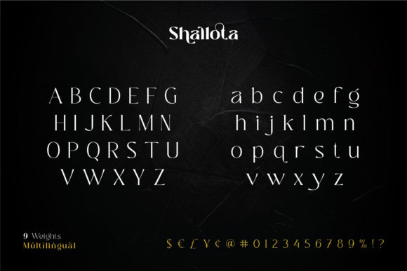
Shallota is a dramatic display serif with heavy curves, sharp contrast, and decorative alternates. The letters feel sculptural and fashion-oriented.
It could suit magazine mastheads, luxury packaging, beauty identities, editorial campaigns, or boutique product branding.
The typeface has nine weights and several alternates, which suggests more flexibility than the preview alone reveals. Even so, the strongest forms should be used selectively.
My take: Shallota could create a memorable logo, but excessive ligatures would weaken readability.
23. Theory Display Font
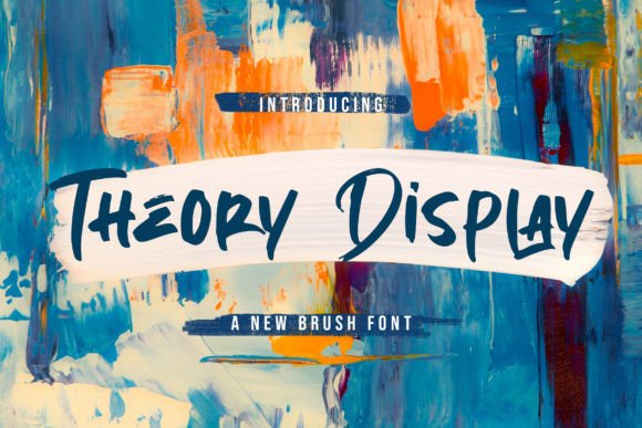
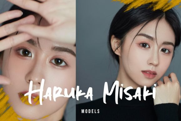
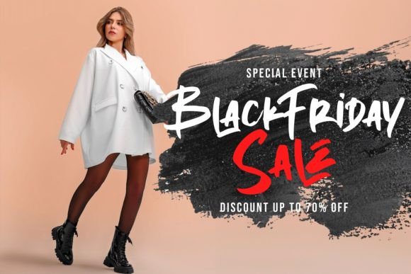
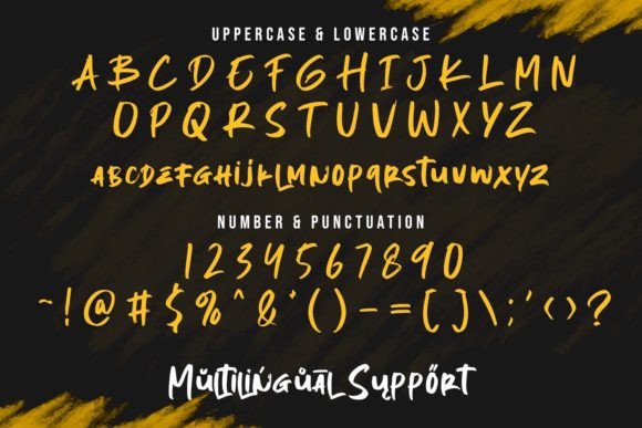
Theory Display is a brush font with visible stroke texture and irregular movement. The dry-brush details give the lettering a physical, handmade quality.
It could suit festival posters, sports graphics, film titles, action-oriented branding, streetwear, or expressive social media campaigns.
Brush fonts often create immediate energy, but they can also dominate a composition. Supporting type should remain simple.
My take: Theory Display is useful when the design needs urgency, texture, and movement without adding those effects manually.
24. Melipe Font
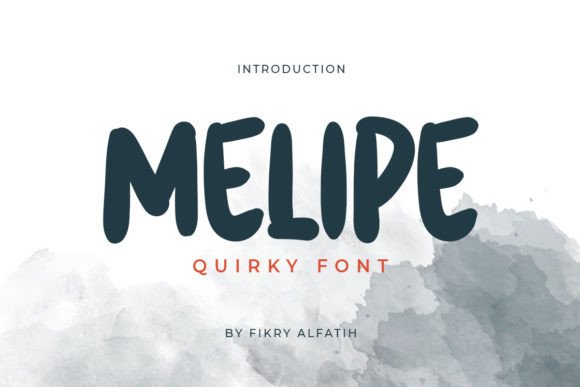
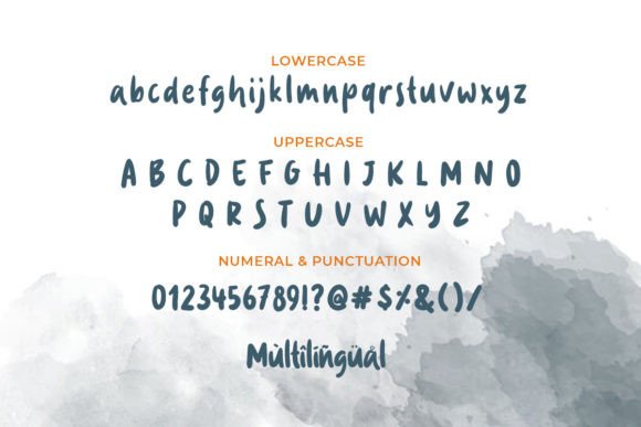
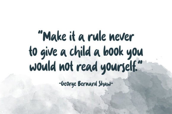
Melipe is a rounded quirky display font with soft corners and uneven proportions. It feels playful, but the forms remain clear enough for longer headings.
That balance is not always easy to achieve. Some novelty fonts look charming in a single word and become exhausting in a full phrase.
Melipe could suit children’s products, food packaging, creative apps, informal branding, educational graphics, or friendly social content.
My take: It has a useful mix of personality and readability, although I would still pair it with a neutral body typeface.
25. Charlotte Font
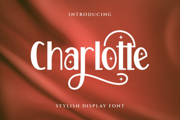
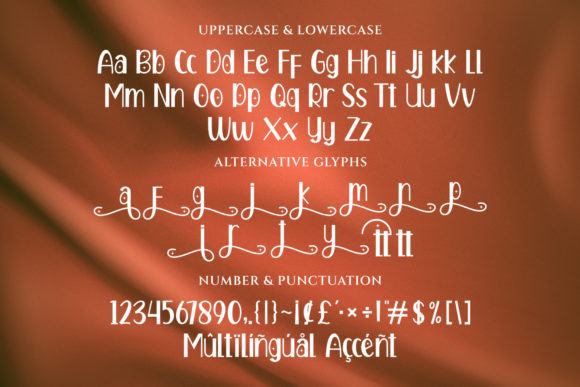
Charlotte is an elegant display serif with flowing details and decorative swashes. Its letterforms feel graceful without becoming extremely thin or fragile.
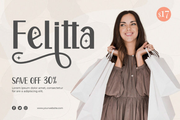
It could suit lifestyle branding, wedding stationery, skincare packaging, boutique identities, or editorial covers.
The decorative details add character, but they also increase the need for careful spacing. Some combinations may require manual adjustment.
My take: Charlotte is a good middle ground between a formal serif and a more expressive calligraphic display font.
Read More: If you're looking for even more stunning options, explore these Best Display Fonts: 10 Creative Fonts for Branding, Cricut & Crafts, perfect for bringing personality to your branding and craft projects.
How to Choose the Right Display Font
A display font should do more than look impressive in a product preview.
I usually consider a few practical questions before choosing one:
- Does the font remain readable in the actual words I need?
- Are the spacing and proportions consistent?
- Does it support the visual personality of the brand?
- Can it be paired with a simpler body font?
- Will thin strokes survive printing or small screens?
- Are the alternates useful, or are they mostly decorative?
- Does the style feel distinctive, or simply familiar because it follows a current trend?
Some display typefaces have a lot of personality but need careful handling to remain readable. Others appear less dramatic, yet offer more long-term value because they adapt to different layouts.
Strong branding often depends on consistency more than complexity. A distinctive display font can help establish the mood, but it still needs to function inside a broader visual identity.
Which Stylish Display Font Should You Choose?
This collection covers a wide range of stylish display fonts, from luxury serifs and handwritten scripts to retro bubble lettering, western outlines, brush fonts, and urban display families.
For editorial or luxury identities, Sovelis, The Paloma, Maghikle, and Shallota offer refined proportions and strong visual hierarchy. For playful packaging or social graphics, Stay Disney, Funny Hippo, and Melipe bring more warmth and energy. Cowboy Varsity, Darkwood, and Distressed have clearer thematic identities, while Maka and Puzo are more adaptable across broader branding systems.
I tend to pay attention to how a typeface feels across different applications rather than judging it from a single preview image. A font may look beautiful in a carefully art-directed mockup and still struggle on packaging, mobile screens, merchandise, or a real logo.
The most useful display fonts are not always the loudest. They are the ones that give a project personality while still leaving enough room for the rest of the design to communicate
Frequently Asked Questions
What is a display font?
A display font is a typeface designed mainly for headlines, logos, posters, packaging, and other large-scale text. These fonts usually have more personality than body typefaces, but they can become difficult to read in long paragraphs.
What makes a display font suitable for branding?
A useful branding font should match the personality of the business, remain readable in the brand name, and work across different applications. I also look at spacing, letterform consistency, available weights, and how the typeface behaves on packaging, websites, social media, and printed materials.
Can display fonts be used for logos?
Yes, many display fonts are suitable for logo design, especially when the brand name is short. Still, a font should not be judged only from its preview image. Testing the actual name is important because some letter combinations, ligatures, and decorative alternates look better than others.
How do I pair a display font with a body font?
I usually pair an expressive display font with a simpler serif or sans serif. The contrast helps create visual hierarchy without making the layout feel crowded. If the headline font is highly decorative, the supporting font should remain restrained and easy to read.
Are trendy display fonts a good long-term branding choice?
Sometimes, but not always. Retro bubble fonts, high-contrast luxury serifs, and condensed editorial styles can look current now, yet some trends age faster than others. For a long-term identity, I prefer typefaces with a clear personality, solid readability, and enough flexibility to work beyond one visual trend.
Follow Us