

ℹ️ Affiliate Disclosure: This article may contain affiliate links. We may earn a commission at no extra cost to you. Thanks for your support! ❤️
Introduction
Elegant script fonts for branding can change the feeling of a visual identity very quickly. A simple wordmark set in a flowing script can feel personal, refined, feminine, handmade, romantic, or boutique-led without adding extra illustration or decoration.
That is also why script fonts need a little more care than most type choices.
A script typeface may look beautiful in a large preview image, but branding asks more from it. It has to survive a logo lockup, a website header, product packaging, Instagram graphics, business cards, email signatures, favicon crops, and sometimes very small mobile layouts. That is where the difference between a decorative font and a usable brand typeface becomes obvious.
One thing I often notice when reviewing brand identities is that the script font gets chosen for mood first and tested for usability later. That usually creates problems. The logo feels elegant, but the tagline becomes hard to pair. The swashes look lovely on a mockup, but they fight with the layout. The thin connecting strokes disappear when the logo is reduced.
So this guide looks at 18 flowing elegant script fonts for branding from a designer’s perspective: not just how attractive they are, but how they might behave inside a real brand system. I have kept the original structure of the article: elegant logo scripts, modern handwritten faces, signature fonts, soft cursives, and fuller font duos or bundles.
For hand-signed wordmarks, a dedicated signature fonts for logo design guide can help. For pairing, luxury serif fonts are often a strong place to start because they give structure to the softness of a script.
Quick Picks
- Best luxury wordmark: Grandvera
- Best fashion-forward option: Valencia Fashion
- Best modern handwritten option: Moretimes Font
- Best personal-brand signature: Rotherdams
- Best modern calligraphy option: Alignment
How I Picked These
I compared these script fonts by wordmark readability, stroke weight, spacing, alternate-character usefulness, small-size performance, pairing flexibility, visual tone, and how well each style can carry a brand name while leaving functional typography for navigation, packaging details, websites, social graphics, and supporting copy.
Elegant script fonts for brand logos
These elegant script fonts for branding are the most logo-oriented choices in the collection. They lean into graceful movement, premium styling, and flowing wordmark shapes.
Use them when the brand needs elegance first: beauty, fashion, bridal, boutique packaging, personal styling, photography, event design, or lifestyle branding.
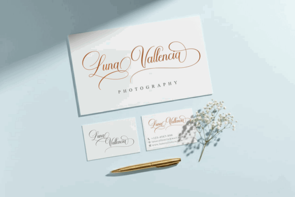
1. Valencia Fashion
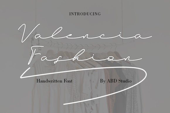
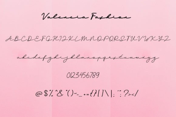
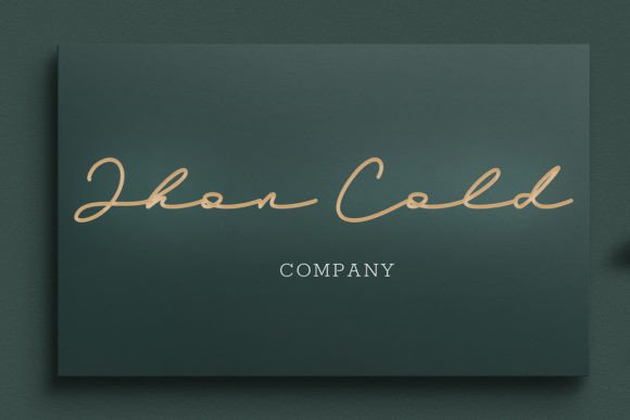
Valencia Fashion has the kind of light, fashion-led movement that immediately suggests softness and polish. Visually, the letterforms feel thin, fluid, and expressive, which gives a wordmark a more editorial personality.
From a branding perspective, I would use Valencia Fashion for a short name rather than a long brand phrase. Its strength is atmosphere. The thin strokes and extended movement can look elegant in a logo, but they need breathing room. If the wordmark is placed too close to supporting text or busy photography, the delicacy may get lost.
This typeface makes sense for beauty studios, fashion boutiques, bridal brands, perfume packaging, or personal brands that want a refined handwritten tone. I would pair it with a minimal sans serif for taglines, pricing details, navigation, and website body copy.
The main thing to test is scale. Valencia Fashion can feel beautiful at large sizes, but very thin script strokes often become fragile in small digital contexts. I would create a simplified logo version for favicons and social profile images.
2. Mallestian Script
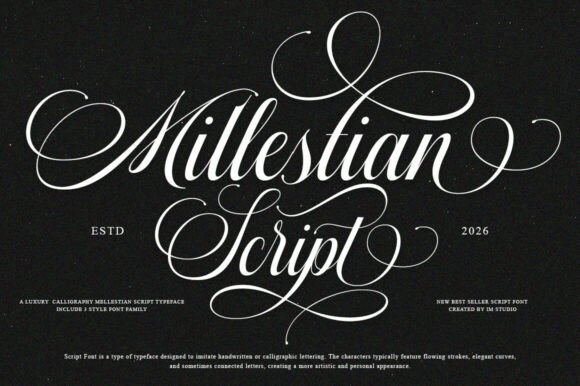
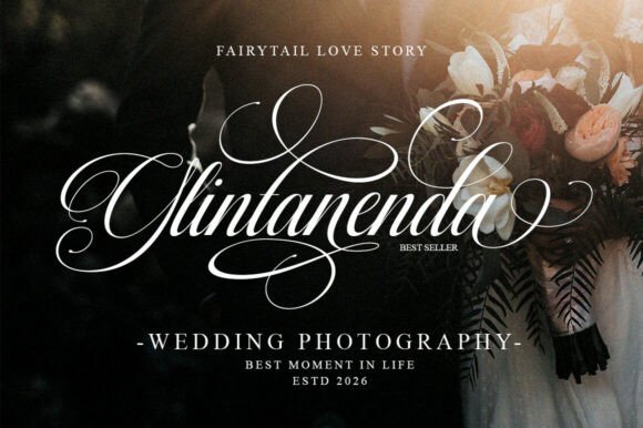
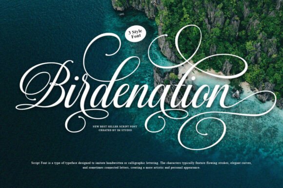
Mallestian Script feels more formal and ornamental. Its letterforms have a classic calligraphic quality, with flourishes that give the wordmark a dressed-up personality.
From a visual identity standpoint, this typeface is strongest when the brand wants to feel established, elegant, and slightly traditional. It is less casual than many handwritten scripts. The character variations are useful because they allow a designer to adjust the flow of a wordmark instead of accepting the default letter connections.
That matters in logo design. A script logo often lives or dies by two or three awkward joins. If the font gives you alternates, you have more control over rhythm, spacing, and word shape.
I would use Mallestian Script for premium stationery, wedding branding, boutique interiors, luxury personal brands, or editorial-style logos. It should be used sparingly. A typeface with this much flourish does not need much additional decoration.
The limitation is readability at smaller sizes. Highly ornamental scripts often need generous space, strong contrast, and a calm layout around them.
3. Cimlajin
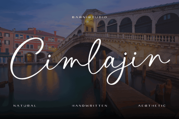
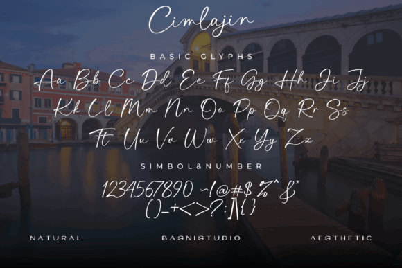
Cimlajin has a romantic, graceful tone. It feels softer and more contemporary than a highly formal calligraphy script, which makes it easier to imagine in beauty, bridal, wellness, or lifestyle branding.
The appeal here is the relaxed flow. The letterforms feel handwritten without becoming messy. That gives the brand a personal quality, but not an overly casual one.
In a website context, I would use Cimlajin for the primary logo, a hero accent, or short editorial callouts. I would not use it for navigation or small labels. Like many flowing scripts, it relies on curves and joins that need enough size to remain clear.
Cimlajin would pair well with a quiet serif if the brand wants a romantic editorial feel, or a soft geometric sans if the goal is more modern and approachable. The pairing choice will make a big difference. With a serif, it becomes more bridal and refined. With a sans, it becomes more lifestyle and contemporary.
4. Grandvera
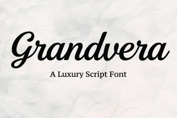
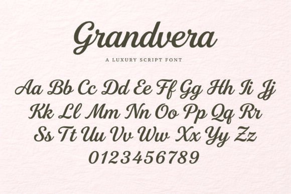
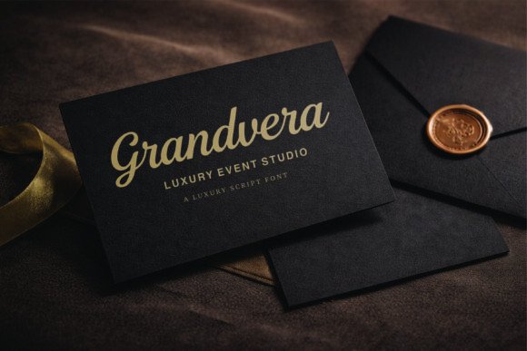
Grandvera has a more polished luxury-script feel. It appears smoother and slightly more substantial, which can make it useful for premium wordmarks.
This is the kind of script I would consider for beauty packaging, fashion labels, high-end salon branding, or boutique product lines. It has enough visual confidence to feel like a logo rather than just a decorative accent.
The smooth strokes are important. Uneven or overly rough scripts can feel charming, but they are harder to use in luxury branding. Grandvera leans toward refinement, which helps when the identity needs to feel calm, expensive, and controlled.
Still, I would keep the system simple around it. A script like this should usually be the expressive element. Supporting typography should be clean, well-spaced, and consistent. Too many decorative details would make the brand feel less premium.
The practical test is how Grandvera behaves in black and white, on packaging, and in smaller horizontal logo placements. If the wordmark remains readable without relying on mockup styling, it has stronger brand potential.
5. Summer Fashion
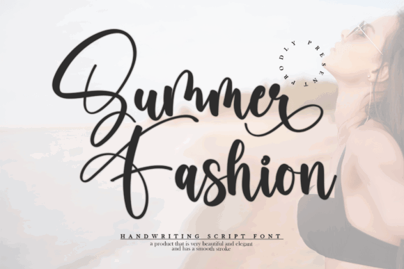
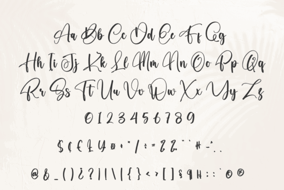
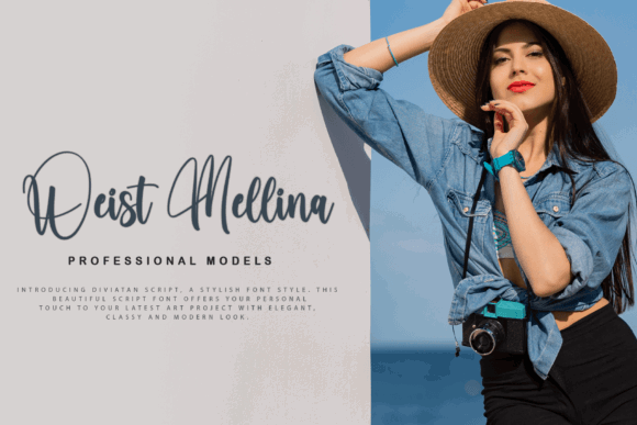
Summer Fashion has a warm handwritten energy. It feels less formal than Grandvera or Mallestian Script and more relaxed than a traditional calligraphy logo.
For fashion and lifestyle brands, that can be useful. Not every elegant brand needs to feel distant or luxurious. Some need to feel friendly, feminine, current, and approachable. Summer Fashion sits closer to that space.
The visual rhythm feels expressive, so I would use it for a short brand name or accent phrase. It may become less controlled in longer wording. As with many handwritten scripts, spacing and letter connections should be checked carefully before committing to a final logo.
This typeface could suit summer collections, lifestyle shops, beauty creators, handmade brands, or casual fashion labels. I would pair it with a clean sans serif and a light color system rather than heavy ornamental elements.
Modern handwritten fonts for branding
Modern handwritten elegant script fonts for branding usually feel more casual, direct, and digital-friendly. They can help a brand feel human without looking overly formal.
This category is useful for lifestyle businesses, creators, small studios, food brands, wellness brands, and modern boutiques.
6. Handwritten
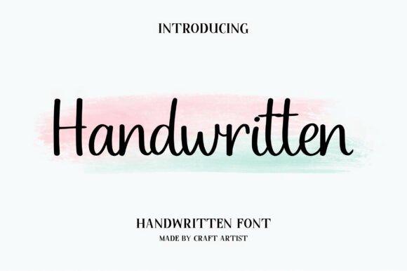
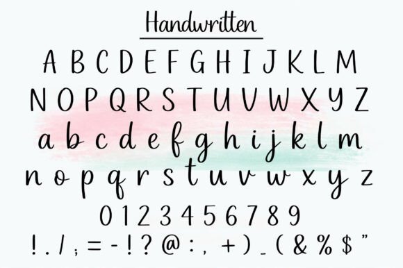
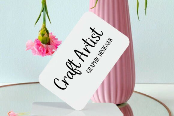
Handwritten has a soft, approachable cursive feel. It is not trying to look overly luxurious, which can be a strength. Some brands need warmth more than polish.
The rounded forms and gentle rhythm make it feel friendly and accessible. From a usability perspective, that can work well for lifestyle brands, small product shops, kids-related brands, or personal creative businesses.
I would be careful about using a typeface this simple as the only identity element for a premium brand. It may not carry enough distinction on its own. But for a softer brand voice, especially one built around care, craft, or personality, it can make sense.
The pairing should add structure. A clean sans serif with good spacing would help keep the identity from feeling too casual. On a website, I would use this script for the logo and maybe one or two accent moments, not for section headings throughout the page.
7. Moretimes Font
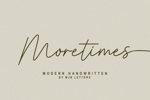
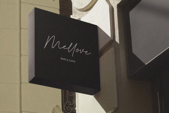
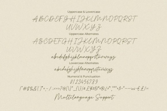
Moretimes is one of the cleaner modern handwritten options in the list. It has a restrained flow, which makes it more usable than many decorative scripts.
From a branding perspective, that restraint is valuable. A font does not need to shout to be memorable. Moretimes gives a hand-written impression without making the reader work too hard.
The thin, elegant strokes give it a modern lifestyle tone. I can imagine it in branding for a photographer, wellness consultant, boutique studio, skincare brand, or personal website. It has enough clarity to feel practical, especially compared with more ornamental scripts.
The main limitation is contrast and size. Thin handwriting can look refined in large logo applications but may weaken in small digital uses. I would test it in a website header, mobile menu, Instagram avatar, and email signature before using it as the primary logo typeface.
Moretimes benefits from generous spacing around it. Let the wordmark breathe.
8. Scribble
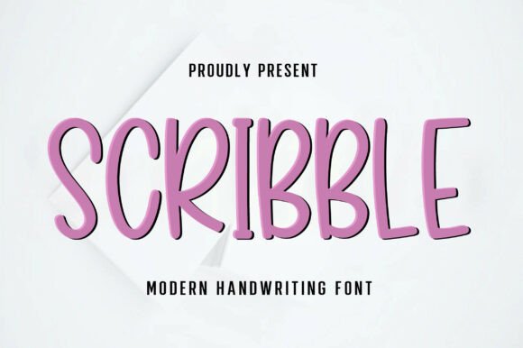
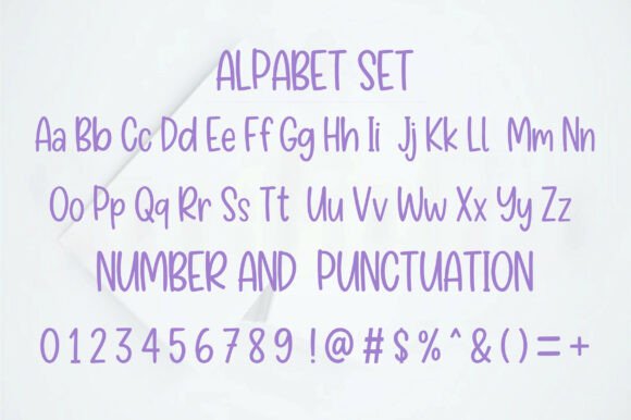
![Canvas tote bag with colorful text saying 'have a nice day !! : ]' in a playful script font.](https://cdn.fontiverse.com/wp-content/uploads/2026/07/Scribble-Fonts-148318191-7-580x386-1.jpg "Scribble-Fonts-148318191-7-580x386")
Scribble moves in a more playful direction. It has a casual, creative energy rather than a polished luxury tone.
That makes it less suitable for high-end fashion or bridal branding, but more suitable for brands that want personality, friendliness, and informality. Creative studios, kids brands, handmade shops, casual lifestyle blogs, and playful packaging could use this kind of handwritten style effectively.
The visual weight appears stronger than the thinner scripts, which can help with readability. Still, playful scripts need discipline. If everything in the identity becomes playful, the brand can quickly lose hierarchy.
I would use Scribble as a logo or accent typeface and pair it with a simple sans serif for structure. The supporting typography should do the serious work: product descriptions, navigation, calls to action, and body copy.
The brand perception here is approachable and casual, not refined luxury. That distinction matters.
9. Butter Love
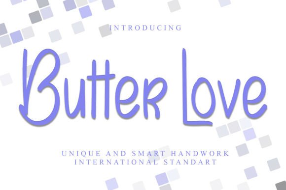

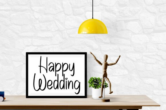
Butter Love has a slim, relaxed handwritten quality. It feels soft, light, and informal.
This typeface would make sense for lifestyle, food, homemade goods, casual beauty, or small creative brands that want a gentle hand-drawn tone. It does not feel overly polished, and that can be useful when the brand wants to appear personal rather than corporate.
Because the forms are slim, I would pay close attention to contrast. A light handwritten font can disappear on textured backgrounds, pale packaging, or mobile screens. It needs enough color contrast and enough size to stay legible.
I would avoid using Butter Love in situations where the logo needs to feel highly premium or authoritative. It has charm, but not much visual weight. It is better for warmth than status.
A clean, slightly sturdy sans serif would help balance it.
10. Alignment
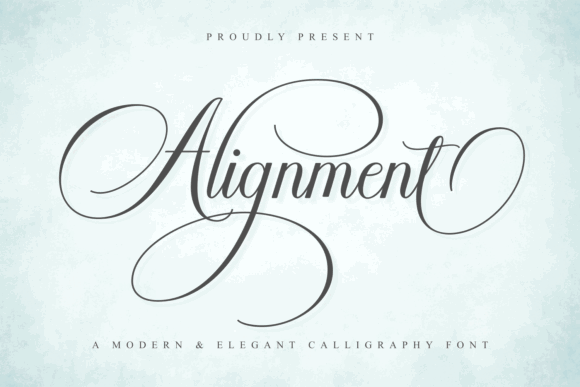
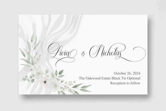
Alignment brings the article back toward modern calligraphy. It has smoother, more elegant strokes and a more refined rhythm than the casual handwritten options.
This makes it useful for brands that want a calligraphic wordmark without looking too old-fashioned. The swashes can add sophistication, but they should be used carefully. Too much flourish can reduce clarity and make the logo harder to place across layouts.
From a logo design standpoint, I would test multiple versions: one with full swashes, one with reduced alternates, and one simplified version for small use. That gives the brand more flexibility.
Alignment could work for bridal brands, photographers, beauty professionals, event designers, or boutique studios. It has enough elegance to feel special, but its modern smoothness keeps it from feeling overly traditional.
The supporting system should be calm: neutral colors, clean spacing, and restrained typography.
Signature scripts for personal brands
Signature scripts are especially useful for founder-led brands. They suggest authorship, personal taste, and human connection.
But they are also risky. Many signature fonts look similar when used without customization. To make them feel credible, I would treat them as a starting point, then adjust spacing, alternates, and lockup details carefully.
11. Rotherdams
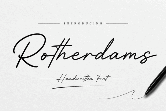
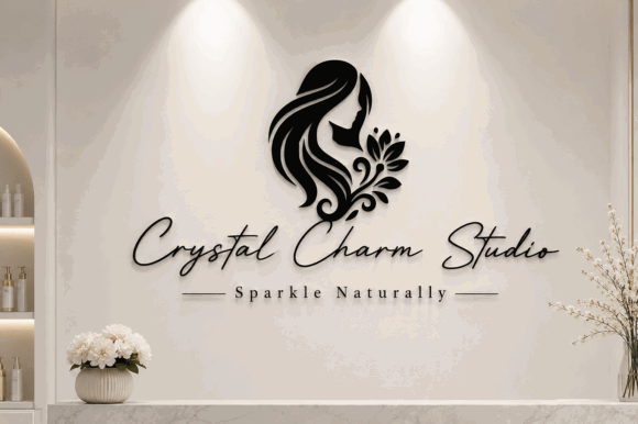
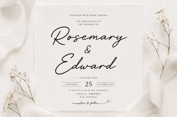
Rotherdams has the familiar feel of a hand-signed wordmark. It is graceful, personal, and warm.
This kind of script can work well for coaches, photographers, designers, stylists, consultants, artists, and boutique service providers. It gives the brand a founder-led quality, which can make the identity feel more intimate.
The key is not to overuse it. A signature font should usually appear in the logo or a few personal accents, not across every heading. If it appears too often, the brand can feel repetitive and less professional.
Rotherdams would pair nicely with a clean sans serif or a refined serif depending on the desired tone. A sans pairing feels modern and personal. A serif pairing feels more editorial and premium.
The biggest check is uniqueness. Signature scripts are popular, so the surrounding identity system needs to add distinction through layout, color, imagery, and spacing.
12. Charlien
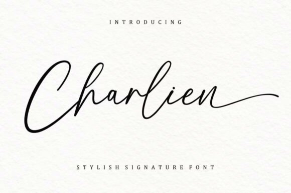
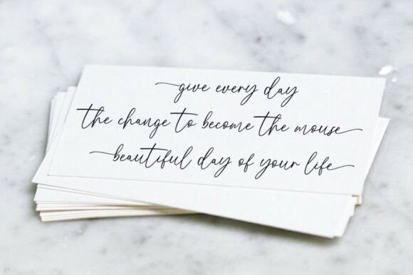
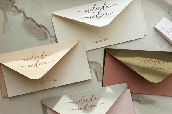
Charlien feels confident and direct. It has a personal signature quality, but it is not overly delicate.
That confidence makes it useful for creator brands, boutique studios, personal websites, and visual identities where the founder’s name is central. It has enough clarity to feel practical in a logo, though small-size testing is still important.
I like signature scripts when they feel like part of a broader brand voice rather than a decorative shortcut. Charlien would need a strong supporting system: consistent photography, clean typography, and a clear hierarchy.
The long exit stroke can be attractive in a wide logo lockup, but it may create spacing issues in narrow placements. I would check how it fits inside square crops, social icons, and mobile headers.
This is a good example of a font that may look simple at first glance but still needs careful layout decisions.
13. Marseliyon
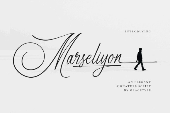
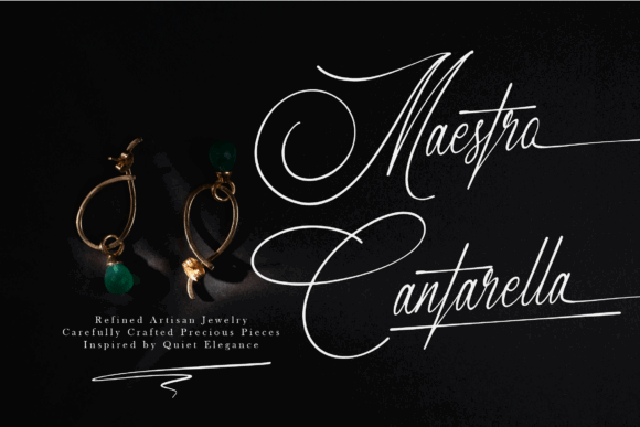
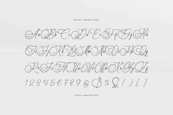
Marseliyon feels more elegant and artful. It has a refined signature look with a stronger calligraphic influence.
This typeface is better suited to premium personal brands than casual ones. I can imagine it in branding for a luxury photographer, wedding creative, fashion stylist, interior designer, or beauty founder.
The flourishes add personality, but they also increase the need for restraint. In a real brand system, I would avoid placing Marseliyon near busy imagery or other decorative typography. Give it space, contrast, and a quiet supporting layout.
Because it has an artful signature style, it may not suit brands that need to feel highly practical, technical, or corporate. It communicates taste and personality more than efficiency.
Used carefully, it can create a polished personal mark.
14. Snettisham
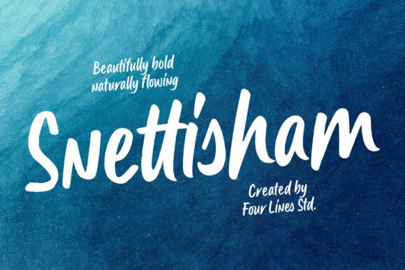
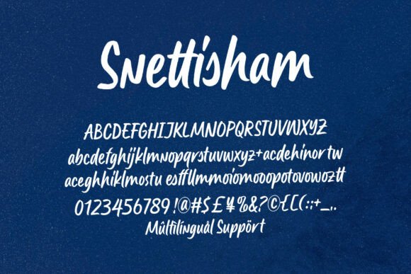
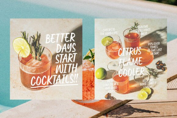
Snettisham has more weight and presence than many signature scripts. It feels bold, smooth, and expressive.
That extra weight can help with visibility, especially in digital branding. A heavier script often survives small sizes better than a very thin one, although the joins and internal shapes still need testing.
This font would suit personal brands that want warmth but also confidence. It could work for creative businesses, lifestyle brands, casual apparel, sports-adjacent brands, or creators with a more energetic tone.
It is not as delicate or luxurious as some of the earlier scripts. That is not a weakness. It simply gives the brand a different personality: more approachable, more casual, more present.
I would keep the color palette and layout clean so the heavier handwritten style does not become visually noisy.
Soft cursive fonts for warm branding
Soft cursive fonts are useful when a brand needs to feel gentle, caring, homemade, nostalgic, or personal.
They are often less formal than luxury scripts and less sharp than signature fonts. The challenge is keeping them readable and avoiding a childish or overly sentimental tone unless that is intentional.
15. Handwriting
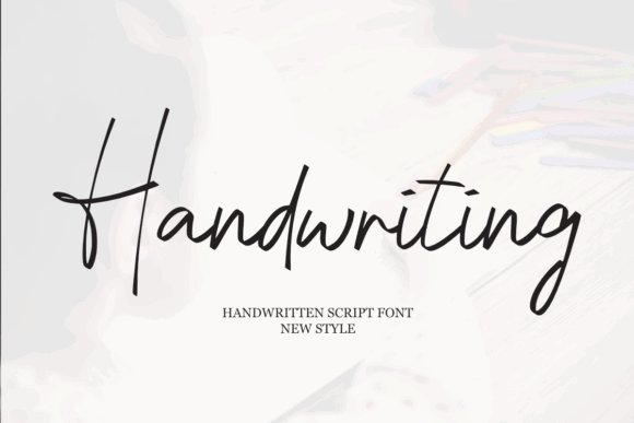
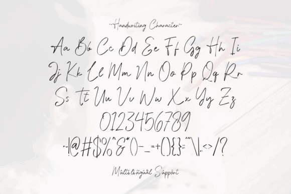
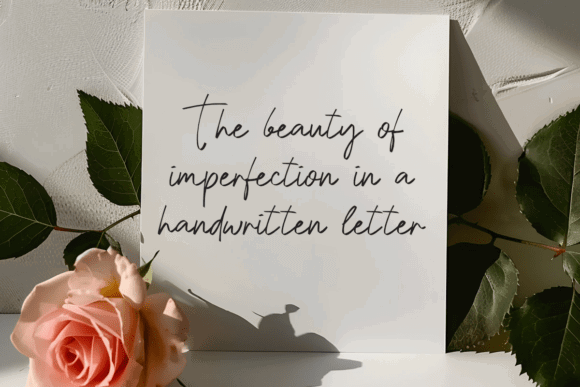
Handwriting has a gentle, personal feel. It reads more like a warm note than a polished fashion logo.
That makes it suitable for homemade goods, care-based brands, family-oriented products, lifestyle projects, or small shops built around a personal touch. It would not be my first choice for a premium beauty logo, but it could be a strong fit for a softer emotional brand.
The letterforms are delicate, so I would keep the wordmark short. Cursive joins can blur when reduced, especially on screens. A simplified secondary mark would be useful.
Pairing matters here. If paired with another soft typeface, the identity may feel weak. I would use a clean sans serif with enough structure to hold the system together.
This typeface is about warmth, not authority.
16. Cursive Delight
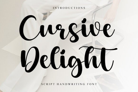
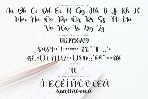
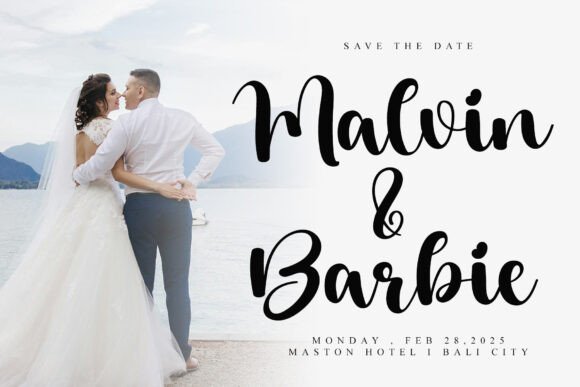
Cursive Delight has a sweet and friendly tone. It feels gentle, approachable, and slightly playful.
That makes it suitable for lifestyle brands, kids brands, handmade products, stationery, small food labels, or community-led projects. It communicates friendliness quickly.
The risk is that it may feel too soft for brands that need sophistication or premium positioning. Not every elegant script font belongs in luxury branding. Some are better at emotional closeness, and Cursive Delight fits that role.
I would use it in a restrained way: logo, packaging accent, short social quote, or small brand phrase. For website usability, supporting text should remain in a highly legible sans serif.
The hierarchy should be clear. Soft cursive can lose impact if every element is trying to feel cute.
17. Fashion
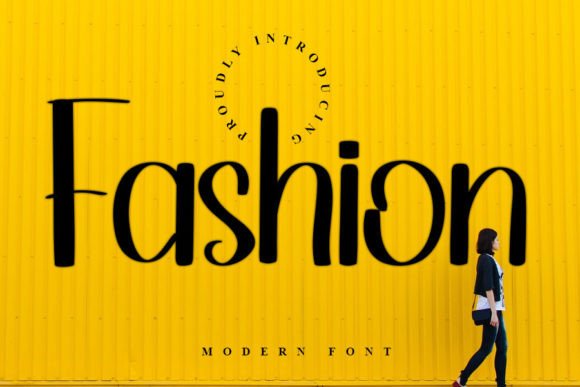
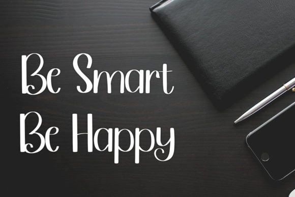
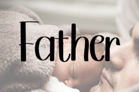
Fashion is a timeless handwritten-style font with a warmer, more classic feel. It is less dramatic than some of the fashion scripts earlier in the article, which can make it more flexible.
This kind of font could work for lifestyle, beauty, boutique clothing, casual fashion, or creator branding. It gives a handwritten impression without feeling too theatrical.
The simplicity is useful, but it also means the brand system needs other distinctive elements. Color, photography, spacing, and layout will matter if the logo itself is understated.
I would test Fashion in a full lockup with a tagline, website navigation, and packaging mockup. Some handwritten fonts look appealing alone but feel too ordinary once placed into a larger identity. The question is whether it still gives the brand enough personality when used with real content.
18. Baseball Handwriting
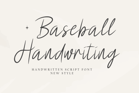
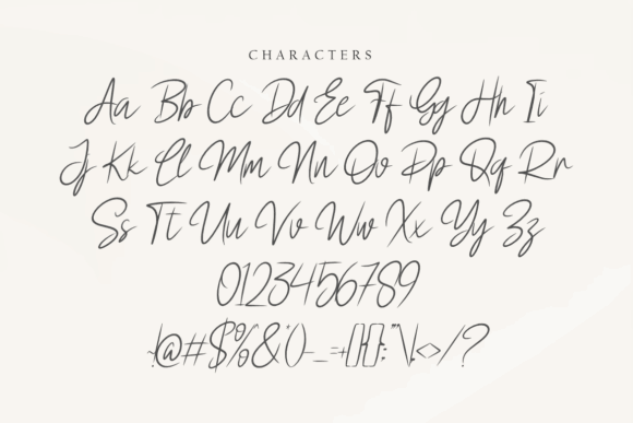
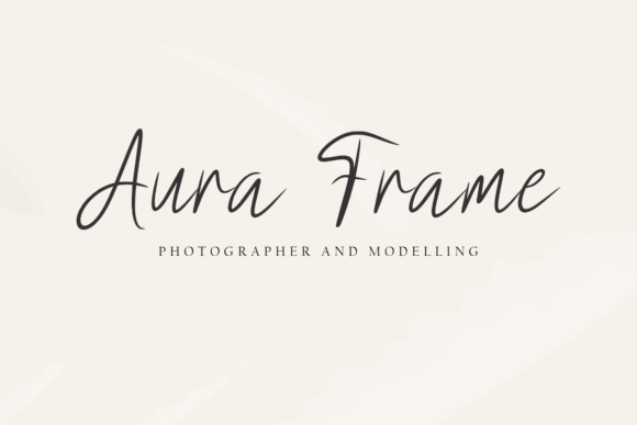
Baseball Handwriting has a casual, flowing character. Despite the name, it does not have to be limited to sports-related brands, though it can naturally fit that direction.
It feels friendly and relaxed. That could work for lifestyle products, casual apparel, handmade goods, food packaging, or youth-oriented branding. It is not the font I would choose for a refined luxury identity, but it has a human quality that can be useful.
The visual tone is more informal than elegant in the traditional sense. That makes it important to match it with the right brand personality. A mismatch would be obvious.
For example, on a premium skincare brand, it might feel too casual. On a handmade snack brand or relaxed lifestyle shop, it could feel approachable and memorable.
Read More: And if you're eager to discover even more elegant options that can make your brand truly stand out, don't miss these Script Fonts for Logo Design: 36 Elegant Picks That Feel Premium.
How to use elegant script fonts for branding
A script logo is always a balance between flow and legibility.
That sounds simple, but it is where many script-based identities succeed or fail. A typeface can completely change the personality of a logo without changing any other design element. A beauty brand can feel more editorial. A wedding brand can feel more romantic. A lifestyle studio can feel more personal. But if the letterforms become unclear, the brand loses confidence.
When I am evaluating elegant script fonts for branding, I usually check a few things before getting attached to the visual style.
Keep it short.
Scripts are strongest when they are used for names, short phrases, initials, or accent words. They are rarely comfortable as long headings, navigation labels, or paragraph text. A beautiful script can become tiring very quickly when it has to carry too much information.
Use alternates carefully.
Swashes, ligatures, and alternate letters can make a wordmark feel custom. They can also make it feel overworked. I usually test the plain version first, then add alternates only where the word needs better rhythm or a cleaner ending.
Pair with a clean sans or serif.
Most elegant script fonts need a quieter partner. A clean sans serif can make the identity feel modern and usable. A refined serif can add luxury and editorial structure. The script should not have to do every job in the brand system.
Test small.
This is non-negotiable. Thin joins, delicate loops, and long entry strokes can vanish at favicon size or in mobile navigation. If the wordmark only works when it is large, it may still be useful, but it should not be the only logo version.
Watch the spacing.
Small spacing decisions often have a bigger impact than people expect. Script fonts depend heavily on rhythm. If the kerning feels uneven, the whole logo can look less refined even if the typeface itself is beautiful.
Which Elegant Script Font Should You Choose for Your Brand?
Choosing elegant script fonts for branding is not just about finding the prettiest wordmark. It is about matching the typeface to the brand’s personality, then making sure it can function across real touchpoints.
A flowing script can make a logo feel warm, personal, refined, or romantic. But the same font can become difficult if the brand needs strong small-size readability, complex layouts, or a highly practical website interface.
My usual advice is simple: choose the script for the emotional tone, then build the rest of the identity for clarity.
Use the script for the name. Keep supporting details in a clean typeface. Test the logo small. Check the spacing. Make sure the wordmark still works without a beautiful mockup around it.
Strong typography usually feels effortless, which is why it is often overlooked. But in branding, those small decisions — the weight of a stroke, the rhythm of a curve, the space between letters — shape how people read and remember the brand.
FAQ
What are the best elegant script fonts for branding?
The best elegant script fonts for branding are the ones that balance beauty with readability. From this collection, Grandvera and Valencia Fashion feel more suited to luxury and beauty wordmarks, Moretimes has a cleaner modern handwritten style, Rotherdams and Charlien work for personal brands, and Alignment is useful when you want a polished modern-calligraphy direction. The right choice depends on the brand system, not just the font preview.
Are script fonts good for branding?
Yes, script fonts can be very effective for branding when the brand needs warmth, personality, romance, elegance, or a personal signature feel. They are not ideal for every business. A script font can look weak in technical, corporate, or highly functional brands if the style does not match the message. They also need careful testing at smaller sizes. A script is usually strongest as a logo or accent typeface, paired with a more readable sans serif or serif for the rest of the identity.
How do I keep a script logo readable?
Keep the wordmark short, avoid long phrases, and test the logo at small sizes before committing. Use alternates only when they improve the flow. Watch the kerning and spacing carefully, because uneven joins can make even a beautiful typeface feel unprofessional. I also recommend creating more than one version of the logo: a full script wordmark, a simplified small-use version, and possibly an initial or monogram mark for favicons and social profiles.
Should I use script fonts on a website?
Yes, but sparingly. Script fonts can add personality to a website logo, hero accent, pull quote, or short heading. They should not be used for body text, navigation, buttons, or important interface labels. Website typography has to support readability and speed. A script may create the brand mood, but the functional typography should make the site easy to use.
What should I pair with an elegant script font?
Most elegant script fonts pair best with a clean sans serif or a refined serif. A sans serif makes the brand feel more modern, minimal, and usable. A serif makes it feel more editorial, premium, or romantic. The key is contrast. If the script is expressive, the supporting font should be calmer. Avoid pairing a script with another decorative font unless there is a clear design reason.
Follow Us