

Halloween Fonts for Posters, Cricut Crafts, Shirts, and Invitations
The best Halloween font can establish the mood of a design before anyone reads the full message. Jagged horror lettering suits haunted-house posters, chunky monster fonts make children’s party graphics more approachable, and vintage drips bring the atmosphere of an old creature-feature movie.
I selected 30 Creative Fabrica fonts that cover those distinct visual directions rather than filling the list with nearly identical dripping alphabets. My picks include scary display fonts, playful ghost lettering, witch-inspired styles, blackletter designs, and readable options for merchandise.
Table of Contents
Best Halloween Fonts for Spooky Design Projects
1. Monster Halloween
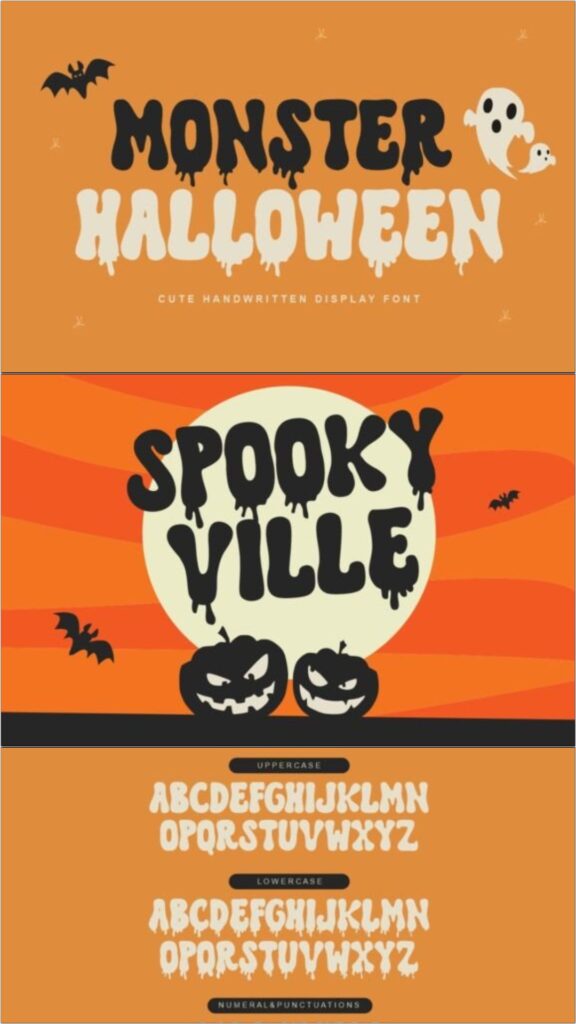
Monster Halloween uses thick, dripping letterforms that immediately suggest slime, melting paint, or a classic monster-movie title. Its substantial strokes give words a strong silhouette, making it suitable for headings that need to remain noticeable against illustrated backgrounds.
This is my pick for designs that should feel spooky without becoming genuinely disturbing. The playful proportions suit family events and children’s merchandise, although the dripping details are better reserved for short phrases than paragraphs.
Best for: party posters, children’s shirts, treat bags
Key features: thick strokes, dripping details, playful horror mood
Download Monster Halloween Font
2. Hello Witch
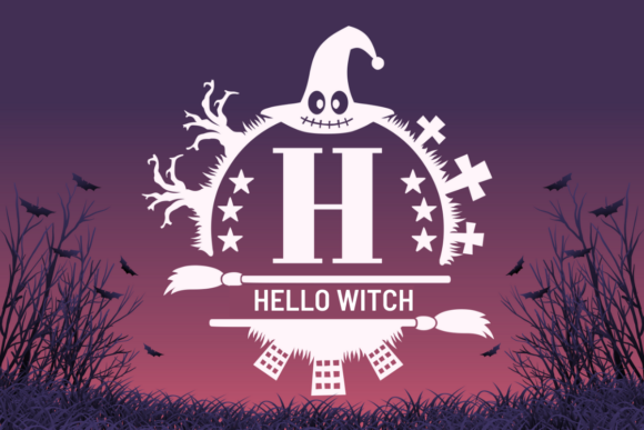
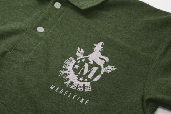
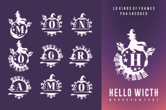
Hello Witch combines decorative Halloween details with an approachable handmade character. The irregular shapes add personality without pushing the design fully into horror territory, so it can support cheerful seasonal messages as well as lightly spooky graphics.
I would use this font for a friendly boutique collection, craft project, or invitation aimed at families. It has enough decoration to carry a short headline, but pairing it with a simple sans serif will keep dates and supporting information easier to scan.
Best for: craft signs, party invitations, Halloween shirts
Key features: decorative lettering, handmade feel, friendly spooky style
3. Horror World
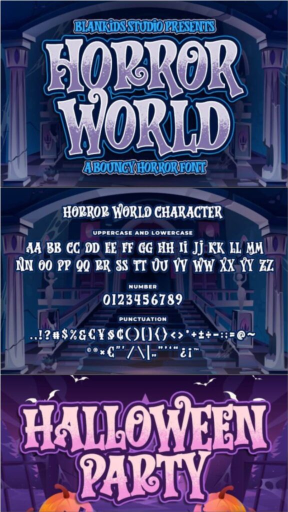
Horror World has a bouncy serif structure that resembles playful comic and children’s book lettering. The uneven forms introduce a creepy edge, while the broader shapes prevent the font from feeling as severe as a narrow slasher-style alphabet.
My favorite application would be packaging or a book cover that needs both humor and Halloween character. It is expressive enough to serve as the main visual element, although using too many competing illustrations around it could make the composition feel crowded.
Best for: book covers, product packaging, comic graphics
Key features: bouncy serif forms, broad characters, playful horror tone
4. Scary Halloween Trio
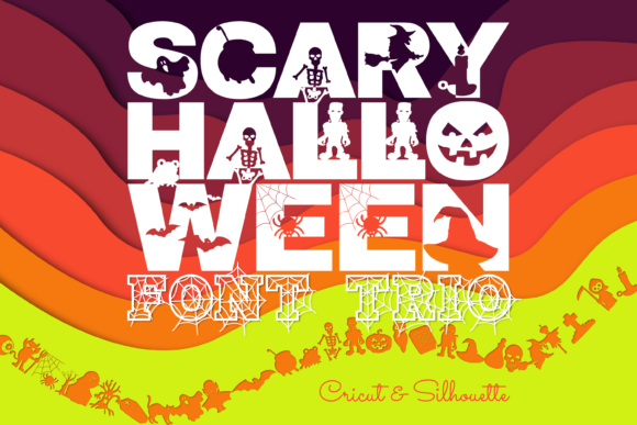
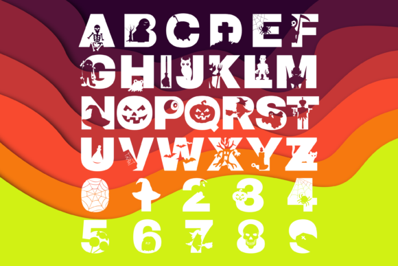
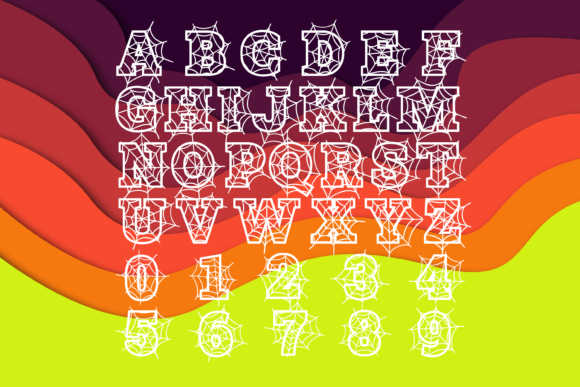
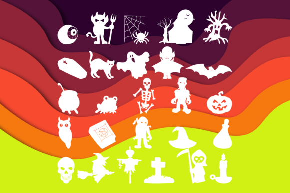
Scary Halloween Trio provides coordinated serif, sans serif, and dingbat styles. That combination is useful when a design needs more than one typographic level, since the related fonts can handle a headline, secondary phrase, and decorative accents without looking randomly assembled.
I like this option for complete invitation suites or printable party collections. A trio offers more flexibility than a single display face, but the decorative components should still be used selectively so the main message remains dominant.
Best for: invitation suites, printable sets, classroom decorations
Key features: three coordinated styles, dingbats, flexible hierarchy
5. Blockton Halloween
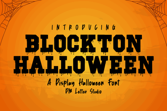
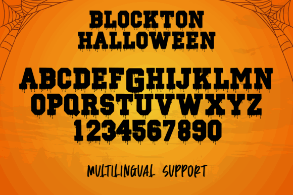
Blockton Halloween is built around bold, chunky letterforms with a seasonal twist. Its sturdy shapes provide stronger readability than many highly distressed horror fonts, especially when text must be seen on a sign, package, or social media thumbnail.
This would be one of my first choices for merchandise because the substantial strokes should reproduce more cleanly than delicate or heavily scratched lettering. Designers seeking an elegant witch aesthetic may find it too playful and heavy.
Best for: stickers, apparel, party signage
Key features: chunky construction, bold silhouette, strong headline readability
Download Blockton Halloween Font
6. Super Horror
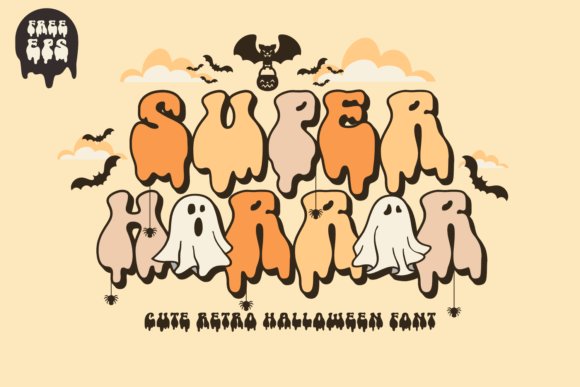
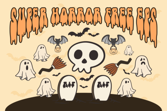
Super Horror blends retro display lettering with a cute, groovy horror personality. The rounded shapes make it less aggressive than traditional blood-drip fonts, while the exaggerated forms still give a headline enough character to anchor a poster or seasonal product.
I would choose it for a 1970s-inspired Halloween collection or an eerie-cute social campaign. Its strong stylistic identity can compete with detailed artwork, so simpler illustrations and a limited color palette will usually produce a cleaner result.
Best for: retro posters, social graphics, novelty merchandise
Key features: groovy shapes, rounded structure, cute horror aesthetic
7. Horror Story
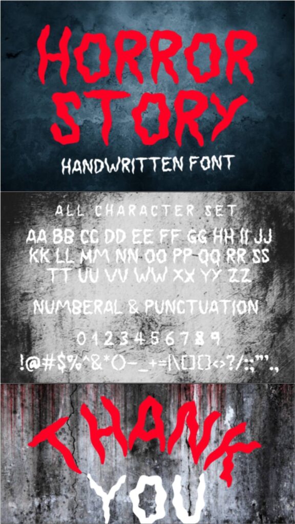
Horror Story uses decorative elements resembling dripping blood and bone-like shapes. It creates a much darker atmosphere than the playful fonts in this collection, making it a natural fit for adult Halloween events, horror artwork, and theatrical promotions.
My take is to use it as a single focal headline rather than throughout the layout. The detailed construction delivers the intended effect at a large size, but it may lose clarity when reduced for small labels or lengthy supporting text.
Best for: horror posters, event invitations, theatrical graphics
Key features: bone-inspired forms, dripping accents, intense horror mood
8. Dripping Halloween
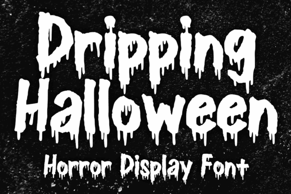
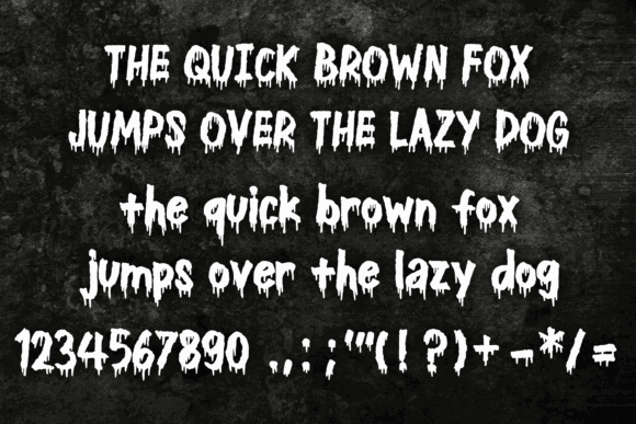
Dripping Halloween draws on vintage horror movies, comic-book lettering, and heavy-metal graphics. The ink-like extensions create movement along the baseline, helping otherwise simple words feel theatrical and slightly chaotic.
I would use this font for a bold title paired with distressed textures or halftone artwork. It is less suitable for clean minimalist branding, and the drips need enough vertical space to avoid colliding with nearby text or design elements.
Best for: horror posters, album-style graphics, Halloween apparel
Key features: ink-drip effect, vintage influence, dramatic baseline
Download Dripping Halloween Font
9. Dark Ghost
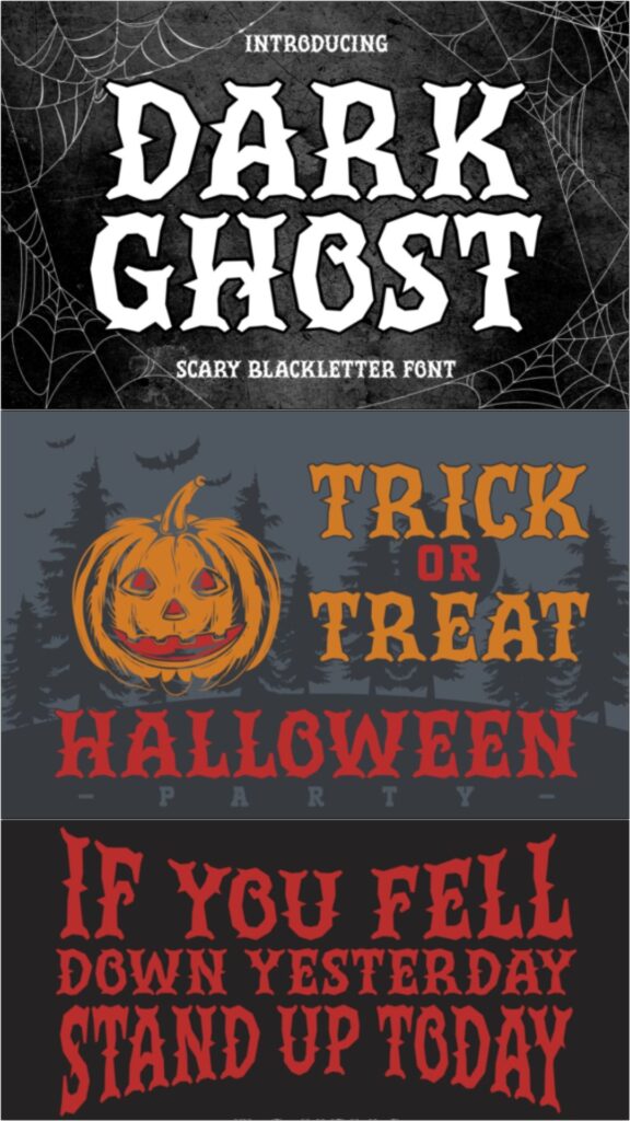
Dark Ghost brings a blackletter structure into a Halloween setting. Its pointed strokes and medieval influence create a more serious gothic tone than bubbly monster alphabets, making it useful for designs inspired by haunted castles, dark fantasy, or occult imagery.
This is my pick for sophisticated gothic packaging or a dramatic title treatment. Blackletter forms can become difficult to read in all caps or long sentences, so I would keep the wording short and allow generous spacing around it.
Best for: gothic packaging, dark fantasy posters, apparel graphics
Key features: blackletter structure, pointed strokes, medieval atmosphere
10. Spooky Halloween
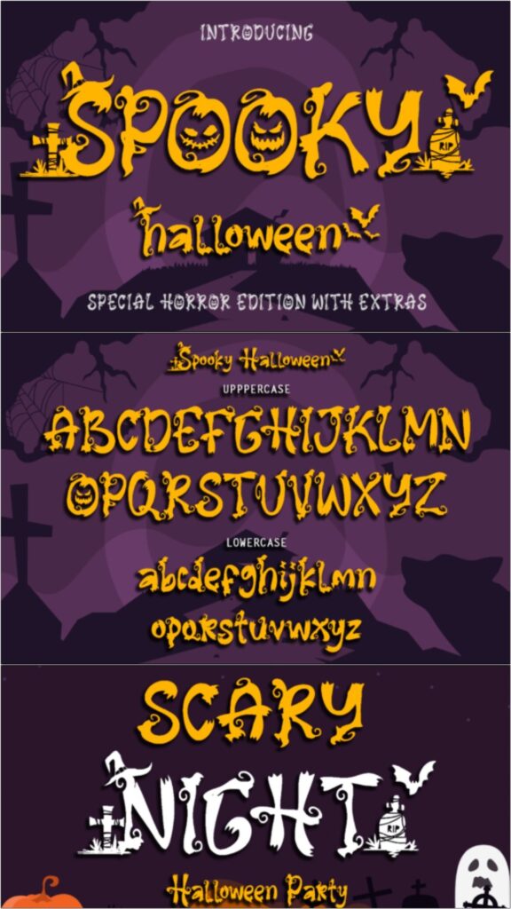
Spooky Halloween is a decorative display font with irregular shapes and seasonal character. Its stylized construction gives short messages a handcrafted appearance that can complement bats, cobwebs, pumpkins, and other familiar October imagery.
The font is PUA encoded, which can make included glyphs and swashes easier to access in compatible software. I would use those extras sparingly; adding a flourish to every letter can reduce the clarity of names and promotional headlines.
Best for: October crafts, greeting cards, decorative headings
Key features: decorative glyphs, irregular forms, PUA encoding
Download Spooky Halloween Font
11. Spooky Coming
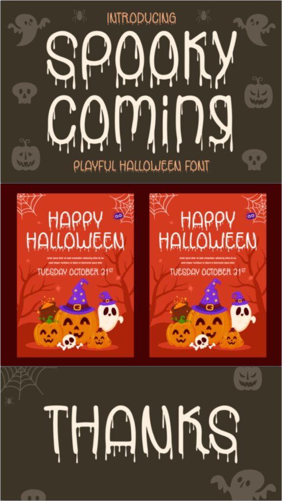
Spooky Coming features jagged edges and bold, uneven characters that resemble hand-cut horror lettering. The sharp outline creates an immediate sense of tension, even without additional blood, slime, or distressed texture effects.
I like it for haunted-attraction advertising and event titles that need to feel energetic from a distance. Because the contours already contain substantial visual noise, I would avoid adding a heavy outline, shadow, and texture at the same time.
Best for: haunted-house posters, party invitations, horror thumbnails
Key features: jagged edges, bold letters, energetic silhouette
12. Shadow Horror
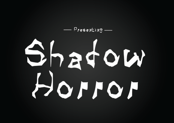
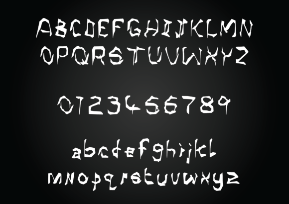
Shadow Horror has a creepy display style that can support both large Halloween headings and smaller pieces of stationery. Its forms are less cartoonish than many monster fonts, which gives it room to work in darker, more atmospheric compositions.
I would consider this option when a project needs recognizable horror styling without elaborate illustrations embedded in every character. Even though it can handle more text than highly decorative alternatives, a neutral font remains the safer choice for detailed event information.
Best for: stationery, headlines, atmospheric posters
Key features: shadowy mood, versatile display forms, restrained decoration
13. Spooky Time
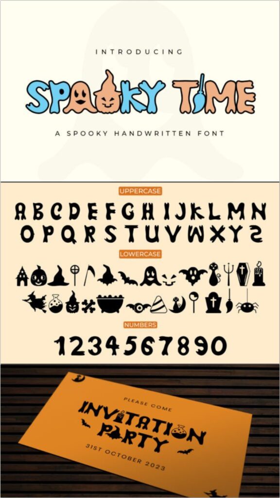
Spooky Time is a playful handwritten display font with uppercase, lowercase, and number characters. The casual rhythm makes it feel more personal than a rigid horror typeface, which can help invitations and craft products retain a friendly tone.
My pick for this font would be a handmade Halloween collection with short conversational phrases. Its irregularity provides charm, but careful alignment and spacing will be important when several lines are stacked on a narrow sign or shirt design.
Best for: handmade signs, invitations, shirt designs
Key features: handwritten style, upper and lowercase, playful irregularity
14. Ghost Halloween
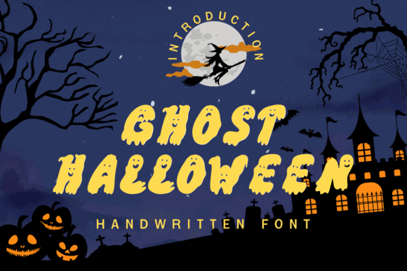
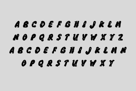
Ghost Halloween turns the alphabet into a collection of ghost-like characters. This built-in visual concept can replace separate clipart in simple compositions, making a single word feel like both typography and illustration.
I would use it for children’s products, classroom decor, or a playful October headline. The novelty is also its limitation: complex letter shapes are strongest in short words, while long sentences can become difficult to process quickly.
Best for: classroom decor, children’s crafts, treat labels
Key features: ghost-shaped letters, illustrative design, playful mood
15. Witch
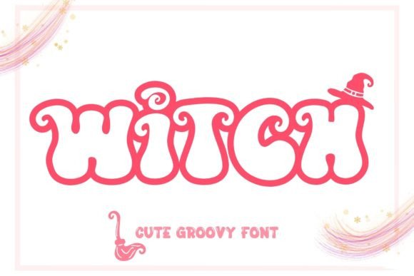
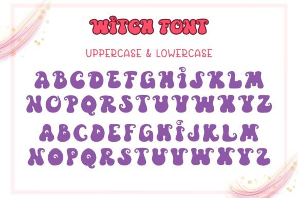
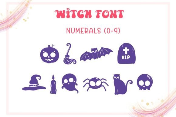
Witch uses groovy, curling forms to create a bright and mischievous Halloween personality. The exaggerated tails give the font movement and make it suitable for designs that lean toward retro magic rather than graphic horror.
I like this style for mugs, shirts, social posts, and witch-themed party graphics. Those extended terminals need breathing room near borders and illustrations, so the font may require a wider layout than a compact block typeface.
Best for: witch shirts, mugs, retro party graphics
Key features: groovy curves, extended tails, bright seasonal tone
16. Witch Spooky
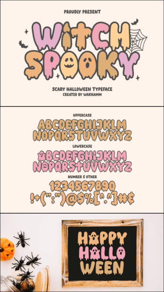
Witch Spooky presents Halloween lettering through an enchanted, storybook-style lens. Its decorative personality can support potion labels, magical invitations, and whimsical branding without relying on the familiar dripping-blood treatment.
This is a useful alternative for projects centered on spells, cauldrons, and witchcraft imagery. I would pair it with a clean serif or sans serif for supporting copy, since two decorative magical fonts in the same layout may compete for attention.
Best for: potion labels, magical invitations, witch-themed packaging
Key features: enchanted mood, decorative forms, storybook character
17. The Witch
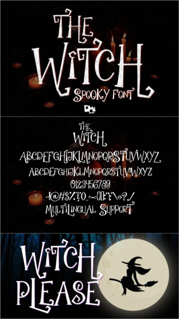
The Witch has a loose handwritten appearance that brings an informal, slightly nervous energy to seasonal messages. It feels closer to a note discovered in an old spell book than a polished commercial headline.
I would use it for labels, journal pages, printable cards, or designs that need a human touch. The irregular letterforms may become harder to read when tightly spaced, so increasing the size and keeping phrases concise should improve the result.
Best for: spell-book pages, labels, printable cards
Key features: handwritten texture, informal rhythm, spooky personal character
18. Ghost Halloween Sans Serif
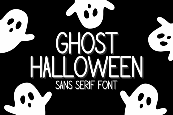
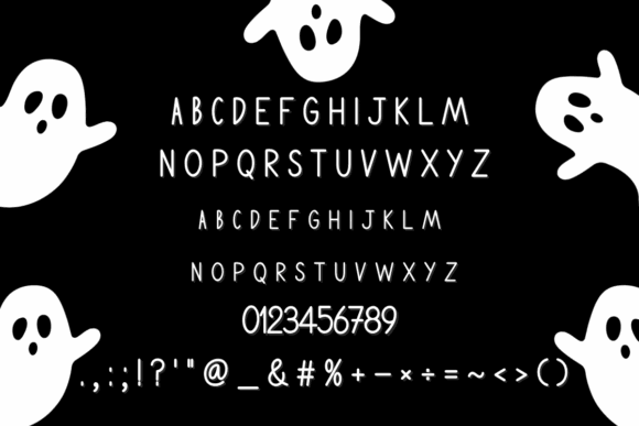
Ghost Halloween Sans Serif balances quirky seasonal details with a comparatively clean letter structure. That makes it easier to combine with bold illustrations or minimalist layouts than a heavily distressed horror font.
I like this option for designers who need a recognizable Halloween font that can move between packaging, social media, and print. It may not feel frightening enough for an intense horror campaign, but its approachable style provides greater versatility.
Best for: packaging, social posts, modern invitations
Key features: sans serif base, quirky details, adaptable structure
19. Ghost
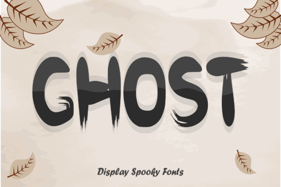
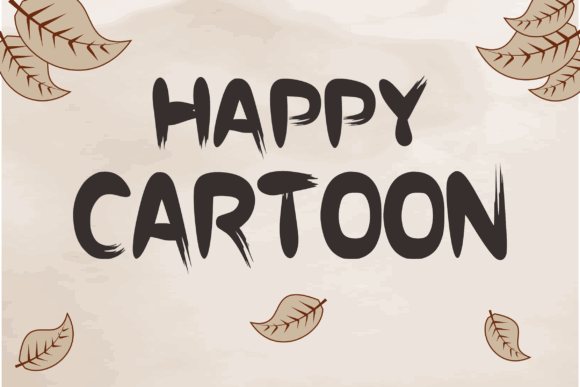
Ghost is a charming display typeface created around a spooky but accessible Halloween theme. The clear, substantial characters make it suitable for posters, apparel, crafts, and embroidery-oriented concepts where thin details could disappear.
This would suit a small craft collection that needs one font across several products. Its straightforward personality is easier to manage than an elaborate novelty alphabet, though designers seeking an antique or gothic effect should choose a sharper alternative.
Best for: apparel, posters, embroidered designs
Key features: substantial strokes, friendly ghost theme, clear display shapes
20. The Monster
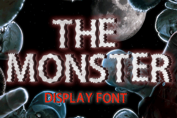
The Monster uses a playful display structure with the exaggerated proportions commonly associated with cartoons and friendly creatures. It delivers Halloween personality without making a design feel dark or graphic.
I would choose it for children’s games, postcards, classroom projects, and casual seasonal branding. The whimsical construction is not ideal for serious gothic packaging, but it can make a simple product name feel lively without additional text effects.
Best for: children’s games, postcards, classroom projects
Key features: playful proportions, cartoon mood, bold display construction
21. Monster Display
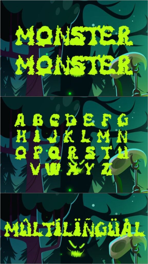
Monster Display is a scary, compact headline font designed specifically for spooky projects. Its prominent shapes can give event names and short phrases enough weight to stand independently against simple backgrounds.
My preferred use would be a poster title or large front-of-shirt graphic. The strongly themed appearance limits its usefulness outside Halloween and horror work, but that specificity can be an advantage when the seasonal message must register immediately.
Best for: poster titles, shirt graphics, haunted events
Key features: scary display style, compact forms, immediate seasonal identity
22. Monster Halloween Handwritten
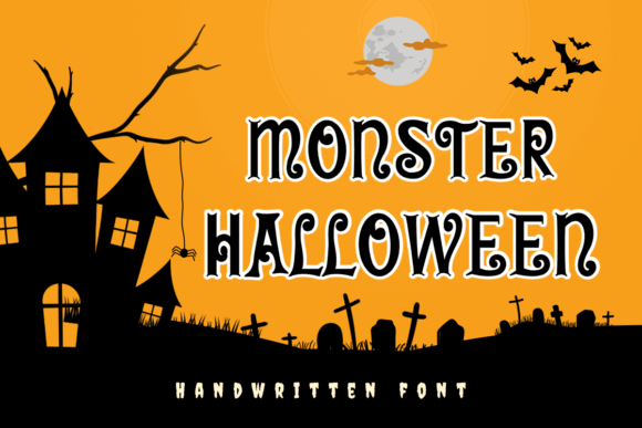
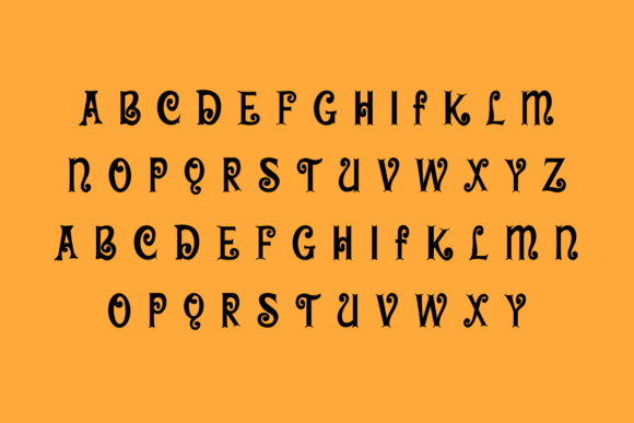
This version of Monster Halloween uses curly, handwritten lines to create a lighthearted eerie effect. The movement in the characters makes it feel more spontaneous than a geometric display font and suits designs built around doodles or hand-drawn illustrations.
I would use it for invitations, playful posters, or decorations rather than formal horror branding. Its fine curls may require a larger output size for cutting and printing, especially when the design contains narrow counters or closely spaced letters.
Best for: invitations, doodle posters, playful decorations
Key features: curly lines, handwritten rhythm, lighthearted spooky mood
Download Monster Handwritten Font
23. Monster Halloween Display
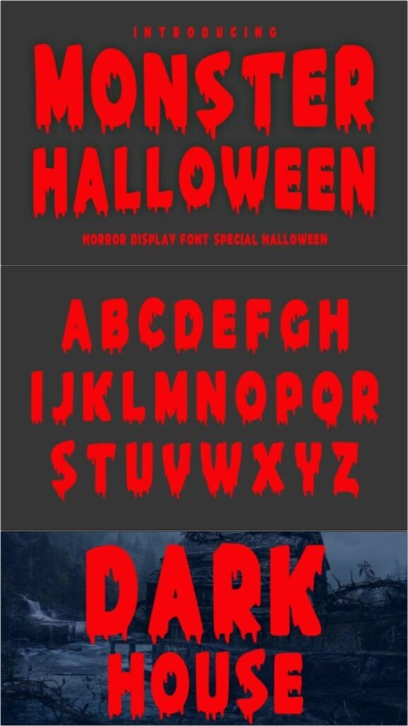
Monster Halloween Display has a bold construction designed to give seasonal headlines a spine-chilling but entertaining edge. The thick letter shapes can support bright fills, outlines, or simple dimensional effects without losing their central form.
This is a practical pick for large-format graphics and merchandise that need visual impact. I would skip it for subtle invitation layouts because its scale and personality naturally dominate the composition.
Best for: large posters, merchandise, signage
Key features: thick display letters, strong silhouette, high visual impact
Download Monster Halloween Display
24. Dripping
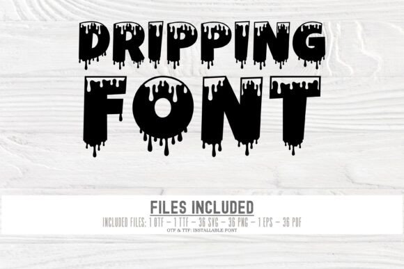
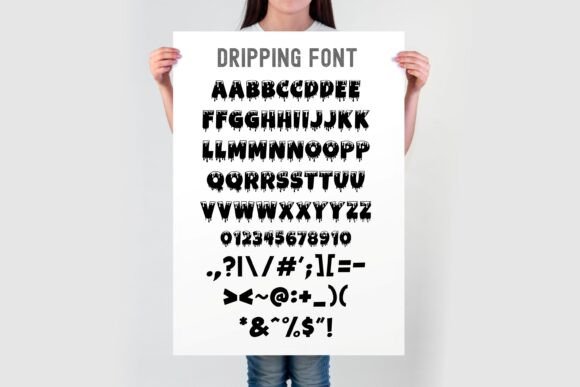
Dripping is a bold novelty font with liquid extensions hanging from the characters. The effect can represent blood, slime, paint, or melted material depending on the color and surrounding illustrations, giving the font more thematic range than its name initially suggests.
I would use it for short words such as “Boo,” “Toxic,” or “Beware.” Longer sentences create a dense row of drips that can become visually repetitive, particularly on small stickers or narrow mobile graphics.
Best for: warning signs, horror headings, slime-themed products
Key features: liquid extensions, bold characters, flexible horror interpretation
Download Dripping Display Font
25. Dripping Blood Halloween
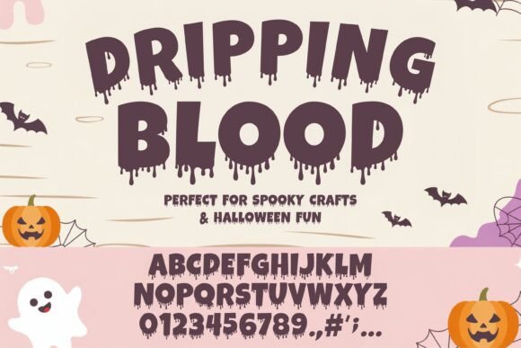
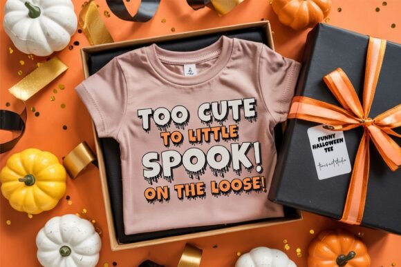
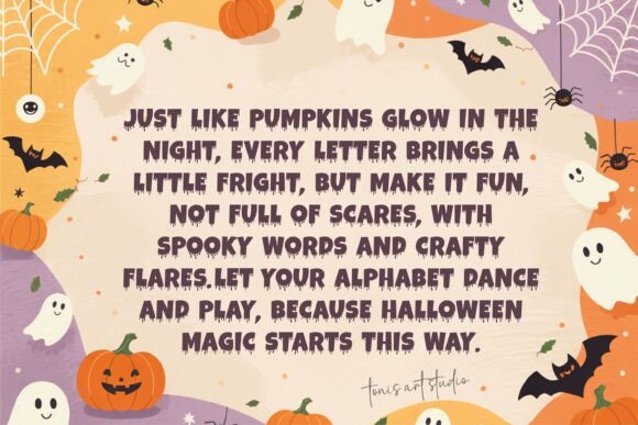
Dripping Blood Halloween takes a direct horror approach with heavy characters and extended liquid details. It is designed for unmistakably scary typography rather than cute seasonal messaging, so the mood registers quickly on posters and digital promotions.
The download includes OTF and TTF font files for use in major design applications. I would reserve it for adult events, horror graphics, and theatrical projects, since the blood-like treatment may be too intense for children’s party materials.
Best for: adult events, horror posters, theatrical promotions
Key features: blood-drip effect, heavy forms, OTF and TTF files
26. Slime Drip Halloween
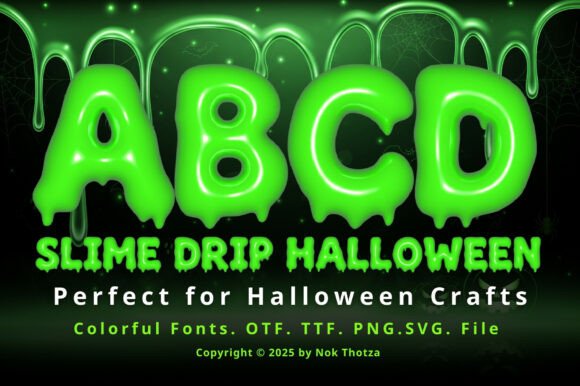
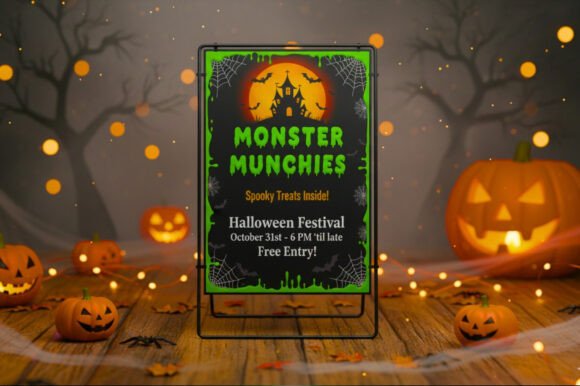
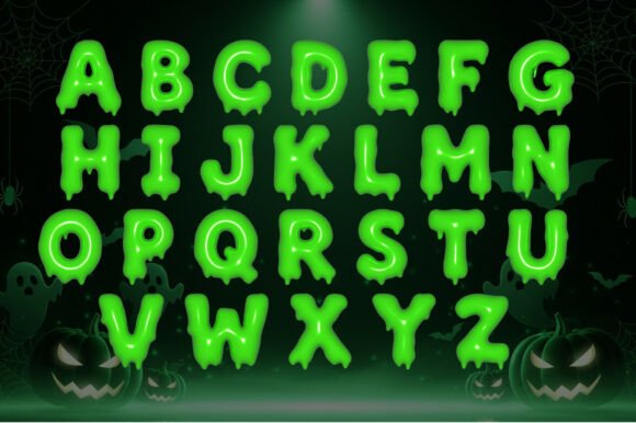
Slime Drip Halloween uses rounded, melting details that suit monster laboratories, toxic themes, and goo-covered party graphics. Compared with realistic blood lettering, slime shapes feel more playful and can be colored in bright green, purple, or orange.
This would be my choice for a child-friendly monster collection or science-inspired Halloween event. The dangling elements require extra clearance beneath each line, so avoid setting the line spacing too tightly in stacked designs.
Best for: monster parties, toxic labels, children’s merchandise
Key features: slime details, rounded forms, playful melting effect
27. Scary Drips
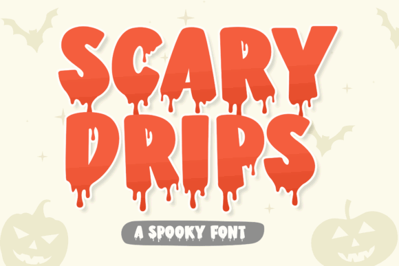
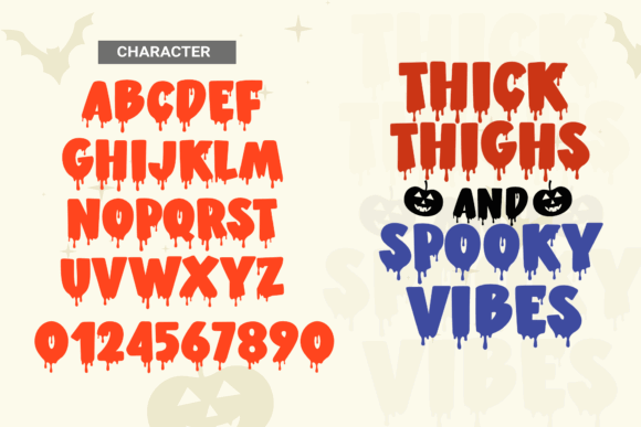
Scary Drips applies an uneven dripping treatment to bold horror lettering. The irregular lower edges help create a handmade, unstable appearance that can complement grunge textures, monster illustrations, and dramatic color contrasts.
I would use it for one dominant phrase rather than an entire poster. The font already supplies considerable texture, so a flat color or simple gradient may produce a stronger result than layering several distressed effects over the letters.
Best for: grunge posters, monster graphics, dramatic headings
Key features: uneven drips, bold structure, distressed horror character
28. Booo Dripping
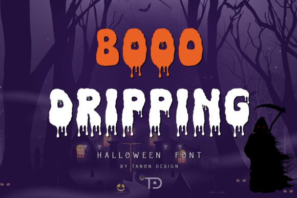
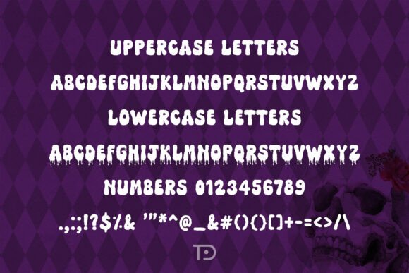
Booo Dripping combines a recognizable Halloween drip with a lighter, novelty-oriented personality. The result works for ghost graphics, humorous slogans, and casual party materials that need more energy than a standard bold font.
My pick would be a short “Boo” or “Spooky Season” design where the typography is the main attraction. Like most dripping fonts, it needs enough size for the lower details to remain distinct after printing or cutting.
Best for: ghost shirts, party decor, novelty slogans
Key features: playful drips, bold headline style, casual seasonal mood
29. Bold Dripping
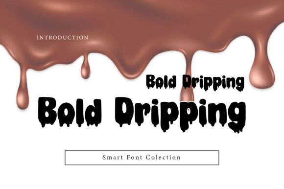
Bold Dripping uses thick display characters and a prominent melting effect. The strong underlying shapes help preserve word recognition, making it a more practical option for large commercial-style headings than fonts built from thin, scratchy strokes.
I would use it for signage, packaging, or event graphics that must attract attention quickly. Its heavy weight can overwhelm small compositions, so generous margins and a limited amount of supporting copy will create better balance.
Best for: event signage, packaging, large headlines
Key features: thick strokes, melting effect, strong word silhouette
30. Drip Horror
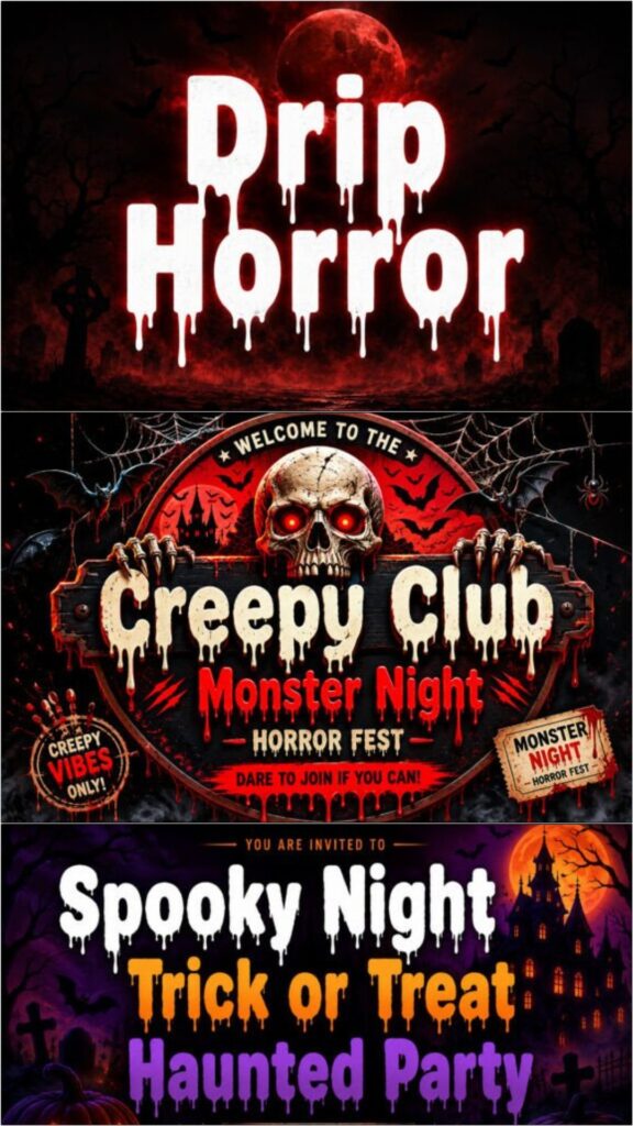
Drip Horror is a bold display font inspired by classic Halloween imagery, horror movies, haunted houses, and creepy storytelling. Its substantial characters and pronounced drips make it suitable for titles that need to communicate the genre immediately.
I would select it for a haunted attraction, horror podcast cover, or movie-night poster. It is intentionally theatrical, so designers seeking a subtle seasonal accent should choose one of the cleaner ghost or witch fonts instead.
Best for: haunted attractions, podcast covers, movie-night posters
Key features: bold display structure, classic drips, theatrical horror mood
Tips for Pairing Spooky Fonts
Use the Halloween font for the main headline and let a neutral sans serif handle dates, addresses, prices, and instructions. Contrast is more useful than choosing two fonts with equally elaborate shapes. A clean secondary typeface also gives the spooky lettering more room to become the focal point.
Avoid stacking multiple novelty effects without a clear reason. Dripping letters, rough textures, thick outlines, shadows, and glowing edges can quickly obscure the word. Begin with the font in a flat color, then add only the effect that improves the intended theme or separation from the background.
Choosing the Right Spooky Style
A Halloween font should support the specific audience and product rather than simply look frightening in isolation. For broad merchandise collections, I would start with a chunky, readable option such as Blockton Halloween or Monster Halloween. For theatrical horror, Drip Horror and Horror Story create a much stronger genre signal.
Whichever style you choose, preview complete words before designing the final layout. The best specimen letter is not always representative of every character, and practical spacing, readability, and production size matter just as much as the spooky effect.
Frequently Asked Questions
What type of font is best for Halloween designs?
A bold display font is usually the most effective choice for a Halloween headline. Choose playful monster or ghost lettering for family projects, dripping fonts for classic horror, and gothic or blackletter styles for darker, more sophisticated designs.
Can Halloween fonts be used for Cricut projects?
Many downloadable OTF and TTF fonts can be installed and used in Cricut Design Space. Thick, connected, and relatively simple letterforms are usually easier to cut and weed than fonts with numerous thin scratches, tiny holes, or long dripping details.
How do I make a Halloween font easier to read?
Keep the phrase short, increase the font size, and provide strong contrast against the background. Avoid tight letter spacing and excessive effects. Supporting information should be placed in a simpler font rather than forcing the decorative typeface to handle every line.
Which Halloween fonts are suitable for children’s designs?
Rounded monster fonts, illustrated ghost alphabets, slime styles, and loose handwritten fonts tend to feel more playful than sharp or blood-inspired lettering. Monster Halloween, Hello Witch, Horror World, Ghost Halloween, and The Monster are among the friendlier options in this selection.
Follow Us