

Thick Halloween fonts are my first pick when a design needs to stay readable across a crowded party poster, an oversized shirt graphic, or a small vinyl decal. Heavy strokes provide room for outlines, shadows, distressing, and layered colors without letting the letters disappear beneath bats, pumpkins, slime, or other seasonal artwork.
This roundup focuses on chunky display faces, bold horror lettering, gooey styles, monster alphabets, and substantial retro fonts from Creative Fabrica.
The best thick Halloween fonts pair heavy, recognizable letterforms with a clearly defined mood. Blockton Halloween is my top pick for readable posters, Halloween Melt suits dimensional dripping headlines, and Super Horror fits playful retro shirts. For cutting projects, choose a design with broad counters and limited fragile details.
Quick Picks
| Font | Best for | Format or style |
|---|---|---|
| Blockton Halloween | Large posters | Bold block display |
| Halloween Melt | Layered headlines | Melting layered font |
| Super Horror | Retro shirts | Groovy horror display |
| Bold Dripping | Slime graphics | Heavy dripping display |
| Horror Drip | Classic horror art | Dripping display |
| Story Halloween | Craft signs | Thick spooky display |
| Halloween Spooky | Chunky party text | Chunky display |
| The Horror | Outlined headlines | Chunky outlined display |
| Night Fall Spooky | Family events | Hand-drawn bold display |
| Big Bold Chunky | Cartoon graphics | Chunky display |
| Crimson Horror | Movie posters | Bold distressed serif |
| Killer Horror | Condensed titles | Bold horror display |
| The Horror by Shape Studio | Haunted signs | Spiky display |
| Dread Monster | Dark apparel | Bold blackletter |
| Halloween Creative | Vintage fright | Distressed display |
| Spooky Halloween | Sharp flyers | Bold sans serif |
| Halloween by Yunus Praditya | Rounded titles | Bold display |
| Spook Halloween | Kids’ merchandise | Playful bold display |
| Halloween Spooky by Ahweproject | T-shirt slogans | Strong display |
| Monster Halloween by Mozatype | Craft bundles | Display font with SVG |
| Monster Bold | Modern graphics | High-impact display |
| The Monster | Playful posters | Spooky display |
| Monster by Ochakov | Outlined artwork | Bold outline display |
| Horror Monster | Action-horror titles | Monster display |
| Monster by Denestudios | Scary projects | Spooky display |
| Pumpkin Halloween | Seasonal packaging | Playful bold display |
| Halloween Pumpkin by Inermedia | Assertive titles | Bold display |
| Halloween Pumpkin by Farz Studio | Gothic merchandise | Bold blackletter |
| Halloween Pumpkin by Numnim | Traditional posters | Bold serif |
| Pumpkin by Planetz Studio | Friendly crafts | Fun display |
| Halloween Pumpkin by Anamalmusyaffa | Retro branding | Cheerful retro display |
| Fancy Pumpkin Halloween | Colorful artwork | OpenType-SVG color font |
| Stinky Slime | Gothic slime art | Horror display |
| Slime Horror | Gooey headlines | Slime display |
| Slime Drip Halloween | Multicolor text | Color dripping font |
| Creature Slime | Monster graphics | Slime display |
| Slime by Squeebcreative | Gaming graphics | Gooey decorative font |
| Zombie Slime | Zombie shirts | Dripping display |
| Slimespooky | Halloween labels | Decorative slime font |
| Spooky Halloween by Sakti Avellin | Groovy apparel | Retro display |
| Scary Halloween Trio | Coordinated sets | Three-font collection |
| Halloween Ghost | Dripping crafts | Spooky display |
| Spider Halloween | Cute party goods | Playful display |
| The Spooky Time | Cutting-machine crafts | Seasonal display |
| Halloween Nightmare | Unusual titles | Decorative display |
| Night Witch Halloween | Book covers | Sinister display |
| Vibes Halloween | Streetwear graphics | Ragged brush display |
| Halloween Creepy | General horror crafts | Creepy display |
| Creepy Halloween | Seasonal headlines | Halloween display |
How I Picked These
I compared these options by how well they fit the article’s intended use, including readability, visual character, practical versatility, distinctive features, and how clearly each choice differs from the rest of the roundup. I prioritized options that solve a specific design need rather than simply adding more similar-looking products.
Best Thick Halloween Fonts
1. Blockton Halloween
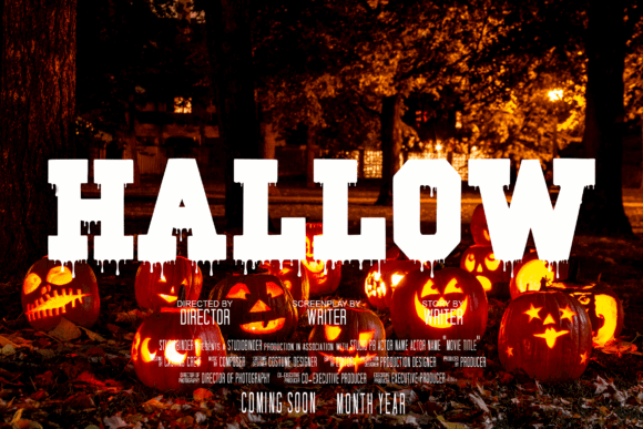
Blockton Halloween is a heavy block display font for designers who need spooky lettering that remains clear from a distance. Its chunky construction makes it my leading option for event posters, storefront signs, banners, and centered shirt slogans.
I like the balance between playful seasonal character and straightforward readability. The broad letters should also accept outlines and drop shadows cleanly, though the blocky personality may feel too casual for a genuinely grim horror concept.
Best for: large posters, readable T-shirts, party banners
Key features: bold block structure, spooky details, strong legibility
2. Halloween Melt
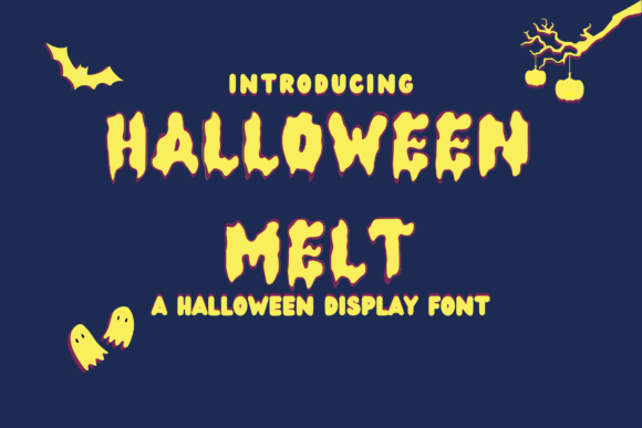
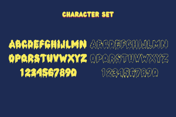
Halloween Melt is a thick layered font built around viscous, dripping letter shapes. It is best suited to haunted-house posters, slime-themed shirts, trick-or-treat bags, and dimensional headlines that need more visual depth than a flat typeface provides.
My favorite feature is the layered construction, which gives designers a direct route to contrasting fills and dimensional effects. The elaborate lower drips need breathing room, so I would reserve it for short phrases rather than dense informational copy.
Best for: layered headlines, slime shirts, haunted events
Key features: melting shapes, layered format, heavy silhouette
3. Super Horror
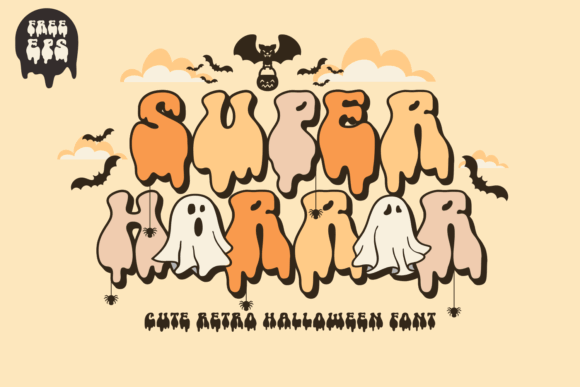
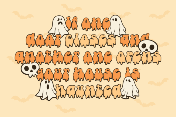
Super Horror is a thick retro display font for cute-spooky designs, groovy Halloween merchandise, and nostalgic party graphics. Its rounded rhythm gives a headline presence without relying on sharp edges or extreme gore.
I would use this for pumpkin-orange shirt lettering, sticker sheets, or a 1970s-inspired event poster. Its playful curves suit lighthearted Halloween campaigns better than serious thriller branding, but that narrower mood is part of its appeal.
Best for: retro T-shirts, stickers, party posters
Key features: groovy curves, thick strokes, cute horror mood
4. Bold Dripping
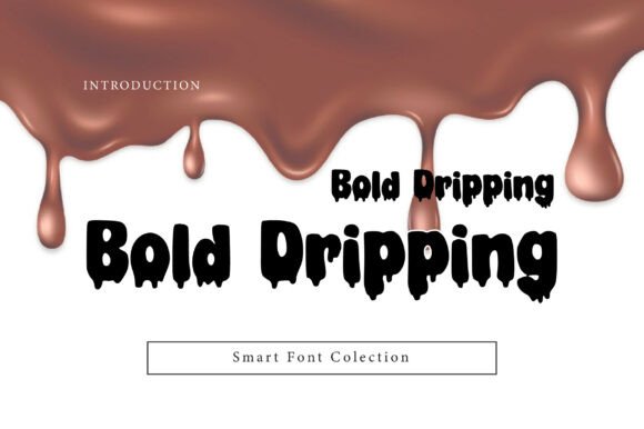
Bold Dripping is a heavy display typeface for Halloween, horror, and creepy typography with an unmistakable liquid effect. It gives short words enough weight to dominate posters, thumbnails, apparel fronts, and sticker designs.
I like it most when the drip treatment is the main visual rather than one effect among many. Because the letter bottoms already carry considerable detail, a simple background and restrained outline should keep the composition from becoming muddy.
Best for: slime headlines, horror thumbnails, bold apparel
Key features: heavy strokes, dripping terminals, high-impact display style
5. Horror Drip
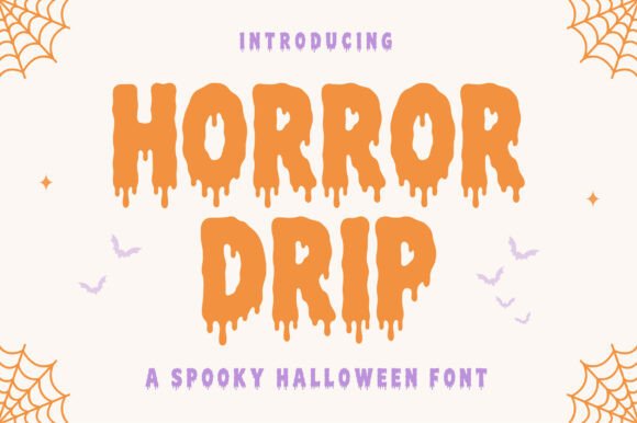
Horror Drip is a bold Halloween display font inspired by classic horror movies, haunted houses, and creepy slime. Its broad, wet-looking letters are intended for shirts, posters, invitations, stickers, and seasonal branding.
This is one of my stronger picks for an instantly recognizable horror treatment. The pronounced drips communicate the theme quickly, although they may be harder to weed at small vinyl sizes than a cleaner block font.
Best for: classic horror posters, haunted-house signs, stickers
Key features: bold letterforms, slime drips, movie-inspired styling
6. Story Halloween
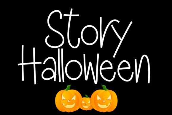


Story Halloween is a thick-lettered spooky display font for craft signs, seasonal labels, party graphics, and uncomplicated shirt sayings. Its substantial forms give short messages a friendly Halloween presence.
I would choose it when readability matters more than shock value. Creative Fabrica identifies compatibility with common desktop systems and cutting-machine workflows, but makers should still test small internal spaces before committing to a detailed vinyl cut.
Best for: craft signs, family shirts, party labels
Key features: thick lettering, spooky character, cutting-machine suitability
7. Halloween Spooky
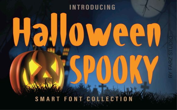
Halloween Spooky is a chunky display font for shadow boxes, bold crafts, party decorations, and playful October headlines. The wide, substantial characters create an obvious seasonal focal point without requiring a long phrase.
My take is that this font makes the most sense in compact layouts where the lettering can stay large. The irregular personality brings energy, but a generous line height will help prevent multiple lines from feeling cramped.
Best for: shadow boxes, party décor, chunky shirts
Key features: wide letterforms, strong seasonal style, craft-friendly display weight
8. The Horror
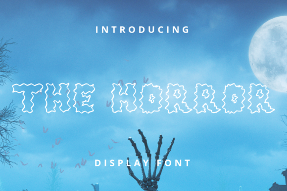
The Horror is a bold, chunky outlined display font made for Halloween graphics and other scary concepts. Its hollow interiors create an easy opportunity for contrasting fills, patterns, or a second seasonal color.
I like this option for screen-sized graphics and large shirt prints where the outline can remain crisp. At small dimensions, the interior gaps and exterior contour may merge, so it is not my first choice for tiny labels.
Best for: outlined shirts, large titles, two-color designs
Key features: chunky construction, outlined letters, strong Halloween mood
9. Night Fall Spooky
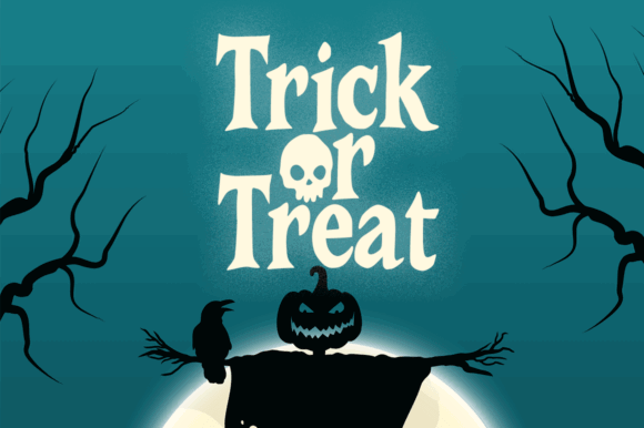
Night Fall Spooky is a bold, hand-drawn Halloween font with chunky forms and a family-friendly balance of eerie and playful details. It fits school events, neighborhood parties, treat bags, and youth apparel.
The readable silhouette is the main reason I would select it over a more distorted horror face. Its informal drawing style may not suit polished luxury packaging, but it gives casual craft projects plenty of warmth.
Best for: school events, family shirts, treat bags
Key features: chunky strokes, hand-drawn finish, approachable spooky mood
10. Big Bold Chunky
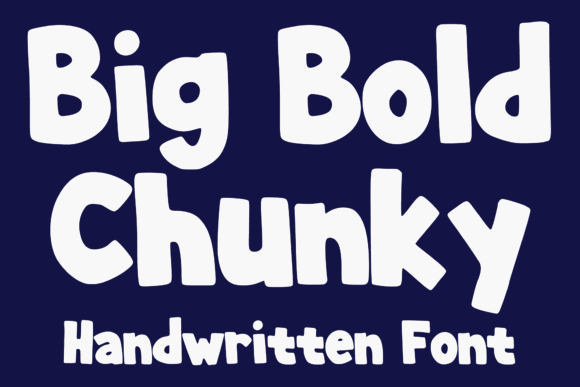
Big Bold Chunky is a playful cartoon display font for Halloween graphics that favor cheerful impact over dark horror. Its oversized forms suit mascots, candy themes, classroom posters, and humorous shirt sayings.
I would pair it with ghosts, smiling pumpkins, or monster illustrations rather than realistic blood effects. It is versatile beyond October, which adds value, though it needs supporting artwork or color to establish a specifically Halloween context.
Best for: cartoon graphics, kids’ posters, funny shirts
Key features: oversized strokes, playful shape language, broad seasonal versatility
11. Crimson Horror
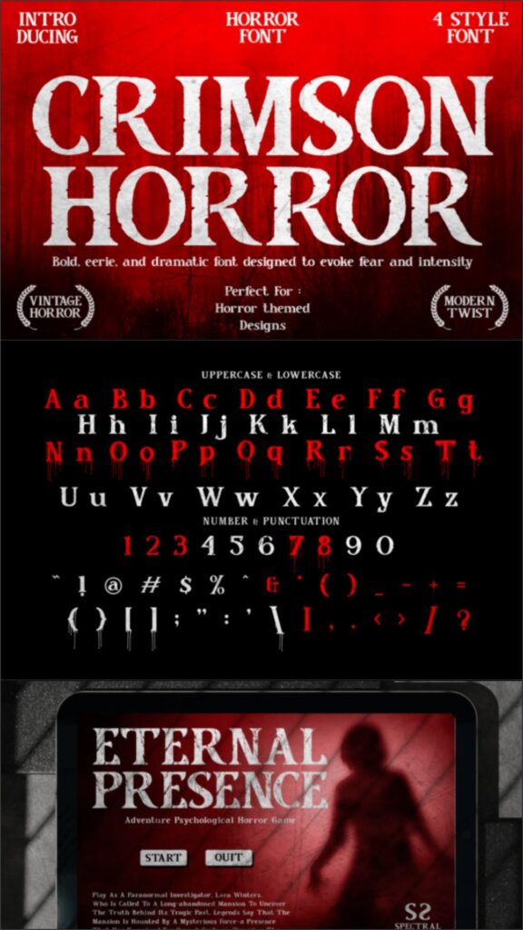
Crimson Horror is a bold horror serif with sharp edges, irregular contours, and distressed texture. It is aimed at movie posters, magazine covers, packaging, and apparel that needs a more aggressive tone than rounded Halloween lettering.
The included range of styles makes this a flexible choice for building hierarchy within one visual system. I would keep supporting type simple, since the razor-like details and surface texture already command substantial attention.
Best for: horror posters, magazine titles, dark merchandise
Key features: bold serif forms, distressed texture, multiple styles
12. Killer Horror
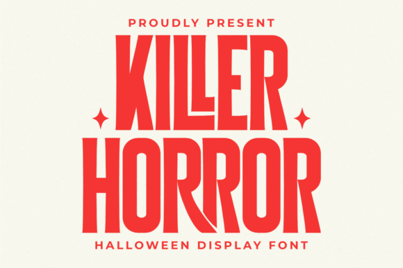
Killer Horror is a bold condensed display font with sharp serifs and a distorted horror-movie character. Its narrow proportions let designers fit forceful titles into tall posters, shirt fronts, album art, and promotional banners.
I like the efficient width for longer event names that would overwhelm a broad bubble font. The aggressive edge treatment makes it less suitable for young children’s graphics, but it is a strong fit for mature haunted attractions.
Best for: condensed posters, haunted attractions, album art
Key features: narrow proportions, sharp serifs, distorted horror styling
13. The Horror by Shape Studio
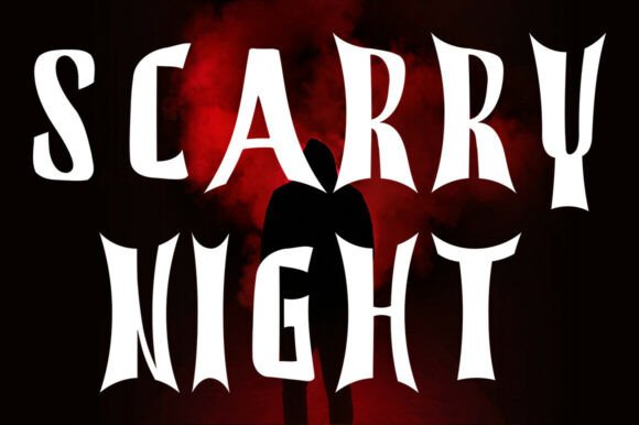
The Horror by Shape Studio is a bold, spiky display font with sharp serifs and an eerie handwritten quality. It targets haunted-house signs, party invitations, horror merchandise, and dramatic seasonal posters.
This is my pick for designers who want the energy of hand lettering without sacrificing headline weight. The uneven, pointed contours can look busy beside intricate illustrations, so I would give the words a relatively open background.
Best for: haunted signs, horror merchandise, dramatic invitations
Key features: spiky serifs, handwritten energy, bold silhouette
14. Dread Monster
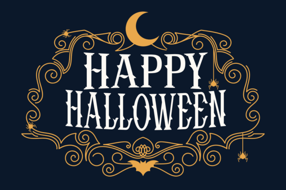
Dread Monster is a bold blackletter font with monstrous detailing for dark shirts, posters, game graphics, and gothic Halloween branding. The dense vertical strokes give short titles an imposing, old-world structure.
I would use it for metal-inspired apparel or a serious haunted event rather than cute pumpkin crafts. Blackletter can become difficult to scan in all caps or long phrases, so a few prominent words will produce the strongest result.
Best for: gothic apparel, dark posters, game titles
Key features: blackletter structure, bold presence, monstrous ornament
15. Halloween Creative
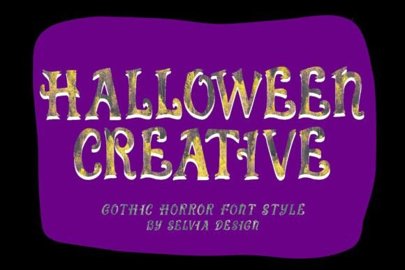
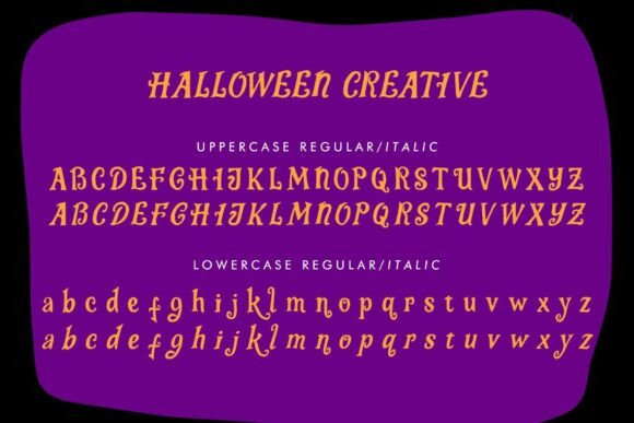
Halloween Creative is a bold display font with distressed surfaces, spooky curves, and a hand-drawn vintage-fright mood. It suits haunted-house posters, party invitations, labels, branding, and weathered shirt prints.
I like it for projects that need texture without applying a separate distress overlay. That built-in roughness can lose definition on very small transfers, so the font should stay reasonably large when printed on fabric.
Best for: vintage posters, distressed shirts, haunted branding
Key features: bold curves, weathered texture, hand-drawn finish
16. Spooky Halloween by The Magic Bee Studio
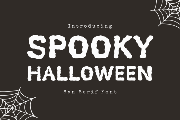
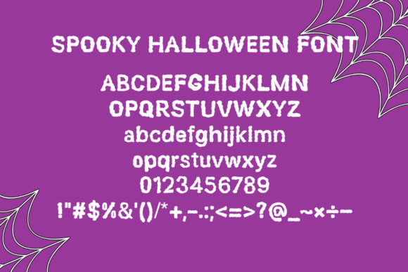
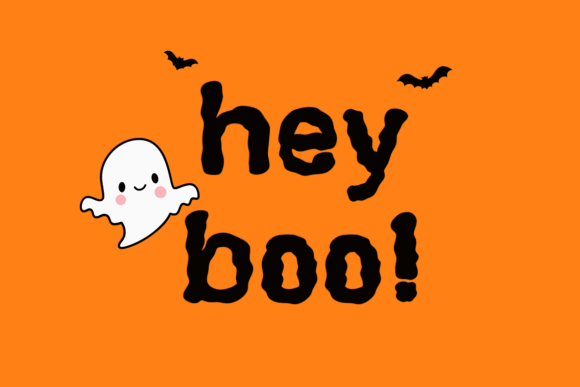
Spooky Halloween by The Magic Bee Studio is a bold sans serif with sharp letterforms and an atmospheric seasonal tone. Its cleaner framework fits flyers, invitations, signage, and promotional graphics that need a controlled spooky look.
This is a useful alternative to drips and novelty illustrations because the underlying sans-serif structure should remain easier to read. The sharper details add mood, though they are less whimsical than rounded monster lettering.
Best for: event flyers, sharp headlines, promotional signs
Key features: bold sans serif, pointed details, clear headline structure
17. Halloween by Yunus Praditya
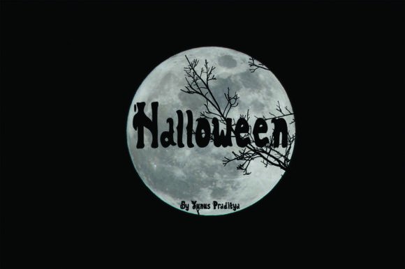
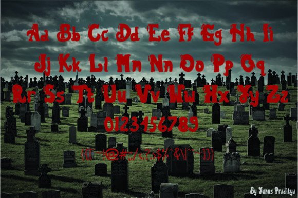
Halloween by Yunus Praditya is a bold display font with rounded, wicked-looking characters. It is suitable for posters, craft projects, cutting-machine designs, labels, and apparel that needs a substantial but not overly gruesome style.
I would use it for family events where ordinary block lettering feels too plain. The rounded structure supports friendly layouts, but its distinctive character shapes mean it should be previewed carefully before setting an unfamiliar brand name.
Best for: rounded posters, craft projects, family apparel
Key features: bold weight, rounded forms, cutting-machine compatibility
18. Spook Halloween

Spook Halloween is a bold and playful decorative font for children’s party materials, classroom signs, candy packaging, and lighthearted shirts. The substantial lettering creates a clear seasonal statement without becoming genuinely frightening.
I like it for designs that need to appeal to younger audiences. Decorative faces can become repetitive across a long paragraph, so I would use this strictly for headlines and pair it with a plain sans serif for details.
Best for: kids’ shirts, classroom signs, candy labels
Key features: bold decorative shapes, playful mood, headline-focused design
19. Halloween Spooky by Ahweproject
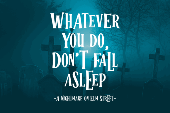
Halloween Spooky by Ahweproject is a strong-character display font for horror posters, shirt designs, crafts, and party graphics. Its assertive silhouette is meant to hold attention in layouts where the headline carries most of the visual weight.
I would use this for a central slogan framed by only a few supporting icons. The expressive letterforms may compete with dense artwork, so simpler compositions should make the font easier to appreciate and read.
Best for: shirt slogans, horror posters, central headlines
Key features: strong silhouette, expressive characters, bold display focus
20. Monster Halloween by Mozatype

Monster Halloween by Mozatype is a spooky display font supplied with bonus SVG crafting elements. It is designed for posters, movie-style titles, social covers, thumbnails, and seasonal projects that benefit from coordinated typography and graphics.
The bonus vector content makes this appealing for makers building a complete composition from one product. Its theme is highly specific, however, so it offers less year-round versatility than a neutral chunky font.
Best for: coordinated crafts, poster graphics, social thumbnails
Key features: monster display letters, bonus SVG elements, strong horror theme
21. Monster Bold
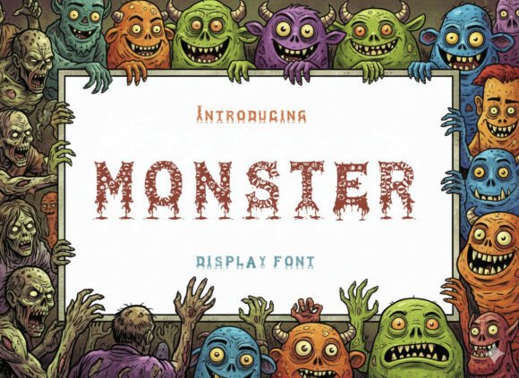
Monster Bold is a high-impact display font for titles, logos, packaging, digital graphics, and modern Halloween layouts. Its artistic shapes provide more contemporary energy than traditional dripping or gothic lettering.
I would choose it for graphic tees and branding that need a monster-adjacent attitude without committing to obvious seasonal symbols. Because the theme is less literal, pumpkins, webs, or a Halloween palette may be needed to establish context.
Best for: modern shirts, logos, packaging graphics
Key features: bold display weight, artistic shapes, contemporary impact
22. The Monster
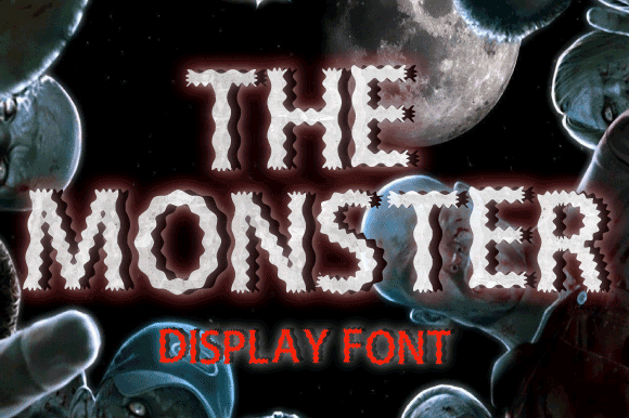
The Monster is a playful spooky display font for posters, postcards, logos, children’s graphics, and humorous Halloween apparel. Its personality-driven letterforms help simple text feel illustrated even before extra artwork is added.
I like it for short, conversational phrases that can take advantage of the font’s character. A restrained palette will prevent a playful composition from looking chaotic, especially when monster illustrations are placed nearby.
Best for: playful posters, postcards, monster shirts
Key features: illustrated personality, spooky theme, informal display structure
23. Monster by Ochakov
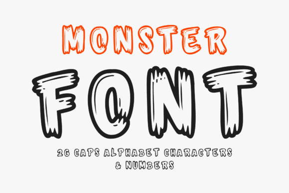
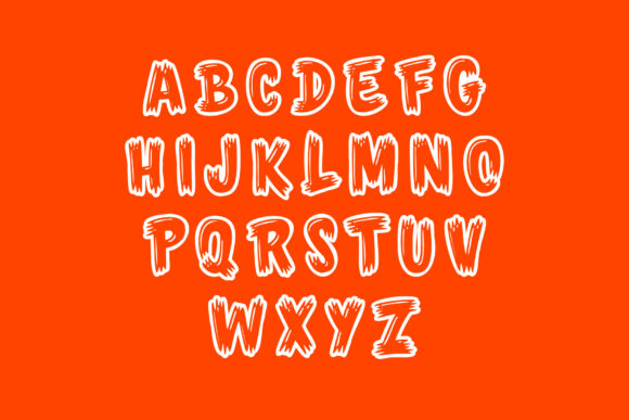
Monster by Ochakov is a cool, bold outlined display font for graphic shirts, party posters, labels, and cartoon horror designs. Its outlined construction leaves space for interior colors, patterns, or texture.
I would use this when a two-tone treatment is central to the concept. The open interior can become less distinct at small sizes, so the design should be proofed at its final output dimensions before production.
Best for: two-color shirts, outlined posters, cartoon graphics
Key features: bold outline, open interiors, playful monster tone
24. Horror Monster
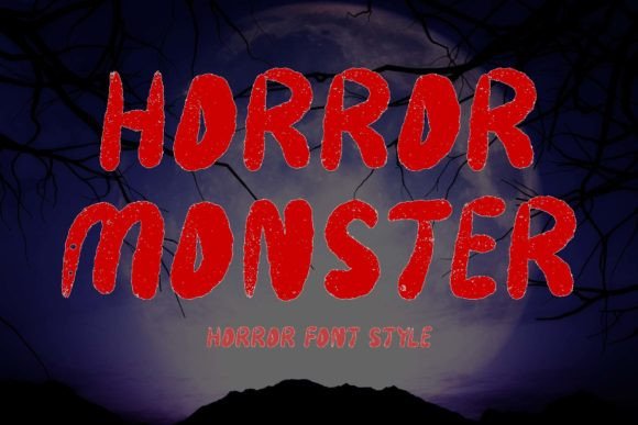
Horror Monster is a display font for Halloween posters, stickers, banners, movie titles, and action-horror artwork. Its forceful styling is intended to make short words read like a dramatic entertainment logo.
This is my pick for high-energy compositions rather than vintage or cute projects. I would avoid setting long sentences in it, since distinctive horror shapes deliver more impact when limited to one title or slogan.
Best for: movie titles, action posters, bold stickers
Key features: forceful display style, horror character, strong title presence
25. Monster by Denestudios
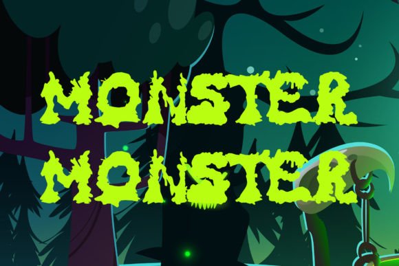
Monster by Denestudios is a scary display font created for spooky Halloween projects and attention-grabbing seasonal headlines. It suits shirts, signs, posters, stickers, and digital event graphics.
I would use it when the font needs to communicate the theme immediately without a complicated illustration. Its highly seasonal identity limits reuse outside horror or Halloween, so neutral craft sellers may prefer it for focused collections.
Best for: scary shirts, seasonal signs, event graphics
Key features: spooky display forms, immediate theme, headline emphasis
26. Pumpkin Halloween
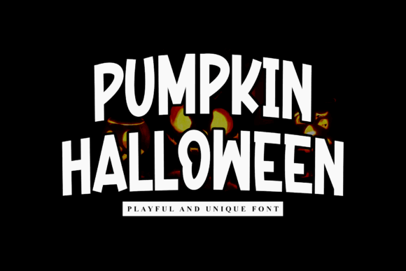
Pumpkin Halloween is a playful bold display font for posters, invitations, banners, packaging, social graphics, and themed merchandise. Its substantial strokes create a festive presence suited to broad seasonal campaigns.
I like this for makers who want recognizable October energy without dripping gore. It should pair naturally with pumpkin illustrations and warm fall colors, though its playful style may not suit severe horror branding.
Best for: seasonal packaging, invitations, pumpkin shirts
Key features: bold display weight, playful mood, broad project range
27. Halloween Pumpkin by Inermedia Studio
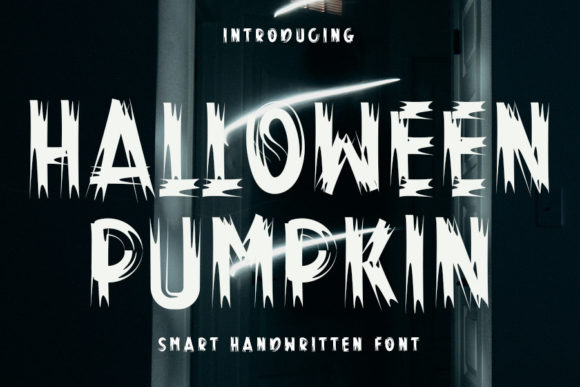
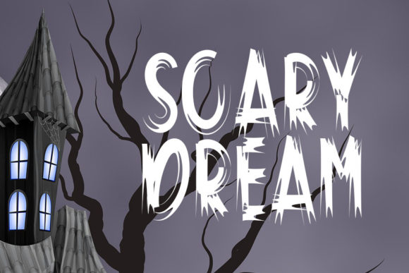
Halloween Pumpkin by Inermedia Studio is a cool, bold, assertive display font for headline-led posters, shirts, signs, and seasonal branding. Its firm structure gives pumpkin-themed projects a stronger voice than delicate handwritten lettering.
I would place this on designs that need to read quickly at a market booth or from across a room. The assertive mood can dominate small illustrations, so I would scale supporting graphics generously.
Best for: assertive posters, market shirts, bold signs
Key features: heavy display structure, confident mood, strong distance readability
28. Halloween Pumpkin by Farz Studio
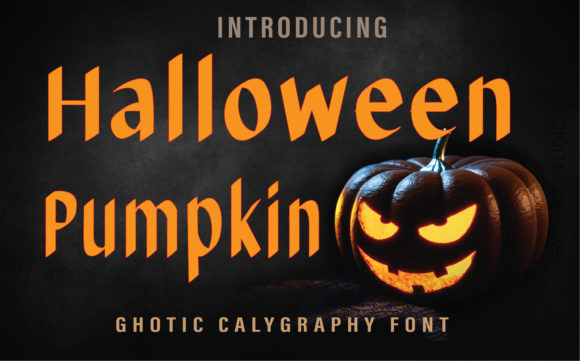
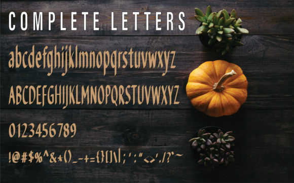
Halloween Pumpkin by Farz Studio is a bold blackletter font for gothic apparel, poster titles, labels, and darker pumpkin-themed graphics. Its dense traditional structure adds historical drama to seasonal wording.
I would use it for a witchy market brand or medieval haunted event rather than a preschool party. Blackletter benefits from short copy and generous spacing, since long uppercase phrases may become difficult to decipher.
Best for: gothic shirts, witchy labels, medieval horror posters
Key features: bold blackletter, dense strokes, dramatic seasonal character
29. Halloween Pumpkin by Numnim
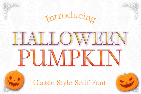
Halloween Pumpkin by Numnim is a bold serif font for traditional posters, seasonal labels, invitations, and merchandise. Its serif foundation gives the lettering more formality than rounded cartoon fonts while retaining a strong headline weight.
I like this for vintage-inspired layouts that need structure without full blackletter complexity. A serif face can also coordinate with bookish or apothecary imagery, although it may feel restrained beside exaggerated monster cartoons.
Best for: traditional posters, vintage labels, formal invitations
Key features: bold serif design, substantial strokes, classic character
30. Pumpkin by Planetz Studio
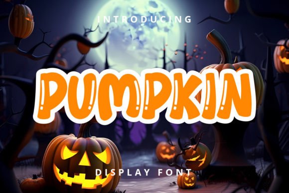
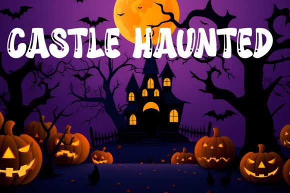
Pumpkin by Planetz Studio is a fun Halloween display font for friendly posters, children’s apparel, treat containers, and uncomplicated craft designs. Its playful shapes make it suitable for less frightening seasonal themes.
I would combine it with smiling jack-o’-lanterns and bold flat colors. The personality is casual rather than cinematic, so designers creating serious horror visuals should choose one of the sharper or distressed options instead.
Best for: friendly crafts, children’s shirts, treat labels
Key features: playful display forms, seasonal focus, approachable tone
31. Halloween Pumpkin by AnamalmusyaffaCreative
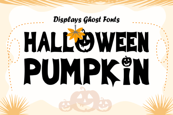
Halloween Pumpkin by AnamalmusyaffaCreative is a cheerful retro display font for seasonal branding, crafts, posters, and groovy merchandise. Its stylized curves suit designers who want pumpkin-season warmth alongside a spooky theme.
I would use this for boutique shirts and social graphics aimed at a trend-conscious audience. The retro voice is visually specific, which can be a strength for cohesive collections but less suitable for timeless corporate materials.
Best for: retro branding, boutique shirts, social posts
Key features: cheerful display style, groovy curves, seasonal versatility
32. Fancy Pumpkin Halloween
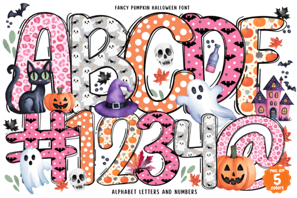
Fancy Pumpkin Halloween is an OpenType-SVG color font for colorful invitations, classroom décor, posters, and seasonal artwork. Its built-in color treatment can create an illustrated result without manually layering several text colors.
I like it for digital graphics and compatible design software where the color data can be retained. Color fonts require more workflow checking than ordinary OTF files, so users should confirm software and output compatibility before building a full project.
Best for: colorful posters, classroom décor, digital invitations
Key features: OpenType-SVG format, built-in color, festive pumpkin styling
33. Stinky Slime
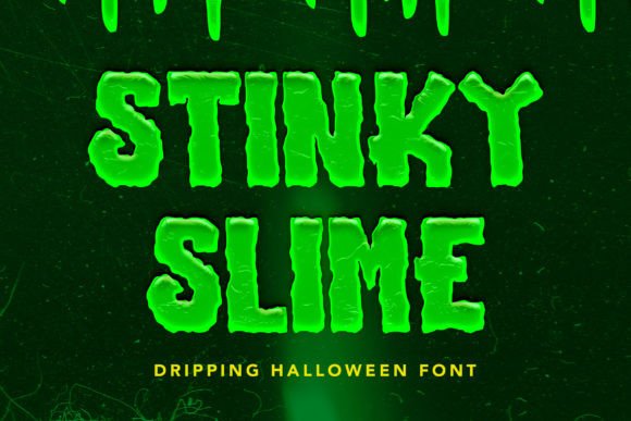
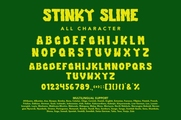
Stinky Slime is a gripping Halloween display font influenced by gothic and horror styling. It is intended for logos, posters, badges, book covers, T-shirts, packaging, and other projects that need gooey lettering with a darker edge.
I would use it for monster-laboratory concepts or a vintage creature feature. The combination of slime and gothic influence is visually busy, so short words and uncomplicated backgrounds should make the design more readable.
Best for: gothic slime art, book covers, creature shirts
Key features: gooey styling, horror influence, broad display applications
34. Slime Horror
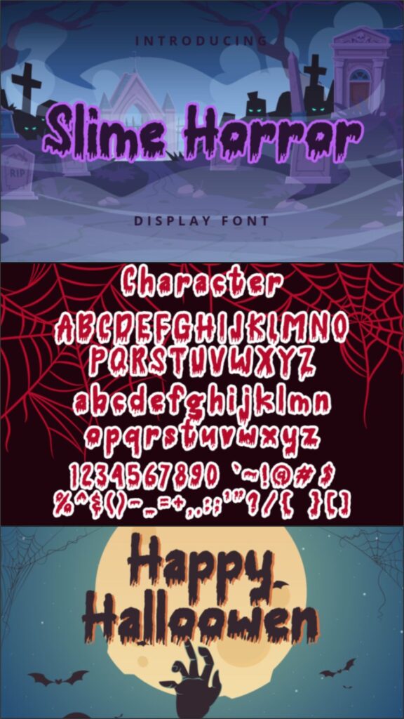
Slime Horror is a Halloween display font for gooey titles, creepy shirts, party posters, gaming art, and monster-themed branding. Its liquid-inspired shapes give ordinary words an immediate horror-comedy treatment.
I would keep it large enough for the irregular edges to remain distinct in print. Slime fonts can overpower supporting information, so a plain companion typeface is the better choice for dates, addresses, or product details.
Best for: gooey headlines, monster shirts, gaming art
Key features: slime-inspired contours, horror display style, expressive silhouette
35. Slime Drip Halloween
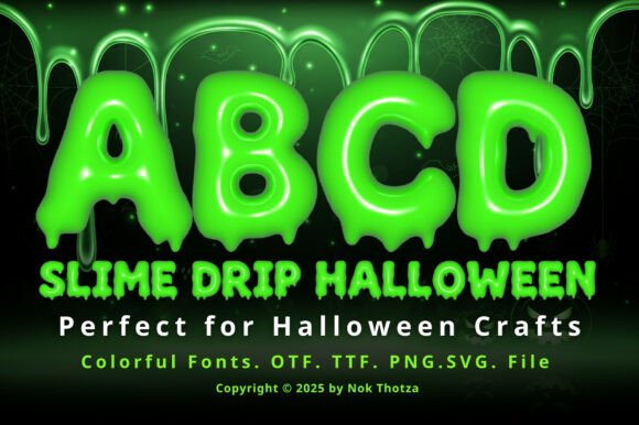
Slime Drip Halloween is a color font that combines substantial Halloween lettering with a dripping slime treatment. It is aimed at vivid digital graphics, posters, stickers, party designs, and colorful merchandise.
The ready-made color styling can save setup time when supported by the chosen software. I would still check how the design exports for print, since color-font behavior and editable color options can vary between applications.
Best for: multicolor posters, vivid stickers, digital graphics
Key features: color-font format, dripping effect, bold seasonal lettering
36. Creature Slime
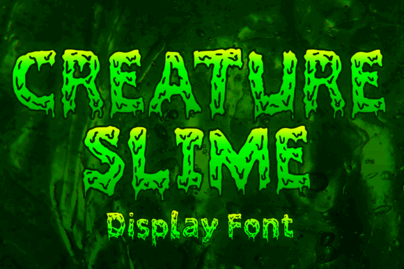
Creature Slime is a display font for monster graphics, creature-feature posters, creepy labels, and playful horror apparel. Its gooey character gives thick text an illustrated quality that can anchor a simple composition.
I would pair it with laboratory icons, eyeballs, or vintage monster art. The specialized slime treatment is less flexible for unrelated projects, but it provides a clear visual direction for a coordinated Halloween product line.
Best for: monster graphics, creature posters, creepy labels
Key features: slime display styling, illustrated personality, strong thematic focus
37. Slime by Squeebcreative
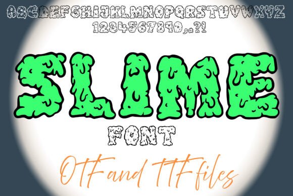
Slime by Squeebcreative is a gooey, dripping decorative font for Halloween artwork, horror posters, gaming graphics, and creepy-cool merchandise. It turns short phrases into an obvious liquid-text effect.
I like this for game-stream graphics and youth-oriented monster designs because the mood is creepy without being overly severe. Fine drips may complicate tiny cuts, so printed or sublimated applications are likely to show the details more reliably.
Best for: gaming graphics, slime shirts, horror posters
Key features: gooey contours, decorative drips, playful creepy tone
38. Zombie Slime
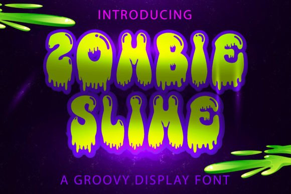
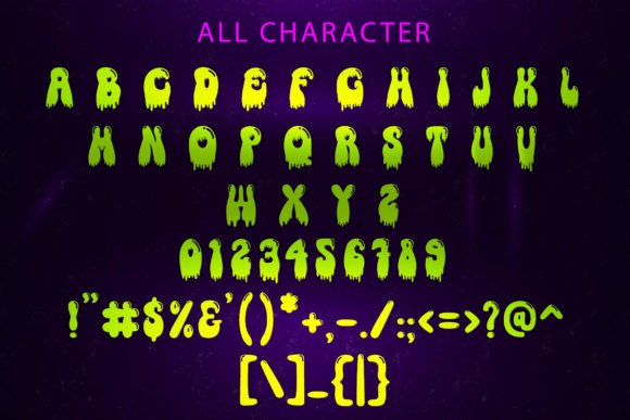
Zombie Slime is a Halloween display font for zombie shirts, undead party posters, sticker designs, and comic-horror graphics. The thick, deteriorating slime concept gives words a messy, infected appearance.
I would use it for humorous zombie themes rather than understated seasonal branding. Its strong concept can carry a design with minimal artwork, but the distinctive texture means it should not be crowded by multiple competing effects.
Best for: zombie shirts, undead posters, comic horror
Key features: dripping display forms, infected visual tone, bold thematic identity
39. Slimespooky
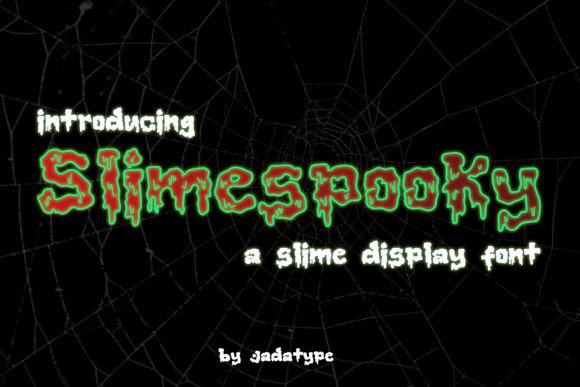
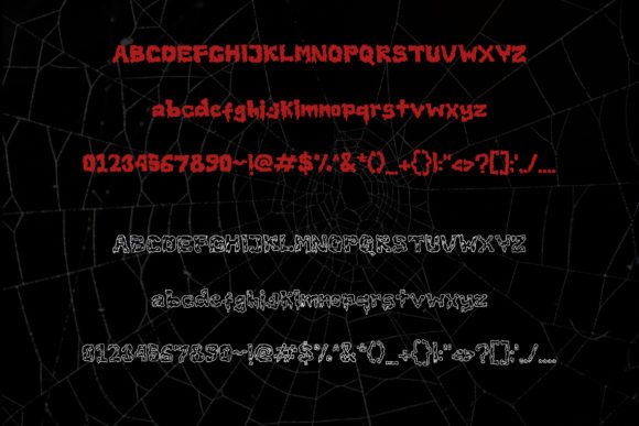
Slimespooky is a decorative font designed to give labels, cards, shirts, and digital headlines a direct Halloween theme. Its slime-based forms suit short names, product titles, and lighthearted creepy messages.
I would choose it for a focused accent rather than an entire typographic system. Pairing it with a neutral sans serif will keep practical information readable while allowing the decorative headline to supply the seasonal personality.
Best for: Halloween labels, card titles, short shirt sayings
Key features: decorative slime style, seasonal identity, accent-font role
40. Spooky Halloween by Sakti Avellin
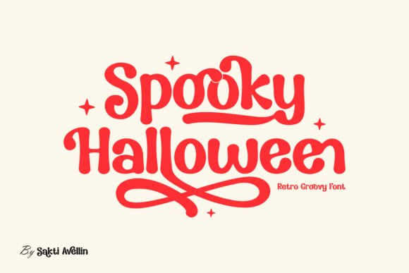
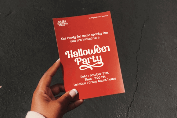
Spooky Halloween by Sakti Avellin is a retro, groovy display font with alternates and ligatures. It suits stylish shirts, quotes, invitations, branding, and Halloween graphics that lean toward nostalgic curves rather than jagged horror.
The alternate characters make this a good candidate for customizing a prominent wordmark. I would avoid overusing decorative substitutions in a single phrase, since too many special forms can weaken the rhythm and readability.
Best for: groovy apparel, custom wordmarks, retro invitations
Key features: alternate characters, ligatures, rounded retro styling
41. Scary Halloween Trio
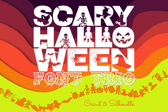
Scary Halloween Trio combines sans serif, serif, and dingbat styles for coordinated Halloween layouts. It is particularly useful for posters, children’s games, party materials, and craft sets that need multiple typographic roles.
I like the convenience of building a headline, secondary phrase, and decorative icon system from one collection. A trio can tempt designers to use every component at once, so visual restraint will produce a cleaner final layout.
Best for: coordinated posters, party sets, children’s activities
Key features: three complementary styles, dingbat elements, flexible hierarchy
42. Halloween Ghost
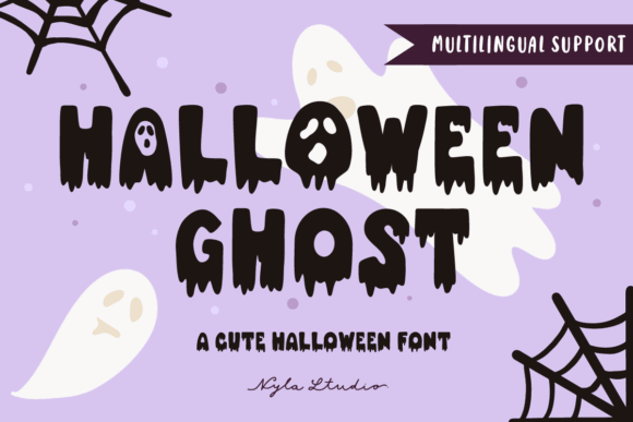
Halloween Ghost is a spooky dripping font for shirts, retro graphics, invitations, mugs, stickers, posters, logos, and packaging. Its bold liquid styling gives everyday craft text an immediate ghostly Halloween identity.
I would use it for short phrases that can remain large on the finished item. The detailed lower edges may require careful sizing for cutting-machine projects, while print and sublimation can preserve the shapes more easily.
Best for: dripping crafts, mugs, retro shirts
Key features: ghostly display style, liquid terminals, broad merchandise use
43. Spider Halloween
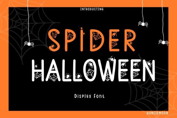
Spider Halloween is a fun display font for cute party goods, classroom graphics, children’s shirts, and jolly seasonal designs. Its playful personality favors approachable Halloween messaging rather than intense horror.
I would pair it with webs, candy, and cartoon spiders for a cohesive theme. Because the letterforms already carry a decorative voice, simple flat colors and limited supporting copy should keep the finished design tidy.
Best for: cute party goods, kids’ apparel, classroom graphics
Key features: playful display forms, spider theme, friendly seasonal tone
44. The Spooky Time
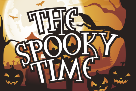
The Spooky Time is a seasonal display font for scary crafts, signs, shirts, party decorations, and cutting-machine projects. Its theme is broad enough to support pumpkins, ghosts, bats, or haunted-house artwork.
I like this as a general-purpose option when a project does not need a specific slime, witch, or monster subtheme. Creative Fabrica lists common desktop and cutting-machine compatibility, but makers should still run a small test cut.
Best for: cutting-machine crafts, general signs, party shirts
Key features: broad spooky theme, display lettering, craft workflow compatibility
45. Halloween Nightmare
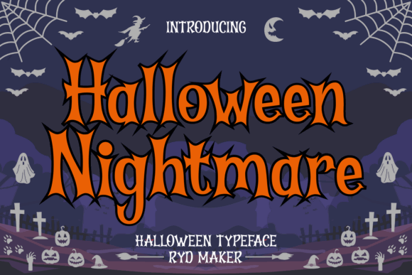
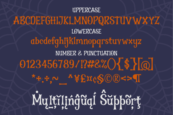
Halloween Nightmare is an unusual display font for eerie titles, experimental shirts, posters, and distinctive seasonal branding. Its unconventional shapes are intended to make short words feel less predictable than ordinary block lettering.
I would choose it when uniqueness outweighs maximum readability. Before committing to a logo or long event name, preview every required character together because expressive display forms can create unexpected spacing or recognition issues.
Best for: unusual titles, experimental apparel, distinctive posters
Key features: unconventional display forms, strong personality, memorable silhouette
46. Night Witch Halloween
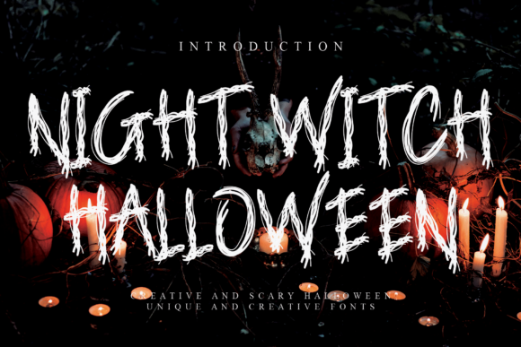
Night Witch Halloween is a sinister display font for horror books, movie covers, spooky games, posters, and witch-themed merchandise. Its dark styling provides a strong title treatment for projects that need more menace than playfulness.
I would use it for covers and promotional art where the headline can occupy a large, uncluttered area. The sinister tone is less suited to cheerful classroom materials, but it aligns naturally with occult and dark-fantasy imagery.
Best for: book covers, witchy shirts, spooky games
Key features: sinister display forms, dark fantasy mood, title-focused design
47. Vibes Halloween
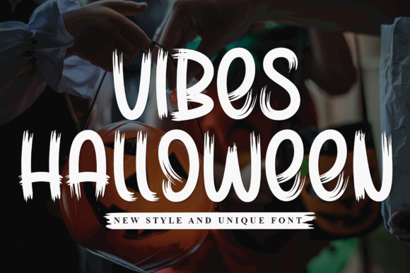
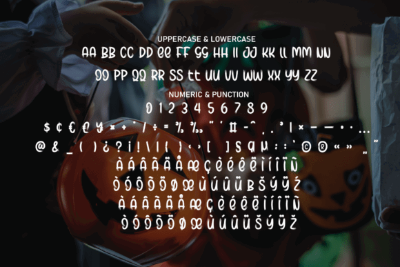
Vibes Halloween is a ragged brush display font with weathered, energetic letterforms. It targets party invitations, horror posters, gothic streetwear, haunted-house promotions, and graphics that need a distressed hand-painted appearance.
I like this for streetwear-inspired shirts where clean geometric type would feel too polished. The uneven texture may lose clarity at small print sizes, so it should be used as a prominent headline rather than supporting text.
Best for: gothic streetwear, haunted promotions, brush posters
Key features: ragged texture, energetic strokes, weathered display style
48. Halloween Creepy
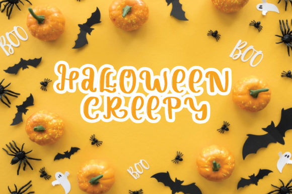
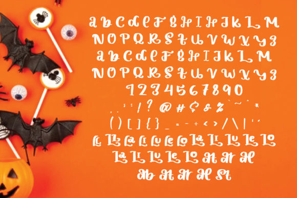
Halloween Creepy is a display font for general horror crafts, shirts, invitations, posters, and seasonal graphics. It provides a dedicated creepy headline style without tying the design to one narrow icon such as a pumpkin or spider.
I would use it as a flexible foundation for multiple Halloween collections, changing the artwork and palette around the lettering. Its decorative identity still makes it a headline font, not a practical option for addresses or fine-print information.
Best for: general horror crafts, seasonal shirts, flexible poster themes
Key features: creepy display styling, broad Halloween use, strong headline role
49. Creepy Halloween
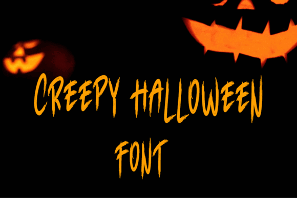
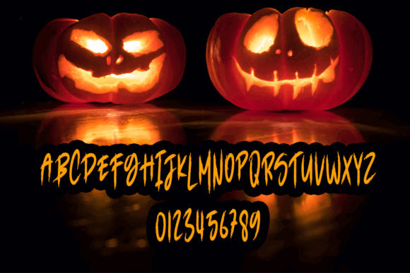
Creepy Halloween is a seasonal display font for bold headlines, posters, apparel, invitations, and other October projects. Its dedicated Halloween character makes it useful when plain heavy type needs more atmosphere.
I would treat it as a final headline option for straightforward spooky designs that do not require a layered or color-font workflow. As with any decorative typeface, previewing the complete phrase is important before cutting or ordering prints.
Best for: seasonal headlines, basic apparel, party posters
Key features: creepy display character, dedicated Halloween theme, simple single-font workflow
Match the Font to the Halloween Mood
- Choose rounded, chunky lettering for children’s events, candy graphics, and cute ghost designs.
- Use dripping or slime fonts for monster laboratories, zombie themes, and horror-comedy shirts.
- Pick distressed serifs, brush fonts, or blackletter for haunted attractions, dark apparel, and mature horror posters.
- Select retro curves for boutique merchandise, groovy pumpkins, and nostalgic party graphics.
Check the Font Format and Software
Standard OTF and TTF files are the simplest choice for most desktop and cutting-machine workflows. Layered fonts need multiple aligned text layers, while OpenType-SVG color fonts require compatible software and may offer fewer options for recoloring individual components.
Always install and preview the font before designing an entire collection. Check punctuation, numerals, uppercase forms, lowercase forms, and any special characters required for the final wording.
Final Picks for Bold Halloween Lettering
Blockton Halloween is my most practical all-around selection, Halloween Melt delivers the strongest dimensional drip effect, and Super Horror stands out for retro merchandise. Designers creating darker work should consider Crimson Horror, Killer Horror, or Dread Monster, while Night Fall Spooky and Spider Halloween are better suited to family-friendly projects.
Whichever font you choose, test the full phrase at its final size before printing or cutting. Thick lettering provides a strong foundation, but careful spacing, restrained effects, and an appropriate production method determine whether the finished poster or T-shirt stays bold and readable.
Some links in this article may be affiliate links. If you purchase through them, we may earn a small commission at no extra cost to you. Thanks for supporting our work.
Frequently Asked Questions
What is the best thick Halloween font for a poster?
u003cstrongu003eBlockton Halloween is my top thick Halloween font for a poster because its broad block letters balance spooky personality with distance readability.u003c/strongu003e Halloween Melt is a stronger alternative when the headline needs dramatic drips, while Killer Horror fits tall layouts that require condensed lettering. A poster font should remain recognizable when viewed from several feet away. Keep essential event details in a simpler companion font and use the decorative Halloween face only for the main title or a short callout.
Which thick Halloween fonts are best for T-shirts?
u003cstrongu003eSuper Horror, Blockton Halloween, Night Fall Spooky, and Big Bold Chunky are strong T-shirt options because their substantial forms can support large, centered slogans.u003c/strongu003e Horror Drip and Zombie Slime suit more theatrical graphics, provided the drips remain large enough to print cleanly. The best choice depends on the production method. Sublimation and direct-to-garment printing can preserve texture and fine details, while cut vinyl generally benefits from broader shapes and fewer tiny projections.
Can I use a thick Halloween font with Cricut or Silhouette?
u003cstrongu003eMany standard OTF and TTF Halloween fonts can be installed and used with Cricut Design Space or Silhouette Studio, but the design still needs a test cut.u003c/strongu003e Broad block letters are usually easier to weed than distressed fonts, narrow counters, sharp spikes, or long slime drips. Weld overlapping letters when the layout requires a connected shape, and inspect small interior pieces before cutting. Increasing the finished size or simplifying the phrase can make a detailed decorative font much easier to produce.
How do I make a thick Halloween font easier to read?
u003cstrongu003eUse a short phrase, strong color contrast, generous spacing, and a simple background to make thick Halloween lettering easier to read.u003c/strongu003e Avoid stacking several decorative effects on a font that already includes drips, distressing, outlines, or sharp ornamental details. A plain outline can separate the letters from artwork, while a restrained shadow can add depth. For posters and invitations, move dates, addresses, and instructions into a clean sans serif so the decorative headline does not carry every communication task.
Follow Us