

How to Choose Halloween Fonts for Cricut Projects
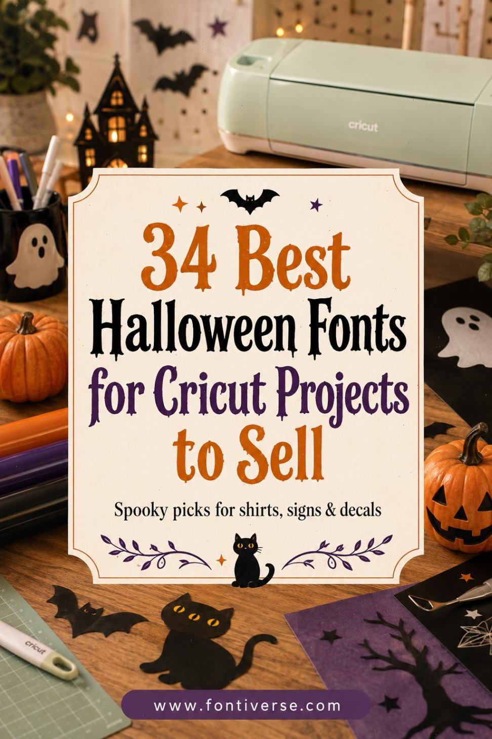
The best Halloween fonts for Cricut projects to sell need to do more than look spooky on a computer screen. They also need to remain recognizable after cutting, weeding, pressing, printing, or shrinking the design to fit a mug.
I’ve gathered 34 Halloween fonts from Creative Fabrica and organized them by practical product type. Some are playful enough for children’s shirts and classroom treats. Others have the dripping, skeletal, witchy, or vintage personality needed for adult apparel, party signs, tumblers, and October home decor.
My recommendations are editorial picks based on the font style, product positioning, likely use cases, and suitability for common Cricut projects.
Table of Contents
Cute Halloween Fonts for Kids’ Shirts and Family Designs
1. Scary Halloween Trio
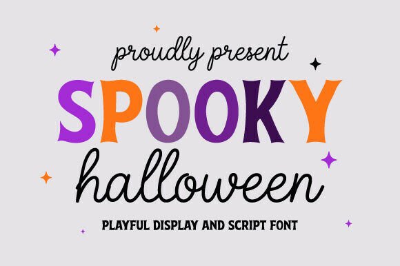
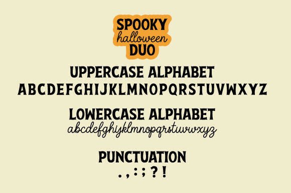
Scary Halloween Trio is my first stop when I want several coordinated looks without building every design around the same letter style. A multi-style set is useful for creating a related group of shirts, treat bags, or party items while giving each design its own personality.
I’d use it for matching family apparel, classroom products, and coordinated Halloween collections. Before cutting, preview each phrase separately because the most decorative style may need to be reserved for larger designs.
Best for: Family shirts, party collections, treat bags
Key features: Three-font set, coordinated Halloween theme, display lettering
2. Halloween Parade
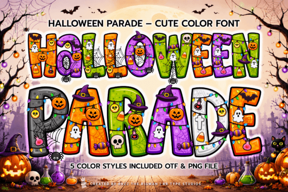
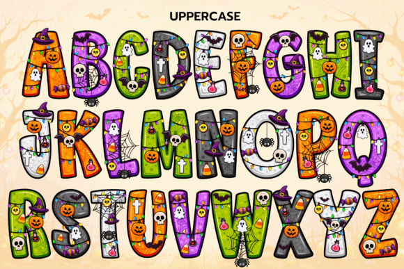
Halloween Parade has the kind of name and seasonal personality that suits cheerful, character-led designs rather than genuinely frightening merchandise. I like this direction for products aimed at younger children or buyers who prefer friendly Halloween graphics.
Pair it with smiling ghosts, candy corn, dancing skeletons, or a row of costumed characters. It should also suit short phrases that need to remain prominent on a shirt.
Best for: Kids’ shirts, classroom decor, party invitations
Key features: Playful Halloween theme, display style, casual personality
3. Halloween Pumpkin

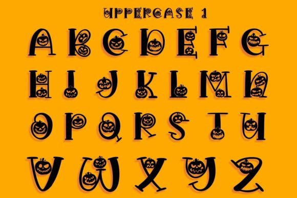
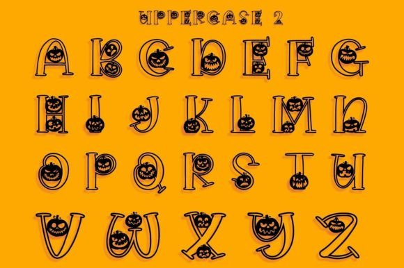
Pumpkin-themed lettering is one of the easiest styles to reuse across an October product line. It can support Halloween designs, pumpkin-patch merchandise, fall-market items, and family trip shirts without pushing every project into horror territory.
I’d use Halloween Pumpkin for short phrases such as “Pumpkin Crew,” “Little Pumpkin,” or “Pick of the Patch.” Keep accompanying illustrations simple so the lettering remains the main seasonal cue.
Best for: Pumpkin shirts, fall signs, treat containers
Key features: Pumpkin theme, seasonal display lettering, family-friendly concept
4. Halloween Ghost
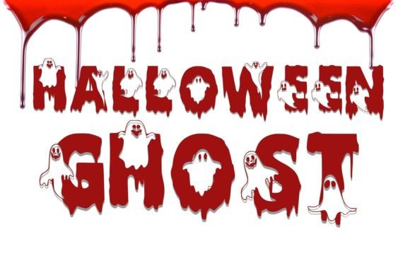
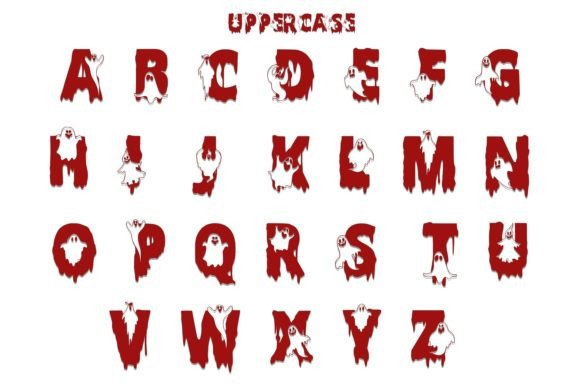
Ghost lettering can be cute, spooky, or somewhere in between, which gives this font broad product potential. My pick would be a short, humorous phrase on a youth shirt, tote bag, or candy bucket.
Ghost motifs also pair nicely with white vinyl on black, purple, or orange blanks. That high-contrast combination can make a simple one-color product feel finished without requiring multiple vinyl layers.
Best for: Ghost shirts, candy bags, simple decals
Key features: Ghost theme, seasonal display font, suitable for short phrases
5. Halloween Black Cat
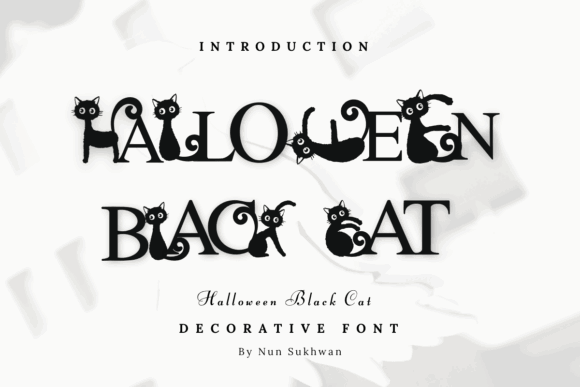
Black cats appeal to Halloween shoppers, cat owners, and buyers who enjoy witchy imagery without wanting a full horror aesthetic. That overlap makes Halloween Black Cat useful for niche products rather than one generic seasonal shirt.
I’d build designs around phrases such as “Feline Spooky” or “Black Cat Club,” then pair the font with a clean cat silhouette. Avoid adding too many whiskers, stars, bats, and sparkles around small lettering.
Best for: Cat-lover shirts, tote bags, stickers
Key features: Black-cat theme, Halloween styling, niche merchandising potential
6. Fancy Pumpkin Halloween
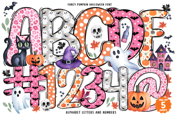
Fancy Pumpkin Halloween leans toward a more decorative interpretation of pumpkin season. I like it for boutique-style products where a plain block font would feel too basic but a dripping horror font would be far too aggressive.
Try it on fall porch signs, decorative pillows, hostess gifts, or adult sweatshirts. A restrained palette of black, cream, rust, and muted orange would support the more polished direction.
Best for: Boutique apparel, fall signs, decorative gifts
Key features: Decorative pumpkin theme, seasonal display style, dressier personality
7. Monster Halloween
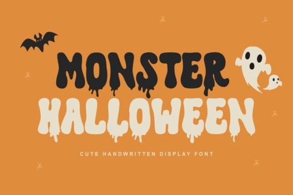
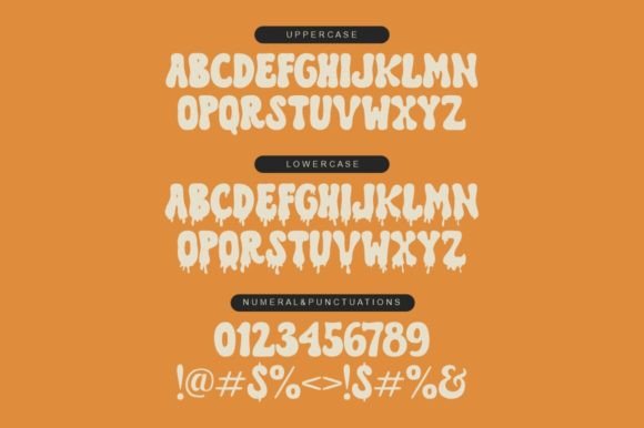
Monster fonts are useful when you want energetic Halloween lettering without focusing on blood, weapons, or graphic horror. That makes this Monster Halloween font a strong direction for children’s apparel, birthday parties, and school-approved seasonal merchandise.
I’d keep the wording short and pair it with one friendly monster illustration. Too many character graphics can quickly make a shirt look crowded.
Best for: Monster shirts, birthday decor, youth products
Key features: Monster theme, bold seasonal character, playful display use
8. Halloween Cat
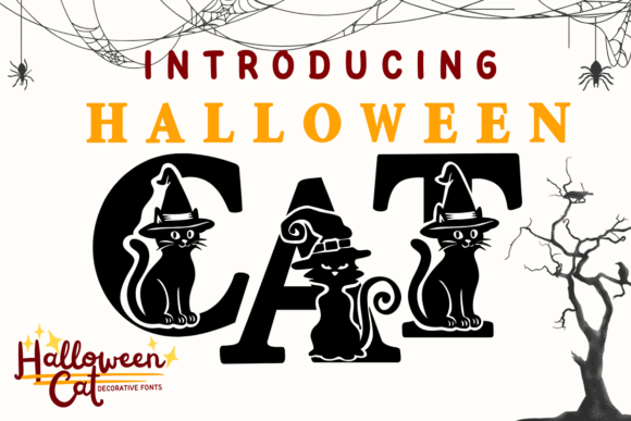
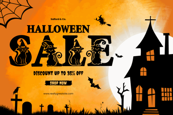
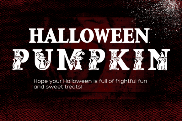
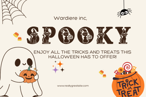
Halloween Cat gives sellers another way to target the large overlap between pet products and seasonal merchandise. I’d use it for cat-mom tumblers, pet bandana packaging, tote bags, or shirts with short sarcastic sayings.
For vinyl projects, a single cat silhouette and one strong line of text will usually read better than a highly detailed scene. Let the font and the cat shape share the attention.
Best for: Cat apparel, tumblers, pet-themed gifts
Key features: Cat theme, Halloween display styling, adaptable product niche
Witchy Fonts for Signs, Tumblers, and Boutique Apparel
9. Witchcraft Halloween
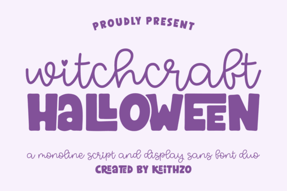
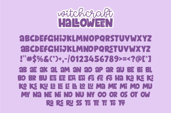
Witchcraft Halloween is a natural fit for potion labels, spell-book graphics, coven shirts, and mystical October decor. I’d choose it for products aimed at adult Halloween shoppers rather than small children.
This kind of lettering benefits from restrained supporting graphics. A moon, crystal, broom, or potion bottle can reinforce the concept without competing with the title.
Best for: Witch shirts, potion labels, mystical signs
Key features: Witchcraft theme, dramatic display lettering, adult-oriented aesthetic
10. Wicked Halloween
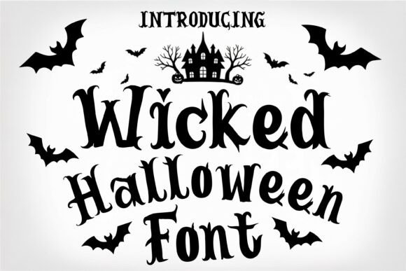
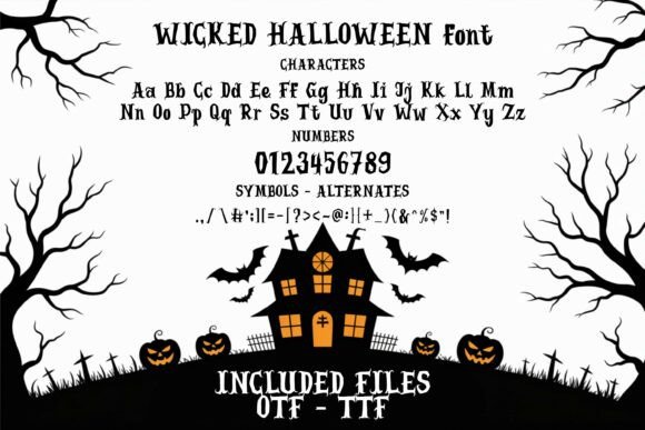
Wicked Halloween suits phrases that need a slightly mischievous or theatrical attitude. My first thought is a bold sweatshirt, tumbler wrap, or door sign built around one strong word.
Because “wicked” can work as both a Halloween reference and a personality statement, this font may have more flexibility than a design filled with pumpkins or dated holiday wording.
Best for: Sweatshirts, tumblers, statement signs
Key features: Wicked theme, expressive display style, strong headline potential
11. Halloween Witches Duo
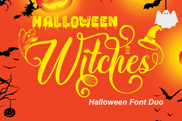
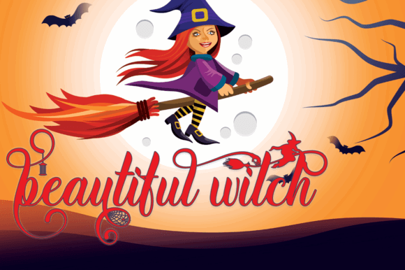
A duo font makes it easier to create contrast between a large headline and a smaller supporting phrase. I’d use one style for the main wording and the other for names, dates, locations, or short subtitles.
That built-in relationship is handy for party invitations, matching coven shirts, boutique packaging, and personalized gifts. It can also help a product collection feel coordinated rather than repetitive.
Best for: Invitations, matching shirts, personalized gifts
Key features: Two-font set, witch theme, coordinated typography
12. Halloween Witchlight
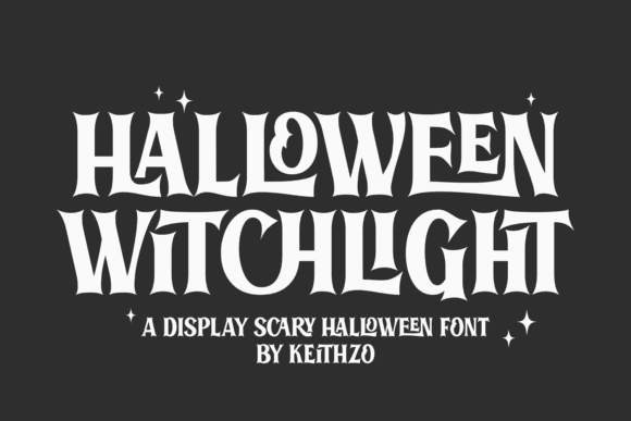
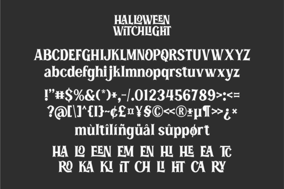
Halloween Witchlight suggests a lighter, magical direction rather than dense gothic horror. I like that for celestial witch designs, moon-phase graphics, candle labels, and feminine Halloween apparel.
Pair it with a clean secondary font when a design includes several lines. Decorative lettering is more effective as a focal point than as a full paragraph of text.
Best for: Celestial shirts, candle labels, moon decor
Key features: Magical Halloween theme, decorative display style, witchy personality
13. Witch Halloween
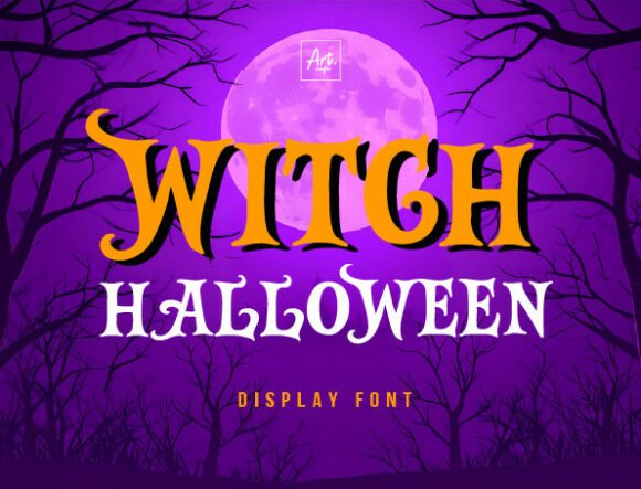
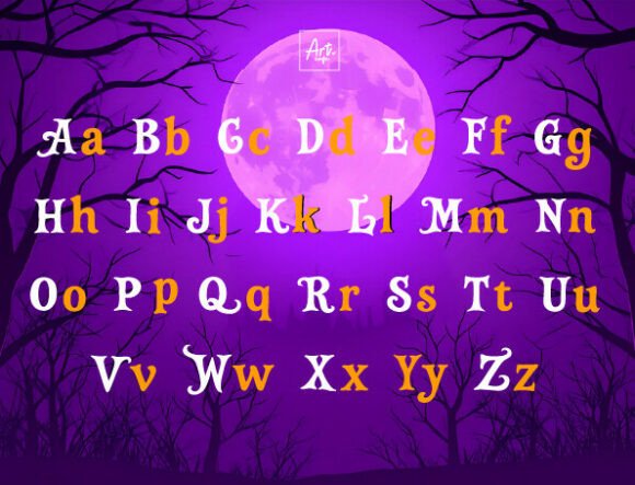
Witch Halloween is a straightforward choice for sellers building broomstick, cauldron, spell, or coven-themed products. The clear subject makes it easy to match the font with familiar seasonal icons.
I’d use it for concise phrases such as “Witch Mode,” “Basic Witch,” or “Coven Crew.” Short wording leaves more room for the font’s decorative features.
Best for: Coven shirts, witch signs, Halloween mugs
Key features: Witch theme, seasonal display font, suited to concise wording
14. Magic Halloween Duo
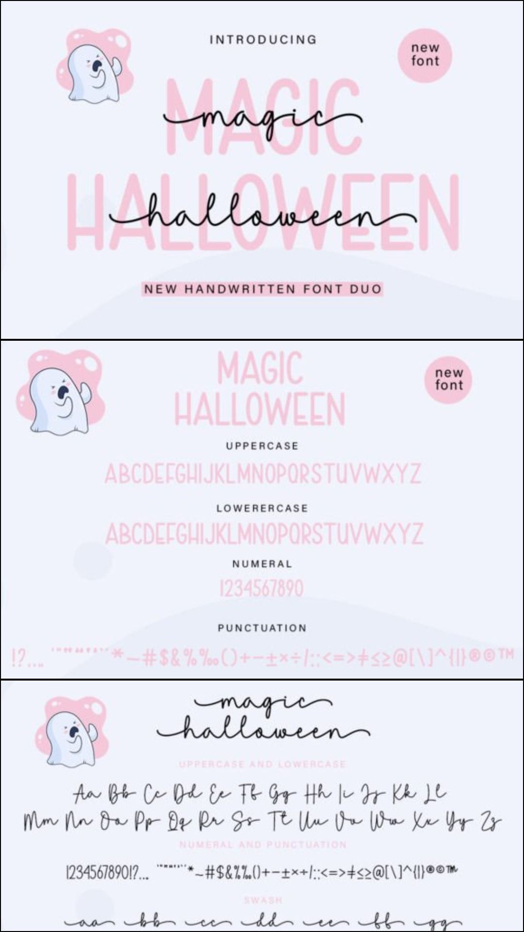
Magic Halloween Duo offers two coordinated options for designs that need more hierarchy. I’d use the more expressive style for the main phrase and the simpler companion for small personalization or supporting copy.
This is especially useful for product families. You can reuse the same two fonts across shirts, mugs, tags, and party stationery without making every item look identical.
Best for: Product collections, party stationery, personalized apparel
Key features: Two-font combination, magical Halloween theme, built-in hierarchy
15. Halloween Witch
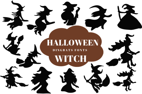
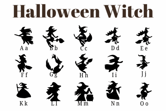
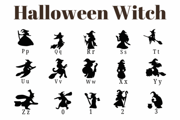
Halloween Witch is another direct option for classic October merchandise. I’d consider it for broom parking signs, trick-or-treat bags, cauldron labels, and simple one-color apparel.
The strongest commercial concept here is clarity. Buyers should understand the joke or theme from a product thumbnail, so I’d avoid pairing the font with a long quotation.
Best for: Broom signs, treat bags, witch apparel
Key features: Classic witch theme, seasonal display lettering, thumbnail-friendly concept
Horror and Dripping Fonts for Bold Halloween Products
16. Spooky Halloween
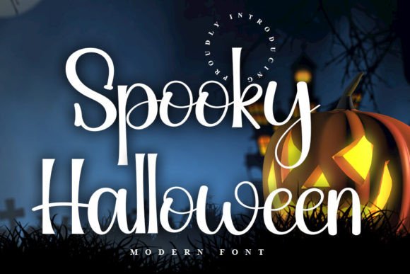
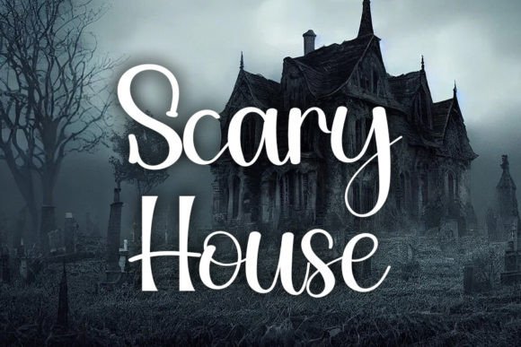
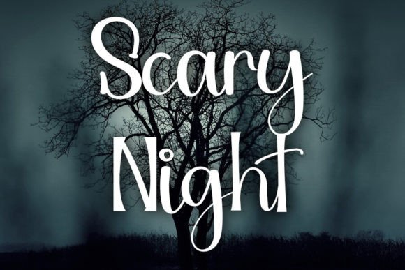
Spooky Halloween is broad enough to support several types of October products. I’d use it when a design needs more edge than a cute pumpkin font but does not need to look like a heavy-metal poster.
It could suit porch signs, event shirts, sticker designs, and party banners. Test the smallest intended size before committing to a large batch, particularly when the letters include irregular details.
Best for: Porch signs, event shirts, party banners
Key features: General spooky theme, display lettering, versatile Halloween positioning
17. Halloween Bone
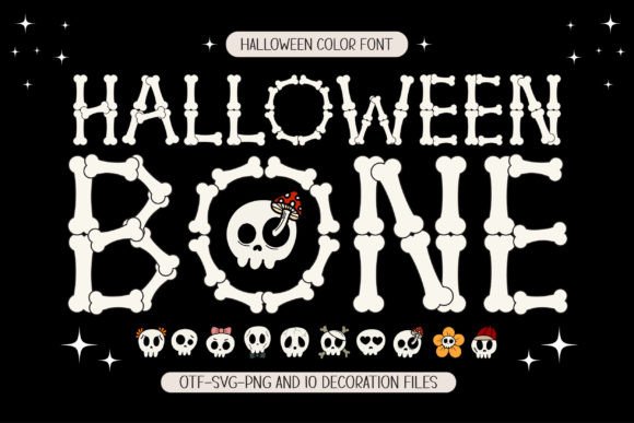
Bone-inspired lettering makes the typography function as part of the illustration. That can reduce the need for separate skeleton graphics and simplify a one-color design.
I’d use Halloween Bone on large shirt graphics, porch decor, party signs, or treat-bag names. For small adhesive-vinyl labels, check that the narrow bone shapes do not become too delicate.
Best for: Skeleton shirts, large signs, treat bags
Key features: Bone motif, illustrative letterforms, strong one-color potential
18. Ghouls Halloween
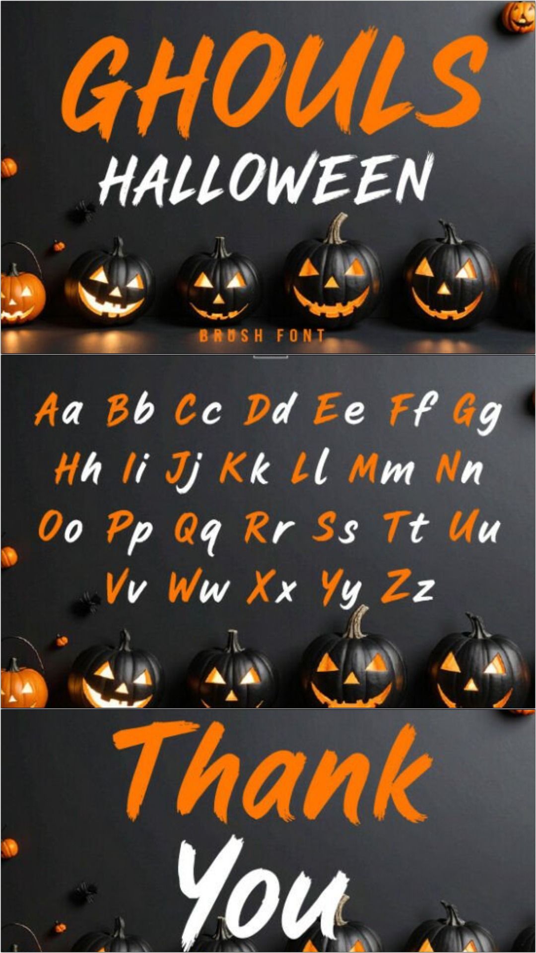
Ghouls Halloween is well matched to haunted-house products, ghost-tour merchandise, and darker party themes. I like it for phrases that need more personality than an ordinary distressed block font.
Try it as the main headline on a black shirt or sign, then use a plain sans serif for locations and dates. This keeps supporting information readable.
Best for: Haunted-house shirts, party decor, ghost-tour designs
Key features: Ghoul theme, spooky display personality, headline-focused use
19. Scary Halloween
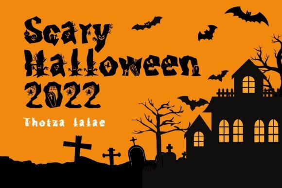
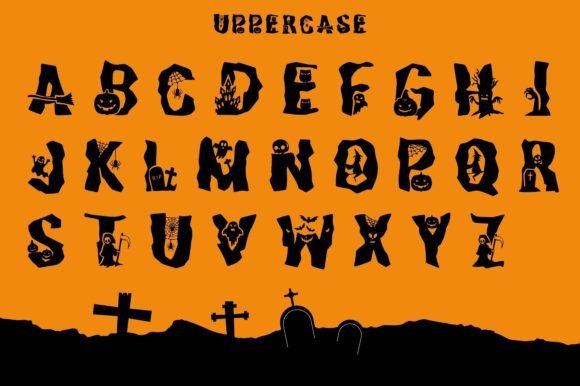
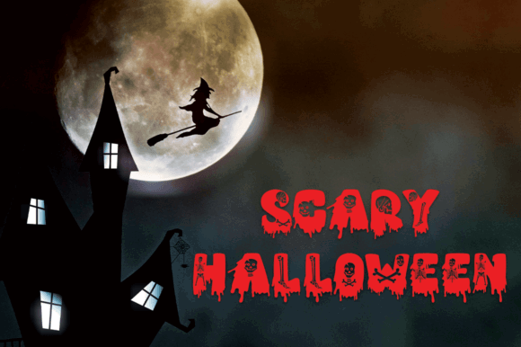
Despite the year in its name, Scary Halloween 2022 can still be used for undated designs. I would avoid including the product name itself in customer-facing copy and focus on the actual letter style.
This pick belongs on bold adult shirts, haunted attraction merchandise, horror-themed stickers, and larger signage. Keep secondary wording clean and compact.
Best for: Horror apparel, attraction merch, large stickers
Key features: Scary theme, strong display role, usable for undated designs
20. Beastly Halloween
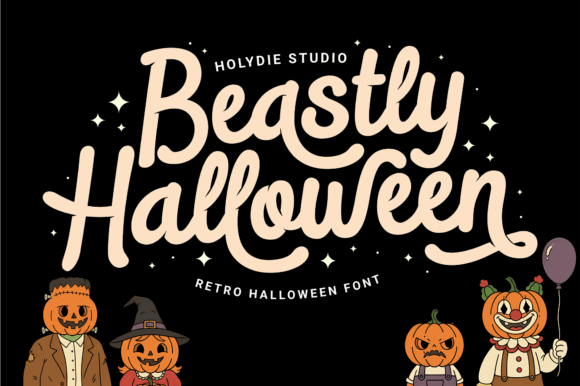
Beastly Halloween has a rougher, creature-driven concept that could support werewolf, monster, beast, or haunted-forest graphics. I’d choose it for designs that need movement and aggression.
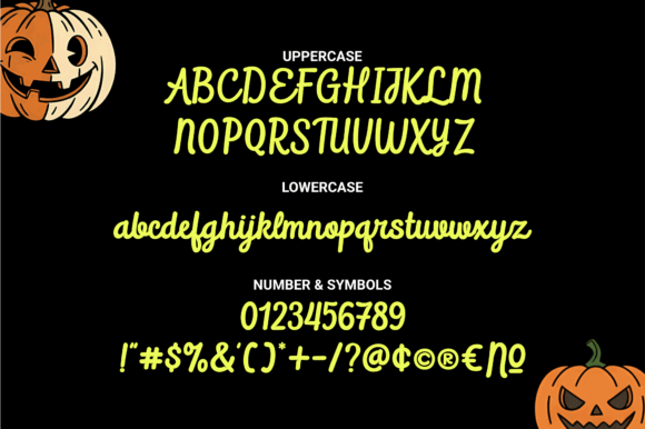
The font should be most effective at medium or large sizes. On small decals, heavily stylized edges can create unnecessary weeding work and weaken legibility.
Best for: Monster apparel, haunted signs, horror posters
Key features: Beast theme, aggressive display direction, suited to larger layouts
21. Slime Drip Halloween
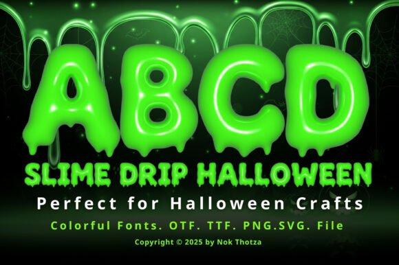
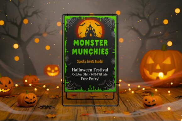
Slime Drip Halloween is an obvious match for neon monster products, mad-scientist parties, alien themes, and playful horror. The dripping effect gives a design immediate seasonal character even without several illustrations.
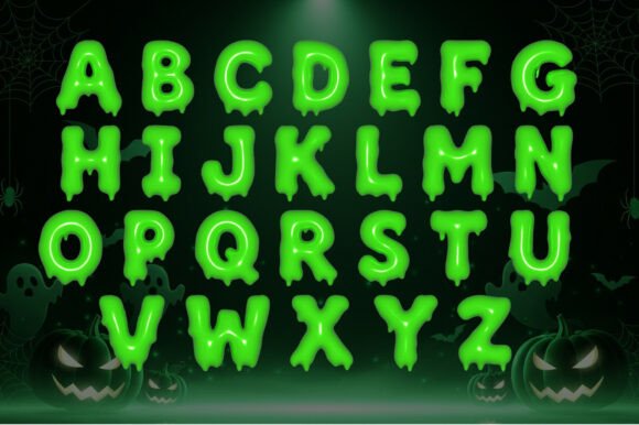
I’d use it for short words in large type. Long quotations can turn a dripping font into a dense wall of irregular shapes.
Best for: Slime shirts, science parties, monster stickers
Key features: Dripping effect, slime theme, bold decorative lettering
22. Halloween Bones
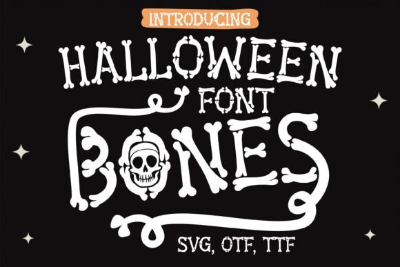
Halloween Bones can carry a skeleton design without requiring a full anatomical illustration. That makes it useful for sellers who want a simple typographic product with unmistakable Halloween styling.
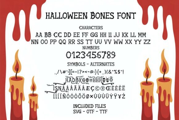
I’d try it on sweatshirts, tote bags, wooden signs, and larger vinyl decals. A clean layout and generous letter spacing can help intricate bone details remain distinct.
Best for: Skeleton products, tote bags, wooden signs
Key features: Bone-inspired lettering, illustrative font concept, seasonal display use
23. Halloween Scream
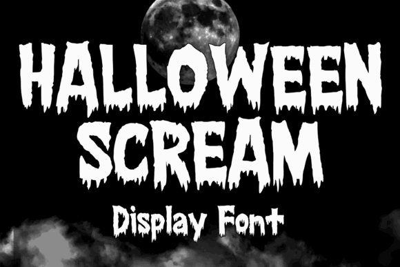
Halloween Scream is my pick for dramatic horror titles, haunted-event graphics, and louder adult apparel. It is less suited to gentle family merchandise and more suited to designs meant to feel intense.
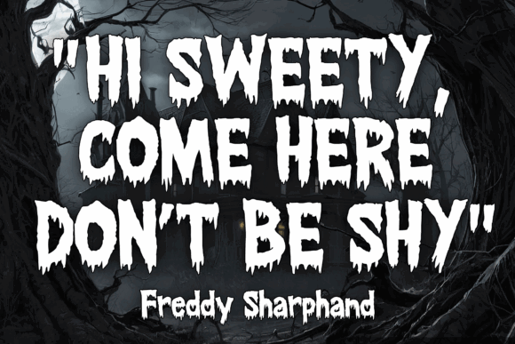
Use it as a headline rather than a supporting font. A clean condensed sans serif underneath can handle dates, locations, or smaller explanatory text.
Best for: Haunted events, horror shirts, dramatic posters
Key features: Horror theme, high-impact display role, expressive personality
24. Dripping Halloween
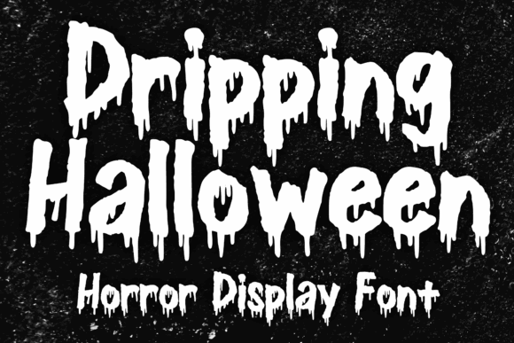
Dripping Halloween offers the classic melting or dripping treatment shoppers associate with slime, potions, and old horror titles. It can make even a simple two-word design feel deliberately seasonal.
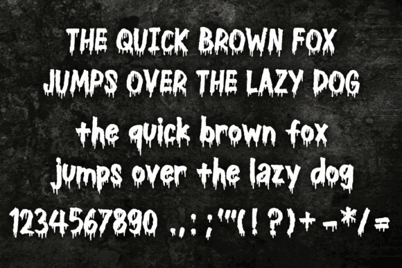
I’d reserve it for large wording on shirts, mugs, party banners, and printed stickers. For cut vinyl, enlarge the design enough that the drip shapes remain manageable.
Best for: Horror shirts, mugs, party banners
Key features: Dripping letter treatment, classic Halloween style, strong headline use
25. Halloween Nightmare
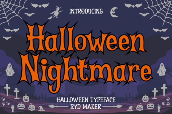
Halloween Nightmare belongs in the darkest part of this collection. I’d use it for haunted-house merchandise, horror movie party decor, adult sweatshirts, and October event graphics.
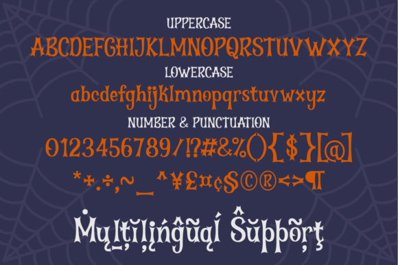
A font this thematic does not need many competing elements. One distressed frame, one ominous illustration, or a limited two-color palette should be enough.
Best for: Haunted attractions, adult apparel, horror decor
Key features: Nightmare theme, dramatic display lettering, dark Halloween positioning
Retro and Decorative Halloween Fonts
26. Midnight Halloween
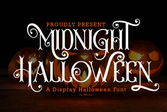
Midnight Halloween sounds suited to moonlit, celestial, and slightly mysterious designs. I’d use it for adult apparel, candle labels, party invitations, or signs that need atmosphere without graphic gore.
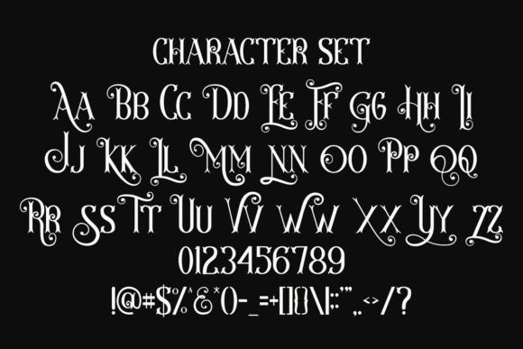
It would pair naturally with moons, stars, bats, or a dark night-sky palette. Keep thin celestial illustrations larger than you think you need when cutting them from vinyl.
Best for: Moon shirts, invitations, candle labels
Key features: Midnight theme, atmospheric Halloween style, decorative display use
27. Halloween Vintage
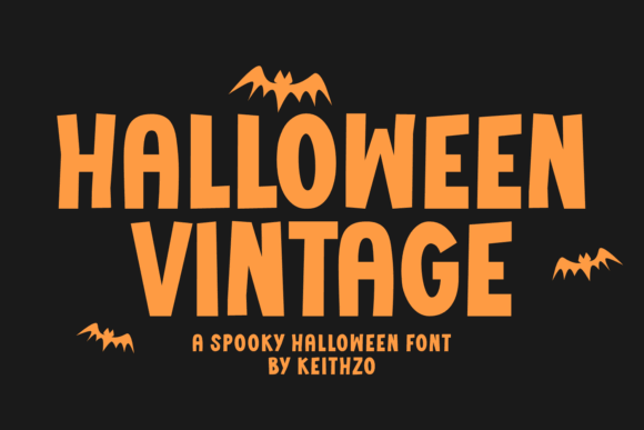
Halloween Vintage is a useful direction for retro postcards, old apothecary labels, heritage-style signs, and distressed apparel. Vintage typography can make a product feel collectible rather than disposable.
I’d pair it with limited colors, aged illustrations, and simple framing. Avoid mixing it with glossy futuristic graphics, which can weaken the period-inspired mood.
Best for: Vintage signs, retro shirts, apothecary labels
Key features: Vintage Halloween theme, decorative display style, nostalgic product potential
28. Groovy Halloween
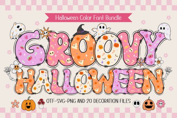
Groovy Halloween is aimed at the retro side of seasonal design: wavy lettering, cheerful palettes, checkerboards, daisies, smiley ghosts, and disco-inspired graphics.
I like this direction for sweatshirts, tote bags, stickers, and sublimation designs sold to buyers who prefer playful retro Halloween decor over traditional orange-and-black horror imagery.
Best for: Retro shirts, tote bags, sublimation products
Key features: Groovy theme, playful retro positioning, decorative display use
29. Handwritten Halloween
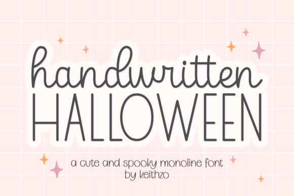
Handwritten Halloween can give product copy a more personal, casual feeling. I’d use it for labels, treat tags, greeting cards, signs, or smaller supporting phrases beneath a bold display font.
Handwritten styles need careful spacing in Design Space. Look at troublesome pairs and adjust them manually when the automatic spacing feels uneven.
Best for: Treat tags, cards, labels
Key features: Handwritten style, informal personality, useful as supporting text
30. Happy Halloween
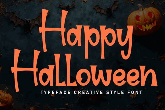
Happy Halloween is built around the most recognizable seasonal greeting, making it a practical option for banners, entry signs, candy bowls, mugs, and gift tags.
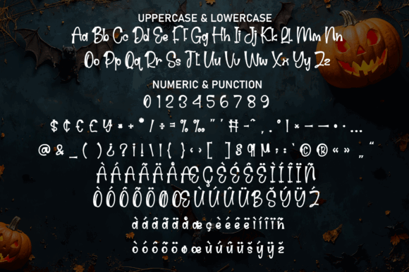
I’d use it when the product needs to communicate instantly rather than rely on a niche joke. Straightforward wording also leaves room for personalization, such as a family name or event year.
Best for: Banners, mugs, entry signs
Key features: Familiar Halloween greeting, seasonal display font, broad audience appeal
Halloween Font Bundles for Building Product Collections
31. Halloween Bundle Volume
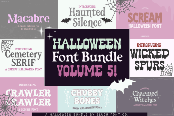
Halloween Bundle Volume 5 is a practical pick for sellers planning several coordinated releases. A bundle gives you more typographic range for shirts, signs, mugs, tags, and social graphics than one standalone font.
The real value is variety, but I would still limit each product to one or two fonts. Using every style at once can make a design feel like a sample sheet.
Best for: Seasonal collections, shop launches, varied product lines
Key features: Multi-font bundle, Halloween theme, range of design options
32. Halloween
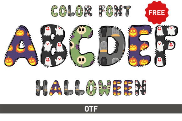
This Halloween font by Veil is a direct seasonal option for makers who want the holiday theme without committing to a narrowly defined pumpkin, bone, cat, or witch style.
I’d use it as a flexible headline font across party signs, shirts, mugs, and simple decals. Its broader concept makes it easier to reuse with different illustration sets.
Best for: General Halloween shirts, signs, mugs
Key features: General Halloween theme, reusable display role, flexible product positioning
33. Happy Halloween Bundle
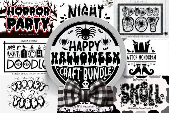
Happy Halloween Bundle is suited to sellers who need enough variation for an entire seasonal shop section. It can support several audiences, from family-friendly gifts to decorative party products.
My approach would be to assign one font style to each mini-collection. That creates visible variety while preserving consistency across matching shirts, mugs, and tote bags.
Best for: Shop collections, coordinated gifts, seasonal launches
Key features: Halloween font bundle, multiple style options, collection-building potential
34. Halloween Parade
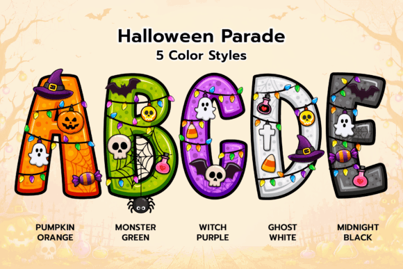
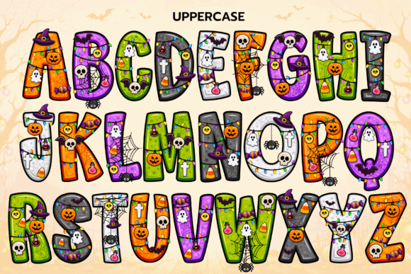
Halloween Parade earns a final mention as one of the more approachable choices for a broad product catalog. It can anchor family shirts, classroom decorations, party stationery, and candy-related merchandise without becoming overly dark.
For a collection, I’d pair it with a plain rounded sans serif and reuse the same limited color palette across products.
Best for: Family collections, classroom products, party stationery
Key features: Friendly seasonal character, display lettering, broad family appeal
What Halloween Products Can You Sell?
Halloween fonts can support far more than basic black T-shirts. I’d consider building small collections around:
- Matching family Halloween shirts
- Trick-or-treat bags and candy buckets
- Porch signs and door hangers
- Mugs and insulated tumblers
- Sweatshirts and tote bags
- Party invitations and banners
- Classroom treat tags
- Sticker sheets
- Pillow covers
- Kitchen towels
- Pet bandanas
- Candle and potion-style labels
- Acrylic ornaments
- Wooden shelf signs
- Sublimation prints
The most efficient approach is to reuse one strong design system across several products. A single ghost phrase could become a shirt, tote bag, mug, sticker, and sign while still being adapted to each format.
Final Picks
For a family-friendly shop, I’d begin with Halloween Parade, Halloween Ghost, Halloween Black Cat, and Halloween Pumpkin. They offer recognizable seasonal themes without narrowing the audience to horror fans.
For trendy adult apparel, my picks are Groovy Halloween, Halloween Vintage, Halloween Witchlight, and Magic Halloween Duo. These can support more fashion-led collections and coordinated typography.
For bold haunted-house or horror products, I’d look first at Halloween Scream, Dripping Halloween, Halloween Nightmare, and Slime Drip Halloween.
The strongest font is not necessarily the most detailed one. It is the font that remains readable at the final size, matches the buyer, cuts or prints cleanly, and makes the product’s idea understandable within a few seconds.
FAQ
What is the best Halloween font for Cricut shirts?
For shirts, I prefer bold fonts with substantial strokes and limited tiny details. Halloween Parade and Monster Halloween suit family products, while Halloween Scream and Dripping Halloween suit bolder adult designs.
Can I sell products made with Creative Fabrica fonts?
Creative Fabrica fonts generally include commercial-use permissions under the applicable license, but there are restrictions on redistributing the font files and selling designs that are essentially the original asset. Check the current license terms for your subscription and intended product.
Why is my Halloween font difficult to weed?
The font may contain narrow strokes, tiny distressed areas, small counters, long drips, or many detached details. Increase the design size, simplify unnecessary texture, or choose a chunkier style.
How do I add a downloaded Halloween font to Cricut Design Space?
Download and install the font on your device, then restart Design Space if it was open during installation. Add a text box, open the font menu, and select the font from your system fonts.
Follow Us