Typography matters a lot in design. It’s more than just picking a font and sizing headlines and body text correctly; it’s both science and art. Here are eight tips to improve your typography, making it look nicer and easier to read.
Table of Contents
1. Lighter Font Weights Look Better on Dark Backgrounds
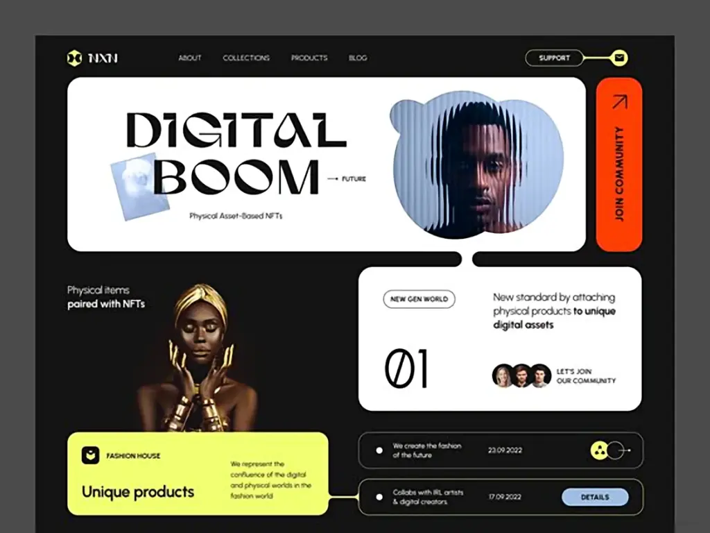
A couple of things are hot in design right now: dark modes and variable fonts. But when adding a dark mode, many designers make the same mistake: Not adjusting the font weight. A bold heading in light mode stays just as bold in dark mode.
This post may contain affiliate links. If you make a purchase through these links, I may earn a small commission at no extra cost to you. Thank you!
Light text appears heavier on a dark background. Besides not looking great, this can make text harder to read. If you have a variable font, tweak the weight in dark mode. Reduce it by about 50. So, a font weight of 700 in light mode should be around 650 in dark mode. The text will appear cleaner, look better, and be easier to read.
2. Using a tighter line height makes headlines look way nicer.
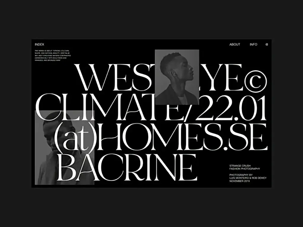
Here are eight tricks to make your typography prettier and easier to read.
Headlines are usually short – just one line, maybe two, and sometimes three at the most. For body text, a line height of about 140% usually works. But if you use that same setting for headlines, the lines can seem too far apart, like they don’t belong together. Try reducing the line height for your headlines to somewhere between 110% and 120%. This makes them look tighter, more complete, and just better overall.
3. OpenType features can add flair to your fonts.
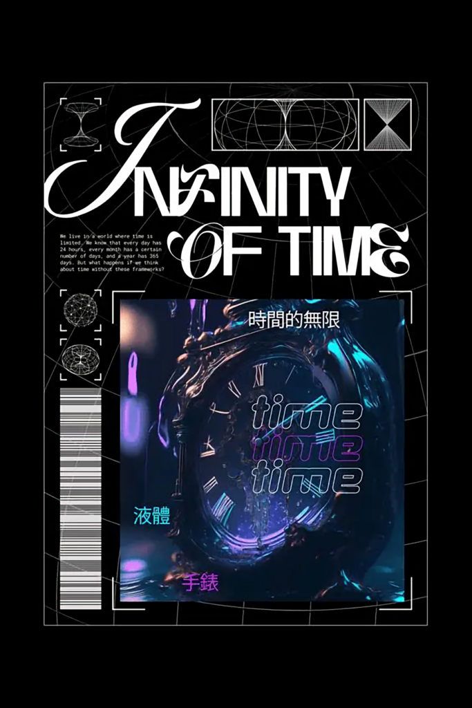
Here are eight tips to make your typography look better and easier to read.
OpenType features are gaining popularity. More fonts support them, which is great. I especially like stylistic alternates. Font designers let you use alternate characters, often extra versions of letters such as a, g, and t. Take a moment to see if your font has OpenType features you can use to give it a unique look.
4. OpenType features can add flair to your fonts.
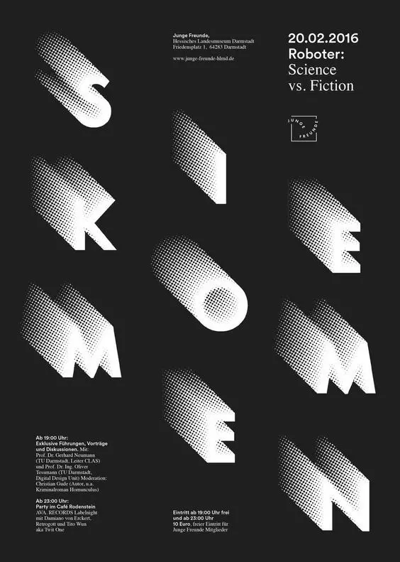
Here are eight tips to make your typography look better and easier to read.
OpenType features are gaining popularity. More fonts support them, which is great. I especially like stylistic alternates. Font designers let you use alternate characters, often extra versions of letters such as a, g, and t. Take a moment to see if your font has OpenType features you can use to give it a unique look.
5. Use lowercase numbers to make the text easier to read.
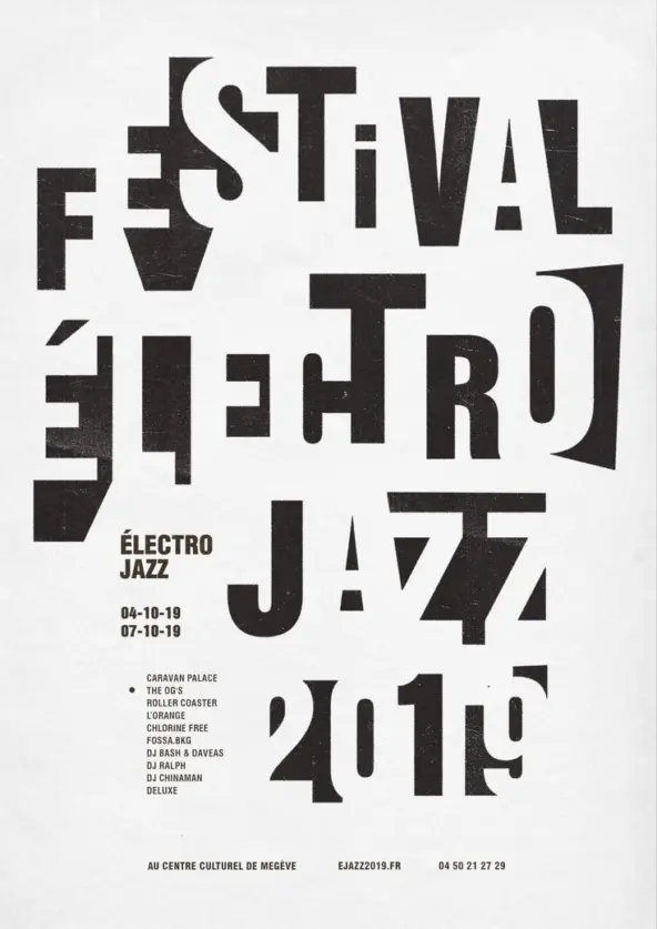
Here are eight tricks to enhance the look and readability of your typography.
Seasoned designers avoid fonts for body text where individual characters stand out too much. For example, I once rejected a font because the lowercase g had an unusual tail. It was too different and distracting. You want readers absorbed in the content. The same goes for numbers. If they’re all the same height – the default style – they stand out. These numbers grab attention, even before someone reads that line, which distracts users and complicates reading. Old-style figures are a good alternative. They fit well with lowercase text and aren’t intrusive. Few website and app creators care about this, but adding it will make your site stand out. Only font experts will notice this detail, but your readers will appreciate it without even realizing why.
6. Use small caps for abbreviations. This tip is similar to the last one, but it applies to letters.
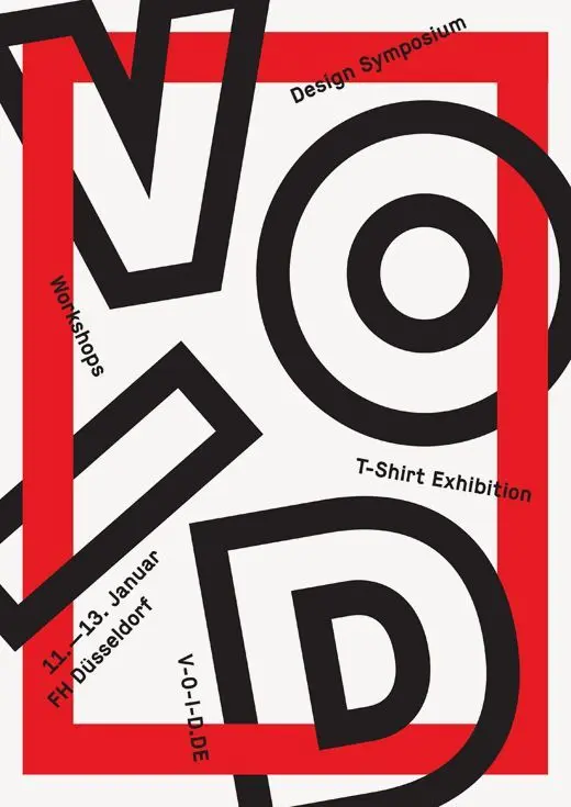
Here are eight tricks to improve your typography’s look and readability, particularly for abbreviations. For example, I’ll write CIA here. I’m sure you noticed that abbreviation right away. If there were many in a paragraph, it would be distracting. Your eyes can’t help but spot them, making the text harder to read.
If your font has small caps, use them to make the text more readable. Bonus tip: don’t try to fake small caps! If the font doesn’t support them but you force them, they’ll look wrong. Fake small caps are just scaled-down capital letters and look too thin compared to the other text. This looks worse than regular caps.
7. Use ligatures to polish up your text.
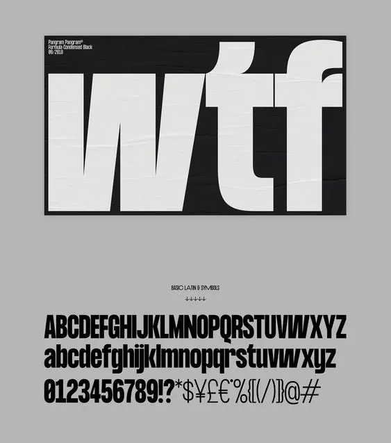
Here are eight tips to make your typography look nicer and read better:
Ligatures make certain letter combos look better. Common examples include things like fi, fl, and ffi. It’s more about looks than how well you can read the words, but some fonts have letter pairs that clash so badly that anyone can spot it. And as you know, readers shouldn’t notice stuff like that. If they do, the designer didn’t do their job right. Readers need to focus on the content. Ligatures can even give your typography some flair and make it stand out.
8. Vertical Icon Alignment with Baseline
I see this mistake all the time. Many designers try to align the bottom of an icon with the baseline of its label. Is this how all typography is aligned? Is the baseline a reference grid to follow, then? Not really. When it comes to aligning icons with text, it’s better to make the icon the same height as the line of its label. If done correctly, the vertical center of the icon will match the middle of the capital letter X.
Want to make your typography better? Creative Fabrica has tons of great fonts, typefaces, and design resources you can’t find anywhere else. It’s great for designers who want their work to stand out with precision and style.
You may also like:


