

ℹ️ Affiliate Disclosure: This article may contain affiliate links. We may earn a commission at no extra cost to you. Thanks for your support! ❤️
10 Stunning Calligraphy Fonts for Wedding Invitations and More
Choosing wedding calligraphy fonts isn't simply about finding something elegant.
From my perspective as a web designer and branding consultant, typography is one of the earliest signals people receive about a brand, an event, or even the people behind it. Long before anyone reads the details of a wedding invitation, they have already formed an impression through its typography.
That is why I never treat script fonts as decorative extras. They're part of the communication system.
Over the years I've noticed the same pattern while reviewing branding projects, websites, and visual identities. Designers often spend hours choosing paper, colors, photography, and layouts, only to settle on a script font because it “looks pretty.” Unfortunately, that's often where an otherwise thoughtful design begins to lose its polish.
Typography usually has a bigger impact on perception than many people realize.
Wedding invitations are especially demanding because they ask a typeface to do several jobs at once. It has to feel elegant without becoming theatrical, expressive without sacrificing readability, and distinctive without distracting from the information people actually need.
The best wedding calligraphy fonts manage this balance surprisingly well.
Some communicate understated luxury. Others create warmth or a handcrafted personality. A few are bold enough to become the centerpiece of the entire composition.
In this collection I've selected ten calligraphy fonts available through Creative Fabrica that stand out for different reasons. Rather than focusing only on appearance, I'll look at how each typeface contributes to hierarchy, branding, readability, and overall visual communication.
Quick Picks
- Best classic elegant option: Chardonnay
- Best expressive luxury option: Laurente
- Best coordinated font duo: Flece Display
- Best warm handmade option: Sweetty Handmade
- Best restrained modern option: Gastonia
How I Picked These
I compared these wedding calligraphy fonts by name readability, stroke contrast, spacing, alternate-character usefulness, print practicality, scalability across stationery and signage, pairing flexibility, and how well each style can create an elegant focal point without competing with dates, venue details, and supporting text.
1. Chardonnay
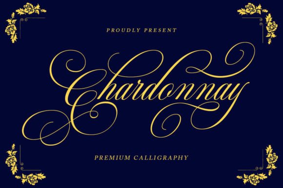
Chardonnay immediately communicates refinement without becoming overly formal.
From a branding perspective, that's one of its strongest qualities.
Many luxury-inspired script fonts rely on oversized flourishes that quickly dominate a composition. Chardonnay avoids that trap by maintaining a disciplined rhythm between expressive capitals and relatively restrained lowercase letterforms.
That balance gives the font a premium appearance while keeping names readable, which is exactly what wedding invitations require.
Its moderate stroke contrast also deserves attention.
When printed on textured cotton paper or lightly coated stock, the thicker downstrokes retain their presence while the finer connecting strokes remain visible. That's something many highly decorative scripts struggle to achieve.
The spacing between characters feels carefully considered as well.
Rather than forcing designers to manually adjust every pair of letters, Chardonnay arrives with proportions that already feel natural. Small spacing decisions often have a bigger impact than people expect, particularly in invitation design where every millimeter contributes to the perceived quality of the piece.
For branding projects, I would reserve this typeface primarily for display applications:
- invitation names
- venue titles
- monograms
- boutique packaging
- luxury product labels
I wouldn't use it for long paragraphs or website body copy. Like most expressive scripts, it performs best when allowed to become a focal point rather than carrying large amounts of information.
For supporting typography, I prefer pairing Chardonnay with a restrained serif such as Crimson Pro or another transitional serif with generous spacing. The contrast between structured body text and expressive calligraphy creates a hierarchy that feels calm rather than competitive.
2. Laurente
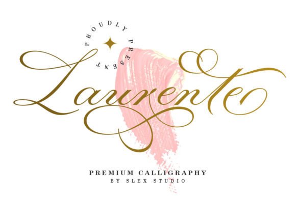
Laurente has a noticeably different personality.
Where Chardonnay feels controlled and classic, Laurente introduces more movement through extended swashes and dramatic entry strokes.
Despite that flourish, it rarely crosses into excess.
Its letterforms remain surprisingly balanced, which is why it works particularly well for upscale wedding branding.
One aspect I appreciate is the rhythm between uppercase and lowercase characters.
The capitals provide visual drama, but the lowercase alphabet settles the composition, preventing headlines from feeling unstable. That internal balance makes Laurente easier to integrate into sophisticated layouts than many decorative alternatives.
Typography isn't simply about attractive shapes.
It's about guiding the eye.
Laurente creates that guidance naturally through its flowing baseline and carefully proportioned ascenders. Readers move comfortably across the word instead of stopping to decode ornamental details.
Because of its expressive personality, I generally recommend limiting Laurente to hero typography.
Names.
Headlines.
Invitation covers.
Large quotations.
Allowing it to handle every typographic role would weaken the hierarchy. Decorative scripts become far more effective when surrounded by restraint.
For supporting text, an elegant serif with moderate contrast usually creates the most balanced composition.
3. Flece Display Font Duo (Calligraphy & Sans Serif)
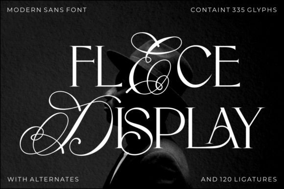
Although Flece Display isn't a traditional calligraphy font, I find it one of the more versatile options in this collection.
The reason is simple.
It already solves one of the biggest typography problems designers face: pairing.
Instead of searching endlessly for a companion font, Flece combines expressive script lettering with a matching sans serif that shares the same visual language.
That consistency becomes valuable across larger branding systems.
Wedding invitations rarely exist in isolation.
They often expand into menus, seating charts, signage, thank-you cards, websites, social graphics, and printed keepsakes.
Maintaining visual consistency across those touchpoints is considerably easier when both primary and secondary typography have been designed together.
The script component remains elegant without becoming fragile.
Meanwhile, the accompanying sans serif introduces clarity exactly where information needs to be scanned quickly.
This kind of built-in hierarchy is something I frequently recommend during brand identity projects.
Rather than mixing unrelated typefaces, working within a coordinated family creates a more cohesive visual identity from the beginning.
The script still deserves careful use.
I'd reserve it for names, initials, and headline moments, allowing the sans serif to handle schedules, locations, contact details, and supporting information.
That's a system that scales well beyond a single invitation.
4. Sweetty Handmade
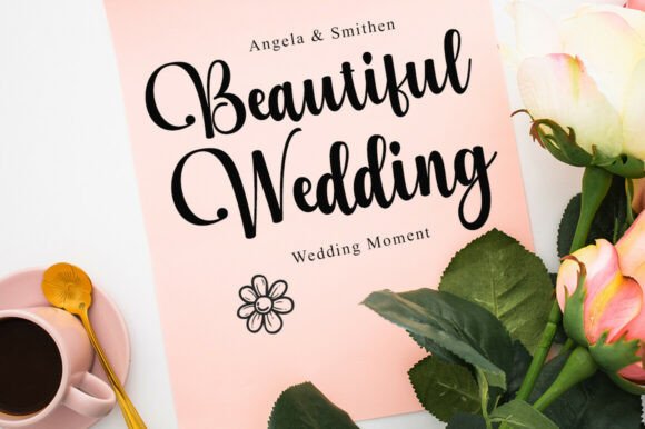
Sweetty Handmade introduces a noticeably warmer tone.
Its rounded terminals and softer rhythm create a sense of approachability that feels less formal than traditional copperplate-inspired calligraphy.
From a branding perspective, this changes the emotional message considerably.
Instead of communicating luxury, Sweetty Handmade suggests intimacy.
That makes it especially suitable for rustic weddings, small creative businesses, handmade product packaging, artisan branding, or boutique stationery.
One thing I appreciate is that the curves never become overly decorative.
Many casual handwritten fonts sacrifice readability in pursuit of authenticity.
Sweetty Handmade manages to retain a handwritten appearance while remaining surprisingly legible, even at moderately small display sizes.
The spacing also feels relaxed.
Nothing appears forced.
That natural rhythm gives layouts more breathing room and helps supporting typography coexist comfortably alongside the script.
I would still avoid using it for long passages of text.
Even approachable scripts introduce visual fatigue when readers are asked to process multiple sentences.
Used selectively, however, Sweetty Handmade creates warmth that feels genuine rather than manufactured.
5. Maphylla
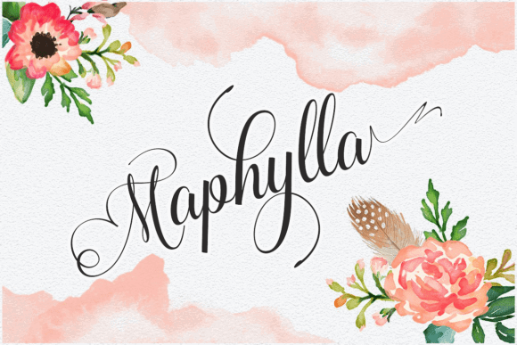
Maphylla immediately stands apart because of its lighter visual weight.
Its thin strokes and elongated proportions create a quieter presence than many calligraphy fonts in this category.
Visually, the typeface communicates elegance through restraint rather than ornament.
That distinction matters.
Many designers assume adding more flourishes automatically creates a more luxurious design.
In practice, the opposite is often true.
Controlled typography frequently feels more expensive because it leaves room for the surrounding layout to breathe.
Maphylla performs particularly well alongside botanical illustrations, watercolor artwork, handmade papers, and minimal compositions with generous white space.
Its delicate letterforms encourage a slower reading experience without becoming difficult to decipher.
There is one limitation worth mentioning.
Because of its fine stroke construction, I'd be cautious when using it at very small sizes or with lower-quality printing methods. Thin scripts can lose definition if ink spreads or paper absorbs too much pigment.
For that reason, I see Maphylla primarily as a display typeface.
Pairing it with a restrained geometric or humanist sans serif creates a clean hierarchy while allowing the script to remain the visual centerpiece.
Many decorative fonts attract attention initially but become harder to work with across larger branding systems.
Maphylla succeeds because it understands restraint.
That quality tends to age far better than decoration alone.
6. Nostalgic Wedding
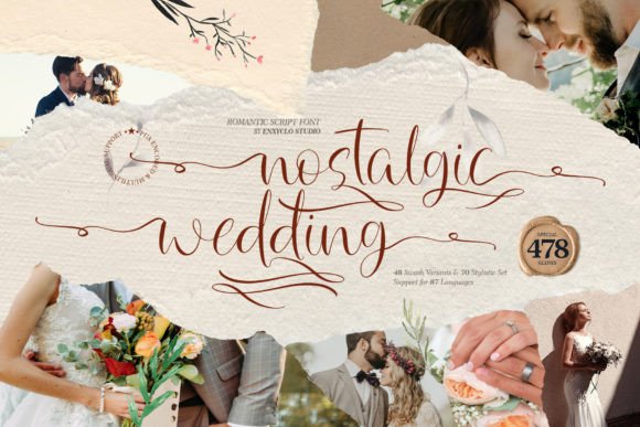
Nostalgic Wedding has a softer rhythm than many of the fonts in this collection. Rather than relying on dramatic flourishes, it builds its personality through delicate proportions, light stroke transitions, and generous spacing between its letterforms.
From a branding perspective, that's a strength.
Not every wedding invitation needs to communicate luxury in an obvious way. Sometimes the goal is intimacy. Sometimes it's calm. Typography has an enormous influence over that emotional tone, and Nostalgic Wedding naturally leans toward romance without becoming sentimental.
One thing I often notice when reviewing invitation designs is that designers mistake ornament for elegance. The two are not interchangeable.
Nostalgic Wedding proves that restraint can feel more sophisticated than excessive decoration.
Its ascenders and descenders remain long enough to create movement, yet they rarely interfere with neighbouring lines of text. That makes the font much easier to integrate into real layouts where spacing is limited.
The typeface works particularly well with:
- botanical illustrations
- fine art photography
- handmade cotton paper
- soft watercolor textures
- minimal editorial layouts
I would pair it with a transitional serif featuring generous tracking. The contrast between structured body copy and flowing script creates a hierarchy that feels balanced rather than forced.
Its main limitation is scale.
Although the font remains readable, its delicate construction deserves room to breathe. Reducing it too aggressively removes much of the elegance that gives it character.
7. Mounday
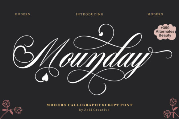
Mounday takes a noticeably different approach.
Unlike several fonts in this collection that aim for understated sophistication, Mounday embraces personality from the very first letter.
The integrated heart motifs and decorative swashes immediately establish an emotional tone.
That makes it an interesting choice for wedding stationery, but it also requires more discipline when building the surrounding layout.
From my experience, decorative typography succeeds when everything around it becomes quieter.
Trying to pair an expressive script like Mounday with another decorative typeface almost always creates unnecessary competition.
Instead, I would allow Mounday to become the hero of the composition.
Use it for:
- couple names
- invitation covers
- welcome signs
- large display headlines
- social graphics announcing the wedding
Everything else should step back.
A clean serif or understated sans serif creates breathing room while allowing the script to remain the visual focal point.
One characteristic I appreciate is the extensive collection of alternates.
OpenType features often receive less attention than they deserve, yet they're one of the easiest ways to create typography that feels genuinely custom. Small variations in terminal strokes or connecting letters can completely change the rhythm of a word.
Used thoughtfully, those alternates prevent repeated names or headings from looking mechanical.
That said, I'd avoid overusing every flourish simply because it's available.
Good typography is often about knowing when to stop.
8. Wedding Luxury – Monogram Font
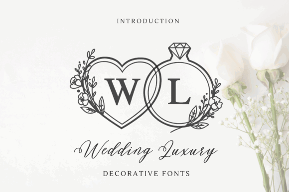
Wedding Luxury approaches typography from a slightly different direction.
Rather than functioning as a traditional script font, it behaves more like a decorative branding element.
That's an important distinction.
Monograms are rarely expected to communicate large amounts of information. Instead, they act as visual signatures, reinforcing identity across invitations, menus, packaging, thank-you cards, websites, and keepsakes.
From a branding perspective, consistency becomes more valuable than complexity.
One carefully designed monogram can unify dozens of individual design pieces.
Visually, Wedding Luxury combines ornamental flourishes with symmetrical structure, giving it an appearance that feels formal without becoming overly rigid.
I'd reserve it for applications such as:
- wax seals
- embossed stationery
- envelope liners
- invitation covers
- luxury packaging
- foil stamped branding
I wouldn't attempt to build complete paragraphs or extensive headlines with it.
Decorative monograms are strongest when treated as identity marks rather than reading text.
One thing I regularly see during branding projects is monograms becoming oversized decorative objects that overwhelm the rest of the composition.
That usually weakens the hierarchy.
Instead, allow the monogram to introduce the identity while the surrounding typography carries the communication.
9. Alignment
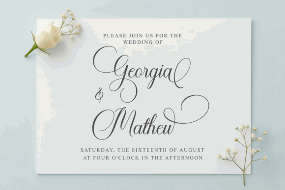
Alignment immediately stands out because of its disciplined structure.
Although it's clearly a calligraphy typeface, the construction feels remarkably controlled. The loops remain open, the connections are clean, and the rhythm between letters avoids the uneven spacing that often affects decorative scripts.
Those qualities improve readability considerably.
Typography isn't only about individual letterforms.
It's about how words behave as complete visual objects.
Alignment creates smooth word shapes that remain recognizable even at moderate viewing distances, making it particularly suitable for printed invitations displayed on tables or welcome boards.
One feature I especially appreciate is the balance between movement and restraint.
The flourishes feel intentional.
Nothing appears added simply for decoration.
This makes the font surprisingly versatile across different branding styles, from traditional weddings to contemporary editorial layouts.
I would pair Alignment with a refined serif featuring moderate contrast or a clean humanist sans serif.
Both combinations reinforce hierarchy without introducing conflicting personalities.
Many designers spend time searching for increasingly decorative fonts when what they really need is stronger structure.
Alignment succeeds because its structure comes first.
10. Gastonia
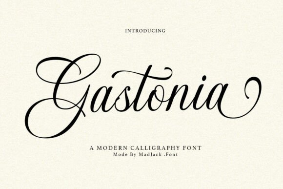
Gastonia closes this collection with a typeface that feels confident without becoming overpowering.
Its loops remain elegant, but they never dominate the composition.
That balance gives the font impressive flexibility across both print and digital branding.
From a visual identity perspective, Gastonia feels more contemporary than several traditional calligraphy scripts.
The stroke transitions remain smooth, yet the overall proportions are slightly cleaner and more geometric.
That subtle modernization helps it integrate naturally alongside today's minimalist branding systems.
One thing I often evaluate is scalability.
A font may look beautiful at invitation size yet become difficult to use across websites, packaging, signage, or social media graphics.
Gastonia handles those transitions surprisingly well because the letterforms maintain their clarity without depending on excessive ornamentation.
I'd confidently use it across:
- wedding invitations
- boutique logos
- premium product packaging
- hospitality branding
- editorial headlines
- event websites
There is still an important limitation.
Like nearly every expressive script, Gastonia shouldn't replace functional typography.
Body copy exists to communicate information efficiently.
Display typography exists to create emotion.
Keeping those roles separate produces stronger layouts and a far more coherent visual hierarchy.
What Makes a Great Wedding Calligraphy Font?
People often assume beautiful calligraphy is defined by dramatic flourishes or elaborate swashes.
I rarely evaluate it that way.
When I'm reviewing typography for branding projects, the first question is never, “Does this font look impressive?” Instead, it's “Does this typeface communicate clearly while supporting the personality of the project?”
A wedding invitation is no different.
Strong calligraphy feels intentional. Every curve, connection, and transition between letterforms should contribute to readability rather than compete for attention.
Some of the characteristics I pay closest attention to include:
- Balanced stroke contrast that reproduces consistently across both digital and printed materials.
- Natural letter spacing that doesn't require excessive manual kerning.
- Smooth rhythm between characters, allowing names and headlines to feel connected rather than crowded.
- Clear hierarchy when paired with serif or sans serif companion fonts.
- Readability at smaller sizes for dates, venues, RSVP information, and supporting copy.
- Consistent visual weight across uppercase and lowercase characters.
- Flexible alternates and ligatures that improve composition instead of adding unnecessary decoration.
- Reliable commercial licensing for professional client work.
One thing I often notice when reviewing wedding stationery is that many script fonts perform beautifully in large previews but become much less convincing once they're placed into a complete layout.
Thin strokes begin to disappear.
Decorative loops overlap surrounding elements.
Letter spacing that looked elegant in isolation suddenly feels compressed.
A typeface may look impressive on its own but struggle once it's becomes part of a larger visual identity.
Good typography rarely calls attention to itself.
Instead, it allows every other design element to work together more effectively.
How to Choose the Right Font for Invitations
One piece of advice I give repeatedly is this:
Start with hierarchy, not style.
It's tempting to begin by searching for the most beautiful calligraphy font you can find, but typography doesn't exist in isolation. Every typeface becomes part of a larger visual system.
That system needs order before it needs personality.
I generally begin every invitation by deciding which information deserves the most attention.
Usually that's:
- the couple's names
- the event title
- the wedding date
Everything else supports those elements.
Once the hierarchy is established, selecting typography becomes considerably easier.
A common mistake is combining several decorative scripts because each one looks attractive individually.
In reality, decorative fonts rarely collaborate well.
They're designed to become the centre of attention.
When several compete for that role, none of them succeeds.
Instead, I prefer a simple formula:
- one expressive display font
- one dependable serif or sans serif
- consistent spacing
- generous white space
- restrained colour palette
That combination produces invitations that feel timeless rather than trend-driven.
Another consideration is print quality.
Some display fonts look remarkable on high-resolution digital previews but lose much of their refinement once printed on textured stock or produced with foil stamping.
Thin connectors disappear.
Tiny counters begin to fill.
Decorative terminals lose definition.
Whenever possible, I recommend printing a physical proof before committing to the final design.
Typography almost always reveals something on paper that wasn't obvious on screen.
Finally, think beyond the invitation itself.
Will this typeface also appear on a wedding website?
Menus?
Place cards?
Signage?
Thank-you cards?
Choosing a font that scales across every touchpoint creates a much stronger visual identity than selecting a different script for every application.
A typeface can completely change the personality of a brand without changing any other design element.
That's why typography deserves as much consideration as photography, colour, or illustration.
How to Never Choose the Wrong Font Again
Over the years I've realised that successful typography has very little to do with collecting hundreds of fonts.
It has far more to do with understanding how type behaves.
Many script fonts attract attention during the first few seconds.
Far fewer continue performing well once they're integrated into a complete branding system.
That's where experience begins to matter.
When I evaluate a typeface, I'm rarely asking whether it's beautiful.
Instead, I'm asking:
Can it establish hierarchy?
Does it scale gracefully?
Will it still feel relevant in five years?
Can it coexist with supporting typography?
Does it reinforce the personality of the project?
Those questions eliminate far more fonts than visual style alone.
The ten typefaces in this collection each offer something different, but they share one important characteristic.
They understand restraint.
Some lean toward luxury.
Others toward warmth.
Some feel contemporary.
Others reference traditional calligraphy.
None of those personalities is automatically better than another.
The strongest choice is simply the one that supports the story your design is trying to tell.
Typography should never compete with the message.
It should make the message more memorable.
Strong branding rarely begins with a logo.
More often than people realise, it begins with the right typeface.
Which Calligraphy Font Should You Choose for Wedding Invitations?
Choosing wedding calligraphy fonts isn't really about collecting the most decorative scripts.
It's about understanding what each typeface communicates.
Throughout branding projects, website redesigns, and visual identity work, I've found that typography is often responsible for the first emotional reaction people have to a design. Before colour, before photography, and before layout, people instinctively respond to the shapes of letters.
That's especially true with wedding stationery.
A carefully chosen calligraphy font doesn't simply make an invitation look elegant. It establishes expectations. It suggests craftsmanship, attention to detail, and the personality behind the celebration.
Every typeface in this collection approaches that goal differently.
Some create quiet sophistication through restrained letterforms.
Others rely on expressive flourishes and flowing movement.
A few are versatile enough to extend beyond invitations into complete branding systems that include websites, signage, packaging, menus, social graphics, and printed keepsakes.
None of them is universally “the best.”
The right choice depends on the message you want your design to communicate.
When evaluating typography, I encourage looking beyond first impressions. Pay attention to spacing, hierarchy, readability, scalability, and how comfortably the font works alongside supporting typefaces. Those qualities determine whether a design continues to feel refined long after the initial excitement of choosing a new font has passed.
A typeface can completely change the personality of a design without changing anything else.
That's why typography remains one of the most powerful tools we have as designers.
If you choose carefully, your fonts won't simply decorate a wedding invitation—they'll help tell its story.
Frequently Asked Questions
What is the best calligraphy font for wedding invitations?
The best calligraphy font depends on the style of the wedding and the overall visual identity you want to create. If you're aiming for timeless elegance, fonts with balanced stroke contrast and refined letterforms usually age better than highly decorative scripts. I also recommend choosing a font that pairs naturally with a clean serif or sans serif to create a clear typographic hierarchy across your invitation suite.
How do I pair a calligraphy font with a serif or sans serif font?
I always start with contrast rather than similarity. An expressive calligraphy font should handle names or headlines, while a restrained serif or humanist sans serif supports the details. This approach improves readability and prevents decorative typefaces from competing for attention. Good font pairing creates balance, not visual noise.
Are premium wedding calligraphy fonts worth buying?
In many cases, yes. Premium fonts often include better spacing, professionally designed ligatures, alternate characters, and stronger kerning than many free alternatives. They also tend to perform more consistently across print and digital projects, making them a worthwhile investment for designers, wedding professionals, and Etsy sellers creating commercial products.
Can I use wedding calligraphy fonts in Canva?
Yes, if the font is supported by your Canva workflow. Canva Pro allows you to upload many custom fonts, making it possible to use premium wedding calligraphy fonts alongside your existing brand assets. Before starting a project, it's worth confirming compatibility so your typography remains consistent across invitations, social media graphics, wedding websites, and printed materials.
What should I avoid when choosing a wedding calligraphy font?
The biggest mistake is choosing a font based only on how it looks in a preview. Test how it performs at different sizes, check its readability in print, and pay attention to spacing and visual hierarchy. I also recommend avoiding multiple decorative script fonts in one design. One strong display typeface supported by clean secondary typography almost always creates a more refined and professional result.
Follow Us