

ℹ️ Affiliate Disclosure: This article may contain affiliate links. We may earn a commission at no extra cost to you. Thanks for your support! ❤️
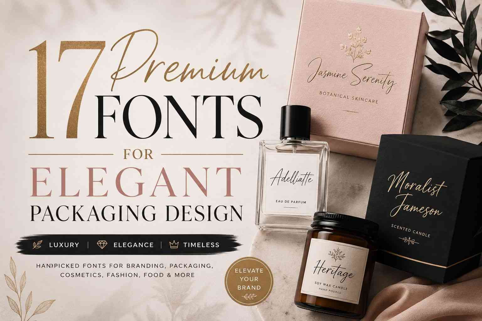
Premium Fonts for Elegant Packaging Design: 17 Luxury Picks That Instantly Elevate Branding
Packaging design changes how people feel about a product before they ever use it. You notice it instantly in stores and even more online. A candle with beautiful typography feels more expensive. A skincare label with clean elegant lettering suddenly looks “high-end,” even if the packaging itself is simple.
Typography does a surprising amount of heavy lifting in branding.
I started noticing this while browsing boutique cosmetic brands and small handmade shops a few years ago. Some products clearly had smaller budgets, but the fonts made everything feel polished and intentional. Meanwhile, other brands used generic typography and the packaging immediately felt forgettable.

That’s why premium fonts matter so much in packaging design. They create mood, personality, and perceived value before someone even reads the ingredients or product details.
The fonts in this collection work especially well for:
- luxury packaging
- cosmetic labels
- candle branding
- fashion products
- artisan food packaging
- boutique businesses
- wedding products
- social media branding
A lot of these styles lean handwritten or signature-inspired because that aesthetic still performs incredibly well in modern branding. Especially on Pinterest and Instagram where packaging visuals matter almost as much as the product itself.
17 Premium Fonts for Elegant Packaging Design
1. Adelliatte
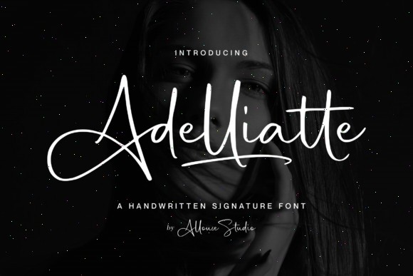

Adelliatte has that modern signature look that instantly feels expensive without trying too hard.
The flowing handwritten strokes work beautifully for:
- perfume labels
- skincare branding
- jewelry packaging
- boutique fashion tags
- candle jars
What I like most about this font is that it feels elegant without becoming overly decorative. Some luxury script fonts go so heavy on flourishes that the packaging starts feeling crowded. Adelliatte stays refined.
It also pairs really nicely with minimalist serif fonts if you’re building a full branding system.
On matte packaging with foil accents, this font looks especially good.
2. Sunshine Bright
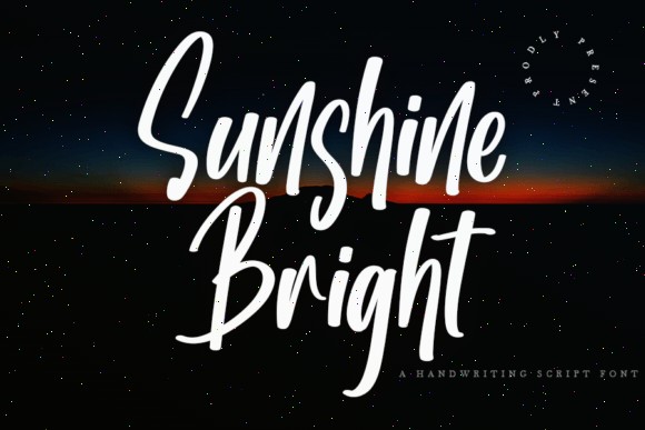
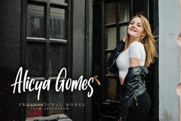
Sunshine Bright feels softer and more approachable than traditional luxury typography.
Instead of cold editorial elegance, it gives off a warm boutique feeling that works really well for handmade or feminine brands.
I could easily picture this font on:
- organic skincare
- artisan bakery packaging
- boutique soap labels
- gift boxes
- lifestyle products
The curves feel natural and energetic without becoming chaotic. That balance is harder to find than people think.
A lot of handwritten fonts either look too stiff or way too messy. Sunshine Bright sits comfortably in the middle.
It also performs surprisingly well on social media graphics, which matters now that packaging is constantly photographed for online content.
3. Demigoldetty
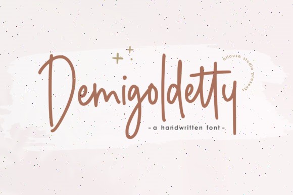
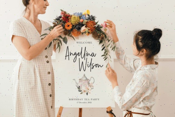
Demigoldetty feels modern, minimal, and clean.
This is the kind of font that works incredibly well with neutral packaging palettes. Think soft beige labels, matte black bottles, monochrome branding, or minimalist cosmetic packaging.
The tall lettering gives it elegance while still staying readable.
That’s important because some premium fonts lose clarity fast on smaller packaging. Demigoldetty holds up nicely even on compact labels and tags.
I especially like this style for:
- fashion branding
- candle packaging
- skincare products
- modern boutique brands
- clean luxury aesthetics
It feels stylish without screaming for attention.
4. Hayamichi
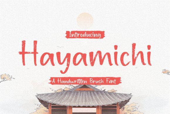
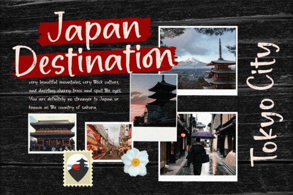
Hayamichi brings a completely different energy compared to polished signature fonts.
It has textured brush strokes that make packaging feel artistic and handcrafted. The font immediately adds personality.
This style works especially well for:
- artisan coffee packaging
- tea brands
- Japanese-inspired branding
- eco packaging
- handmade product lines
I’ve noticed textured fonts like this work beautifully on kraft paper and matte materials because the texture in the font complements the physical texture of the packaging itself.
That combination creates a really strong handcrafted premium aesthetic.
Hayamichi feels expressive without losing sophistication.
5. Sophia Marilyn
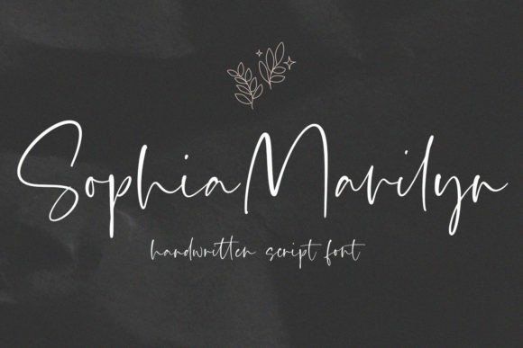
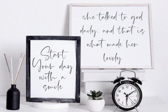
Sophia Marilyn feels delicate, refined, and very fashion-oriented.
The thin flowing lines create that luxury invitation-style aesthetic you see a lot in premium beauty branding.
This font would fit naturally on:
- jewelry boxes
- perfume labels
- bridal packaging
- boutique fashion products
- feminine skincare brands
One thing I genuinely like here is the restraint. The font doesn’t overload the design with dramatic flourishes. It stays elegant and light.
Pairing this with a simple sans-serif underneath creates a really polished hierarchy for packaging layouts.
Especially on white or soft neutral backgrounds.
6. Captain Washington
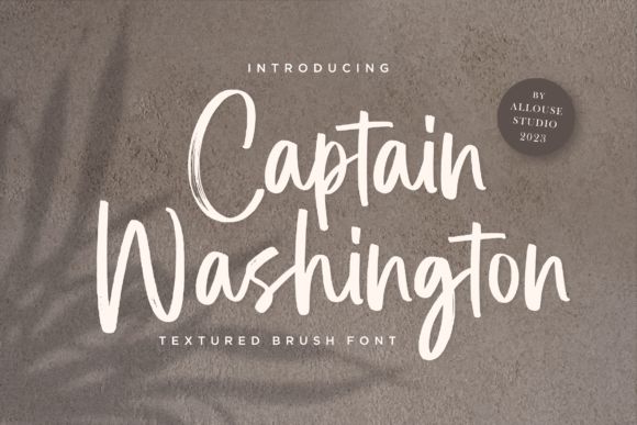
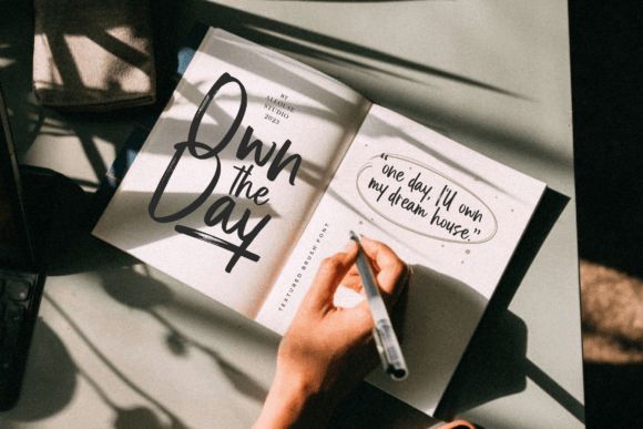
Captain Washington feels bolder and more textured than most elegant script fonts.
It still looks premium, but with a little more confidence and personality.
I could see this working really well for:
- premium beverage branding
- whiskey labels
- creative fashion packaging
- luxury streetwear
- candle brands with darker aesthetics
The textured strokes give it depth, which looks great with embossing or foil printing.
Some elegant fonts disappear visually once printed. Captain Washington holds presence much better.
It has that slightly rugged luxury feel that’s become popular recently in boutique branding.
7. Sampun Hopeless
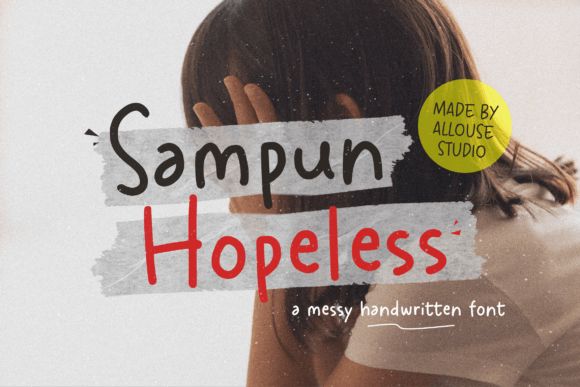
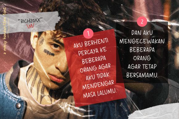
Sampun Hopeless leans intentionally imperfect, and honestly, that’s what makes it interesting.
Not every premium brand needs ultra-clean typography anymore. A lot of consumers actually connect more with packaging that feels human and slightly raw.
This font works beautifully for:
- handmade soaps
- artisan coffee
- indie beauty brands
- creative packaging
- eco-conscious products
The handwritten style feels personal instead of overly corporate.
I’ve seen this kind of typography perform really well for Etsy-style branding because it creates emotional warmth fast.
Especially when paired with earthy colors and textured materials.
8. Little Quotes
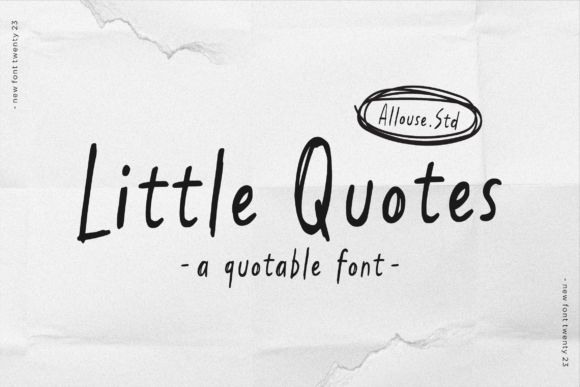
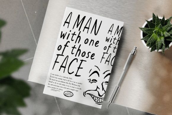
Little Quotes has a softer emotional feel than many fonts in this list.
It reminds me of handwritten notes inside boutique packaging. Simple, calm, and personal.
This style fits especially well for:
- candle labels
- journals
- wellness packaging
- tea brands
- self-care products
- greeting card businesses
Minimal typography like this has become really effective because consumers are overwhelmed by loud branding everywhere.
Little Quotes gives packaging breathing room.
And sometimes that quiet elegance feels more premium than overly decorative luxury fonts.
9. Daydreami
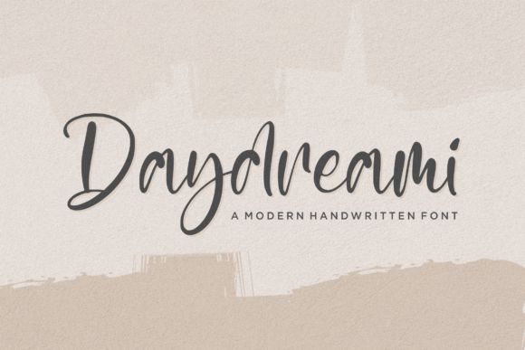
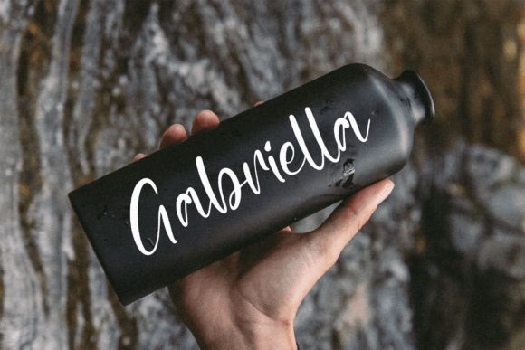
Daydreami balances modern minimalism with handwritten elegance really well.
Some handwritten fonts become too casual. Others become overly formal. This one sits right in the sweet spot.
It works especially nicely for:
- skincare packaging
- feminine branding
- boutique cosmetics
- wedding products
- beauty brands
The soft curves and spacing create a dreamy aesthetic without sacrificing readability.
I also think this font looks particularly strong with muted palettes like:
- blush pink
- beige
- matte black
- cream
- soft gray
That combination photographs beautifully for Pinterest and Instagram content.
10. Fashion History
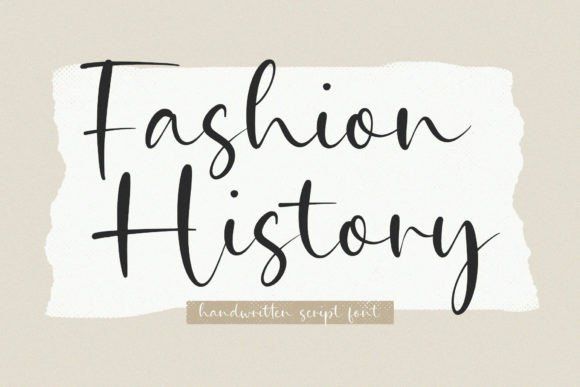
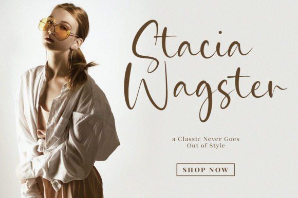
Fashion History feels editorial in the best possible way.
The font immediately reminds me of luxury fashion magazines and boutique designer branding. Very polished. Very runway-inspired.
This is a strong choice for:
- luxury fashion packaging
- jewelry branding
- perfume boxes
- cosmetic labels
- boutique retail packaging
The smooth curves help the typography feel sophisticated instead of aggressive.
And honestly, on minimalist packaging with foil printing, this font looks incredibly expensive.
Especially black packaging with gold typography.
11. Heritage
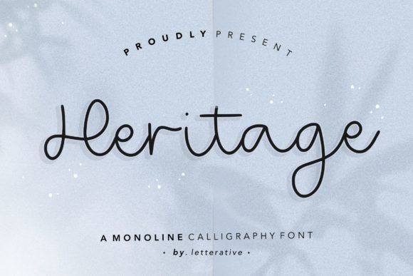
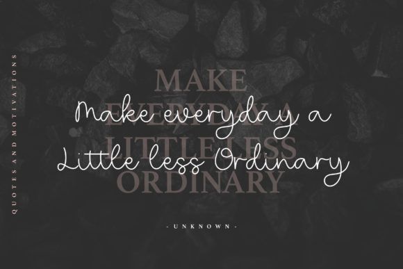
Heritage feels warm, approachable, and handcrafted without losing elegance.
A lot of casual handwritten fonts can look messy once you actually place them on packaging mockups. Heritage stays clean enough to feel professional while still keeping that handmade personality.
This font works especially well for:
- handmade candle brands
- crochet businesses
- artisan bakeries
- boutique skincare
- homemade food packaging
- small business branding
The monoline style gives it consistency, which helps a lot when printing on smaller labels or stickers.
I’ve noticed fonts like this tend to connect really well with customers because they feel personal. Not “mass-produced luxury,” but more thoughtful boutique branding.
And paired with kraft paper or textured cardstock, it looks really good.
12. Retroline
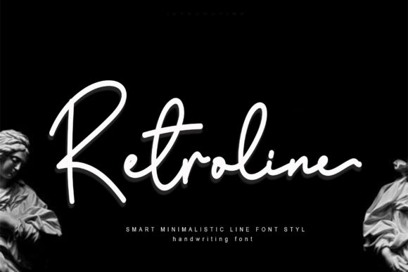
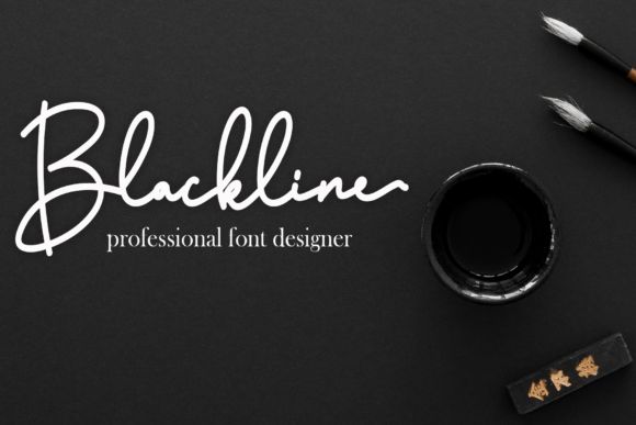
Retroline has that modern luxury signature aesthetic that instantly feels fashion-forward.
The elongated strokes create a very sleek designer-style appearance without becoming too dramatic.
This font feels perfect for:
- perfume packaging
- minimalist cosmetic labels
- boutique apparel branding
- invitation design
- premium accessories
What stands out most is the flow. The letters connect naturally, so the typography almost moves across the packaging instead of sitting stiffly.
That subtle movement creates elegance.
Retroline also looks especially clean in monochrome branding systems. White on black, black on beige, metallic foil on matte packaging — all of those combinations work beautifully with this style.
13. Beauty Paradise
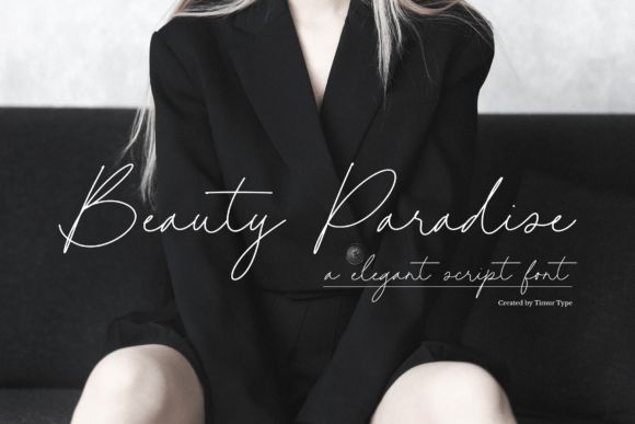
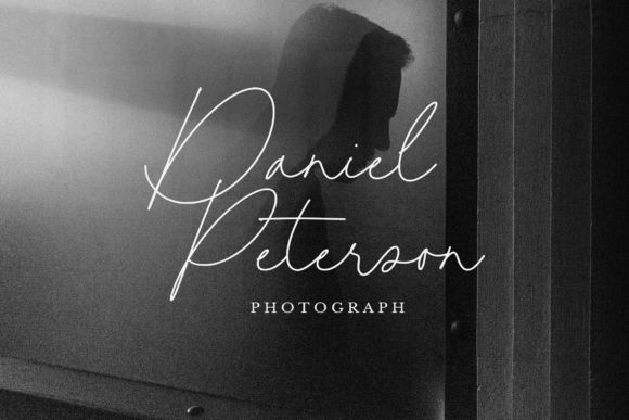
Beauty Paradise feels soft, refined, and very polished.
Some beauty-focused fonts try way too hard with excessive flourishes and decorative swashes. This one keeps things controlled, which honestly makes it feel more premium.
It fits naturally with:
- skincare packaging
- spa branding
- luxury beauty labels
- perfume products
- feminine packaging systems
The thin flowing strokes pair perfectly with modern minimalist packaging trends.
And right now, clean beauty branding is still heavily leaning toward soft neutrals, airy spacing, and understated typography. Beauty Paradise slides into that aesthetic effortlessly.
This font also creates a calming mood, which matters more than people think in wellness and beauty branding.
14. Moralist Jameson
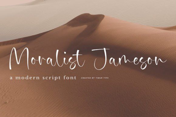
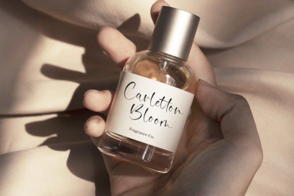
Moralist Jameson has a very cinematic elegance to it.
The thin signature-style strokes feel upscale and refined without looking cold. I could easily picture this font on luxury fragrance packaging or boutique wine labels.
It works especially well for:
- premium candles
- chocolate packaging
- fragrance branding
- stationery
- wine labels
- high-end gift packaging
One thing I really like here is how well it pairs with serif typography. That combination creates a balanced luxury branding system that feels established and polished.
And if you’re using embossing or foil stamping, this kind of typography tends to shine even more because the thin strokes pick up light beautifully.
15. Youth Action
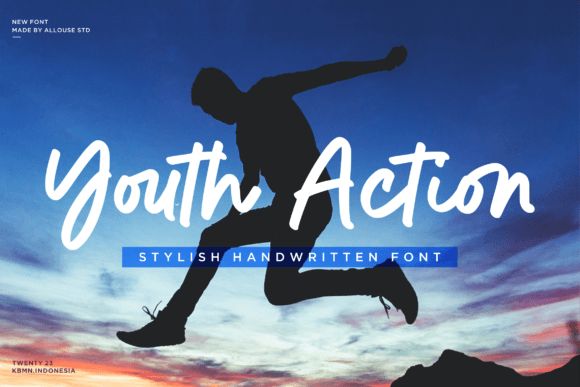
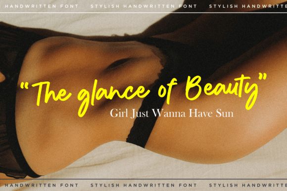
Youth Action brings more movement and energy than traditional luxury fonts.
This is modern premium branding aimed at younger audiences. Less classic elegance, more expressive confidence.
I could see this style working really well for:
- streetwear packaging
- beverage brands
- music merchandise
- trendy cosmetic lines
- lifestyle products
- creator brands
The strokes feel dynamic without becoming unreadable, which is important because energetic fonts can get messy quickly.
Another thing I like is that it holds up well digitally. A lot of packaging today gets seen first through Instagram reels or TikTok clips, and this font still catches attention even on small screens.
It feels current without looking overly trendy.
16. Jasmine Serenity
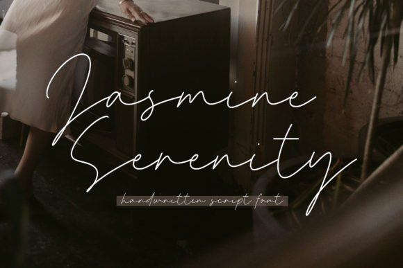
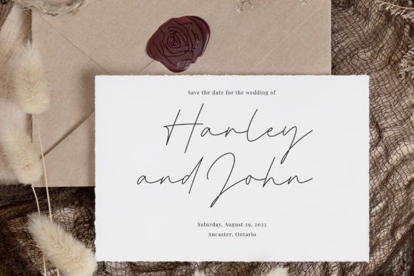
Jasmine Serenity is probably one of the most delicate fonts in this entire collection.
The ultra-thin handwritten strokes create an incredibly refined luxury look. Almost weightless.
This font feels especially suited for:
- premium skincare
- jewelry packaging
- boutique perfume branding
- wedding products
- minimalist luxury labels
I’ve seen typography like this work beautifully on soft-touch packaging because the subtle lettering complements the tactile feel of the box itself.
Especially with:
- matte white packaging
- beige tones
- transparent labels
- gold foil details
The font creates quiet luxury instead of loud luxury.
And honestly, that understated look tends to age much better over time than overly decorative trends.
17. Highstuffy
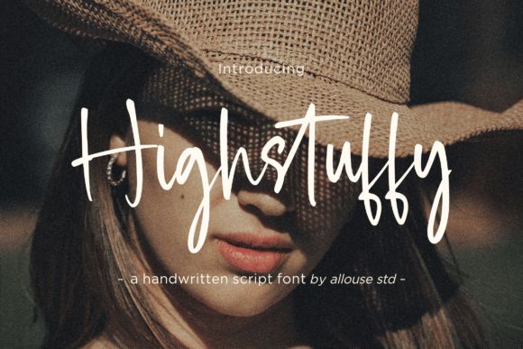
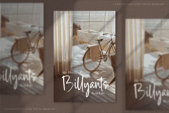
Highstuffy combines expressive handwritten energy with a cleaner premium structure.
That balance makes it feel modern without becoming too polished or sterile.
This font works really well for:
- boutique apparel packaging
- lifestyle branding
- candle labels
- creative product packaging
- modern handmade brands
One thing that stands out immediately is visibility. The tall lettering helps product names stand out quickly, which matters a lot in crowded retail spaces and social feeds.
Some elegant fonts disappear visually once scaled down. Highstuffy keeps strong presence while still looking refined.
It feels artistic, fashionable, and slightly playful at the same time.
While elegant fonts certainly enhance packaging, exploring different styles like 18 Rounded Sans Serif Fonts for Modern Branding can offer a fresh, approachable look for various branding needs, including packaging itself.
Conclusion
Typography shapes packaging more than most people realize.
Before someone smells the candle, tries the skincare product, or tastes the coffee, they’ve already formed an impression based on the visuals. Fonts play a huge role in that first reaction.
The best premium packaging usually doesn’t feel overly complicated.
It feels intentional.
Some fonts in this collection lean refined and editorial like Sophia Marilyn or Jasmine Serenity. Others feel more handcrafted and expressive like Hayamichi or Sampun Hopeless.
There’s no single “perfect” luxury font. The right choice depends on the emotional tone your brand wants to create.
But when typography, spacing, materials, and branding all work together, even simple packaging starts feeling memorable.
And honestly, that’s usually what separates forgettable packaging from branding people actually remember.
FAQs
What type of font works best for luxury packaging?
Elegant signature fonts, refined script fonts, and minimalist serif pairings usually work best because they create sophistication without making packaging feel cluttered.
Are handwritten fonts good for product packaging?
Yes, especially for boutique brands, beauty products, candles, artisan packaging, and handmade businesses. Handwritten typography adds warmth and emotional connection that generic fonts often lack.
How many fonts should I use on packaging?
Usually two is enough. One primary display font and one supporting font creates a cleaner and more premium look.
Why is typography important in branding?
Typography shapes how customers emotionally perceive a brand. It communicates mood, professionalism, luxury, creativity, and trust before someone even interacts with the product itself.
Follow Us