

ℹ️ Affiliate Disclosure: This article may contain affiliate links. We may earn a commission at no extra cost to you. Thanks for your support! ❤️
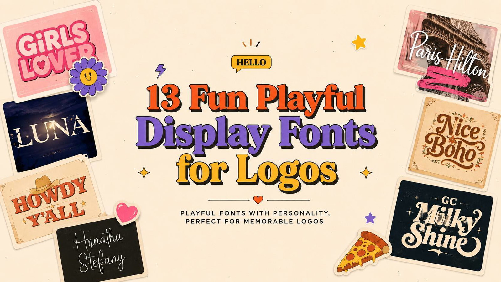
13 Fun Playful Fonts for Logos
Playful fonts for logos can give a brand permission to smile.
Before color, illustration, or packaging enters the picture, the shape of a wordmark already tells us how a brand wants to be perceived. Rounded letters can feel friendly. Uneven baselines suggest movement. Oversized counters, exaggerated serifs, and unexpected details add humor or personality.
That visual energy is useful for children’s brands, candy shops, creative studios, events, cafés, lifestyle products, and labels that do not want to appear overly serious.
Still, playful typography is not automatically good logo typography. Some fonts look expressive in a large marketplace preview but become awkward once placed on a business card, website header, or product label. The best playful display fonts for logos balance character with enough clarity to function as a recognizable brand mark.
I gathered 12 typefaces with different moods, from bouncy display lettering and cute handwritten fonts to decorative themes and bold retro styles. I have not personally used every font in a finished identity project, so my observations are based on the letterforms, spacing, visual hierarchy, and branding potential shown in the available previews.
Quick Picks
- Best cute and energetic option: Girls Lover
- Best handwritten option: Couple Fashion
- Best quirky serif option: Quirky Fashion
- Best retro option: GC Milky Shine
- Best high-impact option: Extreme Event
How I Picked These
I compared these playful logo fonts by wordmark readability, personality, scalability, spacing, small-size performance, industry fit, and how well each option can create a distinctive brand voice while leaving room for practical supporting typography across packaging, websites, social graphics, and print.
1. Girls Lover
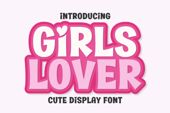
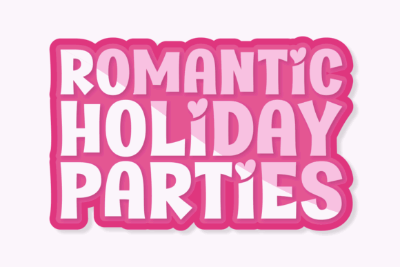
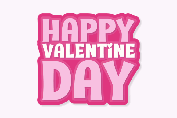
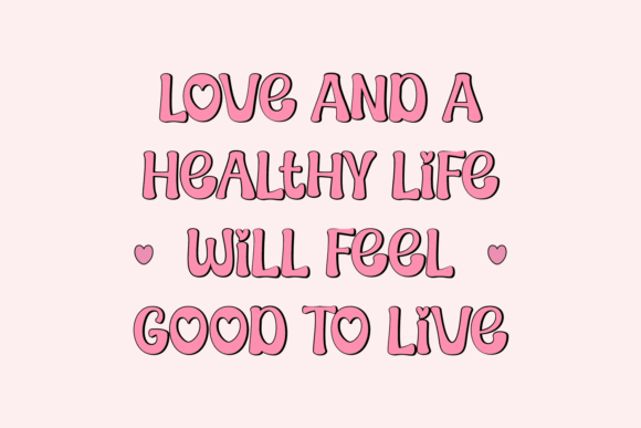
Girls Lover is a sweet, energetic display typeface built around chunky shapes and a visibly bouncy rhythm.
The heavy letterforms give it immediate impact, while the rounded edges and irregular proportions stop it from feeling rigid. Small heart-shaped details push the design further toward a cute, affectionate mood.
Visually, this font feels connected to candy packaging, children’s products, party graphics, stickers, and playful beauty branding. It could also suit a dessert shop or gift label that wants an intentionally youthful identity.
The font has a strong personality, but that personality is quite specific. I would not expect it to adapt comfortably to every industry. It is more convincing when the surrounding brand system supports its sweetness rather than trying to make it look restrained.
Use it for a short name, give the letters generous space, and pair it with a simple sans serif for prices, product details, or navigation.
2. Howdy Y’all
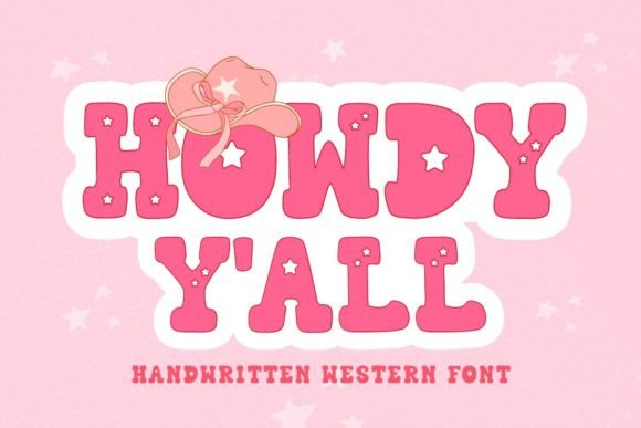
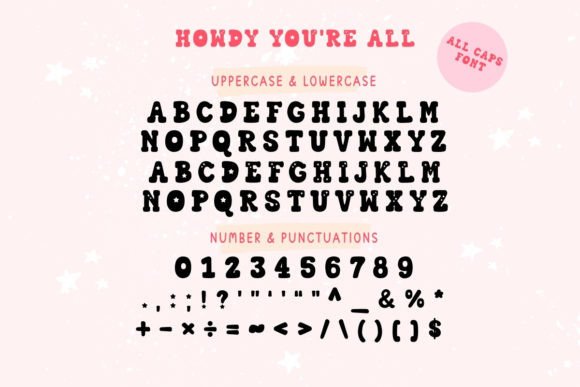
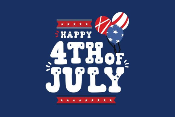
Howdy Y’all combines playful display lettering with a western theme.
The broad slab-like forms, rounded corners, decorative cutouts, and cowboy-inspired details create a rodeo or country-fair atmosphere almost immediately. It feels humorous rather than historically authentic, which is probably part of its appeal.
From a branding perspective, this font could suit a barbecue business, western-themed event, children’s clothing label, novelty product, food truck, or casual hospitality concept.
The themed character is both its strength and its limitation. It communicates quickly, but it leaves little room for interpretation. If the brand later moves away from western imagery, the typography may become harder to maintain.
I would keep the rest of the visual identity fairly clean. Additional horseshoes, stars, ropes, and textures could easily make the logo feel overdecorated.
3. Couple Fashion
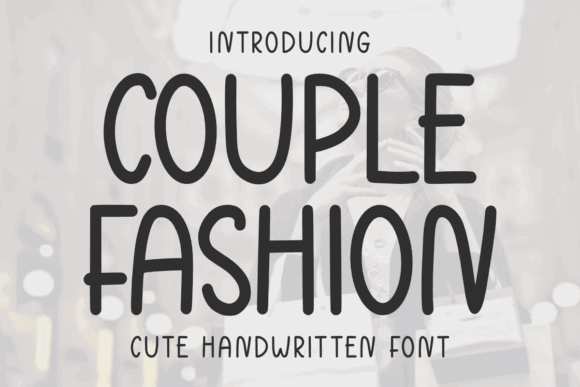
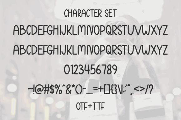
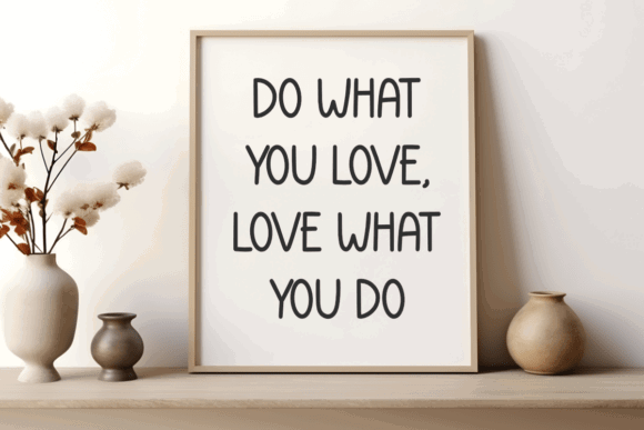
Couple Fashion is a tall handwritten display font with loose proportions and a relaxed rhythm.
Its narrow letterforms create height without adding too much visual weight. The slightly uneven construction gives the lettering an informal, hand-drawn quality, while the overall silhouette remains relatively clean.
The font feels playful, but not childish. I can imagine it appearing in fashion content, lifestyle branding, boutique packaging, social graphics, or a small creative business that wants an approachable identity.
One thing I often notice with narrow handwritten fonts is that they look elegant in short samples but become tiring in longer phrases. Couple Fashion appears better suited to a compact wordmark than a tagline or paragraph.
Spacing will matter here. If the letters are set too tightly, their tall shapes may begin to merge visually. A little breathing room should help preserve the casual character.
4. Styling Fashion
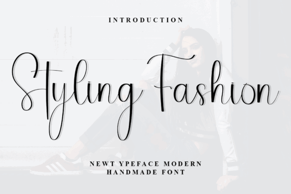
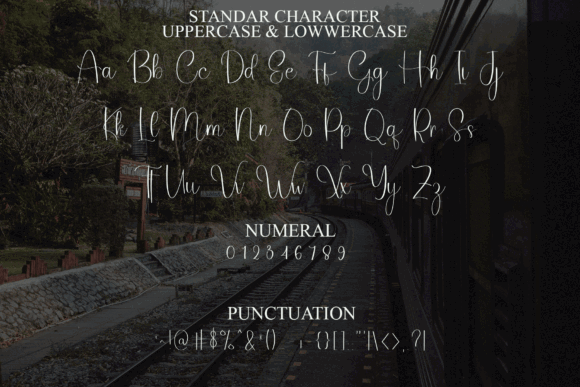
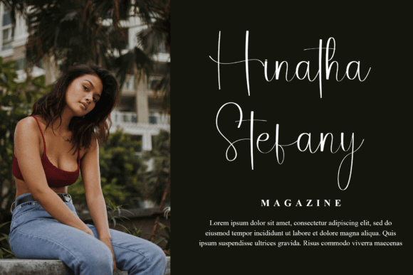
Styling Fashion moves in a more fluid, script-like direction.
The long strokes and handwritten connections create warmth and movement. Compared with a structured display font, it feels more personal and less manufactured. That can be useful for brands centered on craft, beauty, events, stationery, or lifestyle products.
The lettering has a romantic quality, although it is not especially formal. It sits somewhere between modern calligraphy and casual signature typography.
Script fonts like this need careful handling in logos. Some letter combinations may connect beautifully, while others can produce awkward gaps or tangles. I would test the exact brand name rather than judging the font from its promotional preview alone.
It may also need a simplified secondary logo for small applications. Fine strokes and long flourishes do not always translate well to profile icons, stamps, or tiny labels.
5. Fashion Valentine
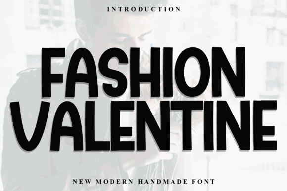
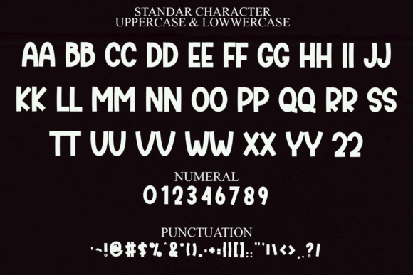
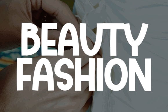
Fashion Valentine is a bold handmade font with a noticeably irregular construction.
The thick strokes give it more visual confidence than many romantic or Valentine-themed fonts. At the same time, the softened shapes prevent it from feeling aggressive. The result is casual, warm, and slightly quirky.
Despite the name, I would not limit it to seasonal Valentine’s Day graphics. It could also fit gift shops, handmade products, casual fashion labels, creative events, or friendly packaging.
The uneven baseline gives the wordmark movement, but the compact shapes may become dense when several letters sit together. Short names will probably show the font at its best.
I would avoid adding heavy outlines, multiple shadows, or excessive decorative elements. The letterforms already provide enough texture.
6. Fashion
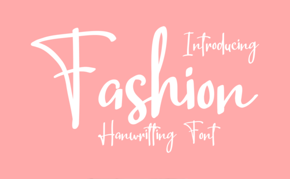
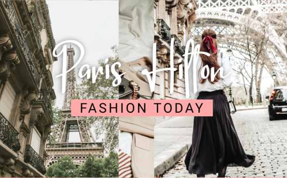
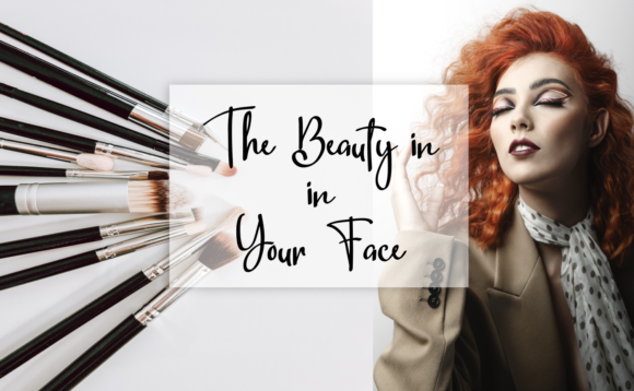
Fashion is a delicate handwritten font with thin, loosely drawn letterforms.
Its visual personality is sweet and informal. The uneven construction makes it feel closer to hand lettering than polished calligraphy, which may suit stationery, craft products, children’s accessories, journaling resources, and small lifestyle brands.
I like the softness of the lettering, but this is also a font that appears dependent on scale. The thin strokes may lose clarity when reduced, printed on textured material, or placed over a photograph.
For a logo, I would keep the background simple and avoid long names. It may also benefit from a stronger supporting typeface that can carry practical information without competing with the wordmark.
Some handwritten fonts look charming in previews but become difficult to use across a full identity. This one seems more suitable as an expressive logo accent than as an all-purpose brand font.
7. Quirky Fashion
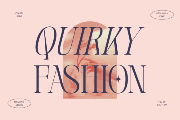
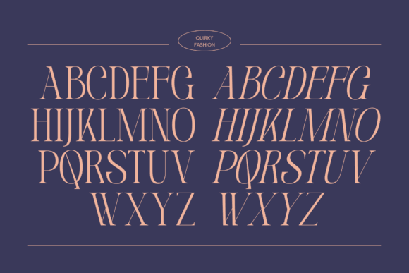
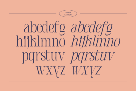
Quirky Fashion takes a different approach by bringing playful character into a serif structure.
That combination can be useful when a brand wants personality without leaning fully into children’s typography or casual handwriting. The serif foundation gives the letters a slightly more established appearance, while unusual details prevent them from feeling conventional.
Visually, the typeface suggests an independent fashion label, creative publication, boutique, art project, or lifestyle brand with an eccentric side.
I often find quirky serifs more flexible than heavily themed display fonts because they can sit beside restrained photography and simple layouts without losing their identity. Still, the unusual letterforms should be tested carefully. A distinctive character can become distracting when repeated too often.
For a logo, I would use it with minimal decoration and allow the shape of the lettering to do most of the work.
8. Luna
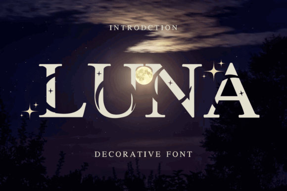
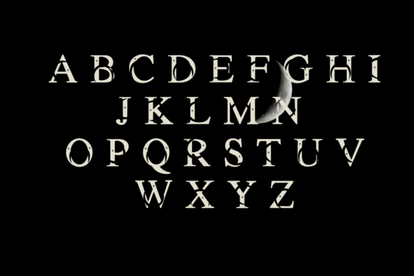
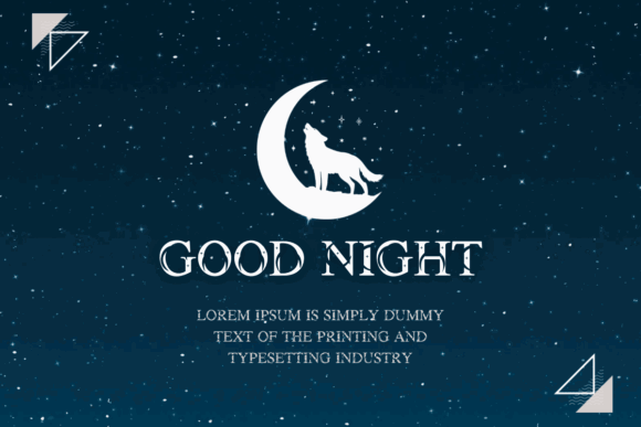
Luna is a decorative display font with a dreamy, celestial personality.
Moon, star, and night-sky references have remained visible in branding for wellness products, children’s goods, spiritual businesses, cafés, cosmetics, and lifestyle collections. Luna fits naturally into that visual territory.
The decorative details create atmosphere quickly. In a short wordmark, they could make the logo feel imaginative without requiring a separate symbol.
At the same time, celestial typography is easy to overuse. When moon phases, stars, gradients, gold foil, and ornamental borders are all added together, the identity can lose focus.
I would let the font carry the theme and keep the rest of the logo restrained. It should also be tested at small sizes because decorative marks can disappear or merge into the letters.
9. Nice Boho
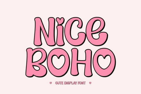
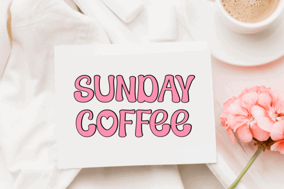
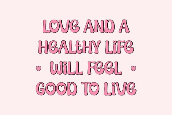
Nice Boho has a free-spirited display style that draws from bohemian and handmade aesthetics.
The lettering feels warm, decorative, and relaxed. It could suit craft products, wellness branding, floral businesses, festivals, handmade clothing, home décor, or a lifestyle project built around natural textures and expressive imagery.
Boho branding has been popular for several years, particularly in creative marketplaces. That familiarity can make a font feel accessible, but it can also make an identity look generic if the same arches, muted colors, rainbows, and floral graphics are used without restraint.
Nice Boho has enough personality to lead the composition. I would pair it with a quieter layout rather than surrounding it with every recognizable bohemian motif.
From a logo perspective, its strongest use is likely a short name displayed prominently.
10. Tim Burton
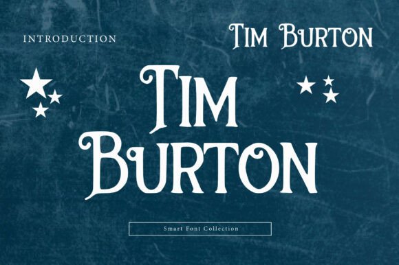
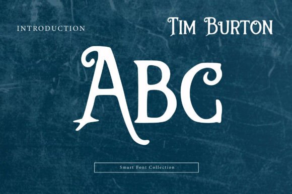
Tim Burton is a whimsical gothic display font inspired by crooked storybook lettering and playful horror aesthetics.
The narrow, irregular forms create a slightly eerie mood without becoming genuinely frightening. That balance could suit Halloween products, themed cafés, escape rooms, children’s stories, entertainment projects, or creative brands with an offbeat identity.
This kind of lettering is visually memorable, but it carries a very strong cultural association. A brand using it may immediately be read through the lens of gothic fantasy.
That is useful when the reference is intentional. It becomes limiting when the business needs a broader or more timeless identity.
I would treat this as a specialized display font rather than a versatile branding system. Use it for the main name, keep supporting text neutral, and check that the most irregular characters remain legible.
11. Middle Stories
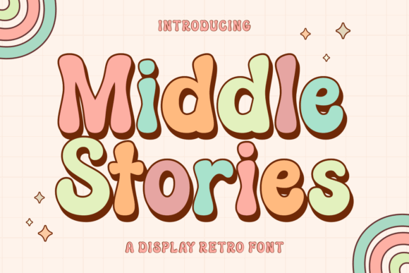
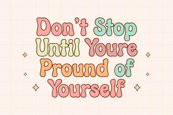
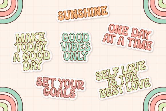
Middle Stories blends vintage warmth with a more contemporary display sensibility.
The name and visual direction suggest storytelling, nostalgia, children’s publishing, handmade goods, and creative projects. Compared with a purely retro font, it appears softer and more approachable.
I can imagine it in a bookshop identity, educational product, toy brand, craft studio, café, or small editorial project. The vintage influence adds familiarity, while the playful details keep it from feeling formal.
This type of font often performs best when the wider identity avoids trying to look equally nostalgic in every element. A modern layout, simple color palette, and clean supporting type can keep the result from resembling a costume.
The balance between old and new gives Middle Stories useful branding potential, although the exact letter spacing should be checked in the intended name.
12. GC Milky Shine
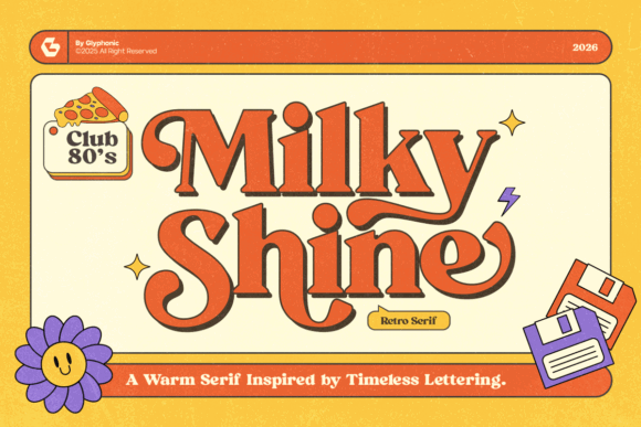
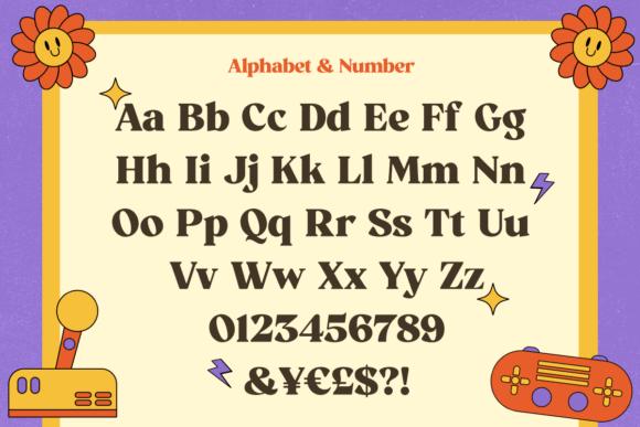
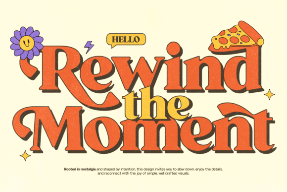
GC Milky Shine is a retro serif with an unmistakable 1980s mood.
The generous curves and high-contrast personality suggest music graphics, neon signage, nightlife, dessert packaging, entertainment branding, and nostalgic editorial design. It feels expressive without relying on hand-drawn irregularity.
Retro styles often move in cycles. This particular direction has shown surprising longevity in modern branding, especially when paired with cleaner layouts rather than full vintage imitation.
The font appears best suited to large applications where its curves and serif details remain visible. In small formats, the contrast may become less clear.
I would avoid using it for long supporting copy. As a logo or headline face, however, it can create a strong focal point with relatively little additional decoration.
13. Extreme Event
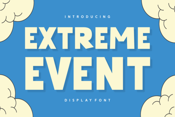
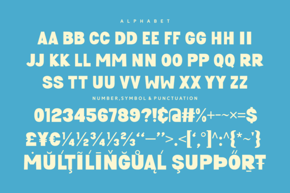
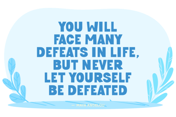
Extreme Event is a heavy display font built around speed, impact, and entertainment energy.
Its bold construction feels connected to sports, festivals, gaming, action-themed products, gyms, and event promotions. The weight creates a strong silhouette, which is useful for signage, merchandise, and social graphics.
Compared with the sweeter fonts in this collection, Extreme Event communicates playfulness through intensity rather than cuteness.
That said, aggressive display fonts can become visually exhausting when used everywhere. I would reserve it for the main wordmark or short headings and use a calmer typeface for schedules, menus, descriptions, and supporting information.
The strong shapes may hold up better at small sizes than thin handwritten options, but spacing still matters. Heavy letters placed too closely can form a dense block and reduce recognition.
Read More: If you're on the hunt for a specific style of playful font, you might be interested in the Adventure Cartoon Font for Fun and Playful Designs, which is perfect for logos that pop.
Which Playful Font Should You Choose for Your Logo?
Choosing playful display fonts for logos is really about balancing expression with control.
A font can completely change the mood of a design before colors, graphics, or photography are added. That makes typography powerful, but it also means a highly distinctive font should be selected carefully.
Start with the brand name and audience. Compare several fonts using the actual wording rather than relying on marketplace samples. Test the logo at large and small sizes, in black and white, and alongside the supporting typography.
Some fonts in this collection are fairly adaptable. Others communicate such a specific theme that they may only suit a narrow range of projects. Neither approach is wrong. The important part is understanding what the letterforms are already saying.
A playful logo does not need to be overloaded with decoration. Often, one characterful typeface, sensible spacing, and a clear visual hierarchy are enough to make the brand feel memorable.
Fonts FAQ
What are the best playful display fonts for logos in 2026?
The best playful display fonts for logos combine a recognizable personality with enough clarity to function across different sizes. Girls Lover brings chunky, bouncy energy, Couple Fashion offers a lighter handwritten mood, Luna and Nice Boho lean into specific visual themes, GC Milky Shine adds retro character, and Extreme Event suits louder sports or entertainment branding. The strongest option depends on the audience, the length of the name, and where the logo will appear.
What kinds of brands suit a playful logo font?
Playful logo fonts can suit children’s brands, toy companies, candy shops, cafés, event businesses, craft studios, stationery labels, entertainment projects, and lifestyle products. Cute handwritten fonts often feel personal and gentle, quirky serifs add character without looking childish, and heavy retro or themed fonts create a more immediate visual mood. The typography should reflect the actual brand experience rather than act as decoration without a clear purpose.
How do I keep a playful logo from looking unprofessional?
Use one expressive typeface as the focal point and pair it with a neutral sans serif for supporting text. Avoid unnecessary shadows, outlines, and decorative graphics, maintain consistent spacing, and test the logo in one color at several sizes. Professional branding often depends more on consistency than complexity, so even a highly playful wordmark can feel polished when the surrounding visual system is controlled.
Can playful display fonts be used for long text?
Most playful display fonts are not designed for long paragraphs because their unusual proportions, decorative details, and irregular rhythm can reduce readability across several lines. They are generally better suited to logos, headlines, packaging names, posters, and short phrases, while a simpler serif or sans serif should handle body copy and practical information.
Should I modify a display font when creating a logo?
Small adjustments can make a wordmark feel more individual, including refining spacing, simplifying a decorative detail, changing a terminal, or improving the relationship between two letters. Any modification should respect the font’s license, and major changes are not always necessary because thoughtful spacing, scale, and composition can already make a standard typeface feel more distinctive.
Follow Us