

ℹ️ Affiliate Disclosure: This article may contain affiliate links. We may earn a commission at no extra cost to you. Thanks for your support! ❤️
Choosing the Best Wedding Card Fonts for Your Invitations
Wedding card fonts have to do two jobs at once: make the invitation feel special and keep the details effortless to read. I usually look for one distinctive typeface for the couple’s names or main heading, then let a quieter serif or sans serif handle the date, venue, RSVP information, and smaller wording.
For this list, I focused on graceful calligraphy, polished handwritten styles, and sophisticated serifs rather than filling every spot with similar swash-heavy scripts.
Quick Picks
The best wedding card fonts combine personality with readable typography. Use decorative script for short, prominent text such as names, initials, or headings, and use a simpler companion font for addresses and event details. Limiting a card to one or two typefaces usually creates a cleaner hierarchy than making every line decorative.
| Font | Best for | Format/type |
|---|---|---|
| Wedding Handwritten | Coordinated romantic layouts | Script + sans duo |
| Hapsha Sophia | Modern formal invitations | Script + sans duo |
| Filanttica | Classic romantic names | Handwritten script |
| Joseph Sophia | Swash-focused name treatments | Handwritten script |
| Karolie | Refined calligraphy | Script |
| Spirit | Delicate formal cards | Script |
| Modern Calligraphy | Vintage-inspired elegance | Calligraphy |
| Mightyline | Contemporary calligraphy | Script |
| Malicka | Soft romantic cards | Calligraphy |
| Hegia Sophia | Personalized stationery | Handwritten |
| Similar | Classic flowing headlines | Calligraphy |
| Rosemode | Minimal luxury layouts | Serif |
| Degila | Modern editorial invitations | Serif |
| French Clover | High-fashion wedding cards | Luxury serif |
| Genshino | Romantic storybook themes | Fantasy serif |
| Rosemary | Bold formal headings | Serif |
How I Picked These Wedding Card Fonts
I prioritized fonts that give the couple’s names a clear visual role without forcing the entire invitation into decorative lettering. Professional invitation guidance consistently recommends keeping essential details readable and using ornate scripts more selectively, especially as type gets smaller.
I also wanted variety. Some picks are expressive scripts, some are restrained serifs, and two are font duos that make pairing easier. That mix gives you options for traditional ballroom cards, garden celebrations, minimalist invitations, romantic stationery, and more editorial-looking designs.
Elegant Wedding Card Fonts to Consider
1. Wedding Handwritten
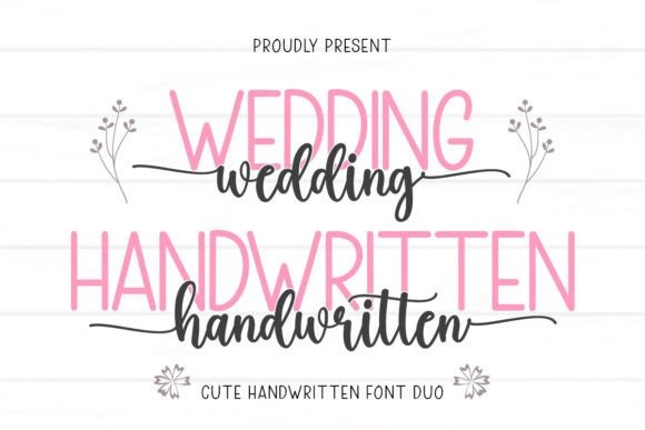
Wedding Handwritten is a script-and-sans duo I’d choose when I want a romantic wedding card without having to hunt for a separate companion typeface. The script supplies the personality, while the cleaner sans style can give supporting information a calmer visual rhythm. Creative Fabrica describes the set as a duo font with accessible glyphs and swashes.
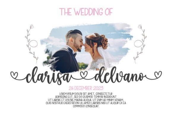
My preference would be to reserve the flowing style for names, a short phrase, or a monogram and use the simpler face for practical details. That division keeps the card elegant without turning an address or RSVP line into a decoding exercise.
Best for: coordinated invitation suites, romantic cards, modern weddings
Key features: script and sans pairing, swashes, glyph access
2. Hapsha Sophia
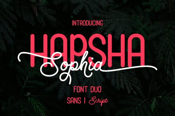
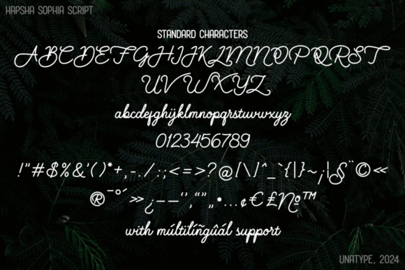
Hapsha Sophia is another useful duo for couples who want calligraphic names beside crisp, understated details. It combines a monoline script featuring swashes, alternates, and ligatures with a clean all-caps sans face, giving the two text roles a built-in relationship.
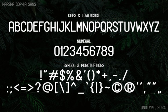
I’d use this for a contemporary formal card where the names need movement but the rest of the invitation should stay structured. The sans portion is all caps, so I would give smaller lines comfortable spacing rather than packing characters tightly together.
Best for: modern formal invitations, name-and-detail pairings, minimalist stationery
Key features: font duo, monoline script, alternates, ligatures
3. Filanttica
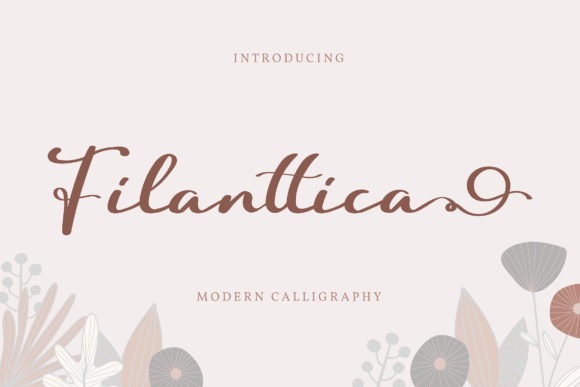
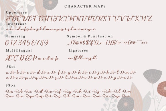
Filanttica is a cursive handwritten font for invitations that need an unmistakably romantic focal point. Its Creative Fabrica page specifically positions it for wedding invitations, thank-you cards, greeting cards, and other personalized designs, with PUA-encoded glyph and swash access.
I’d give Filanttica plenty of open space and use it for the couple’s names rather than several sentences of wording. The handwritten movement is the attraction here, but that same expressiveness means a restrained serif underneath will usually make dates, addresses, and reception information easier to scan.
Best for: couple names, romantic headings, thank-you cards
Key features: cursive styling, swashes, PUA-encoded glyphs
4. Joseph Sophia
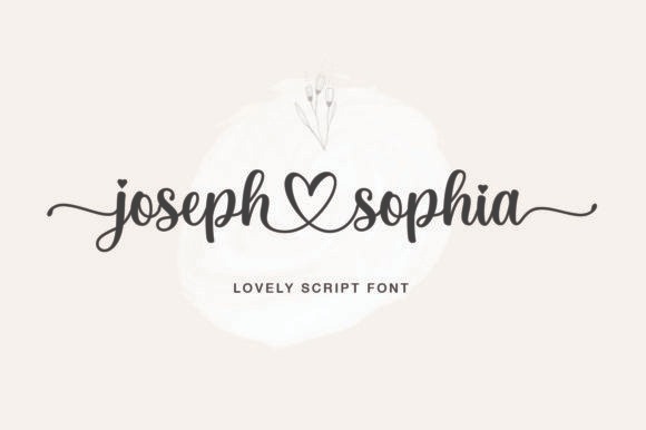
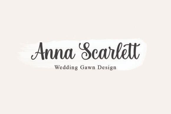
Joseph Sophia is a polished handwritten font for designers who want noticeable flourishes and an expressive baseline. The set includes alternates and glyphs, and its product description identifies wedding invitations, thank-you cards, greeting cards, and similar personalized pieces as natural applications.
This is one of my picks for making two names the visual centerpiece of an otherwise quiet card. I would be selective with the most elaborate alternates; using every flourish available can make a small invitation feel crowded. One or two carefully chosen swashes usually create a more intentional result.
Best for: name treatments, romantic invitations, feature lettering
Key features: alternates, glyphs, varying baseline, smooth script
5. Karolie
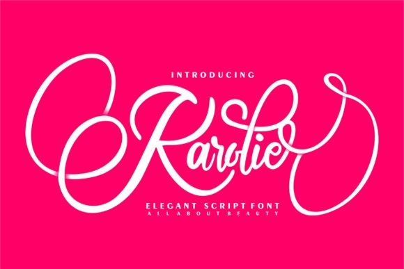
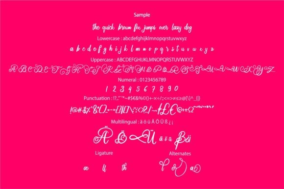
Karolie is an elegant script built around a contemporary interpretation of classic calligraphy. Its strokes are neither extremely thin nor especially heavy, which gives it a more balanced presence than some ultra-delicate wedding scripts.
I’d consider Karolie for a formal invitation where the lettering needs refinement without looking overly ornamental. It can carry the couple’s names, a wedding date, or a short heading with enough personality to set the tone. For multiple lines of logistics, I would still switch to a straightforward serif or sans serif and let Karolie remain the accent.
Best for: classic weddings, formal names, elegant headings
Key features: calligraphic script, balanced strokes, contemporary styling
6. Spirit
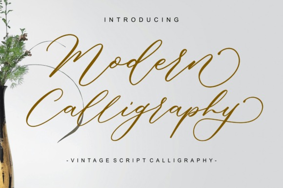
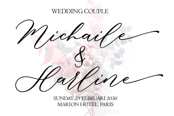
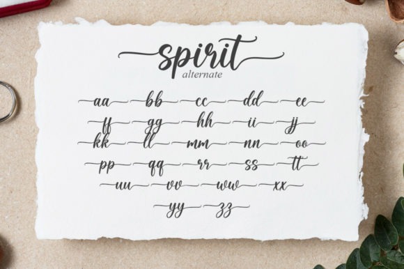
Spirit is a delicate script aimed at sophisticated display lettering, with stylistic alternates, ligatures, glyphs, and swashes available for customized words. I’d put it near the formal end of this collection rather than using it for a casual or rustic card.
The thin, flowing look makes most sense at a generous size where its shapes have room to show. That makes names and short headings the natural assignments. If your card is physically small or your printer softens very fine strokes, I’d proof the design at actual size before committing to the final layout.
Best for: formal cards, refined names, luxury-style stationery
Key features: ligatures, alternates, swashes, PUA encoding
7. Modern Calligraphy
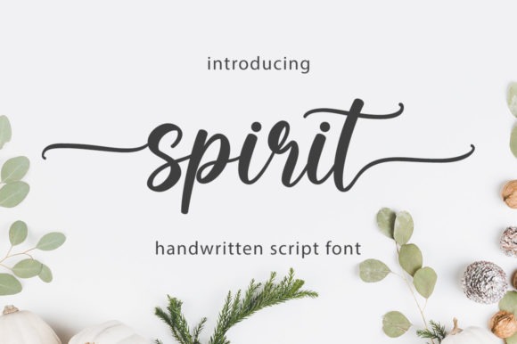
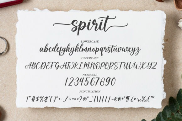
Modern Calligraphy combines flowing script shapes with a vintage-handwriting influence, making it suited to cards that should feel romantic without becoming overly contemporary. The design emphasizes intricate strokes and swash-like details.
I’d use this for a candlelit, estate, vintage, or old-world wedding theme, especially when paired with spacious serif text. The ornamentation carries a lot of visual information, so it is more persuasive as a hero typeface than as a font for every line. Short phrases such as “Together with their families” can also benefit if the size stays comfortably readable.
Best for: vintage-inspired cards, romantic headings, formal names
Key features: flowing calligraphy, intricate strokes, vintage character
8. Mightyline
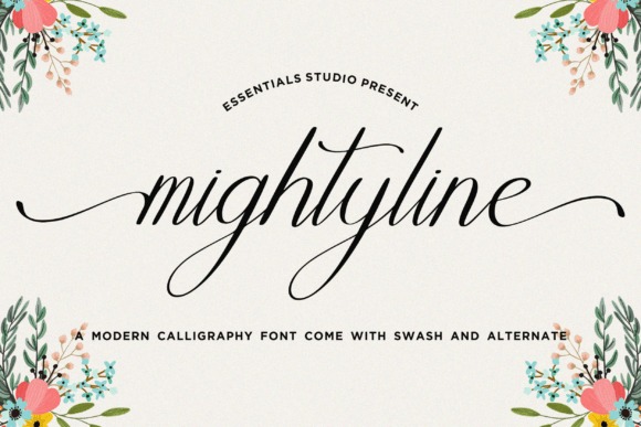
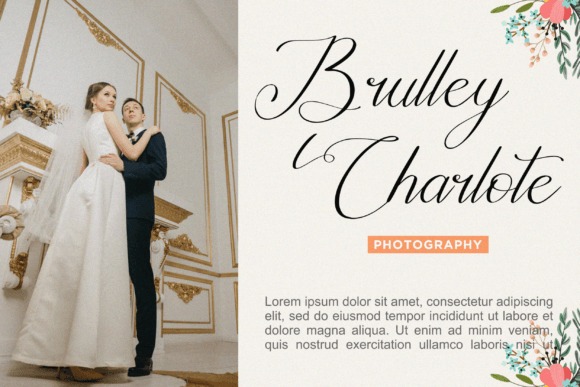
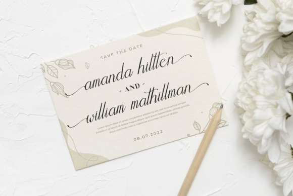
Mightyline is a modern calligraphy font supplied with swashes and alternates, giving invitation designers several ways to shape prominent names or short statements. Creative Fabrica lists weddings among its intended design applications.
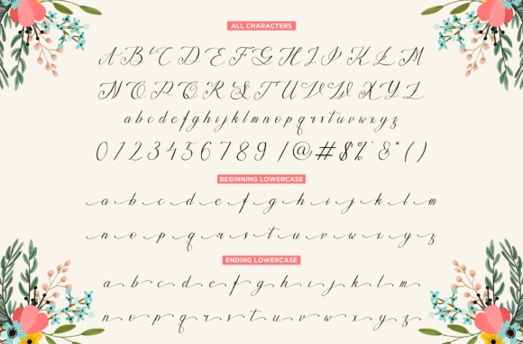
I’d choose Mightyline when a plain minimalist script feels too restrained but a highly traditional calligraphy face feels too formal. Its strongest role is still display text. For a balanced card, I would place the script against simple supporting typography and resist repeating swashes on every word; a few decorative moments have more impact than a dense page of flourishes.
Best for: modern romance, prominent names, invitation headings
Key features: calligraphy style, swashes, alternates
9. Malicka
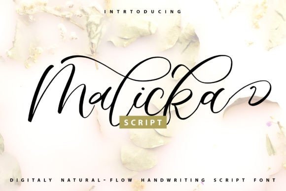
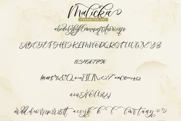
Malicka is a romantic calligraphy font with letters that move along a varied baseline, giving it a softer and less rigid character than formal copperplate-inspired scripts. Creative Fabrica describes it as casual yet elegant, which is the balance that earns it a place here.
I’d use Malicka for garden weddings, intimate celebrations, watercolor stationery, or cards where the design should feel personal rather than ceremonial. That looseness is also its limitation: if the rest of your invitation is extremely architectural or black-tie formal, I would choose one of the more controlled scripts instead.
Best for: garden weddings, soft romantic cards, intimate celebrations
Key features: calligraphic forms, varied baseline, casual elegance
10. Hegia Sophia
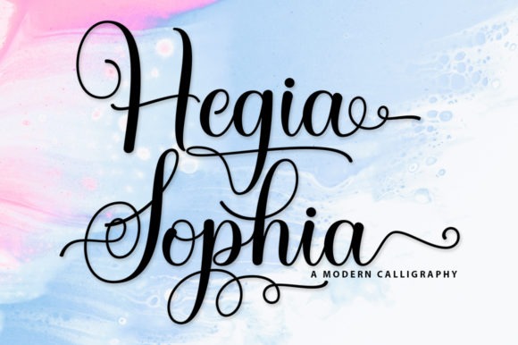
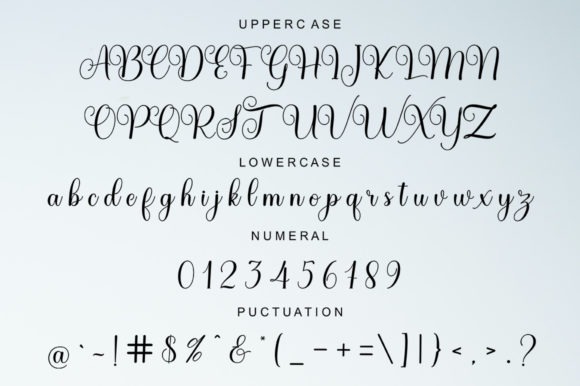
Hegia Sophia is a delicate handwritten font made for personalized design, including wedding invitations and thank-you cards. Its Creative Fabrica listing also notes PUA encoding for accessing glyphs and swashes.
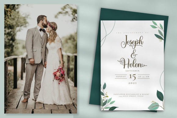
I like this style for invitations where the lettering should suggest handwriting without becoming rough or deliberately rustic. It could also carry through nicely to place cards or small thank-you notes for a consistent stationery identity. Because the character is delicate, I’d keep essential venue information in a sturdier companion face and use Hegia Sophia where personality matters more than density.
Best for: personalized suites, thank-you cards, delicate invitations
Key features: handwritten styling, swashes, PUA-encoded glyphs
11. Similar
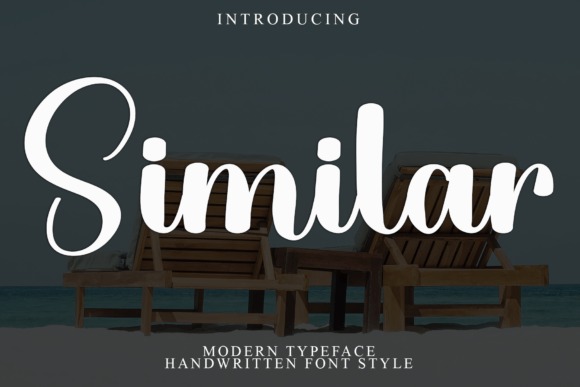
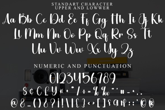
Similar is a contemporary calligraphic font influenced by classic lettering, with glyphs and ligatures that allow more decorative word shapes. Its appearance fits invitation designs that need a polished handwritten accent rather than a casual marker-like style.
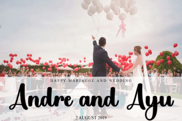
I’d use Similar for a classic wedding with a modern layout: generous white space, restrained colors, and one large line of script. It can make short text feel custom without needing extra illustration around it. I would avoid combining it with another decorative script, since two competing handwriting styles can weaken the hierarchy rather than add sophistication.
Best for: modern-classic cards, script headlines, elegant name layouts
Key features: ligatures, glyphs, classic calligraphy influence
12. Rosemode
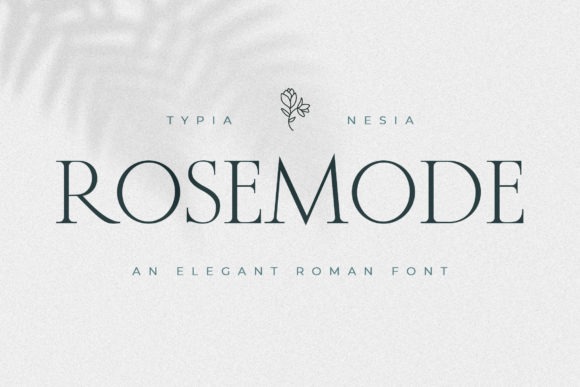
Rosemode is a thin, elegant serif that gives wedding cards an editorial alternative to traditional calligraphy. Its fine letterforms and romantic character make it especially attractive for headings, names, and other short text where a serif can create sophistication without flourishes.
This would be one of my first picks for a minimalist luxury invitation. Instead of pairing script with serif, you could build most of the card around Rosemode and create hierarchy through size, spacing, and capitalization. Fine strokes can lose clarity when printed too small, though, so I would always inspect a physical-size proof before using it for tiny details.
Best for: minimalist luxury cards, editorial layouts, elegant headings
Key features: thin serif construction, romantic tone, refined display style
13. Degila
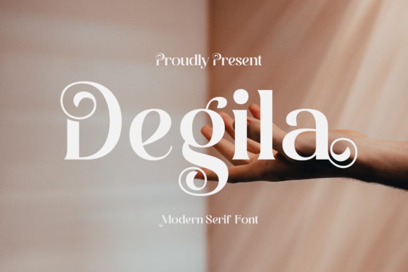
Degila is a contemporary serif that can move a wedding card away from predictable cursive typography. Its letterforms include distinctive styling and PUA-encoded glyph access, giving it enough character to handle prominent titles and names.
I’d pick Degila for a fashion-conscious couple, an art-gallery reception, or a modern city wedding where ornate calligraphy feels too traditional. It can also serve as the structured half of a serif-and-script combination. Because its personality comes from the letter shapes themselves, I would keep decorative borders and extra typographic effects restrained so the invitation does not become visually busy.
Best for: contemporary weddings, editorial cards, serif-script pairings
Key features: modern serif shapes, PUA encoding, display personality
14. French Clover
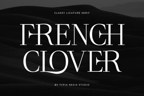
French Clover is a luxury-oriented serif that combines modern polish with a more regal visual direction. Creative Fabrica positions it for refined branding and other high-end display applications, which translates naturally to wedding cards with fashion-editorial styling.
I’d choose it for a black-tie invitation, château-inspired celebration, or a monochrome card that relies on typography rather than floral decoration. It can give names substantial presence while staying cleaner than calligraphy. The regal character is fairly specific, though; for a relaxed beach or rustic-barn wedding, a softer handwritten option from this list would feel more coherent.
Best for: black-tie cards, luxury themes, editorial wedding stationery
Key features: refined serif forms, modern-royal character, strong display presence
15. Genshino
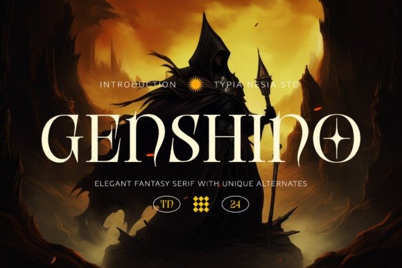
Genshino is an elegant fantasy serif with alternate letterforms that bring a slightly whimsical edge to formal typography. Its designer specifically includes wedding invitations among suitable uses, alongside editorial and display projects.
I’d reserve this for a wedding card with an intentional storybook, enchanted-garden, celestial, or old-world concept. It is more thematic than a neutral serif such as Rosemode, which is exactly why it can be memorable in the right design. For a highly traditional invitation, however, the unusual details may pull too much attention away from the wording, so I would choose a quieter option.
Best for: enchanted themes, storybook weddings, distinctive headings
Key features: fantasy serif styling, alternates, elegant display forms
16. Rosemary
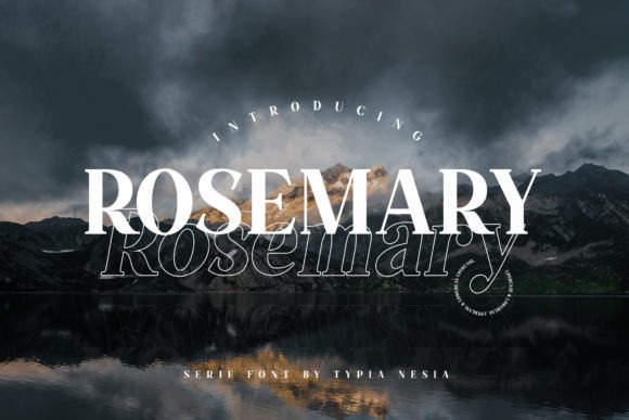
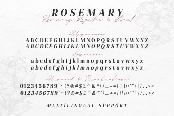
Rosemary is a bold, elegant serif for wedding cards that need stronger typography rather than delicate handwriting. Its heavier presence gives it more authority than the thin serifs in this collection, making it useful when the names or location should read as a confident headline.
I’d consider Rosemary for a formal invitation with restrained colors, architectural spacing, or a serif-led layout. It can also provide visual contrast beside a fine calligraphy accent. Because it is comparatively bold, I would avoid making every line large and heavy; letting secondary information recede is what gives a typographic wedding card its hierarchy.
Best for: bold formal cards, serif-led layouts, strong name headings
Key features: substantial serif strokes, elegant character, headline presence
Choosing the Right Look for Your Invitation
My safest starting point is a font with enough character to make the couple’s names memorable and enough restraint to leave room for the rest of the design. Wedding Handwritten and Hapsha Sophia are convenient when you want a ready-made script-and-sans relationship, while Rosemode, Degila, and French Clover suit cards that lean more toward polished editorial typography.
For a more romantic direction, I’d look first at Filanttica, Joseph Sophia, Karolie, or Spirit. Whichever font you choose, give decorative lettering a specific purpose and keep the practical information clear. That balance is what makes an elegant invitation feel considered rather than merely ornate.
Frequently Asked Questions
What font style looks most elegant on a wedding card?
Calligraphy, refined script, and high-contrast serif fonts are the styles I would consider first for an elegant wedding card. Scripts create a romantic focal point, while serifs can give the invitation a formal or editorial character without relying on decorative flourishes. The strongest option depends on the wedding mood. A traditional formal event can support flowing calligraphy, while a minimalist city wedding may look more sophisticated with a distinctive serif and generous spacing.
Should I use a script font for the whole wedding invitation?
I would usually avoid setting the whole invitation in decorative script. Script is more effective for short focal text, while event details are generally easier to read in a cleaner serif or sans serif. Wedding typography guides likewise recommend prioritizing readability for essential information. Try using the script for the couple’s names or one heading. That creates contrast and gives the decorative typeface more impact without making guests work to find the time, venue, or RSVP instructions.
How many fonts should I use on a wedding card?
One or two typefaces are enough for most wedding cards. A two-font system lets one face create personality while the other handles practical information, and it is easier to keep consistent across invitations, RSVP cards, menus, place cards, and signs. If a single font family already offers enough contrast through weights, italics, capitals, and sizes, you may not need a second typeface at all. Hierarchy matters more than collecting several visually interesting fonts.
How do I make a wedding invitation font easier to read?
Keep critical details in a clear typeface, give lines enough spacing, and judge the design at its real printed size. Very thin strokes and ornate letterforms can lose clarity when reduced, so a screen preview alone is not always a reliable readability check. I would also keep long addresses and RSVP instructions out of elaborate calligraphy. If a guest can immediately spot the names, date, time, venue, and response information, the typography is doing its practical job as well as its decorative one.
Follow Us