

The best fonts similar to Clarendon retain the qualities that make the original typeface so recognizable: sturdy slab serifs, substantial visual weight, readable letterforms, and a sense of nineteenth-century character.
Some of the fonts in this list stay close to traditional Clarendon construction. Others interpret the style more loosely, moving toward Western signage, vintage packaging, editorial typography, or contemporary branding.
Clarendon belongs to the slab serif category, historically also associated with the term “Egyptian.” Unlike geometric slab serifs such as Rockwell, Clarendon-style typefaces generally use bracketed serifs, moderate stroke contrast, and softer transitions between the stems and serifs.
That combination gives the typography authority without making it feel overly rigid or mechanical.
I evaluated these alternatives by looking at their letterform construction, spacing, visual weight, readability, vintage character, and usefulness in real design systems. A few are close Clarendon revivals. Others simply capture the same dependable, confident personality.
Table of Contents
Quick Picks
- Closest all-around alternative: Shenandoah Clarendon Family
- Best neutral branding option: Baldwin
- Best modern packaging option: Mesa Slab Serif
- Best editorial alternative: Story Serif
- Best Western alternative: Glaser Western
How I Picked These
I compared these Clarendon alternatives by slab-serif construction, serif bracketing, visual weight, spacing, readability, historical character, and how well each option can reproduce Clarendon’s dependable presence while fitting real branding, packaging, editorial, signage, and display projects.
Best Fonts Similar to Clarendon
1. Shenandoah Clarendon Family
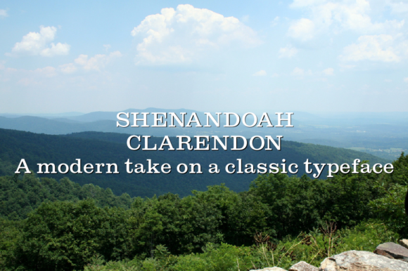
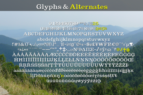
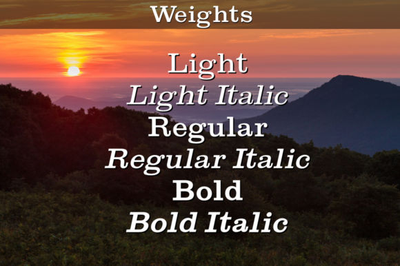
Shenandoah Clarendon Family is the most direct alternative in this collection. It was designed as a modernized interpretation of the traditional Clarendon style, preserving the recognizable slab serif construction while introducing updated glyphs and decorative options.
The broad proportions and gently bracketed serifs create the grounded appearance most designers are looking for when choosing a Clarendon-style font. It feels historic, but not like a poorly digitized antique typeface.
That distinction matters in branding work. Some revival fonts look convincing in a large specimen but begin to feel uneven when used across packaging, websites, signage, and social graphics. Shenandoah appears more controlled, which makes it easier to build into a broader visual system.
I would consider it for heritage identities, book covers, food packaging, pub signs, editorial headings, and logo design. It has enough personality to feel distinctive without becoming overly ornamental.
Best for: Heritage logos, packaging, signs
Key features: Modernized Clarendon revival, broad forms, updated glyphs
2. French Clarendon
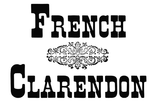
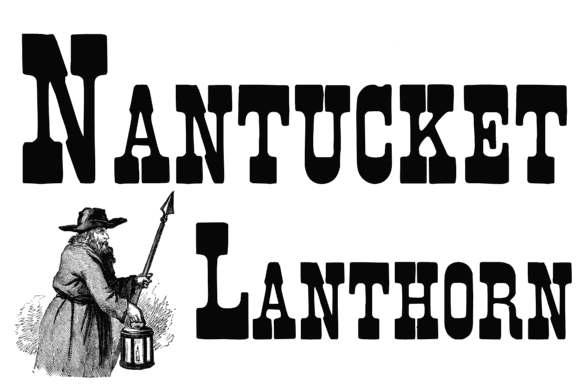
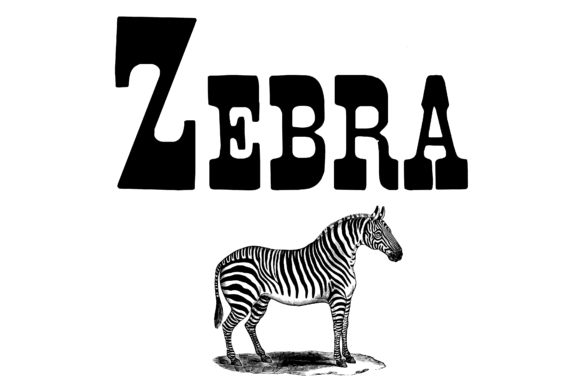
French Clarendon takes the basic Clarendon formula in a more decorative direction. It is a vintage slab serif with ornamental details and a stronger old-world display character than a conventional text-oriented Clarendon.
Visually, the font has a theatrical quality. The pronounced shapes give short words a memorable silhouette, which can be effective on labels, posters, event graphics, and decorative branding.
It is less flexible than a restrained Clarendon revival. The additional details create personality, but they also reduce legibility as the text gets smaller. This is a common limitation with decorative display fonts: they attract attention quickly but become harder to manage across a complete brand system.
I would keep French Clarendon to short headlines, names, packaging titles, and display phrases where the letterforms have enough room to breathe.
Best for: Posters, labels, decorative headlines
Key features: Ornamental slab serifs, vintage detailing, display construction
3. Baldwin
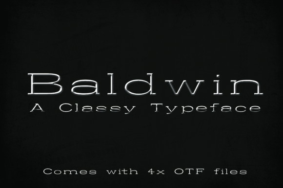
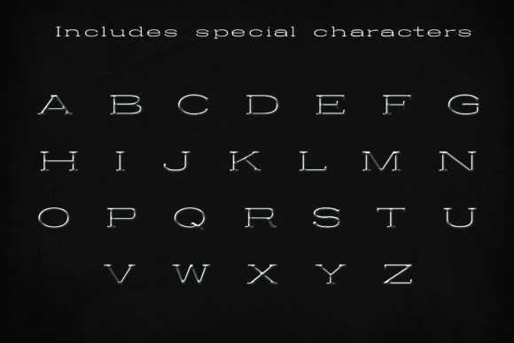
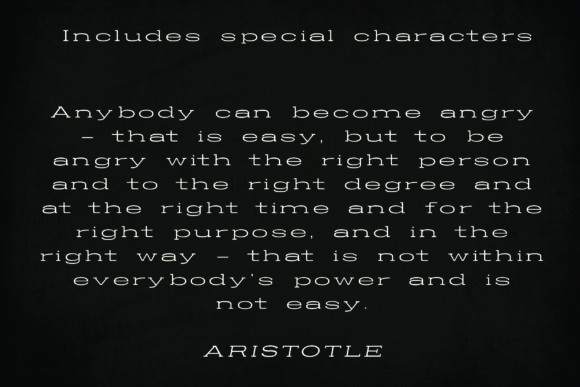
Baldwin is a classic slab serif with a straightforward, substantial structure. Its strong strokes and traditional proportions place it closer to the practical side of Clarendon than to the more theatrical interpretations in this list.
What stands out to me is its restraint.
Baldwin has enough visual weight to establish a clear headline or logo, but it does not immediately push the design toward a cowboy, circus, or antique-shop aesthetic. That makes it more adaptable for editorial graphics, menus, product labels, packaging, and general identity work.
The letterforms appear stable, and the typography should tolerate slightly longer headings better than many distressed or heavily stylized slabs. This matters when a font needs to function beyond a single logo lockup.
Baldwin is a sensible option when you want Clarendon’s solidity without creating something that feels like a direct copy of the original.
Best for: Logos, menus, editorial headings
Key features: Classic slab structure, strong strokes, restrained styling
4. Mesa Slab Serif
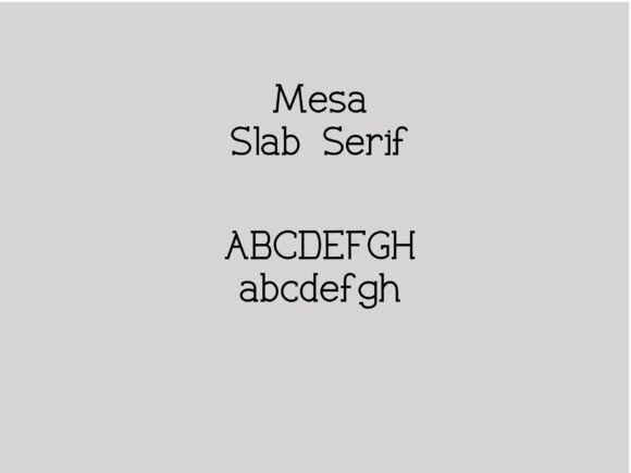
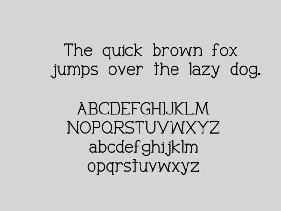
Mesa Slab Serif offers a cleaner, display-focused interpretation of the slab serif category. Its sturdy letterforms form stable word shapes, which is one reason Clarendon-style typography remains effective in signage and branding.
Compared with an ornate vintage slab, Mesa feels simpler and easier to place inside a modern layout. The letters still carry authority, but they do not require the surrounding design to follow a historical theme.
That flexibility is useful in contemporary packaging, café identities, title cards, merchandise, and digital branding. The same typeface can feel vintage or modern depending on its tracking, color palette, image treatment, and supporting font.
I would pay close attention to spacing when using Mesa in a logo. Heavy slab serifs naturally occupy a lot of horizontal and visual space, so small kerning adjustments may be needed to keep the wordmark balanced.
Best for: Packaging, merchandise, café branding
Key features: Clean slab serifs, stable proportions, display-oriented forms
5. Forte
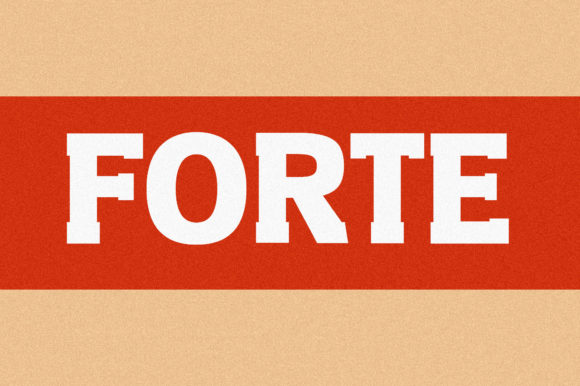
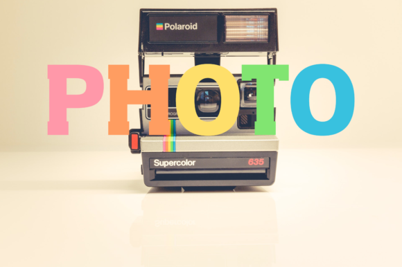

Forte is a vintage slab serif with a clear Egyptian-style influence. That historical connection is relevant because early slab serif designs were commonly called Egyptian typefaces, and Clarendon developed from the same broader typographic tradition.
Forte appears heavier and more display-driven than a typical Clarendon text face. Its visual weight is strong enough to establish much of the composition’s personality on its own.
That can be useful on beverage labels, apparel graphics, retro emblems, music artwork, and packaging where the typography needs to carry the concept. It is less convincing as a general-purpose typeface for long headings or interface text.
I would avoid using Forte for paragraphs or small labels. Thick slabs and tight internal spaces can lose definition when reduced, particularly in print processes where ink spread or material texture affects the edges.
Best for: Labels, apparel, retro emblems
Key features: Egyptian influence, heavy construction, vintage display style
6. Fantastico
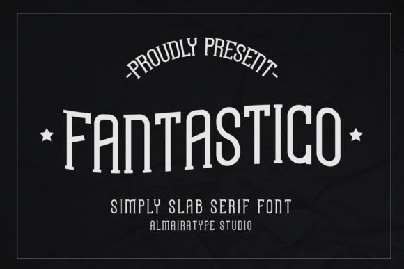
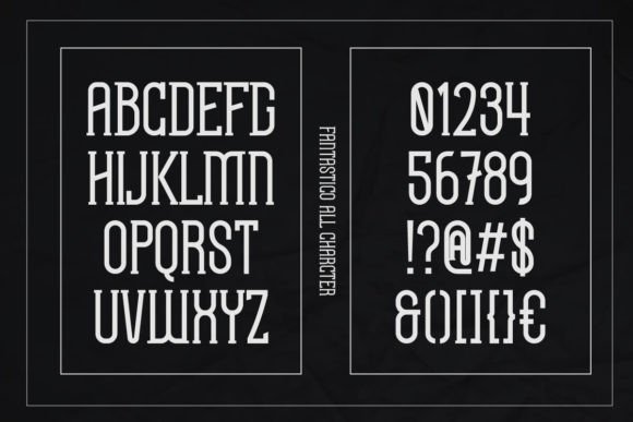
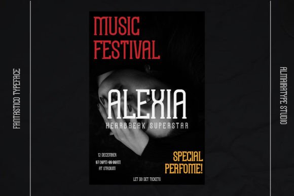
Fantastico is another Egyptian slab serif, but its personality is more stylized and energetic. It was created for display applications such as logotypes, headlines, apparel, posters, magazines, and entertainment graphics.
Its relationship to Clarendon comes mainly through the prominent serifs, forceful rhythm, and substantial visual weight. It is not a close replacement for restrained editorial typography, but it produces a similar sense of presence.
Fantastico suits projects that need to feel nostalgic, expressive, or slightly theatrical. Its letterforms create an active visual rhythm, so it can easily overpower understated layouts.
For that reason, I would pair it with a quiet sans serif and keep the remaining design system controlled. Combining it with another decorative typeface would weaken the hierarchy and make the composition feel unnecessarily busy.
Best for: Logotypes, posters, apparel graphics
Key features: Egyptian slab style, bold rhythm, expressive letterforms
7. Slabtro
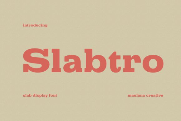
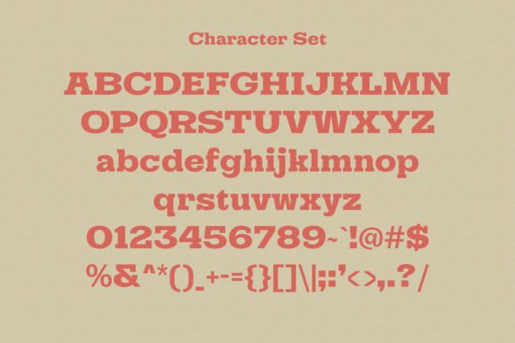
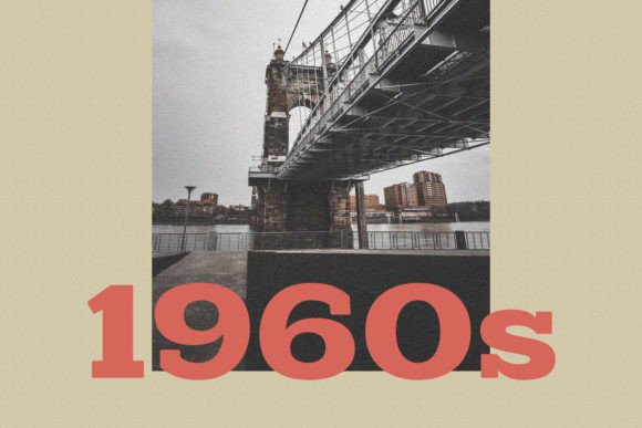
Slabtro has the heavy, attention-grabbing character many designers are looking for when searching for fonts similar to Clarendon. Its proportions are clearly intended for display, making it better suited to large headlines than extended text.
The font feels retro without being locked to one specific historical period. Depending on the surrounding imagery and color palette, it could fit automotive graphics, product packaging, poster design, apparel, or masculine branding.
Slabtro is useful when standard Clarendon feels too polite or reserved. It has more immediate visual impact and can support a headline without much additional decoration.
Tracking needs careful attention. Heavy slab letters can become dense very quickly, especially when their serifs begin to visually connect. Slightly increasing the spacing may improve legibility, but too much tracking can weaken the solid word shape that gives the font its appeal.
Best for: Posters, automotive graphics, bold branding
Key features: Heavy slab forms, retro tone, display proportions
8. Story Serif
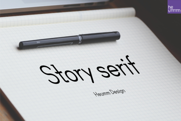
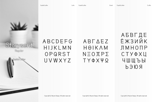
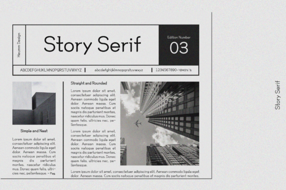
Story Serif is a softer, more editorial alternative. Although it belongs to the slab serif category, it produces a calmer texture than the rugged Western and vintage display fonts elsewhere in this list.
This makes it useful for designers who appreciate Clarendon’s readability and authority but do not want an obvious nineteenth-century or industrial theme.
The quieter construction could suit book covers, magazine layouts, invitations, blog graphics, and visual identities that need warmth rather than raw impact. Its more restrained tone should also make font pairing easier.
A neutral sans serif can sit beside Story Serif without either typeface competing too heavily. That balance is valuable in web design, where headings, body text, navigation, captions, and buttons need a clear hierarchy rather than equal visual emphasis.
Best for: Editorial layouts, books, refined branding
Key features: Soft slab character, readable forms, balanced texture
9. Editorial
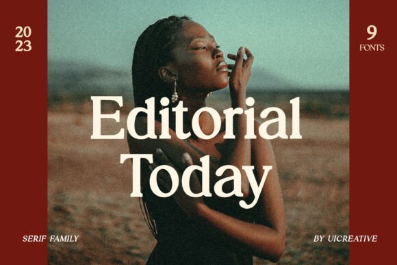
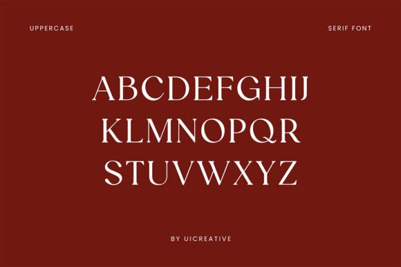
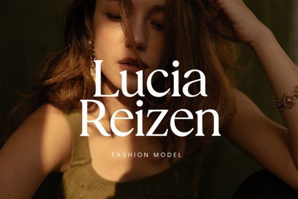
Editorial is a slab serif designed with publication-style typography in mind. Its strong shapes create clear hierarchy, while the cleaner construction makes it easier to use across magazine covers, article graphics, titles, and branding materials.
Clarendon has remained useful in editorial environments because its weight attracts attention without making the words difficult to recognize. Editorial follows the same principle, although its tone feels more contemporary.
This is the kind of typeface I would consider when a historical Clarendon revival feels too literal. It preserves the authority associated with slab serifs but integrates more naturally into minimalist layouts and digital content.
On a website, it could function well for H1 and H2 headings while a simpler serif or sans serif handles the body copy. As with any heavy display font, I would still test it across desktop and mobile breakpoints before committing to it.
Best for: Magazines, web graphics, publication titles
Key features: Editorial proportions, strong hierarchy, contemporary slab style
10. Cottage Vintage
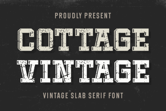
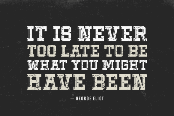
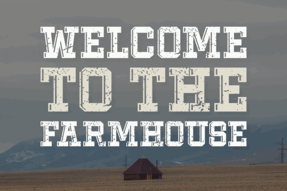
Cottage Vintage is a classic vintage slab serif with an intentionally nostalgic appearance. It has enough irregular character to suggest older printed material while remaining usable in current craft, packaging, and branding projects.
Compared with Clarendon, Cottage Vintage feels more rustic and informal. It is better suited to farmhouse identities, handmade product labels, market signs, invitations, and seasonal merchandise than to formal corporate communication.
Its strongest quality is mood. A few words are often enough to establish a warm, heritage-oriented visual tone.
That strength is also a limitation. The font would be harder to integrate into a brand that needs to communicate technology, precision, luxury minimalism, or modern efficiency. Its personality is specific, so the branding context needs to support it.
Best for: Farmhouse branding, craft labels, market signs
Key features: Nostalgic slab style, rustic character, classic proportions
11. Original Vintage
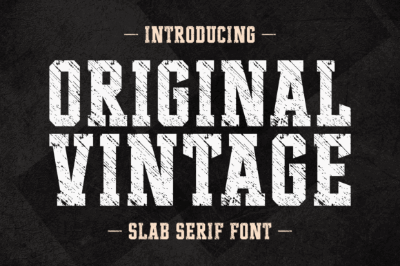
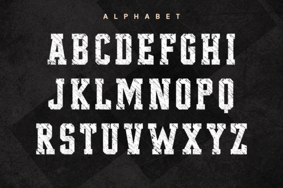
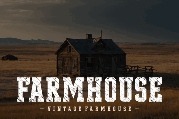
Original Vintage is a thick slab serif with a distressed texture inspired by older typesetting and imperfect printing. The underlying structure is strong and blocky, while the surface treatment introduces a worn, tactile quality.
I would not treat it as a direct Clarendon substitute for clean editorial design. It makes more sense as a textured alternative for projects that need Clarendon’s visual weight with a rougher finish.
The font suits T-shirts, badges, poster titles, product labels, and retro branding. The distressed areas add character, but they can also disappear or merge when the type is printed at a small size.
Always test the final output rather than judging this kind of font only from a large on-screen preview. Texture that looks convincing at 100 pixels tall may become visual noise on a small package label.
Best for: T-shirts, badges, distressed posters
Key features: Thick slabs, grunge texture, old-print appearance
12. Dhefani Vintage
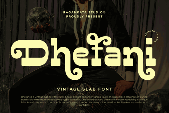
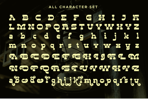
Dhefani Vintage is a bold slab serif with a more polished vintage personality than many rustic display faces.
It captures some of Clarendon’s confident visual weight, but the styling feels more suited to boutique packaging, hospitality branding, and decorative identity work. The letterforms create a strong impression without relying entirely on distressed textures or exaggerated Western ornament.
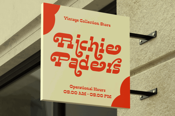
From a branding perspective, Dhefani could suit coffee packaging, apparel labels, barbershop identities, restaurant graphics, and retro-inspired logos.
It may also feel surprisingly current when paired with generous negative space, restrained colors, and a clean geometric sans serif. This is a good example of how the surrounding design system can change the perceived age of a typeface.
Best for: Boutique packaging, logos, restaurant graphics
Key features: Bold slab serifs, polished vintage tone, elegant forms
13. Glaser Western
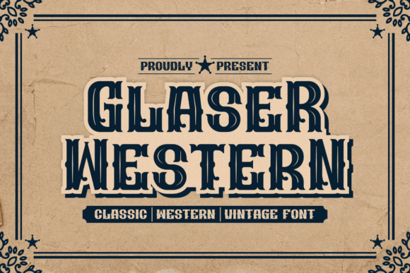
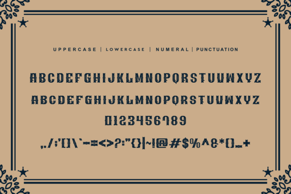
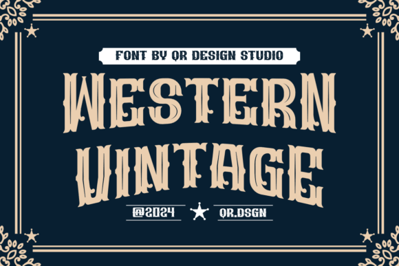
Glaser Western pushes Clarendon’s slab serif foundation toward classic frontier typography. Its bold construction and Western styling make it considerably more specialized than a neutral Clarendon alternative.
The font is most effective when that association is intentional. It could suit saloon-inspired signs, barbecue branding, ranch logos, event posters, apparel, and rustic packaging.
I would avoid it for editorial layouts or brands that require broad stylistic flexibility. Its personality is immediate and difficult to disguise.
That is not necessarily a weakness. Distinctive display fonts can make branding more recognizable, but only when their visual associations match the business. Using Glaser Western for an unrelated technology or financial brand, for example, would create a noticeable communication mismatch.
Best for: Ranch logos, barbecue branding, signs
Key features: Western slab styling, bold forms, rugged personality
14. Ngarai Biscet
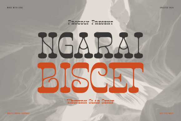
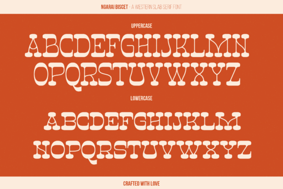
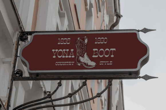
Ngarai Biscet is a bold Western slab serif with a strong decorative silhouette. It retains the broad weight and prominent serifs associated with Clarendon while moving further into cowboy-inspired display typography.
The letterforms look built for posters, logos, labels, signs, and merchandise rather than supporting text. Their distinctive outline should remain recognizable from a distance, which can be useful in apparel and environmental graphics.
Use it when a conventional Clarendon feels too formal or familiar. The typeface already carries a strong theme, so the surrounding layout should remain relatively simple.
Too many additional textures, ornaments, borders, and decorative fonts would compete with the letterforms. A more restrained composition will usually make the typography feel stronger.
Best for: Western posters, merchandise, bold labels
Key features: Decorative slabs, wide forms, cowboy-inspired styling
15. Slabs
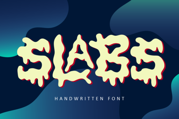
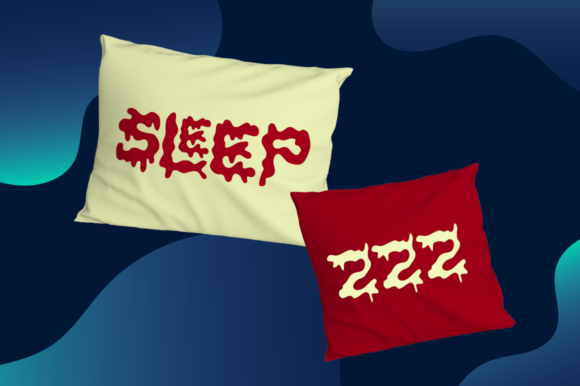
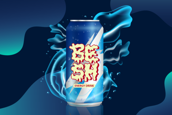
Slabs is a bold, abstract slab serif and the most contemporary interpretation in this collection. It shares Clarendon’s emphasis on weight and prominent serifs, but the construction is more experimental.
This is not the font I would choose for historical accuracy or long-form readability. It is better suited to creative studios, music graphics, streetwear, contemporary posters, and identity projects that need an unconventional headline face.
Its abstract letterforms can give a brand a distinctive visual voice, although that distinctiveness may reduce flexibility. A logo font that feels exciting in isolation can become difficult to use across navigation, packaging details, social content, and smaller brand touchpoints.
I would pair Slabs with a restrained sans serif and allow it to function as the main expressive element.
Best for: Music graphics, streetwear, experimental posters
Key features: Abstract construction, bold slabs, contemporary display style
Read More: While exploring distinctive typefaces like Clarendon, you might also find inspiration in our collection of 15 Best Varsity Slab Serif Fonts for Winning Sports Designs.
Which Clarendon Alternative Should You Choose?
The strongest fonts similar to Clarendon are not always the ones that reproduce it most closely. The better choice is the typeface that preserves the qualities your project genuinely needs.
Shenandoah Clarendon Family is the closest all-around substitute in this collection. Baldwin and Mesa Slab Serif offer more neutral flexibility, while Story Serif and Editorial fit cleaner publication layouts and digital design systems.
For a more expressive result, French Clarendon, Fantastico, and Slabtro introduce stronger display character. Glaser Western and Ngarai Biscet are more specialized, but they can be effective when a rugged Western atmosphere is an intentional part of the brand.
Clarendon has remained relevant because it balances authority, readability, and personality. A successful alternative should maintain that balance, even when it interprets the original letterforms differently.
The goal is not simply to find a similar-looking font. It is to choose typography that communicates the right tone, remains readable, and continues to support the visual identity as the brand grows.
Some links in this article may be affiliate links. If you purchase through them, we may earn a small commission at no extra cost to you. Thanks for supporting our work.
FAQ
What Google font is closest to Clarendon?
Zilla Slab, Bitter, Arvo, and Besley are useful free starting points, although none reproduces every Clarendon detail. Zilla Slab is particularly close in its use of sturdy, bracketed slab serifs, while Besley has a strong historical Clarendon influence.
Is Clarendon a slab serif font?
Yes. Clarendon is a bracketed slab serif typeface. Its serifs are thick, but they connect to the main strokes with curved transitions rather than the sharp, geometric joins seen in some other slab serif families.
What is the difference between Clarendon and Rockwell?
Clarendon typically has bracketed serifs and moderate stroke contrast. Rockwell is more geometric, with relatively uniform strokes and squarer, less curved serif connections. Clarendon generally feels warmer and more traditional, while Rockwell feels more mechanical.
What are Clarendon-style fonts best used for?
They are particularly effective for logos, posters, packaging, signs, editorial headings, book covers, apparel graphics, and heritage-inspired branding. Their heavy serifs make them visible at display sizes, while their familiar letterforms usually remain easy to recognize.
Follow Us