

ℹ️ Affiliate Disclosure: This article may contain affiliate links. We may earn a commission at no extra cost to you. Thanks for your support! ❤️
Introduction
Finding the right handwritten fonts for vinyl is about much more than choosing something that looks attractive on screen. Once a design moves from Illustrator or Cricut Design Space to an actual sheet of adhesive vinyl, typography becomes part of the production process. Tiny counters, fragile connectors, and overly decorative swashes can quickly turn an appealing design into a frustrating cutting job.
One thing I often notice when reviewing branding projects is that designers evaluate fonts almost exclusively by appearance. Vinyl production exposes every weakness in a typeface. Letter spacing, stroke consistency, internal counters, and overall rhythm suddenly become just as important as personality.
A handwritten font may look beautiful inside a mockup but struggle once it's reduced for product labels or transferred onto curved surfaces. That's why I pay close attention to how a typeface balances expression with practicality.
For this collection, I've focused on fonts that combine handcrafted character with production-friendly construction. Many feature generous counters, balanced spacing, and sturdy strokes that make weeding noticeably easier while still delivering the warmth that handwritten typography brings to branding.
Quick Picks
- Best overall font duo: Tingler Duo Font
- Best handmade-brand option: Handmade with Love Font
- Best bold production-friendly option: Vinyl Font
- Best cheerful thick script: Luscious Lemon Font
- Best understated handwritten option: Noteflow Font
How I Picked These
I compared these handwritten fonts by small-size readability, stroke consistency, counter openness, kerning, connector strength, weeding practicality, scalability, pairing flexibility, and how well each style can move from a digital mockup into vinyl decals, labels, apparel, signs, packaging, and broader brand systems.
1. Tingler Duo Font
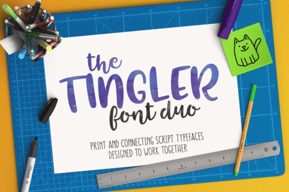
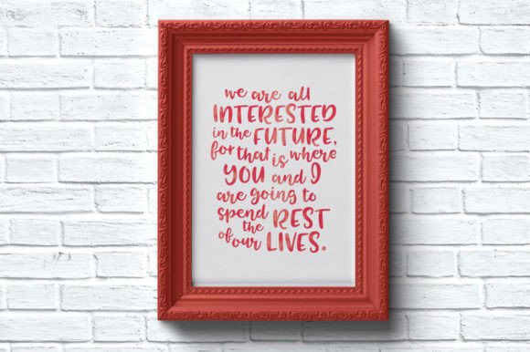
Tingler Duo immediately stands out because it isn't simply a script font with a companion sans—it feels like both typefaces were designed as a complete branding system.
That becomes obvious once you begin pairing the script with the printed companion. The proportions are closely matched, making mixed typography feel intentional rather than assembled from unrelated fonts.
From a branding perspective, that's a significant advantage.
One issue I frequently encounter is pairing a decorative script with a secondary font that competes for attention instead of supporting it. Tingler Duo avoids that problem by giving both styles similar visual rhythm and compatible proportions.
The handwritten script has flowing connections that appear relaxed without becoming difficult to read. The curves remain open, and the counters avoid becoming cramped, which is especially valuable for vinyl production.
Its construction is also well suited for cutting.
Rather than relying on delicate internal details, the letterforms use clean joins and simplified shapes that reduce unnecessary weeding. For Cricut or Silhouette users producing decals, wedding signs, or layered vinyl projects, those seemingly small decisions save considerable time.
The large collection of alternates and ligatures also introduces welcome variation without forcing extensive manual editing.
Designer's Perspective
I particularly like Tingler Duo when building boutique identities or wedding brands.
The companion print font creates a clear typographic hierarchy that many script families lack, allowing headlines and supporting information to work together naturally across packaging, websites, and physical signage.
One limitation worth mentioning is that the flowing script begins to lose some clarity at very small sizes. For tiny product labels, I'd reserve the script for names or short headlines while relying on the companion print for supporting text.
2. Kitchen Chaos Font Duo
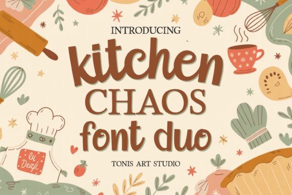
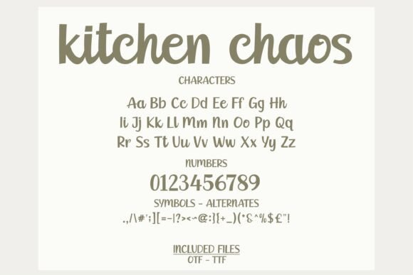
Kitchen Chaos approaches typography differently by combining a lively handwritten script with a grounded serif companion.
I generally appreciate font duos that establish hierarchy rather than simply offering stylistic variety, and this family does exactly that.
The script introduces personality.
The serif provides stability.
Together they create visual contrast that works especially well across branding systems where information needs different levels of emphasis.
One thing I often notice when reviewing restaurant or food branding is that everything is written in decorative script.
While charming initially, this quickly reduces readability.
Kitchen Chaos avoids that trap.
The serif keeps menus, labels, and packaging organized while allowing the handwritten elements to carry emotional appeal.
Production quality also appears thoughtfully considered.
The outlines remain clean, stroke transitions are uncomplicated, and the font behaves predictably in Cricut, Silhouette, and vector workflows.
Designer's Perspective
For farmhouse brands, cafés, food packaging, or handmade kitchen products, this pairing creates a relaxed but organized visual identity.
The handwritten component communicates warmth.
The serif reinforces trust.
That's an effective balance for branding that needs to feel approachable without becoming visually chaotic.
3. Weekend Santa Font
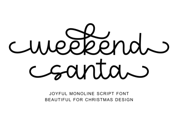
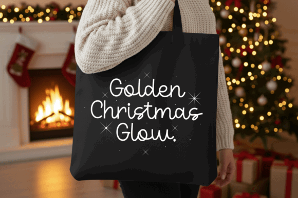
Seasonal fonts often sacrifice usability in pursuit of decoration.
Weekend Santa takes a more restrained approach.
Although it clearly embraces Christmas aesthetics through flowing swashes and playful rhythm, the underlying structure remains remarkably consistent.
Its monoline construction is particularly beneficial.
Uniform stroke weight generally produces cleaner vinyl cuts because there are fewer abrupt transitions between thick and thin areas.
That consistency also contributes to better readability on ornaments, stockings, apparel, and holiday decals.
The decorative swashes remain expressive without overwhelming the letterforms themselves.
I also appreciate that alternate endings are easy to access through PUA encoding, allowing quick experimentation with different compositions.
Designer's Perspective
Holiday branding often exists for only a few weeks each year, so production efficiency matters.
Weekend Santa strikes a sensible compromise between festive personality and manufacturing practicality.
If you're working at very small sizes, I'd simply reduce the number of elaborate swashes. Too many decorative extensions can make compact layouts feel visually crowded.
4. Hockey Font
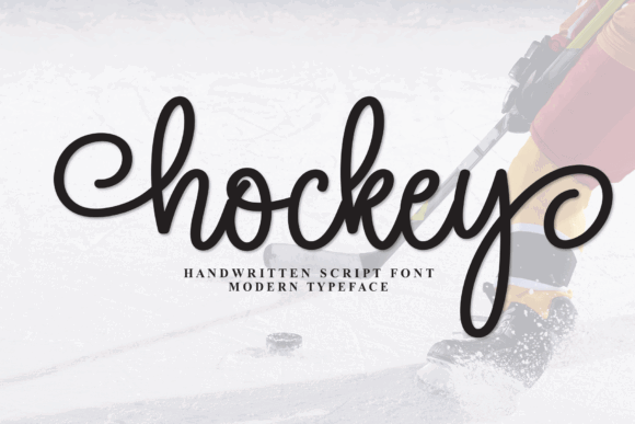
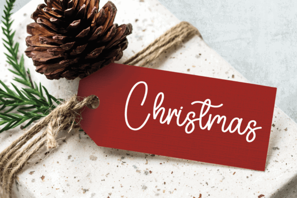
Hockey delivers energy through weight rather than excessive decoration.
Its heavy strokes immediately communicate strength, making it well suited for sports branding, team apparel, promotional graphics, and event signage.
From a typography perspective, the generous stroke width creates substantial visual weight that remains readable from a distance.
That makes it especially effective for banners, jerseys, vehicle graphics, and storefront decals.
One aspect I appreciate is that the script doesn't become overly compressed despite its bold appearance.
The counters remain open enough to maintain clarity.
Production is equally practical.
Heavy strokes generally survive cutting and heat transfer better than extremely delicate scripts, reducing the chance of fragile connections breaking during weeding.
Designer's Perspective
For athletic brands, movement matters as much as legibility.
Hockey communicates momentum without relying on exaggerated distortion.
Personally, I'd pair it with a geometric sans-serif to introduce structure and improve overall hierarchy across larger branding systems.
5. Cake & Cutie Font
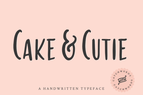
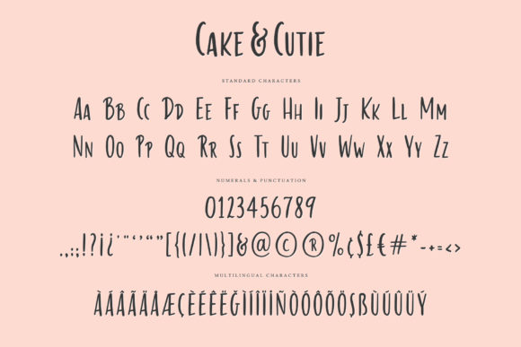
Cake & Cutie takes a deliberately playful approach.
Rounded terminals, open counters, and simplified construction create a friendly personality that immediately feels approachable.
Unlike many novelty fonts, however, its shapes remain disciplined.
That makes a noticeable difference in production.
Rounded letterforms generally produce fewer fragile cut points, and the open counters reduce the amount of detailed weeding required.
The included catchword font is another thoughtful addition.
Rather than repeatedly building decorative phrases manually, designers can assemble product labels, cake toppers, or gift tags much more efficiently.
Designer's Perspective
For bakeries, children's products, party supplies, or handmade packaging, Cake & Cutie communicates warmth without becoming visually noisy.
It isn't designed for premium luxury branding—and that's perfectly acceptable.
Every typeface has its own voice.
This one succeeds because it embraces simplicity instead of trying to imitate formal calligraphy.
6. Kittie Font
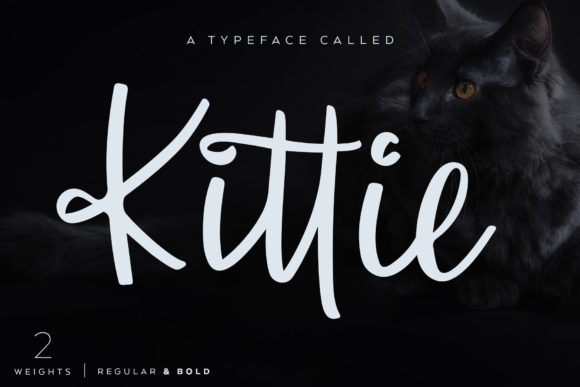
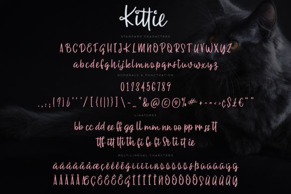
Kittie strikes an appealing balance between casual handwriting and polished typography.
The generous ligatures help words flow naturally while avoiding the repetitive appearance that many connected scripts develop.
Having both Regular and Bold weights significantly increases its flexibility.
That's particularly useful when building visual identity systems where different levels of hierarchy need to remain stylistically consistent.
The spacing also deserves recognition.
Small spacing decisions often have a bigger impact than people expect.
Kittie's kerning feels measured rather than mechanical, helping names, logos, and short headlines appear balanced without requiring extensive manual adjustments.
Its production qualities follow the same philosophy.
Smooth contours, moderate stroke widths, and practical connections make vinyl cutting straightforward while preserving the handwritten personality.
Designer's Perspective
If I were creating branding for a boutique shop, handmade cosmetics, lifestyle packaging, or personalized products, Kittie would comfortably make my shortlist.
It feels contemporary without chasing short-lived design trends.
That usually gives a typeface a much longer lifespan within a brand system.
7. The Ahmedians Font
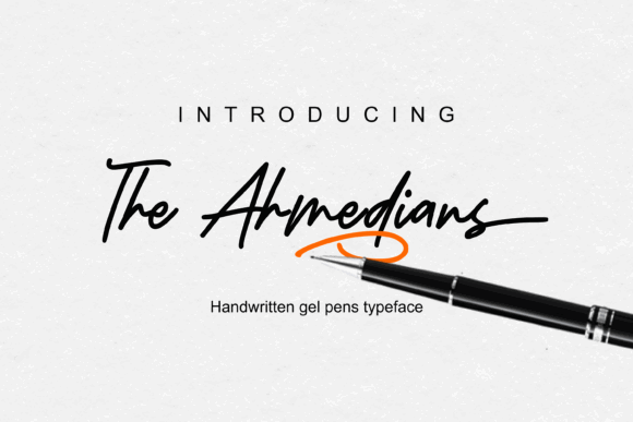
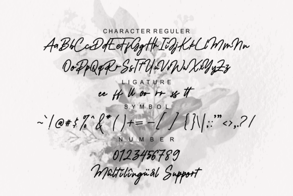
The Ahmedians has the confidence of handwritten lettering created with a fine gel pen. The strokes are narrow, slightly energetic, and intentionally imperfect, giving headlines movement without becoming difficult to read.
One aspect I appreciate is its restraint.
Many handwritten fonts try to create personality through exaggerated swashes or dramatic flourishes. The Ahmedians relies instead on rhythm. The slight irregularities between letters feel natural, while the baseline remains controlled enough to keep words visually stable.
That makes it surprisingly versatile.
From a branding perspective, it suits modern lifestyle brands, apparel labels, editorial graphics, and creative portfolios where a handwritten signature adds personality without overpowering the surrounding design.
Its production qualities are equally practical.
The open counters and uncomplicated outlines translate well to vinyl cutting, while the moderate x-height helps maintain readability when scaled down for decals or labels. It also performs consistently across both print and digital environments, something I always look for when evaluating a typeface for a broader visual identity.
Designer's Perspective
I'd use The Ahmedians for brands that want to feel contemporary and creative rather than traditionally elegant.
Pairing it with a clean grotesque or geometric sans-serif creates a strong hierarchy while allowing the handwritten style to remain the visual focal point.
The only limitation is that its relatively narrow construction can appear slightly condensed in very long phrases. For larger pieces of copy, generous tracking improves readability considerably.
8. Butter Creamy Font
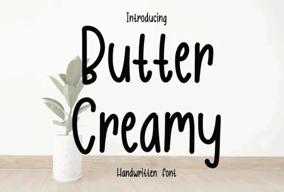
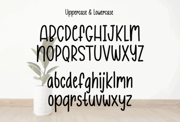
Butter Creamy has an immediately approachable personality.
Its rounded terminals, tall x-height, and smooth continuous strokes create a soft rhythm that feels welcoming rather than decorative. It communicates friendliness without relying on exaggerated styling.
Typography often influences emotional perception more than color alone, and Butter Creamy is a good example of that principle.
Even before reading the words themselves, viewers associate these rounded letterforms with warmth, comfort, and handmade products.
That makes the typeface especially effective for bakeries, cafés, children's products, craft packaging, and lifestyle branding.
Production-wise, the font remains practical.
The continuous stroke construction minimizes tiny gaps during cutting, while the generous counters reduce difficult weeding. These characteristics make it particularly reliable for vinyl stickers, HTV apparel, and small packaging labels.
Designer's Perspective
One thing I particularly like is its versatility across physical and digital media.
Many playful handwritten fonts work beautifully on packaging but feel awkward on websites.
Butter Creamy adapts surprisingly well because its proportions remain balanced and readable even on screen.
I would simply avoid using it for luxury branding. Its friendly voice naturally leans toward approachable businesses rather than premium positioning.
9. Girls Dreams Font
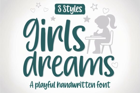
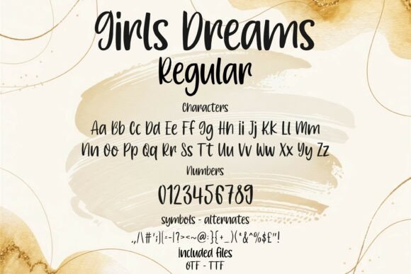
Girls Dreams is clearly designed for playful creative projects, but it offers more flexibility than its cheerful appearance initially suggests.
The family includes Regular, Bold, and Line variations, each serving a distinct purpose within a larger design system.
That variety immediately caught my attention.
Instead of treating alternative styles as decorative extras, this family allows designers to establish hierarchy while maintaining visual consistency.
The Bold version creates confident headlines.
The Regular style supports secondary text.
The Line variation introduces interesting layered effects for stickers and vinyl compositions.
From a production standpoint, the clean outlines are well suited to Cricut and Silhouette workflows.
The Line version, in particular, simplifies layered vinyl designs because the paths remain uncomplicated and easy to weed.
Designer's Perspective
I see Girls Dreams working particularly well for planners, classroom resources, personalized stickers, children's brands, and educational products.
Its biggest strength isn't simply that it's playful.
It's that the different weights allow the personality to remain consistent throughout an entire project rather than relying on multiple unrelated fonts.
10. Sunshine Flower Font
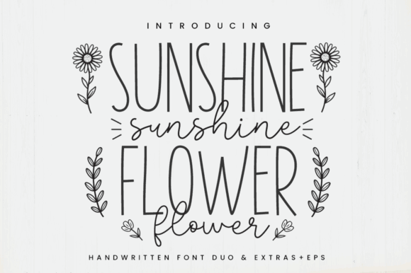
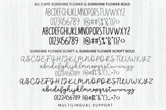
Sunshine Flower approaches typography as a complete creative toolkit rather than simply delivering two fonts.
The combination of a tall sans-serif, handwritten companion, doodle elements, and supporting illustrations encourages designers to think in terms of visual systems instead of isolated typefaces.
That branding perspective makes the family especially interesting.
The tall sans provides structure.
The handwritten script introduces warmth.
The doodles soften negative space and complete compositions without requiring additional illustration assets.
The spacing between the handwritten characters remains open enough for reliable vinyl cutting, while the tall sans stays highly legible on labels and narrow packaging.
This balance is surprisingly difficult to achieve.
Many font duos place too much emphasis on stylistic contrast and neglect usability.
Here, both fonts complement one another naturally.
Designer's Perspective
I'd recommend Sunshine Flower for seasonal products, children's packaging, handmade gift brands, or sticker collections.
Because the illustrations already share the same visual language as the typography, creating cohesive branding becomes significantly easier.
11. Ever After Font
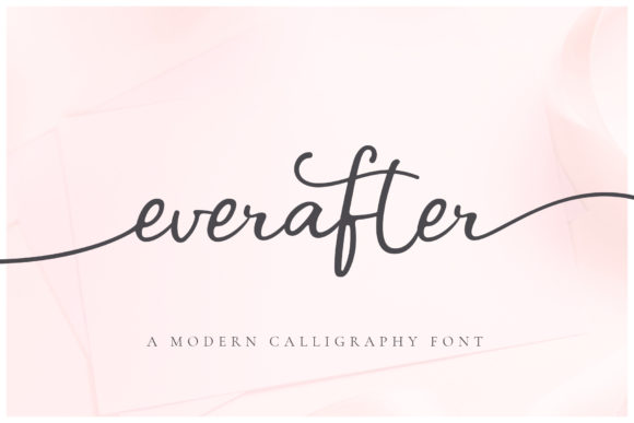
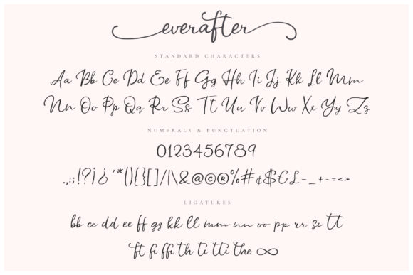
Ever After is one of the more elegant script fonts in this collection.
Its flowing letterforms, graceful swashes, and signature-style rhythm immediately suggest weddings, luxury invitations, and boutique branding.
What I find particularly thoughtful is how the designer separated many decorative swashes into independent font files.
That may sound like a minor technical decision, but it's genuinely useful.
Not every workflow supports advanced OpenType features equally well, especially inside Cricut Design Space or simpler crafting software.
Providing standalone swash fonts makes customization considerably more accessible.
The letterforms themselves remain relatively open despite their decorative appearance.
That improves production reliability by reducing fragile internal details that often complicate vinyl cutting.
Designer's Perspective
Visually, Ever After creates sophistication without feeling excessively formal.
I'd use it sparingly.
Decorative scripts are strongest when they introduce emphasis rather than carrying an entire page of text.
Pairing it with a restrained sans-serif allows the calligraphic details to breathe while improving hierarchy throughout the design.
12. Luscious Lemon Font
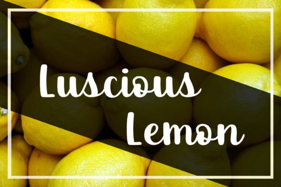
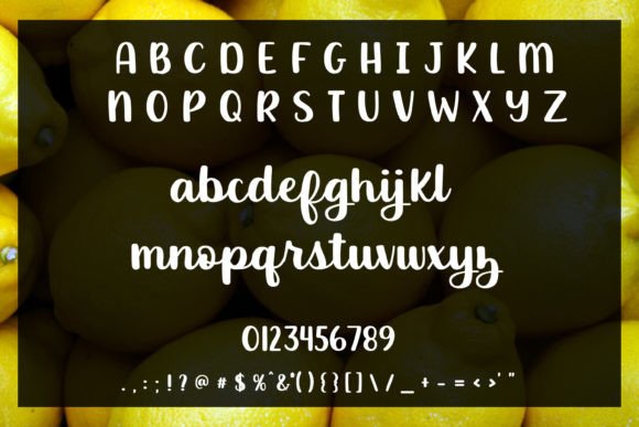
Luscious Lemon embraces boldness.
Its thick handwritten strokes and generous counters immediately communicate confidence while remaining approachable.
Heavy handwritten scripts often perform exceptionally well in vinyl production because their substantial stroke widths tolerate cutting much better than delicate calligraphic styles.
Luscious Lemon follows that principle throughout its design.
The internal counters remain spacious.
Connections between letters feel natural.
Kerning requires minimal adjustment in most common word combinations.
These characteristics reduce preparation time before production.
From a branding perspective, the typeface carries a cheerful handcrafted personality that suits greeting cards, product labels, cafés, handmade businesses, and promotional graphics.
Designer's Perspective
One thing I particularly appreciate is that the weight never overwhelms readability.
Some bold scripts sacrifice clarity for impact.
Luscious Lemon maintains enough openness that words remain comfortable to read, even on larger signage.
For smaller labels, I'd still perform a quick test cut before committing to production, but the underlying construction inspires confidence.
13. Dreamy Clouds Font
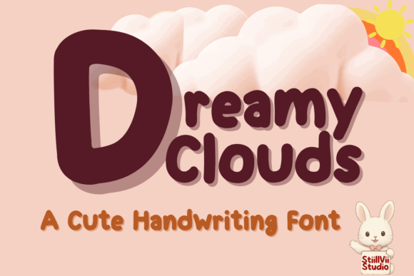
Dreamy Clouds immediately communicates friendliness.
Its inflated bowls, rounded terminals, and soft marker-like construction give every word an inviting, playful personality.
Typography doesn't always need refinement.
Sometimes a brand simply needs to feel approachable.
Dreamy Clouds succeeds because it understands exactly what it wants to communicate.
The wide counters and generous stroke widths also translate exceptionally well into physical production.
These rounded forms create durable cut paths while reducing delicate bridges that often slow down weeding.
That makes the font particularly appealing for stickers, planner accessories, children's products, classrooms, and family-oriented brands.
Designer's Perspective
Many playful fonts become visually exhausting when used extensively.
Dreamy Clouds avoids that problem because the rhythm stays consistent and the spacing remains generous.
I would pair it with simple icons, geometric shapes, or understated sans-serifs instead of competing decorative fonts.
Doing so preserves hierarchy while allowing the handwritten personality to remain the strongest visual element.
Its biggest strength isn't simply that it's cute.
It's that the underlying typography remains practical enough to support real production workflows instead of existing only as an attractive preview image.
14. Birthday Font
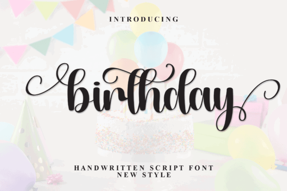
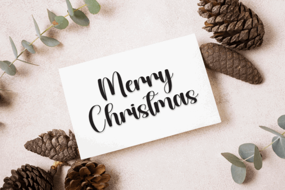
Birthday is built around celebration. The flowing loops, lively ascenders, and rhythmic baseline immediately create a sense of movement, making it a natural fit for party branding, personalized gifts, and event graphics.
What keeps it from feeling overly decorative is its underlying structure.
Although the script includes generous swashes and expressive alternates, the core letterforms remain balanced enough to preserve readability. That's an important distinction. Decorative flourishes should enhance a design, not force the reader to decipher it.
From a production standpoint, the medium stroke weight offers a good compromise between elegance and durability. The connected strokes generally hold together well during vinyl cutting, while the PUA-encoded alternates allow designers to customize names and short phrases without rebuilding lettering manually.
Designer's Perspective
For birthday signs, cake toppers, gift packaging, or event decals, this font captures a cheerful personality without looking childish.
I'd simply be selective with the longer swashes. They add character to headlines but can quickly overwhelm smaller layouts or narrow labels where clean hierarchy is more important than ornamentation.
15. Handmade with Love Font
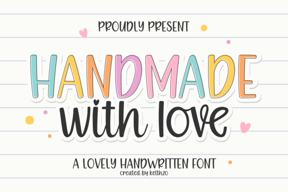
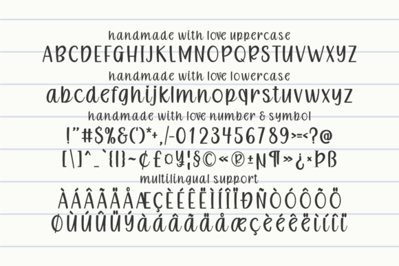
Some handwritten fonts try to imitate natural writing by introducing irregularity everywhere.
Handmade with Love takes a more disciplined approach.
The letterforms feel handcrafted, yet they're drawn with enough consistency that they function comfortably across an entire branding system. That balance between personality and usability is one of its strongest qualities.
The low contrast between thick and thin strokes is particularly valuable for vinyl production.
Thin hairlines often become weak points during cutting or transfer, while more consistent stroke widths create stronger, more dependable results.
The generous spacing also improves legibility on product labels, decals, and small packaging.
From a branding perspective, the font communicates authenticity rather than luxury.
That makes it especially appropriate for handmade goods, artisan packaging, local businesses, and personalized products where warmth builds trust.
Designer's Perspective
One thing I often notice when reviewing craft brands is that typography becomes overly decorative in an attempt to feel “handmade.”
Handmade with Love avoids that mistake.
Its personality comes from confident letterforms rather than excessive embellishment, giving it much greater flexibility across websites, packaging, signage, and printed materials.
16. Strawberry Smoothie Font
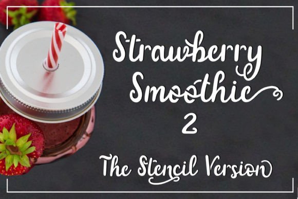
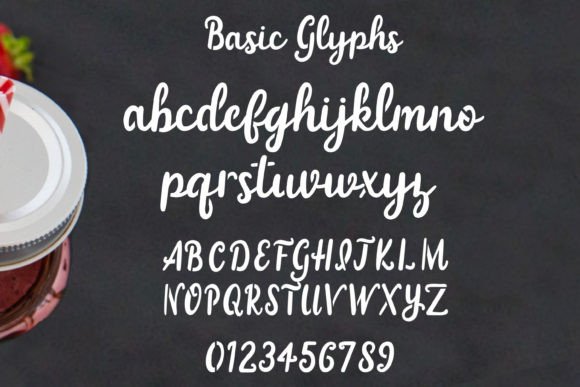
Strawberry Smoothie was clearly designed with production in mind.
The open counters immediately stand out because they remove one of the biggest frustrations associated with vinyl cutting: tiny enclosed islands that slow weeding and increase the likelihood of damaged transfers.
Instead, the font uses broad, open shapes that maintain their structure even after cutting.
That makes it especially appealing for stencil work, classroom graphics, decals, and single-color branding projects.
Visually, the rounded terminals create an approachable personality without becoming overly playful.
The rhythm remains calm and evenly spaced, allowing the typeface to stay readable across different applications.
Designer's Perspective
I like Strawberry Smoothie because it solves practical problems without sacrificing character.
Many production-friendly fonts become sterile.
This one still feels human.
If you're creating product labels or logos that need a handcrafted appearance while remaining easy to manufacture, it's one of the more thoughtful options in this collection.
17. Jenniy & Kary Font
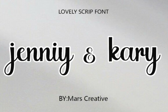
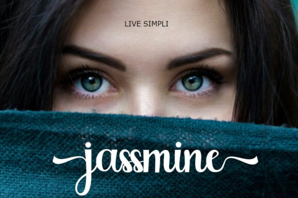
Jenniy & Kary leans toward modern calligraphy, but it avoids many of the fragile characteristics that often accompany signature-style fonts.
The monoline construction immediately improves durability.
Without dramatic transitions between thick and thin strokes, the letterforms remain more stable during cutting while maintaining an elegant handwritten rhythm.
Its proportions also deserve attention.
The spacing feels measured, and the consistent baseline prevents longer names from becoming visually uneven. Those subtle typographic decisions make the font particularly effective for logos, boutique packaging, wedding stationery, and premium labels.
Designer's Perspective
From a branding perspective, Jenniy & Kary creates refinement through simplicity rather than decoration.
That's usually a sign of a typeface with longer-term value.
I'd pair it with a restrained serif or contemporary sans-serif to create clear hierarchy while letting the handwritten signature remain the primary visual accent.
For extremely small decals, increasing the overall scale slightly will preserve the elegant joins much more effectively than relying on intricate details.
18. Quirky Rainbow Font
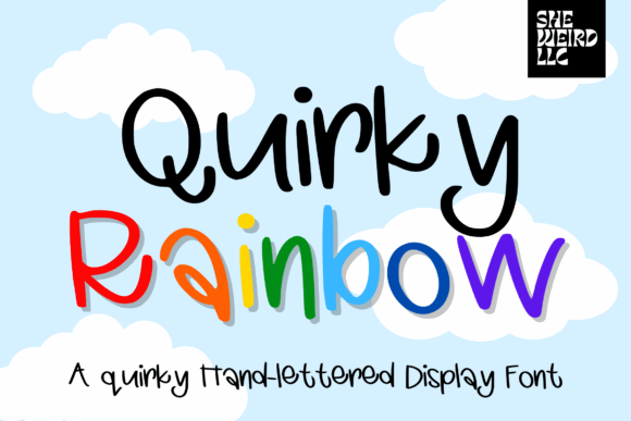
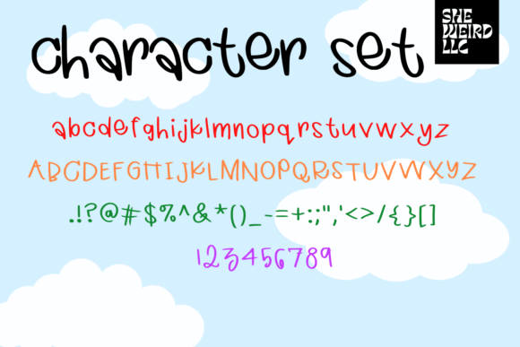
Quirky Rainbow embraces imperfection.
The uneven strokes, playful rhythm, and hand-painted influence give the typeface an energetic personality that immediately feels informal and approachable.
This isn't a font designed for luxury branding.
Instead, it succeeds because it communicates enthusiasm.
The counters remain open, and the rounded terminals reduce fragile cut points during production. Those characteristics make it particularly suitable for layered vinyl, colorful decals, seasonal products, and children's merchandise.
Typography often establishes emotional tone before anyone reads the message itself.
Quirky Rainbow communicates optimism almost instantly.
Designer's Perspective
I'd reserve this typeface for projects where energy matters more than refinement.
Summer campaigns, classroom materials, greeting cards, and playful packaging all benefit from its expressive personality.
To keep layouts balanced, I'd combine it with clean supporting typography rather than introducing additional decorative display fonts.
19. Morning Sunset Font
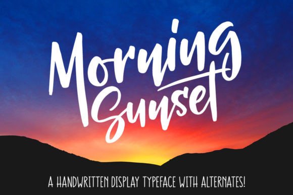
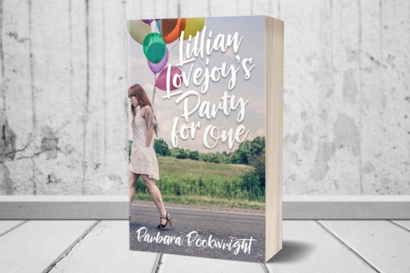
Morning Sunset feels relaxed without becoming careless.
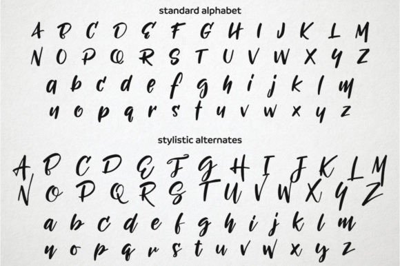
The flowing handwritten construction carries a subtle coastal aesthetic, while the alternate characters provide enough variation to make repeated words appear naturally handwritten.
One thing I appreciate is that the alternates aren't simply decorative extras.
They genuinely improve rhythm.
Repeated characters become less mechanical, allowing logos, decals, and personalized products to feel more authentic.
Technically, the family is also well equipped.
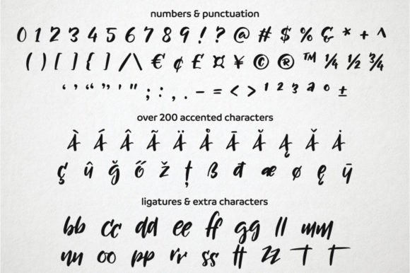
Multiple ligatures, extensive language support, and PUA encoding make customization straightforward across different software environments.
Designer's Perspective
Morning Sunset works particularly well for lifestyle brands, cafés, travel products, beach-inspired packaging, and boutique merchandise.
Its handwritten personality remains approachable without drifting into novelty.
The only detail I'd watch carefully is the thinner connectors. Applying a slight offset before cutting provides additional security for very small vinyl decals.
20. Chubby Cheeks Font
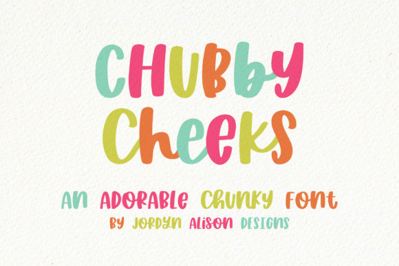
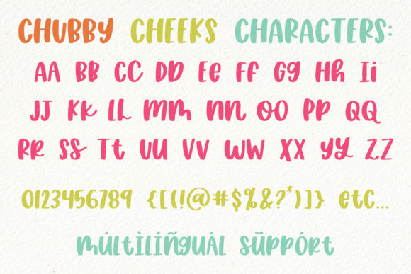
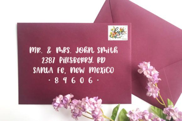
Chubby Cheeks demonstrates how simplicity often produces the strongest practical results.
Its thick rounded letterforms eliminate many of the delicate details that commonly complicate vinyl production.
Instead of intricate joins and decorative terminals, the font relies on confident shapes, generous counters, and substantial visual weight.
That immediately improves both readability and manufacturing reliability.
Because the strokes remain bold throughout the alphabet, the typeface holds together exceptionally well on stickers, nursery signs, children's décor, product packaging, and oversized decals.
From a branding perspective, Chubby Cheeks communicates friendliness without relying on cliché handwritten effects.
The personality comes from proportion rather than ornament.
Designer's Perspective
I often remind clients that readability creates trust.
Chubby Cheeks illustrates that principle well.
Even from a distance, the words remain immediately recognizable because every letter has room to breathe.
For modern branding, I'd introduce contrast by pairing it with a clean geometric sans-serif. The combination creates stronger hierarchy while allowing the handwritten display font to maintain its cheerful character without dominating every part of the design.
21. Daydream Font
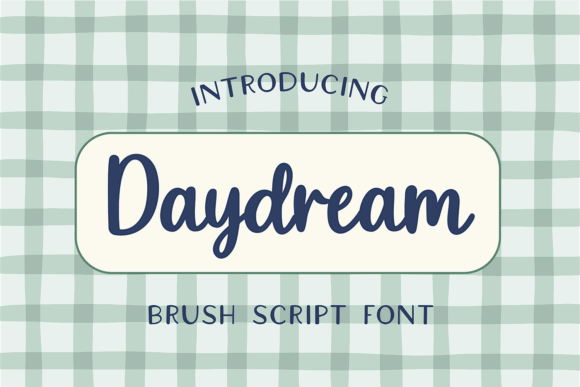
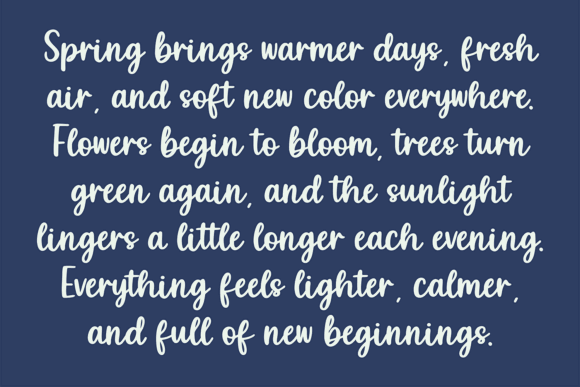
Daydream captures the feel of hand-painted signage rather than traditional handwriting. The broad brush strokes and slightly textured edges give it a vintage character that feels confident without becoming overly distressed.
One thing I appreciate about this typeface is that the texture never interferes with readability. Many brush fonts rely so heavily on rough edges that individual letterforms begin to blur together, especially when viewed from a distance. Daydream keeps enough definition in every character that words remain easy to recognize.
From a vinyl perspective, the heavier construction is another advantage.
The thick downstrokes create durable cut paths, while the rounded terminals reduce delicate bridges that often cause problems during weeding. That makes it a practical option for decals, T-shirts, storefront graphics, and product packaging where production efficiency matters just as much as appearance.
Designer's Perspective
From a branding standpoint, Daydream feels authentic rather than trendy.
I'd use it for coffee brands, outdoor products, handmade goods, or vintage-inspired merchandise where personality is expected but legibility still needs to come first.
Pairing it with a restrained sans-serif creates enough contrast to keep layouts organized while allowing the brush lettering to carry the emotional tone.
22. Noteflow Font
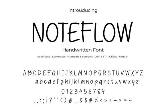
Noteflow takes a very different approach.
Instead of dramatic flourishes or exaggerated handwriting, it focuses on clarity.
The letterforms are clean, moderately spaced, and intentionally understated. Small irregularities preserve the handwritten feeling, but nothing feels forced or theatrical.
That restraint is exactly what gives the font its versatility.
One thing I often notice when reviewing visual identities is that businesses mistake decoration for personality. In reality, subtle typography usually ages much better than highly stylized lettering.
Noteflow reflects that philosophy.
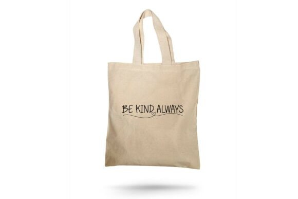
Its open counters and consistent strokes translate equally well across websites, packaging, planners, invitations, and vinyl decals.
Designer's Perspective
If I were designing branding for a stationery company, wellness business, lifestyle blog, or boutique product line, Noteflow would be high on my shortlist.
It communicates warmth while remaining remarkably neutral, making it easier to build a complete design system around it.
Some handwritten fonts dominate every layout.
Noteflow supports the brand instead.
23. Chilly Month Font
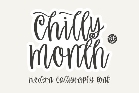
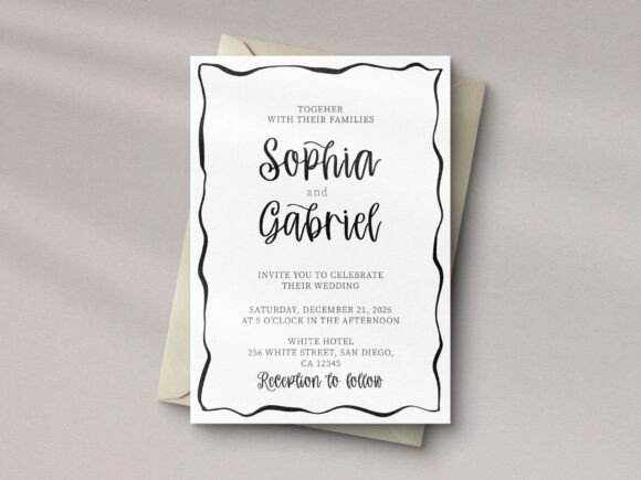
Chilly Month blends modern calligraphy with a playful baseline, creating lettering that feels relaxed without becoming messy.
The flowing connections introduce movement, while the generous counters keep words readable even when decorative swashes are added.
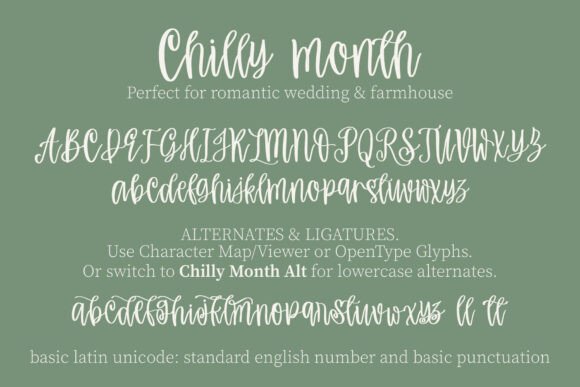
The alternates deserve particular praise.
They're useful because they genuinely reduce repetition rather than simply increasing the feature list.
Repeated endings, duplicated letters, and common combinations all feel more natural once stylistic alternates are introduced.
That flexibility makes the font valuable for personalized products where names and phrases constantly change.
Production quality remains strong as well.
The outlines stay clean enough for vinyl cutting, and the balanced spacing minimizes awkward overlaps during weeding.
Designer's Perspective
I'd choose Chilly Month for greeting cards, seasonal branding, boutique packaging, and wedding signage.
The playful rhythm gives projects warmth without sacrificing professionalism.
As with most expressive scripts, moderation is important.
A few well-placed swashes create elegance.
Too many can quickly reduce hierarchy.
24. Vinyl Font
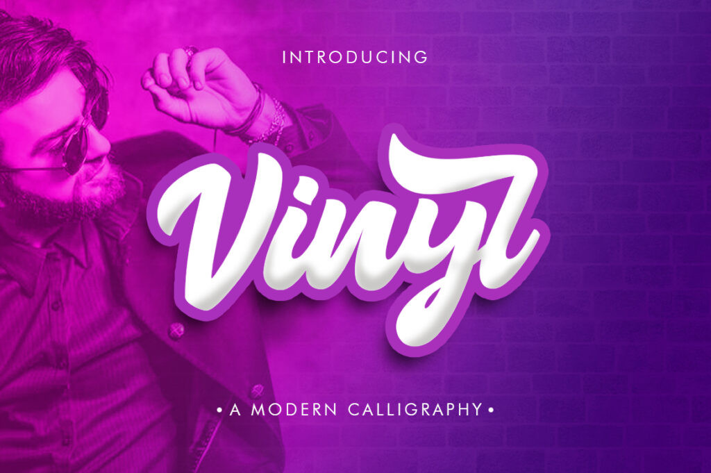
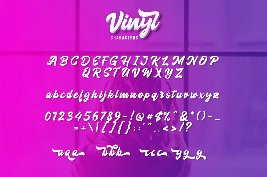
Despite its straightforward name, Vinyl Font clearly understands the requirements of physical production.
Its bold script construction prioritizes open counters, thick downstrokes, and uncomplicated joins—all characteristics that simplify cutting and improve durability.
That's something I always appreciate.
Typography intended for manufacturing shouldn't force designers into unnecessary cleanup before production.
Vinyl Font avoids that issue by relying on predictable geometry instead of fragile decorative details.
Visually, the personality leans slightly retro.
The rounded terminals and rhythmic baseline create an approachable tone that works well for decals, retail graphics, vehicle lettering, product labels, and outdoor signage.
Designer's Perspective
One thing I particularly like is its confidence.
The font doesn't rely on excessive flourishes to attract attention.
Instead, it uses proportion, weight, and spacing to create impact.
Those qualities generally give a typeface much greater longevity inside a brand system.
For large-format vinyl graphics, it's one of the strongest performers in this collection.
25. Galistan Font
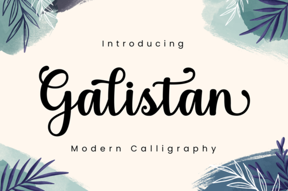
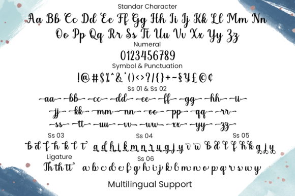
Galistan sits comfortably between traditional calligraphy and modern branding.
Its sturdy loops, moderate contrast, and carefully balanced spacing produce a handwritten style that feels elegant without becoming delicate.
The swashes are present, but they're controlled.
That restraint makes the font much easier to integrate into complete visual identities rather than limiting it to invitations or decorative headlines.
From a production perspective, the generous counters and thicker stems improve cut quality while reducing fragile internal details.
The PUA-encoded alternates also simplify customization for designers working inside Cricut Design Space or similar software.
Designer's Perspective
I see Galistan performing particularly well for artisan products, boutique retail packaging, wedding favors, and handcrafted branding.
Typography should support recognition over time.
Galistan feels refined enough to remain relevant long after current handwritten trends begin to fade.
26. Vinyl Vibes Font
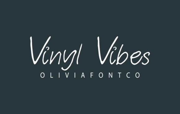
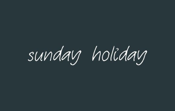
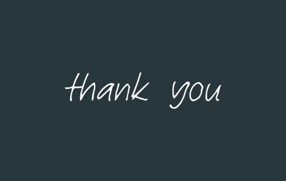
Vinyl Vibes closes this collection with a softer, more relaxed personality.
Unlike dramatic signature scripts, it relies on generous spacing and moderate contrast to create warmth through readability rather than ornament.
That's one of its strongest qualities.
The airy construction prevents letters from feeling crowded, making headlines noticeably easier to read across both digital and physical applications.
For vinyl production, the separated letterforms also reduce tiny interior islands that often complicate weeding.
The alternate characters provide enough flexibility to personalize names, logos, and short phrases without disrupting the natural rhythm of the typeface.
Designer's Perspective
Vinyl Vibes feels particularly appropriate for wedding branding, boutique packaging, lifestyle businesses, and seasonal campaigns.
It isn't the boldest script in this roundup, but it may be one of the easiest to integrate into a broader visual identity.
The calm rhythm, balanced spacing, and approachable personality give it a versatility that's sometimes missing from more decorative handwritten fonts.
Read More: While vinyl sticker labels are fantastic for adding a personal touch to items, choosing the right handwritten font can also significantly elevate your overall branding and appeal for Product Packaging.
Why Choosing the Right Handwritten Font Matters
Typography usually has a bigger impact on production than many people realize.
Unlike digital graphics, vinyl designs have physical limitations. Every enclosed counter, sharp corner, and ultra-thin connector becomes something your cutting machine has to reproduce accurately.
When I prepare branding systems that include packaging, decals, or storefront graphics, I usually evaluate handwritten fonts using several criteria:
- readability at smaller sizes
- consistency of stroke weight
- openness of counters
- natural kerning
- scalability
- visual balance
- ease of weeding
- long-term branding flexibility
A typeface can completely change the personality of a logo without changing any other design element.
Likewise, a poor font choice can make even an excellent logo feel amateur once it's printed or cut.
Which Handwritten Font Should You Choose for Vinyl?
Choose Tingler Duo when you want a complete script-and-companion system, Handmade with Love for an approachable artisan brand, and Vinyl Font when bold, dependable cutting matters most. Luscious Lemon works well for cheerful product labels and signage, while Noteflow is the quieter choice when you need handwritten warmth without a heavily decorative look.
Choosing the best handwritten font for vinyl isn't simply about finding the most beautiful lettering.
In my experience, the strongest typefaces are the ones that continue to perform once they leave the screen.
A font may look impressive inside a mockup but struggle after it's reduced for a sticker label, cut from adhesive vinyl, or applied to textured packaging. That's why I pay close attention to details like counter size, stroke consistency, kerning, and overall rhythm before recommending any handwritten typeface.
Across this collection, a few patterns consistently stand out.
Fonts with generous counters generally weed faster.
Moderate stroke contrast produces more reliable cuts.
Balanced spacing improves readability across both print and digital branding.
And perhaps most importantly, the most effective handwritten fonts don't rely on excessive decoration to create personality.
Strong typography usually feels effortless, which is why it's often overlooked.
Whether you're designing product labels, wedding decals, boutique packaging, storefront graphics, or Cricut projects, selecting a typeface that balances character with usability will almost always produce stronger results than choosing the most elaborate script available.
Typography isn't just decoration.
It's one of the most important tools we have for shaping how people perceive a brand.
Frequently Asked Questions
What are the best handwritten fonts for vinyl sticker labels?
The best handwritten fonts for vinyl combine visual personality with practical letter construction. Look for typefaces that feature open counters, consistent stroke widths, and balanced spacing, as these characteristics produce cleaner cuts and reduce weeding time. Fonts such as u003cstrongu003eTingler Duou003c/strongu003e, u003cstrongu003eHandmade with Loveu003c/strongu003e, u003cstrongu003eVinyl Fontu003c/strongu003e, u003cstrongu003eLuscious Lemonu003c/strongu003e, and u003cstrongu003eNoteflowu003c/strongu003e stand out because they remain readable while performing reliably on Cricut, Silhouette, and other vinyl cutting machines.
What makes a handwritten font easy to cut with Cricut or Silhouette?
A vinyl-friendly handwritten font avoids extremely thin hairlines, overly intricate swashes, and tiny enclosed shapes that can tear or lift during weeding. From a typography perspective, generous counters, moderate stroke contrast, and natural kerning create stronger cut paths. Before producing a full batch of decals or sticker labels, it's always worth testing a small sample at the intended size to confirm the font performs well with your specific vinyl material.
Can handwritten fonts be used for professional branding?
Absolutely—but choosing the right style is important. A handwritten typeface can add warmth, authenticity, and personality to a visual identity when paired with clean supporting typography. I generally recommend using handwritten fonts for logos, product names, or display headlines while relying on a readable serif or sans-serif for body copy. This creates a stronger typographic hierarchy and keeps the overall brand system consistent across websites, packaging, and printed materials.
Which handwritten font style works best for product labels?
For product labels, readability should always come before decoration. Monoline scripts, rounded handwritten fonts, and brush styles with open letterforms usually perform better than highly ornamental calligraphy. Fonts with balanced spacing and clear letter shapes remain legible on small packaging while also producing cleaner vinyl cuts, making them a practical choice for handmade goods, cosmetics, candles, food packaging, and boutique products.
How do I choose the right handwritten font for a vinyl project?
Start by thinking about the personality you want your design to communicate. Soft handwritten fonts create a friendly, approachable feel, while bold brush scripts project confidence and energy. After narrowing your options, evaluate the technical details: check the spacing, internal counters, stroke consistency, and scalability. A font that looks attractive in a mockup should also remain readable after cutting, transferring, and applying it to the final surface. The most successful vinyl typography balances visual character with long-term usability across both digital and physical branding.
Follow Us