

ℹ️ Affiliate Disclosure: This article may contain affiliate links. We may earn a commission at no extra cost to you. Thanks for your support! ❤️
Halloween Fonts for Stickers and Labels That Stay Readable
The best Halloween fonts for stickers and product labels stay readable at small sizes while giving packaging a clear seasonal personality. I looked for typefaces that can handle treat-bag seals, candle labels, bakery stickers, product tags, shipping inserts, and limited-edition packaging without turning every word into an illegible tangle.
This list includes cute ghosts, chunky pumpkins, distressed horror lettering, vintage witch styles, and useful dingbat fonts.
Best Halloween Fonts for Stickers and Labels
1. Halloween

Halloween is a decorative display font for colorful sticker headlines, seasonal product names, and short packaging phrases. Its themed shapes create an immediate October mood, making it useful when the typography needs to carry most of the design without a separate illustration.
I like this one for medium or large stickers where its decorative details have room to breathe. The black version offers a more practical option for cutting machines and single-color printing, but I would pair it with a plain sans serif for ingredients, scents, sizes, and other small information.
Best for: treat-bag stickers, candle lids, seasonal package fronts
Key features: decorative characters, color and black presentation, strong Halloween theme
2. Hellaween


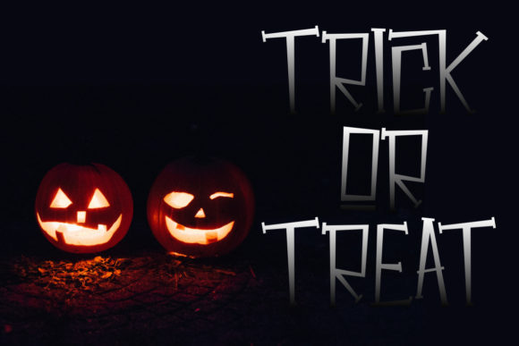
Hellaween is a chunky slab serif display font that suits bold product names and highly legible die-cut stickers. Its sturdy, cartoon-like letterforms have enough Halloween character to feel seasonal while retaining a comparatively simple structure.
This is my pick for makers who need one font to span candy packaging, tumblers, apparel tags, and shipping seals. The wide letters may require careful tracking on narrow labels, but they should remain easier to recognize than thin scripts or heavily distressed horror faces.
Best for: product-name stickers, candy labels, bold package seals
Key features: chunky slab serifs, cartoon styling, clear headline shapes
3. The Mummy Returns
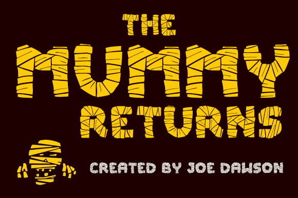
The Mummy Returns is a novelty display font with letterforms inspired by wrapped Egyptian mummies. It gives food labels, party favors, and character stickers a recognizable theme without relying on generic pumpkins or dripping blood.
I would use it for short names such as “Mummy Mix” or “Wrapped Treats,” where the concept can be understood instantly. The textured construction is less appropriate for tiny compliance text, and long words may become visually busy when squeezed onto narrow bottle labels.
Best for: snack labels, party favors, mummy-themed sticker packs
Key features: wrapped letter details, novelty silhouette, themed headline style
4. Halloween Party
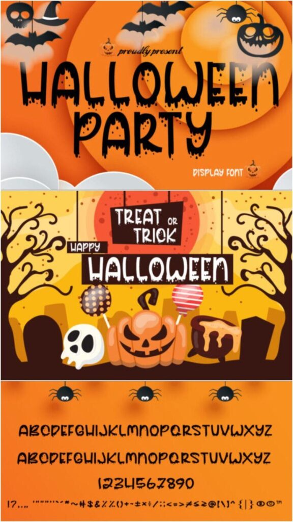
Halloween Party is a dripping display font for horror-forward stickers, party packaging, and theatrical product labels. Its liquid-looking edges create a strong visual cue for fake blood, slime, poison, or monster-themed collections.
My take is that this font is strongest as a single dramatic line rather than a complete label system. Use it for the flavor, scent, or collection name, then set supporting details in a clean typeface so customers can scan the package quickly.
Best for: horror candles, slime products, haunted-party favors
Key features: dripping forms, high-impact headline style, theatrical horror mood
5. Mitoos Halloween

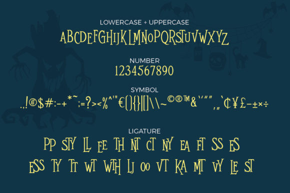
Mitoos Halloween is a cheerful seasonal display font for cute product stickers and lighthearted October packaging. Its decorative personality fits businesses that want a festive look without making their products feel gruesome or frightening.
I would consider it for classroom treats, children’s accessories, bakery boxes, and family event favors. The expressive shapes deserve generous spacing, particularly on curved jar labels, and I would keep the main wording short to prevent the design from feeling crowded.
Best for: kids’ treats, bakery stickers, family party labels
Key features: friendly mood, decorative shapes, approachable seasonal styling
6. Creepyon


Creepyon is a jagged horror display font designed for bold warnings, scary collection names, and dramatic sticker headlines. The irregular, blood-like character details create a more aggressive look than the cute and cartoon fonts in this roundup.
I like it for black, white, and red label systems where typography provides the main contrast. It may be excessive for artisan products with a soft or premium identity, and its rough edges should be checked carefully before printing at small dimensions.
Best for: warning stickers, horror merchandise, novelty drink labels
Key features: jagged edges, distressed appearance, forceful horror personality
7. Ghost Walker
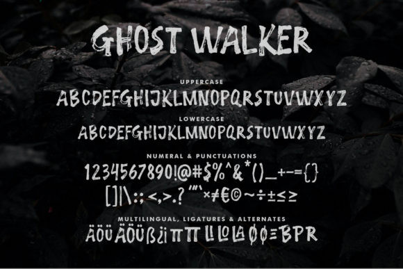
Ghost Walker is a quirky decorative font for playful brand stickers, Halloween stationery, and casually spooky packaging. Its unusual character shapes bring personality to short words without committing to a traditional gothic or blood-drip aesthetic.
I would use this for handmade shops that already have an informal illustration style. It can give a plain circular sticker more movement, although its quirky details may compete with complex artwork, so I would pair it with simple ghosts, stars, or a single border.
Best for: stationery seals, boutique stickers, illustrated package labels
Key features: quirky forms, lively rhythm, casual spooky character
8. The Funny Ghost

The Funny Ghost is a cartoon display font for children’s treat labels, school events, and friendly ghost sticker collections. Curled stroke endings give the letters a whimsical finish that feels mischievous rather than frightening.
This would be one of my first picks for products aimed at younger children because the theme remains obvious without looking harsh. The decorative curls could soften when printed very small, so use a heavier size and avoid squeezing too many characters into a miniature label.
Best for: classroom candy, kids’ party favors, ghost sticker sheets
Key features: cartoon lettering, curled terminals, friendly spooky tone
9. Spooky Webbie


Spooky Webbie is a cobweb-decorated display font for spider-themed labels, apparel tags, and statement stickers. The web details make the Halloween connection explicit, which can reduce the need for extra corner graphics or background illustrations.
I would reserve it for large product names and front-facing seals because thin web lines are vulnerable to filling in or disappearing. It should be particularly effective in high-contrast one-color designs, provided the final print process can reproduce its finer internal spaces.
Best for: spider products, large package seals, cobweb sticker designs
Key features: integrated webs, decorative letterforms, strong monochrome potential
10. Cute Ghost
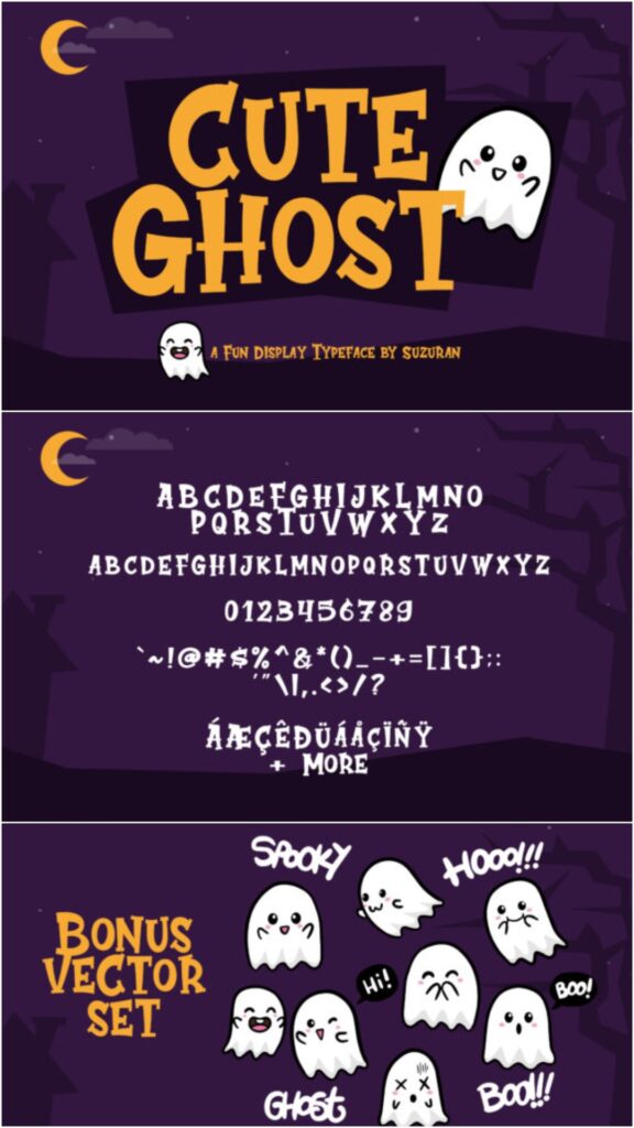
Cute Ghost is a playful Halloween display font for kawaii stickers, children’s accessories, and friendly seasonal product labels. Its lighthearted character makes it a natural fit for pastel palettes, smiling ghost illustrations, and non-scary Halloween collections.
I like this for makers whose existing brand is cheerful, feminine, or child-focused. Because decorative cute fonts can lose clarity in long text, I would use it only for the main product name and let a simple rounded sans serif handle the practical information.
Best for: kawaii stickers, children’s apparel tags, pastel Halloween packaging
Key features: cute theme, lively display shapes, friendly visual tone
11. Scary Zombie
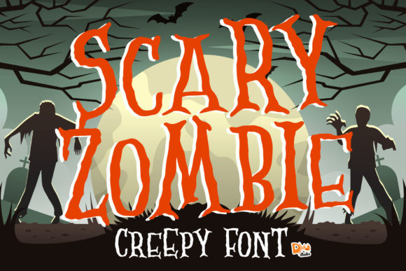

Scary Zombie is an irregular display font for comic-horror stickers, zombie party labels, and deliberately messy package headlines. Its uneven strokes create a handmade monster aesthetic that can complement slime, bite marks, torn paper, and distressed backgrounds.
I would choose it when polished symmetry would feel too tame for the product concept. The uncontrolled shapes are part of its appeal, but they also make alignment more important; placing the type on a simple banner or solid panel can keep the finished label organized.
Best for: zombie treats, comic horror stickers, distressed packaging
Key features: irregular strokes, handmade energy, monster-inspired appearance
12. Afterlife Party


Afterlife Party is a festive display font for party favor stickers, event packaging, and spirited Halloween merchandise. It sits between scary and celebratory, making it useful when the label needs to suggest costumes and nightlife rather than monsters or children’s cartoons.
I would use it for invitation seals, cocktail-related graphics, and temporary product collections with playful copy. Its personality may be too informal for luxury packaging, but it can give affordable party products a distinct seasonal voice without requiring an elaborate layout.
Best for: party favors, cocktail labels, event sticker packs
Key features: festive mood, decorative display style, versatile party theme
13. Crusterous


Crusterous is a chunky display font for large jar labels, shipping stickers, banners, and bold Halloween package fronts. Its substantial letter shapes can support high-contrast printing and should hold their presence next to pumpkins, skulls, or monster illustrations.
This is one of the more practical options for labels viewed from a shelf or market table. The bulkier construction can consume horizontal space, so it favors short product names; condensed supporting text will help preserve a clear hierarchy around it.
Best for: jar fronts, market packaging, oversized brand stickers
Key features: chunky construction, bold silhouette, strong distance readability
14. Cadabra

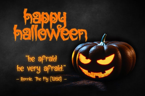
Cadabra is a magic-themed display font for potion labels, witchcraft stickers, and mystical seasonal packaging. Its decorative identity can communicate spells and enchantment without pushing the design fully into gruesome horror.
I like it for products with imaginative names such as elixirs, charms, moonlit candles, or magical bath salts. It should be treated as a focal font rather than body copy, and a restrained border will let the lettering feel special without making the label overly ornate.
Best for: potion bottles, witchy candles, magical sticker collections
Key features: mystical styling, decorative headline forms, versatile fantasy mood
15. Spicy Fire

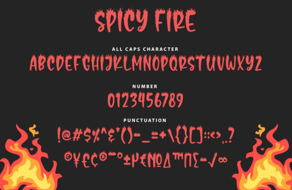
Spicy Fire is a flame-shaped display font for hot sauce labels, spicy snacks, candle stickers, and infernal Halloween themes. The burning letter details connect naturally with heat, danger, dragons, devils, and cauldron-based product concepts.
I would use it beyond Halloween when a product genuinely centers on heat, which gives it more year-round value than a pumpkin-specific font. The flames create a busy upper silhouette, so leave generous space above the text and avoid placing it against detailed artwork.
Best for: hot sauce, spicy snacks, fire-themed candles
Key features: flame details, energetic silhouette, seasonal and year-round uses
16. Beastman
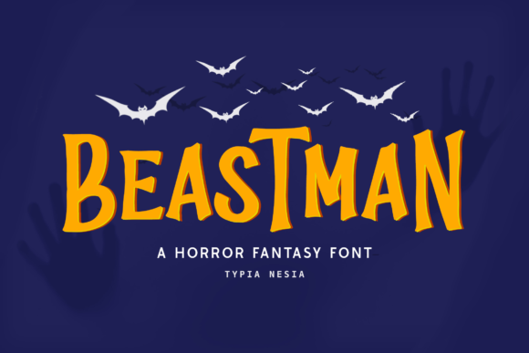
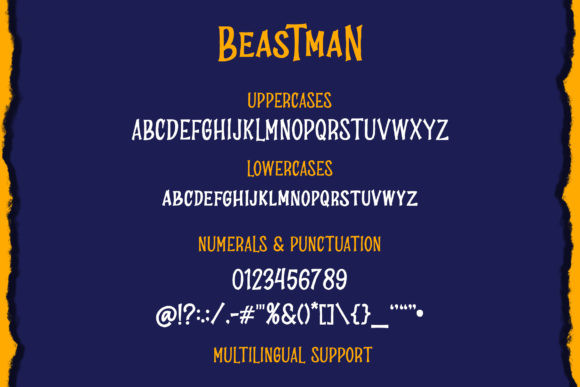
Beastman is a fantasy-inflected display font for monster merchandise, creature stickers, and adventurous Halloween labels. It offers a magical or beastly tone without depending on the familiar dripping-blood treatment used by many horror fonts.
I would reach for this when a product needs to feel bold and supernatural but not necessarily graphic. It can bridge Halloween and fantasy collections, although its stylized personality may be less convincing on delicate handmade goods or minimalist packaging.
Best for: monster stickers, fantasy products, creature-themed packaging
Key features: fantasy influence, bold display structure, broader seasonal potential
17. Pumpkinos
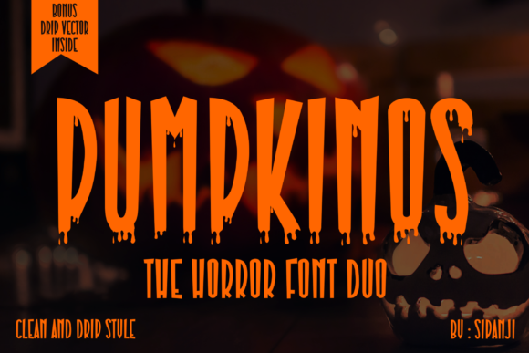
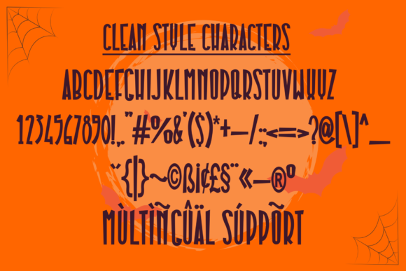
Pumpkinos is a pumpkin-themed Halloween display font for fall product labels, jack-o’-lantern stickers, and seasonal food packaging. Its subject is immediately recognizable, which makes it especially useful for pumpkin spice, pumpkin bread, patch events, and carving-party products.
I like it for businesses that need a clear autumn-to-Halloween crossover. The thematic details can limit its use after the season, and I would avoid combining it with multiple pumpkin illustrations because the repeated motif may make the layout feel overly literal.
Best for: pumpkin foods, fall candles, patch-event stickers
Key features: pumpkin styling, decorative alternates, strong seasonal recognition
18. Spooky Halloween


Spooky Halloween is a scary decorative font for October sticker sets, party labels, and prominent seasonal product names. Its unusual glyphs and swashes give designers more ways to vary repeated words across a coordinated collection.
I would use the extra characters selectively, particularly on small stickers where too many flourishes can interfere with recognition. The font is better suited to short emotional phrases and display copy than directions, ingredients, or other text that customers must read quickly.
Best for: October stickers, party packaging, seasonal headline sets
Key features: decorative horror forms, PUA-encoded extras, swash potential
19. Crimson Horror
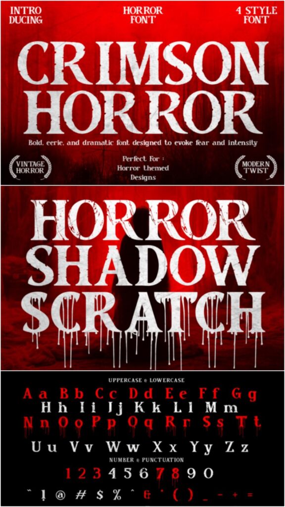
Crimson Horror is a sharp, textured serif family for premium horror packaging, candle labels, bookish stickers, and dramatic specialty products. Its vintage-influenced letterforms feel more sophisticated than a cartoon font while maintaining an unsettling edge.
This is my pick for an adult audience and products that need visual weight without looking playful. The multiple styles provide flexibility for a coordinated range, but the distress and sharp contours should be simplified or enlarged when used on small thermal labels.
Best for: candles, gothic cosmetics, premium horror goods
Key features: four styles, sharp serif forms, distressed vintage character
20. Halloween Color Font

Halloween Color Font is a detailed decorative typeface for full-color stickers, school products, and illustrated package fronts. It includes a colorful presentation for digital or printed projects plus a black version intended to remain usable with common cutting workflows.
I would choose it for sticker sheets or labels produced with a color printer, where the internal details can become part of the artwork. The black version is more flexible for vinyl, but intricate character construction still calls for a test cut before committing expensive material.
Best for: full-color sticker sheets, school labels, vinyl package decals
Key features: colored characters, black cutting version, detailed seasonal artwork
21. Scary Halloween


Scary Halloween is a clean handwritten font for casual product labels, handmade shop stickers, and relaxed October messaging. An included ornament dingbats font adds coordinating decorative elements that can help build borders, icons, or small sticker accents.
I like the combination for sellers who need both lettering and simple visual elements from one download. The handwriting is less theatrical than many choices here, which improves versatility, though it may need an illustration or seasonal color palette to make the Halloween theme unmistakable.
Best for: handmade labels, casual thank-you stickers, coordinated ornaments
Key features: clean handwriting, ornament dingbats, informal visual tone
22. Wonky Halloween

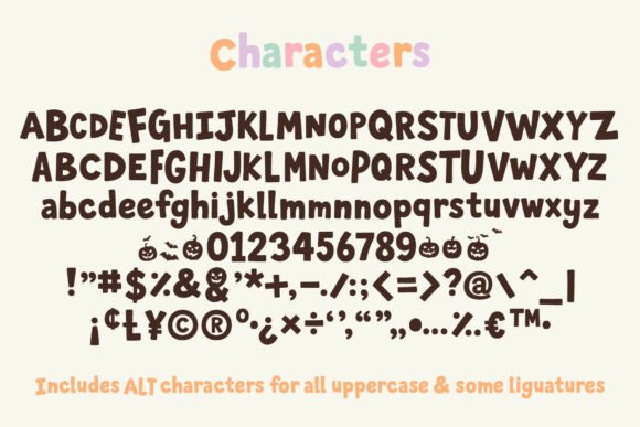
Wonky Halloween is a hand-drawn display font for playful craft labels, trick-or-treat stickers, and intentionally imperfect packaging. Pumpkin and bat dingbats add matching icons, making it easier to create a small product family with consistent typography and graphics.
I would use it for homemade baked goods, children’s crafts, and small-batch items where slight irregularity supports the brand story. The loose shapes are less suited to formal luxury products, but they can make plain kraft labels feel warmer and more personal.
Best for: kraft labels, kids’ crafts, homemade treat packaging
Key features: hand-drawn letters, pumpkin dingbats, bat dingbats
23. Scary Halloween Trio

Scary Halloween Trio is a coordinated font set containing serif, sans serif, and dingbat styles for complete sticker and label systems. The three-part structure lets a designer create hierarchy without introducing unrelated typefaces or mismatched seasonal graphics.
This is my most flexible pick for a collection with multiple scents, flavors, or package sizes. I would use the decorative style for the collection name, the simpler alphabet for product details, and the dingbats for small dividers or seals rather than placing every style on one label.
Best for: coordinated collections, multipanel packaging, full sticker systems
Key features: serif font, sans serif font, matching dingbats
24. Super Horror
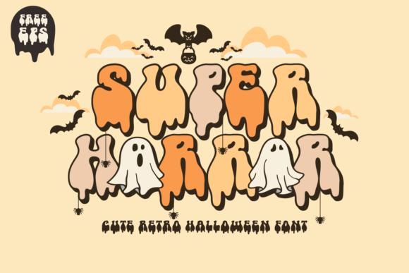
Super Horror is a retro, groovy horror font for nostalgic Halloween branding, apparel stickers, and playful merchandise labels. It blends eerie styling with rounded vintage energy, giving designers an alternative to sharp gothic lettering and distressed monster fonts.
I would use it for 1960s- or 1970s-inspired palettes, cute horror products, and bold social packaging. The strong stylistic reference can overpower a neutral brand, so it makes the most sense for a dedicated seasonal collection rather than a subtle Halloween variation.
Best for: retro stickers, cute horror merchandise, nostalgic packaging
Key features: groovy shapes, rounded horror styling, prominent display personality
25. Halloween Witch

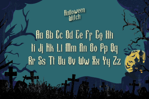

Halloween Witch is a vintage spooky display font for apothecary labels, potion bottles, occult stickers, and dramatic product names. Its theatrical shapes can support old-paper textures, engraved illustrations, moons, ravens, and traditional witch imagery.
I like this for labels that need to feel aged or mysterious rather than cute. It is visually assertive, so a restrained palette and one supporting typeface will usually produce a stronger result than layering it with several other decorative elements.
Best for: apothecary labels, potion packaging, vintage witch stickers
Key features: vintage influence, dramatic shapes, broad software compatibility
26. Night Witch Halloween
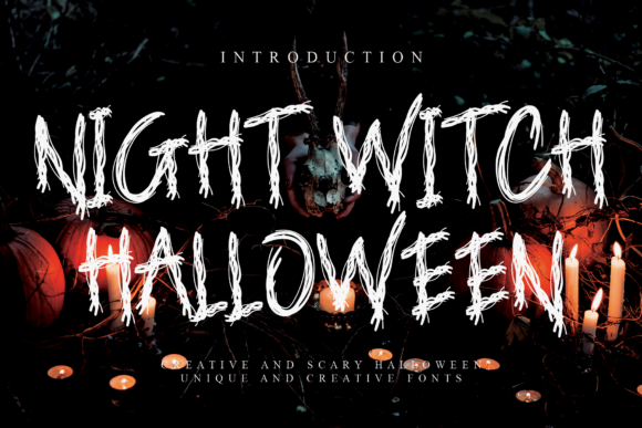
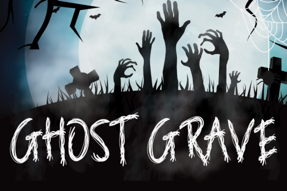
Night Witch Halloween is a sinister display font for dark gothic products, horror book stickers, spooky game labels, and moody candle packaging. Its sharper, shadowy personality is better aligned with adult merchandise than cheerful trick-or-treat designs.
I would pair it with black, deep purple, antique cream, or metallic details for a focused night-witch concept. The dramatic silhouette needs breathing room, and it may lose much of its character if compressed into a long scent name or narrow vertical label.
Best for: gothic candles, dark fantasy products, horror media stickers
Key features: sinister appearance, strong display shapes, adult-oriented mood
27. Pixelart Halloween
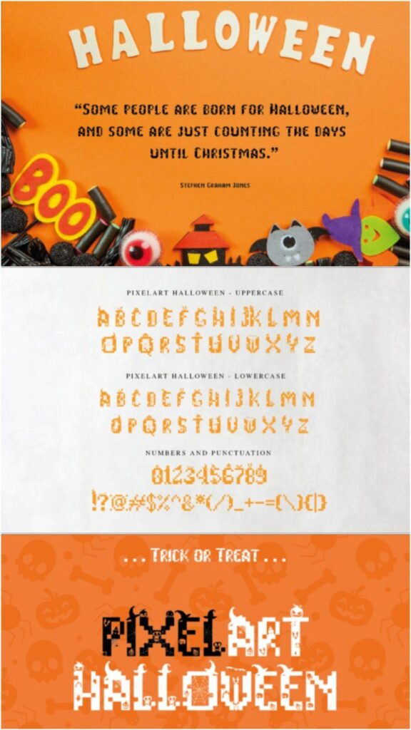
Pixelart Halloween is a decorative pixel font for gaming stickers, arcade-inspired labels, and digital-themed Halloween products. It combines blocky pixel construction with scary details, giving retro game packaging an immediate seasonal identity.
I would use it for gamer gifts, controller decals, party badges, and small products built around an 8-bit visual style. Pixel fonts can become difficult when scaled between arbitrary sizes, so preview the design at the exact intended dimensions to keep edges crisp.
Best for: gaming stickers, arcade party labels, retro digital products
Key features: pixel construction, horror theme, PUA-encoded extra characters
28. Freaky Halloween

Freaky Halloween is a dingbats font for icon sticker sheets, package decorations, and small Halloween symbols. Instead of supplying a conventional alphabet, it provides quirky graphic characters that can be combined with a readable brand font.
I like dingbats for building matching seals, dividers, pattern strips, and bonus stickers without sourcing a separate illustration pack. The limitation is straightforward: it cannot carry the label’s written message by itself, so plan to pair it with one of the simpler headline fonts above.
Best for: icon sheets, decorative seals, package accent graphics
Key features: Halloween symbols, scalable font workflow, coordinated graphic elements
How I Picked These Halloween Label Fonts
I favored fonts with a strong silhouette, recognizable Halloween details, and enough visual clarity for short product names. The list deliberately mixes attention-grabbing headline faces with friendlier options for children’s products and icon fonts that can supply coordinating sticker graphics.
My top pick is Hellaween for bold, readable product names, while Scary Halloween Trio offers the most flexible system for coordinated labels and stickers. Cute Ghost and The Funny Ghost suit family-friendly products, and Crimson Horror is better for dramatic candle, cosmetic, or specialty-food packaging. For small labels, prioritize simpler letterforms and reserve highly decorative fonts for short headlines.
Quick Picks
| Font | Best for | Format or type |
|---|---|---|
| Halloween | Colorful sticker headlines | Decorative display font |
| Hellaween | Bold product names | Slab serif display font |
| The Mummy Returns | Novelty food labels | Wrapped display font |
| Halloween Party | Horror-themed packaging | Dripping display font |
| Mitoos Halloween | Cute seasonal products | Decorative display font |
| Creepyon | High-impact warning labels | Horror display font |
| Ghost Walker | Quirky brand stickers | Decorative display font |
| The Funny Ghost | Kids’ treat packaging | Cartoon display font |
| Spooky Webbie | Cobweb-themed labels | Decorative display font |
| Cute Ghost | Friendly Halloween stickers | Cute display font |
| Scary Zombie | Comic horror products | Irregular display font |
| Afterlife Party | Party favor stickers | Festive display font |
| Crusterous | Large jar labels | Chunky display font |
| Cadabra | Magic-themed packaging | Decorative display font |
| Spicy Fire | Hot sauce labels | Flame display font |
| Beastman | Monster merchandise | Fantasy display font |
| Pumpkinos | Pumpkin product labels | Halloween display font |
| Spooky Halloween | October sticker sets | Decorative font |
| Crimson Horror | Premium horror packaging | Textured serif family |
| Halloween Color Font | Full-color stickers | Color and black font |
| Scary Halloween | Casual handmade labels | Handwritten font and dingbats |
| Wonky Halloween | Playful craft labels | Hand-drawn font and dingbats |
| Scary Halloween Trio | Coordinated product ranges | Serif, sans serif, and dingbats |
| Super Horror | Retro Halloween branding | Groovy horror font |
| Halloween Witch | Vintage apothecary labels | Spooky display font |
| Night Witch Halloween | Dark gothic products | Sinister display font |
| Pixelart Halloween | Gaming stickers | Pixel decorative font |
| Freaky Halloween | Icon sticker sheets | Dingbats font |
How I Picked These
I compared these options by how well they fit the article’s intended use, including readability, visual character, practical versatility, distinctive features, and how clearly each choice differs from the rest of the roundup. I prioritized options that solve a specific design need rather than simply adding more similar-looking products.
How to Choose a Halloween Font for Product Packaging
Start with the smallest label in your product range, not the largest. A font that remains recognizable on a one-inch seal will usually scale up successfully, while a highly detailed font selected for a box front may fail on lip balm tubes, candle lids, or ingredient stickers.
Match the type style to the customer and product category. Rounded ghosts and wonky lettering suit children’s treats, while sharp serifs and vintage witch fonts fit gothic candles, books, cosmetics, and apothecary concepts. Flame and pixel fonts are strongest when their visual theme also connects with the product.
Use decorative lettering for short display text and a plain companion font for supporting information. Product weights, warnings, ingredients, scent notes, website addresses, and care instructions should not be forced into an elaborate Halloween typeface simply to maintain the theme.
Printing Halloween Stickers and Labels
- Print a sample at actual size before producing a full sheet or ordering professional labels.
- Check that distressed gaps, spiderwebs, drips, and thin flourishes remain visible after printing.
- Use strong contrast between the lettering and background, especially on kraft paper or dark packaging.
- Add a cut-line margin around die-cut stickers so decorative letters do not sit too close to the edge.
- Confirm that every required character, numeral, symbol, and punctuation mark is included before building the final layout.
The most useful Halloween font is not always the most elaborate one. Hellaween, Crusterous, and Scary Halloween Trio provide stronger starting points for practical product systems, while Spooky Webbie, Halloween Party, and Pixelart Halloween are better reserved for memorable display moments.
Frequently Asked Questions
What is the best Halloween font for small product labels?
u003cstrongu003eA bold font with simple, open letterforms is usually best for small Halloween labels.u003c/strongu003e Hellaween, Crusterous, and the simpler style in Scary Halloween Trio are safer starting points because they offer substantial shapes that should remain recognizable after reduction. Decorative webs, drips, and textures can close up during printing, particularly on uncoated stock or inexpensive home printers. Set a sample product name at the final label size, print it at 100% scale, and evaluate it from normal viewing distance before finalizing the design.
Can I use two Halloween fonts on the same sticker?
u003cstrongu003eYes, but one font should lead while the other provides a clear supporting role.u003c/strongu003e A decorative Halloween display font can carry the product name, while a clean sans serif or serif handles the flavor, size, ingredients, website, or short descriptive line. Avoid pairing two highly decorative fonts with similar visual weight. Competing cobwebs, drips, flames, and distressed edges make a small sticker harder to scan. Scary Halloween Trio is useful because its coordinated styles already provide contrast without looking unrelated.
Which Halloween fonts are best for cute stickers?
u003cstrongu003eCute Ghost, The Funny Ghost, Mitoos Halloween, and Wonky Halloween are the strongest options here for friendly stickers.u003c/strongu003e Their rounded, cartoon, or hand-drawn qualities suit children’s treats, pastel ghost designs, classroom favors, and cheerful seasonal packaging. Color and illustration choices also determine how cute the finished product feels. Soft orange, lavender, mint, pink, and cream can shift a Halloween design away from horror, while smiling characters and ample white space keep decorative type from becoming visually heavy.
How large should Halloween lettering be on a product label?
u003cstrongu003eHalloween lettering should be large enough for its defining details to survive at the final printed size.u003c/strongu003e There is no single point size that suits every font, printer, and label, so judging a screen preview alone is unreliable. Print several versions at actual size and compare them on the physical container. Increase the size or choose a simpler font when counters fill in, cobweb lines disappear, or similar letters become difficult to distinguish. Readability should take priority over fitting an entire decorative phrase onto the label.
Follow Us