

ℹ️ Affiliate Disclosure: This article may contain affiliate links. We may earn a commission at no extra cost to you. Thanks for your support! ❤️
Best Halloween Witchy Fonts for Grimoires, Spells, and Magical Crafts
The best witchy fonts do more than add crooked letters or a few decorative bats. They establish the age, mood, and personality of a spellbook before anyone reads a single incantation.
A sharp display font can make a grimoire feel dangerous and forbidden. A loose handwritten script suggests hurried field notes from an apprentice witch. Rounded, whimsical lettering feels better suited to potion labels, party invitations, classroom crafts, or a cheerful Halloween journal.

I’ve selected 19 fonts from Creative Fabrica and grouped them by the job I think they handle best.
Quick Picks
- Best overall: Hello Witch
- Best for dark horror spellbooks: Night Witch Halloween
- Best polished fantasy option: Witch Magic by Joe Dawson
- Best handwritten notes: Handwriting Spell
- Best playful crafts: Witches Magic
How I Picked These
I compared these witchy fonts by display readability, magical character, suitability for covers and short headings, handwritten authenticity, decorative complexity, software compatibility, and how easily each style can be paired with a simpler font for longer spellbook text.
Best Witchy Fonts for Dark Spellbook Covers
1. Hello Witch
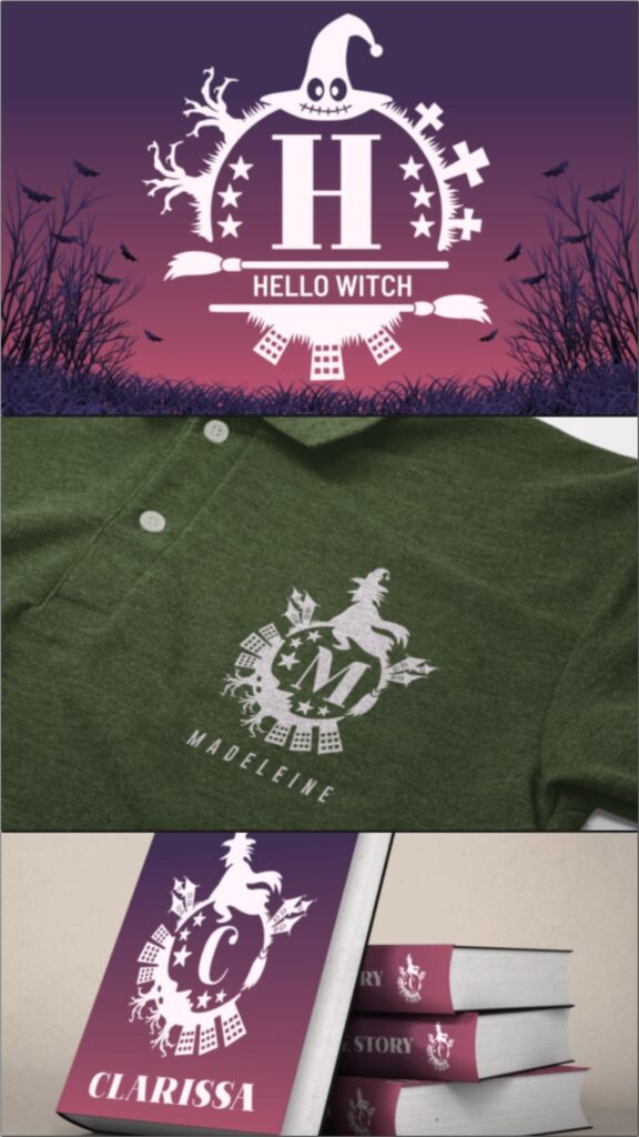
Hello Witch is my safest starting point for a decorative spellbook title. It has an unmistakably spooky personality, but the letter shapes remain substantial enough to carry a cover, sign, shirt graphic, or large chapter heading.
I would use it when the design needs to read as Halloween or witchcraft immediately. For a more restrained historical grimoire, however, the decorative details may feel too literal.
Best for: Spellbook covers, Halloween shirts, chapter openers
Key features: Decorative display style, bold silhouettes, free-font listing, Windows/Mac/Linux compatibility
2. The Witch
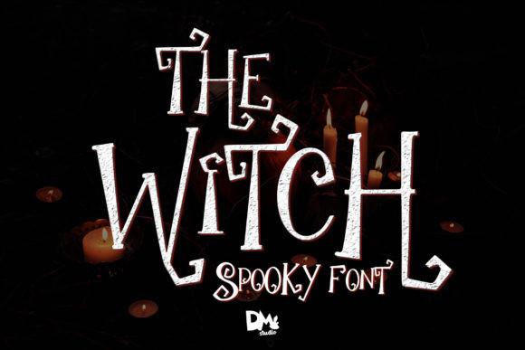
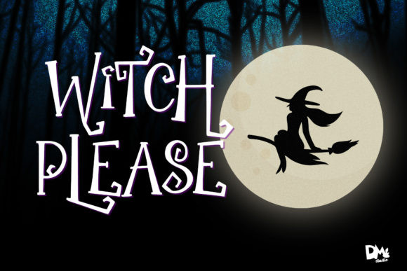
This version of The Witch has a handwritten structure that feels less like polished fantasy branding and more like lettering pulled from a personal Book of Shadows.
It could also work for short spells, section dividers, or illustrated quote pages. I would not use it for several paragraphs of body copy; the personality that makes it appealing at display size can become tiring in longer passages.
Best for: Book of Shadows titles, handwritten headings, quote pages
Key features: Handwritten script, spooky character, display-oriented strokes, broad desktop compatibility
3. Night Witch Halloween
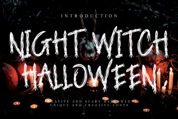
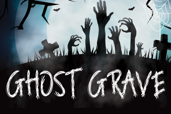
Night Witch Halloween leans darker and more sinister than most fonts on this list. Its display construction is better suited to forbidden grimoires, horror-fantasy covers, dark gaming graphics, or a villain’s spellbook than to cute Halloween crafts.
My take: this is a title font, not a supporting font. Give it space, keep the wording fairly short, and pair it with a quieter serif for subtitles or ingredient lists.
Best for: Dark fantasy covers, horror spellbooks, sinister chapter titles
Key features: Sinister display style, strong title presence, desktop compatibility, horror-oriented letterforms
4. Witch Magic
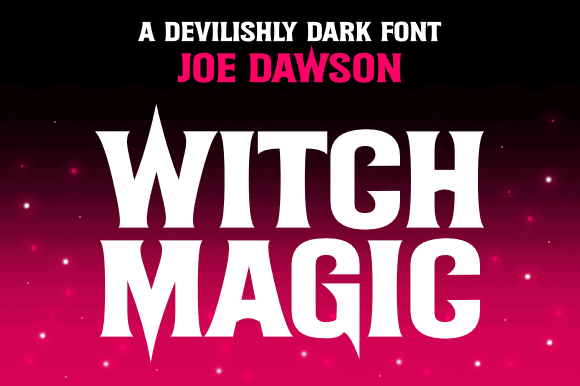
Witch Magic by Joe Dawson combines theatrical curves with a more polished fantasy tone. It feels appropriate for a commercially designed novel cover, magical invitation, themed poster, or branded collection of printable spell pages.
I would choose it over a rough horror font when the design needs mystery without gore.
Best for: Fantasy book covers, magical invitations, Cricut titles
Key features: Curved display forms, polished mystical tone, cutting-machine compatibility, 5.0 rating
5. The Witch
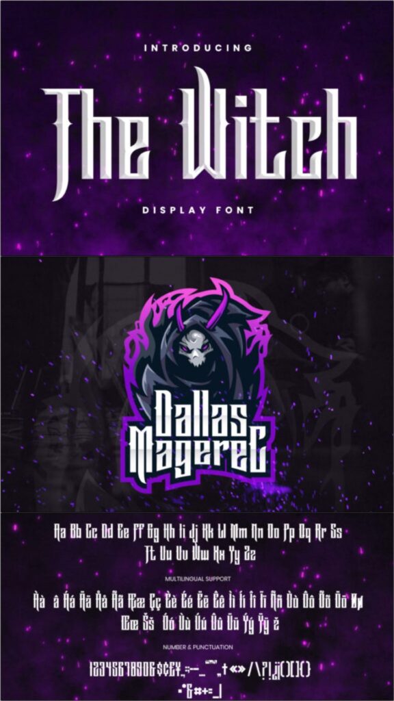
The Witch by ovoz.graphics is a bold, assertive display face. Compared with the handwritten version earlier in this list, this one feels more structured and better suited to a commanding title.
Because of its visual weight, keep secondary text lighter. A small sans serif or traditional book serif will create enough contrast.
Best for: Bold covers, labels, magical branding
Key features: Assertive display construction, heavy visual weight, Cricut support, desktop compatibility
Best Fonts for Handwritten Spells and Notes
6. Halloween Font
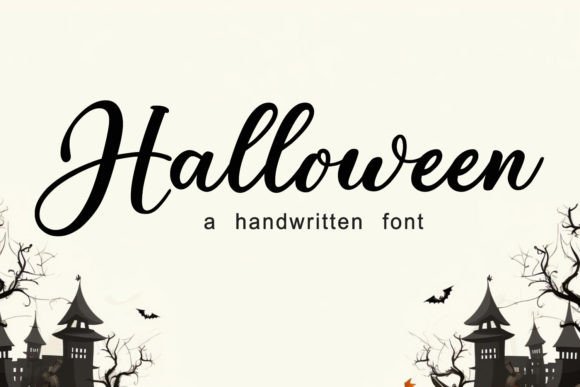
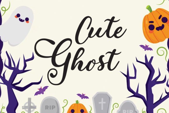
This Halloween script from Lisna.Craft is a useful middle ground between spooky lettering and friendly handwriting. The strokes feel energetic enough for a magical journal while remaining suitable for party signs, printable cards, and craft projects.
I would use it for short passages such as spell names, ingredient headings, page titles, or handwritten callouts. For actual spell instructions, pair it with a readable serif rather than setting an entire page in script.
Best for: Spell names, journal headings, Halloween cards
Key features: Handwritten script, playful spooky tone, strong review count, free-font listing
7. Spooky Spell
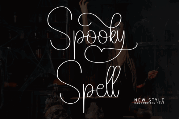
Spooky Spell is a script and handwritten font with a more illustrative, personality-driven feel. It suits pages meant to look expressive rather than historically authentic.
I would grab it for an apprentice witch’s notebook, magical recipe card, printable potion journal, or a scrapbook-style grimoire. The handwritten rhythm can add warmth to a page full of botanical illustrations, moons, crystals, or ingredient sketches.
Use it selectively. Scripts generally perform best for a few words at a time, especially when pages will be printed small.
Best for: Potion recipes, magical journals, scrapbook headings
Key features: Handwritten construction, informal rhythm, decorative display use, multiple specimen examples
8. Handwriting Spell
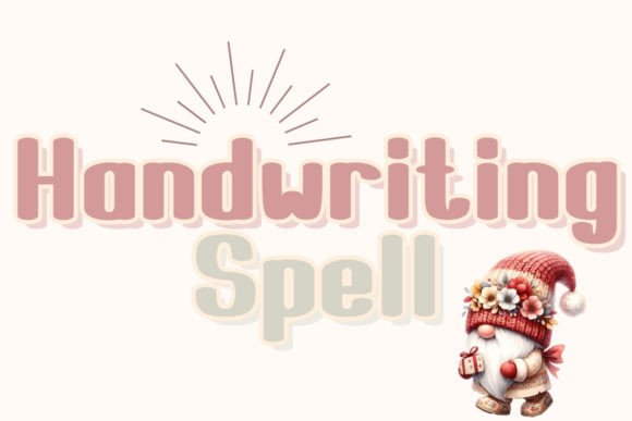
Handwriting Spell is the pick I would consider for a casual field-journal effect. It feels more personal than ceremonial, which can help a spellbook look used, annotated, and lived in.
The font is listed in Creative Fabrica’s free font collection. That makes it an approachable choice for testing a layout before committing to a larger font bundle.
Try it for marginal notes, ingredient substitutions, page numbers, brief warnings, and handwritten labels. Keep the main cover title in a stronger display face so the hierarchy stays clear.
Best for: Marginal notes, labels, field journals
Key features: Casual handwritten look, free-font listing, personal tone, display and annotation use
9. Witch
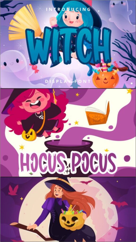
Witch by Brilian uses a brush-style handwritten construction. The irregular energy makes it suitable for expressive notes, spell names, magical quotes, or labels that should look drawn rather than typeset.
The product page lists 13 favorites and compatibility with Cricut, Silhouette, Windows, Mac, and Linux.
I like it for mixed-media layouts where clean typography would feel too polished. It could sit nicely beside ink splatters, rough paper textures, hand-drawn herbs, or charcoal illustrations.
Best for: Brush lettering, magical quotes, mixed-media pages
Key features: Brush display style, informal texture, Cricut compatibility, Silhouette compatibility
10. Under Your Spell
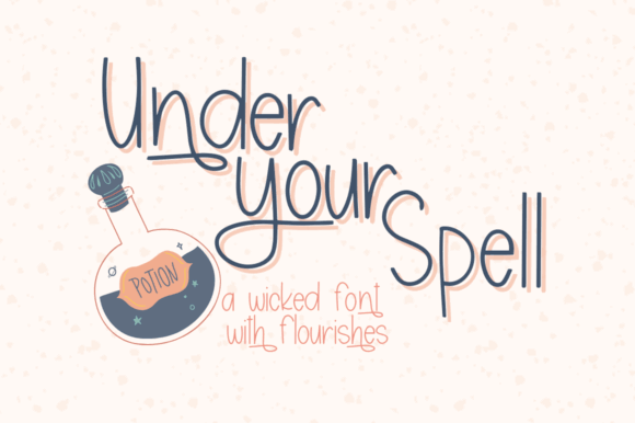
Under Your Spell is a flowing script option for designers who want enchantment rather than outright horror. It is a useful choice for romantic fantasy, moonlit invitations, magical wedding stationery, or elegant spellbook section titles.
I would pair it with a high-contrast serif or clean small caps. That combination keeps the script from carrying too much information while preserving its decorative effect.
This is also one of the better options for a spellbook with a softer, feminine, or celestial direction.
Best for: Romantic fantasy, celestial journals, elegant spell titles
Key features: Flowing script, decorative capitals, soft magical mood, multiple specimen styles
Best Playful Fonts for Potion Labels and Magical Crafts
11. Magic and Spell
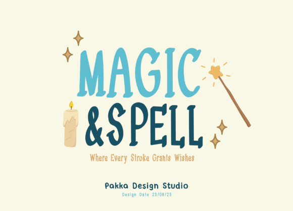
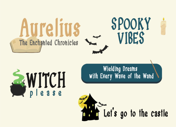
Magic and Spell has a whimsical, storybook-like appearance. It is better suited to playful fantasy than to a severe occult manuscript.
Because the shapes are highly expressive, use generous letter spacing and avoid shrinking the title too far.
Best for: Kids’ spellbooks, potion labels, party printables
Key features: Whimsical display lettering, fantasy tone, 50-plus favorites, prominent decorative shapes
12. Witches Magic
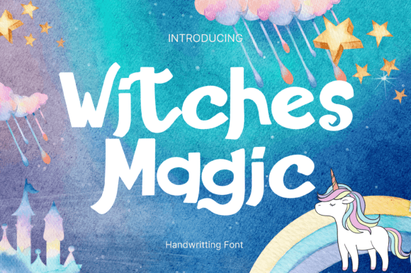
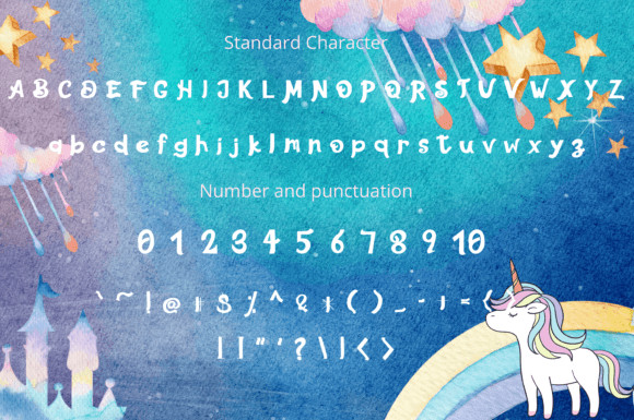
Witches Magic is cute and rounded rather than dark. It is a good fit for friendly witches, candy packaging, classroom décor, tote-bag graphics, and cheerful Halloween crafts.
I would skip it for an ancient grimoire or horror novel. For a child-friendly potion book or a pastel Halloween project, though, its softer personality makes much more sense than a jagged horror face.
Best for: Cute Halloween crafts, children’s designs, candy labels
Key features: Rounded display style, whimsical tone, Cricut support, Silhouette support
13. Witch Magic
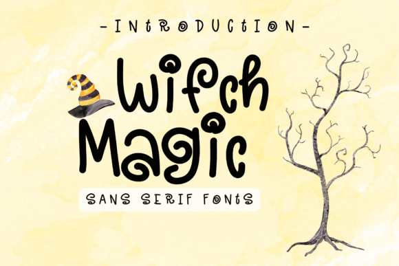
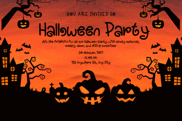
This Witch Magic font by Sirinart uses rounded strokes and curled details that create a friendly magical look. It has less menace and more charm, making it suitable for invitations, mugs, stickers, tote bags, and casual craft graphics.
I would choose it for designs that need to remain legible and approachable. It can also provide a useful contrast to detailed illustrations because the basic letter structure is simpler than a script.
Best for: Stickers, mugs, invitations, friendly spellbooks
Key features: Rounded sans-serif base, curled terminals, 5.0 rating, approachable Halloween style
14. Halloween Witch
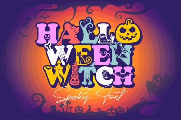
Halloween Witch uses seasonal details such as bats, spiders, and cobweb-inspired elements. It is one of the most literal Halloween fonts in the collection.
That makes it especially useful for party signage, treat-bag graphics, classroom activity sheets, and novelty potion labels. It requires less supporting artwork because the typography already carries much of the theme.
The tradeoff is versatility. Decorative characters can become visually busy, so I would avoid combining this font with an equally detailed background.
Best for: Party signs, novelty spellbooks, Halloween labels
Key features: Bat and spider details, cobweb motifs, decorative display style, strong seasonal identity
15. Magic
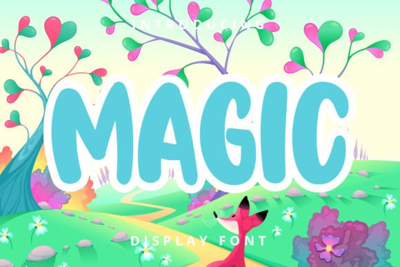
Magic by Planetz Studio is a cute, friendly display font rather than an ominous one. It is suitable for magical greeting cards, school projects, lighthearted craft designs, and younger audiences.
I would use it for a potion-making workbook, wizard birthday party, or illustrated book of beginner spells. For an adult dark-fantasy cover, it will probably feel too playful.
Best for: Beginner spellbooks, school crafts, greeting cards
Key features: Friendly display forms, 5.0 rating, Cricut support, Silhouette support
Best Decorative Fonts for Magical Page Accents
16. Magic
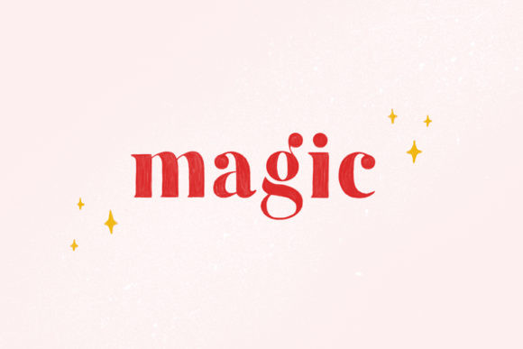
Magic by elvinova is an OpenType-SVG color font, making it one of the most visually distinctive options here. The format can contain color and gradient information directly inside the glyphs, rather than relying on a single flat text color.
That software limitation matters. OpenType-SVG support varies between applications, so check your design program before building an entire project around a color font. Adobe documents support for OpenType-SVG fonts in newer Photoshop releases, while the OpenType specification treats SVG as one of several possible color-font technologies.
Best for: Decorative initials, digital covers, magical logos
Key features: OpenType-SVG color format, gradient-capable glyphs, 300-plus favorites, not intended for Cricut
17. Bookaholic Spells
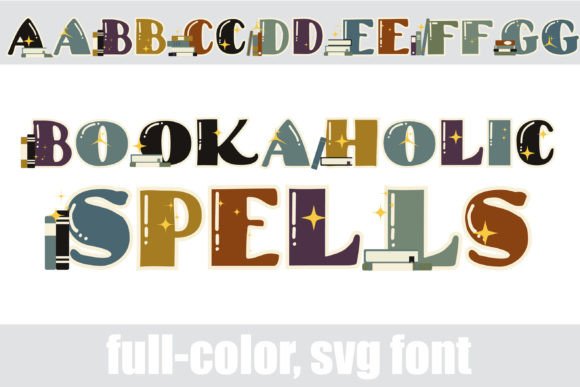
Bookaholic Spells is a full-color font featuring slab-serif lettering and illustrated magical books. That combination makes it less suitable for ordinary text but highly useful as a decorative alphabet or focal element.
I would use it for an initial letter, a short title, a reading-journal cover, library-themed witch artwork, or a printable book-club graphic.
Because each character contains detailed artwork, keep the lettering large. Tiny decorative glyphs can lose their visual impact when printed on labels or reduced to thumbnail size.
Best for: Reading journals, decorative initials, magical library art
Key features: Full-color glyphs, slab-serif foundation, book illustrations, display-only emphasis
18. Halloween
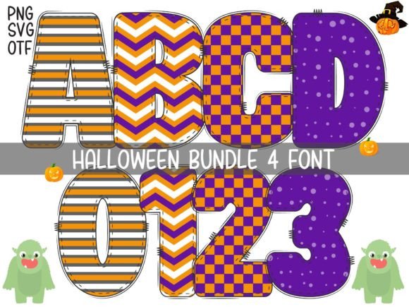
This Halloween font from Font Design Market is another color-font option. The glyphs contain detailed seasonal decoration, giving it an illustrated quality rather than the appearance of plain typed lettering.
I would use it for a single title, alphabet poster, sticker set, or decorative page opener. It is not the font I would choose for ingredient lists or longer instructions.
Best for: Alphabet art, page openers, stickers
Key features: Detailed color glyphs, 5.0 rating, Silhouette compatibility, illustrated Halloween styling
19. Spell Book
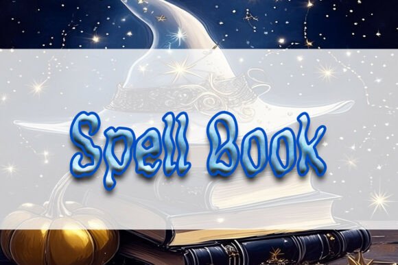
Spell Book by Heidi Vargas-Smith is the most directly named option in the roundup. It is a natural candidate for grimoire headings, magical title pages, fantasy craft graphics, and themed covers.
I would start by testing it on a cover title and a one-line chapter heading. Those two uses quickly reveal whether the font’s proportions match the rest of the illustration style.
Best for: Grimoire headings, title pages, fantasy crafts
Key features: Direct spellbook theme, display construction, recent release, title-oriented design
Which Witchy Font Should You Choose?
Choose Hello Witch when you want an unmistakably witch-themed cover with strong display impact. Pick Night Witch Halloween for darker horror-fantasy work, Witch Magic by Joe Dawson for a more polished fantasy look, and Handwriting Spell when the page should feel annotated by hand. For cheerful potion labels and child-friendly crafts, Witches Magic is the softer option.
Spellbook Font Pairing Tips
A spellbook page usually looks stronger when one expressive font does the magical work and a quieter font handles the information.
Pair a jagged or decorative title font with a readable old-style serif for spell instructions. Combine flowing script with small-cap serif headings for an elegant celestial journal. For potion labels, a whimsical display font can sit above a condensed sans serif used for ingredients and warnings.
Contrast matters more than finding two fonts with matching decorations. Two highly ornamented faces tend to compete with each other. Different proportions, weights, and classifications create clearer hierarchy and help each font keep a distinct role.
I would also limit the palette to two font families on most pages. Use size, capitalization, spacing, rules, and ornaments to create additional levels instead of introducing another typeface every time you need emphasis.
FAQ
What font looks like spellbook writing?
Handwritten scripts such as The Witch, Spooky Spell, and Handwriting Spell can create the appearance of personal spellbook notes. For an older printed grimoire, use a dark display font for headings and pair it with a readable serif for the main text.
What is the best witchy font for a book cover?
Hello Witch is my strongest all-around pick for an obvious witch-themed cover because it has bold decorative shapes and strong popularity signals. Night Witch Halloween is better for horror, while Witch Magic by Joe Dawson suits polished fantasy.
Can I use witchy fonts with Cricut?
Many fonts in this list explicitly support Cricut, including Witch Magic by Joe Dawson, The Witch by ovoz.graphics, Witch by Brilian, and Witches Magic. Always check the individual product page, especially for color fonts. The OpenType-SVG version of Magic by elvinova is not intended for Cricut use.
Are decorative fonts readable enough for spellbook pages?
They are usually best for titles, labels, chapter headings, and short quotations. Use a simpler serif or sans serif for instructions and longer passages. Testing the page at its final print size is the quickest way to spot overly thin lines, crowded details, or unclear characters.
Save to Your Inspiration Board
Follow Us