

ℹ️ Affiliate Disclosure: This article may contain affiliate links. We may earn a commission at no extra cost to you. Thanks for your support! ❤️
How to Choose Sans Serif Font Bundles for Readable Signs
The best sans serif fonts bundle for signs should do more than give you dozens of attractive typefaces. A useful bundle needs fonts that remain recognizable from a distance, cut cleanly in vinyl, and hold their shape when painted, routed, engraved, or printed.
I usually judge sign fonts by their silhouette first. Clean counters, sturdy strokes, distinct letterforms, and sensible spacing matter more than fashionable details. A font can look polished on a laptop and still turn into a fuzzy gray strip when placed on a storefront across a parking lot.
The ten Creative Fabrica bundles below cover different sign-making needs, from tall condensed lettering to bold headline faces and broad general-purpose collections. I have not physically tested these fonts. My recommendations are editorial assessments based on the available specimens, listed features, bundle composition, and practical typography principles.
Quick Picks
- Best overall: Elegant Sans Serif Bundle
- Best for high-impact signs: Bold Sans Font Bundle
- Best for narrow layouts: Condensed Collection — 10 Tall Set
- Best for modern business signage: Geometric Sans Serif Bundle
- Best starter bundle: Sans Serif Font Bundle — 21 Fonts
How I Picked These Font Bundles
I looked for bundles with a useful mix of bold, regular, geometric, extended, or condensed sans serif styles. I favored collections that could cover multiple sign situations instead of supplying ten nearly identical display faces.
My comparison focuses on five practical criteria:
- recognizable letter shapes at a glance;
- strokes that should reproduce cleanly;
- enough width and weight choices for different sign sizes;
- suitability for short, high-impact wording;
- licensing that can accommodate personal or commercial projects.
1. Elegant Sans Serif Bundle
My pick for the best overall balance
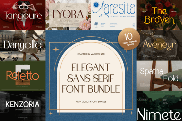
This collection is my first stop when a sign needs to look polished without becoming delicate. The available specimen pages show a broad sans serif bundle with extra PUA-encoded characters, giving designers more room to customize logos, headings, or branded sign layouts. Creative Fabrica also places the product in popular-indexed results, which is one of the stronger public popularity signals available on the marketplace.
For signs, I would start with the simpler, heavier styles in the collection. Elegant thin weights can look refined on a reception wall or salon directory, but they are less forgiving on roadside boards or small vinyl decals.
The bundle makes the most sense for brand-conscious makers who create coordinated storefront signs, price boards, packaging, and social graphics. It offers more visual personality than a purely utilitarian sign family while staying cleaner than scripts or ornate display fonts.
Who should skip it: Anyone who needs only ultra-heavy industrial lettering may find a dedicated bold bundle more efficient.
Best for: Boutique signs, salon signage, reception walls
Key features: Multiple sans serif styles, PUA-encoded extras, polished contemporary appearance
2. Bold Sans Font Bundle
My pick for high-impact sign wording

This bundle contains 20 bold sans serif fonts, including Lazeya, Lasope, Negima, Bova, Kelvira, Jacke Breston, Stanpel, Sanslem, and several other display-oriented faces. The collection is positioned around strong typography for headlines, logos, posters, packaging, and branding.
That composition translates naturally to signs with short wording: OPEN, MARKET, WELCOME, PARKING, or a business name. Heavy strokes tend to survive vinyl cutting, stencil work, and lower-resolution printing better than fragile letterforms.
My caution is variety. Bold display bundles often contain highly stylized letters, and not every face will be equally legible. Check the shapes of A, R, S, G, 6, 8, and 0 before committing. A striking font is not useful if two characters become indistinguishable at a distance.
Who should skip it: Designers building detailed directories, menus, or signs with several lines of smaller copy.
Best for: Storefront names, event signs, bold vinyl decals
Key features: 20 fonts, heavy strokes, strong headline emphasis, varied display styles
3. Sans Serif Font Bundle — 84 Fonts
Best for maximum variety
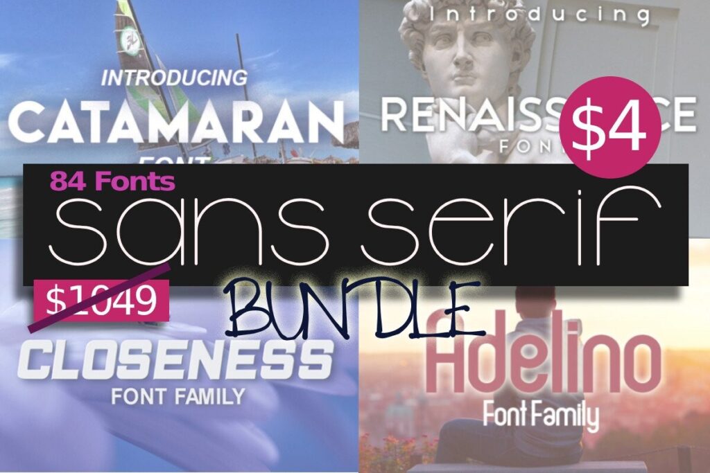
This is the broadest verified collection in my list, gathering 84 sans serif fonts. The page shows a 5.0 score based on one review and lists included faces such as Navigator, Renaissance, Browning, Marksman, Omsk, and Nikolina.
An 84-font bundle is useful when you make signs for different customers rather than maintaining one visual identity. A rustic market, auto-detailing shop, daycare, modern café, and gym will rarely need the same typographic tone.
The downside is decision fatigue. A large bundle does not automatically mean 84 good sign fonts. I would build a smaller working folder after download: perhaps two heavy styles, two neutral styles, one condensed face, and one softer rounded option. That keeps production consistent and prevents endless font browsing.
Who should skip it: Makers who prefer a tightly curated family with predictable weights and spacing.
Best for: Multi-client sign shops, varied craft inventory, experimentation
Key features: 84 fonts, broad stylistic range, one public review, multiple included font families
4. Condensed Collection — 10 Tall Set
Best for narrow panels and vertical space
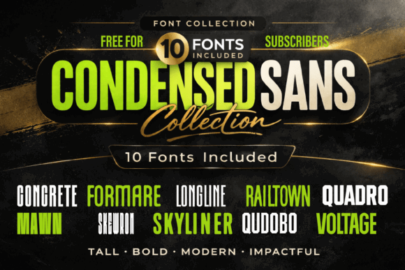
This set includes ten tall, condensed typefaces built around vertical structure and clean geometry. The product description specifically highlights readability, making it one of the most directly relevant bundles for sign layouts in this roundup.
Condensed lettering helps when the wording must fit on a narrow storefront panel, directional blade sign, porch board, or tall welcome sign. It gives you more characters per line without shrinking the cap height as dramatically as a standard-width font.
Still, condensed type is not automatically easier to read. Push it too far and neighboring vertical strokes start blending together. I would add slightly more tracking than the default and avoid extremely long all-caps sentences.
This is a focused bundle rather than a universal library, which I consider a strength. You know exactly what problem it is meant to solve.
Who should skip it: Anyone designing long explanatory text or wide signs where regular-width letters would be clearer.
Best for: Porch signs, menu headers, narrow storefront panels
Key features: 10 typefaces, tall proportions, condensed widths, clean geometric construction
5. Geometric Sans Serif Bundle
Best for modern business signage
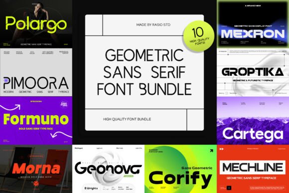
Geometric sans serifs use circles, straight lines, and visibly constructed proportions. That gives signs a clean architectural tone that suits studios, cafés, technology brands, gyms, real estate offices, and contemporary retail spaces.
I like geometric fonts for signs when the wording is brief and the layout has enough breathing room. Their simple structure creates a strong silhouette, although perfectly circular forms can occasionally make letters such as O, C, and G feel too similar from a distance. Spacing and color contrast need to do some of the work.
The product is a recent Creative Fabrica listing, so there is not enough public evidence to call it a long-term bestseller. I am including it because the category itself fills a clear use case missing from general mixed bundles.
Who should skip it: Traditional businesses seeking handmade, heritage, or rustic character.
Best for: Modern storefronts, office signs, minimalist branding
Key features: Geometric construction, contemporary tone, clean display forms
6. Modern Sans Serif Font Bundle
Best for coordinated branding and signs
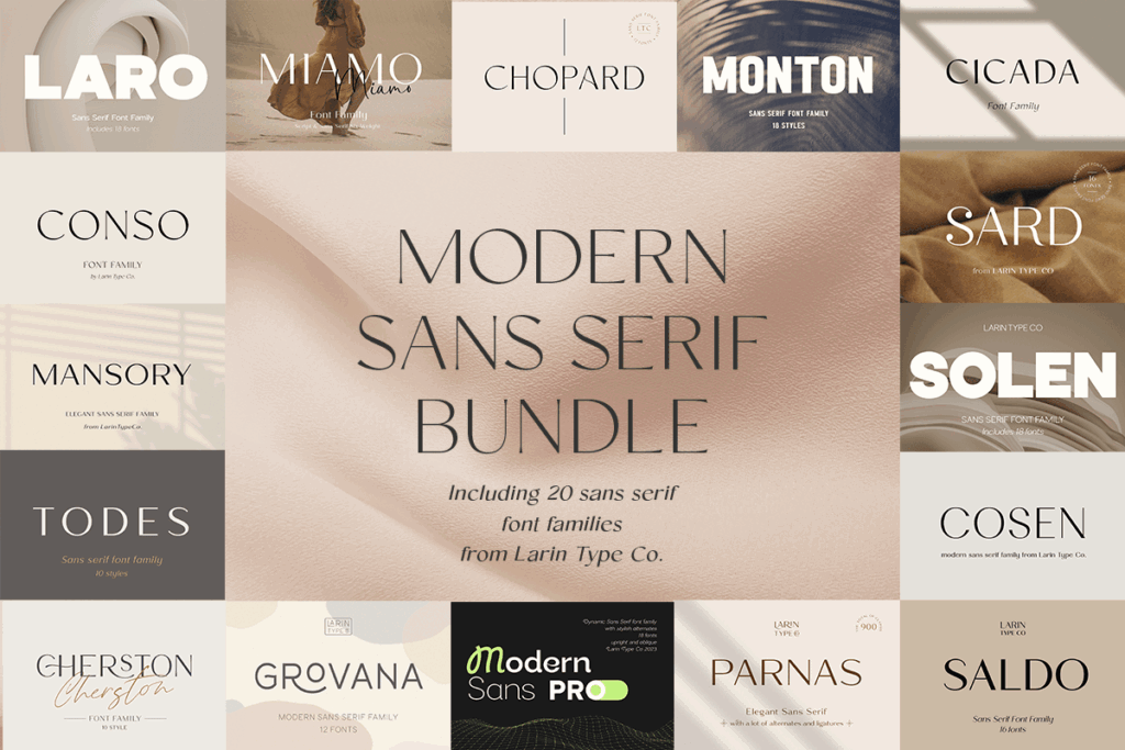
This bundle gathers 20 fonts and has a 5.0 score based on one review. The listing positions it as a multi-font collection rather than a single family, giving buyers a selection of contemporary styles for different projects.
I would choose this kind of bundle for a small business that needs more than one sign. You could use a bold face for the storefront, a simpler companion for hours and contact information, and a lighter style for printed materials.
The key is restraint. A bundle may contain 20 fonts, but one sign system usually needs one family or a carefully controlled pair. Mixing several unrelated sans serifs can make a business look less organized rather than more creative.
Who should skip it: Makers searching specifically for rustic, distressed, or vintage sign lettering.
Best for: Brand kits, retail signage, coordinated print materials
Key features: 20 fonts, modern styling, one public review, multi-project flexibility
7. Sans Serif Font Bundle — 82 Fonts
Best value for a broad sign library
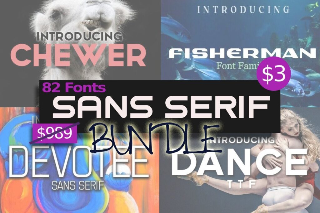
This collection includes 82 sans serif fonts. Like the 84-font option, it is designed around volume and variety rather than one unified type system.
For a busy crafter, that means more chances of finding a suitable face for different sign themes. The bundle could be especially useful when customers arrive with broad requests such as “modern farmhouse,” “minimal,” “playful,” or “masculine.”
I would not install all 82 fonts and treat them equally. Preview the alphabet in words your customers actually request. Test uppercase, lowercase, numbers, punctuation, and common combinations such as RN, CL, LI, and OO. Those pairs quickly reveal awkward spacing or confusing silhouettes.
Who should skip it: Designers who want a professionally coordinated family with consistent weights and italics.
Best for: Craft businesses, customer personalization, varied sign themes
Key features: 82 fonts, large selection, commercial-license listing, broad creative coverage
8. Sans Serif Bundle Collection by Mahesans Co
Best mix of bold, condensed, and playful styles
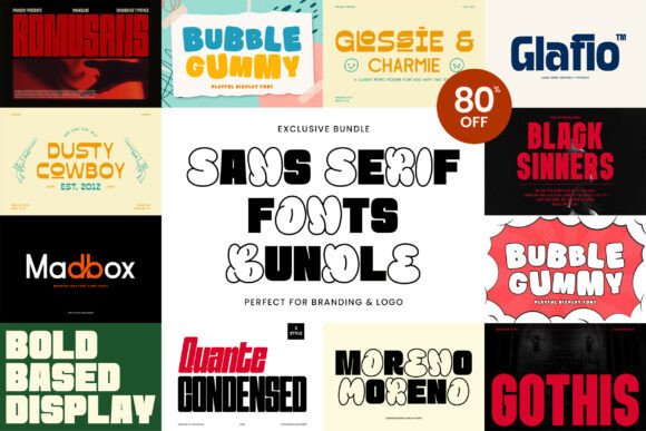
This eight-font bundle contains Moreno, Glafio, Glossie & Charmie, Gothis, Romusans, Quante Condensed, Bubble Gummy, and Madbox. The collection deliberately mixes bold, modern, condensed, elegant, and playful approaches.
That makes it more interesting than a collection of near-duplicates. Quante Condensed can solve tight layouts, while the heavier styles appear better suited to storefront names or promotional signs. The softer options could handle children’s rooms, party boards, or casual vendor displays.
Not every included font is a distance-reading candidate. Bubble-shaped or highly stylized characters belong on short decorative signs, not safety notices or directions. I would treat this as a flexible creative set rather than a dedicated wayfinding system.
Who should skip it: Businesses that need a restrained corporate family with several matching weights.
Best for: Mixed craft projects, kids’ signs, promotional displays
Key features: 8 named fonts, condensed option, bold styles, playful and elegant variants
9. Sans Serif Bundle Collection by Bagus Kunstler
Best compact commercial collection
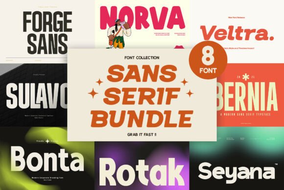
This bundle contains eight fonts and emphasizes bold, modern, extended, and condensed styles. The listing also identifies compatibility with Windows, macOS, Linux, Cricut, and Silhouette.
The extended-versus-condensed contrast is particularly useful for signs. Extended lettering can feel stable and prominent on wide storefronts, while condensed lettering helps fit longer names into restricted spaces.
Because the bundle is compact, it may be easier to learn than an 80-font package. You can quickly determine which face handles large headlines, which one suits secondary copy, and which styles cut most cleanly.
The listing was relatively new at the time of research and showed limited marketplace activity, so its popularity remains unverified. Its inclusion is based on practical range rather than sales claims.
Who should skip it: Anyone who wants dozens of decorative alternatives instead of a focused set.
Best for: Commercial signs, Cricut lettering, wide and narrow layouts
Key features: 8 fonts, extended and condensed options, cross-platform compatibility, Cricut and Silhouette support
10. Sans Serif Font Bundle — 21 Fonts
Best smaller starter bundle
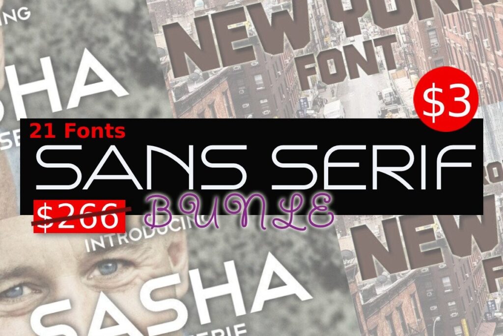
This bundle gathers 21 fonts. It is large enough to provide meaningful choice but far less overwhelming than the 82- and 84-font collections.
For a hobbyist making porch signs, market displays, wedding direction boards, or home labels, 21 fonts may be the more sensible size. You can explore different moods without spending hours sorting through a giant library.
The product did not have public reviews in the retrieved listing, so I would inspect the full specimens carefully before choosing it over a reviewed alternative. Pay special attention to the fonts’ default spacing and the thickness of small joins, especially if you cut adhesive vinyl.
Who should skip it: High-volume professionals who need deep stylistic coverage across many client industries.
Best for: Beginners, home signs, small vinyl projects
Key features: 21 fonts, manageable collection size, commercial-license listing
Quick Comparison
| Best use | My pick |
|---|---|
| Best overall balance | Elegant Sans Serif Bundle |
| Best bold collection | Bold Sans Font Bundle |
| Best large collection | Sans Serif Font Bundle — 84 Fonts |
| Best for narrow sign layouts | Condensed Collection — 10 Tall Set |
| Best geometric option | Geometric Sans Serif Bundle |
| Best small starter bundle | Sans Serif Font Bundle — 21 Fonts |
Which Sans Serif Font Bundle Should You Choose for Signs?
The Elegant Sans Serif Bundle is my best overall pick because it offers a polished look and enough flexibility for branded signs without leaning completely into decorative lettering.
For maximum impact, I would choose the Bold Sans Font Bundle. For narrow porch boards or constrained storefront panels, the Condensed Collection — 10 Tall Set addresses the clearest practical problem.
The huge 82- and 84-font packages offer strong value for makers serving many customers, but they require more curation. More fonts do not guarantee a more readable sign. The smartest purchase is the bundle that supplies a small group of dependable faces for your actual materials, viewing distance, and sign dimensions.
FAQ
What is the easiest sans serif font style to read on a sign?
A regular-width sans serif with open counters, medium-to-bold strokes, and clearly differentiated characters is the safest starting point. Avoid unusually thin, compressed, or decorative forms for important information.
Are condensed sans serif fonts good for signs?
They are useful when a long word must fit into a narrow panel. Add enough letter spacing to stop the vertical strokes from blending together, and reserve highly condensed faces for short headings rather than detailed instructions.
What font weight should I use for outdoor signs?
Bold or semibold weights usually provide stronger visibility than light weights. The ideal choice depends on sign size, viewing distance, contrast, material, and lighting. Avoid weights so heavy that the counters begin to close.
Can Creative Fabrica fonts be used on signs sold to customers?
Creative Fabrica licenses generally allow fonts in commercial physical and digital end products, including text-based designs. You may not redistribute the original font files, and subscription-related usage conditions can apply. Review the current license included with the specific download before selling the sign.
Save to Your Inspiration Board
Follow Us