

ℹ️ Affiliate Disclosure: This article may contain affiliate links. We may earn a commission at no extra cost to you. Thanks for your support! ❤️
How the Best Serif Fonts for Logos Strengthen a Brand
The best serif fonts for logos do more than make a brand appear established. Their stroke contrast, proportions, terminals, and spacing can shape whether a wordmark feels luxurious, approachable, nostalgic, literary, or unconventional.
That range is one reason serif typography has lasting value in branding. A sharp, high-contrast serif can suit a fashion label, while a heavier, softer design may feel more natural on restaurant packaging or a neighborhood retail sign.
The challenge is judging a font as part of an identity rather than admiring it in a large promotional sample. Logos must survive profile icons, business cards, labels, websites, signage, and one-color reproduction. The ten options below are organized around those practical demands.
Quick Picks
- Best for luxury and fashion: Dihot
- Best for friendly vintage branding: Bookman
- Best coordinated serif-and-script system: Georgia Ballpark
- Best for bold signage: Chinook
How We Picked These Serif Logo Fonts
We selected these fonts from Creative Fabrica resources related to serif typography and logo design. The comparison emphasizes four criteria: wordmark distinctiveness, readability when reduced, flexibility across branding materials, and fit with a recognizable commercial use case. Creative Fabrica presents serif fonts as assets for logo and branding projects and provides commercial-use licensing information through its marketplace.
The Best Serif Fonts for Logo Design
1. Dihot — Best for High-Fashion Wordmarks
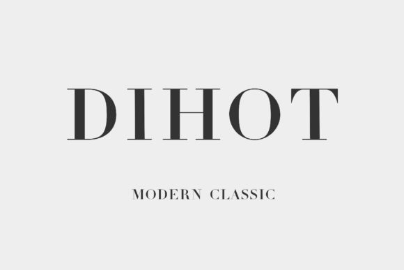
[Dihot] uses dramatic contrast between thick and thin strokes, placing it close to the visual territory associated with Didone-style fashion typography. Its crisp construction gives short names an immediate sense of polish.
This style performs best when the logo has room to breathe. Generous tracking can emphasize the vertical forms and keep fine details from merging. It is a stronger candidate for a primary wordmark than for tiny supporting copy.
Dihot suits brands that need elegance without decorative flourishes. It can look convincing on fragrance packaging, editorial mastheads, salon branding, and formal event identities. Brands that rely heavily on embroidery or very small labels should create a simplified secondary mark because its thinner strokes may be vulnerable at reduced sizes.
Best for: Fashion labels, beauty studios, luxury packaging
Key features: High stroke contrast, sharp details, refined proportions
2. Bookman — Best for Friendly Vintage Branding
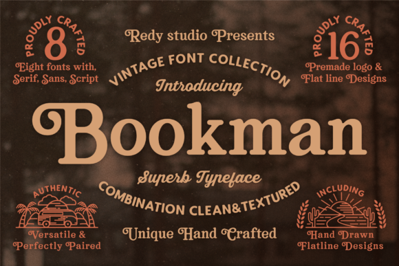
[Bookman] brings more weight and softness than the typical luxury serif. Its rounded forms and substantial strokes give it a familiar, upbeat tone that can make a brand feel established without becoming formal.
That balance is useful for hospitality, food, retail, and community-focused businesses. The heavier construction should remain visible across signs, stickers, merchandise, and packaging. It also gives designers room to use warm colors or illustrated brand elements without losing the wordmark.
Bookman has a strong personality, so restraint matters. Tight spacing or excessive retro decoration can make the identity feel like a costume. A cleaner layout and a neutral supporting sans serif will usually keep the brand current.
Best for: Cafés, barbershops, bookstores, food packaging
Key features: Heavy strokes, rounded shapes, nostalgic character
3. Montage — Best for Refined Boutique Logos
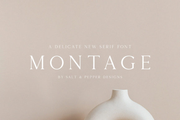
[Montage] is a slender serif with an understated, fashion-oriented appearance. Its narrow strokes create visual delicacy, making it well suited to brands that want softness rather than authority.
It has particular potential in spacious wordmarks. Wider letter spacing gives the characters more presence and prevents the design from appearing fragile. The result can feel composed and editorial, especially in all caps or carefully balanced title case.
This is not the most practical option for a business that needs one logo to work everywhere. Fine details may weaken on stamps, fabric, and small social avatars. Montage makes more sense within a flexible identity system that includes a sturdier monogram or secondary type treatment.
Best for: Bridal studios, boutiques, florists, personal brands
Key features: Fine strokes, narrow structure, delicate visual weight
4. Bodoni Fragile — Best for Dramatic Packaging
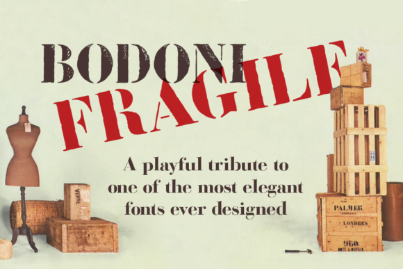
[Bodoni Fragile] pairs classical serif influence with a more decorative, packaging-driven personality. Its contrast and bold shapes can give a short brand name a strong shelf presence.
The font is most convincing when treated as display typography. Large labels, box fronts, posters, and website headers give its details enough space to register. It may also support a premium identity that wants to feel expressive rather than restrained.
Because the design already carries substantial visual flavor, it needs little embellishment. An ornate frame, complicated icon, and decorative font used together would compete for attention. Pairing it with a plain sans serif for ingredients, menus, or website navigation creates a clearer hierarchy.
Best for: Beverage labels, specialty foods, fragrance, editorial packaging
Key features: Strong contrast, decorative construction, vintage undertone
5. Georgia Ballpark — Best for Coordinated Font Pairing
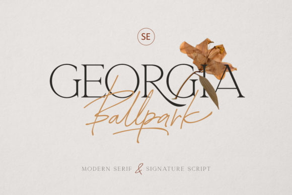
[Georgia Ballpark] includes both serif and script styles, giving designers a ready-made route to a layered identity. The serif can carry the main company name while the script supports a founder’s name, descriptor, or short accent.
That built-in relationship is useful for small businesses that need multiple typographic levels but do not want to source unrelated fonts. Used carefully, the combination can create a polished logo suite for packaging, thank-you cards, social graphics, and stationery.
The main risk is overusing the script. It should act as an accent, not compete with the central wordmark. Small taglines also need to be checked closely, since fine handwritten details can lose clarity sooner than the serif component.
Best for: Wedding brands, photographers, gift shops, boutique services
Key features: Serif-and-script pairing, coordinated style, flexible hierarchy
6. Devroye — Best for Calm Luxury Brands
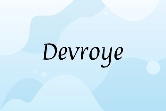
[Devroye] uses slim, slightly slanted letterforms to create a quieter kind of sophistication. Rather than feeling rigid or institutional, it has movement and a measured, lifestyle-oriented tone.
The gentle angle can help a plain wordmark feel custom before any letters are modified. It is particularly suitable for names with flowing lowercase forms or a mix of tall and short characters. Its elegance comes from proportion, so a clean composition is more effective than dense decoration.
As with many fine serifs, designers should test the logo in one color and at business-card scale. A brand that frequently prints on textured stock may need a heavier supporting font or a simplified small-size version.
Best for: Wellness brands, interior studios, skincare, consultants
Key features: Subtle slant, slim strokes, calm visual rhythm
7. Soria — Best for Beauty and Editorial Branding
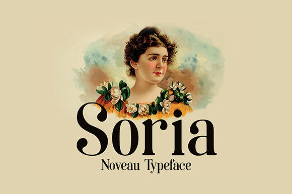
[Soria] combines high contrast with Art Nouveau influence, producing a serif that feels more expressive than a conventional fashion font. Its tall forms can bring elegance to a logo while retaining a recognizable silhouette.
Verticality is one of its strongest assets. It can make a short name look poised and prominent on narrow packages, social graphics, and magazine-style layouts. The unusual curves also offer opportunities for a designer to build a monogram from one or two distinctive characters.
Its personality is specific, however. Soria may feel too stylized for conservative legal, financial, or technical brands. It works better where beauty, culture, ornament, or personal expression already belongs in the brand story.
Best for: Cosmetics, skincare, fashion editorials, creative studios
Key features: Tall proportions, high contrast, Art Nouveau influence
8. Bright — Best for Playful Retro Identities
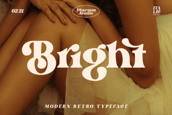
[Bright] has a bold, casual presence that sits between contemporary display type and retro branding. It offers more visual energy than the refined options above and can make a business feel sociable and youthful.
Its heavier forms should translate effectively to social thumbnails, apparel, stickers, and storefront graphics. That makes it a practical choice for brands with an active content or merchandise strategy. The font can also handle saturated color and simple illustrations without disappearing.
Bright is less appropriate when a company needs restraint or institutional trust. Its tone should be intentional. Keep surrounding typography simple, and avoid stacking multiple nostalgic motifs unless the brand is deliberately rooted in a particular period.
Best for: Creative shops, cafés, podcasts, apparel brands
Key features: Bold construction, retro influence, informal personality
9. Chinook — Best for Bold Boutique Signage
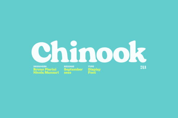
[Chinook] combines substantial letterforms with a balance of vintage and contemporary cues. Its weight gives it authority, while its shapes keep that authority from feeling corporate.
The font is particularly suited to physical environments. Storefronts, wall graphics, menus, packaging, and event signs give its bold characters room to establish a recognizable identity. It may also hold up better than a delicate serif when reproduced in vinyl or screen printing.
Chinook can become visually dense when tightly kerned. Designers should check troublesome pairs and make manual spacing adjustments rather than accepting the font’s default settings without review. A little air around the wordmark will help preserve its silhouette.
Best for: Boutiques, restaurants, home décor brands, retail signs
Key features: Bold characters, signage visibility, vintage-modern balance
10. Jolie — Best for Minimal Creative Wordmarks
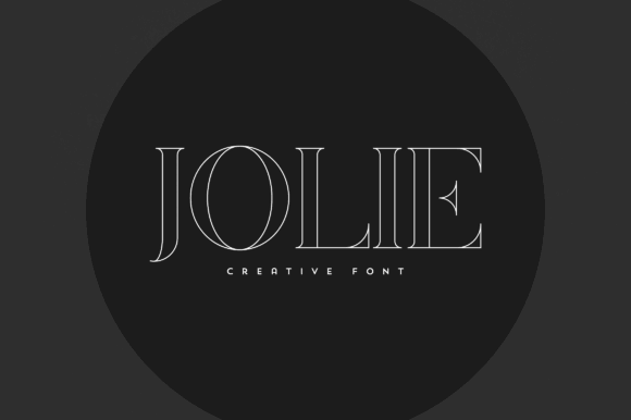
[Jolie] takes a more linear, minimal approach. Its long, thin details give it an elegant appearance that can suit production companies, photographers, stylists, and other image-conscious creative businesses.
The font’s restrained structure works well against dark backgrounds or within monochrome identity systems. It can create a cinematic or gallery-like tone without relying on exaggerated flourishes.
Its lightness is also its main limitation. Small watermarks, embroidery, and low-quality printing may reduce its clarity. Jolie should be tested in every intended format, with a separate icon or heavier alternate available when the main wordmark becomes too delicate.
Best for: Photographers, production studios, galleries, stylists
Key features: Thin linear forms, minimal styling, elegant silhouette
Quick Comparison of the Best Serif Logo Fonts
| Font | Visual personality | Best suited to | Main consideration |
|---|---|---|---|
| Dihot | Polished and dramatic | Fashion, beauty, luxury packaging | Fine strokes require size testing |
| Bookman | Friendly and nostalgic | Cafés, bookstores, food brands | Can feel overly retro if overstyled |
| Montage | Delicate and editorial | Bridal, boutiques, florists | Needs generous spacing |
| Bodoni Fragile | Expressive and premium | Packaging, fragrance, beverages | Best used at display size |
| Georgia Ballpark | Coordinated and romantic | Wedding brands, photography | Script should remain secondary |
| Devroye | Calm and sophisticated | Wellness, interiors, skincare | Thin forms may weaken in print |
| Soria | Artistic and elegant | Beauty, fashion, creative studios | Strong stylistic personality |
| Bright | Playful and energetic | Apparel, cafés, creative shops | Less suitable for conservative brands |
| Chinook | Bold and confident | Retail signs, restaurants, décor | Requires careful kerning |
| Jolie | Minimal and cinematic | Photography, galleries, production | Needs a stronger small-size alternative |
Which Serif Font Should You Choose?
The strongest option depends on the kind of identity being built.
Dihot and Soria offer the clearest direction for fashion, beauty, and editorial brands. Bookman and Bright are better suited to friendly identities with vintage energy. Chinook provides the weight needed for signs and merchandise, while Devroye and Jolie serve brands that prefer quiet, minimal sophistication.
Georgia Ballpark is the most convenient choice for a coordinated serif-and-script system. Montage and Bodoni Fragile make stronger statements, but both benefit from thoughtful size testing and restrained supporting typography.
Before committing, set the real brand name, adjust the kerning, and test the wordmark at its smallest expected size. Those steps reveal far more than a font preview—and often separate a stylish typeface from a dependable logo.
FAQ
1. Are serif fonts good for logos?
Yes. Serif fonts can give logos a sense of heritage, sophistication, craftsmanship, or editorial personality. Their suitability depends on the letterforms, stroke weight, spacing, and how clearly the design reproduces at small sizes.
2. What type of serif font is best for a luxury logo?
High-contrast serifs with thin hairlines and structured proportions are common in luxury branding. Dihot, Montage, and Soria fit that direction, although delicate strokes should be tested carefully on small packaging and digital icons.
3. Can I pair a serif logo font with a sans serif?
Yes. A characterful serif wordmark often benefits from a neutral sans serif used for taglines, website navigation, packaging details, or body copy. The contrast creates hierarchy and prevents the full identity from feeling overly decorative.
4. How many fonts should a brand identity use?
Most small identity systems can function with two coordinated type families: one for the wordmark or display text and another for supporting information. Additional styles should have a clear role rather than being added only for variety.
Follow Us