
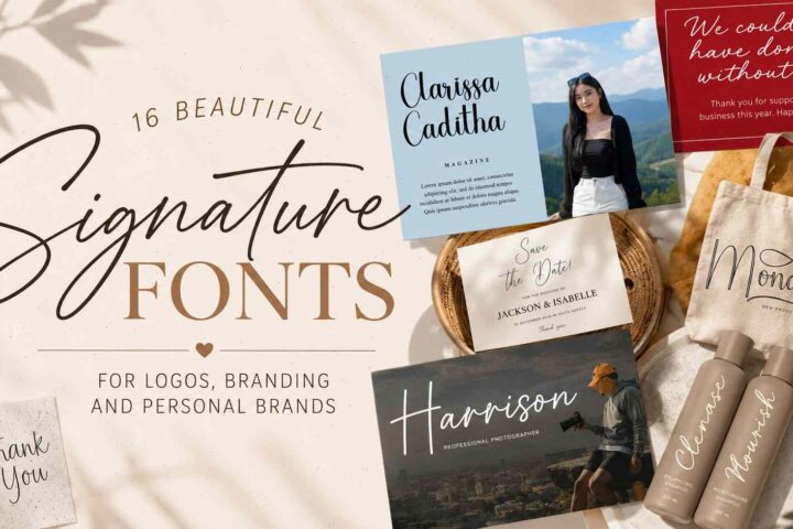
What Makes a Great Feminine Script Font?
I've spent years browsing font marketplaces, comparing branding projects, and studying how typography changes the personality of a design. One thing I've learned is that feminine script fonts aren't simply about decorative flourishes or elegant swashes.
A beautiful script font has to do much more.
It needs rhythm.
It needs balance.
And above all, it has to remain readable once it leaves the font preview and becomes part of a real project.
Many script fonts look spectacular inside marketplace thumbnails but quickly lose their charm when used on packaging, websites, or logos. Decorative loops become visual clutter. Tight spacing creates readability problems. Overly dramatic swashes start competing with the actual message.
The fonts in this collection stood out for different reasons.
Some feel luxurious.
Some feel playful.
Others look wonderfully understated.
Instead of chasing trends, I tried to focus on typefaces that have genuine design value and enough flexibility to work across branding, stationery, editorial layouts, packaging, and social media.
Table of Contents
1. Belita


Belita immediately feels confident without trying too hard.
One of the first things I noticed is how naturally the letters connect. Many script fonts force exaggerated transitions between characters, but Belita allows words to flow with very little visual tension. That creates a signature-style appearance while still remaining easy to read.
From a branding perspective, this balance is incredibly useful.
Luxury beauty products, boutique fashion labels, wedding studios, and lifestyle brands often need typography that feels handcrafted without becoming theatrical. Belita sits comfortably in that space.
Its moderate contrast also deserves attention. Hairlines are delicate enough to feel elegant, but they don't disappear when printed on textured paper or viewed on smaller digital screens. That's a subtle detail many designers only appreciate after seeing a font used outside marketplace previews.
The OpenType alternates and ligatures are thoughtfully designed rather than excessive. They provide enough variation to keep repeated words from looking mechanical, while preserving consistency throughout the overall wordmark.
I also like how Belita behaves alongside cleaner typefaces.
Pair it with a geometric sans serif and the composition immediately feels modern.
Combine it with a refined serif and it leans toward editorial luxury.
That flexibility makes it one of the more dependable feminine script fonts in this collection.
Design Notes
If I were creating branding for a boutique skincare company or a premium florist, Belita would be near the top of my shortlist. It has enough personality to become the visual centerpiece while remaining calm enough to work across packaging, websites, and printed materials.
2. Beauty and Love Duo


Some font duos feel like two unrelated fonts bundled together.
Beauty and Love Duo doesn't.
The script, sans serif companion, and decorative heart dingbats all share the same visual language, making layouts feel intentionally designed instead of assembled from different sources.
That's something I appreciate because typography is often about consistency rather than decoration.
The script itself feels relaxed and approachable. Rather than chasing extreme calligraphy trends, it focuses on smooth movement and comfortable spacing, allowing longer names and headings to remain readable.
Its companion sans isn't simply there to fill space.
It provides structure.
Whenever I work on branding concepts, I naturally look for type combinations that establish hierarchy without introducing visual conflict. The contrast between these two styles does exactly that.
The included heart symbols also deserve mentioning.
Normally I approach decorative dingbats cautiously because they often feel gimmicky. Here they integrate surprisingly well into invitations, cosmetic packaging, social graphics, and greeting cards.
Used sparingly, they become subtle design accents instead of distractions.
Where I Think It Excels
Beauty and Love Duo feels particularly strong for complete identity systems.
Instead of searching separately for a headline font, supporting typography, and decorative elements, you already have a cohesive toolkit that works together visually.
3. Marysha Script


Marysha has a personality that immediately feels approachable.
Its slightly uneven baseline introduces movement without making the typography appear careless. That small amount of irregularity gives the impression of genuine handwriting, which often makes branding feel more personal.
After reviewing countless handwritten fonts over the years, I've noticed that many try too hard to imitate natural writing.
Ironically, they become less believable.
Marysha avoids that trap.
Its rhythm remains controlled.
Repeated letters don't attract attention, and contextual alternates help maintain variation across longer words.
That matters far more than decorative flourishes.
Visually, Marysha works especially well for lifestyle brands, handmade products, creative portfolios, and boutique packaging where warmth is more important than strict luxury.
I also appreciate how comfortably it pairs with condensed sans serifs.
The contrast creates clean hierarchy while allowing the script to remain the emotional element of the composition.
My Thoughts
Marysha feels genuine rather than fashionable.
It's the kind of script that quietly supports a brand for years instead of looking tied to a short-lived design trend.
4. Jenifa


Jenifa leans toward refined elegance from the very first glance.
The letterforms feel carefully balanced, with enough openness to preserve readability while still capturing the fluid motion people expect from modern calligraphy.
One thing I pay attention to whenever I evaluate script fonts is how negative space behaves inside a word.
Some fonts create attractive individual letters but lose rhythm once those letters are combined.
Jenifa performs remarkably well here.
Spacing feels deliberate.
Nothing appears crowded.
Nothing feels forced.
Its contextual alternates and ligatures introduce just enough variation to keep headlines looking handcrafted without drawing attention to the typography itself.
That's usually the sign of mature font design.
From a branding perspective, Jenifa adapts surprisingly well.
Wedding studios.
Luxury candle brands.
Editorial mastheads.
Boutique cosmetics.
Minimal fashion identities.
It comfortably moves between all of them because its personality remains elegant without becoming overly decorative.
Where I'd Use It
If I needed a sophisticated signature font for premium branding, Jenifa would definitely be one of my first options.
Its restraint is exactly what gives it longevity.
Many highly decorative scripts look impressive during the first week of a project.
Jenifa still feels relevant years later because it relies on proportion and rhythm rather than ornament.
5. Daintily


Some script fonts try to make an impression through elaborate flourishes. Daintily takes a quieter approach, and that's exactly what makes it interesting.
Its thin strokes, restrained curves, and airy spacing create a sophisticated look that feels more like luxury editorial typography than traditional calligraphy. Instead of demanding attention, it invites the eye to slow down.
When I browse font collections, I often ask myself a simple question: Would this still look elegant if all the decorative swashes disappeared?
With Daintily, the answer is yes.
The underlying letterforms are strong enough to carry the design on their own. That's usually a sign of thoughtful typography rather than decorative excess.
The lightweight construction also gives the font a premium feeling. On cosmetic packaging, fashion lookbooks, or boutique product photography, it almost disappears into the composition in the best possible way, allowing photography and whitespace to work together with the typography.
That said, this isn't the most versatile script in the collection.
Its delicate strokes require breathing room. Small logos, long headlines, or low-resolution printing can reduce readability.
Design Perspective
I'd reserve Daintily for projects where elegance matters more than boldness. It works beautifully on premium skincare packaging, perfume branding, editorial covers, and luxury stationery, especially when paired with generous white space and restrained color palettes.
6. Sydnee


Sydnee immediately communicates confidence.
Unlike many feminine scripts that focus solely on softness, Sydnee embraces decorative calligraphy with an impressive collection of alternate characters, extended swashes, and multilingual glyphs.
It's one of those fonts that rewards experimentation.
The more you explore its OpenType features, the more unique each composition becomes.
What caught my attention most wasn't simply the number of glyphs—it was how cohesive they feel. Large character sets sometimes become inconsistent, but Sydnee maintains a recognizable personality across the entire family.
Visually, it leans toward high-end branding.
Fashion houses.
Luxury wedding planners.
Boutique hotels.
Premium event identities.
These are the kinds of projects where Sydnee feels completely at home.
The dramatic contrast between thick downstrokes and delicate hairlines gives words a couture-inspired appearance that photographs exceptionally well in printed invitations and foil-stamped packaging.
Of course, there's a tradeoff.
This isn't the script I'd choose for everyday branding.
The more decorative alternates are best treated like jewelry—used selectively rather than everywhere.
What Stands Out
If your goal is to create a memorable hero headline or a sophisticated logo that feels almost custom-lettered, Sydnee offers more creative freedom than most feminine script fonts I've reviewed.
7. Hector Ink


Hector Ink sits somewhere between refined calligraphy and contemporary branding.
It doesn't lean too heavily toward either side, which makes it surprisingly adaptable.
One detail I appreciated almost immediately is the balance between decorative swashes and practical readability. Many modern scripts become difficult to control once alternates are introduced.
Hector Ink manages to avoid that problem.
The connections between letters feel natural.
The rhythm remains consistent.
Even longer words rarely become visually overwhelming.
Its PUA encoding is also a practical advantage for designers working in Canva, Cricut Design Space, Silhouette Studio, or other software where OpenType access isn't always straightforward.
That kind of usability often matters more than another dozen decorative glyphs.
From a branding perspective, Hector Ink performs especially well across multiple applications.
Photography watermarks.
Lifestyle branding.
Boutique cafés.
Wedding planners.
Handmade product packaging.
Rather than dominating a layout, it supports it with just enough personality.
My Observation
I see Hector Ink as one of the safer investments in this collection.
It isn't chasing design trends.
Instead, it focuses on balanced proportions and reliable readability, which usually means it will age more gracefully than highly ornamental alternatives.
8. Sybelia


Sybelia is one of those fonts that doesn't immediately shout for attention.
Instead, its strengths become more obvious the longer you look at it.
The flowing rhythm feels calm.
Ascenders stay under control.
Descenders don't interfere with neighboring words.
These details sound minor, but together they create typography that's much easier to work with in real branding projects.
I've noticed that many elegant scripts rely on oversized loops to appear luxurious.
Sybelia proves that's unnecessary.
Its elegance comes from proportion instead of decoration.
That's something I personally appreciate.
Negative space remains consistent throughout longer words, making headlines feel polished rather than crowded.
This also explains why Sybelia adapts well across different industries.
Wedding branding feels natural.
Luxury candles.
Jewelry packaging.
Boutique clothing.
Lifestyle magazines.
Even minimalist cafés could comfortably use this typeface without it feeling out of place.
Pairing Suggestion
Sybelia looks especially refined beside geometric sans serifs with generous tracking. The contrast between structured simplicity and handwritten movement creates a timeless hierarchy that's difficult to date.
9. Jet Seat


Jet Seat brings noticeably more energy than many of the previous fonts.
The baseline bounces.
Letterforms feel playful.
Connections appear spontaneous.
Yet it somehow avoids becoming chaotic.
Designers often underestimate how difficult that balance is to achieve.
Playful scripts can quickly become exhausting if every letter competes for attention.
Jet Seat keeps enough consistency to remain readable while still feeling expressive.
Visually, it reminds me of modern lifestyle brands that prioritize friendliness over formality.
Boutique cafés.
Creative agencies.
Handcrafted products.
Social media campaigns.
Fashion events.
Its personality naturally fits environments where brands want to appear approachable rather than exclusive.
Because of the energetic rhythm, I would avoid using Jet Seat for long headlines or large paragraphs.
Instead, let it shine as a logo, title, product name, or short marketing phrase.
My Take
If your project needs optimism and movement instead of quiet elegance, Jet Seat offers a refreshing alternative to more traditional feminine script fonts.
10. Babyface


Despite its playful name, Babyface isn't limited to children's branding.
What impressed me most is how successfully it combines softness with sophistication.
The generous loops immediately create warmth, while the balanced proportions prevent the font from becoming overly sweet.
That's a surprisingly difficult combination to achieve.
Many baby-inspired scripts lean heavily into novelty.
Babyface feels more mature.
Of course, it naturally works for birth announcements, baby boutiques, maternity photography, and nursery décor.
But I can just as easily imagine it appearing on premium gift packaging, handmade candle labels, or boutique lifestyle products.
Its OpenType features provide plenty of flexibility without overwhelming the designer.
The alternates feel intentional.
Swashes remain elegant.
Nothing looks exaggerated simply for decoration.
Where It Fits Best
Babyface is a wonderful reminder that feminine typography doesn't always have to mean luxury.
Sometimes warmth, comfort, and authenticity create a much stronger emotional connection than elaborate calligraphy.
11. Blethers


Blethers has an organic quality that immediately feels handcrafted.
Instead of pursuing perfect geometric precision, the designer allowed small irregularities to remain visible, giving each word a subtle human character.
That's something I often appreciate in script typography.
Perfect consistency isn't always desirable.
Small imperfections are often what make lettering believable.
Blethers finds that balance remarkably well.
The contrast between thicker strokes and lighter connecting lines creates movement without sacrificing clarity, making it comfortable across logos, artisan packaging, bakery branding, and editorial headlines.
Its OpenType features are also thoughtfully restrained.
Rather than offering dozens of unnecessary alternates, the font provides just enough variation to prevent repetition while preserving consistency.
Design Notes
Blethers works particularly well when a project needs authenticity rather than luxury.
If your brand tells stories about handmade products, craftsmanship, or small-batch production, this font naturally supports that message.
12. Plantyeus


Plantyeus feels almost botanical in the way its curves develop.
There's a softness to the letterforms that immediately reminded me of floral branding and organic packaging, although the font itself never becomes overly decorative.
The elegant ligatures are one of its strongest features.
They connect naturally without drawing attention to themselves, allowing headlines to feel fluid and effortless.
I also like the spacing.
Nothing feels cramped.
Nothing feels exaggerated.
That restraint gives Plantyeus impressive versatility across branding projects.
Luxury florists.
Organic skincare.
Lifestyle magazines.
Wedding studios.
Interior design brands.
All feel like natural homes for this typeface.
Visually, it pairs especially well with muted palettes, textured paper, linen packaging, and understated photography.
Final Thoughts
Plantyeus isn't trying to become the loudest script in your font library.
Instead, it quietly creates elegant compositions that feel timeless rather than trendy.
13. Salgitha


Salgitha closes this section with perhaps one of the strongest luxury personalities in the entire collection.
The first thing that stands out is the confident rhythm.
Every stroke feels intentional.
Every flourish appears carefully placed.
Despite the decorative style, the typography never feels uncontrolled.
Luxury branding often succeeds through restraint rather than extravagance, and Salgitha understands that surprisingly well.
Its alternate characters allow logos to become highly distinctive without looking overly customized or artificial.
For premium cosmetics, jewelry brands, fashion editorials, wedding invitations, and fragrance packaging, Salgitha creates immediate visual impact.
I would simply recommend using its more expressive swashes sparingly.
When every word contains elaborate flourishes, the typography loses much of its elegance.
Why It Earned a Place on This List
Among the many feminine script fonts released in recent years, Salgitha stands out because it balances decorative beauty with disciplined typography.
It feels luxurious today, but more importantly, it has the proportions to remain elegant long after current design trends have faded.
14. Wristler


Wristler has a little more presence than many script fonts in this collection. The strokes are fuller, the curves are more confident, and the overall rhythm feels energetic without becoming loud.
That extra weight makes a noticeable difference.
One issue I often run into with delicate scripts is that they begin to disappear once they're printed on textured paper or scaled down for packaging. Wristler avoids that problem thanks to its slightly bolder construction while still maintaining a feminine personality.
Its handwritten style feels intentional rather than overly polished. Instead of chasing perfect symmetry, the font embraces subtle variations that keep words looking natural.
OpenType alternates give enough freedom to customize logos and invitations without forcing every composition into the same visual formula.
I also like how adaptable Wristler feels across different industries.
Wedding branding is an obvious fit, but it also works well for cafés, artisan bakeries, beauty salons, floral studios, and lifestyle products where warmth matters as much as elegance.
What I Like Most
Wristler feels approachable.
It doesn't try to imitate luxury branding through excessive ornament. Instead, it builds personality through confident lettering and balanced proportions, which usually results in more timeless branding.
15. Claudia Sansbert Duo


A good font duo should solve problems rather than create them.
Claudia Sansbert Duo does exactly that.
Instead of searching separately for a display script and a supporting sans serif, you already have two typefaces that were clearly designed to coexist.
The contrast immediately creates hierarchy.
The uppercase sans provides structure.
The flowing script introduces warmth.
Neither competes with the other.
I've always believed that branding systems are more successful when typography behaves like a conversation instead of a competition.
That's precisely what this pair achieves.
The sans carries navigation, product information, and supporting copy.
The script becomes the emotional voice of the brand.
This makes Claudia Sansbert Duo particularly useful for designers working on complete visual identities rather than isolated graphics.
Best Used For
Boutique packaging, lifestyle branding, wedding identities, product labels, social media templates, and editorial layouts all benefit from this kind of built-in consistency.
16. Hello Valentina


Some scripts immediately remind me of luxury stationery.
Hello Valentina is one of them.
Its flowing curves feel elegant without becoming theatrical, and there's a quiet confidence in the way the letters connect that makes longer words surprisingly readable.
One thing I appreciated after studying the glyph set is that the alternates don't feel random.
They're consistent with the personality of the main alphabet, allowing designers to personalize headlines without making them appear disconnected.
That consistency matters far more than simply offering dozens of decorative options.
The font naturally fits projects that depend on emotional storytelling.
Wedding invitations.
Boutique perfume brands.
Fine jewelry.
Luxury skincare.
Editorial covers.
Rather than feeling trendy, Hello Valentina leans toward classic sophistication with contemporary refinement.
Design Observation
Typography often communicates quality before anyone reads a single word.
Hello Valentina understands that.
Its graceful rhythm gives brands an immediate sense of craftsmanship that's difficult to achieve with more mechanical lettering.
17. Just Married Script


The name suggests weddings, but this font deserves a broader audience.
Yes, it shines on invitations, save-the-date cards, and bridal branding.
But beyond weddings, it also performs beautifully in greeting cards, lifestyle products, boutique cafés, and seasonal campaigns.
The overall rhythm feels cheerful.
Letters bounce gently across the baseline, creating movement without becoming distracting.
That subtle motion gives headlines personality while remaining comfortably readable.
The moderate stroke contrast also helps.
Some celebratory scripts rely on dramatic flourishes that overwhelm shorter words.
Just Married Script keeps its decoration under control.
As a result, logos remain clean and product names remain legible.
Where It Works Best
I see this font as a strong choice whenever a project needs optimism.
Instead of formal elegance, it offers warmth, celebration, and genuine friendliness.
18. Beautiful


Beautiful is appropriately named, although what impressed me wasn't simply its appearance.
It was the restraint.
Many elegant script fonts rely on increasingly elaborate flourishes to create visual impact.
Beautiful takes almost the opposite approach.
The negative space remains open.
The curves stay controlled.
The letterforms breathe.
That simplicity creates a premium feeling that many decorative scripts struggle to achieve.
From a branding perspective, Beautiful works exceptionally well for industries built around calm aesthetics.
Luxury skincare.
Wellness products.
Minimal fashion.
Interior styling.
Lifestyle publishing.
Its delicate construction encourages designers to slow down and embrace whitespace rather than filling every corner of a layout.
Typography Notes
If I were pairing Beautiful with another typeface, I'd avoid anything overly decorative.
A restrained geometric sans or an elegant transitional serif gives this script exactly the support it needs while allowing it to remain the visual focal point.
19. Boudelaire


Boudelaire immediately feels editorial.
Its high-contrast strokes, elegant terminals, and refined movement remind me of luxury fashion magazines where typography carries as much visual weight as photography.
This isn't a casual script.
Every curve appears intentional.
Every connection feels carefully considered.
As I looked through its alternates, I found myself imagining perfume packaging, couture branding, jewelry collections, and premium cosmetic campaigns.
Those industries rely heavily on typography that communicates exclusivity before the customer even touches the product.
Boudelaire delivers exactly that.
Of course, this level of refinement also means the font deserves space.
Tiny headlines won't fully reveal its personality.
Large display typography is where it becomes most expressive.
My Impression
Some script fonts decorate a design.
Boudelaire elevates it.
Used thoughtfully, it creates a sense of luxury that's remarkably difficult to imitate.
20. Gloams


Gloams represents a newer generation of feminine scripts.
Rather than copying traditional calligraphy, it blends handwritten warmth with contemporary branding aesthetics.
The result feels modern without becoming trendy.
One feature I genuinely appreciate is how accessible the alternates are thanks to PUA encoding.
For many designers working in Canva or Cricut Design Space, this removes unnecessary friction from the creative process.
Usability matters.
Beautiful typography shouldn't require complicated workflows.
Visually, Gloams feels comfortable across multiple applications.
Editorial headlines.
Social media branding.
Photography watermarks.
Wedding suites.
Boutique logos.
Influencer brands.
Lifestyle packaging.
The letterforms remain expressive while preserving readability, something surprisingly few modern scripts consistently achieve.
Final Thoughts
If you're building a contemporary feminine brand rather than a vintage-inspired one, Gloams deserves serious consideration.
21. Phelovetica


At first glance, Phelovetica feels almost understated.
The thin strokes don't compete for attention.
Instead, they quietly introduce refinement into a layout.
This minimalist approach is exactly what makes the font interesting.
The spacing is particularly well executed.
Letters flow naturally, allowing signatures, logos, and editorial headlines to appear calm and intentional.
I've often found that luxury branding depends less on decoration and more on restraint.
Phelovetica reflects that philosophy beautifully.
Of course, delicate typography always requires thoughtful application.
High-quality printing and sufficient display size allow the subtle details to remain visible.
Shrinking it too far would remove much of its elegance.
Designer's Perspective
Phelovetica isn't trying to become the loudest font in your library.
Instead, it quietly adds sophistication wherever subtle elegance is the goal.
22. Angela


Angela strikes a comfortable balance between traditional calligraphy and modern branding.
Its flowing connections feel romantic, yet the letterforms remain surprisingly structured.
That balance makes the font much easier to work with than many highly decorative scripts.
The generous collection of alternates and ligatures allows designers to personalize logos without disrupting the rhythm of the typography.
That's something I always appreciate.
A font should encourage creativity without forcing every project toward excessive decoration.
Angela naturally complements wedding brands, beauty packaging, boutique retailers, and editorial publishing.
The overall personality feels timeless rather than trend-driven.
Why It Caught My Attention
Angela demonstrates that elegance doesn't require complexity.
Its strongest quality is consistency.
Every letter contributes to a harmonious visual rhythm that makes branding feel polished and cohesive.
23. Velsaria


Velsaria has a slightly vintage soul.
Not in an obvious retro way, but through subtle proportions that recall traditional handwritten signage while remaining thoroughly contemporary.
That blend makes it remarkably versatile.
The lettering carries enough personality for boutique branding yet enough discipline for editorial design.
Its alternates are thoughtfully restrained.
Rather than overwhelming designers with endless decorative options, they simply provide enough variation to make repeated compositions feel natural.
Embossing, foil printing, textured stationery, and luxury packaging all suit this typeface exceptionally well.
Pairing Ideas
I would combine Velsaria with a minimalist sans serif that emphasizes clean vertical lines.
That contrast allows the handwritten character to remain expressive while preserving an elegant overall hierarchy.
24. Girls Hands


Girls Hands closes this section on a noticeably lighter note.
The playful curves, energetic baseline, and cheerful rhythm create typography that's impossible to mistake for formal calligraphy.
Instead, it celebrates spontaneity.
Despite its youthful personality, the font remains surprisingly readable.
That's largely thanks to generous counters and thoughtful spacing that prevent decorative details from becoming cluttered.
This makes Girls Hands particularly enjoyable for creative projects.
Children's branding.
Craft businesses.
Handmade packaging.
Party invitations.
Lifestyle blogs.
Sticker collections.
Creative journals.
It naturally supports brands that want to appear approachable rather than luxurious.
My Closing Thought
Not every feminine script font needs to communicate elegance.
Sometimes the goal is simply to make people smile.
Girls Hands achieves that effortlessly while remaining well-designed enough to support professional creative work.
25. My Barbie


At first glance, My Barbie feels playful and nostalgic, but there is more to it than its cheerful personality.
Rather than relying on oversized swashes or exaggerated calligraphy, the font builds its identity through rounded letterforms, balanced spacing, and gentle movement. That makes it surprisingly versatile for modern branding.
One thing I often notice with playful script fonts is that they can quickly become difficult to use outside children's products. My Barbie avoids that limitation because the proportions remain clean and controlled.
The result feels fresh instead of overly themed.
It's easy to imagine this font on boutique gift shops, stationery collections, handmade candles, lifestyle blogs, or colorful cosmetic packaging. Even when paired with modern photography, it doesn't feel out of place.
I especially appreciate the medium stroke weight. Unlike extremely delicate scripts, My Barbie remains readable across social graphics, packaging, and printed labels without losing its friendly personality.
What Makes It Different
My Barbie proves that a feminine script doesn't have to look luxurious to feel memorable.
Sometimes an approachable, optimistic voice creates a stronger emotional connection than formal elegance.
26. Orchidia


Orchidia immediately gives the impression of a carefully written signature.
Everything about the letterforms feels deliberate. The transitions between thick and thin strokes are smooth, the spacing is comfortable, and the overall rhythm has a natural flow that resembles practiced handwriting rather than digital construction.
That's one of the reasons it stood out while reviewing this collection.
Many signature fonts look convincing when viewed as individual letters but lose consistency across complete words. Orchidia maintains its elegance remarkably well, even in longer names and headings.
The OpenType alternates are thoughtfully designed instead of excessive. They allow subtle customization without making every logo feel dramatically different from the original typeface.
From a branding perspective, Orchidia feels especially comfortable in industries where trust and sophistication matter.
Wedding planners.
Luxury skincare.
Interior design.
Jewelry.
Boutique hospitality.
Creative portfolios.
These are all areas where handwritten typography often becomes part of the brand personality.
Design Insight
One lesson I've learned after looking at hundreds of branding projects is that signature fonts work best when they feel effortless.
Orchidia captures exactly that feeling.
Nothing appears forced, yet every curve contributes to a polished identity.
27. Isabella


Unlike many of the luxury-oriented scripts in this article, Isabella leans toward warmth and craftsmanship.
The slightly irregular baseline immediately gives the impression of genuine handwriting. Instead of aiming for polished editorial elegance, it celebrates the charm of handmade design.
That makes Isabella particularly attractive for makers and small creative businesses.
If you've ever browsed artisan markets or Etsy shops, you've probably seen branding styles where warmth matters more than perfection.
Isabella fits naturally into that environment.
Its letterforms are open enough for Cricut and vinyl cutting projects, while the overall rhythm remains clean enough for logos, social media graphics, and product packaging.
One thing I particularly like is that the personality never becomes exaggerated.
The font feels handcrafted without looking messy.
Where I'd Use It
If I were designing branding for a candle maker, ceramic studio, flower farm, or handmade soap business, Isabella would immediately make my shortlist.
Its approachable character creates trust, and that quality is often more valuable than elaborate decoration.
28. Athesa Luxurious


Athesa Luxurious combines two very different personalities into one cohesive design system.
The modern sans serif establishes order.
The flowing script introduces elegance.
Together they create the kind of visual hierarchy that many branding projects need.
One thing I appreciate about professionally designed font duos is that they remove much of the guesswork from typography pairing.
Instead of testing countless combinations, designers can begin with two typefaces already built to complement one another.
Athesa succeeds because neither font overshadows the other.
The sans keeps layouts structured.
The script becomes the emotional highlight.
That balance allows the duo to adapt across packaging, websites, editorials, product labels, and luxury branding without constantly needing additional supporting fonts.
Why It Works
Strong branding isn't built from beautiful fonts alone.
It's built from relationships between fonts.
Athesa Luxurious understands that relationship remarkably well.
29. Angel Landing


Angel Landing immediately feels gentle.
Its rounded curves and restrained flourishes create typography that communicates warmth before the viewer even begins reading.
Some scripts try to impress through complexity.
Angel Landing chooses simplicity instead.
That restraint becomes one of its greatest strengths.
The generous counters improve readability, while the soft movement between letters creates an inviting handwritten appearance.
It naturally suits projects that revolve around personal storytelling.
Baby announcements.
Thank-you cards.
Lifestyle photography.
Boutique gifts.
Family brands.
Creative journals.
The font doesn't overwhelm the design.
Instead, it quietly supports it.
My Thoughts
Typography doesn't always need to be dramatic.
Sometimes calm lettering creates the strongest emotional response.
Angel Landing is an excellent example of that philosophy.
30. Brooklyn Script


Brooklyn Script brings considerably more energy than many fonts on this list.
Its brush-inspired strokes immediately introduce movement.
The curves feel athletic.
The baseline feels lively.
Yet despite all that energy, the font remains surprisingly disciplined.
That's not easy to achieve.
Expressive brush scripts often become visually exhausting because every letter tries to become the star.
Brooklyn Script keeps enough consistency to maintain readability while still feeling dynamic.
This makes it particularly effective for creative industries that benefit from bold personalities.
Coffee brands.
Streetwear.
Lifestyle products.
Creative agencies.
Food packaging.
Modern cafés.
Music events.
Its stronger weight also allows the lettering to perform well on merchandise, signage, and large-format graphics.
Design Observation
Not every feminine script has to whisper.
Brooklyn Script confidently speaks with a louder voice while still maintaining elegance.
31. Niceday

Niceday immediately feels polished.
Rather than relying on dramatic flourishes, it builds sophistication through balanced proportions and clean movement.
That's something I often value more than decorative complexity.
The spacing feels mature.
The rhythm stays consistent.
Nothing interrupts the reading experience.
Those qualities make the font especially useful for branding projects where typography needs to remain elegant over many years instead of following short-lived design trends.
Its alternates introduce subtle variation rather than completely changing the personality of the alphabet.
That restraint helps maintain consistency across logos, editorial headlines, and packaging systems.
Why I Included It
Some fonts become popular because they're fashionable.
Others become popular because they're reliable.
Niceday belongs to the second group.
32. Ma Fille


Ma Fille immediately changes the mood of the collection.
Its oversized loops, playful proportions, and cheerful movement create typography that's difficult not to smile at.
Yet underneath that playful personality lies surprisingly disciplined design.
The spacing remains balanced.
Repeated letters don't feel awkward.
Alternates blend naturally into the main alphabet.
I've found that playful fonts often have a short lifespan because they're built around visual gimmicks.
Ma Fille avoids that problem by focusing on rhythm instead of novelty.
It naturally suits children's brands, boutique stationery, craft businesses, creative journals, and social media graphics where personality matters more than luxury.
What Caught My Attention
Although Ma Fille feels youthful, it never feels careless.
That balance makes it considerably more versatile than many playful scripts currently available.
33. Natalia Roseline


Ending the collection with Natalia Roseline feels appropriate because it captures many qualities that define contemporary feminine script typography.
Elegant movement.
Balanced proportions.
Confident rhythm.
Restrained decoration.
Rather than overwhelming the viewer with dramatic swashes, the font allows its craftsmanship to speak through subtle details.
That's usually the difference between typography that feels expensive and typography that simply looks decorative.
Natalia Roseline performs beautifully in editorial branding, luxury fashion, boutique packaging, magazine covers, wedding invitations, and premium cosmetics.
One detail I particularly appreciate is the spacing.
Many elaborate scripts become visually crowded once alternates are introduced.
Natalia Roseline maintains enough breathing room for each character to remain distinct.
That makes it considerably easier to use across real branding projects.
My Final Impression
If someone asked me to choose one font that represents the direction feminine script typography is moving today, Natalia Roseline would be a strong candidate.
It feels handcrafted without becoming old-fashioned.
Elegant without appearing fragile.
Expressive without sacrificing readability.
Those qualities rarely come together as successfully as they do here.
Read More: Beyond feminine styles, you might also be interested in exploring Modern Script Fonts: 10 Stunning Picks for Weddings & Branding for a contemporary twist on branding and wedding designs.
How I Evaluated These Feminine Script Fonts
Rather than judging fonts by their marketing images alone, I looked at characteristics that usually become obvious after comparing hundreds of script typefaces.
For every font, I considered:
- overall visual personality
- consistency of letterforms
- spacing and rhythm
- readability
- logo potential
- pairing flexibility
- OpenType features
- branding versatility
- long-term design appeal
Not every font excels in every category.
Some are wonderful for invitations but too expressive for logos.
Others make outstanding product packaging while feeling slightly formal for social content.
Understanding these differences usually leads to stronger typography decisions.
Final Thoughts
After spending time comparing these 34 feminine script fonts, one thing becomes clear: there isn't a single definition of feminine typography anymore.
Some designers still associate it with elaborate calligraphy and dramatic flourishes.
Others prefer restrained handwriting with clean, contemporary proportions.
Both approaches have their place.
The best choice depends less on current trends and more on the personality you want your brand to communicate.
One pattern I've noticed while reviewing typography over the years is that the most successful branding rarely depends on the most decorative font.
Instead, it depends on choosing a typeface that feels authentic to the brand itself.
A luxury skincare label doesn't need the same voice as a handmade candle shop.
A wedding photographer doesn't communicate in the same visual language as a children's clothing brand.
That's why I encourage looking beyond marketplace previews.
Imagine the font on real packaging.
Picture it on a storefront.
See it on a website header.
Print it on textured paper.
Typography reveals its strengths only after it leaves the preview image and becomes part of a complete design system.
I hope this collection helps shorten that search.
If even one of these fonts becomes the starting point for your next logo, invitation, packaging design, or visual identity, then this roundup has done exactly what I hoped it would.
Frequently Asked Questions
What are feminine script fonts?
Feminine script fonts are handwritten or calligraphy-inspired typefaces that typically emphasize graceful curves, flowing connections, and elegant proportions. They're commonly used in branding, invitations, packaging, and editorial design.
Are script fonts good for logos?
Yes, provided they're used thoughtfully. Simpler script fonts with balanced spacing generally create stronger, more versatile logos than highly decorative calligraphy.
Which feminine script font is best for branding?
Belita, Jenifa, Orchidia, Natalia Roseline, and Gloams stand out because they balance personality with long-term usability.
Which fonts work best for wedding invitations?
Hello Valentina, Sydnee, Angela, Salgitha, and Just Married Script all offer beautiful calligraphic styles suited to modern wedding stationery.
Can I use script fonts for body text?
Generally, no.
Script fonts are designed for emphasis rather than extended reading.
Pair them with a clean serif or sans serif for paragraphs.
What fonts pair well with feminine scripts?
Minimal sans serifs and elegant serifs usually create the strongest contrast while preserving readability.
Are handwritten fonts still popular?
Yes.
The trend has shifted toward cleaner, more restrained handwriting styles rather than highly ornamental calligraphy.
How many script fonts should one brand use?
Usually one.
A single script combined with one or two supporting fonts creates a much stronger visual identity.
Do script fonts work on websites?
Yes, but they're best reserved for headlines, hero sections, and calls to action.
Body text should remain highly readable.
What size should script fonts be used at?
Most feminine script fonts perform best between 32 px and 120 px on websites and at headline sizes in print.
Are feminine script fonts suitable for packaging?
Absolutely.
Many luxury beauty, fragrance, stationery, and boutique brands rely on script typography to create a handcrafted, premium appearance.
What makes a script font feel luxurious?
Balanced proportions, controlled spacing, subtle contrast, and restrained flourishes usually create a more luxurious impression than excessive ornamentation.
Follow Us