
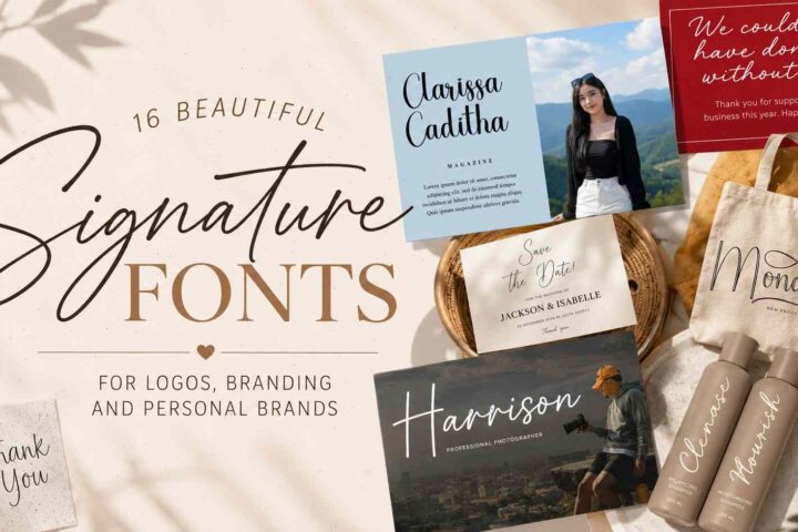
Introduction
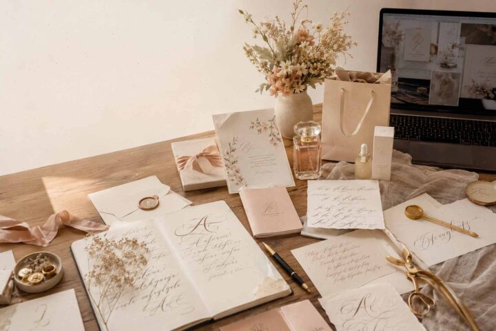
Script fonts have a way of changing the mood of a design almost instantly. Swap a plain sans serif headline for a thoughtfully chosen script, and suddenly the layout feels warmer, more personal, or more luxurious. That transformation is exactly why script typefaces continue to be a favorite for branding, wedding stationery, packaging, and creative projects where personality matters just as much as readability.
The challenge isn't finding a script font—it's finding one that actually works. Some are beautifully decorative but become difficult to read. Others look great in previews but lose their charm once they're placed inside a real logo or invitation.
The collection below brings together ten modern script fonts that strike a much better balance. Each has its own personality, from relaxed handwritten lettering to elegant calligraphy, making them suitable for everything from boutique branding to wedding invitations and social media graphics.
Rather than focusing only on appearance, I've also included where each font feels most natural, what makes it stand out, and the kinds of projects where it delivers the strongest results.
Table of Contents
1. Simple Handwriting Script Font


Sometimes the simplest fonts become the most versatile.
Simple Handwriting captures the relaxed feeling of natural handwriting without trying too hard to imitate every pen stroke. The letterforms are smooth, evenly spaced, and easy to read, giving the font a friendly personality that doesn't feel artificial.
One reason this font stands out is its restraint. Plenty of handwritten fonts add exaggerated loops or dramatic swashes, which can quickly become distracting. Simple Handwriting avoids that trap by keeping the characters clean and balanced.
That makes it surprisingly flexible across different types of creative work.
It works particularly well for:
- personal branding
- Pinterest graphics
- blog covers
- YouTube thumbnails
- Instagram quotes
- product packaging
- handmade shop logos
- email signatures
Another advantage is readability at smaller sizes. That's something many script fonts struggle with. Here, individual letters remain distinct enough that headlines stay clear even on mobile screens.
If you're pairing it with another font, try a modern geometric sans serif. The contrast between structured typography and relaxed handwriting creates a clean, contemporary look without feeling cold.
For designers who regularly create social media content, this is one of those fonts you'll probably end up using more often than expected.
2. Simple Handmade Script Font


While the previous font leans toward casual handwriting, Simple Handmade introduces a softer, slightly more romantic personality.
The strokes feel natural and lightly imperfect, giving words the appearance of something written by hand rather than assembled digitally. That subtle irregularity makes a noticeable difference in projects where authenticity is important.
This font feels especially comfortable in creative industries where warmth matters more than precision.
Some of its strongest applications include:
- wedding invitations
- greeting cards
- lifestyle branding
- bakery logos
- handmade product labels
- florist packaging
- craft businesses
- small boutique shops
One detail I like is the spacing between characters. Everything feels open enough to remain readable, even when longer words are set in script. That's something many decorative fonts overlook.
Because the style isn't overly dramatic, it also layers nicely over photography. Whether it's a flat-lay product shot or a lifestyle image, the lettering stays visible without competing against the background.
If your design needs to feel approachable rather than luxurious, Simple Handmade strikes that balance beautifully.
3. Cozy Disney Script Font


Despite its playful name, Cozy Disney isn't limited to whimsical projects.
The font combines flowing handwritten curves with enough structure that it still feels polished. Instead of becoming overly decorative, it maintains a light rhythm that gives every word movement without sacrificing clarity.
What immediately catches the eye is the way the connecting strokes flow naturally between letters. They mimic real handwriting more convincingly than many script fonts that rely on repetitive shapes.
That organic movement gives logos and headlines a more personal appearance.
It's especially suited for:
- wedding stationery
- boutique cafés
- artisan food packaging
- children's brands
- seasonal collections
- gift products
- home décor
- creative blogs
The font also performs well on textured materials like kraft paper, linen labels, and embossed packaging because the smooth curves remain recognizable even when printed on tactile surfaces.
One small observation: keeping line spacing slightly more generous than usual helps the decorative strokes breathe. Crowding script fonts together often reduces their impact.
Cozy Disney has enough personality to become the focal point of a layout while remaining versatile enough for everyday branding projects.
4. I Heart You Script Font


Some script fonts immediately communicate elegance.
Others simply make people smile.
I Heart You falls into the second category.
Its monoline construction creates a relaxed handwritten appearance that's playful without becoming childish. The consistent stroke width keeps everything clean, while the signature heart swash adds just enough character to make the font memorable.
Instead of relying on elaborate flourishes, the design stays intentionally simple.
That simplicity makes it surprisingly versatile.
You'll often see fonts like this used for:
- Valentine's Day cards
- wedding favors
- engagement announcements
- bridal shower decorations
- custom mugs
- T-shirts
- stickers
- planners
- Cricut projects
Because every stroke has nearly the same thickness, the font also works well for vinyl cutting, laser engraving, foil stamping, and other production methods where extremely thin details can become problematic.
One thing worth mentioning is scale. The heart flourish looks charming in larger headlines but can become less noticeable in very small applications. For logos and packaging, increasing the font size slightly usually preserves the intended effect.
Despite its playful personality, I Heart You never feels cluttered, which is one reason it remains useful across a surprisingly wide variety of creative projects.
5. Stylish Alphabet Script Font


If your goal is to give a brand a more refined, upscale feel, Stylish Alphabet is an easy font to reach for. It blends modern calligraphy with smooth, confident strokes that feel elegant without becoming overly formal.
One thing that stands out is how balanced the lettering is. Plenty of script fonts lean heavily on oversized flourishes that look beautiful in previews but quickly become difficult to work with in real layouts. Stylish Alphabet keeps those decorative elements under control, making it much more practical for everyday design.
That flexibility opens the door to a wide range of creative uses, including:
- luxury branding
- beauty and skincare packaging
- jewelry logos
- boutique fashion labels
- wedding invitations
- cosmetic products
- social media campaigns
- premium gift packaging
The flowing letterforms naturally create a sense of movement across a layout, helping even short headlines feel more expressive. At the same time, the consistent spacing keeps words easy to scan, which isn't always true with decorative scripts.
Another benefit is how well it pairs with minimalist typography. Try combining it with a clean sans serif like Montserrat, Manrope, or Helvetica. The contrast between elegant script and structured geometric lettering creates a polished visual hierarchy that's become increasingly popular in modern branding.
This font also works particularly well with muted color palettes—warm neutrals, ivory, soft blush, charcoal, or deep forest green—where typography carries much of the visual identity.
If you're designing for a premium audience, Stylish Alphabet delivers sophistication without feeling overly ornate.
6. Vintage Story Script Font


Some script fonts feel polished.
Others feel lived in.
Vintage Story belongs to the second group.
Instead of chasing perfect symmetry, it embraces the slight irregularities that make handwritten lettering feel genuine. The flowing strokes, natural rhythm, and carefully designed alternates give every word a more organic appearance.
That's especially valuable in branding, where authenticity often creates a stronger impression than perfection.
One of the strongest features is the collection of ligatures and alternate characters. Repeated letter combinations rarely look identical, which helps avoid the mechanical appearance that can make digital handwriting feel artificial.
This font shines in projects such as:
- artisan coffee brands
- handmade candle labels
- bakery packaging
- winery branding
- rustic wedding stationery
- book covers
- boutique cafés
- personal signatures
The subtle texture also gives the font more depth without relying on distressed effects. It feels handcrafted rather than artificially aged.
When printed on textured paper or natural materials like kraft cardstock, cotton paper, or wood, Vintage Story becomes even more convincing. Those surfaces complement the handwritten style instead of competing with it.
Because of its personality, this isn't a font for long paragraphs. Instead, let it become the focal point—logos, titles, invitations, or packaging where every letter has room to breathe.
7. Tail Script Font


Decorative swashes can easily become too much.
Tail Script shows that a little restraint often produces a more elegant result.
The extended entry and exit strokes are the defining feature here, but they're used thoughtfully rather than excessively. Instead of overwhelming the lettering, they frame words with just enough movement to create a graceful silhouette.
That makes the font feel contemporary despite its classic calligraphy influence.
It's especially effective for:
- Save the Date cards
- wedding signage
- bridal branding
- farmhouse décor
- personalized gifts
- boutique logos
- home décor products
- laser engraved keepsakes
One detail worth appreciating is the consistency of the stroke weight. Even with the decorative tails, the font maintains good visual balance across longer words.
That balance becomes particularly important for logo design. Many script fonts begin to lose readability once words exceed eight or ten letters, but Tail Script remains surprisingly legible because the decorative elements don't dominate every character.
For the cleanest results, avoid placing it over highly textured or busy backgrounds. A generous amount of negative space allows those elegant swashes to become part of the composition instead of competing with other design elements.
If your project calls for modern romance rather than traditional calligraphy, Tail Script strikes that balance beautifully.
8. About Heart Script Font


Some fonts communicate emotion through dramatic flourishes.
About Heart takes a gentler approach.
Its signature feature is the subtle heart connection woven naturally into the lettering. Instead of feeling novelty-driven, the heart becomes part of the typography itself, creating a look that's romantic without becoming overly decorative.
That small design choice gives the font a distinctive personality while keeping it versatile enough for professional work.
It feels especially at home in projects like:
- wedding invitations
- anniversary gifts
- planners and journals
- greeting cards
- personalized stationery
- small business branding
- boutique packaging
- social media graphics
The flowing connections between letters give words an almost handwritten rhythm. Unlike many themed script fonts, About Heart doesn't sacrifice readability in pursuit of decoration.
Another reason it's enjoyable to work with is its moderate visual weight. The lettering feels substantial enough for printing while remaining delicate enough for elegant digital layouts.
Pairing it with a clean serif font creates a timeless combination that works particularly well for wedding suites and luxury branding.
When used sparingly—as a headline, logo, or signature element—it immediately adds warmth without overwhelming the rest of the design.
One practical note: because the connected heart is part of the lettering, it's often most effective in short names or phrases where that detail remains easy to notice.
9. Alignment Script Font


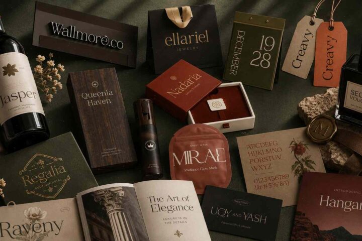
Luxury branding often relies on subtle details rather than dramatic effects, and Alignment fits that approach exceptionally well. It has the graceful flow of modern calligraphy while maintaining the consistency you'd expect from a professionally crafted display typeface.
The first thing you'll notice is how clean the curves feel. Every connection between letters looks intentional, giving words a polished rhythm that works beautifully in premium branding.
Unlike some decorative scripts that become difficult to manage across different layouts, Alignment keeps a strong sense of structure. The generous spacing and balanced proportions make it suitable for projects where elegance and readability need to coexist.
This font is an excellent choice for:
- luxury fashion brands
- cosmetics and skincare
- wedding invitation suites
- boutique hotels
- perfume packaging
- high-end cafés
- editorial mastheads
- personal branding
One particularly useful feature is its support for alternate glyphs and decorative swashes through PUA encoding. That means you can access additional stylistic characters without advanced typography software, making it easier to customize logos, headlines, or monograms.
The swashes themselves are tasteful rather than excessive. They add movement to a composition without pulling attention away from the actual words.
Alignment also pairs especially well with elegant serif fonts. Combining flowing script with a classic serif creates contrast in texture while keeping the overall design refined and cohesive.
For printed materials like invitations or embossed packaging, this font has enough visual weight to reproduce cleanly while still feeling delicate.
If your project needs to communicate sophistication without appearing overly formal, Alignment strikes that balance exceptionally well.
10. Wild Flower Honey Duo Script Font


Pairing fonts can be surprisingly time-consuming. Even experienced designers sometimes spend longer choosing combinations than building the actual layout.
That's exactly what makes Wild Flower Honey Duo so appealing.
Rather than offering only a script font, this family combines a flowing handwritten script with a complementary sans serif. Both styles are designed to work together from the start, making it much easier to build balanced typography.
The contrast feels natural.
The script adds warmth and personality, while the tall sans serif introduces structure and readability. Together they create hierarchy almost automatically.
This duo is particularly effective for:
- lifestyle branding
- handmade businesses
- Etsy shops
- product packaging
- Pinterest graphics
- social media templates
- planners and journals
- DIY projects
- logo systems
- seasonal collections
One practical advantage is consistency. When fonts are designed as a pair, the proportions, spacing, and visual weight tend to complement each other much better than two unrelated typefaces selected independently.
That saves time during the design process and often produces more cohesive branding.
The script itself feels relaxed and approachable rather than overly elegant. Combined with the clean sans serif, it creates a modern look that's equally suitable for digital content and printed materials.
If you're creating branding from scratch and don't want to spend hours experimenting with font pairings, Wild Flower Honey Duo provides an excellent starting point.
Read More: While script fonts offer a distinct flair for branding, 25 Best Sans Serif Fonts for Branding: Modern Logo Fonts That Stand Out can provide a modern, clean look that truly makes your logo stand out.
How to Choose the Right Script Font
Beautiful typography isn't simply about choosing the prettiest font. The most successful designs come from selecting a typeface that matches the personality of the project while remaining readable in its intended use.
Here are a few practical guidelines that can make the decision easier.
Consider readability first
A highly decorative script may look stunning in a large preview but become difficult to read on product labels, social media graphics, or mobile screens.
Before committing to a font, test it at the size your audience will actually see.
Match the mood of the project
Every script font communicates something slightly different.
- Minimal handwriting feels friendly and approachable.
- Elegant calligraphy suggests luxury and sophistication.
- Vintage scripts create nostalgia.
- Playful handwritten lettering feels relaxed and creative.
Choosing a style that reflects the brand personality usually produces stronger results than simply selecting the most decorative option.
Pair script fonts carefully
Script fonts rarely perform well on their own.
Combining them with a clean sans serif or a classic serif creates visual hierarchy and improves readability throughout the design.
The goal isn't contrast for the sake of contrast. It's allowing each typeface to do what it does best.
Leave enough breathing room
Decorative letterforms naturally attract attention.
Giving them generous white space helps preserve that elegance. Crowded layouts often make even the best script fonts feel messy.
Don't use script fonts for everything
This is probably the most common mistake.
Script fonts are display typefaces. They're designed for headlines, logos, invitations, packaging, and short statements—not long paragraphs.
Using them sparingly usually creates a much stronger visual impact.
Final Thoughts
A great script font does more than decorate a design—it gives it personality.
Whether you're building a boutique brand, designing wedding invitations, creating product packaging, or refreshing a logo, the right lettering can completely change how a project feels before anyone even reads the words.
The ten fonts featured here each bring something different to the table. Some lean toward relaxed handwritten charm, while others embrace refined modern calligraphy or timeless vintage influences. Rather than trying to find a single “best” script font, think about the mood you want your audience to experience.
In many cases, that's what separates typography that simply looks attractive from typography that strengthens a brand.
Spend a little time experimenting with pairings, spacing, and hierarchy. Even small adjustments can make a script font feel more polished and intentional.
When chosen carefully, these modern script fonts can become one of the strongest visual elements in your creative toolkit.
Frequently Asked Questions
What are script fonts?
Script fonts are typefaces inspired by handwriting, cursive lettering, or calligraphy. They're commonly used for logos, branding, invitations, packaging, social media graphics, and other display applications where personality and elegance are important.
Are script fonts good for logos?
Many successful boutique brands, beauty companies, cafés, and wedding businesses use script fonts because they communicate authenticity and craftsmanship. Just make sure the lettering remains readable at smaller sizes.
Can script fonts be used for wedding invitations?
Modern script fonts are one of the most popular choices for wedding stationery because they create a romantic, personal atmosphere while still feeling timeless. Pairing a script headline with a serif body font usually delivers the best balance between elegance and readability.
How do I pair a script font with another typeface?
A common approach is to combine a decorative script with a simple sans serif or a classic serif.
This creates contrast, improves readability, and keeps layouts from feeling overly decorative. Avoid pairing two highly expressive script fonts together, as they usually compete for attention instead of complementing one another.
Follow Us