

ℹ️ Affiliate Disclosure: This article may contain affiliate links. We may earn a commission at no extra cost to you. Thanks for your support! ❤️
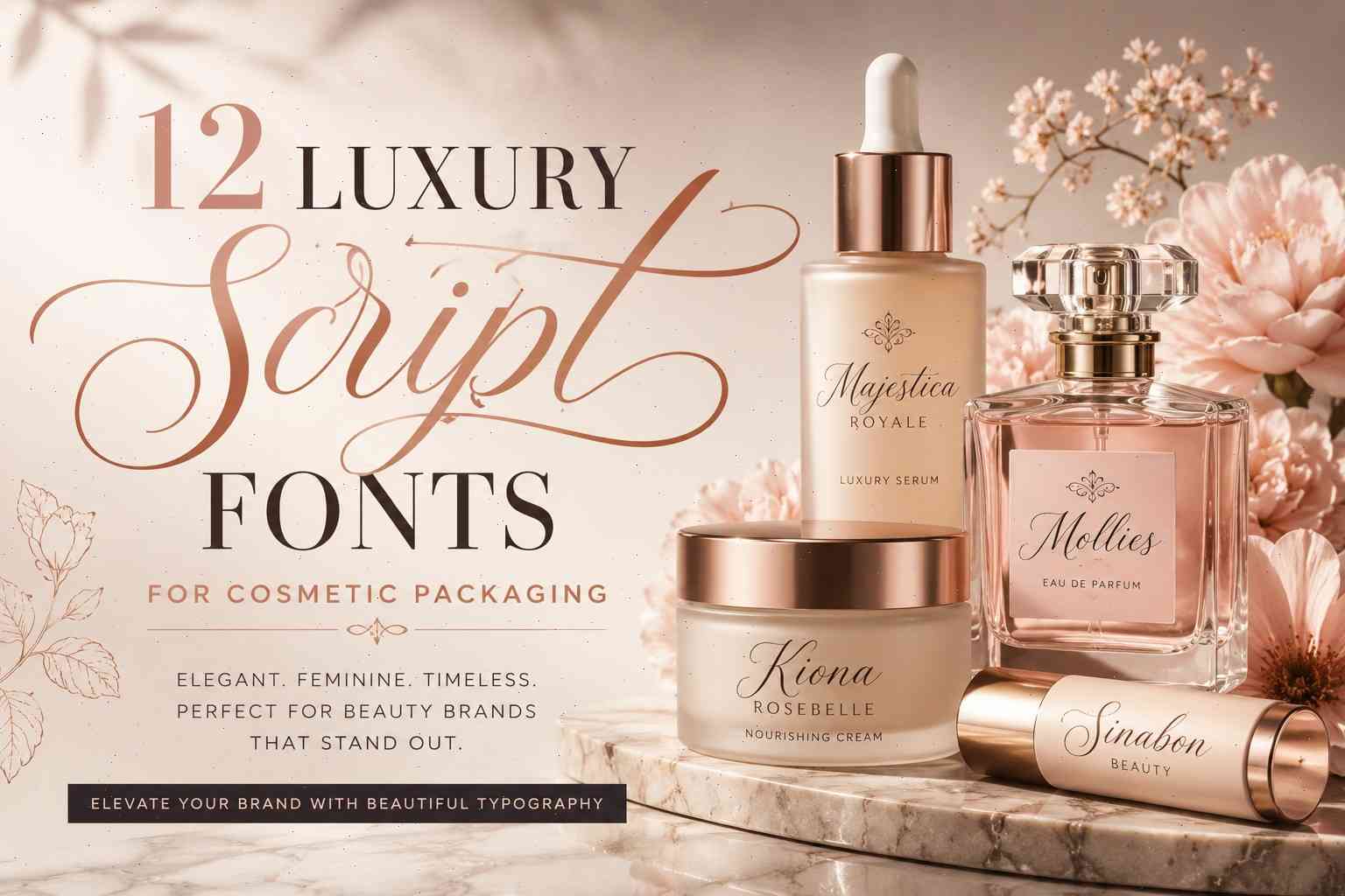
12 Luxury Script Fonts for Cosmetic Packaging
The beauty industry notices typography more than most people realize.
Before someone tests a serum texture or smells a perfume, they’ve already formed an opinion from the packaging sitting in front of them. And honestly, script fonts play a huge role in that first impression. A good one can make a simple skincare bottle feel refined and expensive. A bad one can make even premium products look oddly generic.

I’ve spent way too much time browsing cosmetic branding, skincare packaging mockups, perfume labels, and indie beauty launches on Pinterest and Behance, and there’s a pattern you start noticing pretty quickly: luxury beauty brands rarely use typography randomly.
The fonts usually do most of the emotional work.
Some scripts feel soft and organic. Others feel editorial and fashion-heavy. Some work beautifully on matte labels but completely fall apart once foil stamping or embossing enters the picture. That’s why choosing fonts for cosmetic packaging is a little different from choosing fonts for social media graphics or website headers.
The right script font needs to feel elegant and stay readable on tiny serum bottles, lipstick tubes, or curved jars.
In this guide, you’ll find 12 luxury script fonts that work especially well for cosmetic packaging, skincare branding, perfume labels, spa products, and beauty campaigns.
12 Best Luxury Script Fonts for Cosmetic Packaging
1. Majestica Royale
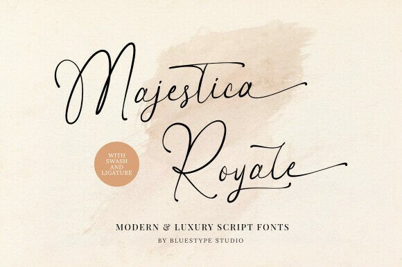
If luxury skincare branding had a signature handwriting style, it would probably look something like Majestica Royale.
This font has those tall elegant ascenders and smooth flowing connections that instantly feel premium without becoming overly decorative. Some luxury script fonts try too hard to look expensive and end up looking chaotic on actual packaging. Majestica Royale avoids that completely.
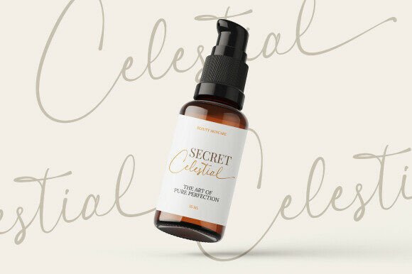
What stood out to me most is how polished it feels on minimalist packaging.
I tested similar styles before on cosmetic mockups, and thinner scripts often disappear once you shrink them onto small labels or frosted bottles. Majestica Royale still keeps its shape surprisingly well. The curves stay clean even at smaller sizes, which matters a lot for real packaging production.
It works especially well for:
- Luxury skincare labels
- Premium serum packaging
- Perfume branding
- Boutique cosmetic logos
- Beauty editorials
I can easily picture this font on a matte black serum bottle with gold foil lettering. That combination almost always works.
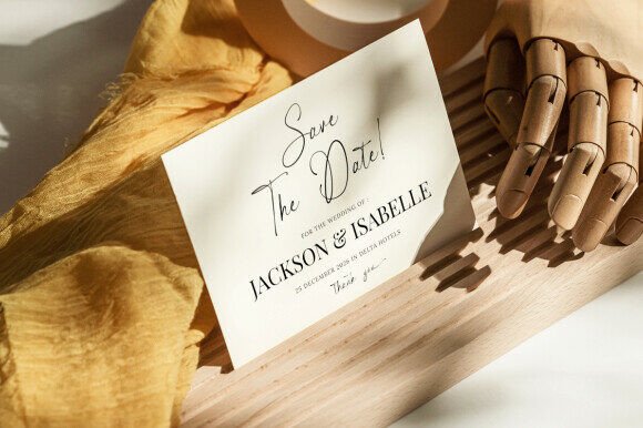
Another thing I like is that it feels elegant without looking cold. Some luxury typography creates distance between the brand and customer. Majestica Royale still feels human enough to work for modern beauty brands that want sophistication without the “old luxury house” vibe.
For timeless cosmetic branding, this one is genuinely strong.
2. Mollies
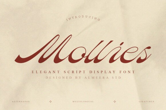
Mollies feels more fashion-oriented.
The first thing I noticed was how dramatic the movement feels compared to softer skincare scripts. The slanted posture and sweeping curves give it that editorial beauty campaign energy you usually see in luxury makeup ads or perfume launches.
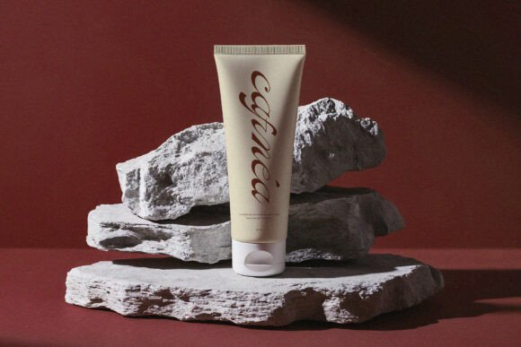
This isn’t really a quiet font.
It wants attention — but in a controlled way.
That makes it especially effective for:
- Makeup collections
- Lipstick packaging
- Fashion-inspired beauty branding
- Signature logos
- Luxury cosmetic campaigns
One thing I appreciate about Mollies is the balance between glamour and readability. A lot of decorative scripts completely lose legibility once printed smaller. Mollies still holds together fairly well, especially for product names and hero text.
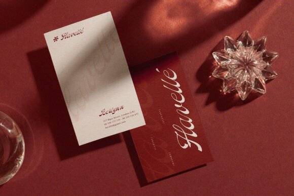
It also pairs beautifully with serif fonts.
I tested similar combinations before for beauty mockups, and high-contrast serif + flowing script almost always creates that premium editorial aesthetic beauty brands love right now.
Especially on:
- ivory packaging
- burgundy labels
- black-and-cream layouts
- metallic foil accents
Mollies has that “luxury fashion magazine” feel without becoming too formal.
3. Sinabon
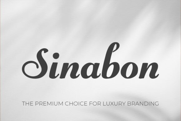
Sinabon immediately feels softer and more approachable.
Some script fonts lean heavily into dramatic luxury aesthetics, but Sinabon works better for skincare brands that want elegance without feeling intimidating or overly polished.
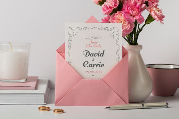
That’s probably why it fits organic beauty branding so naturally.
The handwritten flow feels relaxed and personal, which works incredibly well for:
- clean skincare brands
- spa packaging
- handmade cosmetics
- wellness products
- feminine beauty labels
I’ve noticed this style becoming much more common in modern skincare branding lately. Especially brands using earthy palettes, frosted containers, muted greens, warm neutrals, and minimalist layouts.
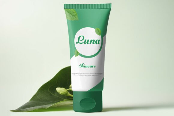
Sinabon fits perfectly into that world.
Another thing worth mentioning is readability. Cosmetic packaging is tricky because labels are often tiny. Some beautiful Pinterest fonts completely collapse once applied to real jars or bottles. Sinabon stays readable without losing personality.
That balance matters more than people think.
It also feels emotionally warmer than many luxury scripts. Less “fashion runway,” more “premium self-care.”
And honestly, for modern skincare branding, that softer direction often works better.
4. Lucia
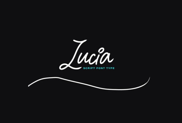
Lucia is easily one of the boldest fonts in this collection.
The swashes are dramatic. The movement feels expressive. Everything about it looks custom and artistic.
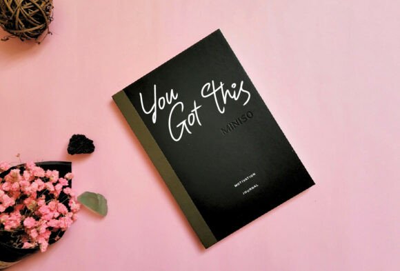
This isn’t the kind of script you use quietly in the corner of packaging design. Lucia becomes part of the brand personality itself.
I’d use it mostly for:
- perfume branding
- cosmetic campaign headlines
- signature logos
- editorial beauty packaging
- influencer beauty launches
What I like most is that it actually feels handwritten instead of digitally “pretending” to be handwritten. Some script fonts feel mechanically smooth in a way that looks artificial once printed. Lucia still has enough movement and irregularity to feel believable.
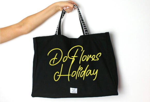
That makes a huge difference visually.
The stylistic alternates also help a lot. You can create logos that feel more custom instead of looking like the exact same typography everyone downloaded from a font marketplace last month.
One thing though: I probably wouldn’t use Lucia for dense packaging layouts or ingredient-heavy labels. The dramatic flourishes work best when the font has breathing room.
But for hero branding?
It looks expensive immediately.
5. Kiona Rosebelle
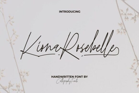
Kiona Rosebelle feels quieter than most fonts on this list, and honestly, that’s why I like it.
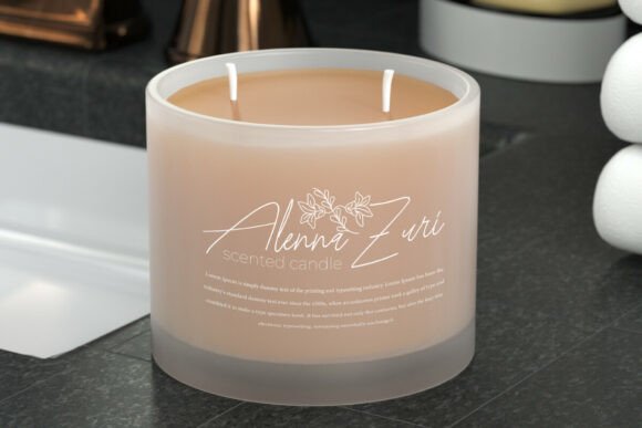
Minimal luxury packaging is everywhere right now, especially in skincare. You see it constantly:
- soft beige labels
- muted typography
- matte containers
- understated branding
- very clean layouts
Kiona Rosebelle fits naturally into that aesthetic.
The monoline structure keeps everything clean and modern, while the handwritten flow still adds warmth. It doesn’t scream for attention. It just feels refined.
This font works beautifully for:
- skincare branding
- spa products
- bridal beauty collections
- feminine cosmetic lines
- Instagram beauty brands
One detail I really appreciate is the ligature work. The letter connections feel natural instead of forced, which gives packaging a more authentic handwritten appearance.
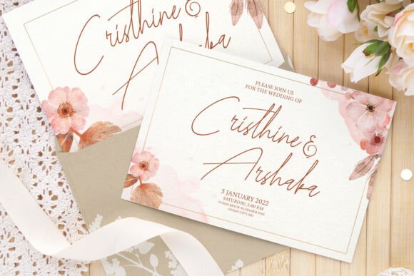
And on minimalist packaging, tiny details like that become much more noticeable.
I also think Kiona Rosebelle photographs extremely well for social media. Some fonts look fine in print but lose character digitally. This one still feels elegant on ecommerce banners, Pinterest graphics, and product photography.
For brands aiming for modern soft luxury, it’s a very safe choice in a good way.
6. Aneaskara
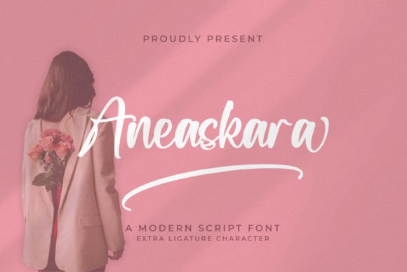
Aneaskara feels younger and more trend-aware than some of the classic calligraphy scripts in this collection.
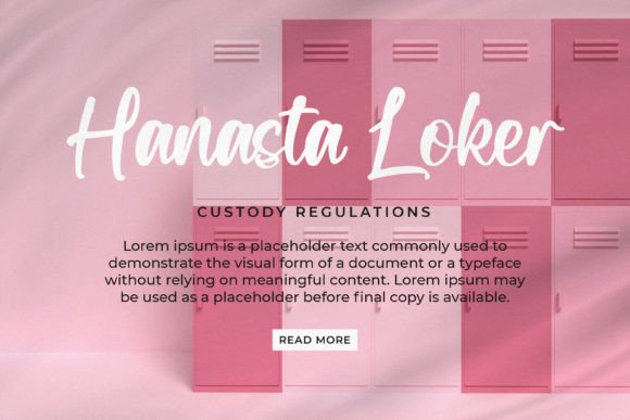
You can tell it was designed with modern beauty branding in mind.
The handwritten flow feels natural and relaxed without becoming messy, which makes it especially good for:
- clean beauty startups
- vegan skincare brands
- influencer cosmetic products
- beauty subscription boxes
- wellness-focused packaging
I’ve seen similar font styles used a lot in newer Instagram-first beauty brands. Especially brands trying to feel approachable instead of traditionally luxurious.
And honestly, that shift makes sense.
A lot of younger consumers don’t really connect with ultra-formal luxury aesthetics anymore. They want packaging that feels stylish, personal, and modern instead of overly polished.
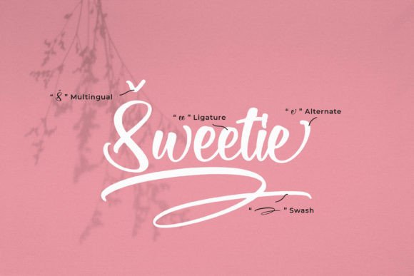
Aneaskara captures that balance nicely.
Another thing I noticed is that it scales pretty well digitally. Some handwritten scripts become hard to read on mobile screens or social thumbnails. Aneaskara still stays fairly clean, which matters if your branding lives heavily on TikTok, Instagram, Pinterest, or ecommerce storefronts.
It feels current without looking overly trendy.
That’s harder to pull off than people realize.
7. Blethers
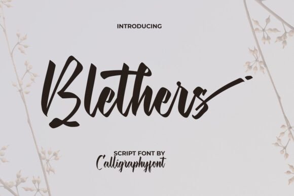
Blethers has more visual weight than most feminine script fonts.
That’s actually one of its biggest strengths.
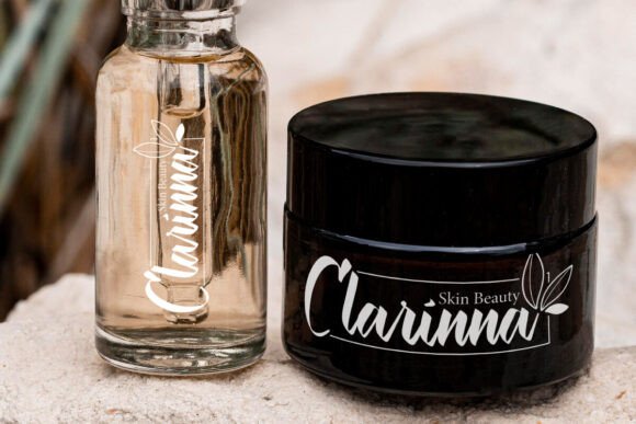
A lot of elegant cosmetic scripts become too thin once applied to real packaging, especially on darker labels or textured materials. Blethers keeps enough stroke contrast to stay visible while still feeling graceful.
It works especially well for:
- luxury spa branding
- premium skincare labels
- perfume packaging
- cosmetic jars
- beauty clinic branding
The calligraphy influence feels polished but not overly formal. I’d describe it as expressive luxury rather than classic luxury.
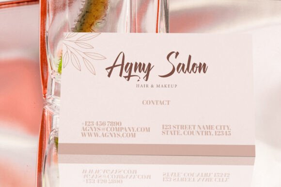
And the ligatures are genuinely nice here.
Sometimes alternate characters feel gimmicky, but Blethers uses them in a way that actually helps branding feel more custom and less template-based.
I could easily see this font printed in rose gold foil on blush-toned packaging. That combination would probably do very well visually on Pinterest too, honestly.
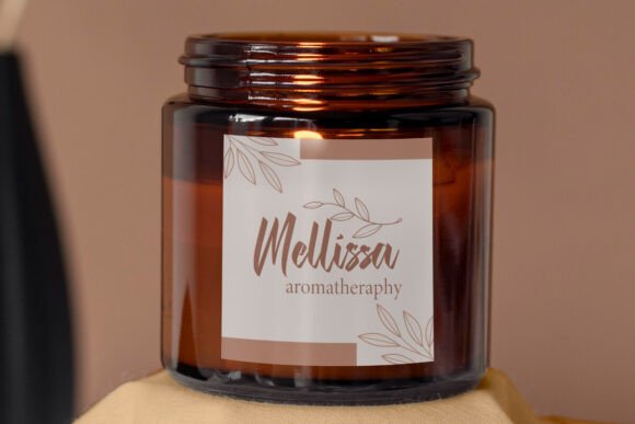
One thing designers sometimes underestimate is how important typography weight becomes during printing. Thin scripts can look incredible on screens and then almost disappear during embossing or foil stamping. Blethers avoids that issue much better than ultra-delicate scripts.
That practicality makes it more useful for real cosmetic packaging production.
8. Florida Island
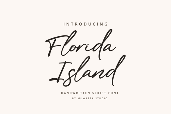
Florida Island feels airy and effortless.
Some luxury fonts feel very structured and formal. This one feels more organic, almost like naturally brushed handwriting rather than traditional calligraphy.
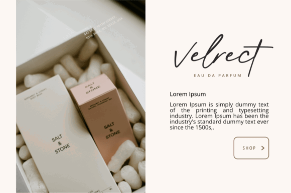
That relaxed elegance works beautifully for:
- boutique skincare brands
- handmade cosmetics
- organic beauty packaging
- self-care branding
- lifestyle beauty campaigns
I especially like this font for brands using earthy palettes and minimalist photography. Think:
- sage green
- cream tones
- warm neutrals
- frosted jars
- textured paper labels
Florida Island fits perfectly into that aesthetic direction.
Another thing worth mentioning is how well it works digitally. A lot of cosmetic branding today lives more on Instagram and ecommerce stores than physical shelves anyway. Florida Island still keeps its personality across social graphics, packaging mockups, and online storefronts.
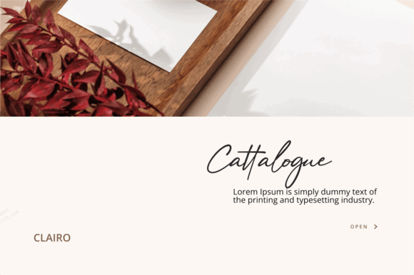
It also doesn’t feel overly “luxury” in the traditional sense.
Instead, it creates that calm modern premium aesthetic many wellness-focused beauty brands aim for now.
Soft. Clean. Slightly artistic.
Very current.
9. Fantasy
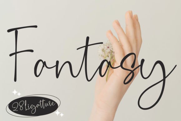
Fantasy feels more relaxed and playful than most fonts here.
That makes it useful for beauty brands targeting younger audiences or social-first branding.
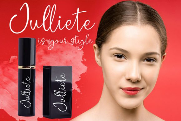
Instead of looking highly polished or fashion-editorial, Fantasy leans into approachable elegance. It still feels premium, just less formal.
I’d use it mostly for:
- beauty subscription boxes
- skincare startups
- cosmetic social campaigns
- feminine lifestyle brands
- casual luxury packaging
One thing I like is that it feels emotionally warmer than ultra-minimal luxury fonts. Some premium beauty branding ends up feeling sterile after a while. Fantasy still keeps personality.
And honestly, consumers notice that.
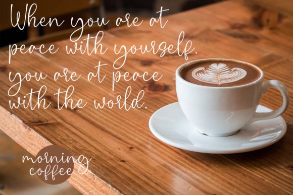
Especially now that so many skincare brands are starting to look visually identical online.
Fantasy also adapts surprisingly well across different styles. It can feel soft and chic on monochrome packaging, but it also works with more colorful branding systems.
That flexibility makes it easier for growing brands that haven’t fully locked into one visual direction yet.
It’s elegant without taking itself too seriously.
10. Sibling Bond
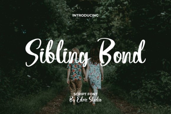
Sibling Bond sits somewhere in the middle between casual handwriting and refined packaging typography.
Which is probably why it works so well.
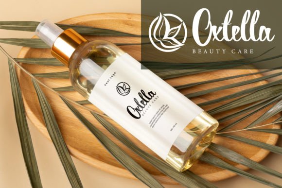
Some cosmetic brands want elegance but don’t want dramatic swashes everywhere. Others want handwritten warmth without looking overly casual. Sibling Bond balances both nicely.
It works especially well for:
- salon branding
- spa packaging
- skincare labels
- boutique cosmetic brands
- wellness products
The stroke variation feels natural without becoming messy, and the spacing is surprisingly clean.
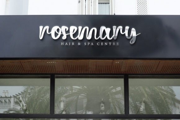
That’s important because packaging typography often fails because of spacing problems, not because the font itself is bad.
I’ve seen beautiful script fonts look cheap simply because the kerning became crowded once applied to curved jars or narrow labels.
Sibling Bond avoids a lot of that.
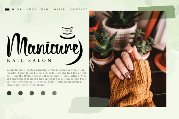
I also think it pairs very easily with minimalist sans-serif fonts, which makes building full packaging systems simpler.
Picture muted olive packaging with soft white typography using Sibling Bond. Clean, calm, understated luxury. That direction feels very modern right now.
11. Jagat Bumi
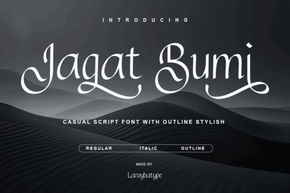
Jagat Bumi feels handcrafted in a very intentional way.
Not rough. Not rustic. Just naturally human.
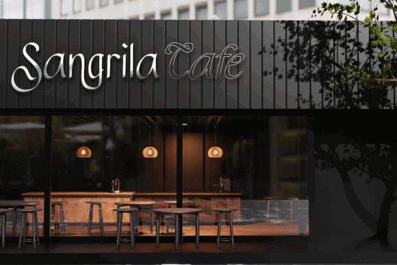
The elegant curves and alternate styles give it a softer emotional feel than highly polished editorial scripts. That makes it especially strong for:
- clean beauty packaging
- wellness brands
- essential oil products
- feminine skincare labels
- eco-conscious cosmetic branding
One thing I genuinely like here is the flexibility. The regular, italic, and outline variations make it easier to build layered branding systems without needing multiple unrelated fonts.
That becomes useful for:
- packaging
- social graphics
- website banners
- inserts
- campaign visuals
Jagat Bumi also works really well with natural materials.
I tested similar script styles before on kraft textures and matte labels, and they usually photograph beautifully. Especially in soft natural lighting. The handwritten curves help packaging feel more tactile and personal.
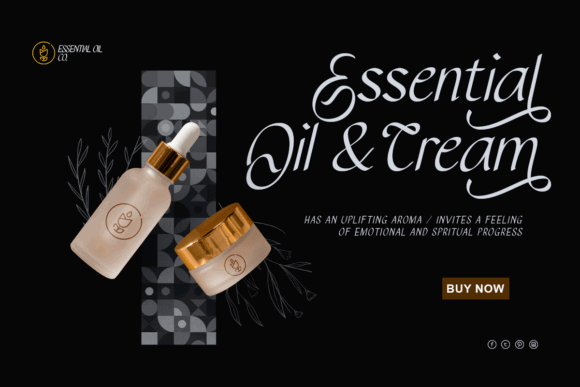
For sustainable beauty brands or wellness-focused skincare, this font feels very aligned emotionally.
12. Shiny Flower
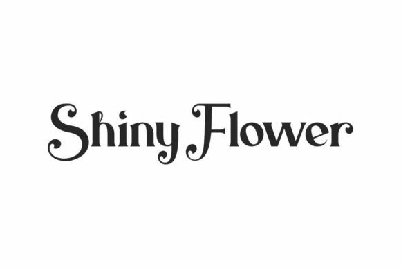
Shiny Flower is a little different from the rest because it’s not really a traditional flowing script.
But it absolutely deserves a spot here.
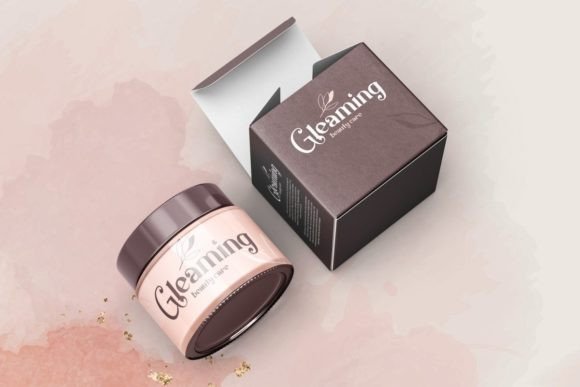
Instead of handwritten elegance, it creates luxury through decorative serif styling and floral-inspired details. The result feels artistic, dramatic, and fashion-oriented.
This font works beautifully for:
- premium perfume packaging
- luxury cosmetic collections
- editorial beauty branding
- fashion-inspired skincare
- statement logo design
I actually like seeing serif display fonts used more often in beauty branding lately. So many cosmetic brands rely on the same ultra-minimal sans-serif look that packaging starts blending together.
Shiny Flower breaks that pattern immediately.
And when used carefully, it looks incredibly premium.
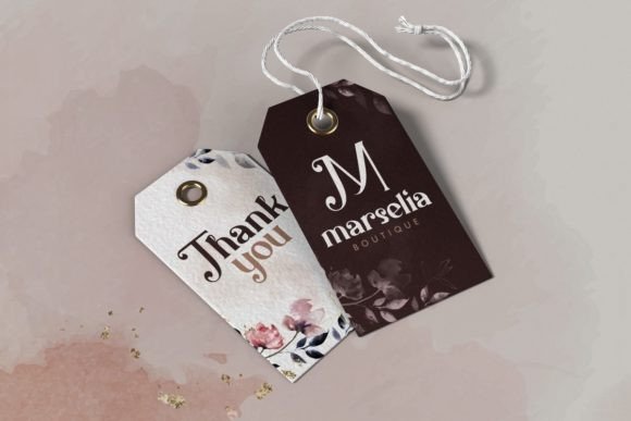
I’d probably avoid using it heavily across dense packaging layouts, though. It works best as a focal typography element rather than body text.
Think:
- embossed perfume logos
- campaign headlines
- luxury collection names
- limited-edition packaging
Used sparingly, it becomes memorable very quickly.
If you're looking for even more stunning options to elevate your product's appearance beyond cosmetics, we've curated 18 Elegant Script Fonts for Luxury Packaging that will instantly enhance branding.
How to Choose the Right Luxury Script Font
Choosing a luxury script font for cosmetic packaging isn’t really about finding the fanciest typography.
It’s more about emotional fit.
Different fonts completely change how beauty products feel before customers even touch them. A dramatic calligraphy script creates a very different impression compared to a soft handwritten monoline font.
And customers pick up on those details immediately, even if they don’t consciously realize it.
One thing I always recommend is testing fonts on actual packaging mockups before finalizing anything.
A font may look incredible in large preview images but become unreadable once printed onto:
- serum bottles
- lipstick tubes
- compact labels
- frosted containers
- curved packaging
That happens constantly.
Thin strokes can disappear during foil stamping or embossing too. Especially on textured materials.
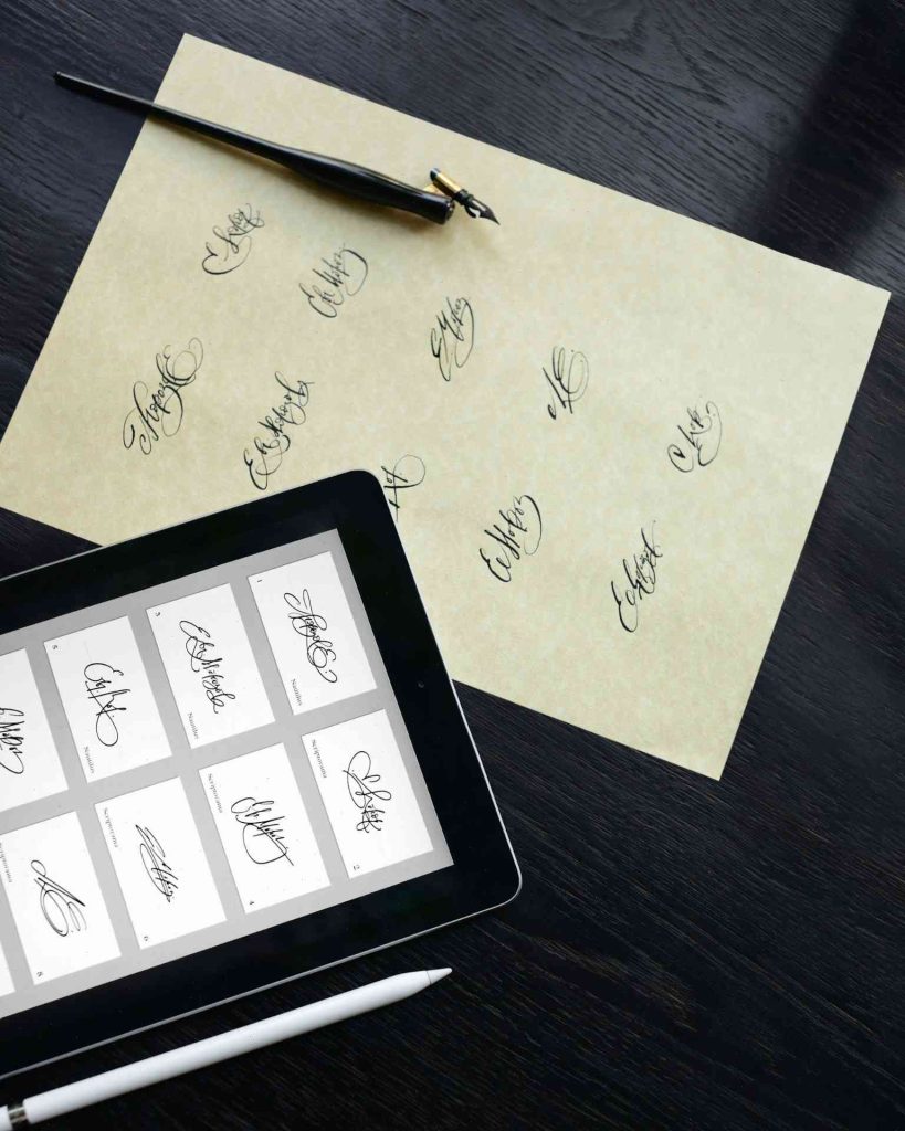
Fonts like Sinabon and Sibling Bond usually hold readability better on smaller cosmetic packaging because the letterforms stay cleaner at reduced sizes.
Another thing people underestimate is digital consistency.
Beauty branding doesn’t live only on packaging anymore. Your typography also needs to work across:
- ecommerce websites
- Pinterest pins
- Instagram graphics
- TikTok visuals
- email campaigns
- influencer collaborations
A font that only looks good in static packaging mockups can create branding problems later.
Common Mistakes to Avoid When Using Script Fonts
One of the biggest mistakes beauty brands make is choosing aesthetics over readability.
A script font might look amazing on Pinterest inspiration boards but become impossible to read once applied to actual cosmetic packaging.
And customers notice that immediately.
Another common issue is over-decoration.
Too many swashes, flourishes, and decorative alternates can make packaging feel cluttered very fast. Luxury branding usually works better with restraint.
The brands that feel most premium often use typography very sparingly.
Poor font pairing is another problem I see constantly. Multiple decorative fonts fighting for attention almost never works. Usually one elegant script paired with a clean serif or sans-serif creates a much stronger hierarchy.
Spacing matters too.
Cheap-looking packaging often isn’t caused by bad fonts — it’s caused by overcrowded layouts. Luxury branding needs breathing room.
And honestly, trend-chasing becomes risky pretty quickly in beauty branding. Some Instagram-popular fonts get overused so heavily that entire product categories start looking identical within a year.
One last thing people forget: licensing.
Cosmetic packaging is commercial usage. Always check licensing rights before using fonts for products, branding, or retail packaging.
Conclusion
Luxury script fonts do a lot more than decorate cosmetic packaging.
They shape how products feel.
The curve of a letter, the softness of a handwritten stroke, even the spacing between characters — those tiny details quietly influence whether packaging feels premium, modern, soft, artistic, or forgettable.
And beauty consumers absolutely notice those details now.
Some brands need dramatic editorial typography like Lucia or Mollies. Others work better with softer minimalist scripts like Kiona Rosebelle or Florida Island. There’s no single “best” luxury font because the right choice depends on the emotional direction of the brand itself.
But one thing is pretty consistent across successful cosmetic branding:
The typography always feels intentional.
When the font, packaging material, color palette, and overall visual identity all align together, products instantly feel more polished and desirable — even before someone opens the box.
FAQs
What is the best script font for luxury cosmetic packaging?
It depends on the brand personality. Majestica Royale and Mollies work beautifully for high-end editorial luxury, while Kiona Rosebelle and Sinabon fit minimalist skincare branding much more naturally.
Are script fonts good for skincare labels?
Yes — especially for beauty and wellness branding. The key is choosing script fonts that remain readable on small labels and curved packaging.
Can luxury script fonts improve brand perception?
Definitely. Typography strongly affects how expensive, trustworthy, and polished cosmetic products feel to customers.
Which script fonts work best for minimalist beauty brands?
Kiona Rosebelle, Florida Island, and Sibling Bond are especially good for clean minimalist beauty aesthetics because they balance elegance with simplicity.
Should I pair script fonts with other fonts on packaging?
Usually yes. Most luxury cosmetic packaging works best when script fonts are paired with clean serif or sans-serif typography for ingredients, instructions, and product details.
Follow Us